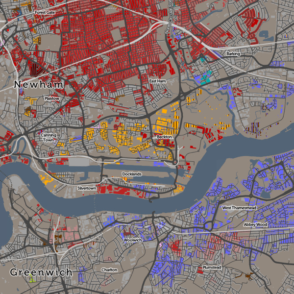
Above: Areas of east and south-east London with more than 8% of inhabitants being originally from (from top to bottom) India (in East Ham), Lithuania (in Beckton) and Nigeria & Nepal (in Abbey Wood).
[Updated] Ever wondered why some branches of Tesco, the ubiquitous supermarket, have an American food section, while others have a Polish food chiller? Alternatively, it might have a catch-all “World Food” aisle, or it might not. The supermarket is, of course, catering to the local community. Immigrants to the UK do not uniformly spread out across the country, but tend to cluster in particular localities.
The latest map that I’ve published on CDRC Maps is a Country of Birth map, which attempts to summarise such communities in one view. It uses the same technique as Top Industry, it maps the most common country of birth (excluding the home nation) of residents in each small area, as of the 2011 Census. The purpose of the map is to identify and map the approximate extent of single-country communities within the UK. For example, to see how big London’s Chinatown is, or whether a Little Italy in the capital still exists.
This map reveals such communities although there is an important caveat when looking at it. I have set out below the rules I applied when constructing it, the most important of which is that only 8% of inhabitants need to share a single country of birth, for it to appear on the map. Bear in mind that, across the UK, 87% of people were born here. These people do not appear on the map, unless they are outside their home nation (and not at all if they are English).
 There are a number of rules I have needed to apply to make this a map that tells an interesting story in a measured and fair way:
- I don’t map native births – the English-born people in England, Welsh-born in Wales, Northern-Irish born in Northern Ireland or Scottish-born in Scotland. There are almost no areas anywhere in the UK where people born in a single foreign-born country outnumber the native-born. If I did map such native births, then the map would be almost completely dominated by them, and would not tell much of a story.
- I also don’t map the English-born within the other home-nations, because the population of England is so much larger than in Scotland, Wales etc such that even the small percentage of them moving into the other home nations would dominate the map of Scotland/Wales/NI, if included.
- I only map a single-country foreign born area if at least 8% of local residents are from that country. This sounds like a low threshold and it is – if an area is coloured a particular colour, it might still have up to 92% of the local residents actually being native-born.
- The above rule means that some very multi-cultural areas don’t get mapped, because they have a large number of non-native residents, but these are split amongst various countries such that none reaches the 8% threshold.
- Necessarily, in the source data, some countries are combined together into regions, either for a whole region (e.g. Central America) or for other countries in a region (e.g. Other East Asia, not including China/Japan etc). This is how the underlying Census statistics are represented. This can have the effect of making a result (for a region) appear when it wouldn’t otherwise appear (for any country in the region). However the number of places where this happens is small so it does not overly bias the map.
- A slight quirk of the census results is that the Scotland and Northern Ireland chose to, based on their own sum populations, aggregate some of the smaller-UK-population countries in a different way. For example, Northern Ireland doesn’t break out “Other Old EU” (e.g. Belgium) and “Other New EU” (e.g. Bulgaria) into separate categories. The Somalian population in Scotland is not presented as a distinct statistic, but it is in NI (and England/Wales). Again, this only affects countries/regions with smaller UK populations so doesn’t overly distort the map.
- I don’t colour the map where it would be showing data for less than 10 people. This causes a most noticeable rationalisation of the map in Scotland, because the small areas here have a lower population (typically 125 instead of 250 people). This means Scotland’s country-of-birth diversity is a little underrepresented when compared with the other regions of the map.
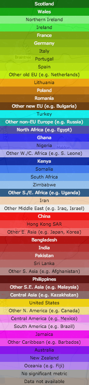
- I’ve used colour hues and brightnesses in an ordered way, to group together continents and regions. Greens = UK nations, Olives = Old EU, Browns = New EU, Yellows = North America, Pinks = Central America, Blues = Africa, Purples = Oceania, Reds = Asia. There is no particular meaning to the colours picked beyond this, but be aware that the eye is naturally drawn to some colour hues more than others.
- If a second country of birth also scores over 8%, but with a smaller local population than the first, then this is shown in striped lines over the first, and labelled as such in the interactive key.
Have a look at the map, and mouse around to find the meaning for the current colour, or see the scrollable key on the right.
Why 8%? I found that dropping this threshold (I tried initially at 5%) results in a lot of “noise” on the map, where only two large families need to move to an area, for it to acquire their birth-country colour. Increasing this threshold (e.g. to 10%, which I tried) results in many of the interesting patterns disappearing.
Interesting, some famous “immigrant” areas of London virtually disappear on this map. Brixton and Hackney are still associated with the Jamaican communities moving there in the 1940s/50s, but, at 8% threshold they virtually disappear. Only at 5% is there a significant community pattern appear. Similarly, Wandsworth and Shepherds Bush are known for their Australian communities but these also almost vanish when moving from 5% to 8%. At a 5% threshold, Hackney and Islington show a “patchwork” effect of integrated multicultural communities of Irish, Turkish, Nigerian and Jamaican-born immigrants. These also disappear largely from the map at 8% threshold. Remnants of the Irish migration to Kentish Town are more obvious.
London remains a fascinating mix where people from many different countries have set up their home in neighbourhoods with established communities and retail that cater for them. While the UK’s other cities have “international” quarters too, none shows the diverse nature of these communities. Virtually every country in the key has a London neighbourhood. (N.B. Places where there are pockets of many nations in a small area in London, and elsewhere, often indicate a student population at a globally well-known university).
Away from London, the Scottish-origin communities in Corby and Blackpool stand out, while the Americans on military bases in East Anglia also dominate the map there. Luton has a Polish, Pakistani and Irish disapora.
As ever, I am mapping small-area statistics, not those for individual houses (I don’t have that information!) and the representation of a particular house on the map is indicative of the local area rather than each house itself. The addition of houses on CDRC Maps maps is intended to make the map more relatable to the population structure of towns and cities, but it can make the data more detailed than it actually is. The map also includes non-residential buildings – there’s no easy way to filter these with the open dataset used, and the great majority of buildings in the UK are residential.
[Update – See this excellent article written by CityLab on this map, which explains some of the above nuances in a better way than I attempted to.]
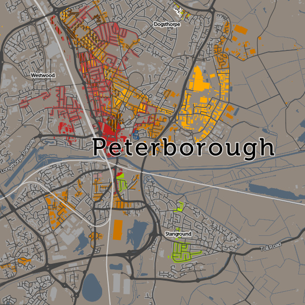
Below: There is a Little Italy, but it’s in Peterborough now.
6 replies on “A Map of Country of Birth Across the UK”
“I also don’t map the English-born within the other home-nations, because the population of England is so much larger than in Scotland, Wales etc such that even the small percentage of them moving into the other home nations would dominate the map of Scotland/Wales/NI, if included.:
So why not show this? Anecdotally, there are many places where English born people are the large, indeed dominating minority, in Scotland and Wales. This is probably the single most significant piece of data that this map should show, and yet it chooses not to. I just don’t understand.
[…] Исходный материал в блоге Оливера О’Брайена. […]
[…] that a single group rarely reaches over the 8 percent threshold. As O’Brien notes on his own blog, if you reduce that threshold to 5 percent, the area instantly turns […]
[…] that a single group rarely reaches over the 8 percent threshold. As O’Brien notes on his own blog, if you reduce that threshold to 5 percent, the area instantly turns […]
[…] that a single group rarely reaches over the 8 percent threshold. As O’Brien notes on his own blog, if you reduce that threshold to 5 percent, the area instantly turns […]
[…] that a single group rarely reaches over the 8 percent threshold. As O’Brien notes on his own blog, if you reduce that threshold to 5 percent, the area instantly turns […]