A minor update to the GB edition of OpenOrienteeringMap – the postcode search has been fixed. Typing in a valid GB postcode should now jump to the map to the centre of that postcode. Note that postcode search for Northern Ireland is not available.
Author: Oliver O'Brien
Construction Open Doors
Construction Open Doors 2017 is almost here – various building sites and other construction projects are opening up to the public next week. Many sites are still bookable.
I’ve booked five sites to look around next week – King’s Cross Central, Waterloo International, Alexandra Palace, Battersea Power Station and Crossrail Whitechapel. I’ve visited two of these sites before so it will be interesting to see what’s changed.
Look out for a writeup of each of the above in the next few weeks.
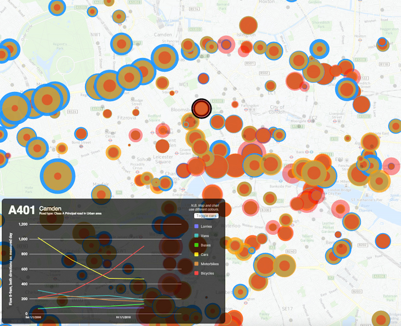
My latest London data visualisation crunches an interesting dataset from the Department of Transport (there’s also a London Borough of Southwark version using their local observation data). The data is available across England, although I’ve chosen London in particular because of its more interesting (i.e. not just car dominated) traffic mix. I’ve also focused on just the data for 8am to 9am, to examine the height of the morning rush hour, when the roads are most heavily used. 15 years worth of data is included – although many recording stations don’t have data for each of those years. You can choose up to three modes of transport at once, with the three showing as three circles of different colours (red, yellow and blue) superimposed on each other. The size of each circle is proportional to the flow.
It’s not strictly a new visualisation, rather, it’s an updated version of an older one which had data from just one year, using “smoothed” counts. But it turns out that the raw counts, while by their nature more “noisy”, cover a great many more years and are split by hours of the day. I’ve also filtered out counting stations which haven’t had measurements made in the last few years.
Note also the graph colours and map colours don’t line up – unfortunately the Google Material API, that I am using for the charting, does not yet allow changing of colours.
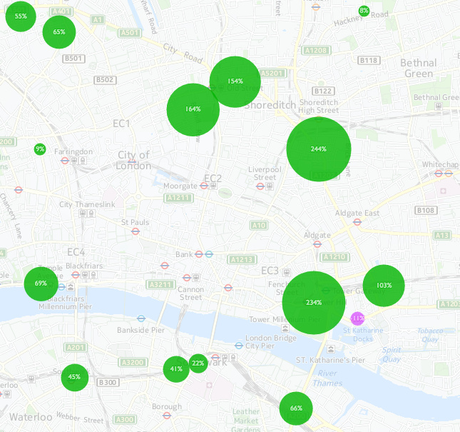
An alternate mode for the map, using the second line of options, allows you to quantify the change between two years, for a single selected type of transport. Green circles show an increase between the first and second year, with purple indicating decreases.
The Final Munros
I climbed my 224th Munro at the beginning of the year, on the final day of the annual JOK winter trip to the Highlands. Poor weather conditions and a lack of unclimbed Munros for me in the area (Lochaber) meant that there was only one new one climbed during the trip. The map shows I have 58 remaining, here’s a possible plan for them:
Northwest Highlands (South): 27 Munros, 14 days
- 12 around Loch Monar – there are lots of Munros accessible from this remote loch, accessed from Glen Strathfarrar, best suited for a summer 3-4 day multi-day trip with wild camping. It’s been a long while since I did this.
- 3 more from Strathcarron – these are all easy ones, good for winter, climbable in two days.
- 6 around Glen Affric – Alltbeithe bothy is a long walk in but potentially a very useful base for doing these in 2-3 days.
- 5 around Loch Quoich – another remote loch although with a road at least. Includes the westernmost of the South Glen Shiel Ridge which is normally climbed from the other direction. Three days in the summer or four in winter.
- 1 near Loch Hourn – Beinn Sgritheall.
Northwest Highlands (North): 9 Munros, 4 days
- 5 in The Great Wildnerness. A good, very long summer’s day.
- 2 on An Teallach – 1 day. The most technical ones remaining.
- 1 – Seana Bhraigh – very long walk in/out.
- 1 – Am Faochagach.
Southern Cairngorms: 13 Munros, 6 days
- 4 from Glenshee in a day including Cairnwell, the easiest one of all.
- 1 awkward one south from Linn of Dee.
- 2 very remote ones from Linn of Dee, to the south-west.
- 2 very remote ones from Linn of Dee, to the north.
- 2 more from Linn of Dee, to the north-east.
- 2 more from Braemar itself (head of the Linn of Dee).
Southern Highlands: 9 Munros, 5 days
- 1 from Corrour station – Sgor Gaibhre. Could be a good final one if the train timings work.
- 2 from Tyndrum – although rather awkward to get to, in one day.
- 1 from Loch Tay.
- 4 from Loch Tulla – a long-anticipated big mountain day.
- 1 from Loch Creran.
That makes 28 more mountain days. I’m planning on doing all the Southern Cairngorm ones in late July/early August, to coincide with the Scottish 6 Days orienteering event which is near there.
London City Race Mega-Map
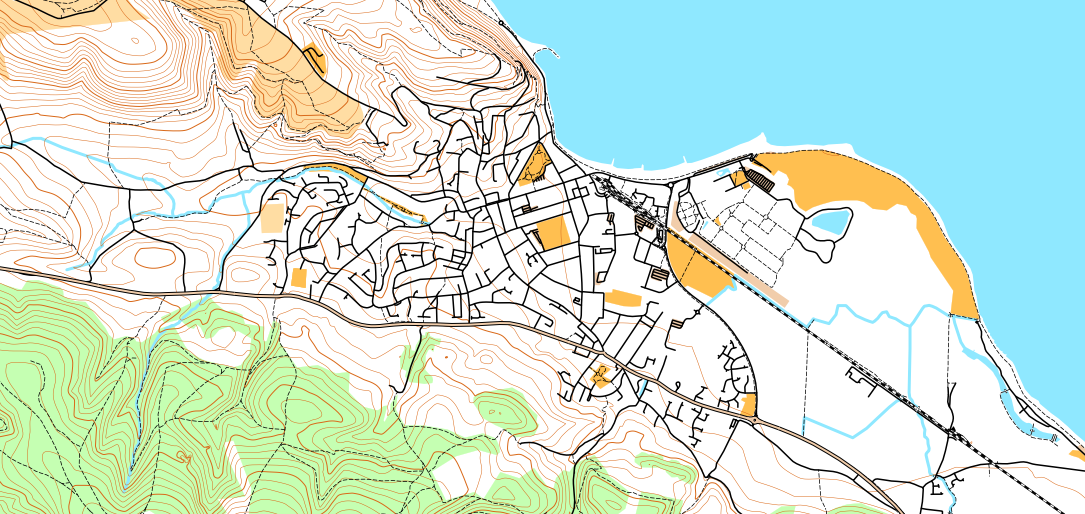
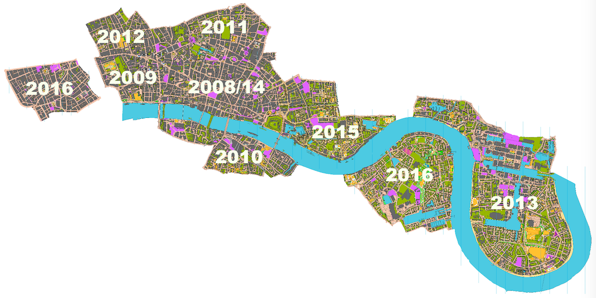
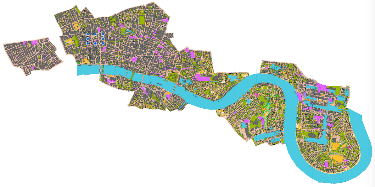
Below is a low-resolution view of the London City Race orienteering maps that have been used since the race was first held in 2008, arranged geographically to show their relative position. The maps were drawn by myself (initially) and Remo Madella (subsequently) who joined them together and assembled this image. Dark grey represents buildings, with olive green for private gardens and other off-limits land, and pink showing construction sites. The map is not entirely up-to-date, as only the relevant section is updated/extended, for each race.
There are only a couple of small gaps, between Covent Garden and Aldwych, and between Wapping and Limehouse. These aside, it would be possible to run on a proper urban (ISSOM) orienteering map, from Oxford Circus in the West End, right down to Island Gardens on the tip of the Isle of Dogs. Such a run would be well over 10km, and the accompanying map would be over two metres long at its 1:5000 native scale.
Here’s where each area was first used. 2014 was the only edition of the race, to date, that did not expand the map:
The maps contain OS data which is Crown Copyright and database right Ordnance Survey, 2007-16, with licence # 100015287 for non-OGL content.
How Mexico City Does Bikeshare
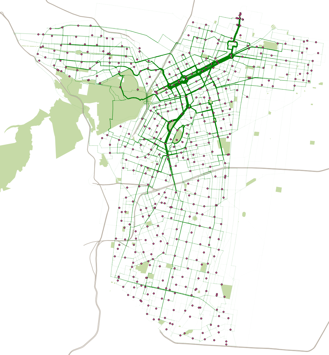
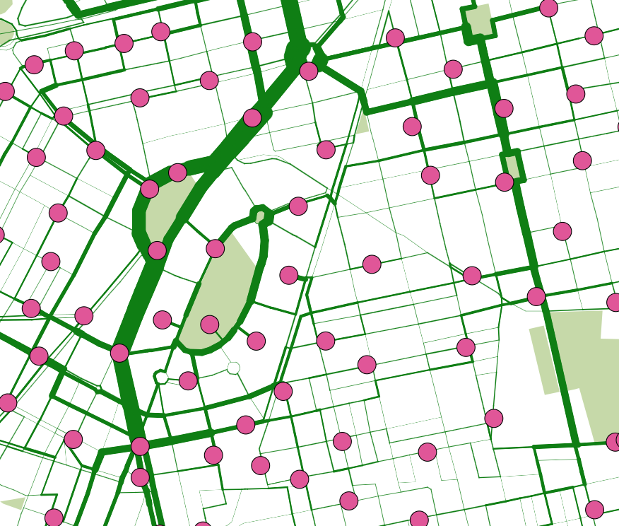
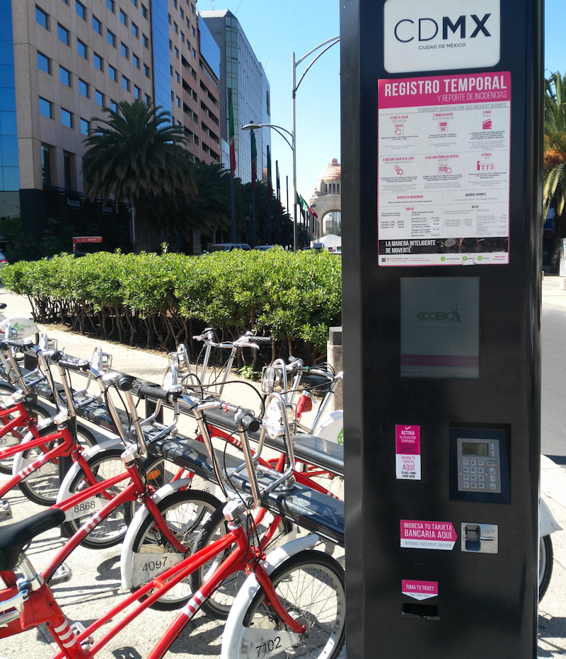
The above map shows the estimated routes and flows of over 16 million users of the bikeshare in Mexico City, “ECOBICI“, across the 22 months between February 2015 and November 2016, using data from their open data portal. The system has been around since 2011 but its most recent major expansion, to the south, was in early February 2015, hence why I have show the flows from this date. The wider the lines, the more bikeshare bikes have been cycled along that street. The bikes themselves don’t have GPS, so the routes are estimated on an “adjusted shortest route” basis using OpenStreetMap data on street types and cycleways, where any nearby cycleway acts as a significant “pull” from the shortest A-to-B route. Having cycled myself on one of the bikes in November (and hence my journey is one of the 16.6 million here) I fully appreciate the benefits of the segregated cycle lanes along some of the major streets. As my routes are estimates, they don’t account for poor routes taken by people, or “tours” which end up at the same places as they started. So, the graphic is just a theoretical illustration, based on the known start/end data.
The bikeshare journeys are in a dark green shade, ECOBICI’s brand colour, with docking stations shown as magenta dots. Magenta is very much the colour of CDMX, the city government, and it consequently is everywhere on street signs and government employee uniforms. Mexico City doesn’t have rivers, which are the “natural” geographical landmark for cities like London and New York where I’ve created similar maps, so I’ve used the motorways (shaded grey) and parks (light green), to provide some context. Mexico City extends well beyond the ECOBICI area.
The maps shows huge flows down the “Paseo de la Reforma”. This route is always popular with cyclists, thanks to large, segregated cycle lanes in both directions, on the parallel side roads. On Sunday mornings, the main road itself is closed to motor traffic, along with some other link routes. This is not reflected in my routing algorithm but also acts to increase the popularity of the flow in this general area. To the north, a cluster of docking stations and a large flow indicates the location of Buena Vista station, the only remaining commuter rail terminal in Mexico City. Further south, the curved roads around Parque México and Parque España are also popular with bikeshare users, in this leafy area that very much feels like the “Islington” of Mexico City:
Mexico City’s ECOBICI is one of the 150+ systems I’m tracking live on Bike Share Map. You can see the live situation, or an animation for the last 48 hours.
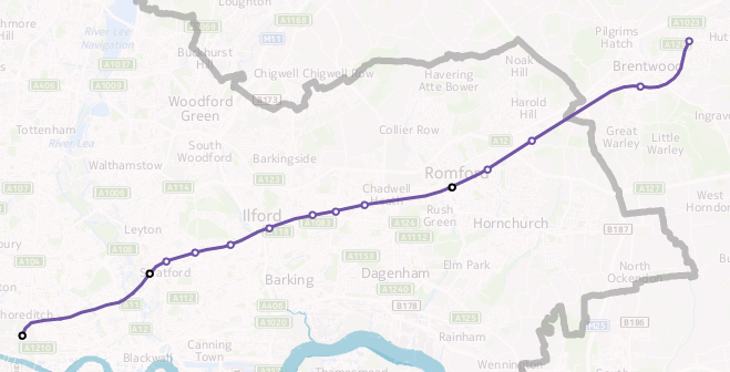
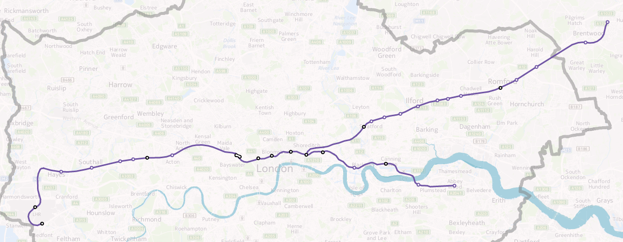
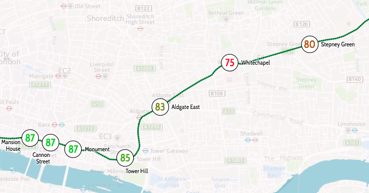
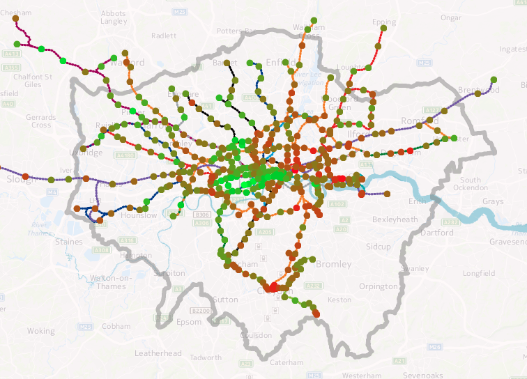
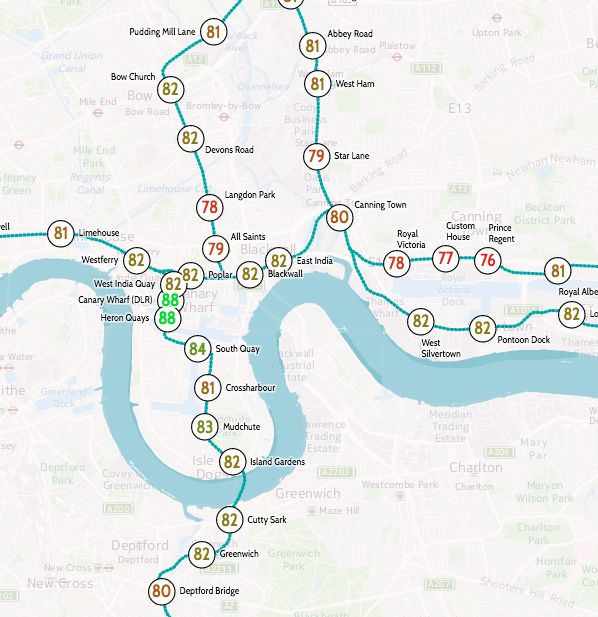
I’ve produced an updated version of a graphic that my colleague Dr James Cheshire created a few years ago, showing how the estimated life expectancy at birth varies throughout the capital, using a geographical tube map to illustrate sometimes dramatic change in a short distance.
You can see an interactive version on my tube data visualisation platform. Click a line colour in the key on the bottom right, to show just that line. For example, here’s the Central line in west London.
The data source is this ONS report from 2015 which reports averages by MSOA (typical population 8000) for 2009-2013. I’ve averaged the male and female estimates, and included all MSOAs which touch or are within a 200m radius buffer surrounding the centroid of each tube, DLR and London Overground station and London Tram stops. I’ve also included Crossrail which opens fully in 2019. The technique is similar to James’s, he wrote up how he did it in this blogpost. I used QGIS to perform the spatial analysis. The file with my calculated numbers by station is here and I’m planning on placing the updated code on GitHub soon.
My version uses different aggregation units (MSOAs) to James’s original (which used wards). As such, due to differing wards and MSOAs being included within each station’s buffer area, you cannot directly compare the numbers between the two graphics. An addition is that I can include stations beyond the London boundary, as James’s original dataset was a special dataset covering the GLA area only, while my dataset covers the whole of England. The advantage of utilising my data-driven platform means that I can easily update the numbers, as and when new estimates are published by the ONS.
Estimating life expectancies at birth for small areas, such as MSOAs, is a tricky business and highly susceptible to change, particularly due London’s high rates of internal migration and environmental change. Nevertheless it provides a good snapshot of a divided city.
Data: ONS. Code: Oliver O’Brien. Background mapping: HERE Maps.
Below is a presentation that combines my talks last Thursday and Friday at the Smart Mobility forums in central Mexico City, organised by ITDP Mexico and funded by the Foreign and Commonwealth Office’s Prosperity Fund (respresented by the British Embassy in Mexico). The Thursday presentation focused on the third-party app ecosystem that exists around bikesharing in London and elsewhere, while the Friday presentation included more examples of private sector innovation using open data:
My week in Mexico City also included a visit to CIC at IPN (the computational research centre city’s main polytechnic) where I was introduced to a product building visualisations of ECO-BICI data to help create more effective strategies for redistribution. I also visited LabCDMX, a research group and ideas hub to study Mexico City that has been created by the city government, to give a couple of talks in their rooftop on visualising London transit and a summary of web mapping technologies. The organisers also squeezed in a couple of short TV interviews, including Milenio Noticias (23 minutes in). The week ended with a tour of the ECO-BICI operations, repair, management and redistribution warehouse, located centrally and a hive of activity. This included a look at their big-screen redistribution map and vehicle routing system.
Some of the companies and products I cited included CityBikes, Cycle Hire Widget, TransitScreen, ITO World, Shoothill, Waze, Strava Metro and CityMapper. I also showed some academic work from myself, James Cheshire and Steve James Gray in UCL GSAC and UCL CASA respectively, an article in The Guardian by Charles Arthur, an artwork by Keiichi Matsudaa and a book by James Cheshire and Oliver Uberti. I also mentioned WhatDoTheyKnow and heavily featured the open data from Transport for London.
I also featured some work of my own, including CDRC Maps, TubeHeartbeat, London Panopticon, Tube Stats Map, CityDashboard, Bike Share Map and London Cycling Census map.
Twelve Talks
November is shaping up to be a very busy month for me, in terms of giving talks – I will have presented 13 times by the end of the month. I appreciate that lecturers might not agree that this is a particular busy month! Anyway, here’s a list of them:
- 1 November – CDRC Maps: Introduction and Impact (10m)
Audience: ESRC/Moore-Sloan Meeting - 3 November – Guest Lecture & Practical: Web Mapping (60m + 2h)
Audience: Second Year Geography Undergraduates at UCL - 9 November – Research Lab Update: Worldnames & CDRC Maps (3m)
Audience: Jack Dangermond Keynote Lecture at UCL - 11 November – London: Visualising the Moving City (30m)
Audience: EU COST Action London meeting - 15 November – CDRC Maps: Introduction (5m)
Audience: Academic visitors from South Korea - 17 November – London: Visualising the Moving City (60m)
Audience: Geospatial Seminar Series (UCL CEGE) - 22 November – Data visualisation for Bikeshare Systems (60m)
Audience: CIC-IPN staff and students (Mexico City) - 22 November – Web Mapping (60m)
Audience: CIC-IPN students (Mexico City) - 23 November – London: Visualising the Moving City (60m)
Audience: Public officials and students (Mexico City) - 23 November – Data visualisation design workshop (60m)
Audience: ITDP staff (Mexico City) - 24 November – Third-party App Ecosystems using Open Data (45m)
Audience: Public officials (Mexico City) - 25 November – Open Data and Innovation for the Private Sector (60m)
Audience: Small businesses (Mexico City) - 28 November – CDRC Maps: Introduction (5m)
Audience: Academic visitors from Japan
I have also contributed material for a further talk given by a colleague – an introduction to geodemographics in the UK, for the Brazil governmental statistical service.
Here’s an attempt to create a simple taxonomy of the currently active and popular web mapping frameworks available. This covers web mapping that delivers a consumer-navigable geographic “slippy” map of raster and/or vector tiles containing bespoke geographic data.
FRAMEWORKS | ||||||
---|---|---|---|---|---|---|
< < < EASY, costs, limited, quick
Flexible, Needs resources, time, HARD > > > |
||||||
Ecosystems | Hosted Wrappers | Managed Wrappers | Managed APIs | Open Frameworks | Spatial Servers | Server Programming |
Mapbox Studio
|
|
Google Maps Embed API
|
HERE Maps API for JavaScript
|
OpenLayers
|
MapServer
|
R (ggplot)
|
Capabilities/Requirements of the above Frameworks | ||||||
Data analysis | Data analysis | |||||
Remote server dependency | Server with shell access required | |||||
Web space required | ||||||
Scripting knowledge required | Programming required |
I will aim to update based on feedback and new discovery. This initial version is based on my own usages/experiences in the field, so it is quite possible there are some very obvious candidates I have missed.
Additionally (and with the some proviso as above) here’s a 2×2 table of file formats used in slippy and static web mapping, for vectors and rasters – the latter including attribute fields like UTF Grids. I am only including formats widely used in web mapping, rather than GIS in general.
DATA SPECIFICATIONS & FILE FORMATS | |||
---|---|---|---|
Static “WebGIS” | |||
Raster | OGC WMS
GIF, JPG, PNG, (Geo)TIFF |
OGC WFS, GeoJSON, TopoJSON, KML, SVG
XML, SHP, JSON |
Vector |
TMS, WMTS, XYZ, UTFGrid
GIF, PNG, JSON |
Mapbox Vector Tile Specification
JSON, PBF |
||
Tiled “Slippy” |