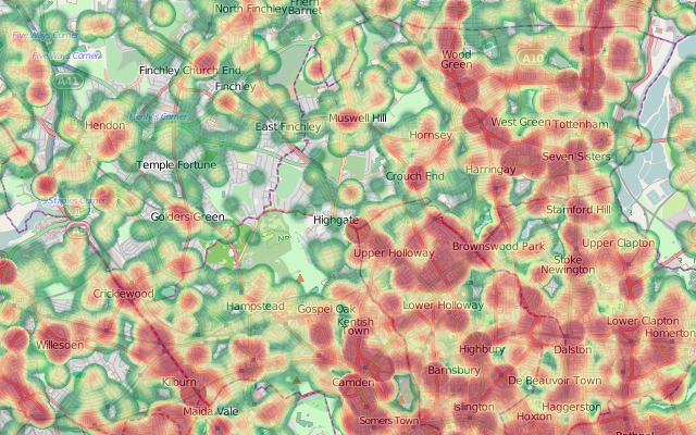
Categories
Bike Share London

Disposable Boris Bikes

A nice April Fools from Firebox – a disposable cardboard bike. The design bears more than a passing resemblance to the Bixi-designed bikes used for the London Cycle Hire scheme – complete with ID number. Also includes a paper-chain chain and egg-box saddle – I like!

Categories
London Olympic Park

New Aerial Photos of Central London in Google Maps

Google Maps has today updated its aerial imagery for central London. The new imagery appears to be from sometime late last summer, and reveals the many new buildings and features that have appeared in the capital recently.

Above is the Olympic Stadium (with the triangular lighting gantries casting shadows into the bowl) and the partially complete Aquatic Centre. The high-capacity bridges linking to the stadium are in place. Below shows the coach park for the Olympics intruding into East Marsh, part of the famous Hackney Marshes. I’ve also included some pictures of the curvy new Walbrook building, on Cannon Street, which is squeezed around a tiny churchyard, and the new Shoredich High Street Station, with surrounding brownfield land.

…and here’s a plane in a very central location.

Categories
Bike Share Data Graphics London OpenStreetMap

Boris Bikes Flow Video – Now with Better Curves!

Dr Martin Austwick and I have produced an updated version of the animation of Barclays Cycle Hire bikes on a typical weekday:

Martin has once again done some programming magic to show the River Thames, Hyde Park/Kensington Gardens and Regent’s Park to add context, plus the trails for the bike “motes” are longer, allowing the road network to be picked out more easily – and the network lines remain as faint “ghosting” in the video. The bikes are also more blue! Although the bridges aren’t specifically marked, their locations quickly become obvious from the volume of bikes crossing them.

I’ve redone the routing, to fix a few problems around Trafalgar Square and a couple of other obvious places. As before, the routing is done using OpenStreetMap data and the Routino routing scripts, optimised for bike usage (i.e constant speeds on all road types, obeying one-way roads and taking advantage of marked cycleways.) I’ve tweaked the desireability of road types, so that trunk and primary roads are now only slightly less desirable than quieter routes. The traffic in most parts of central London is so slow that, based on my own observations, such roads are not such a significant deterrent to cycling. As before, I’m assuming the bikes go along the “best” route, I don’t know where they actually went. Hires that start and end at the same point – popular in Hyde Park – are shown with the motes spinning around the point.

I’ve also included road curves this time. This means bikes don’t go in straight lines between junctions. This was particularly noticeable when they cut the corner of the Thames in the last animation! Watch the bikes as they carefully curve around the kinks of West Carriage Drive in Hyde Park, around the graceful arcs of Regent Street and Aldwych and along the Victoria Embankment. (I don’t think there are many other classic curves in the central London area?)

Expand the video to full-screen, and, if your connection can take it, click the HD button to get a higher-quality with even bluer bikes!

The data for the bikes themselves is from Transport for London, with the Thames, parks and the underlying network being faithfully drawn by OpenStreetMap contributors. One of the great advantages of using OSM data – apart from it being easy to access, is it’s often very up-to-date. For example, you can see the kink at the northern end of Blackfriars Bridge, on the animation, where the road bends around the Blackfriars Station redevelopment site.

Categories
London Olympic Park

Will you be buying tickets for the London Olympics?

So are you coming to the greatest show on earth in London next summer? Or are you making a point of staying away? Perhaps even going to a rival sporting event?

Answer my one-question survey below, and enter the first bit of your postcode, and a map will be drawn automatically, showing how the country’s enthusiam for tickets for the games varies!

Categories
Bike Share Data Graphics London OpenStreetMap

Flow Animation of Barclays Cycle Hire Bikes

Dr Martin Austwick and I, here at UCL CASA, have been working on an animation of the Barclays Cycle Hire bikes (aka Boris Bikes) in London, based on the historical flow information that was released by Transport for London (TfL) last month.

Taking one of the busiest days of the scheme – the 4th of October last year, a Monday which coincided with a London Underground strike – Martin has created an animation showing pulsing blobs, or motes, representing the bikes, moving through the 18 hours of the day that the data is available for. As each hire is made, the docking station dot flashes red, and and blue trail starts to leave it, heading towards the destination dock which flashes yellow as it receives a bike.

At the rush-hour peaks (08:45 and 17:45) the map becomes a sea of a 1000 blue pulses, many congregating on a number of key routes in London. The few bridges across River Thames can be picked out as intense bars of light, as commuters travel between Waterloo/South Bank and the City/West End. Hyde Park (middle left) and Regents Park (top left) are noticeable from having few docks in their area, and only a few bikes crossing them. The east seems busier than the west, as the City workers typically commute to work earlier and so dominate the scheme on strike day.

Martin’s used Processing, a rich Java graphics library, to create the animation, which has been then output to video. This allows the up-to-1000 bikes to be animated smoothly and effectively.

The bikes are in official Barclays Blue, although if you don’t view the video in HD, they look slightly washed out. Watch the video on the Vimeo website in HD, although you’ll need a fast computer and a broadband connection.

The routing is done based on the
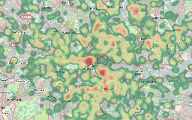
 OpenStreetMap data for central London. I used Routino to do the routing, producing a routing file for each of the 137,000 possible journeys between docks in London. The routing is directed, meaning the bikes won’t cycle the wrong way down a one-way street. They also generally avoid trunk roads, such as Euston Road, preferring to use the quieter roads and dedicated cycle lanes nearby. Being able to use the new cycling infrastructure in the routing, is one big advantage of using OpenStreetMap.

A disadvantage is where the routing is wrong. For example, access from the Embankment is not shown correctly. Another problem was the reluctance to cross Trafalgar Square in the centre of the city. This meant I had to move a couple of the docking stations slightly. An example of the latter is shown in the picture here. These quirks, and a few others, result in some bikes flying around the animation extremely fast, as the router sends them a mile up in one direction, around a roundabout, and back down in the other direction. The speeds of the bikes are based on the duration information for the journey, which is included in the data, so they start and finish at the right time.

The routing is the “best guess” route, based on the assumption that the majority of cycle users will know the “best” route to take. Casual and multi-stop use will be less accurately shown. Bikes which are returned to the same docking station they started from, are shown “orbiting” the dock for four times, before returning to it.

The work follows on from a recent animation showing the TfL buses in London, by Anil Bawa-Cavia, also here at the UCL Centre for Advanced Spatial Analysis in London.

Categories
London

Crime Maps – New and Improved

A new version of the crime maps for England and Wales was launched last night, at police.uk. These are now more granular, offering street-level detail, rather than the sub-ward choropleths that were available before. More significantly, the data behind the maps is now readily downloadable from the website, so if you don’t like the maps, you can create your own. No more will we have maps showing virtually the whole of London has having “average” crime levels, due to the outliers – the pickpockets in the West End – being so much higher than anything else.

My tweet-stream is full of people grumbling about the new system – but I rather like it:

Technical Concerns

  • It’s broken
    Any website launched with a fanfare will break on the first day as the media announce it. There’s not point spending huge amounts on the infrastructure for one day of use, when the rest of the time, the number of visits will be far smaller

Data Concerns

  • It’s using point data for streets
    Yes, it’s not ideal, but it means you don’t have a problem with (a) drawing lots of polygons which would slow things down, or (b) drawing lots of lines and having them not quite line up with the background. It is a bit of a (mis-)use of the Google Maps aggregating icon, having it show at every level, but this means there’s no “pin-point” at anyone’s door.
  • It’s showing anti-social behaviour reports as well as crimes. Conspiracy!
    They are separated out – you can turn these on and off. They do certainly make some areas look a lot higher for crime than they actually are.
  • The data shouldn’t just be given away like this – people will misinterpet it and jump to the wrong inclusions
    Yes, absolutely, and this is a big problem at the moment. My own maps (above and below) certainly have their problems. But isn’t it better to have the data open so people start to become more aware of the statistics around them? My hope is that, with all these public datasets becoming available, people will start to get a greater awareness that maps can lie, and be more investigative about the truth.
  • The data shouldn’t just be given away like this – it’s an invasion of privacy
    Maybe, but the data is only at street-level, rather than house-level. In the U.S., the data is at house-level. The point-based nature of the data does make it appear that particular houses are crime-hotspots rather than the whole street, but that is a technical limitation of the way the data is made available at present.
  • The data will blight my area!
    The truth hurts?
  • My street is showing up as a crime hotspot – it’s not
    Not a fault of the map or the website (although perhaps it should carry a warning) – at the end of the day if the data supplied is wrong, then it’s going to show up wrong. Don’t shoot the messenger! The data may also be referring to shopping arcades the like for which this street is the nearest.

More Technical Concerns

  • It’s not using OpenStreetMap (an open map dataset)
    OSM isn’t complete for England and Wales – particularly in parts of north England. It wouldn’t look good if someone uses the map and finds their street is not there. Like it or not, this wouldn’t happen so often with Google maps. Additionally, very popular sites using OpenStreetMap tiles from the tileserver are frowned upon, the project doesn’t have the server resources of Google.
  • It’s not using custom mapping based on OpenStreetMap
    This is quite hard to do, and, while allowing for theming of the mapping, would present an unfamiliar looking and still incomplete map. Plus hosting the tiles yourself means a lot more bandwidth is needed, so the site is likely to suffer even more under the high load.
  • It’s not using third-party suppliers of tiles, such as Cloudmade
    These address the hosting problem but still suffer from incompleteness.
  • It’s not using Ordnance Survey OpenData (another open map dataset)
    The OpenData image tiles don’t include maps that the general public is familiar with (i.e. Landranger, Explorer). People are more familiar with Google Maps now and understand them more quickly. The vector information could have been used to make some really nice background mapping, but again this requires advanced knowledge and being able to host the tiles and manage the bandwidth that would ensue. Google is happy to give you their own tiles for free and they are highly scalable. Certainly I think this is a missed opportunity for making a completely open site, but I don’t have a major problem with Google Maps here – it’s a sensible tactical decision.
  • It’s not using OpenLayers (an open mapping API)
    Google Maps API works on mobile devices, e.g. the iPhone. OpenLayers (on a website) doesn’t really – no gesture support.
  • Just give us the data, we don’t need a map
    You might not, but the media and public do need something they can look at immediately, rather than waiting for third-party developers to release their own interpretations.

Political Concerns

  • I can’t believe they spent £300,000 on this!
    Actually pretty good value for a site like this – if that includes the infrastructure, bandwidth, database support, testing, maintenance. It’s not just for building a Google Maps API map.
  • It’s still broken
    Wait until tomorrow. Or download the data here – this link has been generally working through the day.

The heatmap above shows robberies in London, below shows anti-social behaviour in north London. I’ve combined the Metropolitan Police and City of London police data-files for December 2010 together. You can play with the heatmap yourself [Updated – the website is now offline] if you have an HTML5-compliant browser. The background mapping is from OpenStreetMap. More about the heatmaps.

Categories
Data Graphics London

London Surnames: An Onomap of London

I’ve created a website to showcase a number of bespoke typographic maps that James Cheshire (a Ph.D colleague UCL Geography) has created. The website shows the origin of the most common 15 surnames in each MSOA in London – MSOAs are spatial units roughly encompassing 7000 people.

It’s important to emphasise that these are the origins of the surnames, not of the people themselves, i.e. it is a map of names, not ethnicities. The categories are chosen descriptions of the Onomap groupings that appear when matching surnames and forenames and therefore don’t necessarily line up with associated ethnicities or countries. For example, the high numbers of “Welsh” names appearing is likely not due to lots of Welsh people!

Communities which have more homogenous surnames are more likely to be highlighted on a map like that, at the expense of communities with more mixed surnames – another reason why this map cannot tell you about the proportion of people in a particular area – just their names.

The extract below shows a small Jewish “cluster” of names appearing on the border of Harringay, Hackney and Waltham Forest boroughs – the area known as Stamford Hill, which is an area noted for its large Orthodox Jewish community.

The website itself is nothing particularly special, except that it allows easy panning, zooming and scrolling of James’ eye-catching maps. OpenLayers powers the website, and a custom “pixel-coordinate” projection is used. There is a JQuery slider to scroll through the maps, and the user interface elements adopt the “London street sign” look. The data comes from 2001 so doesn’t account for the likely recent significant population movements around the city in the last few years.

More on James’ blog.

Categories
London OpenStreetMap

Friday Review: London Crumpled City Map

I got the London Crumpled City Map as a Christmas pressie. It is a large scale map of central London – covering most, but not all, of Zone 1 – the eastern edge of the City is chopped off. It is designed and produced by an Italian company, and is one of a series of maps that also includes New York, Paris, Tokyo, Berlin and Rome.

The big feature about the map is you can scrunch it up into a ball and keep it in the soft pouch that comes with it – unraveling for later use is straightforward. The map is printed on a very thin and light plastic waterproof sheet, kind of like a synthetic tablecloth. The map remains very creased when it is flattened out – naively I was expecting it to spring back to its perfect condition which it was in when I opened the present – but is still very readable.

The cartography is simple and clear – grey roads with black text, on white. Large buildings are shown in lighter grey, parkland is in olive and the Thames is an unusually light blue. It’s too simple in places – paths in parks and on the Thames’s pedestrian bridges appear just like the roads, and bridges and tunnels are not shown, which means the Victoria Embankment appears to end abruptly as Blackfriars, rather than continuing under it as Upper Thames Street. Surface railway lines are present as narrow lines. Only the TfL stations are shown – City Thameslink is missing, for instance.

As a some-time contributor to the project, I’m pleased to see (thanks to the prominent credit on the map) that the data is from OpenStreetMap. Unfortunately the map does have a number of typos, more so than you would normally expect for a central London map. I’m not sure if these are due to the OpenStreetMap data – in which case the data must have been sourced a long time ago, as OpenStreetMap is pretty good in central London these days – or from an independent list of points of interest which have been superimposed on the top.

From the nature of the mistakes, I’m pretty sure OSM is not at fault here. For example, UCL appears as the University College of London, and Russel(l) Square station is missing an “l”. The Diana memorial fountain in Kensington Gardens appears as “Diana, Princess of Wales Memorial Fund”. A mysterious second “Paddington” station appears where the Bakerloo Line’s Edgware Road station is, and the other Edgware Road station doesn’t appear at all. Some of the landmarks are a bit dubious – the Royal Agricultural Hall is actually better known these days as the Business Design Centre in Islington and has been as such for at least 15 years. There are some prominent landmarks missing too, such as the Globe theatre on Bankside, the Old Bailey and the BFI IMAX cinema in Waterloo.

So – it’s probably not a particularly useful map for anyone – for tourists it leaves off too many attractions and stations, for cyclists and drivers it doesn’t distinguish between paths and roads, and for walkers, it doesn’t show the route of the underground lines. You would probably be better off looking at the many “minilith” map slabs that are starting to appear all around the city. However, it is very light, easy to store (there’s something very satisfying about crumpling it up) and completely waterproof. And it’s another real-world use of OSM. So I like it. Link to it on Amazon.

Categories
Bike Share Data Graphics London

Barclays Cycle Hire – Extending East

Alexander Baxevanis, maker of the excellent free Cycle Hire Map app for the iPhone, has obtained a list of 227 proposed sites for the eastwards extension (and expansion of the existing area) of the Barclays Cycle Hires scheme through a Freedom of Information request on MySociety’s What Do They Know. Unfortunately TfL didn’t provide the exact locations of the proposed new docks, rather just the street names, or occasionally junctions.

I have taken the list and geocoded it – using Google Maps and Google Fusion Tables as a first pass, then manually geocoding the 40 or so that failed using OpenStreetMap data.

Red dots show the proposed new locations, with yellow dots showing the existing stands as of January 2011.

You can download the locations from the Google Fusion table here or view a larger version of the map here. See the FOI response for the source data set.

Very important caveats: Because the names are often only street names, the “dot” representing the new dock is placed fairly arbitrarily along the street – in reality, the actual location may be quite far along the street from this place. Consider that these locations are simply my guesses. Also, it is really important to emphasise these are the proposed locations – TfL has not yet started the planning process or consulted with the councils/residents yet. It is likely that quite a few of these will not actually be built, or will be relocated elsewhere, come later this year or early 2012 when the expansion goes live.

Along the way I discovered a number of curiosities, such as:

  • the official name for College Green – the bit of grass outside the Palace of Westminster where MPs are often interviewed – being Abingdon (or Abington?) Street Gardens.
  • a street that has just been born (photo) and doesn’t appear on any public web maps except OSM (now).
  • the various “marketing” names for the new residential skyscrapers appearing around Canary Wharf, such as Streamlight, Ability Place and Pan Peninsula.

Indeed, many of the proposed sites are outside these large new residential blocks, and also outside many of the DLR and train/tube stations in Tower Hamlets – unlike the initial launch of the scheme, there seems to be no shying away from placing stands right next to the stations, where commuters are likely to be piling onto them.

(I was very impressed with Openlayers/Canvas heatmaps the other day, so the first picture above is a heatmap showing dock density, for the fully extended scheme. The background for that picture is OpenStreetMap.)

Categories
Bike Share London

The Most Popular Bike Share Routes in London

Following on from my map of all the first million or so bike routes, Here are the most popular bike share routes in London, based on flow data for August, September and October 2010.

Weekdays – the map below shows where there were more than 200 journeys (in either direction) in the weekdays during the period. The line thickness grows by one pixel for each 100 journeys:

Flows here are dominated by commuters going to/from King’s Cross station to Bloomsbury, and Waterloo and London Bridge stations to the City. A short hop to Notting Hill Gate station, in the far west of the scheme, is also popular, as is the Broad Walk route through Kensington Gardens.

The top 5 weekday journeys are:

  • Finsbury Circus, Liverpool Street Newgate Street, St. Paul’s
  • Queen Street, Bank Concert Hall Approach 2, South Bank
  • Turquoise Island, Notting Hill Notting Hill Gate Station, Notting Hill
  • Lexham Gardens, Kensington Wright’s Lane, Kensington
  • Holborn Circus, Holborn Concert Hall Approach 2, South Bank

Weekends – the map below shows where there were more than 50 journeys in total (in either direction) in the weekends during the period. The line thickness grows by one pixel for each 50 journeys:

The parks – Hyde Park and Regent’s Park in particular – are much more popular at the weekends, as is Angel and London Bridge. Docks around the British Museum and the Museum of London are also popular. The City itself is, as expected, virtually dead at weekends for Bike Share users.

The top 5 weekend journeys are:

  • Black Lion Gate, Kensington Gardens Palace Gate, Kensington Gardens
  • Hyde Park Corner, Hyde Park Black Lion Gate, Kensington Gardens
  • Warwick Avenue Station, Maida Vale Clifton Road, Maida Vale
  • Turquoise Island, Notting Hill Notting Hill Gate Station, Notting Hill
  • Westbourne Grove, Bayswater Turquoise Island, Notting Hill