
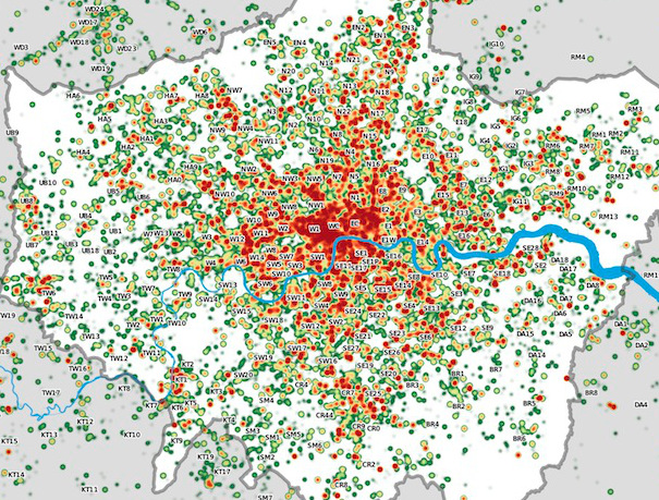
[Updated with new connections.] Ever thought what the tube network would look like if you took out the expensive Zone 1? Me neither, until this morning, when I was wondering if it was possible to utilise my current “Boris Bike” bikeshare 24-hour membership to save a bit of money on commuting in to work.
Transport for London would really rather you didn’t take the tube into Zone 1. It’s often at capacity during the rush hour. The fares are priced accordingly – for example, to get a tube from Zone 3 to Zone 1, it costs £2.90 during the Peak Fare periods, compared with £1.40 if you only go from Zone 3 to Zone 2. Do that commute twice, and it’s a £3 saving missing out Zone 1, which more than makes up for the £1 Boris Bike 24-hour membership charge. So, I was wondering if it is viable to get off the tube a few stops early and Boris Bike the final mile or so.
Superimposing my London bike share map reveals directions from where such money-saving journeys may be possible. Plenty of opportunities from the north-west or the west, with St John’s Wood, Notting Hill and Earls Court having easy Boris Bike accessibility. Access from the south-west and south is also good, thanks to Vauxhall and Elephant & Castle. Things get a little trickier – as usual – in the south-east, where a 1km walk from Bermondsey, or a much longer walk from South Bermondsey are your only options – the region won’t even stand to benefit from the forthcoming scheme expansion. The east is also an option, with Whitechapel being very well stocked with Boris Bikes, and Wapping not being too far either. The east is set to benefit too from the imminent expansion of the Barclays Cycle Hire scheme, to use its full name, to cover all of Tower Hamlets. The north-east is OK, with Hoxton an option, although it’s a shame the docks don’t extend up to Highbury & Islington station, a major interchange. The north is also good, thanks to the legendary Mornington Crescent station.
Four of the Best Zone 2 & Bike Opportunities
- Mornington Crescent (Northern Line) – right beside a big docking station. Don’t go to Euston (Zone 1). It’s also easy to get to Mornington Crescent from the Overground, thanks to an unmarked but official Out of Station Interchange.
- Notting Hill Gate (Central Line) – the tube takes you to the top of the hill, then go east by Boris Bike.
- Earl’s Court (District/Piccadilly) – it’s a long way to Charing Cross, but if you don’t need to go that far, the bike is a good way to travel.
- Whitechapel (District/Hammersmith & City) – two big stands very close to the station, and an easy cycle along CS2 into the City.
So, all in all, not too bad. Whether it’s worth the extra time walking to a convenient docking station, and the worry of finding it all out of bikes, to save a pound or two, is another thing…
See my Mapping London article for more detail about the No Zone 1 map. You can click on the map above for a larger version. An SVG version (i.e. editable) without the bike docking stations, is downloadable here although there is lots of missing detail beyond Zone 2.
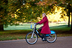
The map was based on a Wikimedia/Wikipedia file, which I then augmented (to show the Overground and some selected regular railway lines) with OpenStreetMap data, by producing a map in GEMMA of railway=rail features. I also added some unmarked Out of Station Interchanges, thanks to this FOI request. Photos by Gnatallica, Clotheyes and Wwarby on Flickr.
[Update: An earlier version of the article and map made reference to Shoreditch High Street station which I incorrectly thought was in Zone 2 for “old East London Line” journeys – it appears this is not actually the case – the anomaly that I was misremembering is that for short journeys from the station, the Peak Fare increases do not apply. I’ve also updated the map a few times since posting this article, to add in a few missing stations and also the locations of the big terminus stations in London. I’ve also added some “Out of Station Interchanges” on the Overground – many of these aren’t marked on official TfL maps, but are valid interchanges, i.e. you don’t get charged for two journeys.]


 The exhibition is in three main sections – downstairs there are a number of big screens, showing the aforementioned animations. The area is quite dark, so the graphics have come out really well. The second section is up a spiral staircase (easy to miss) where a number of touch-screen computers show more visualisations from CASA and others, each selectable by the user. The system that runs this will allow us to update the animations during the course of the exhibition, so if we do some newer related work, you may well see it here! Behind this is the last section, which is more conceptual, with a number of “visions of the future from the past” magazine covers, and other bits of futuristic transport technology – a Sinclair C5 and a “Ryno” one-wheeled motorbike. Sadly a Barclays Cycle Hire bike is not there in the flesh, but you

