Categories
Orienteering

Summer Plans 2011

I’m now fixed, finally, after my fall in Sicily, and back to running again. My first event since recovering was the Bushy Park Trail Challenge that SLOW, my orienteering club, organises every year. It’s roughly a 10K run. I didn’t feel particularly fast out there – although I did sprint for the line at the end. My quads were screaming for about two days afterwards – to the point that I was holding onto bannisters walking down stairs. It’s amazing what a couple of months off does to your fitness – I was still cycling every day so thought I had a good base fitness, but I guess not.

Anyway, this summer is looking like:

  • London Park Race series. Generally Tuesday evenings in June and Thursday evenings in July. I’m doing the website again so will be quite involved, although I think I’ve managed to offload the publicity this year. The Park Race events are generally quite short (5K) and finish in a pub, which is good.
  • parkrun. I’ve done 47 of these over the last four years, and really want to do three more soon, to get a highly coveted (and very red) parkrun 50 technical shirt. As seems to happen often in the summer, it’s going to be a while before I can run those three Saturday 9am 5Ks – 2 July, 9 July (slowly) and 13 August are the next three free days.
  • Ripon and York urban double – 29/30 May.
  • Nottingham urban race – 5 June
  • Lossie/Culbin double weekend – 11/12 June. A long way to travel but should be great.
  • Great Wilderness munroing – 13-16 June. Might as well as I’m up there.
  • North Downs Way Relay – 25 June. Don’t think I’ll be fit enough to break the record for the leg I’m on – this year at least.
  • Saxons Trail Challenge Half Marathon – 10 July. Knole Park near Sevenoaks, and along to the east. Should be lovely.
  • Scottish 6 Days – 31 July – 6 August. Really looking forward to this, I have ambitiously entered elite, so really need to step up my training.
Categories
London

Tweets in London

From the Mapping London blog:

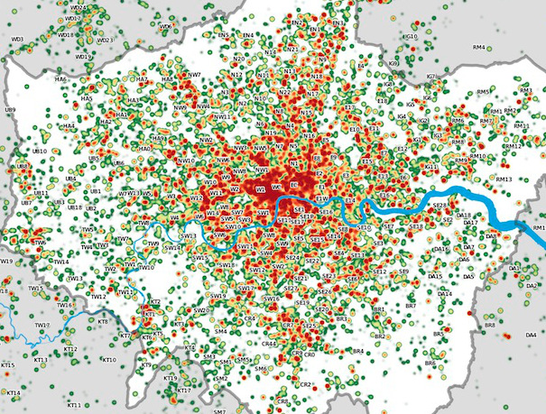
Many Twitter messages, or “tweets”, are sent with latitude/longitude information, allowing an insight into the places where the most amount of tweeting happens. For a magazine article, I produced the above map of London, with help from a colleague Steven Gray, who collected the data across several weeks using some technologies he has developed. It is a heatmap of sorts, with particular locations where the level of tweets are very high. The data is collected in a 30km radius around central London.

London’s city centre stands out, as would be expected, as well as a distinctive streak of tweets heading directly north – an arm of London where the typical Twitter demographic – young and connected – makes up a particularly high proportion of people living there. Other features – such as along a road in the North West that suffered severe roadworks during the collection period, the A13/Eurostar travel line running along estuarine Essex, and the runways of Heathrow Airport, also appear. It’s also interesting to see how large parts of surburban London are “empty” of tweets.

Further detail on Steven’s Big Data Toolkit blog.

The map contains data which is CC-By-SA OpenStreetMap and contributors (the River Thames) and which is Crown Copyright Ordnance Survey (OpenData) 2011.

Categories
Data Graphics OpenStreetMap

A Historical Comparison of OpenStreetMap’s Completeness in Britain

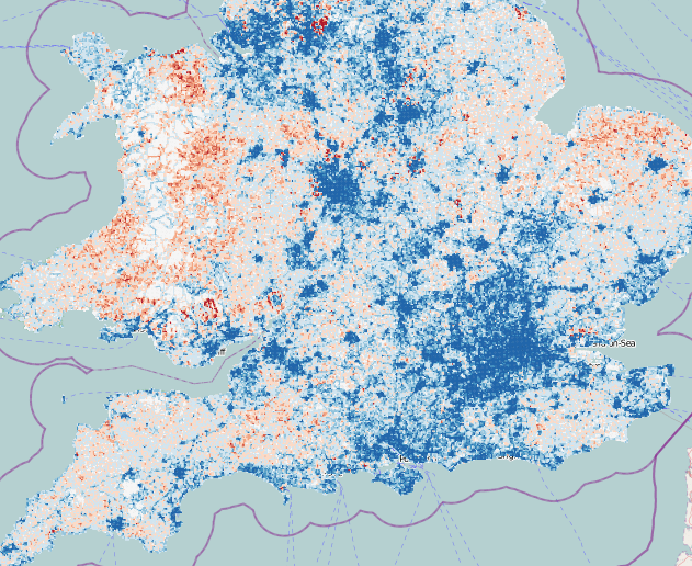
Dr Muki Haklay, UCL CEGE, has been carrying out some quantitative research into OpenStreetMap’s coverage in the UK, comparing road lengths in each square kilometre, with those in a definitive national dataset, Ordnance Survey Meridian 2. He’s updated his findings every few months, from March 2008 until March this year. Some interesting research findings have been found, such as a potential correlation between an area’s affluence and the map’s completeness, a possible reflection of a contributor demographic. On his suggestion I’ve taken his dataset and overlaid the red/blue under/overcompleteness maps on OpenStreetMap (or Ordnance Survey StreetView) itself, allowing the specific towns and villages that are missing the OSM love, to be identified.

The mashup can be viewed here [no longer online].

These days, OpenStreetMap’s coverage is pretty good -often exceeding Meridian’s, as service roads, private roads and alleys, that don’t exist on Meridian 2 are added in. There’s still (as of March 2011) some significant holes though, particularly in parts of Wales, the North East and East Anglia.

Note the first four maps only cover England. There is an interesting artefact in the first one – a square around London can clearly be seen, corresponding to the extent of aerial imagery, in that area, that was available via a special agreement with Yahoo for tracing. Outside of that area, only 50-year-old (out of copyright) maps and contributor GPS traces were available. Since May last year, the Ordnance Survey OpenData release, and Microsoft Bing Aerial imagery, which became available at roughly the same time, has significantly accelerated work on the map. I presented on the diverse sources of data at the Society of Cartographers annual conference last year, you can see the slides here.

ITO World’s OS Locator is just one of a number of tools that the OpenStreetMap contributor community in the UK is using to “complete” the map, moving towards the goal of a comprehensive free database of the UK’s (and world’s) streets.

Categories
Technical

Notes on a Migration with Images from Blogger to WordPress

I’ve recently reported a very large blog from Blogger to WordPress. The blog has been around for many years, with around a thousand posts – most of which contain at least one image embedded in.

The WordPress theme to be used was a gallery-style one (Arras) which displays the post image thumbnails properly, so there was a requirement to have these included in the import. However it is trickier than you might think to get these in from Blogger on a bulk-import basis. Individually associating all the images is not an option due the number of posts. I’ve not used a solution requiring programming, but writing a Python script to do this would be pretty straightforward. Instead I’ve used Excel to extract the URLs and build up SQL queries with the URLs in them, to insert into WordPress. These notes will hopefully prove useful to someone trying to do the same thing.

Assumptions (a lot of these can be worked around if you have the know-how): You have Excel, EditPad (a text editor), a WordPress.org 3.1.X install which allows you to install arbitrary plugins (i.e. if using WordPress Multisite, you are a super-admin), and that you can access the MySQL database backing your blog using phpMyAdmin.

1. Install the Blogger Import plugin in WordPress and use it to import your blog in.

The result should be a successfully imported blog. When viewing a post, the images even appear. However – these are just links to images on the Blogger server. The images themselves haven’t been pulled across.

2. Install the Hot Linked Image Cacher (HLIC) plugin and use it to pull in local copies of your images.

Now the images are locally stored, and linked to locally in the content of your posts – the plugin updates the URLs as well as copying the images across. However, the images are still not formally associated with the posts that link to them.

3. Use phpMyAdmin to export just the ID and post_content columns of the wp_posts table to a CSV file. Use the suppress CR/LF option and the pipe “|” delimiter.

4. Open the CSV file in EditPad (not Excel – as Excel will automatically assume that the commas in your posts are the field delimiters.) and change all commas in the document to spaces.

5. Copy the contents and paste them into a blank Excel document. Use the Text-to-Columns Import wizard to import in the data with the pipe delimiter.

6. Extract the (first) image URL from the post_content column. You can do this by adding another column and using a formula like this:

=MID($B823,FIND("HLIC/", $B823),41)

It’s OK to use 41 characters because the HLIC plugin always saves images with names this long.

7. Use a Filter (AutoFilter) to remove rows for which there is no image URL.

8. You need to create SQL statements, two for each image, structuring them using Excel columns. Post-associated images are considered by WordPress to be themselves posts, with a parent ID referencing the corresponding post ID – and the images also have entries in the post metadata table. Here’s two examples of the two statements you need for each image, I’ve used IDs from the 7xxxxx and 8xxxxx ranges on the assumption there are no existing posts with IDs this high.

insert into wp_posts values( 700002 ,1,NOW(),NOW(),"","","","inherit","open","open","","","","",NOW(),NOW(),"", 1654 ,"/wp-content/uploads/ HLIC/2af1d48d3251d953b106a0bbf8f2f810.jpg ", 0,"attachment", "image/jpeg", 0); insert into wp_postmeta values( 800002 , 700002 ,
"_wp_attached_file", "HLIC/2af1d48d3251d953b106a0bbf8f2f810.jpg ");

insert into wp_posts values( 700003
,1,NOW(),NOW(),"","","","inherit","open","open","","","","",NOW(),NOW(),"", 1683 ,"/wp-content/uploads/ HLIC/dd376f1a86ba3e833e866e7f03127712.jpg ", 0,"attachment", "image/jpeg", 0); insert into wp_postmeta values( 800003 , 700003 , "_wp_attached_file", "HLIC/dd376f1a86ba3e833e866e7f03127712.jpg ");

Elements in red are from the original database export. Elements in blue are sequential numbers.

I’ve assumed all the images are JPEGs – you’ll need to change the “image/jpeg” part of the SQL statement if this is not the case.

If using WordPress Multisite, you’ll need to use the appropriate wp_NN_ table prefix and also set the author number (1 above) appropriately.

9. Paste the statements into EditPad, remove all tabs, and then paste all the statements into phpMyAdmin and execute.

10. Finally you need to build in the attributes for each image, before they are seen. You can do this with another plugin called Regenerate Thumbnails. Note that this plugin depends on the URL that was specified in the post metadata table.

Manual tidying will still be needed – particularly for embedded YouTube videos and other content.

One more gotcha with the import was that the Blogger post tags were coming in as categories. As there were several hundred of these, that wasn’t very practical. So I ran the following bit of SQL to change them to be WordPress tags:

UPDATE wp_term_taxonomy SET taxonomy = replace(taxonomy,"category","post_tag")

Categories
Orienteering

City of London Race 2011 – Preview

It’s the fourth year for the City of London Orienteering Race, which is taking place on 10 September (entries open!). It’s also the fourth year that I’m producing the map for the race. Having extended the map westwards to Temple for 2009, and southwards to Bankside for 2010, this year we are moving northwards to Finsbury. There are three distinct new areas being mapped, here’s a preview of them:

1. West Shoreditch

A slightly scruffy quarter, where slightly dilapidated offices mix with “interesting” looking independent car parks. It is the surprisingly quiet “no-mans land” between super-trendy Hoxton with its hipsters and bars and the City with its financial workers – and bars. Nearby is the Old Street Roundabout, often nicknamed “Silicon Roundabout” today as the hub of London’s tech startup industry.

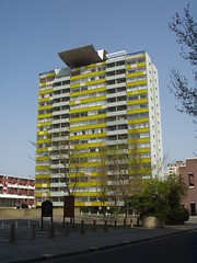
Hitchcock’s Reel, known locally as “The Disco Biscuit”, is a large sculpture in the centre of the area.

2. Golden Lane Estate

The most interesting part of the new map, the Golden Lane Estate is adjacent to the Barbican and also features some of the Barbican’s characteristic multi-level urban landscape and dramatic concrete structures. It is certain to be a highlight of most courses.

The local area also includes the Quaker Gardens and Bunhill Fields, a large and historic park and cemetery where Daniel Defoe, John Bunyan and William Blake are amongst those buried. The Honourable Artillery Company also have a barracks, large parade ground and field in the area, which is often used for cricket games.

3. Clerkenwell

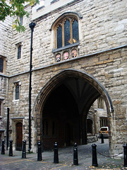
Clerkenwell’s most distinctive feature is the 500 year-old St John’s Gate. There are also a number of narrow passageways and alleys in the area, reminiscent of the most ancient parts of the City to the south. St John Street runs through the area, on it is the Michelin-starred St John Restaurant. Located immediately north of Smithfield, London’s meat wholesale market, it is often rated as one of the world’s top restaurants and is famous for its offal items on the menu, and “nose to tail” eating. Not one for the vegetarians…

As well as the new parts of the map, the existing area is being updated to reflect the changes in the last few years. The City is constantly evolving, with old office blocks being demolished and new ones built in their place.

Photos – Top: Partial by Jeff Van Campen, Middle: By Cowfish, Bottom: St John’s Arch by Peter Gasston

Categories
Bike Share

Washington DC Cycle Commuters Suddenly Appear

One of the striking aspects of the US bike share schemes thus far is that they have generally been dominated by weekend use. There has been some weekday use but not a large commuter morning/evening surge, like has been seen consistently in London. However Washington DC at least seems to have reached a turning point, with the characteristic commuter spikes starting to appear, and a post-pm-peak distribution of bikes that had a distinctly London-esque blue in the middle (few bikes in the centre of Washington DC) and red on the outside (presumably more residential areas).

As Washington DC is joining London’s characteristic commuter “tidal flow”, London itself seems to be moving away from that. “Casual” use combined with unseasonably hot and sunny weather here, has meant a “tourist” afternoon surge, always seen at weekends, is present on weekdays now too. This somewhat dilutes the evening commuter use, although the system still ends up quite unbalanced at the end of the day.

I’ve made a minor adjustment to my bike share map statistics (see the “graph” link) – namely the one on the current number of bikes predicted to be in use. I’ve removed this statistic now. Previously, this assumed that the highest number of bikes available in the preceding 24 hours indicated the lowest moment of use. This is the case if no bikes are marked as faulty (or no docks are added to/removed from to the system) – however it turns out this is a significant number, at least in London. When a bike is marked as faulty, at least on the London system, then both the bike and the dock are removed from the availability numbers. By plotting this on a graph, estimates can be made of the number of bikes being marked as faulty each day. At the moment, this seems to be about 5-10% each day for London. Such bikes then get taken to the workshop, fixed, and appear to be replaced en masse just before the morning rush hour:

So now I look at the minimum number of free docking spaces in the last 24 hours instead. This should avoid the poor numbers after a heavy day of usage, where several hundred still appear to be in use at around 2am, whereas actually they are just bikes that were marked as broken on that day, on the stands. I have instead replaced it with a statistic showing the proportion of docks that don’t have bikes in them. This is effectively the same statistic as before, but now I don’t make assumptions about the “baseline” value, i.e. when no bikes are supposedly being used. In other words, previously I was effectively substracting a percentage from this value, based on the baseline percentage. I’m no longer doing that subtraction.

Finally, Toronto and Tel Aviv have just gone live with their bike share schemes, and have been duly added to the map. Ottawa, Boston and Antwerp are all launching in the next month or so.

[Update – Those missing the # number of bikes measure for Washington DC/Arlington can find it here. These measurements are carried out a different way – by looking at changes in individual docks.]

Categories
Data Graphics

The iPhone Locations DB – Fun, but not Accurate

As a followup to my previous post about the (re-)discovery of the iPhone locations cache, the graphic above shows the apparent locations (of known mobile-phone masts and wifi) that were captured on my iPhone, over the last couple of weeks while I have been in Scotland. These were either independently detected by my iPhone and georeferenced using a built-in service, or, more likely as it turns out, the details of supposed nearby masts were downloaded by my iPhone from this service, based on its own location, in the hope they would subsequently be detected and allow for quick positioning.

The graphic is from my hacked version of iPhoneLocator, changed to show a higher density of dots and include the wifi data. I have superimposed on the map red lines showing where I’ve actually gone over the break. Some of the detected (or downloaded in the hope of detection) mobile-phone masts were over 40 miles away from where I actually was. Some of these may have been when I was on top of a Munro (i.e. over 3000 feet up) which therefore affords a good line of sight. Or simply, there were so few in the area, that details from the far-away ones were the best available to be obtained.

If I hadn’t drawn the red lines, you would probably be surprised to discover, for example, that I never went to Inverness during this trip (the big patch of yellow circles in the very top part of the map extract. I also never went along the various roads visible in the north, west or east part of the map, but my phone still saw the towers in these locations. So to conclude, take the detected locations with a pinch of salt. They tell you where an external database thinks a cell-phone tower once was, or where the nearest few are, even if they are a long way away. They certainly don’t tell you where you’ve actually been…

Categories
Reviews

Review: Map of a Nation – A Biography of the Ordnance Survey

Map of a Nation, by Rachel Hewitt, comes in a large, chunky hard-back volume with a beautiful, gold-laced front depicting one of the Ordnance Survey’s earliest First Series maps, dated 1810. The book documents, in often immense detail, the early history of the Ordnance Survey – from the activities leading up to its creation in the early 18th century, to the publication of its final First Series map in 1870.

Rather than being a general history of the OS, the book focuses on the lives of its first director generals, Mudge and Colby, and Roy, whose work led to the creation of the organisation. It details particularly the trigonometric survey, under which an accurate triangular network of known points was gradually built up, and the creation, alongside, of large and small scale maps.

The book is therefore somewhat misnamed – it’s really “Ordnance Survey: Its Birth and The Early Years”. I was disappointed that there is little discussion of the OS’s history after 1870, apart from in a brief Epilogue. The organisation’s more modern history was what indeed I had been most looking forward to. The cover notes mention a Ph.D thesis written by the same author a couple of years before the book’s publication, and I wonder if the book is largely based on the thesis. The language in some parts of the book is also quite formal, with the prose being sometimes on a level consummate with a professional thesis but a little above what would normally expected for a popular book. (A very flowery way of saying I didn’t understand every word in the book!)

The pacing of the book is generally quite good, it is on a near chronological basis, although does tend to jump back in time briefly for short sections. Perhaps too much time is spent on the pre-OS period, important though it is – the detailed biographical sections of the principal people involved, prior to the organisation’s foundation, weighed the narrative down a bit. Later on, the book’s pace picks up. The latter half of the book details the slow progress towards completion of the First Series, with various delays caused by creation of the Irish Survey and expeditions to Sinai and so on.

The book includes a short plate section with colour extracts of various paintings and maps. It is a pity though that it has no photographs of, for example, the monuments showing the endpoints of the original baseline across Hounslow Heath. (See these pictures by Diamond Geezer.)

A note for those that measure their progress through a book by the position of their bookmark – the narrative ends quite abruptly 114 pages before the end, with the rest taken up by the extremely comprehensive citation marks, citation references and index. Again, very worthy for a thesis – the content has been researched extremely thoroughly – but slightly overwhelming for a book like this.

In all, a rigid, well written and authoritative discussion of the first part of the Ordnance Survey’s history, but I was left wanting for more. This is not the OS’s complete biography!

You can see the book on Amazon. A paper-back edition is coming out in July.