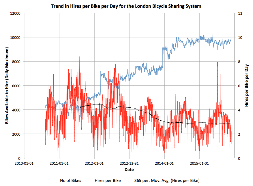
Here’s an interesting graph, which combines data on total journeys per day on London’s bicycle sharing system (currently called “Santander Cycles”) from the London Data Store, with counts of available bicycles per day to hire, from my own research database. The system launched in summer 2010 and I started tracking the numbers almost from the start.
You can see the two big expansions of the system as jumps in the numbers of available bikes – to all of Tower Hamlets in early 2012, and to Putney and Fulham in late 2013. Since then, the system has somewhat stagnated in terms of its area of availability, although encouragingly at least the numbers of available bikes has remained constant at around 9500, suggesting that at least the operator is on top of being able to maintain and repair the bikes (or regularly source new ones). Some of the individual bikes have had 4000 trips on them. There is a small expansion due in the Olympic Park in spring 2016, but the 8 new docking stations represents only a 1% increase in the number of docking stations across the system, so I doubt it will have a significant impact on the numbers of available bikes for use.
There is a general downward trend in the numbers of uses of each bike per day, since the halycon Olympic days of Summer 2012, over and above the normal seasonal variation, which concerns me. The one-year moving average recently dipped below 3 uses of each bike per day, this summer, and I am not confident it will pick up any time soon. (The occasional spikes in uses/bike, by the way, generally correspond to sunny summer bank holidays, tube strikes and Christmas Day).
To rejuvenate the system and draw in more users, rather than relying on the established commuter and tourist flows which likely dominate the current usage, I am convinced that the system needs to expand – not necessarily in terms of the number of bikes or docking stations, but in its footprint. I think the system would be much improved by dropping the constraining rule on density (which approximates to always having one docking station every 300m) and instead redistributing some of the poorly performing docking stations themselves further out. It’s crazy that, five years on, there are no docking stations in central Hackney, Highbury, or Brixton, three areas with an established cycling culture and easily cycle-able into the centre of London. Conversely, Putney and Tower Hamlets simply don’t need the high density of docking stations that they currently have, except in specific areas (such as around the train/tube stations in Putney, and Canary Wharf).
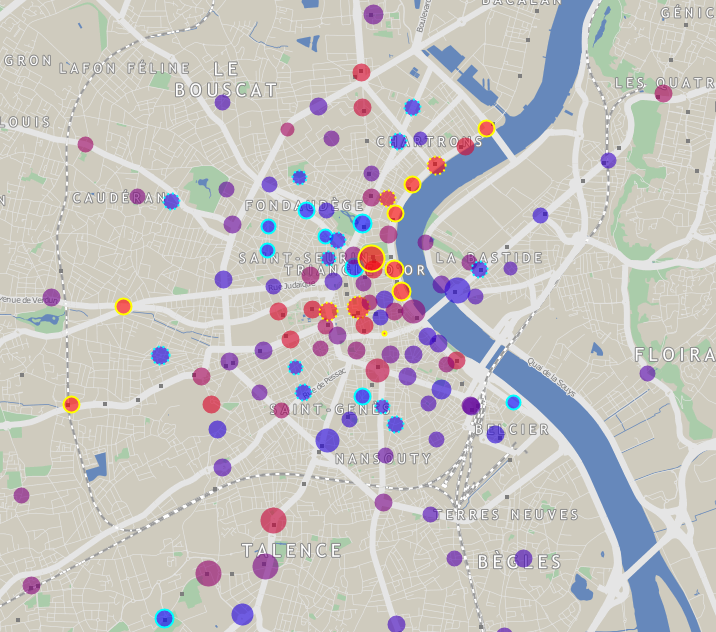
Ideally we would have a good density of docking stations throughout cycleable London but, as docking stations (and bikes) are very expensive, I would suggest that TfL instead adopts the model used in Bordeaux (below). Here, the city retains a high-dense core serving tourists, commuters and other centrally-based workers, but adopts a much lower density in the suburbs, so that, while tourists can still “run into” docking stations they don’t know about in the centre thanks to the high density, local users can benefit from the facility in their neighbourhood too, even if it requires a little longer walk to get to it.
Technical note: Before November 2011, the London numbers included bicycles that were in a docking station but not available to hire (i.e. marked as broken). This exaggerates the number of available bikes (and correspondingly reduces the number of hires/bike/day from the true value) in this period by a small amount – typically around 3-5%, an effect I am not considering significant for this analysis.
5 replies on “London’s Bikeshare Needs A Redistribution of Stations”
It would also be interesting to know why when you aggregate these data http://cycling.data.tfl.gov.uk/ the totals you get are a bit different. In the summary the totals are on average 2% higher than the detailed database
isn’t poor usage down above all to the bikes being so expensive? how about comparing use of boris-style bikes in various places with regard to their hourly cost, among other things. anecdotally: i walk down camden town parkway regularly, where there is a bike stand; it’s a massively popular area w young tourists, and the stand is usually 90+% full of unused bikes.
Out of curiosity, does the data show that the outlying stations in Bordeaux have a better per bike per day usage than the least used London Santander Cycle Stations?
I don’t think the outlying Bordeaux stations get a lot of use. When the stations are far afield, (which is not generally recommended) they need to be rather large. Although that is counter intuitive, the increase over a normal size station is recommended so that there is little re-balancing needed. It is major cost to service the stations that are far from the maintenance depot. Better to send a crew to many stations close to each other, than a crew to only one far afield. Take a look at these papers concerning density:
http://jonorcutt.tumblr.com/post/111388358970/plans-to-launch-bike-share-systems-in-separate
http://nacto.org/wp-content/uploads/2015/09/NACTO_Walkable-Station-Spacing-Is-Key-For-Bike-Share_Sc.pdf
Hi Russell,
While Jon Orcutt’s animation (is there an accompanying paper?) is logical, it assumes a homogenous space of attractors. At some point cities’ BSS’ expansions leave the core and reach the periphery where the returns (in terms of trips or revenue) of stations would be less than having stations in an another higher density city centre. How far out into the periphery or beyond what attractor density a city’s BSS station expansion is worthwhile versus jumping to another agglomeration is a research project in itself. I’m curious what your thoughts are on Nice Ride Minnesota’s station placement? Regardless of station distribution, I’m guessing the option of putting all stations in Minneapolis rather than shared with Saint Paul gets pretty political rather quickly.
Regarding the NACTO flyer it would be interesting to see the underlying work supporting their statements because the explanation given in the document doesn’t support it. They use a 15 minute buffer around stations to county density. This has nothing to do with density, but centrality. Ahmadrez Faghih-Imani et al. (2014) show distance to the city centre having an important impact on usage. As you said, stations on the edges don’t get much use, just as they’re not central. I find NACTO’s exponential curves relating density with usage misleading as well. Further having a completely filled grid makes no sense as it ignores land use (although it would make station placement planning a heck of a lot easier. As I said in my earlier post it’s logical that stations in greater density have more trips simply because more trips were expected at those locations and therefore more stations were placed.
Well that went a bit long. I was just trying to say that I agree with you but there doesn’t really exist robust work/papers showing that the suggested relocating of stations as Oliver suggest has been shown to be explicitly detrimental in terms of trips per bike per day. There are some theoretical reasons why it might not work well but it’s a fuzzy issue relating to the spatial density of attractors.
Cheers,
Cyrille
TLDR: I agree but don’t find that the suggested papers are suitable to oppose Oliver’s point.
Hi Oliver,
Having a reduced station density in areas of lower attractors makes sense from a perspective where we want an equal quantity of trip attractors per station’s catchment area (if we assume a Vornoi catchment area). Having the higher density in the centre may also help deal with the synchronous pulse of people coming to the centre. This seems to contradict having equal attractors per station catchment area, but this isn’t thought through so I’ll move on. The problem I have is that I’m not sure how ‘effective’ those stations in Bordeaux’s periphery are. Unless a BSS has really badly allocated it’s stations it’s also normal that network edge stations are used less. In addition it clearly looks as if many residential areas closer to the centre than some of the periphery stations have no ‘access’ to a station. I believe a few studies have shown in Lyon and Montreal that home-station distance have a significant impact on BSS usage.
So I worry that the suggestion of spreading stations to potentially lower residential/attractor density areas would result in fewer people using the stations, regardless that trips may generally be longer which is another thing we don’t see too much in BSS usage for various reasons.
I don’t know if there exists any good literature showing the effectiveness of station spacing, besides this laughable ‘study’ by NACTO (http://nacto.org/2015/04/28/walkable-station-spacing-is-key-to-successful-equitable-bike-share/). The problem with the few papers I have seen that state higher density means more trips don’t account for the fact that stations were placed more densely based on higher expected demand. This is a kind of self selection bias.
From a rebalancing perspective I can already see Serco having fits about the larger coverage area. Anyways, I would love to see this happen just for the science!
Look forward to hearing your thoughts.
Cheers,
Cyrille
TLDR: I worry that station catchment areas are buffers of ~400m around stations and not Voronoi meaning that areas of higher density are necessary to maximize attractors and therefore trips.