Categories
Data Graphics London

A Census for Open Data in Cities

okfn_census

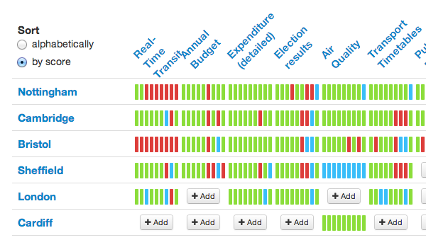
The Open Knowledge Foundation (OKFN) have produced a census for government open data availability for countries around the world, known as the Open Data Index. Each country is assigned scores for 10 attributes on openness and accessibility for each of 10 types of data (such as election results and pollution information). Currently the United Kingdom is at the top of the table.

More recently, OKFN expanded the concept to look at open data for cities within each country, in other words data that is managed at the City Hall level. For example, there is a project page for individual cities within the UK. This time, 15 types of data are examined, again each gaining up to 10 points for openness. The project is still in its information gathering stage so, at the time of writing, only 6 cities have their data partially, or fully, entered. The census for Italian cities, for example, is looking more complete.

Such a census is of great interest when building an application like CityDashboard, which is currently available for eight cities around the UK. Although CityDashboard doesn’t only use open data sources, those which do have documented APIs, open data licences and machine readable formats greatly aid building and expanding a website such as CityDashboard. CityDashboard takes in social media and sensor data, as well as “official” data of the sort that is being categorised by the OKFN project, but some data, such as live running information for metro services, will quite likely always best come from the official sources.

As such, I will keep a close eye on this project. Cambridge and Sheffield look like two promising cities for which the necessary official data is both available and open, which would make implementing them in CityDashboard relatively straightforward.

The census is user-driven and reviewed, so it’s up to you to get information on the availability (or lack) of data for your local city catalogued in the census.
Categories
Olympic Park OpenStreetMap

Mapping the Queen Elizabeth Olympic Park

[Updated – Event webpage here]

The southern section of the Queen Elizabeth Olympic Park opens on 5 April. Much of the northern section is already open.

I’m considering organising an OpenStreetMap mapping party (likely using Walking Papers as a basemap for people) to map the park in its new, legacy mode. Currently, much of the area is shown on OpenStreetMap as it was during London 2012, or as out-of-bounds.

The date is the evening of Wednesday 9 April from 6pm until dark (7:30pm?) followed by beers in The Crate pub. People can then add their discovered detail into the map in their own time or (if they are really keen and bring a laptop/dongle) at the pub.

Post-event pub will be The Crate pub in Hackney Wick, which is right beside an exit to the park, and is a nice pub and brewery that does great pizzas and serves some great beers brewed on site and also Dalston Cola, made just down the street by my bro. It’s a more relaxing experience than the pubs at Westfield.

Stratford is easiest to get to by tube so meeting at Westfield (ground level – that’s UP from the station exit level) at the Westfield end of the big iron bridge that goes over the station, would be the best location. I am planning on setting out from there shortly after 6pm, and then meeting people at The Crate pub (which is at the other side of the park) at 7:30-8pm. The Crate pub is near Hackney Wick station for those who don’t want to walk back across the park afterwards.

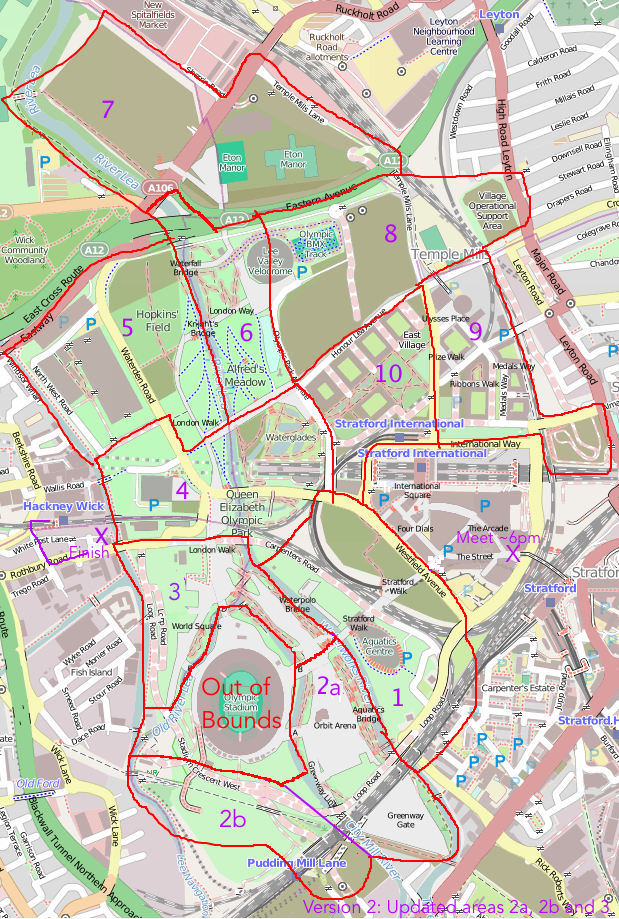
The idea is that everyone picks a slice of this cake – if we get more than 10 people, then we can double-up in the complex central sections, and if we get fewer, then we can concentrate mainly on the central area.

map_qeop

Some notes on the slices:

  • 1. Eastern part will still be a building site but plenty of detail to be both added and removed elsewhere.
  • 2. The southern half of the new South that will be newly opened, includes the Orbit and associated buildings. If time then it’s worth progressing to section 2b – unclear how much of this is open but there are a couple of new links here. The Greenway Gate area may still be inaccessible.
  • 3. Northern half of the new South Park, including the Great British Garden on the other side of the stadium. Lots of natural detail to be added.
  • 4. Not sure if the Waterglades will be open – but if not, some other new detail to add here.
  • 5. May still be under construction in places but definitely some changes from what’s on the map – even simply things like bus stops.
  • 6. The north park is already open but could do with a lot more detail, e.g. the Olympic Rings sculpture, vegetation, and link path to the north.
  • 7. Quite far away and mostly will still be a construction site. Good for someone on a bike.
  • 8. May not be too much to see here as under construction and/or fenced off for the cycling.
  • 9. This part of East Village is partially open and lots of residential detail can be added in.
  • 10. This part of the East Village is mainly closed but some bits, e.g. the park bit, are open.

I will aim to print Walking Papers maps for each of the slices and bring them to the pub.

I’ve added this to the London wiki and Lanyrd. If it’s raining cats-and-dogs on the day we can just go to the pub.

We held a similar mapping party back in late 2011, to map Westfield Stratford City. We based the party at the Cow pub on the edge of the shopping centre. Here’s a neat video that Derick created, showing the map evolving as people added to it, following the party.

Things to add to the map

  • Bus stops (& number of bus service)
  • Car parks (no. of spaces, disabled-bay information)
  • Roads and paths – particularly at park edges/entrances: official or unofficial, walking or cycling, steps
  • Vegetation – woodland, grass, garden, marsh, water
  • Individual trees, if distinctive or ‘street’ trees, ie planted in hard standing or grass
  • Facilities – toilets, concession stands, playgrounds
  • Fences, walls and gates
  • Electricity substations
  • Artworks, sculptures (with name)
  • Traffic lights, zebra crossings
  • Names of areas, places, things – many of these are new – look at what signs say
  • However do not copy names or details from official maps – these may be copyright and not open data
Categories
Data Graphics London

A Changing City – OS Open Data Reveals a Dynamic London

changingcity_detail

Since launching the data store in early 2010, the Ordnance Survey have been releasing a number of updates to an interesting dataset – VectorMap District – which is a generalisation and simplification of their MasterMap “gold standard” dataset for Great Britain. The updates have been appearing roughly every 6-12 months, and by comparing them in a GIS, you can start to see how places change – at least in the eyes of the Ordnance Survey surveyors tasked to keep the map current. Roads occasionally get built, but building footprints evolve more rapidly – as office blocks and housing developments get taken down and rebuilt with higher capacities or more glass windows.

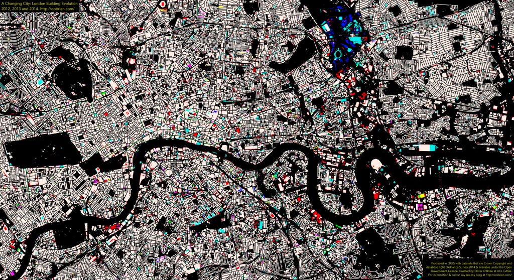
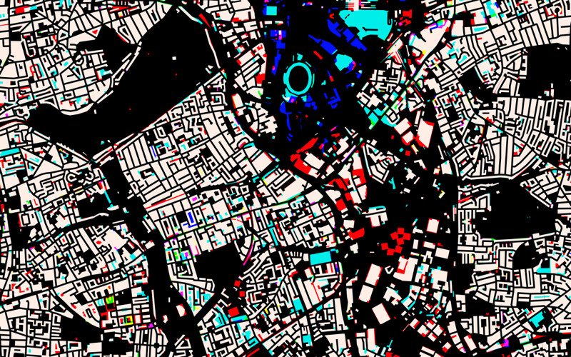
I’ve taken three of the VectorMap District dataset releases – April 2012, September 2013 and March 2014 – combined the data together and used QGIS’s layer compositing operations to show the geographical differences.

The colours tell of the age of the building – bearing in mind that there is a lag of a few months or years between buildings appearing/disappearing in real life, and on the map. For example, the Olympic Stadium, the turquoise oval above, appears in the 2013 dataset but not the 2012 one, even though of course it was finished in 2011, for the London 2012 Olympic Games.

White Building has existed throughout the three years.
Red Building existed in 2012 only (see note below about extra detail).
Purple Building existed in 2012-2013, but has now gone.
Blue Building was new for 2013, but has now gone.
Turquoise Building was new for 2013, still present (see note below about extra detail).
Green Building is new for 2014, still present.
Yellow Building was around in 2012, disappeared in 2013, but has appeared again now.
Black No building existed in any of the three years.

Above, much of the Olympic Park can be seen – the permanent new buildings (turquoise), temporary buildings for the Games only (blue) and demolished for the games and associated planned development (red). Below, the map covering a wider part of London, zones of activity can be seen. For example, demolition associated with the Nine Elms and Deptford Creek developments (red), and major new blocks such as near the Arsenel stadium (yellow).

Important Note

Between the 2012 and 2013 datasets, the Ordnance Survey changed they way they applied the generalisation on the data, so some of the 2012-2013 changes (shown as red on the maps here for reductions, and turquoise for additions) are as a result of this. For example, narrow gaps between buildings, that always existed, are shown for the first time in 2013 in red (building reductions).

As such, my map slightly overemphasises changes between 2012 and 2013. For example, the pitch at Arsenal and the Great Court at the British Museum appear as changes, but they were always there. As a rough rule of thumb, the smaller red/turquoise patches are due to the generalisation changes, the larger areas of colour show genuine change. With this important caveat, the map remains an interesting insight into London changes, and the larger coloured regions give a good indication of parts of London which are undergoing intensive building redevelopment.

The Bigger Picture

Here is the map for central London – click on it to see a full-size version.

changingcity_overall

Categories
Munros

The Munros: 1 – Ben Vorlich

This is the first in an occasional series of chronological posts about Munros that I have climbed. I have so far climbed 206 of the 284-odd Munros – these are mountains in Scotland that are at least 3000 feet (914m) high, with a distinct (but, curiously, not defined) drop between each one and the next. I’m planning to go through the 69 (so far) expeditions where I successfully made it up the the summit of at least one Munro. I’m been keeping track of the Munros I climbed on a Google Map (v2 API – old!) here. The page is old, but has somehow survived my current infatuation with all things OpenStreetMap and OpenLayers. Red pins are climbed Munros and blue ones are those still to do – generally these are well away from the south of Scotland or convenient railway stations.

Expedition 1 – Ben Vorlich

(location)

Ben Vorlich was my first Munro, climbed on 3 May 1992. It was one of the nine trips, carried out once a term in a three-year cycle, by the Junior section of my school’s active and popular Mountaineering Club. Most of these trips didn’t involve Munros, but a couple did, and this one, being right on the edge of the Highlands, was judged OK for kids aged as young as 10 to ascend (I myself had just turned 12). I had been up a few hills before – the 454m Ben A’an in the Trossachs, aged 10, being a highlight, but Ben Vorlich was obviously quite a bit bigger.

I don’t remember too much from the trip, except that, despite an intermittent view at the top, it was a cold, wet and windy day, and I didn’t have a proper outer shell, just a single-layer nylon thing. I developed mild hypothermia (going beyond the shivering stage and into a slightly zen-like state), on the long walk back down the glen to the north of the mountain. This has not happened to me since, but it was scary experience and thankfully one of the adults spotted me in a bad way and gave me a proper cagoule to shelter in for the remainder of the descent. The traditional stop in Callander for fish and chips soon cheered me up again (50 school kids piling off a coach and into the local chippies – so “locking out” the locals for a good half an hour).

One other thing I remember is that one of the kids had this high-tech device, called a GPS receiver. It was a Magellan (Garmin hadn’t really got going with consumer GPSes back then, I think) At the time, the GPS signal was still degraded by the US military – it was just after the Gulf War – so it was only accurate to around 100m. It also had a short battery life, so my friend switched it on every hour or so, waited to get a fix, recorded a waypoint and then switched it off again. Such a device seemed amazing – suddenly, we could “cheat” and find our location on the OS map without having to mapread. But the whole switching on-and-off thing was cumbersome and at the time I thought it was not a practical tool to have.

I don’t have any pics from the expedition unfortunately.

Categories
London Technical

37000 Old OS Maps

nls_kew

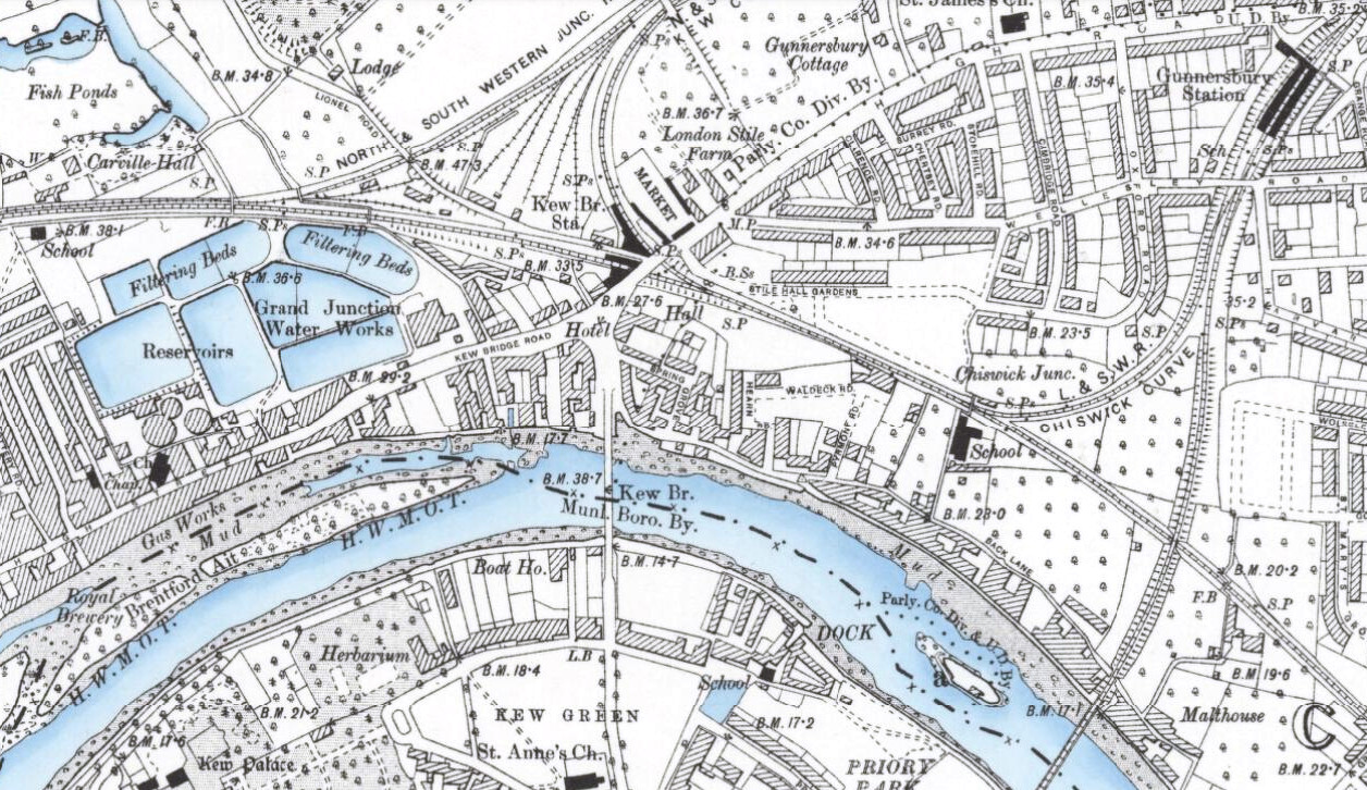
The National Library of Scotland (NLS) yesterday unveiled a HUGE collection of maps that they have digitised and placed online. The maps, covering England and Wales, are historic Ordnance Survey maps that are between 60 and 170 years old and are at a high resolution. The scale is 6-inch-to-the-mile and covers the whole country. At the moment each map can be viewed by clicking on the appropriate box on an online map, they plan to undertake further work to join many of the maps together to create a single scrollable historic map of the whole country this summer.

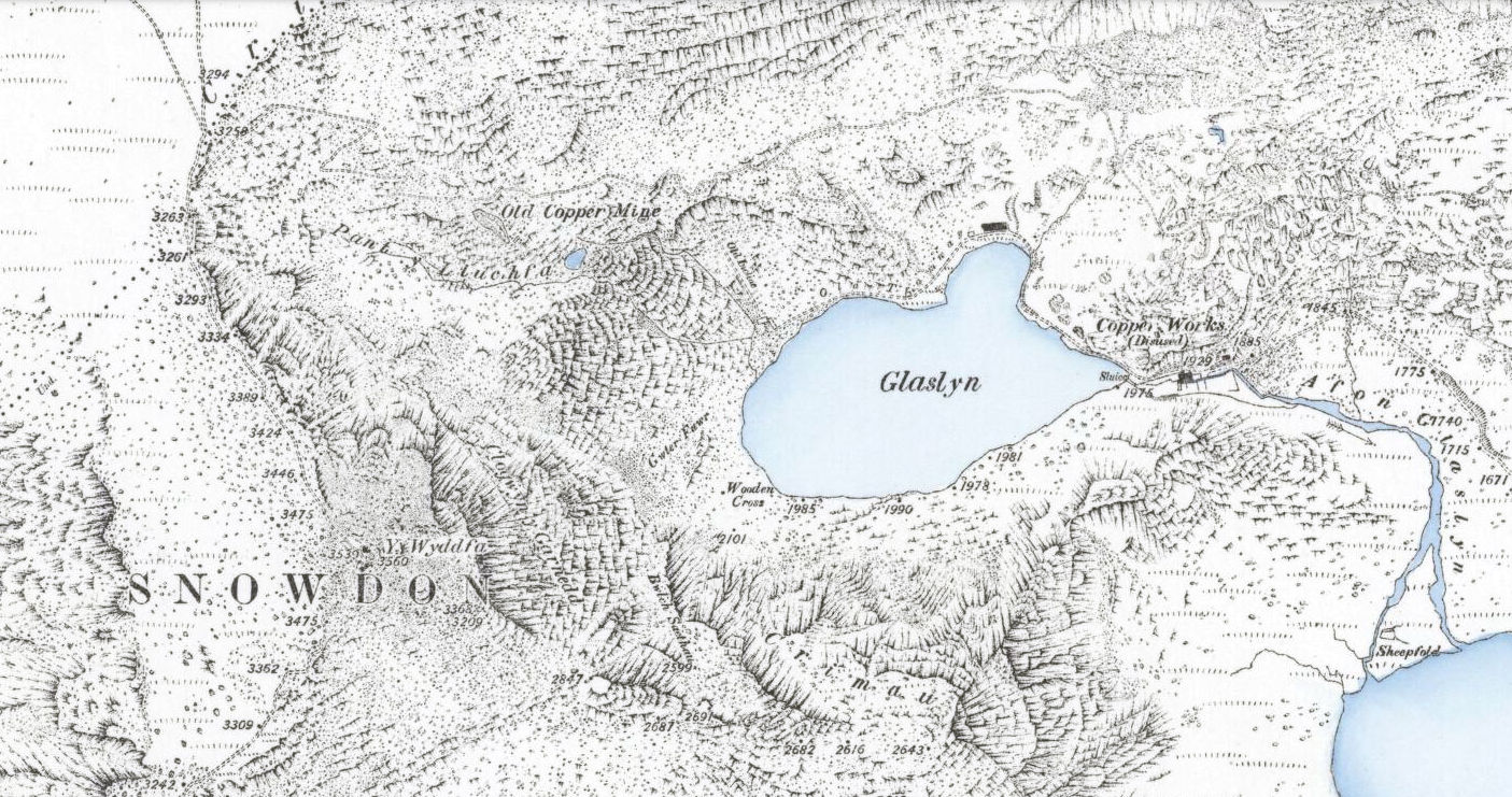
The extract above, of the Kew Bridge area in 1899, is from this map (I’ve shifted the white balance.) Some of the maps have some rather nice colouring for water – with the blue colour being augmented by some subtle shading on the riverbanks. The same effect is see in a Snowdon map (extract below), from 1889.

I featured an earlier release of Victorian 60-inch-to-the-mile maps, for London, on Mapping London. The number of retweets and Facebook likes for this posting was unprecedented for the blog, suggesting a huge interest in high quality scans of historic maps.

Here’s their press release, includes the reason why the NLS is including maps from outside Scotland!

New map resource – OS six-inch England and Wales, 1842-1952

We are very pleased to announce the availability of a new website resource – zoomable colour images of the Ordnance Survey’s six-inch to the mile (1:10,560) mapping of England and Wales. All our map digitisation work in recent years has been externally funded, hence the recent expansion of our map images beyond Scotland.

This is the most detailed OS topographic mapping covering all of England and Wales from the 1840s to the 1950s. It was revised for the whole country twice between 1842-1893 and between 1891-1914, and then updated regularly for urban or rapidly changing areas from 1914 to the 1940s. Our holdings are made up of 37,390 sheets, including 35,124 quarter sheets, and 2,237 full sheets.

The maps are immensely valuable for local and family history, allowing most features in the landscape to be shown. The more detailed 25 inch to the mile (or 1:2,500) maps allow specific features to be seen more clearly in urban areas, as well as greater detail for buildings and railways. However, most topographic features on the 25 inch to the mile maps are in fact also shown on the six-inch to the mile maps.

The easiest way of finding sheets is through a clickable graphic index using our ‘Find by Place’ viewer: http://maps.nls.uk/openlayers.cfm?id=39&zoom=6&lat=53.39954&lon=-3.0305

This allows searching through a gazetteer of placenames, street names, postcodes and Grid References, as well as by zooming in on an area of interest with smaller-scale locational mapping as a backdrop.

The sheets are also available via county lists: http://maps.nls.uk/os/6inch-england-and-wales/counties.html

We plan to also make georeferenced mosaics available of the series by the late summer.

OS six-inch England and Wales home page: http://maps.nls.uk/os/6inch-england-and-wales/index.html

Further information: http://maps.nls.uk/os/6inch-england-and-wales/info1.html

nls_snowdon
Categories
Data Graphics London Mashups

Talking Rabbits and Glowing Lamps – The Internet of London Things

At CASA we’ve always been keen on marrying the online with the tangible – such as the London Data Table (a real table, cut in the shape of London, showing live London data), PigeonSim (fly around a Google Earth view augmented with real-time information) and a couple of 3D printers, one of which was used to print the results of an online mapping field project in Lima, Peru, a couple of weeks ago. One of CASA’s core research projects, Tales of Things, is all about this space.

rabbitOver the last couple of days, Steve, boss Andy and I have been working further on linking online and offline London, by making use of Boris, one of the two Karotz Rabbits that have been knocking around the lab for a while (the other one is of course called Ken), plus a couple of wifi-controllable multi-colour Hue lightbulbs that we acquired more recently.

Steve has set up a couple of servers that receive instructions as simple URL requests, format them and pass them to the external company servers that are an inevitable part of most sensor products these days. (In the case of the Karotz server, this usefully turns text into audio files.) The servers then send instructions back into our network and on to the objects themselves.

A few Python scripts later, and we have the following:

  • Boris announces changes to the statuses of the various London Underground lines, when they occur. He also flashes the colour of the affected line as he speaks the message. Between announcements, Boris will pulsate the colour of lines which are not in “Good Service”. His ears also twitch appropriately – appearing fully alert when there are major problems on the network, and a more lackadaisical look when everything’s OK.
  • The first hue lamp, which sits in a spherical orb, shows the weather forecast, as calculated by CASA’s own weather station that sits on the roof of the building opposite. Steve has configured it to show a yellow glow for sunny and dry weather to follow, while a moody blue indicates rain. Disruptive weather, such as likely snowfalls or strong winds, are shown in red, while rain ceasing is green.
  • The second lamp, also in a spherical orb, polls a special Twitter list of active CASA researchers. Every time one tweets, the lamp which change to a particular colour linked to them. For instance, when I tweet about this blogpost, the lamp will turn a distinctive shade of green.

Data Sources

The rabbit, which is in the video above, sits in front of a TV showing CityDashboard, and speaks its wisdom to the office in general from time to time. The video shows him announcing that problems earlier on the Central and District lines are resolved. After the announcement, he goes back to pulsating green to indicate an ongoing District Line issue. The data comes from the tube line status panel on CityDashboard which is itself using the near-live feed from Transport for London’s Developer Area.

The lamps are in the corridor connecting CASA to the rest of the building. As such, it’s often quite a dark place, but now is bathed in an everchanging glow of light based on both sensor data (weather) and social media output (tweets) from our digital city. The Twitter data for the second lamp comes from the London Periodic Table, which accesses the data from Twitter via a proxy server that Steve built. Once a change is detected, another of Steve’s servers is used to send the message to the Hue servers, which then send it back through a special link, to the lamp. Convoluted, but, with a 10-20 second delay, it does work!

Steve has written up a blog post with more details behind the servers that make the system work.

Panos Mavros, a Ph.D student here at CASA, is also using the Hue lamps, in his research into “digital empathy”. He is bringing a whole new meaning to the phrase “mood lighting” – he only has to think and the colours change!

IMG_5532