Google has added a tube/metro network layer for various cities, including London.
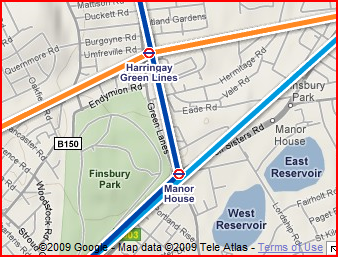
On the one hand, a geographically accurate map is useful for, for example, realising that you might as well just walk between Blackfriars and Farringdon. On the other hand, it isn’t very useful when you are actually using the tube, to have each station connected to the next with straight lines, as overlaps can cause problems. In the screen-grab below, the Victoria line (light blue) doesn’t stop at Manor House, and the Piccadilly line (dark blue) doesn’t stop at Harringay Green Lanes.

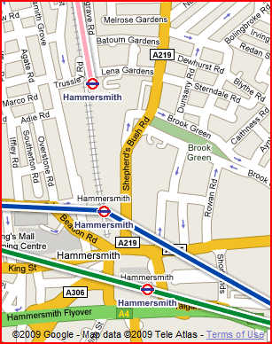
Something very odd seems to be going on in Hammersmith – the H&C (pink) line is shown ending several hundred metres north of its true end station, at what looks like a depo. The actual H&C end station is shown instead as being connected to the Piccadilly line (dark blue) whereas you would actually need to go to the bottom station to get a Piccadilly train.

There is also a mysterious extra link on the London Overground line which doesn’t appear on any tube map.
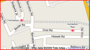
…and while we are on the topic of Google and public transport, my local station appears to have split into two:

The one on the left is correct, the one on the right doesn’t exist. All along the route in fact, the stations are mostly doubled up, with the “x” one being correct and the “x Rail” one being wrong.
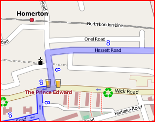
Thank goodness we have OpenStreetMap where, if something’s wrong, we can go in and immediately fix it. Being my local area, of course, the map is already pristine:
