Categories
CDRC London Technical

Big Data Here: The Code

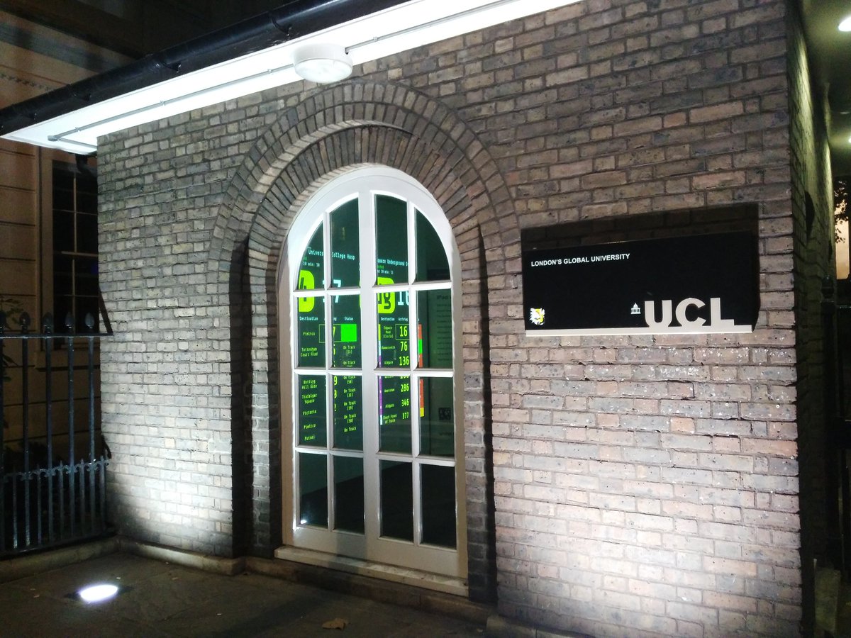
So Big Data Here, a little pop-up exhibition of hyperlocal data, has just closed, having run continuously from Tuesday evening to this morning, as part of Big Data Week. We had many people peering through the windows of the characterful North Lodge building beside UCL’s main entrance on Gower Street, particularly during the evening rush hour, when the main projection was obvious through the windows in the dark, and some interested visitors were also able to come inside the room itself and take a closer look during our open sessions on Wednesday, Thursday and Friday afternoons.

Thanks to the Centre for Advanced Spatial Analysis (CASA) for loaning the special floor-mounted projector and the iPad Wall, the Consumer Data Research Centre (CDRC) for arranging for the exhibition with UCL Events, Steven Gray for helping with the configuration and setup of the iPad Wall, Bala Soundararaj for creating visuals of footfall data for 4 of the 12 iPad Wall panels, Jeff for logistics help, Navta for publicity and Wen, Tian, Roberto, Bala and Sarah for helping with the open sessions and logistics.

The exhibition website is here.

I created three custom local data visualisations for the big screen that was the main exhibit in the pop-up. Each of these was shown for around 24 hours, but you can relive the experience on the comfort of your own computer:

bdh_buses

1. Arrival Board

View / Code

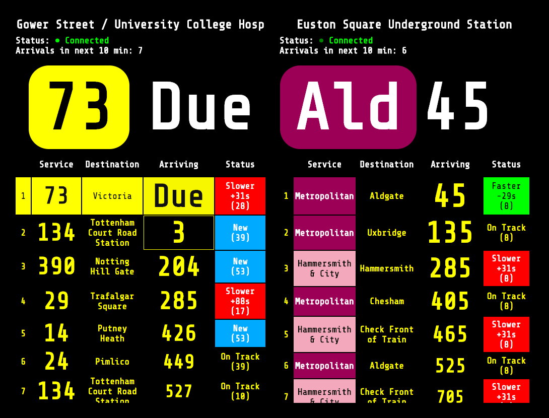
This was shown from Tuesday until Wednesday evening, and consisted of a live souped-up “countdown” board for the bus stop outside, alongside one for Euston Square tube station just up the road. Both bus stops and tube stations in London have predicted arrival information supplied by TfL through a “push” API. My code was based on a nice bit of sample code from GitHub, created by one of TfL’s developers. You can see the Arrival Board here or Download the code on Github. This is a slightly enhanced version that includes additional information (e.g. bus registration numbers) that I had to hide due to space constraints, during the exhibition.

Customisation: Note that you need to specify a Naptan ID on the URL to show your bus stop or tube station of choice. To find it out, go here, click “Buses” or “Tube…”, then select your route/line, then the stop/station. Once you are viewing the individual stop page, note the Naptan ID forms part of the URL – copy it and paste it into the Arrival Board URL. For example, the Naptan ID for this page is 940GZZLUBSC, so your Arrival Baord URL needs to be this.

bdh_traffic2

2. Traffic Cameras

View / Code

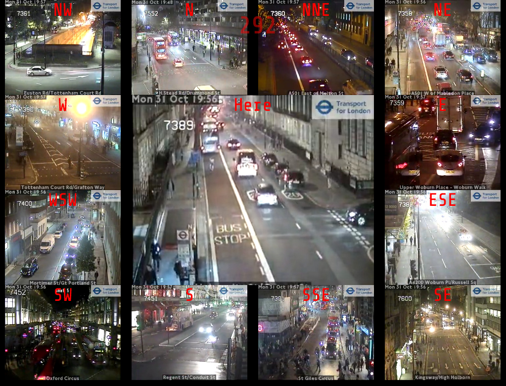
This was shown from Wednesday evening until Friday morning, and consisted of a looping video feed from the TfL traffic camera positioned right outside the North Lodge. The feed is a 10 second loop and is updated every five minutes. The exhibition version then had 12 other feeds, surrounding the main one and representing the nearest camera in each direction. The code is a slightly modified version of the London Panopticon which you can also get the code for on Github.

Customisation: You can specify a custom location by adding ?lat=X&lon=Y to the URL, using decimal coordinates – find these out from OpenStreetMap. (N.B. TfL has recently changed the way it makes available the list of traffic cameras, so the list used by London Panopticon may not be completely up-to-date.)

bdh_census

3. Census Numbers

View / Code

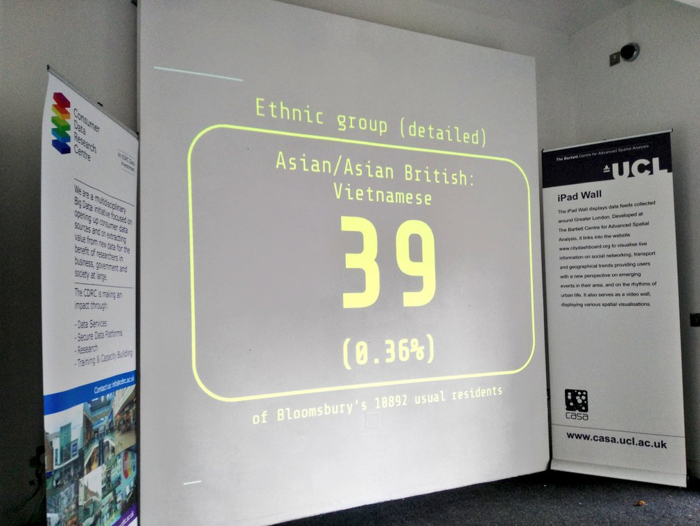
Finally, the screen showed randomly chosen statistical numbers, for the local Bloomsbury ward that UCL is in, from the 2011 Census. Again, you can see it in action here (wait 10 seconds for each change, or refresh), and download the code from GitHub.

Customisation: This one needs a file for each area it is used in and unfortunately I have, for now, only produced one for Bloomsbury. The data originally came, via the NOMIS download service, from the Office for National Statistics and is Crown Copyright.

bdh_traffic3

Categories
Data Graphics London

Big Data Here

9k-1

The Consumer Data Research Centre (CDRC) at UCL is organising a short pop-up exhibition on hyperlocal data: Big Data Here. The exhibition is taking place in North Lodge, the small building right beside UCL’s main entrance. The exhibition materials are supplied by the Centre for Advanced Spatial Analysis (CASA).

Inside, a big projection shows local digital information. What the screen shows will change daily between now and Friday, when the exhibition closes. Today it is showing a live to-the-second feed of bus arrivals at the bus stop outside the North Lodge, and tube train arrivals at Euston Square station just up the road. Watch the buses zip by as they flash up “Due” in big letters on the feed. Both of these are powered by Transport for London’s Unified Push API, and we are planning on publishing the visualisation online next week. Tomorrow will be showing a different local data feed, and then a final one on Friday.

cvimcbqwgaa4bkw

Opposite the projection is the iPad Wall. This was created by CASA a few years back by mounting a bank of iPads to a solid panel (above photo shows them in test mode) and allowing remote configuration and display. The wall has been adapted to show a number of metrics across its 12 panels. Four of these showcase footfall data collected by one of our data partners, and being used currently in CDRC Ph.D. research. The other panels show a mixture of air quality/pollutant measures, tube train numbers and trends, and traffic camera videos.

We hope that passersby will enjoy the exhibition visuals and use them to connect the real world with the digital space, a transposition of a digital data view onto the physical street space outside.

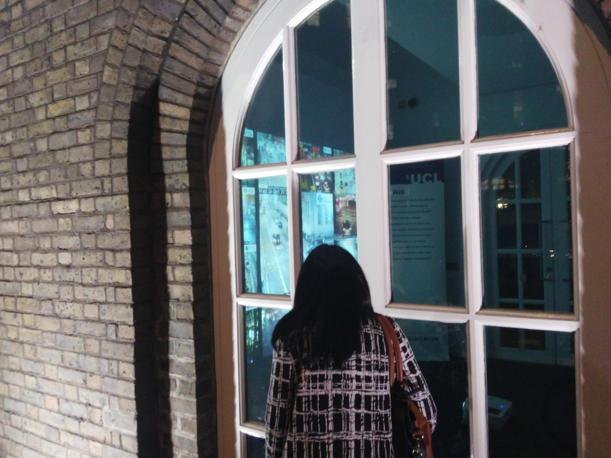
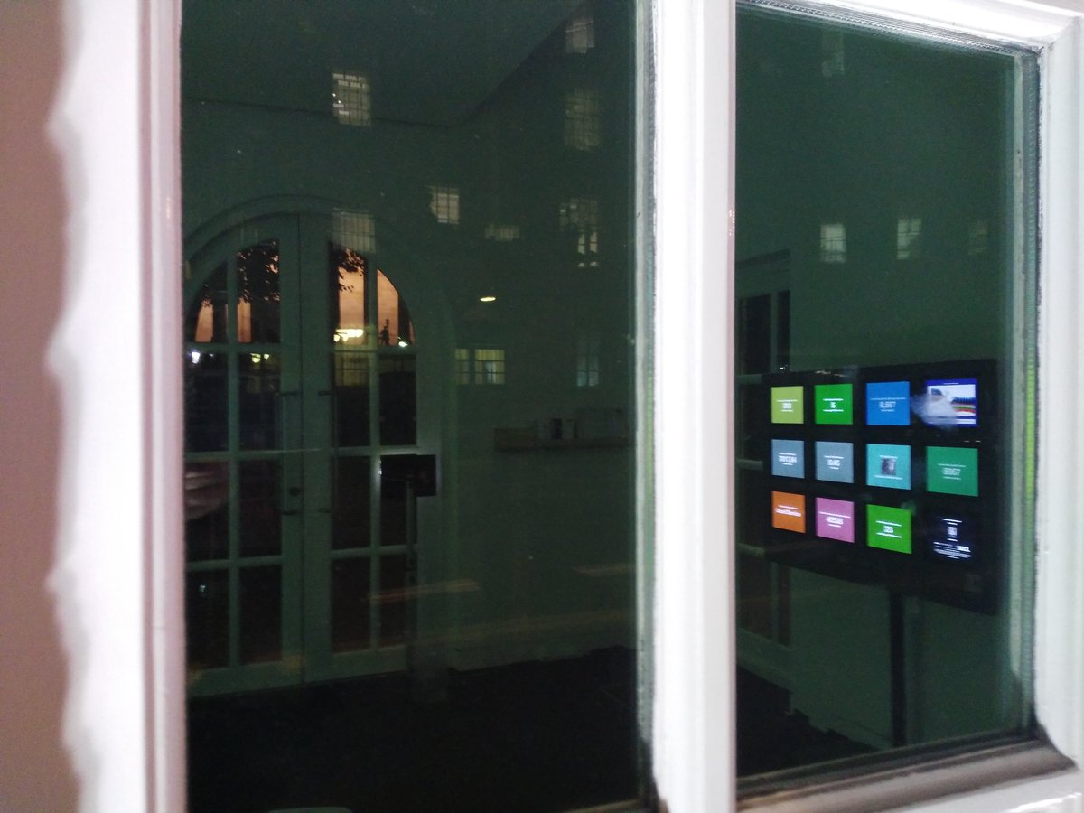
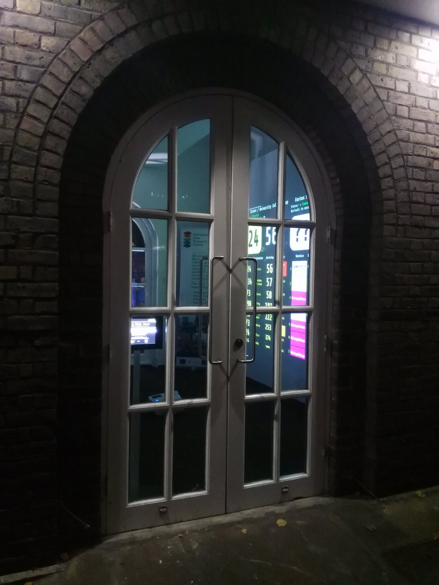
The exhibition runs 24 hours a day until Friday evening, with the doors open from noon until 3:30pm each day. The rest of the time, the visualisations will be visible through the North Lodge’s four windows. The exhibition is best viewed at night, where the data shines out of the window, spilling out onto the pavement and public space beyond:

2q

Big Data Here is taking place during Big Data Week 2016. Visit the exhibition website or just pop by UCL before Friday evening.

9k

cvmvee-xyaaxmep

Categories
London

Busiest Tube Station Times

chesham_max

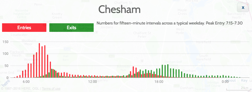
Here are the busiest Tube station quarter-hour periods, based on the Transport for London 2015 RODS data (modelled, based on typical autumn weekday), used in Tube Heartbeat, adding together entries, exits and interchange stats and excluding Kensington Olympia which does not have a frequent Tube service.

The main pattern shows that stations further out (map) from London’s main work areas (The West End, the City and Canary Wharf) have an earlier morning peak (or later evening peak), due to the journey taking longer and the tendency for many people to arrive at their work-end station at about the same time – just before 9am. A secondary effect is that stations which just act as simple commuter home and work portals, we would expect the usage to peak in the morning rush hour, rather than than evening one, as the morning rush hour is shorter and so the simple commuter flow is more concentrated. Therefore, stations which show a peak in the evening are often due to a combination of this simple commuter flow and an evening “going out” destination.

Station Peaks by Time of Day

7:15am-7:30am: Chesham [Zone 9]

7:30am-7:45am: Chalfont & Latimer [8], Epping [6]

7:45am-8:00am: Amersham [9], Chorleywood [7], Debden [6], Elm Park [6], Hillingdon [6], Hornchurch [6], Theydon Bois [6], Cockfosters [5], Pinner [5], South Ruislip [5], Stanmore [5], Mill Hill East [4], Chigwell [4], Grange Hill [4], Perivale [4],Kew Gardens [3/4], Wimbledon Park [3], Holland Park [2]

8:00am-8:15am: Alperton, Arnos Grove, Balham, Barking, Barkingside, Becontree, Buckhurst Hill, Canons Park, Chiswick Park, Clapham South, Colindale, Colliers Wood, Croxley, Dagenham East, Dagenham Heathway, Eastcote, East Putney, Edgware, Fairlop, Finchley Central, Gants Hill, Hainault, Harlesden, Harrow-on-the-Hill, Hatton Cross, High Barnet, Hounslow Central, Hounslow East, Hounslow West, Ickenham, Kenton, Kingsbury, Loughton, Moor Park, Morden, Neasden, Newbury Park, Northfields, North Harrow, Northolt, Northwick Park, Northwood, Northwood Hills, Oakwood, Osterley, Parsons Green, Preston Road, Ravenscourt Park, Rayners Lane, Redbridge, Rickmansworth, Roding Valley, Ruislip, Ruislip Gardens, Ruislip Manor, Seven Sisters, Snaresbrook, South Ealing, Southfields, Southgate, South Harrow, South Kenton, South Wimbledon, Stamford Brook, Sudbury Hill, Sudbury Town, Totteridge & Whetstone, Turnham Green, Upminster Bridge, Upney, Wanstead, Watford, West Acton, West Harrow, West Ruislip, Wimbledon, Woodford, Woodside Park

8:15am-8:30am: Acton Town, Archway, Arsenal, Blackhorse Road, Boston Manor, Bounds Green, Bow Road, Brent Cross, Brixton, Bromley-by-Bow, Burnt Oak, Canada Water, Canning Town, Dollis Hill, Ealing Broadway, Ealing Common, East Acton, East Finchley, Finchley Road, Finsbury Park, Fulham Broadway, Golders Green, Goldhawk Road, Hammersmith (H&C), Harrow & Wealdstone, Hendon Central, Highgate, Kensal Green, Kilburn, Kilburn Park, Leytonstone, Maida Vale, Manor House, North Acton, North Wembley, Park Royal, Plaistow, Putney Bridge, Queen’s Park, Shepherd’s Bush Market, St. John’s Wood, South Woodford, Swiss Cottage, Tooting Bec, Tooting Broadway, Tottenham Hale, Tufnell Park, Upton Park, Walthamstow Central, Warwick Avenue, Wembley Park, West Brompton, West Finchley, West Hampstead, Willesden Green, Wood Green

8:30am-8:45am: Baker Street, Bank/Monument, Barons Court, Belsize Park, Bermondsey, Caledonian Road, Canary Wharf, Chalk Farm, Earl’s Court, Edgware Road, Elephant & Castle, Euston, Hammersmith, Hampstead, Highbury & Islington, Holloway Road, Kennington, Kentish Town, Ladbroke Grove, Lancaster Gate, London Bridge, Marylebone, Mile End, Moorgate, Notting Hill Gate, Oval, Paddington, Pimlico, Richmond, Royal Oak, Stepney Green, Stockwell, Uxbridge, Vauxhall, Victoria, Westbourne Park, West Kensington, Westminster, Whitechapel

8:45am-9:00am: Barbican, Aldgate East, Blackfriars, Borough, Cannon Street, Chancery Lane, Edgware Road (Bakerloo), Euston Square, Farringdon, Great Portland Street, Latimer Road, Mansion House, Old Street, Regent’s Park, Southwark, St. James’s Park, St. Paul’s, Warren Street

3:30pm-3:45pm: North Ealing

5:00pm-5:15pm: Heathrow Terminal 5

5:15pm-5:30pm: Willesden Junction

5:30pm-5:45pm: Aldgate, Russell Square, South Kensington, West Ham, Heathrow Terminals 1 2 3, Heathrow Terminal 4

5:45pm-6:00pm: Bond Street, Embankment, Goodge Street, Green Park, Gunnersbury, Hanger Lane, Wood Lane, Holborn, King’s Cross St. Pancras, Knightsbridge, Lambeth North, Liverpool Street, Mornington Crescent, North Greenwich, Oxford Circus, Stonebridge Park, Charing Cross, Stratford, Temple, Tower Hill, Turnpike Lane, Upminster, Waterloo, White City

6:00pm-6:15pm: Angel, Camden Town, Covent Garden, East Ham, Gloucester Road, Greenford, High Street Kensington, Hyde Park Corner, Leicester Square, Leyton, Marble Arch, Piccadilly Circus, Queensway, Shepherd’s Bush, Sloane Square, Tottenham Court Road

6:15pm-6:30pm: Bayswater [1], Bethnal Green [2], Clapham Common [2], Clapham North [2], Queensbury [4], Wembley Central [4]

You can explore graphs of the flows, in detail, at Tube Heartbeat – just choose the station of your choice on the drop-down on the top right, or click on it on the map.

Six Rush Hours?

Interestingly, if you look at the flows between stations, you can actually see SIX rush hours each weekday (you can see five of them below by looking across these sample segment graphs):
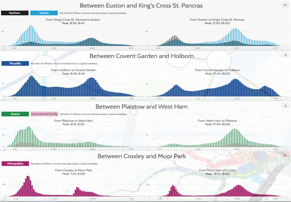
fiverushhours

These are:

  • A early morning peak, 7-8am. This is distinct from the main morning peak, and can be seen certain segments in east London, particularly on the District line near Plaistow, where the two morning peaks are an hour apart, with a noticeable dip in flow between the two. This may reflect the workforce for some traditional industries with 8am-4pm historical or shift-based working hours.
  • The main morning rush hour that almost all stations and line segments see – 7:30am-9am. Some of the more outlying stations (Zones 5-9) see their peak for this rush hour earlier than 8am, as it takes a while to get into the centre of London. You can see this is not the 7-8am peak above, by “tracing” the ripple through the network towards central London.
  • School home-time at roughly 3-4pm. Mainly affects some smaller, outer London stations, particularly in the north-west, for example Moor Park.
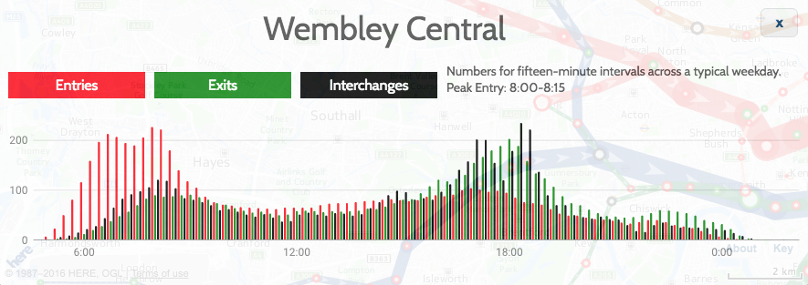
  • A corresponding 4-5pm peak for shift workers who started at 8am. Only a few links show this, such as Wembley Central in north-west London. The evening rush hours are less “compressed” than the morning ones so it is generally harder to distinguish between this one and the next one.
  • The main evening rush hour, 5-7pm.
  • Theatreland end-of-show rush hour, 10-11pm. Noticeable around Leicester Square, Covent Garden and Holborn. Some other areas, with established night-time economies, may also see a slight peak around this time.

You can also see 3+ rush hours in some of the stations, such as Wembley Central, which shows all six:
wembley_max

Categories
London

Open House London 2016: City of London (East)

A couple of weekends ago it was Open House London, two days where hundreds of London’s more interesting buildings open up, for free, for curious passersby (and organised pre-bookers). The capital fills up with interested parties carrying the distinctive green books. This year, on both days, we were only free from around 3pm onwards (due to a wedding and a sports race on Saturday and Sunday respectively) so had to optimise carefully with most places closing by 5pm – so we focused on the eastern part of the City of London, where there is a great density of interesting (and open) buildings.

Saturday

ohl_cheesegrater

3pm: RSHP architects practice in the Leadenhall Tower

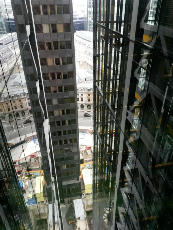
This was a pre-booked tour and involved a couple of queues and a wait before getting in. Once on the 3rd floor lobby (there are multiple levels), we looked at an impressive Lego model of the tower (also known as the Cheesegrater), before heading up in high-speed lifts to the 14th floor, where the architectural practice which designed the tower, and numerous others including the famous Lloyds of London opposite, is based. There is a striking gap (see pic above) in the interface between the lift landing area and the workspace, followed by a glass-panelled room where the practice’s servers are based – very neatly racked, as they are visible to all who enter, stored behind glass. The kitchens and meeting rooms are here. The lift landing area contains the bathrooms, where the bottom of the sinks are angled horizontal in exactly the same way that the tower is angled vertically – that is, with a 20 degree tilt. This all means that the rest of the space can be completely open – and it is, on this floor. Even the ceiling panels were not installed, instead, the plant infrastructure was left. This creates a void which allows talking and other office noise to just disappear. Sir Richard Roger himself sits at the far end of one of the long desks – his desk noticeable for having no computer on it. The windows have stickers on them showing which way to look towards other buildings designed by the practice. The most iconic building of all though, perfectly lined up with the tower (and the reason why it has to tilt backwards) is St Paul’s Cathedral, out to the west.

ohl_stehelens

4pm: St Helen’s Bishopsgate

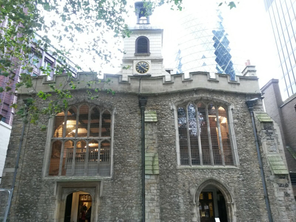
By 4pm on Open House London days, most buildings are shutting their doors or have set of their final tour. So we were lucky to stumble into St Helen’s Bishopsgate, just 100 years from the Leadenhall Tower. This ancient and curious church, formally a nunnery and parish church now joined together, was badly damaged in the 1990s IRA bombings, and has radically restored. Inside, it is very bright inside, it is largely a box shape with the platform off to one side rather than being in the middle. The floor was also raised by nearly a metre, so that some of the older stone memorials have a pronounced drop downwards from the floor edge to them. One particularly interesting and unusual feature is the walk-in baptistry.

Sunday

ohl_drapershall

2:30pm: Drapers’ Hall

One of London’s livery halls, and recently famous for the Great British Banquet, this is an exceedingly grand and opulent set of rooms, accessed through a suprisingly small doorway and corridor. It was great to be able to just walk in, get handed a guide and wander under huge chandeliers and huge, gilded ceilings.

ohl_gold

3pm: Bank of England

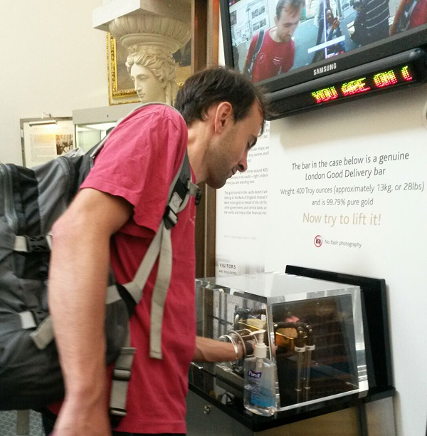
This was another pre-booked tour, with tight (X-ray) security and a strict ban on photography. Fair enough – it is the Bank of England, and while the museum is normally open to the public (on weekdays), this was a tour inside the functioning rooms themselves. The tour included the marble floors and the parlour rooms, though not the gold vaults. The parlour rooms are very opulent and set in historic styles, even though the bank was rebuilt from the ground up in the 1930s. They include a red room which is set up like an “old boys clubroom” and is for visiting guests, a blue room which is where the Monetary Policy Committee meets to make decisions on interest rates etc, a green room which is a larger and more rarely used room for larger meetings and banquets, and finally a yellow dining room. Most of the rest of the bank is just standard office space and so we only saw a glimpse of these bits. We then exited into the museum itself, where we were able to lift a gold-bar (through a hole in a perspex box and with theatrical security – four CCTV camera screens, two members of staff flanking the box). A ticker display above showed the current value of the London Gold Standard bar I was holding – £399,000. I did manage to open another perspex box in the museum though – one operated by a rotary combination lock, the sequence of which can be revealed by answering a number of questions. It still took a good 10 minutes to perform the required number of rotations to the correct accuracy, with suitable pauses between. The token inside could then be swapped for a mini “gold bar” pin badge freebie.

ohl_masonictemple

4:30pm: Masonic Temple in the Andaz Hotel, Liverpool Street

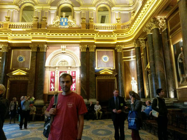
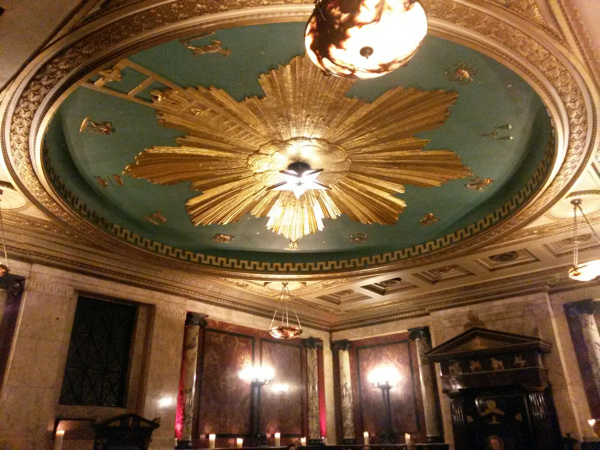
Quite a long queue to get in for this final building – perhaps because it was one of the few still open for access as Open House London was drawing to the close. Eventually we squeezed in, just before 5pm, into a hotel and along and up a long set of corridors and steps, until suddenly we stepped into an opulent and windowless “secret” chamber, elaborately decorated. It was bricked up for many years since the lodge was abandoned in the 1950s, only discovered a few years ago when builders knocked down a void. Now it is used for receptions and other formal events.

Looking forward already to next year’s weekend, and hopefully I’ll have the full weekend to explore. I think concentrating one one small area – or alternatively focusing on one particular borough, not necessarily a central one – is a good strategy, for maximising visiting time over travelling time.

Categories
Conferences

Mapping at the Edge – the BCS/SoC Conference 2016

bcsconf_osquarterinch

The British Cartography Society and Society of Cartographers* once again combined their two annual conferences together, for a two-day meet in Cheltenham in early September. After last year’s win for the DataShine website, I was there in a more passive capability, although my colleague Dr Cheshire, who collected a trio of prizes last year, presented on why cartographers should learn to code too – see his talk summary.

I like the BCS conference format – it’s quite a small conference, so there’s only two streams, unlike many trade-focused conferences the trade exhibits don’t dominate the space, instead the talks themselves are the main focus. The residential nature of the conference also promotes a relaxed feel. Stand-out talks for me included Ross McDonald‘s excellent summary of new features in QGIS 2.14, Dr Cheshire’s talk about cartographers needing to code, and finally a walkthrough on creating an impressive relief map using Blender 3D, from Steven Bernard of the FT.

A highlight was the awards ceremony – and not just because of last year’s win. Every Person in Scotland Mapped won the Ordnance Survey Open Data award. This simple but effective visualisation assigns each person in Scotland to a dot in a housing block, as represented in OS OpenMap Local, filtering out non-residential buildings. It combines population density information from the census, with area information for each block.

bcsconf_awards

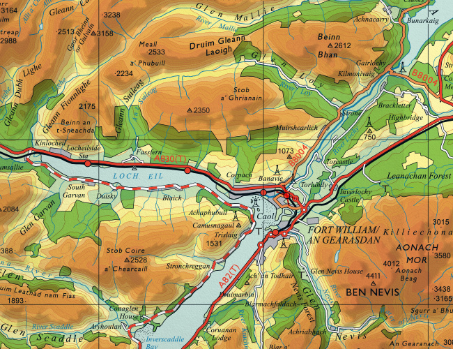
There is an accompanying exhibition, showing the various entrants for the awards – this is a highlight for me, because it’s great to see many novel printed maps in the same place, many showing innovative ideas. You can’t beat a good large-print map. I particularly liked the GIS-powered reimagining of two classic Ordnance Survey mapping styles with modern datasets, by Charley Glynn of the OS – there’s a 19th century London style brought up to date, but my favourite is a reworking of the 1960s OS “Quarter Inch” style with the strong colours for mountains. It always looked good in Scotland, and Charley has produced a version with modern data for the West Highlands – see the extract above. You can buy it from the OS shop online.

I would love to see this idea expanded to cover the whole of the UK – a key of course is to have it all automatically generated. The human cartographer’s input is still required for label positioning etc – the “last 10%” of the effort is still manual.

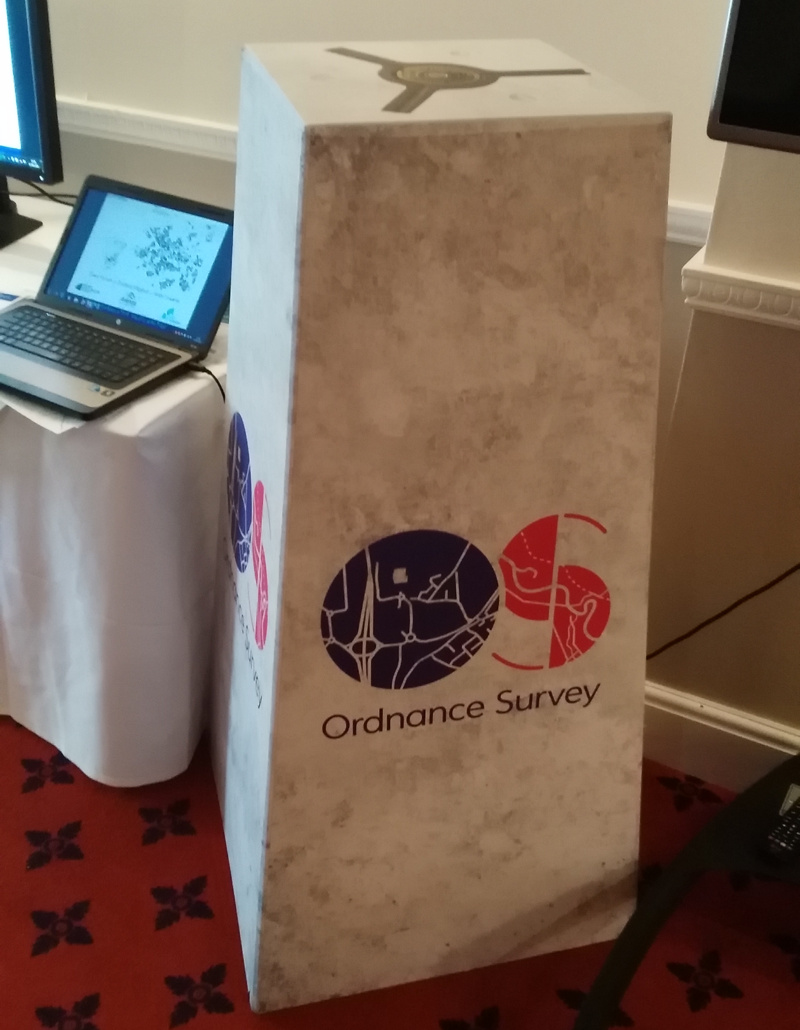
I also liked the pop-up trig point at the OS stand:

bcsconf_ostrig

* It is a curiosity that there are two national bodies representing cartographers in the UK, especially considering that the field is quite small anyway. The BCS is larger and more industry focused, while SoC is smaller and more academia focused. It’s great to see both bodies coordinating their annual conference to be the same event, as happened last year and this year – long may it continue.

Categories
CDRC

Population Density and Urban/Rural Split of the UK

popdens1

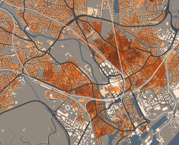
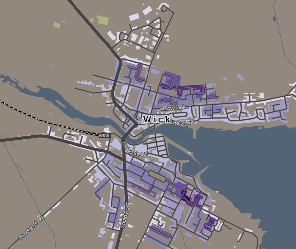
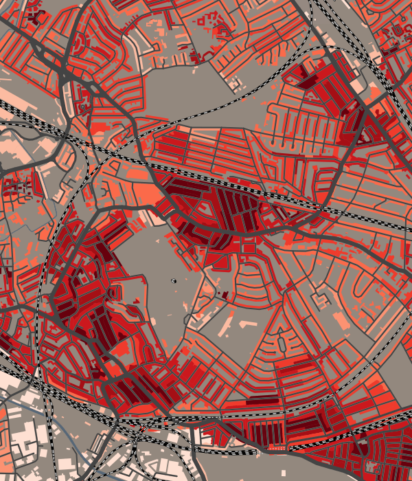
A new map on CDRC Maps showing perhaps one of the simplest demographic metrics – residential population density – how many people live in each hectare across the UK. The data is available at the smallest statistical area available (output areas in GB and small areas in NI) and I have combined this with the various urban/rural classifications used by the three national statistical agencies across the UK, to produce a single map. Colour is the urban/rural classification, and lightness/darkness shows how densely populated each area is. Because urban areas are so much more densely populated than rural ones are, I’ve used a series of scales to gradate the representation of density on the map – the scale used depends on the classification. This is the best way to allow both high and low density populated areas to be able to show local variations.

A few observations:

  • many linear blocks along roads in east London have a noteably high density compared to the rest of suburbia – there are not tower blocks here, just terraces, so maybe this is a sign of overcrowding?
  • The centre of Birmingham is extremely low density – very few residential blocks here.
  • There is a significant contrast between high-density Portsmouth, hemmed in on three sides by water, and the much lower density Southampton, not far away, which is not so constrained by the sea.
  • Many cities, such as Cardiff (above) show a distinct pattern where the inner city has two parallel zones of high-density population, either side of a relatively sparse CBD core. Other cities where this is seen include Plymouth, Glasgow and Leicester.

popdens2a

There are flaws in this method of combining datasets across national boundaries. The different agencies calculate in different ways. Notably, in Scotland, the small areas are themselves smaller in population and are designed to better encapsulate the urban part only of settlements, with different small areas for the rural parts. As such, Scottish villages tend to show up as higher density than their English counterparts, which by necessity often need to include a substantial rural element in order to hit their population threshold. This is a statistical quirk.

The other significant difference is that English/Wales define “sparseness”, while Scotland and Northern Ireland use “remoteness” and measure this quantitatively in terms of driving time to the nearest settlement of over 10000 people. The definition of sparseness does not relate to distance from such settlements and therefore there are some “urban” areas with population of over 10000 but in a sparse setting. For consistency, I consider these alongside remote settlements in the other nations, which are considered rural. The raw data download, on CDRC Data, includes a simple urban/rural flag if you prefer to use the strict urban/rural definitions.

See the map here.

popdens3

As ever, please note that maps on CDRC Maps show all buildings but the data is generally for residential buildings only. The data is a single value across the whole small area, not a measurement of population in individual buildings.

Categories
Data Graphics

SIMD 2016: The Scottish Index of Multiple Deprivation

simd_2016_pic1

Like its English counterpart IMD, SIMD is released every few years by the Scottish government, as a dataset which scores and ranks every small statistical area in Scotland according to a number of measures. These are then combined to form an overall rank and measure of deprivation for the area. This can then be mapped to show the geographical variation and spread of deprived (and non-deprived) communities across the country. I mapped SIMD 2012 for The New Booth Map and also it appears as a layer in CDRC Maps.

simd_2016_pic3Dr Cheshire and I recently were commissioned to produce a new website to showcase the older SIMD 2012, and for the release of SIMD 2016, that contained tools useful for researchers and other specialist users, such as specific area data selection and retrieval and map downloads. The base of the website was the “DataShine” mapping style used in both the above examples, where only buildings are coloured, so that urban areas can be easily seen and related. With the great majority of the Scottish population in urban areas, and vast areas of unpopulated land in the country, this style of mapping is very useful both to draw the eye to where the population is, and also present a map that is a more familiar representation of the country. As such, even though this is intended to be a “pro users” site, it is accessible and useful to the general viewer too.

The new website SIMD.scot, was launched by the Scottish Government along with the SIMD 2016 statistical release, at the end of August. It was featured on the BBC News Scotland website, as well as on the Daily Record and Scotsman newspaper websites, drawing 60,000+ visits in the first few days.

Some technical notes about SIMD.scot:

  • UTFGrids, at 4×4 pixel resolution are used for the mouseover popup data on component indices.
  • I use HTML5 Download to create a PNG image of the current map view – this works only in Chrome and Firefox.
  • A “mobile” version of the website starts with an area chooser dialog, when viewed on screens smaller than 800px wide.
  • The website uses static content (except for the postcode search) in order to load quickly, even when many people are viewing the site at once.

The work was carried out through UCL Consultants. Explore the SIMD 2016 map itself at SIMD.scot or see the 2012 version.

simd_2016_pic2

Categories
Technical

Behind the Code in Tube Heartbeat

Cross-posted to the 360 Here blog.

As a follow-up to my intro post about Tube Heartbeat, here’s some notes on the API usage that allowed me to get the digital cartography right, and build out the interactive visualisation I wanted to.

The key technology behind the visualisation is the HERE JavaScript API. This not only displays the background HERE map tiles and provides the “slippy map” panning/zoom and scale controls, but also allows the transportation data to be easily overlaid on top. It’s the first project I’ve created on the HERE platform and the API was easy to get to grips with. The documentation includes plenty of examples, as well the API reference.

The top feature of the API for me is that it is very fast, both on desktop browsers but also on smartphones. I have struggled in the past with needing to optimise code or reduce functionality, to show interactive mapped content on smartphones – not just needing to design a small-screen UI, but dealing with the browser struggling to show sometimes complex and large-volume spatial data. The API has some nice specific features too, here’s some that I used:

Arrows

One of the smallest features, but a very nice one I haven’t come across elsewhere, is the addition of arrows along vector lines, showing their direction. Useful for routing, but also useful for showing which flow is currently being shown on a bi-directional dataset – all the lines on Tube Heartbeat use it:

var strip = new H.geo.Strip();
strip.pushPoint({ lat: startLat, lng: startLon });
strip.pushPoint({ lat: endLat, lng: endLon });

var polyline;
var arrowWidth = 0.5; /* example value */

polyline = new H.map.Polyline(
	strip, { 
		style: { ... }, 
		arrows: { 
			fillColor: 'rgba(255, 255, 255, 0.5)', 
			frequency: 2, 
			width: arrowWidth, 
			length: arrowWidth*1.5 
		}
	}
);

polyline.zorder = lines[lineID].zorder;

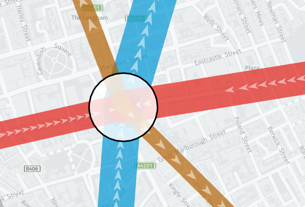
The frequency that the arrows occur can be specified, as well as their width and length. I’m using quite elongated ones, which are 3 times as long as they are wide, and occupy the middle half of the arrow (above/below certain flow thresholds, I used different numbers). A frequency of 2 means there is an arrow-sized gap between each one. Using 1 results in a continuous stream of arrows. (N.B. Rendering quirks in some browsers mean that other gaps may appear too.) Here, the blue and red segments have a frequency of 1 and a width of 0.2, while the smaller flows in the brown segments are shown with the frequency of 2 and width of 0.5 in the example code above:

tubeflows

Z-Order

Z-order is important so that the map has a natural hierarchy of data. I decided to use an order where the busiest tube lines were generally at the bottom, with the quieter lines being layered on top of them (i.e. having a higher Z-order). Because the busier tube lines are shown with correspondingly fatter vector lines on the map, the ordering means that generally all the data can be seen at once, rather some lines being hidden. You can see the order in the penultimate column of my lines data file (CSV). I’m specifying z-order simply as a custom object “zorder” on the H.map.Polyline, as shown in the code sample above. This then gets used later when assembling the lines to draw, in a group (see below).

Translucency

I’m using translucency both as a cartographical tool and to ensure that data does not otherwise become invisible. The latter is simply achieved by using RGBA colours rather than the more normal hexadecimals; that is, colours with a opacity specified as well as the colour components. In the code block above, “rgba(255, 255, 255, 0.5)” gives white arrows which are only 50% opaque. The tube lines themselves are shown as 70% opaque – specified in lines data file along with the z-order – this allows their colour to appear strongly while allowing other lines or background map features/captions, such as road or neighborhood names, to still be observable.

While objects such as the tube lines can be made translucent by manipulating their colour values, layers themselves always display at 100% opacity. This is probably a good thing because translucent map image layers could look a mess, if you layered multiple ones on top of each other, but it means you need to use a different technique if you want to tint or fade a layer. Because even the simplified “base” background map tiles from HERE for London have a lot of detail on them, and the “xbase” extra-simplified ones don’t have enough for my purposes, I needed a half-way house approach. I acheived this by creating a geographical object in code and placing it on top of the layers:

var tintStyle = {
	fillColor: 'rgba(240, 240, 240, 0.35)'
};
var rect = new H.map.Rect(
	new H.geo.Rect(	42, -7, 58, 7 ), 
	{ style: tintStyle }
);
map.addObject(rect);

The object here is a very light gray box, at 35% opacity, with an extent that covers all of the London area and well beyond. In HERE JavaScript API, such objects automatically go on top of the layers. My tint doesn’t affect the lines or stations, because I add two groups, containing them, after my rectangle:

var stationGroup = new H.map.Group();
var segGroup = new H.map.Group();
map.addObject(segGroup);
map.addObject(stationGroup);  

Object Groups

I can add and remove objects from the above groups rather than directly to the map object, and the groups themselves remain in place, ordered above my tint and the background map layers. Objects are drawn in the order they appear in the group, the so-called “Painters Algorithm“, hence why I sort using my previously specified “zorder” object’s value, earlier:

function segSort(a, b)
{
	var lineA = parseInt(a.zorder);
	var lineB = parseInt(b.zorder);
	if (lineA > lineB) return 1;	
	if (lineA < lineB) return -1;
	return 0;
}

var segsToDraw = [];
segGroup.removeAll();

...

segsToDraw.sort(segSort);	
for (var i in segsToDraw)
{
	segGroup.addObject(segsToDraw[i]);									
}		 

Circles

There are super easy to create and illustrate the second reason that I very much like the HERE JavaScript API. The code is obvious:

var circle = new H.map.Circle(
	{	
		lat: Number(stations[i].lat), 
		lng: Number(stations[i].lon)
	}, 
	radius, 
	{ 
		style: { 
			strokeColor: stationColour, 
			fillColor: 'rgba(255, 255, 255, 0.8)', 
			lineWidth: 3 
		} 
	}
);

These are my station circles. They are thickly bordered white circles, as is the tradition for stations on maps of the London Underground as well as many other metros worldwide, but with a little bit of translucent to allow background map details to still be glimpsed. Here you can see the circle translucencies, as well as those on the lines, and the arrows themselves, the lines also being ordered as per the z-order specification, so that the popular Victoria line (light blue) doesn't obscure the Northern line (black):

translucency

Other Technologies

As well as the HERE JavaScript API, I used JQuery to short-cut some of the non-map JavaScript coding, as well as JQueryUI for some of the user controls, and the Google Visualization API (aka Google Charts) for the graphs. Google's Visualization API is full-featured, although a note of caution: I am using their new "Material" look, which works better on mobile and looks nicer too than their regular "Classic" look - but it is still very much in development - it is missing quite a few features of the older version, and sometimes requires the use of configuration converters - so check Google's documentation carefully. However, it produces nicer looking charts of the data, a trade-off that I decided it was worth making:

google_material_chart2

These are just some of the techniques I used for Tube Heartbeat, and I only scratched at the surface of the HERE APIs, there are all sorts of interesting ones I could additionally incorporate, including some you might not expect, such as a Weather API.

Try out Tube Heartbeat for yourself.

Background map tiles shown here are Copyright HERE 2016.

Categories
London

Crossrail: Tottenham Court Road Station

tcr1

Thanks to spotting a notification for a tour of several Crossrail stations as part of a get-parents-and-kids-into-construction day, I was able to visit a space deep beneath Oxford Street and Tottenham Court Road, back in July, to look around the huge Crossrail station there which is rapidly taking shape, with Crossrail (aka the Elizabeth line) due to start through the centre of London in only a couple of years.

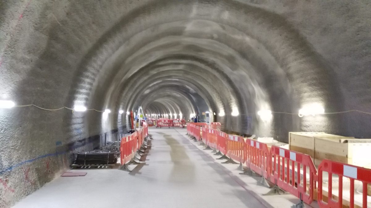
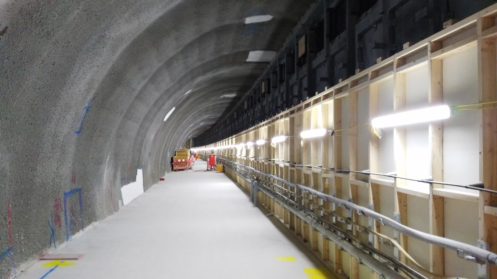
There is lots of activity on the site, as would be expected, and at times it was tricky for the tour to move around, but eventually we made it to level minus 4 – platform level, and were able to walk the length of the platforms, as well as an intermediate tunnel that runs between them, to get an appreciation of the scale of underground Crossrail stations, which are noticeable bigger than their regular tube equivalents.

One real surprise for me was to see the distinct curve on the eastbound platform. It’s the only underground one in the Crossrail network, and was necessitated by the tight nature of threading the stations and tunnel tubes through the area – at one point, less than a metre from the Northern Line platforms there. The curve will no doubt provide challenges for the station cladding, as well as the automatic platform-edge doors that will be on all the underground stations on Crossrail.

tcr2

We also got a glimpse of the huge bank of escalators which will take people up and down from the station level. Pouring the huge slab of concrete to set not horizontally, but at the 30 degree angle of the escalators themselves, was another considerable engineering challenge.

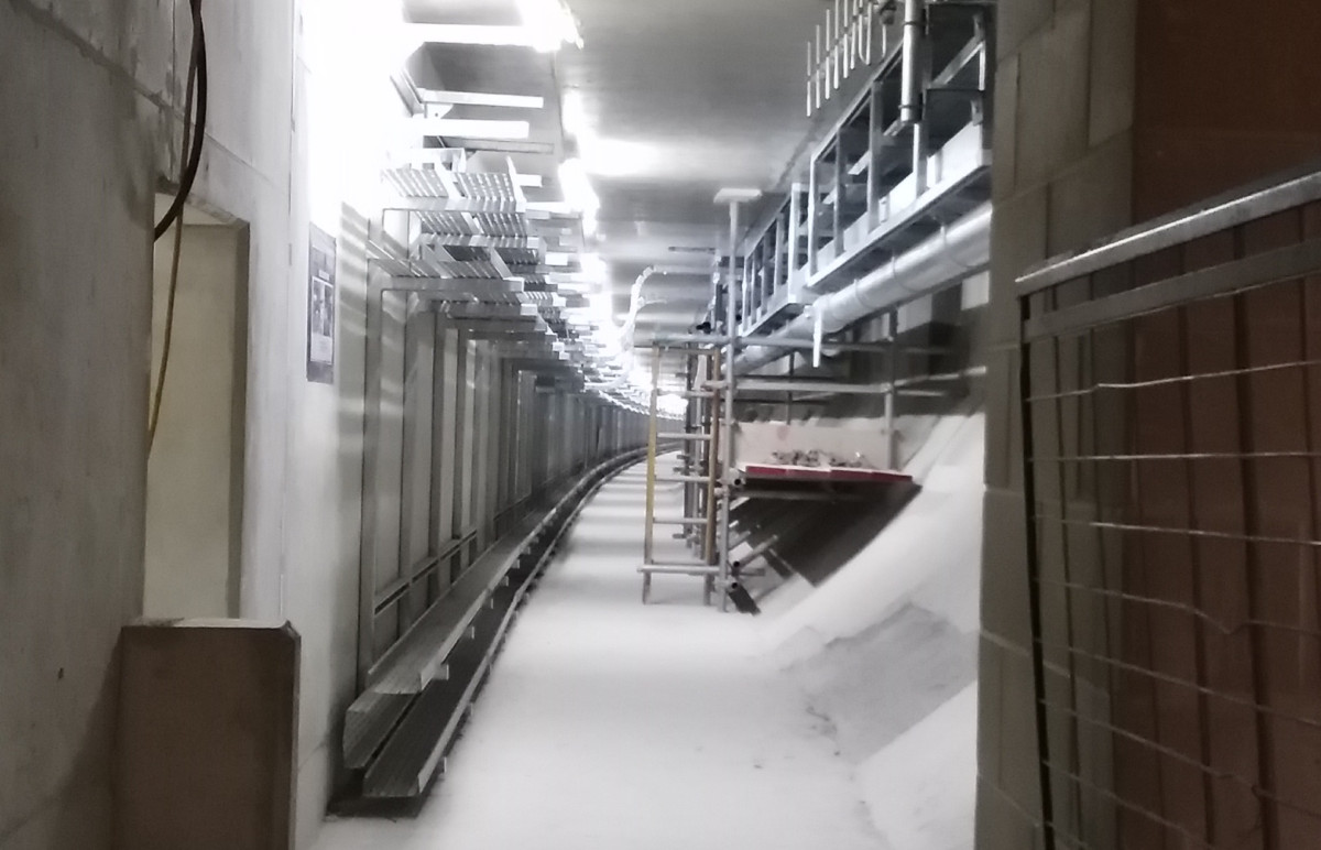
Level -4 is not the lowest level, and we also got a quick look at Level -5, which runs underneath the platforms themselves and provides all the cabling and pipe infrastructure for the station and indeed the running lines themselves. No more cables running along the nice new tunnel tubes, or disfiguring the space age, Star Wars-like stations with their white acrylic panel sections and organic looking curves rather than corners.

tcr2a

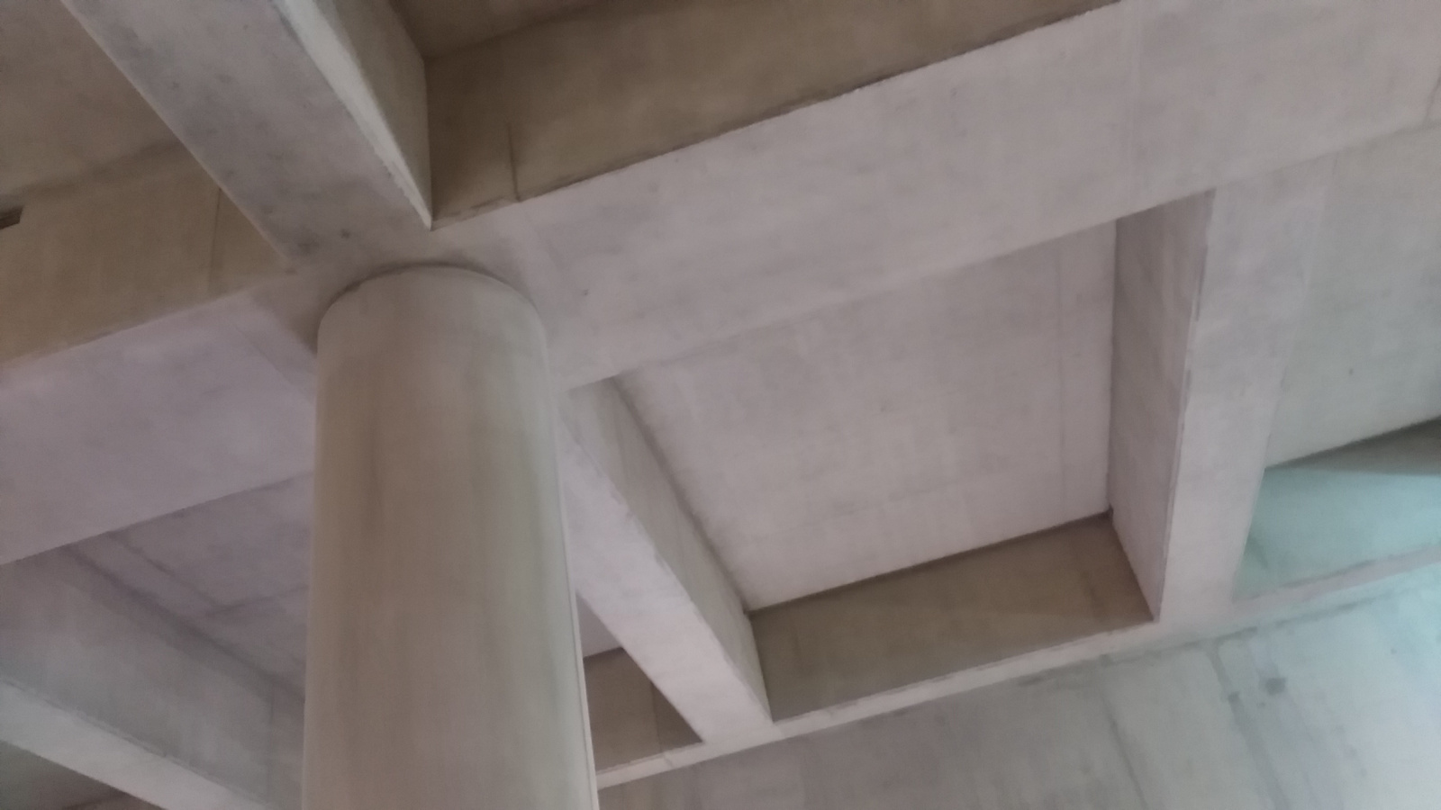
It was also nice to see a glimpse of some rather pleasing looking concrete ceilings – they reminded me of the bold Euston Station ceiling that hardly anyone spots – sadly I suspect they will not appear “raw” in the finished station, but the green and orange glows of the worklights on them looked great.

tcr3

(By the way, I’ve been into the station construction site before, in March 2015.)

All in, a great tour of one of the stations that will be a significant addition to London’s transport capability, and looking forward to seeing the finished product at the end of 2018.

Categories
London

Open Doors: Bermondsey Dive-Under

diveunder1

The third tour I managed during the Construction Open Doors week of events back in June was to the site of the Bermondsey Diveunder. After visiting the (re)beginnings of a skyscraper, and a huge building development – this was something very different – a project building downwards, reusing old Victorian arches and the space between tracks on a very busy junction near London Bridge station, to allow for a “metro” frequency service into London Bridge and up through the centre of the capital to St Pancras – the so-called Thameslink Programme.

The project is building a “diveunder” – letting certain inbound services pass beneath outbound services elsewhere, so allowing a greater frequency of service. Essentially it is “grade separating” a busy junction, which happens to be part of the world’s oldest railway viaduct and once the longest viaduct of any kind, stretching over four miles from London Bridge to Greenwich.

diveunder2

From a historical perspective, it is nice to see that as much use of the existing, historic arches as possible is being made – the main part of the diveunder itself sitting on them until it ducks too low and they are replaced with smaller, modern ones, and eventually solid concrete. With the first big part of the new London Bridge station concourse opening up this weekend, things are starting to gear up and hopefully the extra capacity created by the diveunder will, in the short term, help to repair the currently badly suffering Southern services through the area, once it is opened in just a few short months.

diveunder3

The tour ended personally for me with a sour note – I returned back to find my bike was stolen. I’m happy to put South Bermondsey on my list of places to avoid in London in the future, except perhaps looking out of a train window at the new, sweeping lines that have been installed here.