Categories
OpenStreetMap

High Resolution Historical OS Maps now in OSM

campbeltown

[Updated] – Steve Chilton (designer-in-chief of the “standard” OpenStreetMap map) has announced the first Ordnance Survey 7th Series 1:50000 map scans are now available for tracing on to OpenStreetMap. The first ones available are in the south-west of Scotland. Further details of the project area are here.

On the right is what Girvan, a town in Ayrshire and Galloway, looks like in OpenStreetMap currently. Below that is what the 7th series imagery offers – and, bottom, the modern-day Google mapping data. This shows that, for even some sizeable towns, a 50-year-old map still has a lot to offer to enrich OpenStreetMap.

The scans have been reprojected into the “Spherical Mercator” format so they can be used in Potlatch – OpenStreetMap’s main online editor. They build on the New Popular Edition maps, which have been reprojected in England and Wales, but not Scotland so far, allowing OSM contributors to add features from the maps into the project.

Because the maps are (just) over 50 years old, their Crown Copyright has expired, which is why they can now be included in the project. Unfortunately many of the 7th series maps were printed in the early 1960s, so we’ll have to wait a few more years for these to come out of copyright and Scotland be fully covered. It would be lovely of course if the OS were to waive the copyright on these…

The maps can be seen directly here – the quality of the imagery is excellent, as can be seen in the screenshot above. Incidentally, the tilt of the grid squares is very noticeable here – the angle between grid and “true” north is quite pronounced in west Scotland.

[Update – The NPE, OS 7th Edition mentioned here, and a small number of 1:25000 OS 1st Edition maps can be directly compared on the new OOC map.]

Categories
Mashups

Visualisation of Census Data

This is the seventh in a series detailing the projects I have worked on at UCL in the last academic year.

My final mashup over the last year is not a “fully working” website, rather an interactive mockup of the sort of web application that I could potentially be building over the next year. It takes some of the data tables from the 2001 UK census, create choropleths of them and shows them on an OpenLayers-powered map. There is the ability to jump to an area by searching on a postcode, and to show, as vector points with name popups, schools. If the site looks similar to some of my other work, that’s because it is – it was cobbled together from existing code, as a “quick” demonstration, rather than being a polished product.

censusprofiler

Categories
Data Graphics

Data Graphics and Beer Don’t Mix

Here’s an example of an outstandingly misleading data-graphic, appearing in this week’s LondonStudent freepaper.

beergraphic

It attempts to show the disparity of bar staff pay across London universities, but:

  • The “empty” pint glass does not correspond to £0.00. To the casual observer it makes it look like CSSD work for free, until the figures are noticed. In fact, the text of the article mentions that, at two other London university bars, the staff do in fact work for free (or for beer – ouch) – but these are not shown on the graphic.
  • The graphic is a 2D (i.e. print) representation of a 3D object (a pint glass, tilted slightly towards the viewer) but the scale appears to vary in 1D – the values form a straight line across the “glass”. Hence the graphic has a large “Lie Factor”, the concept discussed in detail in E. Tufte’s totemic book The Visual Display of Quantitative Information (p57 for those making notes!)
  • LSE’s amount bizarrely isn’t represented at all in the graphic, but appears in a text box above it.
  • The numbers are on their side, even though there is plenty of room to show them horizontally – making the real values harder to read, so the reader concentrates on the misleading graphic representation instead.
  • The actual levels don’t bear any resemblance to the values – the ordering is correct but the relative value differences don’t correspond to the “beer levels”. For example, the drop between £5.90 and £5.95 is larger than the £5.95 to £6.25 drop.
  • Why’s beer being used to represent pay anyway?
Categories
Data Graphics Mashups

HEFCE Funding Map

This is the sixth in a series detailing the projects I have worked on at UCL in the last academic year.

hefce

This was a quick mashup to show on a map the latest HEFCE funding round – HEFCE is the government body that decides and awards research funding to the universities around the UK.

This is a vector-based mashup, once again using OpenLayers. For each point, representing a university’s “main” campus, I request a pie-chart from the Google Charts API, and use the resulting image as the marker for the point. There’s no simplification or other generalisation, so, for example, you’ll need to zoom in quite far if you want to make out the different universities in London.

It was cobbled together in about a day, the Thematic Mapping blog was particularly useful for getting the images working as markers.

You can see the mashup here.

Categories
Leisure

Finsbury Parkrun

[Updated] North London finally has its own parkrun – a free 5K timed race, starting at 9am every Saturday in Finsbury Park. The inaugural is on 31 October.

And unlike Bushy Park, this one has hills…

Update: It looks like a Victoria parkrun might be on its way too, permissions pending… and also a Greenwich parkrun, which could be just as hilly as Finsbury.

Categories
Mashups OpenLayers

Manchester Map

This is the fifth in a series detailing the projects I have worked on at UCL in the last academic year.

manchester

This was born out of Alex acquiring a old (1094) map of Manchester showing the different housing types that existed back then. I put together some image tiles he created of the map, in OpenLayers, and combined it with some existing modern OAC demographic map tiles that I had created for a separate project, and Google mapping and aerial imagery. Vectors are not used on the map, but you can switch between, combine and reorder the raster layers, for quick visual comparison between the maps.

Alex blogs the creation process here, and you can see the map itself here.

Categories
Orienteering

The Amazing Maze

Maize Maze-O

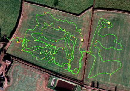
I ran in a rather unusual orienteering event yesterday – a maze cut in a field of maize. It was the Maize Maze-O Challenge, taking place at the National Forest Maize Maze in the Midlands and organised by Stodgetta of WCH. I’d never heard of maize mazes before, but there are several throughout England. They generally have a new design each year, the crop is planted, the pathways have their crop removed, the field grows and the maize appears, before being cut down for animal feed at the beginning of October.

maizegps

The format of the race was two qualifying runs, both less than a kilometre straight-line but well over 2km by the shortest path. These were in the afternoon, there was then a pause while the sun went down (and the competitors took advantage of the local catering – burgers from cows fed on last year’s maize) and then the finals – in the dark! A first at night-orienteering for me, but I just about made it around, along with around 100 other connoisseurs of unusual orienteering races!

Mike G enters the maze for the night final.

The map and pic (of Mike G from SLOW entering the maize maze for the night final) is on the WCH website. The GPS trace is of my night final route.

Categories
Data Graphics Mashups OpenLayers

HE Profiler

This is the fourth in a series detailing the projects I have worked on at UCL in the last academic year.

The HE Profiler is the last of the three “core” school-profiling map mashups that I have developed over the last year – this has been developed over the last few weeks and indeed was finished only today, my final project of the year.

It is designed to be used by university widening-participation administrators, as a graphical tool to discover and evaluate the schools to target for campaigns to encourage university application. To do this, it makes use of two metrics – the OAC demographics of pupils attending each school, and the POLAR score of their postcode – in simple terms a National Statistics demographic describing the likelihood that people from this postcode go to university.

Again it is powered by OpenLayers, displaying point-based vector information on top of Google Maps image tiles, using NPE data for geocoding postcodes. The most interesting thing about this application is I’ve started to explore the very powerful rule/attribute based symbolisation for points available in OpenLayers. This sort of symbolisation will be, I expect, very useful in my next year’s project. I am very impressed with what can be done – some quite GIS-like properties present in a popular and freely available web application.

heprofiler

The graphic above shows target schools for a central-London university, based on the proportion of POLAR1/2 pupils (least likely to go to universities) compared with the rest. Schools with a majority of pupils in this category are coloured red. The area of each circle represents the number of such pupils present. The poor representation at university of the Thames Gateway region can be clearly seen. As an aside, the OAC demographic, not shown here, does not work well for London due to its size – the OAC is calibrated across the whole UK, and it is likely a more specific demographic analysis for London (e.g. LOAC) for schools there, would be more useful.

Categories
Mashups

School Catchments

This is the third in a series detailing the projects I have worked on at UCL in the last academic year.

catchments
School Catchments was developed to complement the Education Profiler. Like the Education Profiler, It is powered by OpenLayers, but uses Google Maps tiles as its background rather than custom OpenStreetMap-based ones. For each of the schools in the database, it loads in “catchment maps” for the GCSE and A-Level students. OpenLayers’ vector mapping is used to display them on the Google Map. These reveal the “real” catchment areas for a school, which may or may not correlate with the school’s official catchment area, if available (many schools choose not to publish this information.)

Most schools are roughly in the centre of their catchment area, but geographies, spatial distribution of population – and geodemographics – can all act to distort the contour’s shape. In general, the Roman Catholic and other faith schools have noticeably large catchment areas. Of the regular schools, poorly performing schools often have very small catchments. It should be noted that we only had geodemographic data for the state school sector.

The process of developing the catchment maps was interesting – the known postcodes for each pupil are geocoded and the resulting grid of locations is simplified into a single “contour”, generally surrounding at least 60% of the pupils. One requirement was that only a single contour is produced – problematic when one school serves two small and well spaced villages. The contours were created in R, a statistical programming language popular in the academic community – it’s popular in the department, but quite alien to my Java/PHP/python past. I found the learning curve rather steep and am still a “non-proficient” R coder. Most available documentation for R assumes a level of experience I do not have. Searching for R information in Google is a pain too, thanks to its name.

catchmentgen

The generation process is highlighted in the second half of this screen video that my boss produced for a presentation – in the context of the School Profiler that also included the catchments.

The website is also the first eCommerce site I’ve developed (my boss is planning on the catchment vectors being available only through a subscription.) It was interesting getting to grips with the eCommerce paradigm. After struggling for a while to try and make sense of Google Checkout (having assumed, incorrectly in this case, that Google=easy) I switched to using NoChex as the payment processor. It is impressively simple to use, if not well documented, and I got the end-to-end flow set up in only a couple of days.

The site is still in “test” mode and needs some polishing (and the underlying data updated) before a public release.

Categories
Mashups OpenLayers

The Education Atlas

This is the second in a series detailing the projects I have worked on at UCL in the last academic year.

This is a mashup, powered by OpenLayers, and using network data from OpenStreetMap (OSM) to provide a “contextual window” on top of choropleths (colour-region maps) representing various educational attributes. Both the choropleths and the OSM maps were created using Mapnik. Data from the NPEMap project is used to provide geocoding (locating from postcodes). Schools from the ShowUsABetterWay competition are available as a simple point-based vector layer.

This project has been through various iterations before ending up as a (sort-of) finished product. An earlier version was briefly demoed at the GISRUK 2009 conference in April at Durham. This was an “all-singing, all-dancing” mashup, which wowed the judges at the conference (it was entered in, and won, the Mashup Challenge competition) with its many layers and features, but was probably too complicated for the intended end use.

The functionality has been split into three different mashups – the first, the choropleths, form the Education Atlas. The school catchment contours are in a separate mashup, School Catchments, which I’ll talk about in a future post. The detailed metrics about each individual school are in a third application.

The choropleths mainly relate to academic attainment and geodemographic background (for GCSE pupils) and A-Level subject choice. Some interesting patterns emerge, for example French is particularly popular in Kent (funny that…) and Geography is more popular in the rural north of England than in the cities – as shown below. The demographic maps show a characteristic pattern of city poverty/underachievement compared with rural areas.

eduatlas

The resulting slimmed-down application is available at http://atlas.publicprofiler.org/, however it is only soft-launched, as the data is quite old, and there are some noticeable gaps in coverage, particularly in Manchester and Hampshire, where state school pupils generally don’t have any sixth-form provision in their secondary schools.

Noteable features, apart from the bespoke black-and-white “network” layer, are the keys, which change depending on the choropleth selected.

I presented some screenshots of the mashup, and talked about how it was made, at the RGS conference in Manchester, in August.

A screenshot of the mashup forms the banner of this blog.