I have uploaded a number of spatially-referenced, recent datasets from the London Data Store, to MapTube. Here are some of the more interesting looking ones.
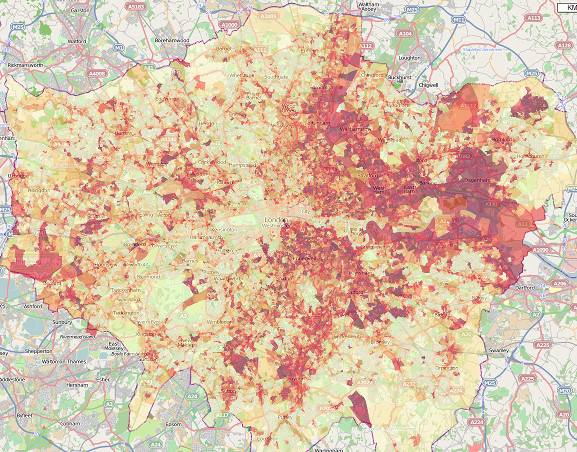
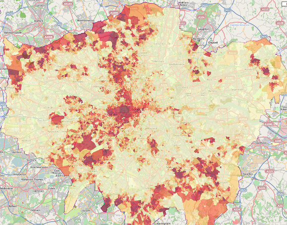
(1) Data from the London Ambulance Survey (LASS) – here comparing the numbers of ambulance callouts to assaults with knife injuries vs gun injuries for each London ward in the last 24 months to May – please note the category scales across the two maps areas are different, so cannot be compared directly. Darker, redder values are higher. Click a picture to see the interactive map and legend, and download the source data.
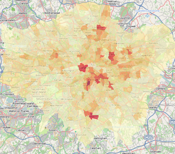
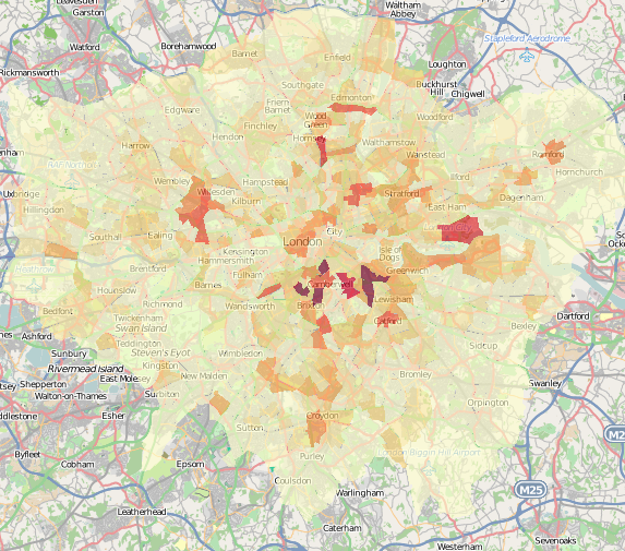
(2) The Active People Survey – an interesting difference between the boroughs for volunteering rates compared with participation rates. Darker, redder boroughs indicate higher proportions of those surveyed in that borough say they volunteer or participate in active sports.
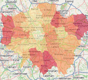
Volunteering much better in the outer London boroughs right around the centre, while participation is concentrated in the south-west.
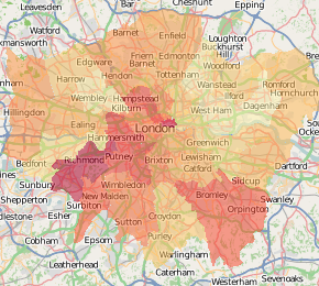
(3) Houses in council tax bands A, B and C (the lowest rates) vs those in F, G & H (the highest rates), at output area level – very detailed! Not necessarily a proxy for affluence. Again, darker, redder areas have a greater proportion of houses and other dwellings in these bands.