Categories
Geodemographics London

Reworking Booth: Geodemographics of Housing

[Update January 2013 – Scottish SIMD 2012 map added, more details.]

I’ve created a new visualisation, a dasymetric map of housing demographics which you can see here, which attempts to improve on the common thematic (a.k.a. choropleth) maps – a traditional example is shown below – where areas across the country are colour-coded according to some attribute. My visualisation clips the colour-coding to the building outlines in each area, leaving open ground, parks etc uncoloured.

The Traditional Approach

The shortcoming of choropleth maps is that each area is coloured uniformly. If the attribute being measured is a property of the houses in that area, such as much of the census data, then choropleth maps not only colour the houses in each area, but also the parks, rivers and mountains that might also be contained within the area, even though the data being displayed arguably only applies to the houses. This means that geodemographic classification results that predominate in rural areas tend to overwhelm a map at smaller scales – as can be seen in the map on the right – where the green represents a countryside geodemographic.

An alternative to choropleth maps is to use cartograms. These distort the area, elastically, to tessellating hexagonal groups or to circles (Dorling cartograms), to match typically population rather than geographic extent, so that the colours are represented more fairly, but cartograms are very difficult for most people to interpret and relate to familiar physical features. They can look very “alien”. One further alternative is dot distribution maps – these assign dots of colour, randomly within each area. This reduces the colour density correctly in sparsely populated areas, but distributes the dots evenly across empty parks and rows of houses, if both are in a single area, and imply single points of population.

Clipping the Choropleth Maps

My visualisation attempts be the best of both worlds, by retaining the familiar geographic shape of the UK and its towns and cities, but not swamping the map with colours in all areas, and indeed ensuring that unpopulated areas have no colour. This is possible because Ordnance Survey Open Data includes Vector Map District. The second release of this dataset improved the quality of building outlines considerably, allowing distinct rows of buildings on streets to be seen and even individual detached houses. Unfortunately building classifications are not included, so the process necessarily colours all buildings, rather than just the residential ones that formed part of the census data. This is why, for example, the Millennium Dome in Greenwich appears, even though no one (hopefully!) lives there.

The major shortcoming of doing this is that it falsely implies a higher level of precision within each Output Area, by often showing and colouring individual buildings, whereas the colour is representative as an average of the properties in the area concerned, rather than telling you something about that particular building itself. That is, the technique is showing no new or more detailed data than can be seen in the traditional choropleth maps, but tends to mislead the viewer otherwise. This is balanced by making the map seem more realistic, by not unformly covering everything in the area with a giant blob of a single colour.

The map can be considered to be a dasymetric map, albeit one where the spatial qualifier, population density, is one of two values – high (in a building) or zero (not in a building).

Booth’s Poverty Map

An inspiration for this kind of map is the Charles Booth Poverty Map of 1898-9, although my example is considerably less sophisticated. For this map, Booth (and his assistants) visited every house, to determine the demographic of the house, and then painstakingly coloured in the houses, along the streets. His map therefore did not suffer from the falsely implied accuracy – his map really was as accurate as it looks. The Museum of London, incidentally, has a “walk in” Booth poverty map, I featured it on Mapping London blog last year.

The photo above compares Booth’s map (from a photo of the map in the Museum exhibition, including a friend’s hand) with my map, for the Hackney area in London.

OAC, IMD and London

My main geodemographic map is showing the OAC (Output Area Classification), which was created by Dan Vickers in Sheffield in 2005, and is based on data from the 2001 census. The areas used are Output Areas, there are around 210,000 of them in the UK, each one with a population of roughly 250 people in 2001.

The OAC map is not particularly illuminating for London – the capital is considerably more ethnically diverse than most other parts of the country, but because the clustering process used to create OAC is run across the whole country uniformly, only one Supergroup appears to show such ethnically diverse areas – “7” (Multicultural), rather than showing the variety within this group that extends across the capital. With this in mind I have created an alternative map, which colours the housing according to the IMD (Index of Multiple Deprivation) rankings. This covers England only, and the data is only available at larger spatial units, called LSOAs (Lower Super Output Areas) but is more up-to-date, being from 2010, and shows considerable more variety across London. Use the link at the bottom of the visualisation to switch between the two.

You can view the map here. It uses geolocation to attempt to zoom to your local area, if you allow it to – it will probably ask you to allow this when you visit the site.

Categories
Orienteering

Athlete Stats for UK Orienteers

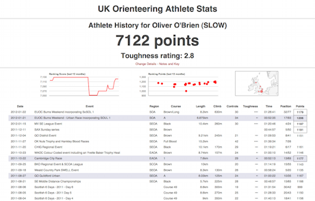
I’ve been mining the British Orienteering event results pages and have produced a websites presenting the results in a more effective way – i.e. athlete focused rather than event focused. I’m also having a go at recalculating the ranking score based on this data.

http://oobrien.com/stats/

Unfortunately there are a couple of flaws:

  • The BOF ID is not available on the source website, so I have had to construct a key based on name (which can be misspelled on results uploads from time-to-time) and club (ditto). This mainly works, except where people change club, in which case their results, run under other clubs, that contribute to their ranking score, won’t be included.
  • It turns out that, with each new result upload, all the ranking points for all events going back the whole of the last year – possibly more – are recalculated. This has the effect of old scores drifting slightly – I wasn’t expecting the points to fluctuate in such a way. The effect is mainly small – so far one of my scores has drifted by 1 point – but another person’s score has drifted by 7 points. I could mitigate this by scraping all results over the last year every night, but this would put strain on BOF’s servers and they would probably not appreciate it – it would be over 5000 page requests over the course of several hours. So, instead, I’m updating the most recent 25 events nightly and may manually resync the whole year on an ad-hoc basis. The result is that, after a while, the scores don’t match precisely with those on the source website.

The toughness scores for each event are just a bit of fun and based on the details of the course, not how well people did on it. The urban shading is also just based on the name of the event, rather than any specific metadata on the event that I am accessing. Such metadata may be available in the event details section of the source website but I am just using the results information here.

The collation of a large number of results has highlighted various data problems, such as results appearing as HH:MM rather than MM:SS, or x,xxx km instead of x.xxx km. Unfortunately one of my own (few) event result uploads suffered the first problem. This doesn’t affect the points at all, because the times within each course are only used on a relative, not absolute, basis, but it does preclude me, for example, totalling the “yearly run hours” for each athlete, without cleaning up the data on my side.

You can see the stats here – type in your name and club to see your stats. See the notes on the search page, e.g. most Level D events not included. You can also compare two people, looking at where they ran the same courses at the same event.

Categories
Orienteering

Manifesto for a New Type of Orienteering Club

I’ve had an idea for a new type of orienteering club for London. One with a slightly different focus to the current ones. My inspiration is City Runners and Centrum OK, and to a lesser extent Stragglers RC and Fetch Everyone.

  • Its aim would be member training, socialising and attending external events in a coordinated way, rather than putting on events.*
  • Its initial life would be as an community orienteering group (it is unclear whether such entities can be affiliated to the national federation) moving to full club status when membership numbers – and so finances – allowed, and certainly before it put on public events. Alternatively, and probably more likely, it could exist as a satellite of another club, such as MADO, which is/was a satellite of HOC.*
  • Membership would be very cheap – say £4 (+national/regional membership) or even free – it would be the cheapest way to be a member of an orienteering club and a national federation – especially as local-level national/regional membership is also free for the first year, making membership completely free for new people.**
  • It would potentially affiliate also to England Athletics – although as community running group rather than as a full running club.*
  • It would be an open, geographical club with core membership intended to be in, but not limited to, London Zones 1-4, or people who are otherwise very well connected to the centre of London.*
  • It would be called something like Central London or Cross River, to reflect its central London focus. Acronyms for the club name would be avoided as far as possible.*
  • It would have little kit of its own. It would probably have a small set of training flags, possibly acquired through the “Year in a Box”, bought from the national federation.
  • It would have a significant sponsor.
    PROMOTION

  • Promotion would be entirely online. It would have a small, low-key website, an announcement email list, a Facebook group and probably a Twitter account.*
  • Its primary form of promotion, announcements etc would be through the Facebook group.*
  • If funds allowed, a limited amount of advertising would be placed through Facebook and Google Adwords.
  • It would not have a paper newsletter, print flyers or indeed have any paper presence.*
    EVENTS AND TRAINING

  • It would in fact run some events, membership willing, but these would mainly be in the Street-O format (both score and point-to-point). Eventually it would put on a couple of Park Race style events in the summer time, once a small number of parks had been mapped by members of the club and members had gained the necessary qualifications.***
  • Professional mappers would not be employed. If possible, the club’s maps would be produced using FOSS.
  • As soon as its finances allowed, first-claim members would be able to attend all events put on by the club for free.
  • Its members would be actively encouraged to regularly take part in local events put on by the other London clubs and, if available, join such clubs as second-claim members.
  • It would eventually have a club kit but this would be in the form of runners’ technical tops rather than orienteering kit or runners’ race kit.*
  • It would have a club night run from a regular and central London location, probably a friendly pub. This would often take the form of a run rather than technical training.*

Inspired by:
* City Runners
** Stragglers
*** Centrum OK

Photo by timbobee.

Categories
Data Graphics London

Tube Colours

[If you are looking for my London Tube Stats interactive map, it’s now here.]

Transport for London (TfL) take their colours extremely seriously – the London Underground, in particularly, uses colour extensively to brand each line, and the maps and liveries are very well known.

The organisation has a colour guide to ensure that, when referencing the tube lines, the correct colour is used. Somewhat surprisingly, the guide includes hexadecimal (i.e. web) colours for only a “safe” palette – i.e. colours which would definitely work in very old web browsers. They don’t list the “true” hexadecimal for the colours, even though, confusingly, the colour shown is the true one. I couldn’t find anywhere on the web that did this either, all in one place, so here below is a summary. I’ve also included the safe colours so you can see the difference – but don’t use these unless you have to.

Line True Hexadecimal Web Safe Hexadecimal
Bakerloo #B36305 #996633
Central #E32017 #CC3333
Circle #FFD300 #FFCC00
District #00782A #006633
Hammersmith and City #F3A9BB #CC9999
Jubilee #A0A5A9 #868F98
Metropolitan #9B0056 #660066
Northern #000000 #000000
Piccadilly #003688 #000099
Victoria #0098D4 #0099CC
Waterloo and City #95CDBA #66CCCC
DLR #00A4A7 #009999
Overground #EE7C0E #FF6600
Tramlink #84B817 #66CC00
Cable Car #E21836
Crossrail #7156A5

All the colours above can be found on my new Electric Tube print.

Categories
Data Graphics

Mappiness – A Personal Mood Map

The Mappiness project is run by one of CASA’s technology superstars Dr George MacKerron – it was his Ph.D project at LSE. The project, which is still going, aims to quantify happiness based on environmental factors, such as location, views and sound, as well as who people are with and what they are doing. Data is collected by volunteers downloading an iPhone app, which then pings them at random moments twice a day between 8am and 11pm (configurable) to ask them the questions and collect the data. Volunteer incentive is driven by having access to a personal webpage which contains all their collected data, visualised in a wealth of attractive graphs and maps.

I’ve been using the app since late October, it has been steadily pinging me twice a day since then, and most of the time I hear the familiar ‘ding ding’ and get around to recording the information. With around 160 responses, some interesting insights are now appearing, some(!) of which are non-personal enough to share here. The map above shows the locations where I was pinged, for the London area – yellow stars indicate where a photo was taken.

Here’s one, based on the general environment:

Perhaps more interesting is that I spend much less time outdoors than I thought. The app (by default) only asks for a picture if you are outdoors, so by counting the number of pictures that appear on my personal webpage – just 14 out of 161 – this in theory means that I spend only 8-9% of my waking life outside. This percentage will hopefully grow as summer approaches and things start to warm up again.

Because I don’t get to choose when to post the images, the photos are a good snapshot of my “everyday” outdoor view, rather than a nice or interesting place that I would specifically stop to photograph. Here’s a couple of my most recent ones:

One of Dr MacKerron’s current projects involves using Microsoft Kinect sensors for visualisation – this is my very tenuous link to allow me to post the image below, which is a 3D grid “photograph” of me at my desk, constructed from Kinect data.

Mappiness managed to choose to ping me this morning precisely at the moment that my bike chain snapped, on the way to work. Needless to say, a low score for happiness was recorded.

Map background Copyright Google.

Categories
Orienteering

The State of British Orienteering, in Wordles

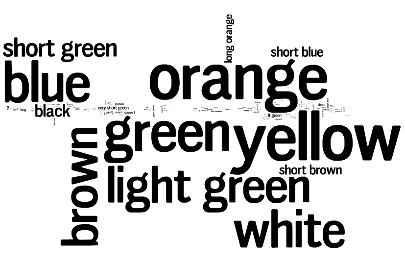
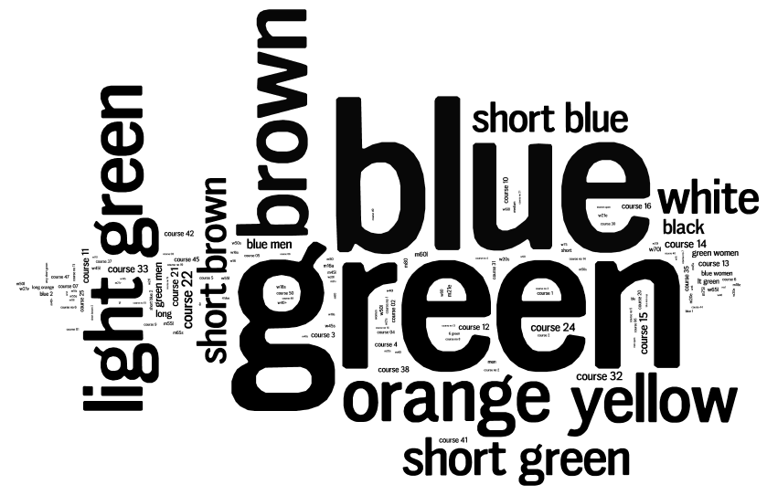
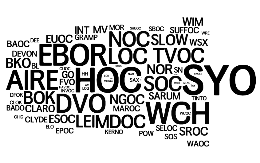
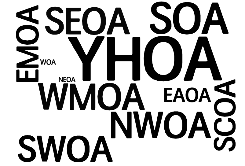
Here’s some Wordles that I’ve created with the runs and events data available on the British Orienteering website, based on 166,000 runs on 5000 courses across 600 events between January 2010 and now.

1. Courses put on by clubs:

vs Actual runs done, by course:

…which shows that we put on a lot of Orange and Yellow courses, but really everyone wants to run Green or Blue.

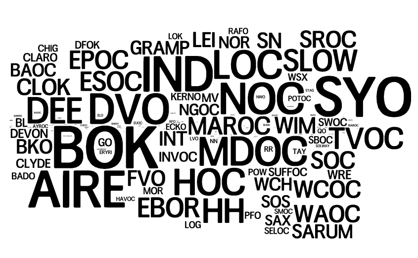
2. Actual runs done, by club of the runner:

vs Actual runs done, by organising club:

…which shows that some clubs are mainly about organising events (e.g. HOC), some are mainly about running in events (e.g. BOK), but most are about both.

3. Finally – which regions see the most number of runs?

S(OA) = Scotland, W = Wales. The rest are English regions: NE/NW/SE/SW, EA (East Anglia), SC = (South Central), YH (Yorkshire/Humberside), EM/WM (E/W Midlands). While large events that rotate around the regions on a multi-year timetable will distort this, some very large events (e.g. the Scottish 6 Days) don’t appear on British Orienteering’s system as having a region associated with them, so will not appear in the above Wordle.

Categories
Bike Share Data Graphics

Bike Share Route Fluxes

Capital Bikeshare, the bike sharing system for Washington DC and Arlington, recently released the data on their first 1.3 million journeys. Boston’s Hubway bike sharing system also released journey data for around 5000 journeys across an October weekend, as part of a visualisation competition. Both these data releases sit alongside London’s Barclays Cycle Hire scheme, which also released data on around 3.2 million journeys made during the first part of last year.

Taking together all these data sets, I’ve used Routino and OpenStreetMap data to suggest likely routes taken for each recorded journey. This same set of data was used for Martin Zaltz Austwick’s excellent animation of bikes going around London streets. I’ve then built another set of data, an node/edge list, showing how many bike sharing bikes have probably travelled along each section of road. Finally, I’ve used node/edge visualiser Gephi and its Geo Layout plugin to visualise the sets of edges. The resulting maps here are presented below without embellishment, contextual information, scale or legend (for which I apologise – unfortunately this isn’t my current primary work focus so my time on it is restricted.)

For the two American schemes featured here, I have set the Routino profiler to not use trunk roads. Unlike most UK trunk roads, American trunk roads (“freeways”?) appear to be almost as big as our motorways, and I expect you wouldn’t find bikes on them. Unfortunately there are some gaps in the Washington DC data, which does show some cycle-lane bridges alongside such freeways, but these aren’t always connected to roads at either end or to other parts of the cycle network, so my router doesn’t discover them. This means that only a few crossings between Virginia and Washington DC are shown, whereas actually more direct ones are likely to be also in use. The profile also over-rewards cycleways – yes these are popular but probably not quite as popular as the distinctive one in the centre of Washington DC (15th Street North West) showing up as a very fat red line, suggests. The highlighting of other errors in the comments on this post is welcomed, I may optimise the profiler (or even edit OpenStreetMap a bit, if appropriate) and have another shot.

London:

Washington DC:

Boston:

Categories
Mashups OpenStreetMap

Run Every Street in Edinburgh – in Strict Alphabetical Order

…it sounds like one heck of a lot of running. But Murray Strain, one of Scotland’s top terrain runners, is counting on it for his basic training. He’s logging the whole venture, which is based on his trusty Edinburgh A-Z. If two adjacent streets with very similar names are nonetheless separated in the A-Z index by one on the far side of the city, it means a couple of legs right across the city.

Since he started the exercise last year Murray’s got through all the As, and is currently midway through the Bs. I’ve produce a couple of GEMMA maps, one showing the A-Bs (above, As are red and Bs are orange) and one showing the A-Gs (below, in rainbow order). That’s a lot of streets. N.B. The maps in fact show all linear features in the area in OpenStreetMap, so the odd named cycleway and waterway has crept in there too. But the ~95% of the coloured lines will be the streets that Murray will be run.

In order to produce the map, I’ve added a new feature to GEMMA – it now allows you specify only one desired geometry type, i.e. points, lines OR polygons, when adding an OpenStreetMap layer to your map. Previously, you got all three types, although you could reduce each to a dot if desired. This example also highlights the need for legends on the PDF maps that GEMMA produces – a larger coding change, so one that would make it into a future version 2 of GEMMA.

Categories
Notes

MOO Facebook Cards

My 50 new MOO Facebook cards arrived today – I ordered them on Thursday last week, taking advantage of the first 200,000 sets ordered being free. The cards are auto-created from my Facebook profile, the builder then allows you to further customise them. Note you need to have a new-style Timeline profile on Facebook to work – not everyone has been offered the option to upgrade to this yet.

I’m particularly impressed with the quality of the paper the cards are printed on – a nice, smooth feel – and the neat Facebook-branded presentation holder they come in. The photos look surprisingly low-res and rather blurry, particularly the small profile photo. It doesn’t bug me too much though – they are nicer than my official business cards, and were completely free!

Categories
Bike Share Data Graphics

A Glimpse of Bike Share Geographies Around the World

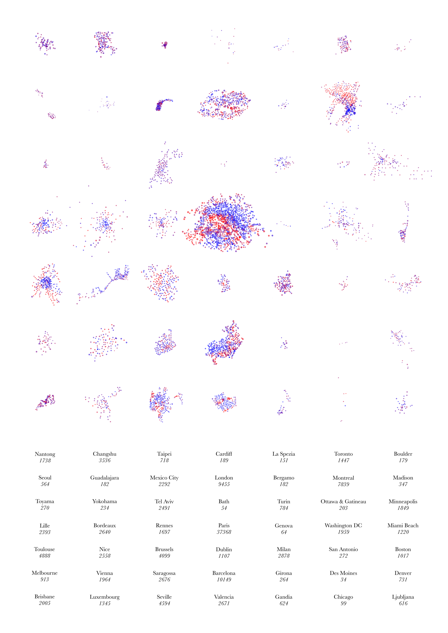
[Update – now including a much larger version.] Below is the image I submitted to this year’s UCL Research Images as Art exhibition. You can see it, and around 300 other entries, in the South Cloisters on the UCL campus in central London, for the next few days. A larger version can be viewed here. The image purposely has no explanatory text as it is intended as a piece of “infogeographic art” rather than as a map. It is derived from the dots for the various cities on my bike share map.

It shows the “footprint” of the docking stations making up 49 bike share systems around the world. The colours represent the empty/full state of each docking station at the particular moment in time when the image was made. The numbers show the total number of docking points – each docking station being made up of one or more docking points, each of which may or may not have a bike currently parked in it.

The geographies and topographies of the cities themselves inform the shape of the systems – particularly coastal cities (e.g. Nice, Rio, Barcelona, Miami Beach) and ones with large lakes mountains near their centres (e.g. Montreal).

A subtle but important point on the scaling: The scales of the systems (i.e. each system footprint and the spacing between docking stations) are roughly comparable – they actually vary by the cosine of the latitude – these means that the more tropical systems, e.g. Mexico City’s, appear to be up to ~20% smaller than they actually are, relative to the majority which are generally at temperate latitudes. However, the sizes of the circles themselves are directly comparable across all the systems, i.e each pixel on the graphic represents an equal number of docking points, regardless of which system it is in.