There was a time when Google Maps was an ugly ducking. It started life as a road map, and its grey background was decryed at a memorable keynote at the British Cartographic Society annual conference 8 years, contrasting with the classic Ordnance Survey Landranger maps where the spaces between roads were normally full of “something” – be it contours, trees or antiquities. Google’s features, on the other hand, were pretty messy, and often wrong. However, Google has been steadily beautifying its functional map (and correcting it), focusing on the cartography as well as the data, as it turns from a map of roads and POI pins, to a map of everything. 2013 was a big step forward, when the map became vector-based and superimposed features customised to just you. Now in 2016, it’s the look of the map itself that is the focus. Cartography on digital maps is far from dead.
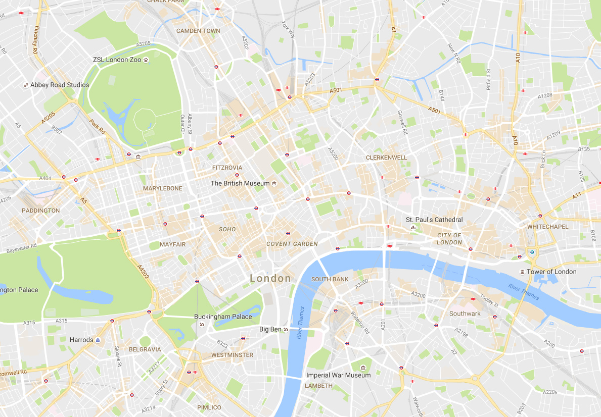
This week, Google has unveiled a the latest update to Google Maps, showing that it is serious about the cartography and colour. The map has a cleaner, more refined look that continues its trend of taking out the detail you don’t need and focusing on the information that you are looking for. The two most obvious changes are (a) a new, brown/orange shading showing “areas of interest” – think high streets and tourist attractions, and (b) smaller roads have had their borders removed and are now simple white lines overlaid on a grey, green or brown background. I have been keen on this technique, using it for OOMap, DataShine and CDRC Maps. MapBox’s basic-style map of OpenStreetMap data also has taken this “white on grey, + data” approach which I am sure has helped inspire Google’s new look. (OpenStreetMap.org has always taken a different approach, with the many contributors wanting their particular mapping visible, it has always looked very busy and colourful. Unlike MapBox and Google Maps, OpenStreetMap.org’s map is to be seen “as is”, rather than acting as a background map upon which colourful project-specific data is intended to be overlaid.)
An accompanying blog post goes into more details about the changes. It includes a nice graphic demonstrating the new colour palette used and how Google are using colour to group and categorise map features, which I’ve reproduced here:
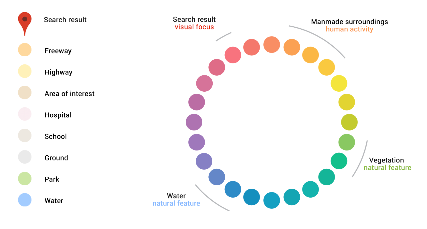
There is a clear use of complementary colours to balance out the map – the search results and current user interest shown in red, man-made features in pinks and oranges, and natural features in greens and blues, all criss-crossed with the white (and yellow) transport networks. It makes for a map that is logical to look at – and crucially, one that is immediately pleasing to the eye. It doesn’t “shout” at you any more.
One final note – the “Areas of Interest” is a powerful new bit of cartography – it draws the eye to it, and means Google Maps has a significant influence on what parts of an unfamiliar city you are likely to visit. It’s a subtle but key bit of “suggestive” mapping. Bad news for the businesses though that rely on passing trade, and are not in these areas.
One reply on “Putting Cartography Back on the Map – Google Maps Getting Prettier”
Can’t see the bloody roads because white roads on a very very light grey background does not work, might as well just carry round a blank piece of fucking paper and lookat it for directions.
FUCK MY LIFE.