Trust for London (TFL), a charity and themselves a major funder of charitable projects in London to address poverty and inequality, has this week launched the London Poverty Profile (LPP) 2020. There is an updated data-driven website with over 100 different indicators of poverty and inequality, compiled by WPI Economics, along with a PDF report snapshotting the indicators as at early 2020.
With the ongoing Covid-19 pandemic and resulting lockdown likely to cause a significant impact on London’s social economics and community wellbeing throughout this year and going forward, the LPP 2020, which was compiled with pre-Covid-19 data, acts as an important baseline, looking at London’s poverty and inequality profile towards the beginning of the year.
As one of the world’s most international and wealthy cities, it is easy to overlook that London also has areas of extreme poverty and deprivation. The luxury apartments of Knightsbridge and Chelsea are often in the headlines but less obvious are the endemic poverty that has persisted in areas such as much of Newham borough in east London, parts of Tower Hamlets close to the glittering lights of Canary Wharf, or even North Kensington in the west. The recent political focus may have been on “rebalancing the North” (of England) away from London as a whole, but treating London as a single unit of the wealthy South is over-simplistic. The London Poverty Profile acts to ensure that all of London is understood and its challenges, when considered at detail, are not overlooked.
The Consumer Data Research Centre (CDRC)’s London hub has been involved with the LPP 2020 and will continue to work with Trust for London going forward. Our role has been two-fold. First of all, I was seconded to Trust for London periodically over the last year to overhaul the mapping system that appears on the LPP webpages. Previously using a heavily simplified representation of London boroughs, it has now been rewritten to use OpenLayers 6 (in Javascript ES6 form) which is integrated with the Content Management System used to publish the data and indicators by WPI and TFL. Secondly, CDRC will be contributing and mapping “experimental” datasets, from time to time. These will utilise CDRC’s own datasets and its ability to cross-tabulate datasets from other source, open and non-open, to provide further innovative insight into spatial aspects of poverty and inequality across the capital’s 9 million population.
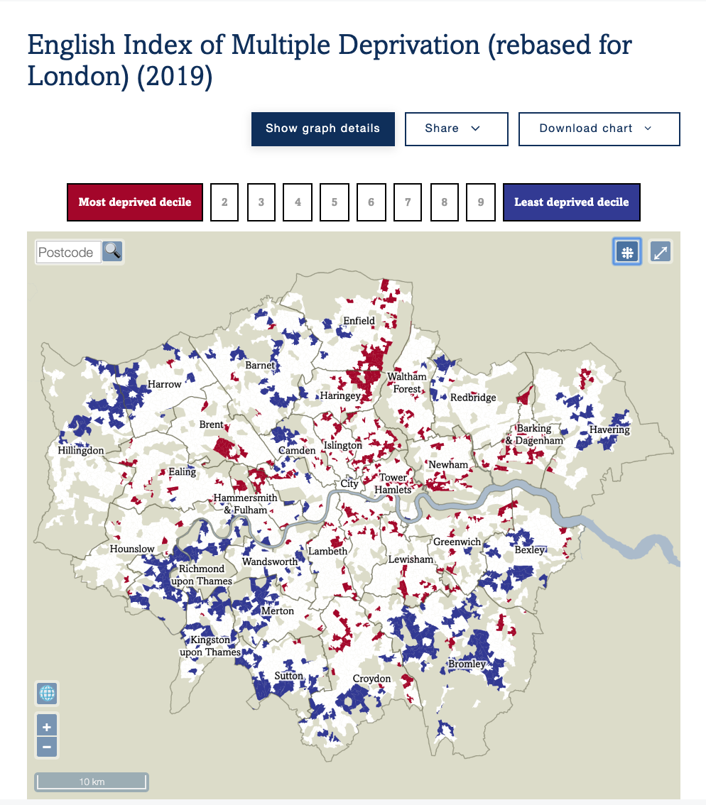
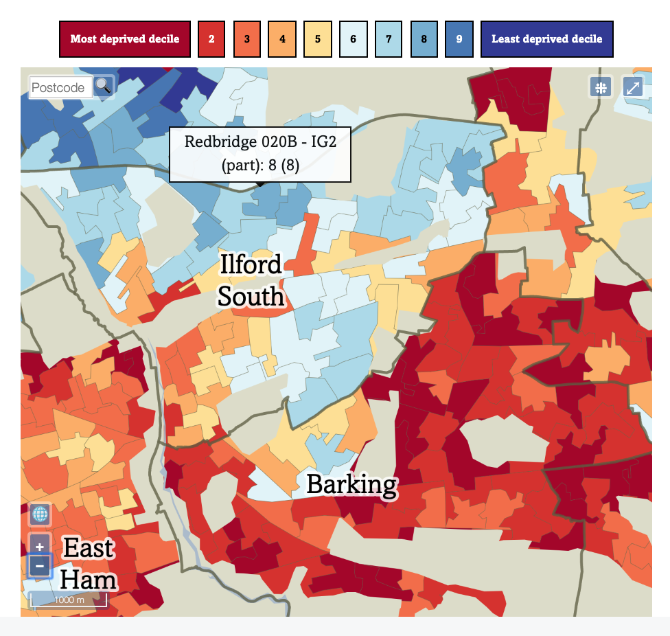
Geographies that can now be used extend beyond the London boroughs, to include LSOAs, MSOAs and (shortly) Wards. This allows more detailed maps. Poverty does not stop at London borough boundaries (although there are a number of cases where there is a big change, for example Redbridge to Waltham Forest), and some boroughs, such as Haringey, are well known for having a considerable east-west split, with a major railway line acting as a physical and socioeconomic split between wealthy Highgate and Muswell Hill to the west, and poorer Wood Green and Tottenham to the east.
Sometimes, other political boundaries do show a step-change in deprivation, as seen here between Ilford South and Barking constituencies (which is also a Redbridge/Barking & Dagenham borough boundary):
In addition, the maps use a selection of ColorBrewer colour ramps to ensure that spatial trends in the datasets are easily seen. ColorBrewer is widely used in the digital cartography field to ensure visually fair and effective use of colour in showing quantitative data.
All maps include a postcode search widget, and ones showing data at a final resolution than London boroughs include a toggle between borough outlines and Westminster political constituencies. Maps are zoomable and pannable, and PDFs and images can be quickly produced.
For launch, the new maps on London Poverty Profile include:
- The English Index of Multiple Deprivation (IMD) 2019, rebased for just London, so, for example, the bottom decile represents 10% of London’s (rather than England’s) population.
- The employment-related deprivation domain from the English IMD 2019. This also appears in the PDF report.
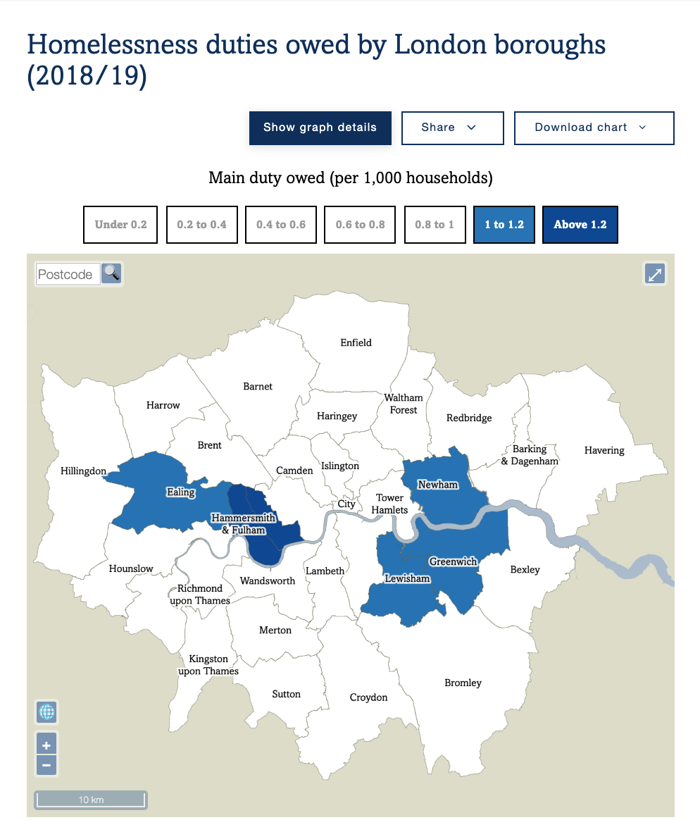
- Homelessness duties owed by boroughs (a measure of the rate of homelessness). This also appears in the PDF report. The map is viewable by toggling the “Switch chart type” button.
- An Office of National Statistics (ONS) model of poverty levels across London, from 2014, shown by MSOA.
- The London sub-region borough groupings (as defined by the GLA London Plan) that are used for some other statistics in the LPP.
In addition, a number of existing maps on the LPP have been brought over to the new system, and other datasets, typically those split by borough and with some slight of spatial autocorrelation, will also gain maps in due course.
We hope to introduce additional experimental datasets, and corresponding maps, to the London Poverty Profile, on an approximately monthly basis this summer. Possible examples, based on current maps on CDRC Maps, include mapping on access to broadband, rate of household composition turnover, and consumer vulnerability to marketing practises.
Understanding the spatial characteristics of London’s poverty, inequality and other social challenges, is vital, and our hope is that these maps will help inform and better navigate the data available.