Categories
Bike Share London

London Bikeshare Expanding East and West

The Barclays Cycle Hire bikesharing system (map) in London is due for a major expansion on 8 March. Overnight on the 7th, operators will be working flat out to add 2300 1700 1900 new bikes into 4800 3000 3400 new stands, clustered in the 200 150 new docking stations that have been tested over the last few weeks, across the East End of London (Tower Hamlets, Shoreditch/Hackney Road and Canary Wharf). Also going live the same day will be a much smaller expansion west to the area round the Westfield shopping centre in Shepherd’s Bush in West London. Another small expansion around Camden Town has just been completed, adding several new stands to the northern tip of the system, including handily around Camden Town tube station and Camden Road train station, allowing commuters from the north and the Overground network (like me!) to avoid the expensive Zone 1 fares and Boris Bike the last few kilometres to work.

The expansion will move London up the league table of bike share cities from 7th to 5th – in a top 20 dominated by China. It will remain the second largest system outside of China, after Paris, although New York’s planned system will be even larger:

The Biggest Bike Sharing Cities (March 2012)

City Country Bikes
Mar 2012
Bikes
Nov 2011
(If Different)
1 Wuhan China 70000 Now believed closed
Bejing (planned) China 50000
2 Hangzhou China 60600 24000
3 Paris France 18000
New York (planned) United States 10000
4 Taizhou China 10000
5 London (8 March+) Great Britain 7200 5000
6 Yantai China 6000
7 Shanghai China 5700
Chicago (planned) United States 5000
8 Guangzhou China 5000
9 Barcelona Spain 4700 4400
10 Kaohsiung China 4500
11 Montreal Canada 4220*
12 Foshan China 4000
13 Lyon France 3400 3060
14 Zhangjiagang China 3200
15 Munich Germany 3000
16 Wuham/Qinshan China 3000
17 Toulouse France 2500
18 Brussels Belgium 2180 2060
19 Seville Spain 1950
20 Changshu China 1700 1440

* Currently closed for winter.

Data sources: Scheme operator websites (through my live map), http://publicbike.net/, http://citybik.es/, http://bike-sharing.blogspot.com/, press releases/newspaper articles on new schemes, Wikipedia articles. If you are aware of any mistakes, please let me know and I will correct. Photo: CC-By-NC IanVisits.

Categories
OpenStreetMap

Extracting Feature Geometries from OpenStreetMap

minnea_summary

I’ve recently been extracting some river geometries for major cities around the world. The data needs to be a list of latitude/longitude coordinates, representing the nodes on the shape for the river concerned.

I’m sure there’s easier ways to do this, but here’s my technique, shown here for Minneapolis. Click the images for larger version.

1. Extract the data from OpenStreetMap. Use the Export function, and draw out the area concerned with a bounding box. Choose OpenStreetMap XML as the format. I originally tried SVG, but this presents you with screen coordinates instead of latitude/longitude pairs.

2. Open the resulting file in Quantum GIS (QGIS). I used QGIS 1.9. You need the OpenStreetMap plugin installed, this will allow the OSM file that was created in Step 1 to be read straight in (in fact you could download the file directly from the OSM servers, if you wanted to).

3. Select the feature you are interested in. My river (actually a waterbank polygon) is a “hairy feature” as it extends well beyond the extent of the data that was downloaded. Make sure you are selecting it (feature turns yellow) rather than highlighting it for feature information (feature turns red). Otherwise, the subsequent file is, rather unhelpfully, blank.

4. Do Layer > Save Selection as Vector File. Choose “KML” as the format. You probably don’t need to change the coordinate reference system (CRS) as the data will already be in WGS 84, and this (“normal GPS-style latitude/longitude) is the CRS you want.

5. Edit the resulting file, removing the XML tags, and header/footer, and replace spaces with return characters, to leave a long list of latitude/longitudes, ready for importing into your visualisation code.

Categories
OpenStreetMap Orienteering

OpenOrienteeringMap – Thoughts on a Version 2

I’m hoping to do some significant work on OpenOrienteeringMap (more information) in the near future.

Below is a summary of the major features that I am hoping to include, and you are invited to leave your feature requests as comments here too. (I may eventually get around to formalising this in a code repository.)

High Priority

  • [1] Editing of control locations, numbers and number positions for existing maps, via the web interface.
  • [1] Saving of existing maps, via a short URL.
  • Applying out of bounds points (e.g. gates), lines (e.g. major roads) and areas (e.g. closed parks) to the maps.
  • [1] Addition of a new style – Street-O Enhanced, which builds on the Street-O style but adds parks, open areas and other useful features.
  • Addition of a new style – Urban Adventure, which includes street names for the larger roads.
  • [1] Automatic creation of the clue-sheet.
  • [1] Assignment of points values to the controls. This will help with the clue-sheet creation and potential future route-analysis applications.
  • Optional colouring of control circles based on points values.
  • Better match of the look of the web preview and the final PDF.
  • A basic how-to guide.
  • Inclusion of a OpenStreetMap editing 101 guide.
  • Output of a high-resolution raster (e.g. JPG) of completed maps and “blank” maps, for embellishment in Purple Pen etc.
  • [2] Automatic daily refresh of the data from OpenStreetMap.

Medium Priority

  • [2] Increase contour widths and/or darken colours.
  • More configuration options, e.g. railways on/off, contours on/off.
  • Import/export of courses, probably via text config file.
  • Allow separate start and end points.
  • Creation and setup of an alternative tile rendering source.
  • [2] Use source code management for the website and the stylesheets.
  • [2] Better usage tracking and statistics.

Low Priority

  • Use OS Open Data Vector Map District as alternative data source – misses out paths/parks, but complete coverage for roads.
  • [1] Apply OpenOrienteeringMap logo and branding.
  • Create point-to-point courses, with straight lines between each line.
  • Use SVGs rather than raster graphics for points and complex lines.
Categories
Data Graphics OpenLayers

Rank Clocks and Maps: Spatiotemporal Visualisation of Ordered Datasets

Rank Clocks are a type of visualisation invented by Prof Michael Batty here at UCL CASA. They are time-based line charts, wrapped around a clockface – with the start date at the top, wrapping around clockwise to the end date. The lines on the clock show the change in ranking of the items being visualised. By effectively wrapping a line chart around itself, certain patterns, that would be otherwise hard to spot, become clearer.

Starting from Prof Batty’s Rank Clocks application (written in VB), I created a web version that has a subset of the application’s features, but also includes a map, allowing both temporal rank changes, and location, to be shown. A future enhancement would also be to show the change in location with time as well (an example would be how football clubs have moved around in London over the years and how their relative rank in the leagues has also varied) but for now each item in the dataset has just a single point location that remains constant with time.

Live Rank Clock site here.

The “classic” Rank Clock is of New York skyscrapers – looking at the clock allows bursts of skyscraper development to be easily spotted, and as New Yorkers have been building skyscrapers for over a hundred years, and have many of them, it is a rich dataset. I have curated a London equivalent from various sources including Wikipedia. It includes the many residential towerblocks of the 1960s/1970s, many now knocked down, but is not quite the same as New York’s.

The website is written in Javascript, using OpenLayers both for the map (with OpenStreetMap background) and for the rank clock itself. For the rank clock, I am doing some basic trigonmetry to calculate the coordinates needed to show the lines and converting from polar coordinates to “native” screen coordinates. This is a novel but not particularly efficient use of OpenLayers, but I used it as I am quite familiar with using OpenLayers, particularly for showing lines as vectors, rather than using a Javascript vector-based charting API which would be the more obvious choice.

My interpretation of the Rank Clock concept has plenty of flaws – in particular, data can often be easily obscured, and spotting patterns in noisy (frequently changing rank) data is difficult. It’s difficult even to select lines (to see their caption) if other lines are nearby and overlaying them. Nonetheless, it can provide an unusual way of looking at some interesting datasets.

For one of the datasets in the sample website (US baby names) I have repurposed the map to effectively show a 2D graph indicating beginning and ending (in time) positions of the names – so here OpenLayers is being used to show two “maps” – but neither are actually maps.

I’ve also linked into the Google Earth browser plugin (installation maybe be required), replacing each dot on the OpenStreetMap map, with a column of varying height (and colour) based on the initial rank, with an extent appropriate to the data set. Google Earth can be refreshed by supplying new KML information – and it turns out that OpenLayers has a rather nice KML conversion and export feature for any geometry in it, which allows Google Earth to be driven in this way. This is done when clicking on a Rank Clock line, allowing the equivalent feature in Google Earth to be redrawn with a thicker border. Unfortuantely events cannot be captured from Google Earth and back into the OpenLayers map, so clicking on a pillar in the former will not highlight the corresponding Rank Clock line in the latter. Still, it’s a nice way of linking spatialtemporal information and then visualising it in 3D.

I carried this work out quite a while ago, but haven’t mentioned it to now, as it’s not complete. There are only a limited number of datasets available, and plenty more features could be added – and the navigation and interaction improved significantly. Please bear this in mind when viewing the live site.

There are a few “toy” features already though – you can invert the rank clock (normally the top-ranked items are in the middle of the circle and so are hard to see), change the metric the colour is showing, and filter and relayer.

The three rank clocks shown here are showing: TOP – Changes in population of the London Boroughs of Newham and Tower Hamlets, and the City of London, over 150 years. The City of London line spirals outwards, showing its drop in population (and so rank). Tower Hamlets also shows a big drop in rank during WWII, but has started to increase again recently. Westminster’s population rank has steadily increased, until WWII – but again its rank has also more recently increased. MIDDLE – Tall buildings in London, coloured by year they were built. The oldest (red) buildings have been selected and show in Google Earth, showing that such buildings were entirely in the centre and west of London. BOTTOM – US company revenue. The San-Francisco-headquartered companies are selected on the map and correspondingly highlighted on the rank clock, showing that only one was founded before the 1970s – IBM – and a general spiralling inwards as Silicon Valley grows.

Live Rank Clock site here.

Categories
Orienteering

City of London Race 2012

Yes, the fifth running of the City of London Race, the world’s second biggest standalone urban orienteering race, will be happening, & as for previous years, I will be occasionally be blogging about it, as the mapping progresses.

Here’s the new bit I am planning on mapping this year (in red), along with what is already mapped (in green). The mapped area now far exceeds what will fit on the A3+ paper, so the red section actually represents around a third of the what will appear on the 2012 map. Another important caveat is that access agreements are still being negotiated, so it is not a 100% certainty that this is what this year’s map will look like.

The areas:

  1. Hatton Garden. London’s jewellery and diamond quarter, with an interesting set of side-alleys.
  2. Gray’s Inn and surrounding area – the former subject to access.
  3. Great Ormond Street – the area around the famous children’s hospital.
  4. Mount Pleasant – the area around the huge Royal Mail facility.
  5. Lincoln’s Inn – subject to access.
  6. Corram’s Fields. A backup area, in case we have to move our race HQ to around here – this is not our Plan A though, and we are keeping our preferred race HQ venue under wraps for now – it is cool though! Junior courses would then be in this park, which is particularly apt as adults are only allowed into the park when accompanied by a child!

Map from Cloudmade, contains OpenStreetMap data.

Categories
Olympic Park

Olympic Velodrome Test Event

I was at the Velodrome in the Olympic Park yesterday, for the opening evening of the UCI Track World Cup London stage, which was also a London Prepares test event for the forthcoming Olympics. As such, it was the first opportunity to get into the Velodrome to watch an competitive event. The only races taking part were the Team Pursuit qualifications, but it was still exciting to see 33 teams go around the track (one at a time) at impressive speeds.

Tickets were not easy to get – I got through as a local resident, and even then had to apply on the dot as registrations opened, and the ticket site slowed down. So it was a little galling to see some seats (5-10%) remain empty all evening. As many of these were “prime” seats adjacent to the finish, I wonder if these were free seats give to sponsors, who then decided that the preliminary arounds weren’t that exciting to watch.

The logistics were also a little awkward – requiring a longish bus ride from right the other end of the park. With nearly 6,000 spectators to bus, there were inevitably long queues both to get to the velodrome, and (longer) coming back. Obviously for the Olympics itself, people will be walking around the park, rather than being bussed around it.

There were some technical issues on the night – the start gate failed to release one of the riders, at one point, and the overall time system got confused for a couple of teams and arbitrarily added over a minute to the affected team’s time, as they crossed the finish line. This was particularly odd as the erroneous time had not yet elapsed, so where this extra time came from I do not know. Of course, the whole point of test events like this is to test the equipment, in a competition environment, so that come August, the bugs will have been ironed out. One non-technical “incident” was that the Spanish men – who incidentally had the most striking tops of the night – managed to get themselves disqualified, for altering a bike into an illegal configuration after it had been measured. Oops!

But enough of the negatives, it is a super venue. We entered through the door where the roof shrinks right down so it is barely 10 foot above you – and then suddenly you are in a huge, brightly lit arena, with terraces of seats disappearing into the “Pringle” shape and masses of cyclists and bikes in the race team area within the track. Certainly the entrance had more of an impact than the previous test event I went to at the Copper Box (aka the Handball Arena). The seats are more comfortable too.

The best aspect of the night though was the two times that Team GB took to the track (the Women, and later the Men). Deafening clapping and cheering from start to finish of their cycle. If they can sort the other problems, the Olympic experience here is going to be amazing.

Categories
Olympic Park

February Circuit of the Olympic Park

I went for a cycle around the perimeter of the Olympic Park on Saturday. The route is around 11km, and although it’s outside the park itself, there’s still plenty to see – particularly as the Greenway (also to be known soon as Victoria Walk) crosses through the site, and the Stratford City retail complex protrudes someway into it. I’ve already done the circuit twice in 2011 and also been on two bus tours inside the park, in 2010 and 2011. You can see my complete collection of Olympic Park photos on Flickr.

My route was along the Greenway, then along Stratford High Street, around Stratford City, then through Leyton and along Ruckholt Road to Hackney Marshes, finishing by returning down the canal to Hackney Wick, Fish Island and Old Ford. The last first and last sections are the most scenic – mainly because they don’t involve cycling along roads, so the natural state of the park and surrounding area is more evident.

The main changes were the appearance of a tunnel across the Greenway, linking the warm-up tracks to the stadium, lighting towers on the former, and much wider Greenway (with the security fencing moved back) and the complete, and surprisingly ugly, Olympic Village – maybe I just got it in a bad light. Crossrail also makes an appearance – the Pudding Mill Lane tunnel portal work has started. The blue Olympic hoarding in the area has been replaced by a slightly darker blue, with the Crossrail logo on it. With ongoing Olympic works on the other side, the narrow passageway looks like it will be there for a while yet.

There was also a lot more security fencing than I remember before in the north and east of the zone, with 16-foot high fencing, topped with a 4-foot electric fence, CCTV cameras and microwave detectors, protecting empty coach parks and concrete podiums away from the main park. I can understand it for the central area but it seemed a bit over the top for these areas which are generally unconnected to the main park.

Most excitingly was the appearance of two new slender footbridges, both of identical design, spanning the canal. These will “open up” the park in legacy mode (i.e. from late 2013 onwards) to the residents of Hackney Wick. One links to the Copper Box (formerly known as the Handball Arena) and the other is beside the Omega Works housing development and links to the area north of the main stadium. I’ve added both bridges on to OpenStreetMap, where they are currently showing as dotted pink blobs, i.e. under construction.

My favourite find was this furry graffiti monster, below, on a warehouse in Hackney Wick, overlooking the canal and sticking its tongue out at the Olympic Park. I think it’s been there for a while (and has been since “adorned” with other graffiti) but I hadn’t spotted it before now.

You can see all the photos in my Flickr album.

Categories
Orienteering

Open Orienteering Mapper

Thomas Schöps is developing a suite of open-source tools, Open Orienteering, including an application for creating orienteering maps called Open Orienteering Mapper (not to be confused with my own OpenOrienteeringMap. He is updating his blog regularly with development process, and today announced an alpha release of Mapper. The application runs on both Windows and Linux and shortly, following an imminent patch, Macs. The impact of a completely free, cross-platform application for creating “proper” orienteering maps, should not be underestimated. Having used both OCAD (PC only, expensive) and Illustrator/MapStudio (expensive) to create/edit maps in the past, and having failed to get Inkscape/MapStudio to work, I am quite excited about this. At the moment, ISOM maps can be created, but there are plans to include ISSOM (sprint standard) symbols sets soon. I am looking forward to creating my first OO Mapper map!

A not of caution – if you want try the software, be aware that is in an early (alpha) state and that you will need to have development tools installed in order to retrieve it (through git) and build and run it – the application is not ready yet for non-developers!

Mapper, along with the other applications in the Open Orienteering toolset, is being managed through Sourceforge and there is a bug tracker which already contains lots of ideas for further expanding the application.

Categories
Geodemographics London

Reworking Booth: Geodemographics of Housing

[Update January 2013 – Scottish SIMD 2012 map added, more details.]

I’ve created a new visualisation, a dasymetric map of housing demographics which you can see here, which attempts to improve on the common thematic (a.k.a. choropleth) maps – a traditional example is shown below – where areas across the country are colour-coded according to some attribute. My visualisation clips the colour-coding to the building outlines in each area, leaving open ground, parks etc uncoloured.

The Traditional Approach

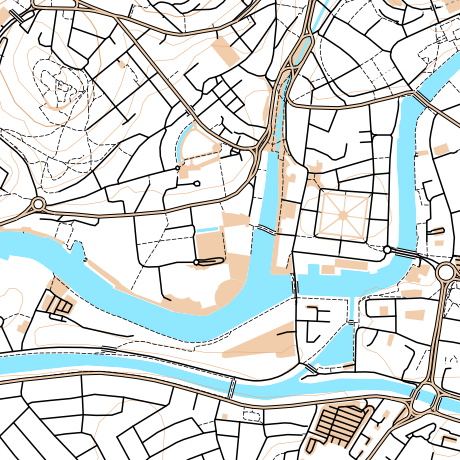
The shortcoming of choropleth maps is that each area is coloured uniformly. If the attribute being measured is a property of the houses in that area, such as much of the census data, then choropleth maps not only colour the houses in each area, but also the parks, rivers and mountains that might also be contained within the area, even though the data being displayed arguably only applies to the houses. This means that geodemographic classification results that predominate in rural areas tend to overwhelm a map at smaller scales – as can be seen in the map on the right – where the green represents a countryside geodemographic.

An alternative to choropleth maps is to use cartograms. These distort the area, elastically, to tessellating hexagonal groups or to circles (Dorling cartograms), to match typically population rather than geographic extent, so that the colours are represented more fairly, but cartograms are very difficult for most people to interpret and relate to familiar physical features. They can look very “alien”. One further alternative is dot distribution maps – these assign dots of colour, randomly within each area. This reduces the colour density correctly in sparsely populated areas, but distributes the dots evenly across empty parks and rows of houses, if both are in a single area, and imply single points of population.

Clipping the Choropleth Maps

My visualisation attempts be the best of both worlds, by retaining the familiar geographic shape of the UK and its towns and cities, but not swamping the map with colours in all areas, and indeed ensuring that unpopulated areas have no colour. This is possible because Ordnance Survey Open Data includes Vector Map District. The second release of this dataset improved the quality of building outlines considerably, allowing distinct rows of buildings on streets to be seen and even individual detached houses. Unfortunately building classifications are not included, so the process necessarily colours all buildings, rather than just the residential ones that formed part of the census data. This is why, for example, the Millennium Dome in Greenwich appears, even though no one (hopefully!) lives there.

The major shortcoming of doing this is that it falsely implies a higher level of precision within each Output Area, by often showing and colouring individual buildings, whereas the colour is representative as an average of the properties in the area concerned, rather than telling you something about that particular building itself. That is, the technique is showing no new or more detailed data than can be seen in the traditional choropleth maps, but tends to mislead the viewer otherwise. This is balanced by making the map seem more realistic, by not unformly covering everything in the area with a giant blob of a single colour.

The map can be considered to be a dasymetric map, albeit one where the spatial qualifier, population density, is one of two values – high (in a building) or zero (not in a building).

Booth’s Poverty Map

An inspiration for this kind of map is the Charles Booth Poverty Map of 1898-9, although my example is considerably less sophisticated. For this map, Booth (and his assistants) visited every house, to determine the demographic of the house, and then painstakingly coloured in the houses, along the streets. His map therefore did not suffer from the falsely implied accuracy – his map really was as accurate as it looks. The Museum of London, incidentally, has a “walk in” Booth poverty map, I featured it on Mapping London blog last year.

The photo above compares Booth’s map (from a photo of the map in the Museum exhibition, including a friend’s hand) with my map, for the Hackney area in London.

OAC, IMD and London

My main geodemographic map is showing the OAC (Output Area Classification), which was created by Dan Vickers in Sheffield in 2005, and is based on data from the 2001 census. The areas used are Output Areas, there are around 210,000 of them in the UK, each one with a population of roughly 250 people in 2001.

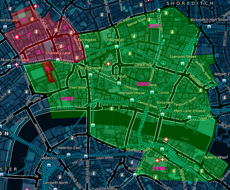
The OAC map is not particularly illuminating for London – the capital is considerably more ethnically diverse than most other parts of the country, but because the clustering process used to create OAC is run across the whole country uniformly, only one Supergroup appears to show such ethnically diverse areas – “7” (Multicultural), rather than showing the variety within this group that extends across the capital. With this in mind I have created an alternative map, which colours the housing according to the IMD (Index of Multiple Deprivation) rankings. This covers England only, and the data is only available at larger spatial units, called LSOAs (Lower Super Output Areas) but is more up-to-date, being from 2010, and shows considerable more variety across London. Use the link at the bottom of the visualisation to switch between the two.

You can view the map here. It uses geolocation to attempt to zoom to your local area, if you allow it to – it will probably ask you to allow this when you visit the site.

Categories
Orienteering

Athlete Stats for UK Orienteers

I’ve been mining the British Orienteering event results pages and have produced a websites presenting the results in a more effective way – i.e. athlete focused rather than event focused. I’m also having a go at recalculating the ranking score based on this data.

http://oobrien.com/stats/

Unfortunately there are a couple of flaws:

  • The BOF ID is not available on the source website, so I have had to construct a key based on name (which can be misspelled on results uploads from time-to-time) and club (ditto). This mainly works, except where people change club, in which case their results, run under other clubs, that contribute to their ranking score, won’t be included.
  • It turns out that, with each new result upload, all the ranking points for all events going back the whole of the last year – possibly more – are recalculated. This has the effect of old scores drifting slightly – I wasn’t expecting the points to fluctuate in such a way. The effect is mainly small – so far one of my scores has drifted by 1 point – but another person’s score has drifted by 7 points. I could mitigate this by scraping all results over the last year every night, but this would put strain on BOF’s servers and they would probably not appreciate it – it would be over 5000 page requests over the course of several hours. So, instead, I’m updating the most recent 25 events nightly and may manually resync the whole year on an ad-hoc basis. The result is that, after a while, the scores don’t match precisely with those on the source website.

The toughness scores for each event are just a bit of fun and based on the details of the course, not how well people did on it. The urban shading is also just based on the name of the event, rather than any specific metadata on the event that I am accessing. Such metadata may be available in the event details section of the source website but I am just using the results information here.

The collation of a large number of results has highlighted various data problems, such as results appearing as HH:MM rather than MM:SS, or x,xxx km instead of x.xxx km. Unfortunately one of my own (few) event result uploads suffered the first problem. This doesn’t affect the points at all, because the times within each course are only used on a relative, not absolute, basis, but it does preclude me, for example, totalling the “yearly run hours” for each athlete, without cleaning up the data on my side.

You can see the stats here – type in your name and club to see your stats. See the notes on the search page, e.g. most Level D events not included. You can also compare two people, looking at where they ran the same courses at the same event.