Categories
BODMAS OpenLayers

DataShine Travel to Work Flows

datashinecommute

Today, the Office for National Statistics (ONS) have released the Travel to Work Flows based on the 2011 census. These are a giant origin-destination matrix of where people commute to work. There are various tables that have been released. I’ve chosen the Method of Travel to Work and visualised the flows, for England and Wales, on this interactive map. The map uses OpenLayers, with an OpenStreetMap background for context. Because we are showing the flows and places (MSOA population-weighted centroids) as vectors, a reasonably powerful computer with a large screen and a modern web browser is needed to view the map. The latest versions of Firefox, Safari or Chrome should be OK. Your mobile phone will likely not be so happy.

Blue lines represent flows coming in to a selected place, that people work in. Red lines show flows out from the selected location, to work elsewhere.

The map is part of the DataShine platform, an output of the BODMAS project led by Dr Cheshire, where we take big, open datasets and analyse them. The data – both the travel to work flows and the population-weighted MSOA centroids – come from from the ONS, table WU03EW.

View the interactive map here.

lichfieldcommute

Categories
BODMAS Geodemographics

Introducing DataShine

kingston_5beds

This week, James and I launch DataShine: Census. This is part of the ESRC BODMAS project, here at UCL’s Centre for Advanced Spatial Analysis, that is led by James, and which started at the beginning of this year.

DataShine: Census shows web maps of the Quick Statistics aggregate tables of Census data for England/Wales for 2011, that were published last year by the Office of National Statistics.

DataShine: Census is the successor to CensusProfiler which I put together when I was at UCL’s Department of Geography in 2009. The main difference, apart from being a more modern website with updating URLs, geolocation etc, is that the data maps presented are “shone” through buildings, rather than covering all the land area. This has two advantages, and two disadvantages. The two advantages are that it means the countryside doesn’t dominate, and that the urban form (building blocks, parks, road structures) is more recognisable – so it looks more like a map of real places rather than a complicated patchwork of bright colours with abstract boundaries. The two disadvantages are that buildings can be individually represented, implying a greater level of spatial precision than is the case.

For the Census data, I wanted to come up with a good way of showing an interesting map, for all ~900 census aggregate variables, without having to make 900 decisions manually. To do this, I calculated the average percentage population, based on the populations across the output areas (~150 houses each), and the standard deviation of the percentage population. When you do this, and then plot the two statistics for each variable against each other, you get a graph like this:

census_qsgraph

Most variables have very small averages and so cluster at the bottom left hand side. The distinctive line of variables with small averages and high standard deviations are where the overall population is care homes and other institutions, rather than people or standard households.

I have split the variables into four sections, each of which is grouped differently for the key. The ones under the main triangle are mapped using a divergent colour scheme (red/green by default) from the average, which always appears in the middle of the key:

divergencemean

The ones above it (high standard deviations) are mapped as simple equal intervals of eighths, between 0 and 100%:

equalintervals

Finally, variables with very small/large averages, and large standard deviations, are mapped as multiples of the average (or 1-average) – here the average will always appear one from the beginning or the end of the key:

highav_highsd lowav_highsd

(The other three are using sequential colour ramps.)

DataShine is a platform for creating these kinds of web maps. As well as the initial census example, we are hoping to use it create other sorts of web maps, I hope to release and blog about those soon! I am also running a dedicated DataShine blog, which currently features some examples of particularly interesting maps coming from DataShine: Census, as well as some technical detail of the “geostack” behind the platform.

James has also written about the project.

Categories
BODMAS Data Graphics London

London Borough Websites and their Election Data

lewishamdata

Lewisham’s “data”

I’ve been looking at a lot of London Borough council websites recently, for the Election Map. I’d rather I hadn’t – just one website would be better – but in London, each borough council publishes its local election results first and foremost to its own website, rather than it being pushed to a more central location such as London Councils which only holds aggregate data. It is also likely that the London Data Store, run by the Greater London Authority, will publish the combined results in due course.

So I’ve been visiting the 32 council websites in order to obtain the full (i.e. number of votes for every candidate in every ward) election data for 2014, for some forthcoming work. It’s striking how differently the data is presented, from site to site. A number of councils use the same software to show the data, but even there there are slight differences – and the other council websites do entirely their own thing.

Perhaps of most surprise is that – in 2014, only 1 of the 32 councils provide their election results in a machine readable data (e.g. CSV). Step forward the London Borough of Redbridge and their excellent data website – its interactive and database-driven nature meant that it struggled to show the live results on election night itself (judging by some now-deleted Tweets they sent out) but now that the “surge” of interest has passed, it means it is very easily to obtain the full dataset, even including geographical IDs that are critically important when creating a map – matching by name is fraught with errors due to punctuation and abbreviation variations.

hounslowdataAt the other end of the scale, Lewisham and Bromley councils only provide the data as PDFs. The tables contained with these does not indicate the winners – only the prose below it does. In Lewisham’s case the PDFs were scanned in so the text is not even copyable. Hounslow was a narrow second worst – while they did list all the candidates for all the wards on a single page (yay!) this information does not include the party that the candidates were representing (boo!). You have to go to another page for that and read the party name off a bar chart, as shown on the right here…

In the table below, I’ve awarded each council up to 5 stars on the following basis. This was inspired by Tim Berners-Lee’s Open Data deployment star system which uses a similar (but more nuanced) approach.

  • One star if the individual counts for most of the borough’s wards are available on the council’s main website or a dedicated subdomain, four days after the end of the election, in a searchable form (i.e. not as an image). Speedy and official publication is important for maximum transparency of the process. Only Lewisham failed have published their data by Monday evening. Croydon was pretty slow but got there in the end. Tower Hamlets results dribbled in but only one ward missed the deadline, which is not ideal but sufficient here.
  • Two stars if the data in available as structured data which is straightforward to manually extract for further processing. Examples where are good: HTML tables and Excel documents. Bromley’s results were supplied in the form of vector PDFs which made their tables difficult to copy. Hounslow’s results were presented in an attractive way, with maps and graphs, but no table containing both the candidate’s votes and their party.
  • Three stars if the data is free of errors and typos, such as punctuation problems (stray commas/hyphens, parts of candidate names in the party column, inconsistent ways of referencing which candidates were elected (or missing altogether) or party names, suggesting that it was input into the system in a structured/managed way.
  • Four stars if the data is supplied as a downloadable datafile in a standard machine-readable format, e.g. CSV, JSON, XML. Only Redbridge makes the data available in this way.
  • Five stars if the data contains ward and borough geographical identifier ONS GSS codes. Only Redbridge has this facility.
Rating Borough(s)
0 Lewisham
* Bromley, Hounslow
** Ealing, Hammersmith, Islington, Barking & Dagenham, Southwark, Kingston upon Thames^
*** Barnet, Bexley^, Brent^, Camden, Croydon, Enfield, Greenwich, Hackney, Hammersmith & Fulham, Haringey, Harrow^, Havering^, Hillingdon, Kensington & Chelsea, Lambeth^, Merton^, Newham^, Richmond upon Thames^, Sutton, Tower Hamlets^, Waltham Forest^, Wandsworth, Westminster
****
*****       Redbridge

^ = Councils that appear to use a common technology package for displaying their election results.

redbridgedata

Redbridge’s excellent data website.

A number of councils, mainly in the 3* category above and marked with a ^, seem to use the same software for displaying their election results on their webpages. The software outputs the results as tables, and includes graphs. If this one piece of software was improved to allow a data download (e.g. as a CSV with ONS GSS codes) of the tabular data, and was then pushed out to the relevant sites, then a lot of councils could move to give stars with a minimum of effort.

Categories
BODMAS London

London’s New Political Colour: 2014 Elections

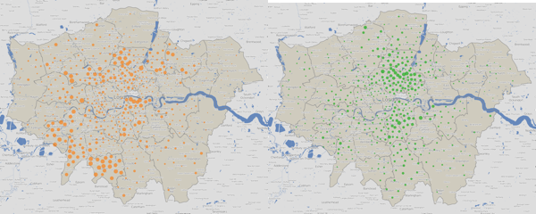
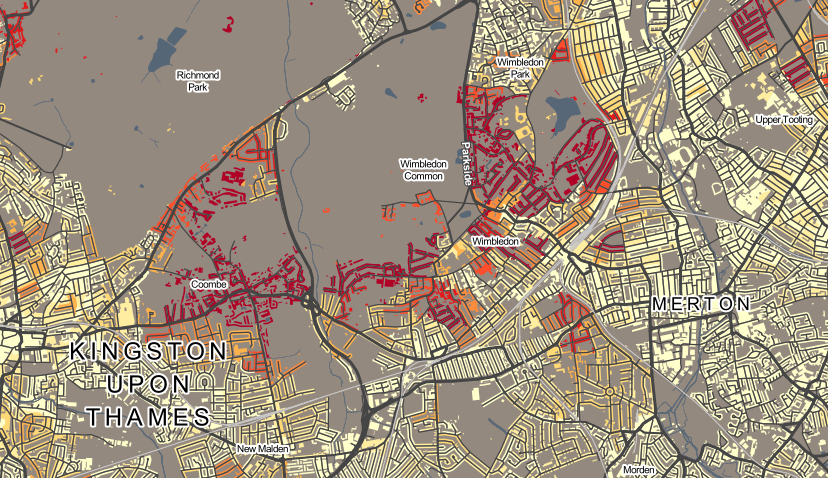
Here is the new political colour of London for 2014, following the local council elections last week. Rather than applying a simple colour to each of the 32 boroughs as most election maps do, I have instead represented all the 628 wards, across the boroughs, as a coloured circle. The map shows votes, not results. Every one of the 6+ million votes cast has an effect on the colour of one of the circles, in some way. Interactive version.

votecolour

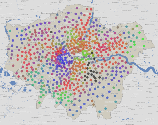
The final colour for each dot is an addition of colours for the votes for each of the political parties in that ward. Red = Labour, Blue = Conservative, Green = everything else (Lib Dems, UKIP, Greens etc). By adding the colours in the correct proportions, in the RGB (Red-Green-Blue) colour space, a single representative colour for each ward can be obtained.

N.B. Lewisham hadn’t published most of its ward results, more than four days after the election, when I took these screenshots, so they are shown with black dots here. There are also three more black dots – two elections have been postponed and one recount is to happen later today. The interactive version of the map has been updated now that the delayed results and recounts has happened.

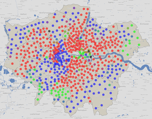
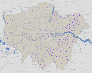
Here is a version using colours for just the elected councillors (a maximum of three) in each ward, rather than considering all votes cast:

electedcolour

These maps are an update of a website that I built back in 2010 to visualise the election data then. The traditional way of representing an election map – colouring in the wards as solid blocks to make a choropleth – tends to exaggerate the results in the sparser, larger wards on the edge of the capital. A common alternative, a cartogram, tends to distort the map in such a way that makes it “fairer” but at the expense of ending up with something which is difficult to recognise as a map of a familiar place. My “dots in the centres” approach is the best of both worlds – it works by assigning each ward the same amount of “data impact” on the map, while positioning the results in their correct geographical place.

colourtriangle

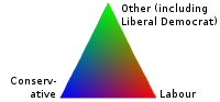
Red + Blue = Purple, so a purple dot is where people voted in roughly equal proportions for Labour and the Conservatives, and very few voted for other parties, which would act to make the colour greener. Similarly Red + Green = Brown – an area with little Conservative support. If all three categories have roughly equal numbers of votes, the colour would be grey.

Note that the colour addition technique has a three major flaws. Firstly, people who are colour-blind will struggle to see some of the contrasts. Secondly, the human eye, even for the non colour-blind, perceives colours of the same intensity differently. So, it is difficult to make quantitative judgements on the proportions, based simply on the colour. The third issue is that there are only three primary colours that can be used, which means a maximum of three categories can be visualised in this way. This means lumping in the Lib Dems and UKIP (amongst others) into the same category, which is I’m sure not where they’d want to be.

Let’s take the major parties individually – and this time, vary the areas of each circle by the number of votes received for that party:

labourconservatives

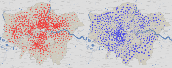
Labour (left) and the Conservatives (right) have strongholds in very different geographies of London – Labour tend to be inner and east, Conservatives outer and west. This tends to mean both parties have a good number of councillors, as their strongly varying popularity, geographically, favours them in the first-past-the-post system.

libdemgreen

The Lib Dem (left) and Green (right) votes are more closely aligned, running roughly on a north-south axis, through the centre of London.

ukip

UKIP’s votes are primarily in outer London only. All their elected councillors were in the outer eastern parts of London, but this graphic shows a quite strong, but “hidden” popularity, in the west and, to a lesser extent, south parts of outer London too.

You can view an interactive version of this map which is zoomable and scrollable, and also has the data for the two previous council elections, in 2010 and 2006. Note the 2010 election was during a general election, so the turnout was generally much higher – this is reflected in the increased sizes of the circles for the individual party maps. Some boundaries have changed between 2010 and 2014 so you’ll see some dots move a bit, as well as change colour.

The data behind these maps was collected from the various council websites over the weekend. I will pass comment on the dramatically varying qualities of the data access on the council sites in a subsequent post, but you can download the data that I did manage to collect, tabulate and normalise, as a tab-delimited 1.2MB text file, suitable for importing into Excel. There are almost 7000 candidates included there, and I am hoping to update it as the final few results come in.

This work was carried out as part of the BODMAS project (Big Open Data Mining & Synthesis) at UCL’s Centre for Advanced Spatial Analysis (CASA).
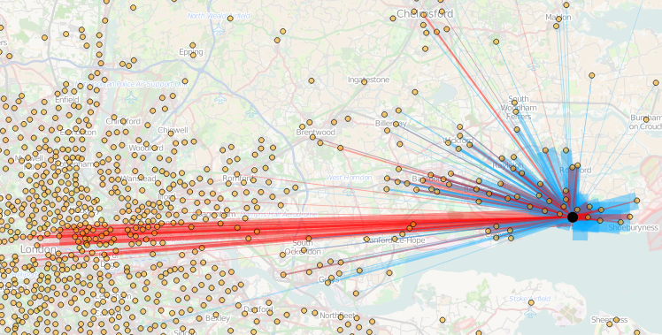
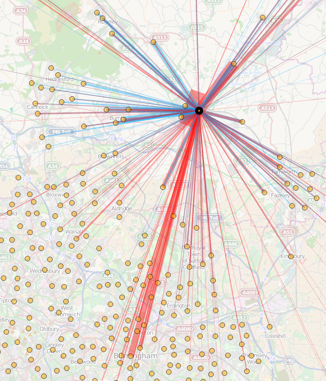
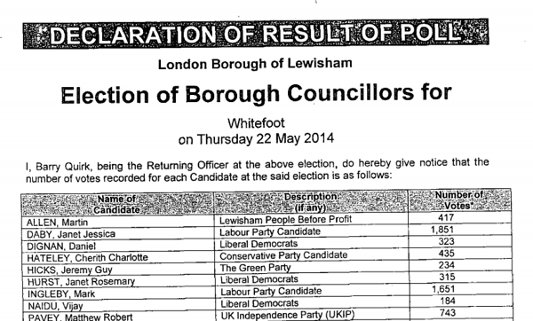
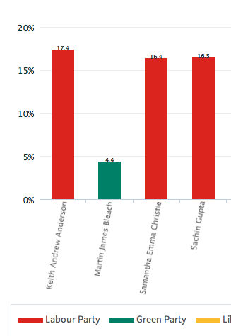
Categories
BODMAS London

London Tube Stats

londontubestats

London Tube Stats maps data about how the London Underground is used – how many people use each station at various times of the day, and where they go once they are on the tube.

Transport for London, the city’s public transport authority, have a huge amount of data available in their Developers’ Area website, much of which is regularly updated. I’ve used the bike sharing system data fairly regularly, however I’m keen to take advantage some of their other datasets.

Back in 2010 I built a map mashup of the entries/exits data that, at the time, TfL made available on a (now defunct) performance website. The mashup consisted of varying the sizes of circles over each station, to represent how many people entered/exited the station, at certain times of the day, days of the week, or years, depending on the options selected. I wrote about the mashup here and also mentioned an update when the 2009 data was released, but the site languished. TfL changed the way that the data is formatted as it was moved across to the developer website, so adding future years wasn’t going to be straightforward, and also I never liked the rather stark black and white background map, with the tube lines “baked in” to it, and including various tube depots and other running lines that weren’t part of the passenger network, that I had created quickly.

londontubestats_keySo, I’ve rewritten the mashup from scratch. The main view shows the entry/exit data, by time of day, for 2003-2012. Choosing an option from the drop-down menu at the top will vary the circle sizes, the area of each circle representing the numbers. Clicking on a station will reveal a table of the underlying numbers, with colours showing trends. Then there is an additional view that uses the TfL RODS (Rolling Origin Destination Survey) data for 2012, to show journeys. RODS is based on surveyed data that is then scaled up to match the recorded entries/exits from the barriers, and the numbers represent a typical day. Click on a station to mark the place people enter the system, the other stations then shift in size to show where people exit. You can change between the two datasets using the Metric drop-down menu.

The background map is based on OpenStreetMap data, and the station locations and coloured tube lines are also based on this data – but I’ve tweaked it to show just one line per service, rather then individual tracks and depots.

Gist on GitHub

As part of creating this map, I’ve released the first in what I hope will be an increasingly large set of CASA open data releases. The release, as a Gist on GitHub, is of two files, in GeoJSON format – one for the tube lines, and one for the stations. The files also contain routes and stations for Overground, DLR, Tramlink, Emirates Airline and Crossrail (which starts in 2018) services. These are hidden from the London Tube Stats map, as stats are not available for these at the moment, although you can see them by setting all three dropdowns to the blank option.

I particularly like that GitHub spots that the files are GeoJSON, and effortlessly displays them as a map, rather than presenting the underlying JSON data by default.

[Update 1I’ve tweaked some colours – I now am using yellow vs blue when showing entries and exits for the journey metric. I’ve also added a new metric which compares the ratio of entries vs exits for the AM Peak numbers. Choosing the journey metric now always defaults to showing a selected starting station – currently Finchley Road. Click another station to show the stats.]