Categories
Data Graphics Mashups

Dials and Levers Overload

Steve, here in the lab at CASA, has adapted his popular Tweet-O-Meter display of Twitter activity in cities around the world, for my bike hire maps, to create Bike-O-Meter. Now, on a single screen, you can see lots of Google-powered gauges, showing how busy the bike share schemes around the world are right now. Some show massive spikes during their rush hours, while others are more popular at weekends. Most dials will move every two minutes, a few (the Velib ones) update every 10 or 20 minutes.

At the time of writing, the bike share schemes of the Spanish cities, particularly Barcelona, Girona and Valencia, are the ones being most actively used. Spanish rush-hours at lunchtimes seem generally to be as big as the morning/evening ones! Biking home for the siesta?

There’s a second mode, accessed here, that shows how unbalanced the schemes are – high values indicate that a lot of the bikes are concentrated in one part of the city, and there’s a lot of empty docking stations in another part. The metric is the percentage of bikes that would need to be moved to balance out the docking stations across the city.

Thanks Steve for making this awesome visualisation!

Categories
Mashups

Bike Hire Around the World

My map/visualisation of the Boris Bikes – the London cycle hire scheme – is now available for four eight fifteen more cities. The complete list:

Paris has so many docking stations that many browsers and computers will struggle to show everything – although the site and animations work very well in Webkit-based web browsers such as Apple’s Safari and Google’s Chrome. The maps are all at approximately* the same scale.

Montreal’s scheme is similar to London’s – indeed the underlying technology (Bixi) is the same and in fact the London system was bought in from Montreal. Paris’s scheme (Vélib) is quite different and, because a separate webpage has to be loaded for each one of the 1200 docking stations, the map only updates once every 20 minutes. Seville and Brussels also use Vélib and update once every 10 minutes, while Montreal, along with Denver, Girona, London, Washington DC and Melbourne, update every two minutes.

More cities to follow soon!

* There is a slight difference in scale depending on the latitude of the city, the difference equal to the difference in the cosines of the respective latitudes.

Categories
Mashups

Animation of Cycle Hire Patterns

I’ve now added a historic view of my cycle hire dock visualisation – you can “replay” the dock capacity changes over the last 48 hours by clicking on the “Animation” link or going directly to the animation page and then clicking “Start Animation”

By default, a different colour/shape scheme is used – the circles grow or shrink and become redder or duller, as the docks fill up or empty respectively. You can change the colours used with the drop-down, as normal.

The circles are being redrawn by your browser for each frame of the animation, and speeds vary greatly on your browser. Each frame represents 10 minutes of real time. The redrawing is intensive and might occasionally lock up your computer!

On my reasonably fast computer, the maximum frame rate I can get is:

  • Chrome or Safari: 7 frames a second
  • Firefox: 3 frames a second
  • Internet Explorer 8: 2 frames a second (zoomed in)

If Internet Explorer is zoomed out to match the default zooms in the other browsers, the rate drops to 1 frame every 8 seconds…

The distinctive weekday commuting patterns are easy to spot, with the morning rush into the centre, followed by the evening rush back out to the edges and the station terminals. Distribution vehicles movements can be inferred, particularly during the wee small hours when there is little other activity.

Categories
Mashups

London data in MapTube

I have uploaded a number of spatially-referenced, recent datasets from the London Data Store, to MapTube. Here are some of the more interesting looking ones.

(1) Data from the London Ambulance Survey (LASS) – here comparing the numbers of ambulance callouts to assaults with knife injuries vs gun injuries for each London ward in the last 24 months to May – please note the category scales across the two maps areas are different, so cannot be compared directly. Darker, redder values are higher. Click a picture to see the interactive map and legend, and download the source data.

Knives
Guns

(2) The Active People Survey – an interesting difference between the boroughs for volunteering rates compared with participation rates. Darker, redder boroughs indicate higher proportions of those surveyed in that borough say they volunteer or participate in active sports.

Volunteering
Participation

Volunteering much better in the outer London boroughs right around the centre, while participation is concentrated in the south-west.

(3) Houses in council tax bands A, B and C (the lowest rates) vs those in F, G & H (the highest rates), at output area level – very detailed! Not necessarily a proxy for affluence. Again, darker, redder areas have a greater proportion of houses and other dwellings in these bands.

A, B and C (Lowest council tax rate bands)
F, G and H (Highest council tax rate bands)
Categories
Data Graphics Mashups

London Cycle Hire Vis – New Colours and Stats

I’ve made a couple of enhancements to my live London cycle hire map – you can now choose from several colour sets. A couple of the sets also change the circle sizes, so that these correspond to the number of bikes (or spaces) rather than the dock size. This means the circles grow or shrink as the bikes get used, rather than remaining static as before.

Using value-based colour ramps and/or circle size changes, rather than the standard hue-based colour ramp, are are a more “correct” way to show quantitative data graphics such as the hire map, as the data values aren’t distorted by “colour bias” (where a particular hue has more of an impact to the viewer).

I’ve also added a couple of panels to show how busy the hire scheme currently is, and how this compares to the same time 24 hours ago, and added a ticker which lists changes as they happen (e.g. docks becoming full or emptying quickly), in the style of the old BBC Grandstand vidi-printer.

Very few people have been using the bikes to commute home this evening (and yesterday evening) as it’s been raining a lot here in London! We have a weather station here at CASA, with historical data, so it should be possible to quantify the relationship between how hard it’s raining and what proportion of people decide to try another way to get home.

Categories
Data Graphics Mashups

24 hours of London Cycling

[A final word on my cycle hire visualisation – which you can see here.]

James has posted a video showing how the colours (i.e. bike usage patterns) changed during Wednesday – a typical day with good weather (so high usage) and sharply defined rush hours. The video shows one hour every second and starts at midnight (so look out for the main changes at 9s and 18s in.)

Another quirk is a characteristic move from red to purple of several stations overnight (i.e. in the first 5s of the video) in the northern edge of the zone, i.e. around Angel, travelling from east to west. A redistribution vehicle at work?

Today’s evening rush hour is showing quite a different pattern – a much less pronounced spike in usage, spread out over a longer time interval. This is probably because of the rain showers this afternoon and correspondingly damp roads, but possibly because Thursdays are traditionally team drinks nights in the City for many people, and so people will either be delaying the journey home, or deciding not to take the bike at all after a few drinks (not a bad idea really.) Certainly I’ve noticed a large difference in the numbers of people spilling out of the traditional City drinking dens on Thursday (and to a lesser extent Friday) evenings, compared with Monday-Wednesday.

Aidan’s sparklines, showing yesterday’s data as grey lines and today’s in orange, show this lag effect strikingly.

Neal Lathia, a research fellow here at UCL alerted me to a study carried out on usage patterns of a very similar scheme in Barcelona – even the dock numbers and scheme shape match London – clustering and categorising docking stations based on their usage patterns. Their method of data capture is also very similar to what I’m doing and the resulting dataset should lend itself to an equivalent categorisation in London. Things will only get more interesting when “casual” (i.e. non-registered) users get access to the scheme, which may happen next month, and new user types, such as foreign tourists, get involved, and the seasons (and weather) will also probably play a part, as different user types have different levels of willingness to use the system based on daily conditions.

The BBC’s Tom Edwards has an interview with the operators of the scheme, which includes at one point a screenshot of the internal (Google-maps based) map used by them to see what docking points are on their way to becoming full or empty.

Categories
Data Graphics Mashups

London Cycle Hire Visualisation

I’ve created a visualisation of how the TFL Cycle Hire scheme in London is being used – the so-called “Boris Bikes”. Around 4000 bikes have been placed in 400 cycle parking stands in the centre of the city, and people have been using them to get from A-B.

Some distinctive if not entirely surprising patterns have appeared already – with heavy usage (~10% of total bikes out on the streets) during the rush-hours, which occur in a strikingly small time interval – a narrow, sharp dip appearing only between 5:30pm to 6pm. Usage is much less in rainy weather, such as has happened today, and weekend use is both lower, and quite different in “shape”. During weekday days, the City tends to have a lot of the bikes, while in the evening, the bikes end up at the cycle parking stands near the big terminal train stations and in Pimlico in the south-west of the area – probably the biggest residential area covered by the scheme, and also a popular place for city workers to live…


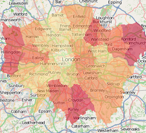
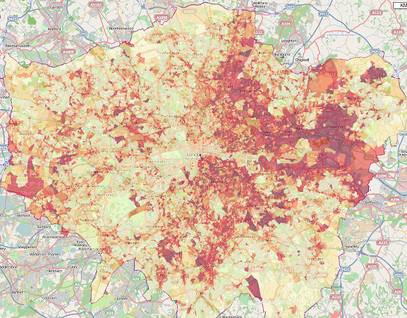
10am Tuesday: Straight after a sunny morning rush-hour, before redistribution kicks in – many of the central stands are now completely full of bikes (red with yellow borders.)


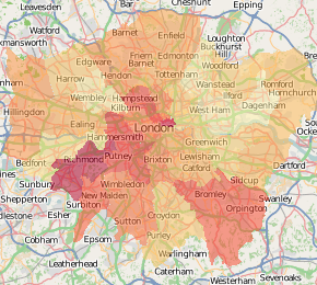
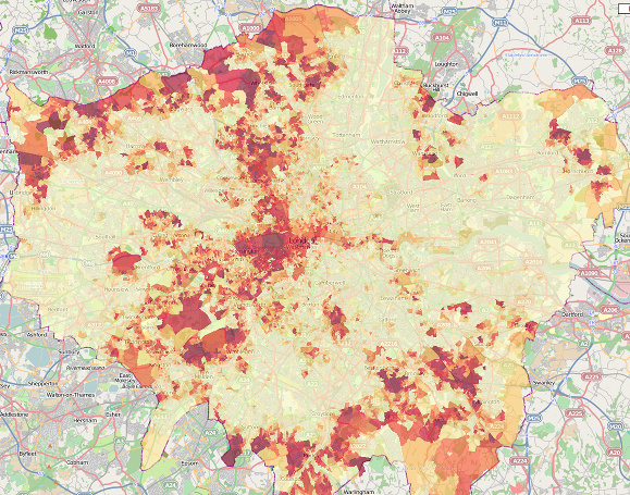
8pm Tuesday: A typical evening pattern – the bikes are on the edge, and at the terminal stations, particularly around Waterloo and King’s Cross, while the centre is short of bikes…

The visualisation consists of coloured dots, which change from blue to red as each stand fills up with docked bikes. A purple dot indicates a half-full stand. The size of the dots corresponds to the total capacity of the stand.

You can click on a stand’s dot to see information about its current status, as well as its use over the last 24 hours, represented as a minimalistic graph. A graph of overall usage can also be viewed. Both get updated as the new data comes in.

The data comes from TFL’s own map of the stands in central London, and is updated at source typically every six minutes – my own visualisation updates every two minutes, so you should never be more than ten minutes out of date, looking at the map.

The background is a bespoke render of central London, from OpenStreetMap data.

See it here.

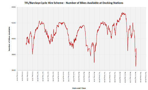
Here’s how the total number of available bikes has fluctuated, since Friday morning (click for larger version):

totalavail_thumb

[Update: Some articles about the visualisation – Telegraph, Londonist, Road.cc, Real Cycling, Bikeradar]

Categories
Mashups

Manchester Map Mega-Mashup

I’ve now updated my Manchester Historic Map mashup (previous blog post) with five fourteen more historical maps, the earliest is from 1772. Maptastic.

[Update: I’ve also added a split-screen view for side-by-side comparison of the maps.]

Categories
Mashups

Tube Flow Update: 2009 Changes

Transport for London have published the 2009 data for numbers of people entering/leaving the stations on the tube network. I’ve updated my visualisation/map with the new data.

Some interesting trends have emerged. Blackfriars sees the biggest decrease (i.e. biggest red circle) – no surprise, as the station has been closed throughout 2009. The other big decreases are at Canary Wharf, Finsbury Park and Wimbledon. The former is on the Jubilee Line, and many of the stations on the line have seen a drop in usage – presumably something to do with various sections of the line being closed most weekends throughout last year. The station for the O2 is doing well though. Many of the Victoria and Metropolitan line stations have also seen a big drop. Indeed in general, the network has seen a drop in usage, the map being predominately red.

The biggest increases are Temple and Mansion House, presumably spillover from the Blackfriars closure, Euston, maybe due to increased use of the Eurostar services new higher-speed services to NW England, and Barking – lots of new build flats here?

Within the overall pattern, there’s a cluster of decreases (red) in West London Zone 2 (Shepherd’s Bush), and a a cluster of increases (blue) around East London Zone 1/2 (Aldgate) and North London Zone 2 (Camden).

The map does not include DLR, rail or London Overground usage.

See it here.

Categories
Mashups

The Political Colour of London

Following on from The Political Colour of Great Britain, and reusing the same code, I have produced a map for London, showing graphically the results of the voting for the local elections in Greater London’s 600-odd wards, for the May 2010 elections and back in 2006.

The “colour” map assigns every vote to one of the three RGB primary colours – red for Labour, blue for Conservative and green for all other parties. It so happens that the three groupings have roughly the same number of votes across the whole of London. These are scaled by the total number of votes for each ward, and then resulting proportions are converted to the hexadecimal “web” colours you see on the dots. An “enhance” function is used to increase the value of the colours away from the mean, to prevent the map from looking muddy.

The advantage of using colour in this way to represent each constituency is every person’s vote counts towards the final colour, rather than just those that elected the three winning councillors in each ward. Use of a single colour is the simplest way to summarise each result. The disadvantage is that it is difficult for human eyes to quantitatively perceive the colour and translate it to a result – although we are quite good at spotting differences in colours, it is more difficult to interpret these.

The voting data is from the London Datastore, the ward and borough boundaries from Ordnance Survey Open Data, and the background map from OpenStreetMap data, rendered using Mapnik. The ward centroids were calculated in ArcGIS and the map is displayed with the OpenLayers framework. Performance is very poor in Internet Explorer because the VML renderer it uses is extremely slow – SVG is used instead in Firefox and the other standards-based browsers and is vastly better.

See it here.

For a different take on the same technique of using colour to show the vote composition for each ward, see the article on Spatial Analysis.