Categories
BODMAS OpenLayers Technical

OpenLayers 3 and DataShine

ds_ol3

OpenLayers is a powerful web mapping API that many of my websites use to display full-page “slippy” maps. DataShine: Census has been upgraded to use OpenLayers 3. Previously it was powered by OpenLayers 2, so it doesn’t sound like a major change, but OL3 is a major rewrite and as such it was quite an effort to migrate to it. I’ve run into issues with OL3 before, many of which have since been resolved by the library authors or myself. I was a bit grumbly in that earlier blogpost for which I apologise! Now that I have fought through, the clouds have lifted.

Here are some notes on the upgrade including details on a couple of major new features afforded by the update.

New Features

Drag-and-drop shapes

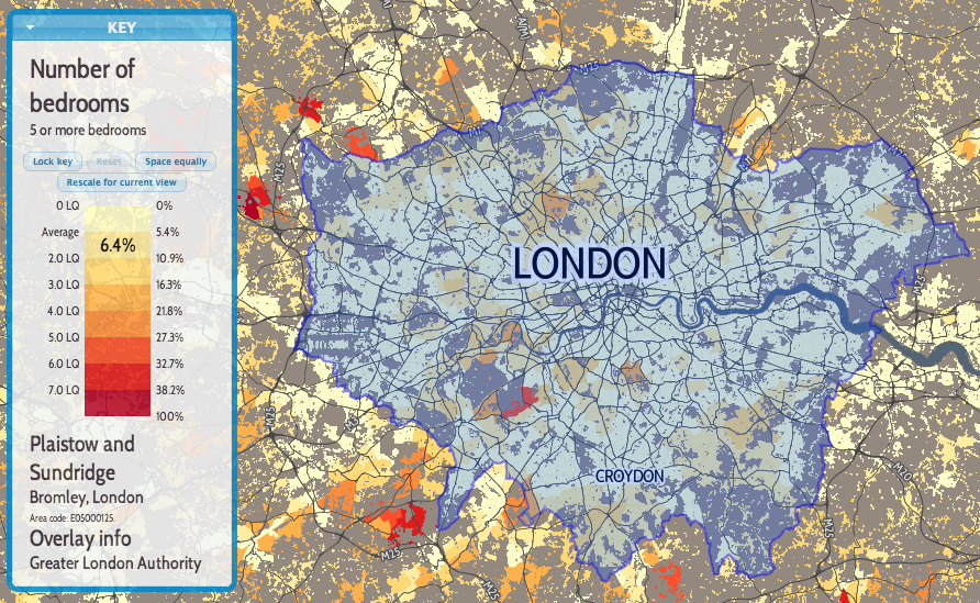
One of the nicest new features of OL3 is drag-and-dropping of KMLs, GeoJSONs and other geo-data files onto the map (simple example). This adds the features pans and zooms the map to the appropriate area. This is likely most useful for showing political/administrative boundaries, allowing for easier visual comparisons. For example, download and drag this file onto DataShine to see the GLA boundary appear. New buttons at the bottom allow for removal or opacity variation of the overlay files. If the added features include a “name” tag this appears on the key on the left, as you “mouse over” them. I modified the simple example to keep track of files added in this way, in an ol.layer.Group, initially empty when added to the map during initialisation.

Nice printing

Another key feature of OL3 that I was keen to make use of is much better looking printing of the map. With the updated library, this required only a few tweaks to CSS. Choosing the “background colours” option when printing is recommended. Printing also hides a couple of the panels you see on the website.

Nice zooming

OL3 also has much smoother zooming, and nicer looking controls. Try moving the slider on the bottom right up and down, to see the smooth zooming effect. The scale control also changes smoothly. Finally, data attributes and credits are now contained in an expandable control on the bottom left.

A bonus update, unrelated to OL3, is that I’ve recreated the placename labels with the same font as the DataShine UI, Cabin Condensed. The previous font I was using was a bit ugly.

Major reworkings to move from OL2 to OL3

UTF Grids

With OpenLayers 3.1, that was released in December 2014, a major missing feature was added back in – support for UTF Grid tiles of metadata. I use this to display the census information about the current area as you “mouse over” it. The new implementation wasn’t quite the same as the old though and I’ve had to do a few tricks to get it working. First of all, the ol.source.TileUTFGrid that your UTF ol.layer.Tile uses expects a TileJSON file. This was a new format that I hadn’t come across before. It also, as far as I can tell, insists on requesting the file with a JSONP callback. The TileJSON file then contains another URL to the UTF Grid file, which OL3 also calls requiring a JSONP callback. I implemented both of these with PHP files that return the appropriate data (with appropriate filetype and compression headers), programmatically building “files” based on various parameters I’m sending though. The display procedure is also a little different, with a new ol.source.TileUTFGrid.forDataAtCoordinateAndResolution function needing to be utilised.

In my map initialisation function:

layerUTFData = new ol.layer.Tile({});

var handleUTFData = function(coordinate)
{
  var viewResolution = olMap.getView().getResolution();
  layerUTFData.getSource().forDataAtCoordinateAndResolution(coordinate, viewResolution, showUTFData);
}

$(olMap.getViewport()).on('mousemove', function(evt) {
  var coordinate = olMap.getEventCoordinate(evt.originalEvent);
  handleUTFData(coordinate);
});

In my layer change function:

layerUTFData.setSource(new ol.source.TileUTFGrid({
  url: "http://datashine.org.uk/utf_tilejsonwrapper.php?json_name=" + jsonName
})

(where jsonName is how I’ve encoded the current census data being shown.)

Elsewhere:

var callback = function(data) { [show the data in the UI] }

In utf_tilejsonwrapper.php:

<?php
header('Content-Type: application/json');
$callback = $_GET['callback'];
$json_name = $_GET['json_name'];
echo $callback . "(";
echo "
{ 'grids' : ['http://datashine.org.uk/utf_tilefilewrapper.php?x={x}&y={y}&z={z}&json_name=$json_name'],
'tilejson' : '2.1.0', 'scheme' : 'xyz', 'tiles' : [''], 'version' : '1.0.0' }";
echo ')';
?>

(tilejson and tiles are the two mandatory parts of a TileJSON file.)

In utf_tilefilewrapper.php:

<?php
header('Content-Type: application/json');
$callback = $_GET['callback'];
$z = $_GET['z'];
$y = $_GET['y'];
$x = $_GET['x'];
$json_name = $_GET['json_name'];
echo $callback . "(";
echo file_get_contents("http://[URL to my UTF files or creator service]/$json_name/$z/$x/$y.json");
echo ')';
?>

Permalinks

The other change that required careful coding to recreate the functionality of OL2, was permalinks. The OL3 developers have stated that they consider permalinks to be the responsibility of the the application (e.g. DataShine) rather than the mapping API, and, to a large extent, I agree. However OL2 created permalinks in a particular way and it would be useful to include OL3 ones in the same format, so that external custom links to DataShine continue to work correctly. To do this, I had to mimic the old “layers”, “zoom”, “lat” and “lon” parameters that OL2’s permalink updated, and again work in my custom “table”, “col” and “ramp” ones.

Various listeners for events need to be added, and functions appended, for when the URL needs to be updated. Note that the “zoom ended” event has changed its name/location – unlike moveend (end of a pan) which sits on your ol.map, the old “zoomend” is now called change:resolution and sets on olMap.getView(). Incidentally, the appropriate mouseover event is in an OL3-created HTML element now – olMap.getViewport() – and is mousemove.

Using the permalink parameters (args):

if (args['layers']) {
  var layers = args['layers'];
  if (layers.substring(1, 2) == "F") {
    layerBuildMask.setVisible(false);
  }
  [etc...]
}
[& similarly for the other args]

On map initialisation:

args = []; //Created this global variable elsewhere.
var hash = window.location.hash;
if (hash.length > 0) {
  var elements = hash.split('&');
  elements[0] = elements[0].substring(1); /* Remove the # */
  for(var i = 0; i < elements.length; i++) {     var pair = elements[i].split('=');     args[pair[0]] = pair[1];   } }

Whenever something happens that means the URL needs an update, call a function that includes this:

var layerString = "B"; //My old "base layer"
layerBuildMask.getVisible() ? layerString += "T" : layerString += "F";
[etc...]
layerString += "T"; //The UTF data layer.
[...]
var centre = ol.proj.transform(olMap.getView().getCenter(), "EPSG:3857", "EPSG:4326");
window.location.hash = "table=" + tableval + "&col=" + colval + "&ramp=" + colourRamp + "&layers=" + layerString + "&zoom=" + olMap.getView().getZoom() + "&lon=" + centre[0].toFixed(4) + "&lat=" + centre[1].toFixed(4);
}

Issues Remaining

There remains a big performance drop-off in panning when using DataShine on mobile phones and other small-screen devices. I have put in a workaround "viewport" meta-tag in the HTML which halves the UI size, and this makes panning work on an iPhone 4/4S, viewed horizontally, but as soon as the display is a bit bigger (e.g. iPhone 5 viewed horizontally) performance drops off a cliff. It's not a gradual thing, but a sudden decrease in update-speed as you pan around, from a few per second, to one every few seconds.

Additional Notes

Openlayers 3 is compatible with Proj4js version 2 only. Using this newer version requires a slightly different syntax when adding special projections. I use Proj4js to handle the Ordnance Survey GB projection (aka ESPG:27700), which is used for the postcode search, as I use a file derived from the Ordnance Survey's Code-Point Open product.

I had no problems with my existing JQuery/JQueryUI-based code, which powers much of the non-map part of the website, when doing the upgrade.

Remember to link in the new ol.css stylesheet, or controls will not display correctly. This was not needed for OL2.

OL3 is getting there. The biggest issue remains the sparsity of documentation available online - so I hope the above notes are helpful in the interim.

ds_ol3overlay2

Above: GeoJSON-format datafiles for tube lines and stations (both in blue), added onto a DataShine map of commuters (% by tube) in south London.

Categories
OpenLayers Technical

OpenLayers 3

ol-logo

As a learning exercise, I been trying to “migrate” my recent #indyref map from OpenLayers 2.13.1 to the very new version 3.0.0 of the popular mapping API. It seemed a good time to learn this, because the OpenLayers website now shows v3 as the default version for people to download and use. Much of my output in the last few years has been maps based on OpenLayers, so I have considerable interest in the new version. There are some production sites using OpenLayers 3 already – for example, the official Swiss map.

I use the term “migrate” in inverted commas, because, really, OpenLayers 3 is pretty much a rewrite, with an altered object model, and accordingly requires coding from scratch a new map rather than just changing a few lines. It has so far taken me four times as long to do the conversion, as it did to create the original map, although that is an inevitable consequence of learning as I go along.

I’ll update this blogpost as I discover workarounds.

Shortcomings in v3 that I have come across so far:

  • No Permalink control. This is unfortunate, particularly as “anchor” style permalinks, which update as you move around the map, are very useful for visualisations like DataShine where people share specific views and places, and I can inject extra parameters in. The site linked above suggests this is a feature that should not be in the core mapping library, but instead an additional library can query/construct necessary parameters. Perhaps, but I think layer/zoom/lat/lon parameters are such a key part of a map (as opposed to other interactive content) that they still deserve to be treated specially.
  • The online documentation, particularly the apidoc, is very sparse in places. As mentioned above, there is also some mismatching in functionality suggested in the online tutorials, to what is actually available. Another example, the use of “font” instead of “fontSize” and “fontStyle” for styles. This will improve I am sure, and there is at least one book available on OpenLayers 3, but it’s still a little frustrating at this stage.
  • Label centering on the circle vectors is not as good as with OL 2. This is possibly due to antialiasing of the circle itself. You can see the labels “jump” slightly when comparing the two versions – see links below.
  • Much, much slower on my iPhone 4 (and also on a friend’s Android phone). This is not what I was expecting! This is the “killer” problem for me which means I’ve kept my map on OL 2 for now. Wrapping my vector layer in an Image layer is supposed to speed things up, but causes the layer not to display on my iPhone. Disabling the potentially expensive mousemove listener did not make a difference. Adding a viewport meta tag with width=device-width speeded things up a lot so that it was almost as fast as OL 2 (without the meta tag) but then I would need to rewrite my own UI for mobile – something I don’t need to do with the OL 2 version!
  • No support (yet) for UTFGrids. These are a form of vector tiles, for metadata rather than geographic features, which I use on the DataShine project.

Things which I like about the new version:

  • Smooth vector resizing/repositioning when zooming in/out on a computer. (N.B. This is only when using a Vector layer and a Vector source, rather than Image layer with an ImageVector source that itself uses a Vector source.)
  • Attribution is handled better, it looks nicer.
  • No need to have a 100% width/height on the map div any more.
  • Resolution-specific styling. I’ve used this to hide the labels when zoomed out beyond a certain amount.
  • Can finally specify (in a straightforward fashion) a minimum zoom level.
  • Point coordinates and extents/bounds are specified in a much simpler way.
  • On a more general note, the new syntax is more complete and feels less “hacky”. The developers have taken the opportunity to do it “right” and remove inconsistencies, misplaced functionality and other quirks from the old version. For example, separating out visual UI controls and interaction management controls into two separate classes.
  • Drag-and-drop addition of KML/GeoJSON vector features. Example (use this file as a test).

Some gotchas, which got me for a bit, but I was able to solve:

  • You need to link in a new ol.css stylesheet, not just the Javascript library, in order to get the default controls to display and position correctly.
  • Attribution information is attached to a source object now, not directly to the layer. A layer contains a source.
  • Attribute-based vector styling is a lot more complicated to specify. You need to create a function which you feed in to an attribute. The function has to return a style wrapped in an array – this may be the closure syntax in Javascript that I have not come across before.
  • Hover/mouseover events are not handled directly by OpenLayers any more – but click events are, so the two event types require quite different setups.
  • Minor differences between the debug and regular versions of the library. The example I noticed is that the debug version allows ol.control.ScaleLineUnits.METRIC to be specified as an attribute for the ScaleLine control, but the non-debug version needs to use an explicit string “metric”.
  • No opacity control on individual styles – only on layers. This means I can’t have the circles with the fill at 80% opacity but the text at 100% opacity. Opacity can be set on styles, but has to be specified as part of the colour, in RGBA format (where A is the alpha, i.e. opacity, you want) rather than as a separate attribute. This is contrary to the tutorials on the website. Layer opacity can continue to be specified as seperate attributes.

My OpenLayers 3 version of the #indyref map is here – compare with the OpenLayers 2 one. Note that, since first writing this blogpost, I’ve subsequently updated the OpenLayers 2 one to change the cartography there further.

Categories
BODMAS OpenLayers

DataShine Travel to Work Flows

datashinecommute

Today, the Office for National Statistics (ONS) have released the Travel to Work Flows based on the 2011 census. These are a giant origin-destination matrix of where people commute to work. There are various tables that have been released. I’ve chosen the Method of Travel to Work and visualised the flows, for England and Wales, on this interactive map. The map uses OpenLayers, with an OpenStreetMap background for context. Because we are showing the flows and places (MSOA population-weighted centroids) as vectors, a reasonably powerful computer with a large screen and a modern web browser is needed to view the map. The latest versions of Firefox, Safari or Chrome should be OK. Your mobile phone will likely not be so happy.

Blue lines represent flows coming in to a selected place, that people work in. Red lines show flows out from the selected location, to work elsewhere.

The map is part of the DataShine platform, an output of the BODMAS project led by Dr Cheshire, where we take big, open datasets and analyse them. The data – both the travel to work flows and the population-weighted MSOA centroids – come from from the ONS, table WU03EW.

View the interactive map here.

lichfieldcommute

Categories
Conferences OpenLayers

FOSS4G 2013 Conference

IMG_4958

Well, that was good.

September this year was Maptember with numerous conferences with a geographical flavour taking place in the East Midlands. The undoubted highlight for me was FOSS4G 2013, the annual conference for OSGeo which travels around the world, this year it was conveniently in Nottingham, so I was able to make it along relatively easily. FOSS4G is Free and Open Source Software for GIS and as such the conference is a good mix of open-source technology and geography.

As I will be spending some time this month writing a book chapter on open source GIS, the conference was an unmissable event for me, even though a clash with another conference (ECCS) abroad meant logistics were tricky – in the end, a 6am wakeup call necessitated and lots of freshly ground coffee (very big thumbs up to the conference for that – a first) helped me out.

Just over 800 people attended the conference and there were up to 9 parallel streams. With many talks sounding very interesting it was often hard to pick a track to follow, not least as there was a 10 minute walk between the two main conference venues. I had brought my bike up from London, which helped.

Highlights of the conference for me were:

  • A keynote by Ben Hennig of Worldmapper fame on the need for the Open Source geospatial software community to remember about the cartography – the gist being just because you have the tools to map, doesn’t always mean you jump straight in without thinking about the better picture.
  • IMG_4959Keynotes by the two top sponsors at the conference – the Ordnance Survey and the Met Office. Both sponsors knew who they were talking to, and pitched the technical level appropriately. At both organisations, the open source ecosystem is pushing in from the sides and slowly becoming a core asset. Both also have large open datasets ready for crunching in your open source GIS of choice.
  • QGIS 2. This was launched at the conference. I’ve always been a fan of this open source GIS in particular (there are others available, including the venerable GRASS, uDIG etc), in no short part because of its excellent integration with PostGIS, that it works well on the Mac and that it is extendable and drivable with Python. Also, excitingly for the project in the longer time, the developer time and effort has ramped up recently – it’s reassuring to be using an open source application with a large and enthusiastic team beside it. Also – it’s not called Quantum anymore, although it’s going to take me a while to stop accidentally still calling it that.
  • OpenLayers 3. The first beta of this was also launched at the conference. I have long been a fan on OpenLayers, having regarded it as a richer and more powerful web mapping API than the Google Maps API, and have used its vector styling capabilities extensively. However, it has somewhat had its lunch stolen from it by Leaflet and by Google Maps continuously innovating, so it was due a rewrite – and OpenLayers 3 looks to be that rewrite!
  • IMG_4956PostGIS/PostgreSQL. There were a number of PostGIS talks, almost all of which were massively oversubscribed – not sure why they were in one of the smallest venues – one even got a representation later! PostGIS is another enormously impressive bit of open source technology, and the rapid-fire demonstration of what was new made me realise I really need to move forward and update my old version! (& do more cool stuff with it.)
  • The final talk before the closing session was by a tech person at ESRI. He had an awful lot to say in 20 minutes, and consequently overran, but had numerous interesting things to say on JavaScript geo libraries, many of which he lamented hadn’t been covered much (or at all) in the conference – I agree, but the conference did have to pare down nearly 400 submissions to under 200 at the event – such as TopoJSON, Node JS, JS Topology Suite, Shapefile.js, or D3. He did bash QGIS a bit which didn’t go down very well, but to be fair some of the QGIS talks had previously bashed ESRI a lot, which wasn’t called for… Good for ESRI for making the effort to come, even if (or indeed because) QGIS is rapidly becoming a serious competitor.
  • The conference food – it was excellent.
  • Catching up with a bunch of people in the community, not just the OSMers – e.g. Rollo (OS), Addy (Edina), Andy, Ben. Andy showed me some new OpenStreetMap renderings which use some advanced cartographic techniques in Mapnik and look great. Mapnik was another topic that I missed from the conference.
  • Evening tour of Nottingham by SK53 (actually just the leg from the curry house to the Ye Olde Trip To Jerusalem, but we went an interesting way.) SK53 has also written up in detail a blog post based in part on a comment I made!
  • IMG_4944The CASA iPad Wall (which was the other reason I was there) was showing, Ken Burns style, the various submissions to the map competition. In the end, the wall pretty much ran itself, thanks to careful stewardship by the Ordnance Survey who had requested it, and some high quality code that had been written for the display. Interestingly, Wired covered the conference, and focused on the iPad Wall, which really was quite a minor, albeit cool, part of the conference.
  • Winning a green glass globe paperweight for my submission to the aforementioned competition, namely the global version of my Bike Share Map – “Best Web Map”. This was completely unexpected, indeed I was already on a train back to London, having left just before the announcement, and found out through Twitter. “Singing” legend Gregory is, I hope, keeping careful stewardship of the globe and I will grab it in due course.

There’s a lot I didn’t get to see – Cartopy/Iris, more CartoDB, plus lots of interesting sounding papers presented on the integrated academic track.

This could have been the best conference I’ve ever been to. Ever. Well done to the organising team – I know they worked incredibly hard to deliver, but it was very definitely worth it.

Categories
Mashups OpenLayers

Rise of the Colourful Circles – Election 2010 Visualisation

election

I’ve fixed and tidied up a visualisation I created back in 2010, which showed the results of that year’s General Election in the UK. Newer versions of OpenLayers had broken it (specifically the use of addUniqueValueRule with a custom context resulted in no circles appearing) and also the UI looked rather rudimentary. Now it has rounded corners, transparency, more spacing and a prettier font!

Although it was my first “coloured circles” visualisation (the Bike Share Map followed on from it a few months later when London’s system launched) it was my most sophisticated, with the circles having different coloured areas and borders, and changing in size – plus a view where the colour itself is calculated from the numeric values – select the “Constituency Colour” from the first pop-down.

The key benefit of the circles other the traditional “colour in the constituency” election map is that sparsely populated rural areas did not dominate the map. It also means that, when viewing the results from individual parties, that each pixel of each colour represents exactly the same number of votes – whether in central London or the Highlands of Scotland.

The background map is not great at all – a mess of greys and names. At the time, I was strictly keeping colour out of it, so that the only colour was the data being visualised. The early Bike Share Map also had the uninspiring background, with a dark grey river flowing past lighter grey lands. These days I’ve relented – a small amount of colour is OK, as long as the shades are pastel and appropriate, and the key data’s colours are vibrant.

You can see the map here.

Categories
Data Graphics OpenLayers

Rank Clocks and Maps: Spatiotemporal Visualisation of Ordered Datasets

Rank Clocks are a type of visualisation invented by Prof Michael Batty here at UCL CASA. They are time-based line charts, wrapped around a clockface – with the start date at the top, wrapping around clockwise to the end date. The lines on the clock show the change in ranking of the items being visualised. By effectively wrapping a line chart around itself, certain patterns, that would be otherwise hard to spot, become clearer.

Starting from Prof Batty’s Rank Clocks application (written in VB), I created a web version that has a subset of the application’s features, but also includes a map, allowing both temporal rank changes, and location, to be shown. A future enhancement would also be to show the change in location with time as well (an example would be how football clubs have moved around in London over the years and how their relative rank in the leagues has also varied) but for now each item in the dataset has just a single point location that remains constant with time.

Live Rank Clock site here.

The “classic” Rank Clock is of New York skyscrapers – looking at the clock allows bursts of skyscraper development to be easily spotted, and as New Yorkers have been building skyscrapers for over a hundred years, and have many of them, it is a rich dataset. I have curated a London equivalent from various sources including Wikipedia. It includes the many residential towerblocks of the 1960s/1970s, many now knocked down, but is not quite the same as New York’s.

The website is written in Javascript, using OpenLayers both for the map (with OpenStreetMap background) and for the rank clock itself. For the rank clock, I am doing some basic trigonmetry to calculate the coordinates needed to show the lines and converting from polar coordinates to “native” screen coordinates. This is a novel but not particularly efficient use of OpenLayers, but I used it as I am quite familiar with using OpenLayers, particularly for showing lines as vectors, rather than using a Javascript vector-based charting API which would be the more obvious choice.

My interpretation of the Rank Clock concept has plenty of flaws – in particular, data can often be easily obscured, and spotting patterns in noisy (frequently changing rank) data is difficult. It’s difficult even to select lines (to see their caption) if other lines are nearby and overlaying them. Nonetheless, it can provide an unusual way of looking at some interesting datasets.

For one of the datasets in the sample website (US baby names) I have repurposed the map to effectively show a 2D graph indicating beginning and ending (in time) positions of the names – so here OpenLayers is being used to show two “maps” – but neither are actually maps.

I’ve also linked into the Google Earth browser plugin (installation maybe be required), replacing each dot on the OpenStreetMap map, with a column of varying height (and colour) based on the initial rank, with an extent appropriate to the data set. Google Earth can be refreshed by supplying new KML information – and it turns out that OpenLayers has a rather nice KML conversion and export feature for any geometry in it, which allows Google Earth to be driven in this way. This is done when clicking on a Rank Clock line, allowing the equivalent feature in Google Earth to be redrawn with a thicker border. Unfortuantely events cannot be captured from Google Earth and back into the OpenLayers map, so clicking on a pillar in the former will not highlight the corresponding Rank Clock line in the latter. Still, it’s a nice way of linking spatialtemporal information and then visualising it in 3D.

I carried this work out quite a while ago, but haven’t mentioned it to now, as it’s not complete. There are only a limited number of datasets available, and plenty more features could be added – and the navigation and interaction improved significantly. Please bear this in mind when viewing the live site.

There are a few “toy” features already though – you can invert the rank clock (normally the top-ranked items are in the middle of the circle and so are hard to see), change the metric the colour is showing, and filter and relayer.

The three rank clocks shown here are showing: TOP – Changes in population of the London Boroughs of Newham and Tower Hamlets, and the City of London, over 150 years. The City of London line spirals outwards, showing its drop in population (and so rank). Tower Hamlets also shows a big drop in rank during WWII, but has started to increase again recently. Westminster’s population rank has steadily increased, until WWII – but again its rank has also more recently increased. MIDDLE – Tall buildings in London, coloured by year they were built. The oldest (red) buildings have been selected and show in Google Earth, showing that such buildings were entirely in the centre and west of London. BOTTOM – US company revenue. The San-Francisco-headquartered companies are selected on the map and correspondingly highlighted on the rank clock, showing that only one was founded before the 1970s – IBM – and a general spiralling inwards as Silicon Valley grows.

Live Rank Clock site here.

Categories
OpenLayers

Review: OpenLayers – The Book

OpenLayers 2.10 Beginner’s GuideErik Hazard, Packt Publishing

The OpenLayers 2.10 Beginner’s Guide (buy: Amazon) is a guidebook for a technology that is relatively unknown in the broader technology world – OpenLayers being a JavaScript-based online mapping framework, the open-source equivalent of the popular Google Maps API. As mapping and open source software have increasingly become mainstream over the last couple of years, such a guide has appeared at just the right time.

As with many open source projects, documentation and startup guides are freely available online, but their quality and completeness often is very variable. A paper-based guidebook is still the best way to get to grips with the complete capabilities of a complex framework like OpenLayers – but with the danger that it is likely to date quickly as the project evolves. The author is particularly brave in referring to the current version – 2.10 – in the book title, as any subsequent release (2.11 is probably just around the corner) will appear to age the book, while actually it is likely the vast majority of its content will remain relevant with the new version.

The book serves both as an introduction for beginners to JavaScript and/or online mapping, while also acting as a reference that means it can remain in the development bookshelf for even more advanced developers. There is not a standalone reference section – but then the automatically-generated JavaScript documentation online perhaps serves best for this. However the detail of the chapters mean they effectively can act as a near complete reference.

OpenLayers does have a notably steeper learning curve than (for example) the Google Maps API – although it is ultimately more powerful. A physical, complete guide like this does therefore have a definite benefit to a developer aiming to produce online mapping applications based on open source technology.

The book, slightly surprisingly, introduces some fairly weighty programmatic detail right at the beginning – in Chapter 1. For example, I wasn’t expecting a discussion of Object Orientated Programming, and defining objects, instances and classes/subclasses, so early on in the book. It could be argued that these are important concepts to learn early, o gain a good understanding of a powerful API. I do still think that these would be likely to intimidate a genuine beginner, who just wants to quickly create a map.

The second chapter covers Firebug in depth. While again I was not expecting this so early in the book, I can understand why it is introduced at this stage. It is easy to make typos when writing JavaScript, and a working knowledge of Firebug stops painful debugging that might be necessary for someone just starting out with JavaScript development. But it is possible to use OpenLayers and dip into its rich API without knowing about Firebug, and such detail might serve to intimidate a novice, who would get buried in the detail – hence why I was surprised to see this inclusion so early.

It is interesting that OpenStreetMap (OSM) was not introduced until a third of the way into the book. Before, complex concepts such as map projections and coordinate transforms are used. You really don’t need to know these to use OpenStreetMap! OpenLayers is of course used for so much more than just showing OSM maps – at a recent academic conference I was impressed by the number of speakers that showed complex web applications using OpenLayers. But the “simple case” for OpenLayers is pulling in Google Maps or OpenStreetMap map tiles, and putting pins on them – “mashing up” data, without worrying about projections, ESPG numbers, JavaScript debugging and WMS parameters – all of which you’ll meet early on in the book. Only on page 124 is a simple mashup (Google + WMS + vector editing) introduced, with a more complex example application dissected in the very final chapter.

The vector layers – which in my opinion are the most interesting and powerful part of OpenLayers are introduced all the way back in chapter 9. Vector styling – advanced but powerful – is in the chapter after that. There are many complex method calls for vector layers, and so many of these do deserve to be introduced only late on – but introducing a subset of vector capabilities much earlier in the book would have been of benefit.

There are several typos and minor misspellings in the book, including in a couple of code examples, detracted slightly from the clarity of the book.

The OpenLayers 2.10 Beginners Guide is fantastic as a reference – it goes into great detail and is so very useful for advanced users of the OpenLayers API. But it forsakes smoothing the OpenLayers learning curve in favour of a solid ground-working of the detail – great if this is your career, not so great if you just want to download OpenLayers and create a simple map. If you are prepared to spend the time with the detail, then you will emerge an OpenLayers expert!

The book’s accompanying website includes Chapter 9 as a sample. You can also buy the book – OpenLayers 2.10 Beginner’s Guide – from Amazon.

Categories
Mashups OpenLayers

Heatmaps are Simple with HTML 5 and Canvas

Cross-posted from my orienteering blog.

As a Saturday-lunchtime project, I have created a heatmap of where the 2700-odd geolocated orienteering races have been held in Great Britain in the last two years.

The heatmap quickly shows clusters around the main urban areas, where the population sizes supply participation for many local events being put on. Another major bright-spot is the Lake District extract on the right – which contains a large amount of high quality terrain for events. Other areas, such as the Cotswolds NW of Oxford, seem to be somewhat underused.

If you have a browser than can handle the HTML5 Canvas tag (i.e. not Internet Explorer!) you can view the heatmap here. Zoom into your local town or city to see if events have been held there – when zooming in, you’ll need to adjust the two sliders most of the way to the right, so that individual events show up. With the individual settings, a single, isolated event will have very little impact on the heatmap.

The heatmap was possible thanks to the excellent Heatmap library produced for OpenLayers by Bjoern Hoehrmann. The map is powered by OpenLayers, with an OpenStreetMap basemap. I’ve used a custom colour ramp, based on one supplied by Colorbrewer. The custom map adornments are supplied by MapBox.

Creating a heatmap like this is very easily, with just a few lines of Javascript needed to add objects in. The Heatmap library does the rest. See Bjoern’s example for the documentation.

Categories
Bike Share Data Graphics London Mashups OpenLayers

The First Million London Bike Share Journeys

Thanks to a FOI request from Adrian Short, Transport for London have recently released to their developers area details of 1.4 million bike share journeys. The data is believed to include all the journeys between 30 July 2010 and 3 November 2010, except those starting between midnight and 6am.

I’ve created a map which visualises these journeys – select a docking station and a time, and it will show the journeys that start/end at that dock, depending on the options chosen.

You can see the map here. On launching the site, an initial docking station – one outside Waterloo station – is selected, and an “interesting” timeframe is chosen – the morning of 4 October, which was a day impacted by a tube strike.

Heavy usage along the Broad Walk through Kensington Gardens, particularly at weekends:

The predominant flows from a docking station near King’s Cross station, in weekday mornings, are outwards (red lines), particularly south towards the river. Only a few inbound journeys happen (blue lines):

The reverse is true in weekday evenings, as commuters head back to the stations:

The map bears a resemblance to my live Barclays Cycle Hire scheme status map, as I’m reusing a lot of the same code and graphics.

Categories
Mashups OpenLayers OpenStreetMap

More Circles on a Map – Orienteering Fixtures

Five years ago, I created a mashup of forthcoming orienteering fixtures in Great Britain, as listed by the sport’s national governing body, British Orienteering, on its website. It was based on the Google Maps v2 API, and a regular scraping of the HTML on their website, and was a set of pins on a map, coloured by the number of weeks to the event. On clicking a pin, you got a popup balloon with details of the event, and a link to the organising club’s website. A postcode locator, based on data from the NPEMap project, was added, so you could focus on events in your local area. You could also filter out far away events.

A couple of years later, British Orienteering’s web developers added their own map to their website – Google Maps v2 API based, with pins coloured by the number of weeks to the event, and a popup balloon, a postcode search and distance filter etc etc… The Unique Selling Point of my fixtures map was lost.

So, when a rewrite of British Orienteering’s website just before Christmas broke my map, I took the opportunity to rewrite it, as a vacation project, using the technologies I’ve been using a lot in 2010 – namely OpenLayers, OpenStreetMap, OS OpenData and coloured vector circles. The map is bigger, brighter, and hopefully more useable than the official map and my previous version.

You can see the new map here – with a mass of dots representing forthcoming fixtures, and circles surrounding the “home” postcode, backed by OpenStreetMap, with the postcode locator based on CodePoint Open from Ordnance Survey OpenData. Only the locator uses a database, the rest of the webpage is constructed on-the-fly from a webpage regularly copied from the British Orienteering website.

Not Scarborough…

The map remains subject to the quality of the data entered on the corresponding list – there is some limited tidying up of the data, but it’s difficult to correct grid references that result in events being in the sea – there’s currently one in the Irish Sea, as the event registrant entered “GR” as the grid reference letters, and this just so happens to be the location of the GR myriad. There is still work to be done on my new map, such as spotting obvious errors like this, guessing locations where a grid reference isn’t supplied, and perhaps including Northern Ireland’s events.

Incidentally, my original orienteering web map, which inspired my fixtures map, was one showing orienteering maps, it was written way back in August 2004, using a Flash mapping package by Map Bureau, with dots superimposed on top of a map pinched from Wikipedia. We’ve come a long way.