Categories
Data Graphics Geodemographics OpenStreetMap

Main Street UK

GEMMA is the project I’ve been working on for the last six months, it’s one of the JISCgeo projects and it is now released – although consider it to be beta as there are lots of bugs and UI quirks that we are aware of. More about GEMMA can be found on the project’s blog.

One use of the OpenStreetMap feature highlighter in GEMMA, that was suggested by one of the participants at the JISCgeo Meeting earlier this week where we launched the web application, and augmented by a friend who was trying it out, was mapping the occurrences of the “High Street” road name – and a few regional variations, namely Main Street, Front Street, Market Street, Fore Street and The Street. Using GEMMA, and the high level of completion of OpenStreetMap in the UK and Ireland, allows us to visually show the spatial patterns of such street names.

Here’s a stitched-together screenshot of the GEMMA webpage showing the pattern throughout the UK and part of Ireland:

It turns out that Main Street is popular in the Midlands and in Scotland and Ireland, and Front Street is popular in the North-East of England (around Newcastle) while High Street is used nearly everywhere in the UK – but only sparingly in Ireland. Market Street is popular in the Manchester and Devon areas. Fore Street is popular in Cornwall and The Street very popular in Essex and Kent.

Note that many parts of Northern Ireland and the Republic of Ireland, are not yet well mapped in OpenStreetMap, so the street names will be missing in some parts here. The base-map is copyright Google and the street data is CC-By-SA OpenStreetMap.

You can see the live version of the map here.

Categories
Data Graphics

The Relative Urban Footprint of Tokyo and London

I was intrigued by this tweet that appeared in my Twitter client this morning:

It’s one of those tweets that makes you go “That doesn’t sound right?”

Is Tokyo really a third of the size of England? It generally takes just under four hours by highish-speed train from London to the edge of England (Berwick) and a similar amount of time to get down to Cornwall. Even Wales is a good couple of hours away. I know they have ultra-fast trains in Japan but can Tokyo really be that big?

The link offers up the following map as proof, which appears to be based on Google Earth (very likely Copyright Google and its aerial imagery partners):

Some of the comments on the source article mention the key point that the Toyko metropolitan area, an administrative area, contains a large amount of rural land. The same is somewhat true of London – parts of the south-eastern fringe of the Greater London Authority (GLA) area are very definitely rural, and conversely built-up areas (Loughton) are outside of the GLA but part of the London continuous urban area and very much feel part of London – e.g. it’s on the tube network and in Zone 6.

Another example of administrative areas not coinciding with urban areas is that the City of Edinburgh council area extends well away from the city – but only to the west (i.e. to the Forth Bridge). In all other directions, the boundary is not far from the city bypass which is itself not far from the urban area, or there’s water in the way.

So a better comparison would be to visually compare the built-up areas of the two cities, first of all making sure that the scales are exactly the same and that the projections are appropriate for each city – I’m not saying this is not the case for the Google Earth example, although you do have to be careful with how Google Earth displays scales for, and projects, very large areas, as they are not always 100% rigorous.

I asked James of Spatial Analysis to have a quick look, as he had the data to hand, and he’s produced the rather lovely map which is at the top of this article. Thanks James! The dark grey areas are built-up areas and railways and the land and sea are also shown for context. A rough visual comparison of the map shows the urban area of Tokyo is maybe 3 times the size of London. This kind of equates to the population difference (8.5 million vs 31 million, using very rough numbers) and shows that Tokyo would fit quite snugly into Kent, rather than taking up much of southern England as the original statement implied – its own map, while exaggerating the urban area, also doesn’t quite cover a third of the nation.

(As an aside – it’s tricky to define exactly what a metropolitan area is – Wikipedia’s article for instance has very different numbers.)

So Tokyo is big – yes – but not nation-eating gigantic. I could probably just about cope with it.

Categories
Olympic Park

London Handball Cup

I was along on Saturday, along with James, Dan and Isla, for the semi-finals of the London Handball Cup. Handball is a sport I had never seen or even thought about before (along with the majority of the UK, I expect) but it’s an Olympic sport, and this event was a test event (part of the London Prepares series) for next year’s Games. Particularly exciting for me was that the event was taking place in the Handball Arena, a new permanent venue that is in the Olympic Park itself – so this was an excellent early chance to walk through and experience this huge newly transformed area of London, ahead of next year’s Games and the presumed general opening of the park to the non-ticketed public sometime in late 2013 or early 2014.

The tournament was over four days (Thursday to Sunday) with six women’s teams, and on Saturday the semi-finals and the 5th/6th place playoff was taking place. Unfortunately, the new Great Britain team was in the latter playoff – and lost to Slovakia 17-22. The other game we saw was the Angola vs Poland semi-finals, which was tied at 22-22 after normal time, resulting in 10 minutes of extra time being needed. Being such a close score, things got pretty exciting at the end.

Handball was a pretty easy game to pick up for spectating (the event guide helped) and the new arena is great. The seating is multicoloured, to provide the illusion of the arena always being full of spectators even if it is half empty. Everything’s brand new and – although the seating is rather uncomfortable, it was OK for the two matches (an hour each) that we stayed for. This being a test event, there were a few hitches – one notable one being the scoreboard, which displays an impressive number of stats, freezing up. The wrong team also got a point scored after a penalty, although this was presumably human error.

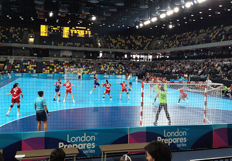
It was a bleak, windswept and chilly 1km walk from Westfield Stratford – the entry point – to the arena itself, but it did mean a walk right through the park (between temporary security fences) crossing numerous wide bridges and passing the Water Polo arena (temporary) and almost underneath the front of the Aquatic Centre. There is quite a lot of landscaping going on, and the odd tree here and there, but also large areas of hard paving, unfortunately reminiscent of the area around the O2 or Surrey Quays but I am sure necessary to cope with the huge volumes of people next summer. Hopefully the post-games conversion work will do a lot to break up the windswept plazas and soften the park area.

One particularly odd bridge had soft paving made up of multicoloured circles, rather lurid and jarring, and presumably soon to fade to murky brown with the weather over the winter. Surely some nice Portland granite would be better, or red brick – presumably much more expensive though. If the Barbican Estate can get large expanses of paving right, then why not the Olympic Park?

Still, it’s going to be a fascinating new part of London to explore – eventually.

Categories
Conferences London

Magical Maps: An Evening at the Art of Mapping Exhibition

I was at a talk last night organised by the Londonist – Magical Maps. It took place in the TAG Fine Arts‘ Air Gallery in Mayfair. TAG Fine Arts currently have an exhibition there – The Art of Mapping, and the audience was surrounded by the various artworks – some made from maps, some as interpretations of maps and some simply with a geographical theme.

The speakers were Stephen Walter, an artist who drew the “Island” London map that was a hit at the British Library’s recent Magnificent Maps exhibition; John Kennedy, a London cabbie, blogger and chronologer of bollards and other London objects; and UCL CASA’s very own James Cheshire, recent PhD, now lecturer.

James was up first and showed some of the recent visualisation work by CASA. You can see most of what he showed in an article here.

Then John explained The Knowledge, taking the audience on a verbal taxi journey, from the gallery to the Elephant and Castle – “the true centre of London” – and back, taking into account various banned turns and other taxi restrictions! His journey was peppered with anecdotes of the various places encountered.

Finally, Stephen outlined his artistic career, showing how he switched from traditional photography and painting, to producing the monochromatic repeated symbols on landscapes, that envolved into maps and finally his famous Island map. He also showed some works in progress, such as a map of London’s underground structures (tube lines, water pipes, the Mail Rail etc).

Matt from the Londonist then chaired a Q&A session with the panel, and finally there was another chance to look around and think about the artworks on the walls. I was most intrigued by the below image, which lists and shows all the bridges across the Thames in London, the top line being Teddington Lock and the bottom being the Thames Barrier – but I don’t know why the lines cross over and wiggle. Perhaps it is just purely artistic, but the data visualiser in me hopes there is a deeper meaning and an embedded infographic…

An excellent evening with three very different but equally engaging speakers and some very interesting things to look at.

The exhibition is open for another week, it’s quite small and free, and there is a complementary exhibition book, so take a visit to Mayfair and have a look! There is a talk tomorrow by some of the artists.

Categories
London Mashups

The Tech City Map

Last week the government launched the Tech City map. It is not the first – there have been several previous maps, e.g. by the Guardian, of technology startups in the Old Street/Shoreditch area of London, but this is the highest profile one produced yet. I’m not sure whether a map itself is useful to the community but it serves perhaps to increase the identity and branding of the area – and awareness of it for the general public.

Incidentally, the area covered is also known as the Silicon Roundabout area, it often incorrectly referred to the Westminster set as “East London” (I would more term it as North-East inner-city London). I would consider more for the area around the Olympic Park to be true East London, i.e. east of Charing Cross, north of the river and east of the City – areas such as the East End, Stratford, Barking and West Ham.

As for the cartography, there has been some criticism by some people of the mass of straight blue lines, representing retweets of one company’s message by others. I prefer to see it as a piece of “art” showing the interconnectiveness of the organisations. No one’s trying to do serious quantitative impact work with this, it’s just for visual impact and identification of a new organically-created geographical area.

It’s nice also that the custom style functionality of Google Maps v3 API is being used – giving the streets a nice blue hue rather than the very familiar (and quite distracting) regular colours on Google Maps. Of course Google has recently introduced quite low limits (2500 map loads) for free usage of its custom style functionality, I wonder if this website eventually breaching such a limit if it gets hit with another blaze of publicity?

Perhaps the most exciting news that came out of last week’s announcements was that UCL, Imperial and Cisco are collaborating to build a new Future Cities research facility in the Tech City area, which would be focusing on urban modelling and technology. This is music to my ears – I’m not sure whether UCL CASA, the lab where I work, has plans ever have a presence there but it would be an amazing place to work. Maybe there will be a CASA East in the not too distant future?

Categories
OpenStreetMap Orienteering Training

OpenOrienteeringMap is on Attackpoint

Just a quick post for people who use Attackpoint – >a OpenOrienteeringMap (OOM) is on it! More specifically, you can view GPS routes that people have uploaded, using OpenOrienteeringMap as a background.

To do this:
1. Click on the little “globe” icon beside an entry that has a GPS log. Here’s an example from my Venice Street Race run on Sunday.
2. On the map that loads, click on the “OSM” button on the top right.
3. Click on one of the OOM items on the menu that appears just below the OSM button.

(Note, the global version of OOM is used – this one does not update as the OpenStreetMap database updates, but instead on a more occasional schedule.)

The basemap is based on OpenStreetMap data.

Categories
Mashups Technical

WMS and SVG Input with Mapnik and Cairo

A rather techy post from me, just before the Final Project Post for GEMMA (my current project at CASA) is submitted, summing the project and applications up. Why? I wanted to share with you two rather specialist bits of GEMMA that required quite a bit of head-scratching and trial-and-error, in the hope that, for some developer out there, they will be of use in their own work. I’m cross-posting this from the GEMMA project blog.

One of the core features of GEMMA that I have always desired is the ability to output the created map as a PDF. Not just any PDF, but a vector-based one – the idea that it will be razor-sharp when you print it out, rather than just looking like a screen grab. I had written a basic PDF creator, using Mapnik and Cairo, for OpenOrienteeringMap (OOM), an earlier side-project, and because the GEMMA project is about embracing and extending our existing technologies and knowledge at CASA, rather than reinventing the wheel, I was keen to utilise this code in GEMMA.

Most of the layers were quite straightforward – the two OpenStreetMap layers (background and feature) are very similar indeed to OOM, while the Markers and Data Collector layers were also reasonably easy to do – once I had imported (for the former) and hand-crafted (for the latter) suitable SVG images, so that they would stay looking nice when on the PDF. The trickiest layer was the MapTube layer. For the terms of this project, the MapTube imagery is not a vector layer, i.e. we are not using WFS. However I was still keen to include this layer in the PDF, so I turned to Richard Milton (the creator of MapTube) and discovered there is an WMS service that will stitch together the tiled images and serve them across the net. I could combine this requesting the WMS images on the GEMMA server (not the client!), converting them to temporary files, and then using a RasterSymbolizer in Mapnik 2, and an associated GDAL filetype.

The trickiest part was setting georeferencing information for the WMS image. Georeferencing is used to request the image, but it is also needed to position the image above or below the other Mapnik layers. Initially it looked like I would have to manually create a “worldfile”, but eventually I found a possibly undocumented Mapnik feature which allows manual specification of the bounding box.

I’ve not seen this done anywhere else before, although I presume people have just done it and not written it down on the web, so here’s my take, in Python.

First we get our WMS image. MAP_W and MAP_H are the size of the map area on the “sheet” in metres. We request it with a resolution of 5000 pixels per metre, which should produce a crisp looking image without stressing the server too much.

mb = map.envelope()
url = maptube_wms_path + "/?request=GetMap&service=WMS&version=1.3.0"
url = url + &format=image/png&crs=EPSG:900913"
url = url + "&width=" + str(int(MAP_W*5000)) 
url = url + "&height=" + str(int(MAP_H*5000))
url = url + "&bbox=" + str(mb.minx) + "," + str(mb.miny) + "," 
url = url + str(mb.maxx) + "," + str(mb.maxy)
url = url + "&layers=MAPID" + str(maptubeid)

furl = urllib2.urlopen(url, timeout=30)

Mapnik doesn’t work directly with images, but files, so we create a temporary file:

ftmp = tempfile.NamedTemporaryFile(suffix = '.png')
filename = ftmp.name
ftmp.write(furl.read())

Next we set up the layer and style. It’s nice that we can pass the opacity, set on the GEMMA website, straight into the layer in Mapnik.

			
style = mapnik.Style()
rule = mapnik.Rule()
rs = mapnik.RasterSymbolizer()
rs.opacity = opacity
rule.symbols.append(rs)
style.rules.append(rule)
map.append_style(filename,style)
lyr = mapnik.Layer(filename)

Here’s the key step, where we manually provide georeferencing information. epsg900913 is the usual Proj4 string for this coordinate reference system.

lyr.datasource = mapnik.Gdal(base='',file=filename, bbox=(mb.minx, mb.miny, mb.maxx, mb.maxy)) #Override GDAL
lyr.srs = epsg900913

Finally:

lyr.styles.append(filename)
map.layers.append(lyr)

I’m excited about one other piece of code in the PDF generation process, as again it involves jumping through some hoops, that are only lightly documented – adding an SVG “logo” – the SVG in this case being the GEMMA gerbil logo, that Steve (co-developer) created from Illustrator. Cairo does not allow native SVG import (only export) but you can use the RSVG Python package to pull this in. I’m being a bit lazy in hard-coding widths and scales here, because the logo never changes. There are more sophisticated calls, e.g. svg.props.width, that could be useful.

	
svg = rsvg.Handle(gemma_path + "/images/logo.svg")
ctx = cairo.Context(surface)
ctx.translate((MAP_WM+MAP_W)*S2P-ADORN_LOGO_SIZE, CONTENT_NM*S2P)
ctx.scale(0.062, 0.062)
svg.render_cairo(ctx)

Note that we are calling render_cairo, a function in RSVG, rather than a native Cairo function that we do for all the other layers in the PDF.

The screenshot above contains data from the OpenStreetMap project.

Categories
Olympic Park OpenStreetMap Orienteering Events Log

Olympic Torch Relay – The Unofficial Map

Cross-posted from my research blog.

The organisers of next year’s Olympic Games in London, LOCOG, have unveiled their map of the 1000+ places that the Olympic Torch Relay will pass through. The data that the map is built from is readily accessible (as a JSON file that gets downloaded to your computer when you view the map) so I’ve taken the data and built my own (unofficial) map. It has a number of advantages over the official map:

  • The base map is OpenStreetMap, which is much more detailed.
  • The map takes up the whole browser page, allowing for easier panning around.
  • The line that connects each of the places is drawn as a vector, so it still appears as you to zoom right in to see individual villages. (The official map surprisingly uses tiles for the line.)
  • There are Wikipedia links for each of the places. Almost all of these resolve to proper Wikipedia entries, so you can easily find out about the places that have been picked, with the richness of detail that is characteristic of the Wikipedia project.

See it here.

Categories
Olympic Park OpenStreetMap

Olympic Torch Relay – The Unofficial Map

The organisers of next year’s Olympic Games in London, LOCOG, have unveiled their map of the 1000+ places that the Olympic Torch Relay will pass through. The data that the map is built from is readily accessible (as a JSON file that gets downloaded to your computer when you view the map) so I’ve taken the data and built my own (unofficial) map [no longer online due to dependency removals, as of ~2020]. It has a number of advantages over the official map:

  • The base map is OpenStreetMap, which is much more detailed.
  • The map takes up the whole browser page, allowing for easier panning around.
  • The line that connects each of the places is drawn as a vector, so it still appears as you to zoom right in to see individual villages. (The official map surprisingly uses tiles for the line.)
  • There are Wikipedia links for each of the places. Almost all of these resolve to proper Wikipedia entries, so you can easily find out about the places that have been picked, with the richness of detail that is characteristic of the Wikipedia project.

The route has been designed to “ensure the flame within a one-hour journey of 95% of people in the UK” (Source).

Although my map is no longer online, you can download the geospatial data I used, here.

Categories
Technical

The Ease of Monitoring with Munin

I’m currently using Munin to keep an eye on the various services running on my main server at UCL CASA. Munin is a monitoring package. It is simple to install (on Ubuntu, sudo apt-get install munin on your primary server, sudo apt-get install munin-node on all servers you want to monitor), and brilliantly simple to set up and – most importantly – extend.

Out of the box, Munin will start monitoring and graphing various aspects of your server, such as CPU usage, memory usage, disk space and uptime. The key is that everything is graphed, so that trends can be spotted and action taken before it’s too late. Munin always collects its data every five minutes, and always presents the graphs in four timescales: the last 24 hours, the last 7 days, the last month and the last year.

Extending Munin to measure your own service or process is quite straightforward. All you need is a shell-executable script which returns key/value pairs representing the metric you want to measure. You also need to add a special response for when Munin wants to configure your plugin. This response sets graph titles, information on what you are measuring, and optionally thresholds for tripping alerts.

Here’s a typical response from a munin script “uptime”, this is used by Munin to construct the graph:

uptime.value 9.29

Here’s what you get when you call it with the config parameter:

graph_title Uptime
graph_args --base 1000 -l 0 
graph_scale no
graph_vlabel uptime in days
graph_category system
uptime.label uptime
uptime.draw AREA

Munin takes this and draws (or reconfigures) the trend graph, with the data and a historical record. Here’s the daily graph for that:

I have two custom processes being monitored with Munin. The first is my minute-by-minute synchronisation of my database (used by OpenOrienteeringMap and, soon hopefully*, GEMMA) with the UK portion of the master OpenStreetMap database. The metric being measured is the time lag. Normally this is around a minute or less, but if there are problems with the feed at either OSM’s end or (more likely) my end, the graph spikes up and the problem can be spotted and dealt with. Also, the subsequent graphing trend, after such an issue, is useful for predicting how quickly things will be back to normal. I’m using an OSM plugin (part of the Osmosis system, which is also doing the synchronisation) rather than writing my own.

The other process is for monitoring the various feeds I have to around 50 cities around the world, to get their current bikes/spaces information for my Bike Share Map. Munin graphs are useful for spotting feeds that temporarily fail, and then hopefully fix themselves, resulting in distinctive “shark fin” trendlines. If one feed doesn’t fix itself, its shark fin will get huge and I will then probably go and have a look. Above is what the daily graph looks like.

I wrote this plugin myself, in two stages. First, my scripts themselves “touch” a “heartbeat” file (one for each script) upon successful execution. When the feed’s file is touched, its modified timestamp updates, this can then be used as a basis for determining how long ago the last successful operation is.

Secondly, my Munin plugin, every five minutes, scans through the folder of heartbeat files (new ones may occasionally appear – they go automatically onto the graph which is nice) and extracts the name and modified timestamp for each file, and reports this back to Munin, which then updates the graphs.

Because Munin allows any shell-executable script, I was able to use my language du-jour, Python, to write the plugin.

Here it is – latest_dir is an absolute path to the parent of the heartbeats directory, scheme is the name of the city concerned:

#!/usr/bin/python

import os
import time
import sys

filedir = latest_dir + '/heartbeats/'

files = os.listdir(filedir)
files.sort()

if len(sys.argv) > 1: 
	if sys.argv[1] == 'config':
		print "graph_title Bike Data Monitoring"
		print "graph_vlabel seconds"
		for f in files:
			fp = f[:-6]
			print fp + ".label " + fp
		exit()

for f in files:
	tdiff = time.time() - os.path.getmtime(filedir + f)
	fp = f[:-6]
	print fp + ".value " + str(tdiff)

The middle section is for the config, the bit that is used every five minutes is just the gathering of the list of files at the top, and the simple measurement at the bottom.

That is really it – there is no other custom code that is producing the graphs like the one at the top of this post – all the colours, historical result storing and HTML production is handled internally in Munin.

My code that updates the heartbeat file is even simpler:


def heartbeat(scheme):
	open(latest_dir + '/heartbeats/' + scheme + '.touch', 'w').close()

Fingers crossed things won’t go wrong, but if they do, I now have a pleasant, graphical interface to spotting them.

* GEMMA will use OpenStreetMap data for the whole world, but currently it takes longer than a minute to process a minute’s worth of OpenStreetMap database updates, such is the level of activity in the project at the moment, so my minutely-updating database only covers the UK. So, for GEMMA, I am just using a “static” copy of the whole world. OpenOrienteeringMap has two modes, UK and Global – only the UK one uses the updating database.