Simon has a good article about how OpenOrienteeringMap was used for a street orienteering event in St Albans. See it here.
Manchester Map Mega-Mashup
I’ve now updated my Manchester Historic Map mashup (previous blog post) with five fourteen more historical maps, the earliest is from 1772. Maptastic.
[Update: I’ve also added a split-screen view for side-by-side comparison of the maps.]
OS Locator vs OSM
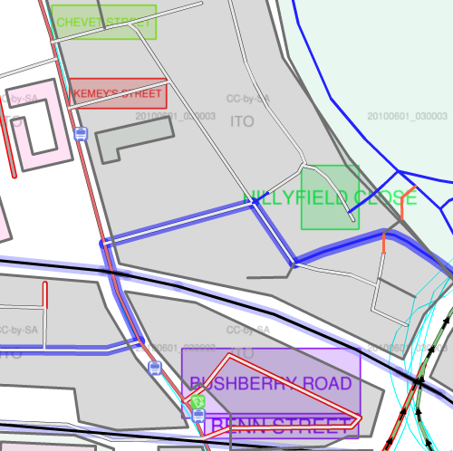
ITOWorld have created a rather nice streetname error indicator layer for Great Britain, which graphically shows naming inconsistencies for streets, between OS Locator (part of the Ordnance Survey Open Data release) and OpenStreetMap, when using the latter’s editor tools.
The service uses rectangular bounding boxes to show the discrepancies. Initially I thought this would not work well, as streets that are aligned north-south or diagonally would dominate compared with streets aligned to the east-west axis, but actually it visually works well, regardless of the orientation.
Here’s a screenshot of what it looks like for a park of Hackney:
The light green square at the top is indicating “Chevet Street” – this is the OS Locator name, and clicking the road underneath the rectangle in the editor reveals it is called “Chevet Road” in the OpenStreetMap database. Similarly, the red square reads “Kemey’s Street”, while in OSM it is currently “Kemey Street”. The close in green on the right appears to be misnamed as an extension of the street it joins, while the two streets at the bottom aren’t named at all in OpenStreetMap – which is why they are also showing up as red in the editor. (The blue outline indicators one of the London Cycling Network routes, by the way.)
Time to get out on the streets and and clear these errors!
Tube Flow Update: 2009 Changes
Transport for London have published the 2009 data for numbers of people entering/leaving the stations on the tube network. I’ve updated my visualisation/map with the new data.
Some interesting trends have emerged. Blackfriars sees the biggest decrease (i.e. biggest red circle) – no surprise, as the station has been closed throughout 2009. The other big decreases are at Canary Wharf, Finsbury Park and Wimbledon. The former is on the Jubilee Line, and many of the stations on the line have seen a drop in usage – presumably something to do with various sections of the line being closed most weekends throughout last year. The station for the O2 is doing well though. Many of the Victoria and Metropolitan line stations have also seen a big drop. Indeed in general, the network has seen a drop in usage, the map being predominately red.
The biggest increases are Temple and Mansion House, presumably spillover from the Blackfriars closure, Euston, maybe due to increased use of the Eurostar services new higher-speed services to NW England, and Barking – lots of new build flats here?
Within the overall pattern, there’s a cluster of decreases (red) in West London Zone 2 (Shepherd’s Bush), and a a cluster of increases (blue) around East London Zone 1/2 (Aldgate) and North London Zone 2 (Camden).
The map does not include DLR, rail or London Overground usage.
See it here.
Summer Plans
What I’m planning on doing this summer:
3 June pm | LOK Park Race | Grovelands Park | 5km |
5 June | parkrun | Hackney Marshes | 5km |
8 June pm | SLOW Park Race | Battersea Park | 5km |
11-21 June | A wedding/Lakes/Knoydart trip | ||
22 June pm | SLOW Trail Challenge | Ham | 10km |
26-27 June | A stag | ||
29 June pm | SLOW Park Race | Tooting Bec Common | 5km |
3 July | parkrun (maybe) | Hackney Marshes | 5km |
3 July | North Downs Relay | North Downs | 10km |
4 July | LOK London Interclub | Addington Hills | 7km |
7-15 July | Sweden training tour | ||
17 July | parkrun | Hackney Marshes | 5km |
18 July | MV London Interclub | Ashtead | 7km |
20 July pm | SLOW Park Race | Bishop’s Park | 5km |
21 July pm | DFOK local event | Shooters Hill | 5km |
22 – 31 July | Land’s End-London cycling trip | ||
4 August pm | DFOK local event | Lesnes Abbey | 5km |
7 August | parkrun | Hackney Marshes | 5km |
8 August | SAX Trail Challenge | Sevenoaks | 21.1km |
10 August pm | SLOW Trail Challenge | Richmond Park | 10km |
11 August pm | DFOK local event | Bostall Heath | 5km |
13-15 August | Purple Thistle orienteering event | ||
16-22 August | Hillwalking/Edinburgh Fringe | ||
28 August | parkrun | Hackney Marshes | 5km |
30 August | Urban Race | Didcot | 7km |
4 Sept | Urban Race | Sheffield | 7km |
5 Sept | Urban Race | Lincoln | 7km |
9 Sept pm | DFOK local event | Jubilee Park | 5km |
11 Sept | Two2Go marathon | Lea Valley | 42.2km |
18 Sept | Urban Race | City of London | 10km |
19 Sept | LOK local event | Hampstead Heath | 7km |
25 Sept | Urban Race | St Andrews | 7km |
26 Sept | District event | Tentsmuir | 10km |
2 Oct | parkrun | Hackney Marshes | 5km |
3 Oct | Urban Race | Warwick | 7km |
Marathons
So, I ran my first marathon last Sunday – the Edinburgh Marathon. Although really it’s the East Lothian Marathon, as 19 of the 26 miles are outside the city, and along the East Lothian coastline. Still, the route goes past the village I grew up in, and the coastline is quite scenic.
It was a pretty hot and humid day and the heat really got to me after around 20 miles, but I just about managed to finish without stopping, mainly by running in any available shade, picking up extra water bottles off the road, and taking the pace right down.
The pain in the legs on finishing was noticeably more than any previous running event I’ve done, and the euphoria of finishing didn’t quite cancel it out… indeed it’s taken four days for the quads and hamstrings to stop hurting. My time – 3h 34m 22s (1003rd place out of about 9500 finisher) – was well outside where I would need to be for London (3h 10m) but, after a moment of possible madness last night, I have entered two more – the Lea Valley (Two To Go) Marathon in September, which helpfully finishes about a mile from my house and is very flat, and the Brighton Marathon in April next year, which looks nice and flat, highly organised (they are emulating London by the looks of things) and had rave reviews from almost everyone who ran it last year. Brighton’s also pretty easy to get to and from. I’m not planning on doing more than a couple every year – they aren’t very good for you, and the switch in training doesn’t help the regular running and orienteering.
So now I have a PB that I can aim to beat in the future, now that I know that I can run 42.2km without passing out – my longest training run having been 32.5km.
A friend, Ed, was also up for the weekend and finished in an impressive 22nd place – 2h 48. That’s one time that is definitely out of reach.
Hackney Marshes parkrun
There’s going to be more than just football going on in Hackney Marshes on Saturday mornings in the future – the parkrun series of 5km running races is coming to Hackney and the inaugural is this coming Saturday at 9am – and then every Saturday at 9am. Same time, same place, every week. Simple.
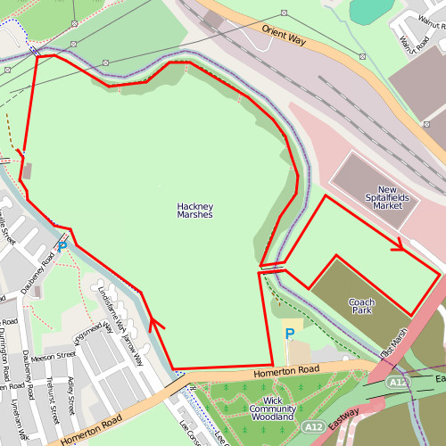
The course is most suited to people who like off-road as well as on-road running. The first 2km is on a tarmac’d track, the next 2km is on grass around the East Marsh, with a great view of the emerging Velodrome in the Olympic Park, and the southern edge of the main Marshes, and the final km is on a tarmac’d track beside the Lee Navigation Canal.
I’ll be helping out at the finish, rather than running it, as my legs won’t quite have recovered from last weekend’s marathon. Once I am back into running, the event should have excellent PB potential (if the grass doesn’t slow things down too much) as it is a completely flat course. Much as I like Finsbury parkrun, the hills do add a good 45 seconds to my run each time. I expect I will alternate between the two, though, as each has its charms.
If you are in south London, Crystal Palace is also starting a parkrun this weekend. Ironically, it’s now pretty easy to get to from Hackney, thanks to the new Overground service that runs from Dalston.
Mapping the London Olympics
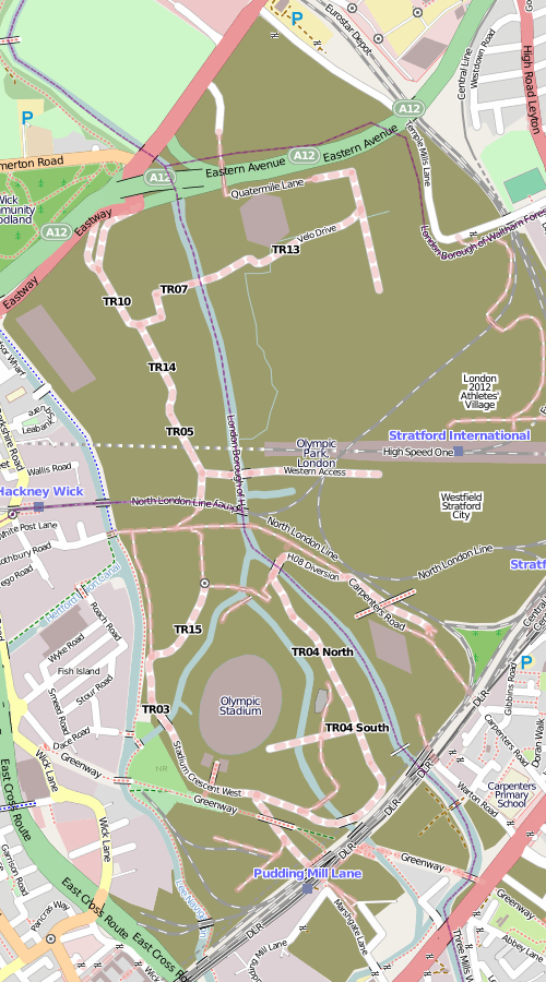
Here’s what the Olympic Park in East London currently looks like on OpenStreetMap, following my recent tour and some other visual guestimating from outside the boundary fence:
The brown areas shows the construction sites, most of which are for the Olympic Park, apart from the eastern area which is the Stratford City development and the southernmost area which is the Crossrail Pudding Mill Lane construction.
The main stadium is a rather unsteady oval, the media centre is the not-quite-rectangular building in the left-hand corner, the velodrome is the hexagon, and the aquatic centre is the diamond. These are all simplified shapes based on what I see, rather than any official plans. There aren’t any buildings yet for the athletes’ village (the fifth of the Big 5 permanent venues) or the Westfield Stratford City mega-development, just POIs. The roads are rather incomplete – although unlike the main venues, these might not be permanent. It’s about as complete as I can get it without privileged access to the site (unlikely) or tracing from detailed aerial or elevated imagery. There’s lots of such imagery out there – the official London 2012 blog has published quite a lot recently, as have some media.
So this is a plea to anyone owning such imagery – if they don’t mind it being used for OpenStreetMap data (i.e. happy to licence it under a Creative Commons Attribution licence) to let the OSM community use it for such purposes, so this high-profile site looks great and up-to-date on the map that everyone can use.
…or I could just wait until the park opens in two years time.
The Political Colour of London
Following on from The Political Colour of Great Britain, and reusing the same code, I have produced a map for London, showing graphically the results of the voting for the local elections in Greater London’s 600-odd wards, for the May 2010 elections and back in 2006.
The “colour” map assigns every vote to one of the three RGB primary colours – red for Labour, blue for Conservative and green for all other parties. It so happens that the three groupings have roughly the same number of votes across the whole of London. These are scaled by the total number of votes for each ward, and then resulting proportions are converted to the hexadecimal “web” colours you see on the dots. An “enhance” function is used to increase the value of the colours away from the mean, to prevent the map from looking muddy.
The advantage of using colour in this way to represent each constituency is every person’s vote counts towards the final colour, rather than just those that elected the three winning councillors in each ward. Use of a single colour is the simplest way to summarise each result. The disadvantage is that it is difficult for human eyes to quantitatively perceive the colour and translate it to a result – although we are quite good at spotting differences in colours, it is more difficult to interpret these.
The voting data is from the London Datastore, the ward and borough boundaries from Ordnance Survey Open Data, and the background map from OpenStreetMap data, rendered using Mapnik. The ward centroids were calculated in ArcGIS and the map is displayed with the OpenLayers framework. Performance is very poor in Internet Explorer because the VML renderer it uses is extremely slow – SVG is used instead in Firefox and the other standards-based browsers and is vastly better.
For a different take on the same technique of using colour to show the vote composition for each ward, see the article on Spatial Analysis.
Following on my UK General Elections 2010 Swings map, where circles represent each constituency, with the sizes and colour describing the metrics, I have used a technique that James has been studying, to combine the vote proportions together to produce a single coloured dot for each constituency. The more blue the dot, the higher the proportion of the vote was Conservative. Similarly, red for Labour and Green for the Lib Dems and the other parties and independents.
A purple constituency represents a Labour/Conservative marginal, as blue+red = purple. There are many of these in the Midlands. Similarly, orange areas indicate likely Labour/Lib Dem (or SNP/PC etc) marginals, such as in South Wales, and turquoise areas indicate Conservative/Lib Dem (& other) margins, there are many of these in SW England. Grey dots show three-way marginals, e.g. Hampstead in London.
Because I am using just three colours, to represent three political groupings, the visualisation does not show the variation in results between the Liberal Democrats and the nationalist parties – the SNP and PC in Scotland and Wales respectively.
Some interesting patterns are revealed – the ring of blue/purple around the red/orange centres of London and Birmingham – with no such corresponding ring around Manchester or Newcastle. Scotland’s lack of blue. The straightforward Labour/Conservative split in NW England. East London isn’t quite as safe-Labour as you might think – with the exception of East Ham standing out in bright red.
The benefit of this visualisation is that every vote is included in it – on a regular election map, if one party just fails to win, then an election map won’t show them at all on it. Here, every vote influences the colour of the map. Each circle represents roughly the same number of people – the populations of constituencies are fairly even, with some notable exceptions such as the Isle of Wight (very populated) and the Scottish Islands (very few people.)
You can see the colour map by going to the election visualisation and choosing “Constituency Colour” from the “Other graphs” drop-down. James has produced a regular choropleth map version, which shows the green (SNP/LD) of northern Scotland and blue (Conservative) of southern England strikingly well.