Categories
London Technical

37000 Old OS Maps

nls_kew

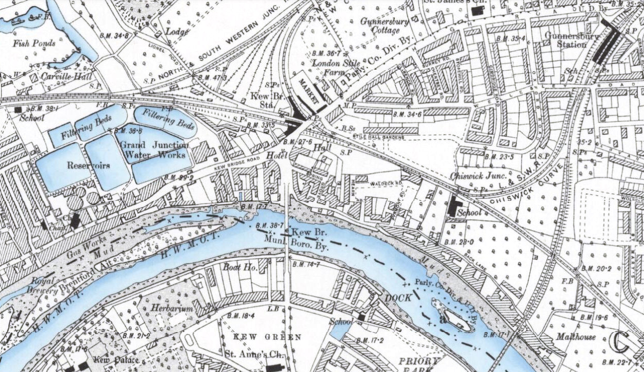
The National Library of Scotland (NLS) yesterday unveiled a HUGE collection of maps that they have digitised and placed online. The maps, covering England and Wales, are historic Ordnance Survey maps that are between 60 and 170 years old and are at a high resolution. The scale is 6-inch-to-the-mile and covers the whole country. At the moment each map can be viewed by clicking on the appropriate box on an online map, they plan to undertake further work to join many of the maps together to create a single scrollable historic map of the whole country this summer.

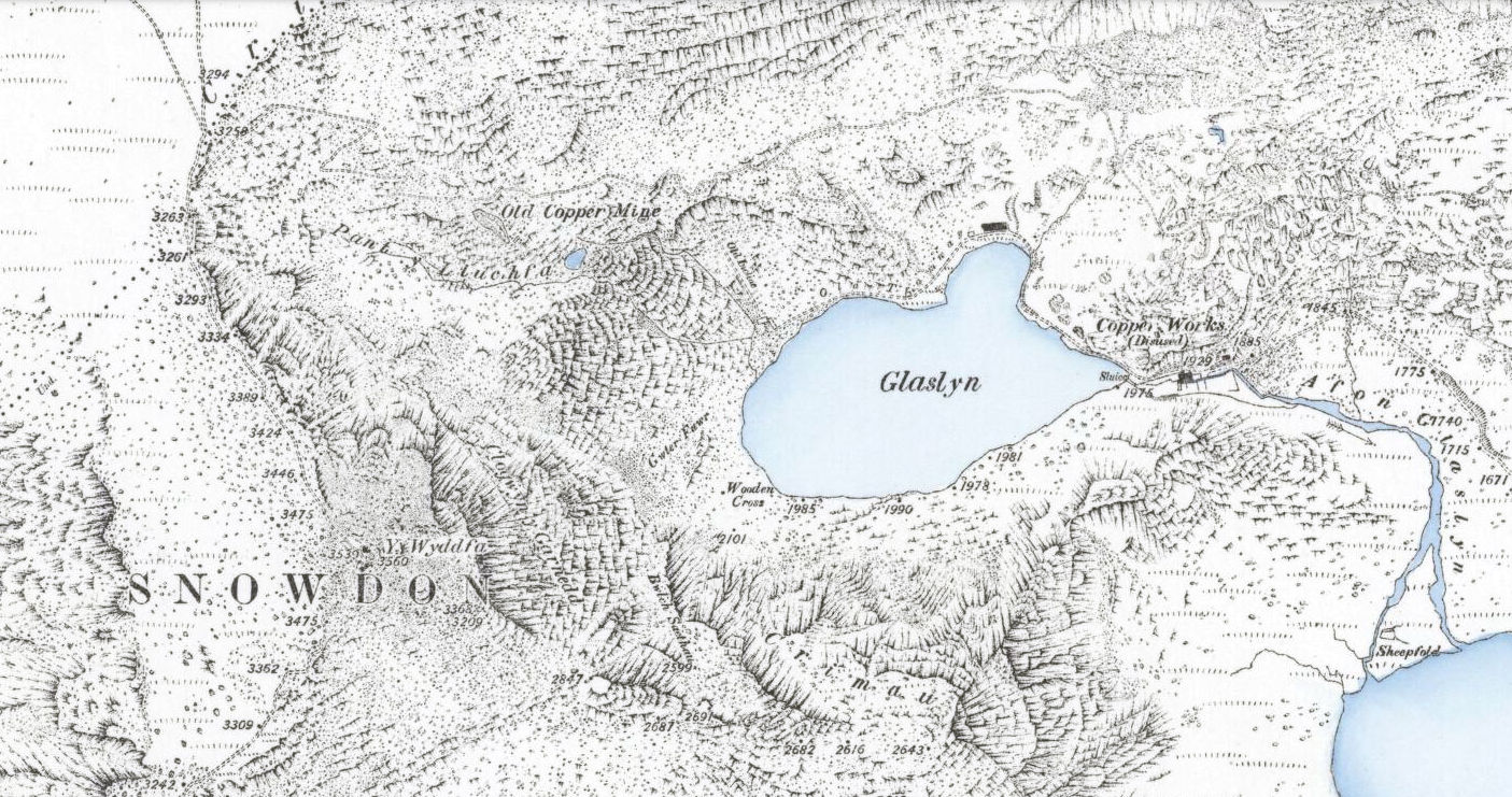
The extract above, of the Kew Bridge area in 1899, is from this map (I’ve shifted the white balance.) Some of the maps have some rather nice colouring for water – with the blue colour being augmented by some subtle shading on the riverbanks. The same effect is see in a Snowdon map (extract below), from 1889.

I featured an earlier release of Victorian 60-inch-to-the-mile maps, for London, on Mapping London. The number of retweets and Facebook likes for this posting was unprecedented for the blog, suggesting a huge interest in high quality scans of historic maps.

Here’s their press release, includes the reason why the NLS is including maps from outside Scotland!

New map resource – OS six-inch England and Wales, 1842-1952

We are very pleased to announce the availability of a new website resource – zoomable colour images of the Ordnance Survey’s six-inch to the mile (1:10,560) mapping of England and Wales. All our map digitisation work in recent years has been externally funded, hence the recent expansion of our map images beyond Scotland.

This is the most detailed OS topographic mapping covering all of England and Wales from the 1840s to the 1950s. It was revised for the whole country twice between 1842-1893 and between 1891-1914, and then updated regularly for urban or rapidly changing areas from 1914 to the 1940s. Our holdings are made up of 37,390 sheets, including 35,124 quarter sheets, and 2,237 full sheets.

The maps are immensely valuable for local and family history, allowing most features in the landscape to be shown. The more detailed 25 inch to the mile (or 1:2,500) maps allow specific features to be seen more clearly in urban areas, as well as greater detail for buildings and railways. However, most topographic features on the 25 inch to the mile maps are in fact also shown on the six-inch to the mile maps.

The easiest way of finding sheets is through a clickable graphic index using our ‘Find by Place’ viewer: http://maps.nls.uk/openlayers.cfm?id=39&zoom=6&lat=53.39954&lon=-3.0305

This allows searching through a gazetteer of placenames, street names, postcodes and Grid References, as well as by zooming in on an area of interest with smaller-scale locational mapping as a backdrop.

The sheets are also available via county lists: http://maps.nls.uk/os/6inch-england-and-wales/counties.html

We plan to also make georeferenced mosaics available of the series by the late summer.

OS six-inch England and Wales home page: http://maps.nls.uk/os/6inch-england-and-wales/index.html

Further information: http://maps.nls.uk/os/6inch-england-and-wales/info1.html

nls_snowdon
Categories
Data Graphics London Mashups

Talking Rabbits and Glowing Lamps – The Internet of London Things

At CASA we’ve always been keen on marrying the online with the tangible – such as the London Data Table (a real table, cut in the shape of London, showing live London data), PigeonSim (fly around a Google Earth view augmented with real-time information) and a couple of 3D printers, one of which was used to print the results of an online mapping field project in Lima, Peru, a couple of weeks ago. One of CASA’s core research projects, Tales of Things, is all about this space.

rabbitOver the last couple of days, Steve, boss Andy and I have been working further on linking online and offline London, by making use of Boris, one of the two Karotz Rabbits that have been knocking around the lab for a while (the other one is of course called Ken), plus a couple of wifi-controllable multi-colour Hue lightbulbs that we acquired more recently.
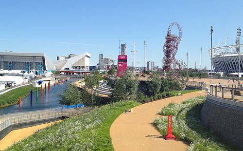
Steve has set up a couple of servers that receive instructions as simple URL requests, format them and pass them to the external company servers that are an inevitable part of most sensor products these days. (In the case of the Karotz server, this usefully turns text into audio files.) The servers then send instructions back into our network and on to the objects themselves.

A few Python scripts later, and we have the following:

  • Boris announces changes to the statuses of the various London Underground lines, when they occur. He also flashes the colour of the affected line as he speaks the message. Between announcements, Boris will pulsate the colour of lines which are not in “Good Service”. His ears also twitch appropriately – appearing fully alert when there are major problems on the network, and a more lackadaisical look when everything’s OK.
  • The first hue lamp, which sits in a spherical orb, shows the weather forecast, as calculated by CASA’s own weather station that sits on the roof of the building opposite. Steve has configured it to show a yellow glow for sunny and dry weather to follow, while a moody blue indicates rain. Disruptive weather, such as likely snowfalls or strong winds, are shown in red, while rain ceasing is green.
  • The second lamp, also in a spherical orb, polls a special Twitter list of active CASA researchers. Every time one tweets, the lamp which change to a particular colour linked to them. For instance, when I tweet about this blogpost, the lamp will turn a distinctive shade of green.

Data Sources

The rabbit, which is in the video above, sits in front of a TV showing CityDashboard, and speaks its wisdom to the office in general from time to time. The video shows him announcing that problems earlier on the Central and District lines are resolved. After the announcement, he goes back to pulsating green to indicate an ongoing District Line issue. The data comes from the tube line status panel on CityDashboard which is itself using the near-live feed from Transport for London’s Developer Area.

The lamps are in the corridor connecting CASA to the rest of the building. As such, it’s often quite a dark place, but now is bathed in an everchanging glow of light based on both sensor data (weather) and social media output (tweets) from our digital city. The Twitter data for the second lamp comes from the London Periodic Table, which accesses the data from Twitter via a proxy server that Steve built. Once a change is detected, another of Steve’s servers is used to send the message to the Hue servers, which then send it back through a special link, to the lamp. Convoluted, but, with a 10-20 second delay, it does work!

Steve has written up a blog post with more details behind the servers that make the system work.

Panos Mavros, a Ph.D student here at CASA, is also using the Hue lamps, in his research into “digital empathy”. He is bringing a whole new meaning to the phrase “mood lighting” – he only has to think and the colours change!

IMG_5532

Categories
Bike Share Data Graphics London

London Cycle Hire on the Cover of BMJ

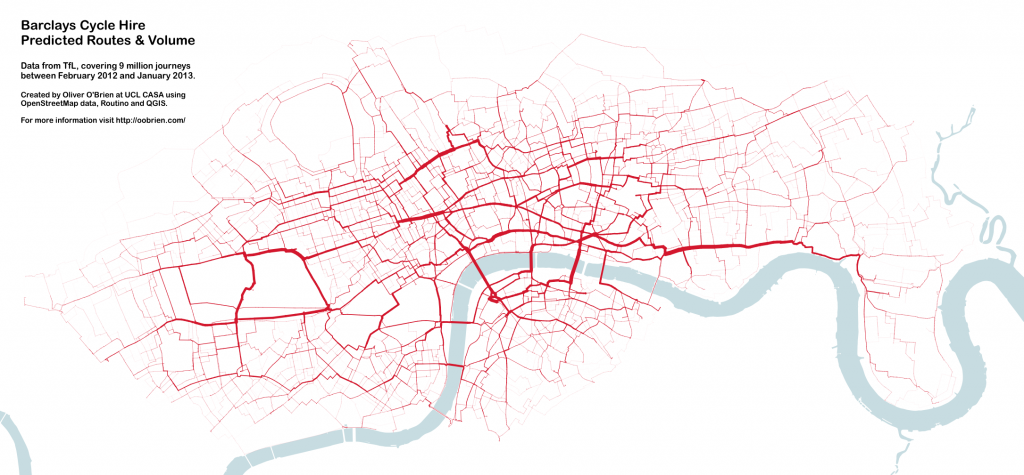
7946.cover_89I produced this data map which forms the front cover of this week’s British Medical Journal (BMJ). The graphic shows the volumes of Barclays Cycle Hire bikeshare users in London, based on journeys from February 2012 to January 2013 inclusive. The routes are the most likely routes between each pair of stations, as calculated using Routino and OpenStreetMap data. The area concerned includes the February 2012 eastern extension to Tower Hamlets (including Canary Wharf) but not the December 2013 extension to Putney. The river was added in from Ordnance Survey’s Vector Map District, part of the Open Data release. QGIS was used to put together the calculated results and apply data-specified styling to the map.

The thickness of each segment corresponds to the volume of cyclists taking that link on their journey – assuming they take the idealised calculated route, which is of course a not very accurate assumption. Nevertheless, certain routes stand out as expected – the Cycle Superhighway along Cable Street between the City and Canary Wharf is one, Waterloo Bridge is another, and the segregated cycle route south of Euston Road is also a popular route.

The graphic references an article in the journal issue which is on comparing health benefits and disbenefits of people using the system, with comparison to other forms of transport in central London. Pollution data is combined with accident records and models. The paper was written by experts at the UKCRC and the London School of Hygiene and Tropical Medicine (LSHTM) and I had only a very small part in the paper itself – a map produced by Dr Cheshire and myself was used to illustrate the varying levels of PM2.5 (small particulate matter) pollution in different parts of central London and how these combine with the volume of bikeshare users on the roads and cycle tracks. The journal editors asked for a selection of images relating to cycle hire in London in general and picked this one, as the wiggly nature and predominant red colour looks slightly like a blood capillary network.

A larger version of the graphic, covering the whole extent of the bikeshare system at the time, is here or by clicking on this thumbnail of it:

bmjfinal

Very rare journeys, such as those from London Bridge to Island Gardens, have faded out to such an extent that they are not visible on the map here. An example route, which the map doesn’t show due to this, goes through Deptford and then through the Greenwich Foot Tunnel.

For an interactive version of the graphic (using a slightly older dataset) I recommend looking at Dimi Sztanko’s excellent visualisation.

Categories
Data Graphics London

London North/South

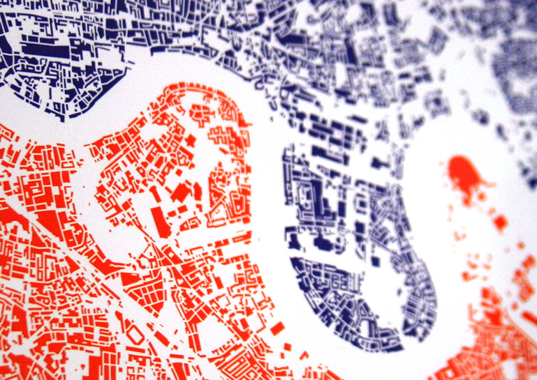
[Buy this print!]

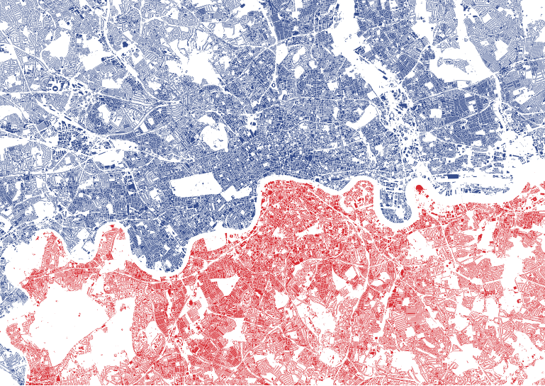
London North/South shows every building block in central and inner city London, coloured blue if it’s north of the River Thames and red if it’s south. And that’s all. No other features are shown, and yet, from this simple premise, a map of the city appears. Almost every street is visible, as a linear white line. Longer lines, with gentler curves, particularly in south London, are often the railways. Stadia are noticeable for generally having a football-field-sized hole surrounded by an often oval block of colour. St Paul’s Cathedral is surprisingly small, but obvious if you know where to look. Big holes in the map are London’s grand parks – Hyde Park and Kensington Gardens being perhaps the most distinctive, as they are surrounded on all sides by densely packed building blocks. A flash of blue appears in the bottom left corner of the map – a mistake? No, the Thames wiggles so much in west London, that this area (Hampton Wick), on the far south of the map, is in fact on the river’s north bank.

The map has 48912 shapes on it – 28200 in blue and 20712 in red. It covers, I think, more than half of London’s eight million plus population, suggesting an average of around 100 people live in each housing block. It does include industrial and commercial buildings, but it’s a fair assumption I think to say that the great majority of buildings in London are residential ones.

The map is centred on a spot just south of Waterloo Railway Station, which is the geographical centroid of Greater London – despite this being south of the river, while the major institutions of the capital – and most of Zone 1 of the tube network – are on the north.

One feature which is on almost all London maps is the River Thames. Famously, when it was removed from the official tube map a few years ago, there was a big outcry and it was hastily restored. This map doesn’t have the Thames on it – but the space through where it runs is obvious. Think of it as being there after all – but coloured white.

I’ve had the graphic professionally litho-printed and it is currently available as a limited edition A2 edge-to-edge print which you can buy from my new online shop, as one of two designs available at the shop’s launch. So far, it’s comfortably outselling the other print which is an update of my Electric Tube design. I think a lot of people like the idea of owning something which has their house on it!

The data comes is Ordnance Survey’s Vector Map District, released under the Open Government Licence. The data is therefore Crown copyright and database right Ordnance Survey 2014. It was prepared in QGIS 2.0, with finishing touches and colouring carried out in Illustrator.

Categories
Data Graphics London

Electric Tube

electric-tube-photo

[Buy this print!]

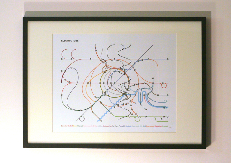
A couple of years I drew a quirky tube map to commemorate the completing of the circle on London’s Overground, affectionally known as the Ginger Line. The artwork has proven to be quite popular so I’ve produced a print run of an updated version of it. The new version retains the circles, loops and quirks of the original, but I took the opportunity to fix a few lines that weren’t quite right, and throw in a few more wiggles – have a look at that DLR!

Here’s what I wrote previously:

My starting principles for the diagram were concentric circles for the orbital sections of the Circle Line and the Overground network, and straight lines for the Central and Piccadilly Lines, with the latter two converging in the centre of the circles. I then squeezed everything else in. I realised that the Northern Line’s Bank branch passed the Circle Line three times so was going to need something special, so I added a sine wave for this section, and extended this north and south as much as possible.

The River Thames is on there – because any tube diagram doesn’t look correct without the river – and the diagram is topologically accurate – everything connects correctly, and features are in an approximately correct geographical position relative to their neighbours, but not to the diagram overall. Only stations that are designated intersections, or have connections with National Rail stations, are shown. I haven’t labelled anything. It’s art.

I was also thinking about physics when creating the diagram – specifically Feynman diagrams, bubble chamber traces, particle physics collisions, magnetic flow lines and electrical circuit diagrams (as was Beck himself). Hence why I’ve called it the Electric Tube.

The work was also inspired by the likes of Fransicso Dans (more) and Project Mapping, as well as of course the famous Official Tube Map.

The limited edition prints can be bought from my online shop.

electric-tube-detail

Categories
Orienteering

OpenOrienteeringMap now Worldwide

I’ve released a new version (v2.1) of OpenOrienteeringMap today, and there are now three editions – UK (as before), Ireland and Global. An earlier global version existed from 2010 to 2012, and has been able to be re-implemented thanks to a server upgrade at work. I hope to have it running for as long as possible.

OpenOrienteeringMap allows you to easily create high quality vector PDF maps, of OpenStreetMap data styled to look like simple orienteering maps, optionally with “score” control points included. It was originally released in 2009, with a major update in 2012 commissioned by British Orienteering. OpenOrienteeringMap is intended for use for urban training exercises and simple street events. As OpenStreetMap (the wiki world map) is updated, both by orienteers and by the general public, so OpenOrienteeringMap also improves. More info about the service.

Here are the different versions:

Edition Updates Versions Contours Branding Funding
UK Daily at 8am UK time StreetO
StO xrail
PseudO
Yes (10m, from OS Terrain 50) British Orienteering British Orienteering development grant in 2012
Ireland Daily at 8am UK time StreetO
StO xrail
PseudO
No Irish Orienteering Association None
Global Every few months StreetO
StO xrail
PseudO
No Generic Ad-supported

You can access them at these links:

The Ireland (IOA) version uses the same database as the UK version, it is just a cosmetic rebranding (& without the postcode search or the contour generation). The global version uses a much larger database which takes three days to create even on the new, fast server, and uses up a lot of disk space. Hence, it will only be updated every few months, unless work dictates. Note also the global version is slower to access and use, because of the extra time taken to live-render the images, from a much larger (100GB+) database than the UK/Ireland versions (<1GB!). It will be even slower if multiple people are visiting the site at the same time, so if the images are very slow to load, wait a few minutes before trying again. In addition to this release, I have open-sourced the Mapnik stylesheets and symbols used to create the maps, on GitHub. I encourage interested people who which to see feature additions, changes or reorderings to submit pull requests. Note that I am using the pre-release version of Mapnik 2.3.0 and the rendering is done via python bindings.

See the stylesheets on GitHub here. If you just want to see the map, here’s a link straight to the global version.

Categories
London Technical

I’m a Londoner… Get Me Out of Here!

leavelondon_essex

Diamond Geezer escaped from London by plotting the shortest distance (as the crow flies) from his home to the London boundary, and then taking the shortest walking route that gets to that same point on the boundary. He identified a pub in Woodford Green as the closest point on the boundary from a nominal start location at the Bow Roundabout in east London. A great example of experimental travel.

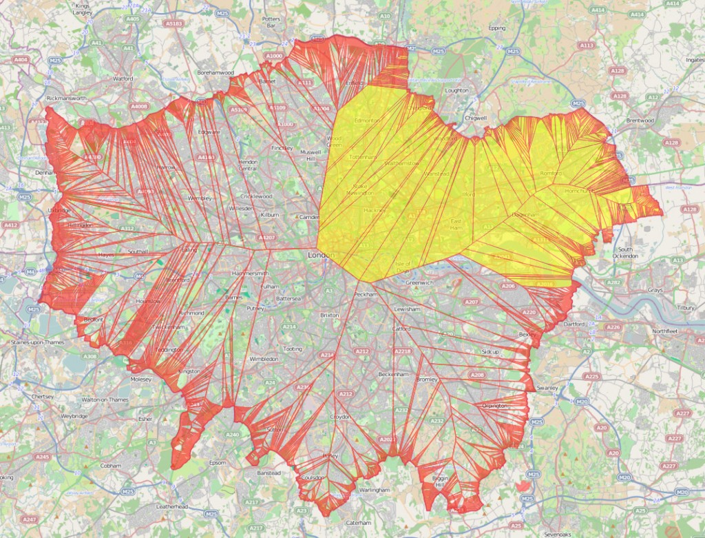
Being an occasional spatial analyst I wondered if there was a way to do the first step – identifying the closest point to me that is outside of London – using a GIS. In so doing I identified that there are five key exit points to where a large portion of Londoners could “escape” to. Additionally, it’s a novel way of identifying the location of a north/south London line, an east/west London split, and a way of working out which home county is your closest. Most of these are obvious if you are in outer London (Zones 3+), but are not so apparent if you are an inner-city dweller. The map above shows the parts of London where The Only Way Is Essex if you are looking for the shortest route out as the crow flies. This includes, somewhat surprisingly, the northern corner of Burgess Park, on the Old Kent Road in what most people would consider south London.

It turns out it is relatively straightforward to produce such a map – however with the important simplification that it is necessary to treat the boundary as a series of points, rather than as a border “line”, to avoid the problem with huge numbers of very small areas when increasingly close to the line. I used QGIS to create the resulting map, shown above. To create the map, follow the steps at the bottom of this post.

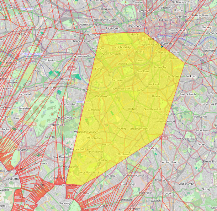
The bit of London’s border which has the largest part of London as its go-to point, shown on the map below, is just behind The Midas Touch pub, just south of Worcester Park station. This is the closest point on the London border for a huge area, including such places as diverse as Hyde Park, Kensington and Elephant & Castle.

leavelondon_biggest

The blue dot near Waterloo in the map above, by the way, is the geographical centre, or “centroid“, of London.

So did DG head to the right place? Nearly. The exit point is on Manor Road, by Woodfood Green, just a short walk from the aforementioned Woodford Green pub:

leavelondon_dg

& those five exit points most useful to Londoners? The places on the edge of London that are the nearest such place for the the five largest single polygons on the map. They are:

  • Just behind the aforementioned Midas Touch pub near Worcester Park station.
  • The junction of footpaths just beyond the end of Courtwood Lane, in Forestdale. Near Tramlink’s Gravel Hill station.
  • A track just inside the northern edge of Joydens Wood (the wood itself, not the village). Not far from Bexley.
  • The far end of the first road loop in Elstree Park, just off the Stirling Corner roundabout.
  • The middle of the woodland behind Monken Hadley Church of England Primary School.

So now you know.

Addendum: How to create the map yourself

You’ll need QGIS installed and to be familiar with how to use it to load layers, change settings etc.

Note: In many of these steps, the GIS operation requires the naming of a new Shapefile that is created, which should then be added to the list of loaded layers (aka Table of Contents) for the next operation.

  1. Add http://mapit.mysociety.org/area/2247.geojson as a new layer. This loads in the London (strictly, Greater London Authority plus City of London) boundary.
  2. Save this layer as a Shapefile, with CRS set to British National Grid, aka ESPG:27700, and add it back in to the project. The specification of British National Grid is necessary to ensure that “proper” square metres are used in the distance calculations.
  3. Set the project to allow on-the-fly reprojection, and set its coordinate reference system to British National Grid, also.
  4. Choose “Extract nodes” from the Geometry Tools submenu in the Vector menu. Because the London boundary is sufficiently complex, there is generally at least one point at least every 100m along the boundary. Optional: You can simplify the boundary before this step, for example if simplifying to 20m accuracy, this will drop the number of points generated from around 10000 to around 1000, although the resulting final map will look a little different.
  5. Choose “Voroni polygons” from the Geometry Tools submenu in the Vector menu.
  6. Choose “Clip” from the Geoprocessing Tools submenu in the Vector menu. You need to clip your newly created Voroni polygons layer to the original boundary polygon that was loaded in in the first step. This step will take a few minutes if you didn’t simplify the boundary.
  7. Add in an OpenStreetMap background. This can be done by installing the OpenLayers plugin, then using the plugin’s menu and adding an OpenStreetMap layer. You normally need to pan (or zoom) the map a bit for it to first load in. Note also this step will reproject the map to “WebMercator” which is similar to, but not the same as, British National Grid – sufficient for display purposes however.
  8. Reorder the layer list so that the OpenStreetMap layer is at the bottom.
  9. Remove all the other layers except for your newly clipped Voroni polygons and the OpenStreetMap background.
  10. Adjust the styling of the Voroni layer, so that the polygons are semi-transparent.
Categories
Leisure Olympic Park OpenStreetMap

Olympic Park Rising

7629386754_86db110501

The Olympic Park in east London was a flurry of colour and activity during a few weeks in summer 2012, but since then it has been largely locked away – a parcel of land opened last year, but with a security fence, access only from certain points and at certain hours, it hasn’t really felt like a proper park. A few cycleways have also appeared, but considering the “blank slate” of the area, they are laughably awful. Tradtionally the excuse for London’s poor standard of cycle tracks is that the roads are too narrow to fit them in, or there’s too much traffic to close a lane for cyclists. Both of these are rubbish reasons for many of our streets of course, but the lack of positive and effective action (apart from in a few isolated places) has allowed places like New York to leap-frog London as cycle friendly cities – during Autumn, more people used the bike-sharing system in New York than in London. I really hope it’s not too late to fix these mistakes.

The good news is that a lot more of the park is due to open very soon. The Aquatic Centre and the Velodrome are due to open in March, along with the outside BMX, mountain bike and road tracks. I’m rather disappointed that we’ll have to pay to use the latter, I had originally envisaged all the bridges being open to the public at all times, but with two of the bridges are forming the circuit, this will represent quite a large part of the park that is fenced off. I appreciate the venue buildings need to be self-sustaining in funding but it’s a shame that the outdoor as well as the indoor circuits are pay-to-play.

Then in April the south of the park reopens, and the Orbit. The orbit will, I’m sure, be about as popular as the cable car, at least until the view improves, but with the southern part of the park opening up, finally there will be a large, green(-ish) space which just might start to feel like a proper London park.

olympicpark_jan2014

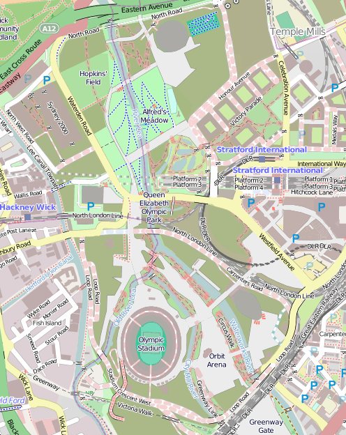
One thing that is going to need updating is the map. The official one is really not that great (What do the dashes mean? What do the dots mean? Why are the open areas outside the park shown in the same grey as closed areas inside the park?) so we’ll have to turn to the crowdsourced map of choice, OpenStreetMap. This map (above) isn’t looking great at all either at the moment – some features that were around only in 2012, such as the athlete’s access tunnel across the Greenway, are still on there. Red dashes show out of bounds paths – how many of these will come in bounds in March/April? So we’ll need a Mapping Party some time there in April/May, and after that, the map should look pretty good.

The park was great for a few weeks in 2012, but the slow pace of opening, and the efforts so far, have been disappointing. But despite my grumbles above I’m greatly looking forward to the park opening, them sorting out the cycle lanes and access, and it maybe becoming, one day, a great space for cycling through, jogging in, or maybe even a bit of park orienteering?

Map © OpenStreetMap & contributors.

Categories
Conferences

Globe

globe

I’m now the proud owner of this lovely green glass globe paperweight – it was my prize from the web map category of the mapping competition at the FOSS4G conference last year, but it’s taken me this long to finally get my hands on it, as I was disappearing on a train before the end of the conference, and accidentally delegated receipt of the prize to a friend who I thought lived in London – actually he lives several hundred miles away. Anyway, thanks to the organisers for coming up with such an inspired prize, one that is useful and beautiful.

Categories
BODMAS London

London Tube Stats

londontubestats

London Tube Stats maps data about how the London Underground is used – how many people use each station at various times of the day, and where they go once they are on the tube.

Transport for London, the city’s public transport authority, have a huge amount of data available in their Developers’ Area website, much of which is regularly updated. I’ve used the bike sharing system data fairly regularly, however I’m keen to take advantage some of their other datasets.

Back in 2010 I built a map mashup of the entries/exits data that, at the time, TfL made available on a (now defunct) performance website. The mashup consisted of varying the sizes of circles over each station, to represent how many people entered/exited the station, at certain times of the day, days of the week, or years, depending on the options selected. I wrote about the mashup here and also mentioned an update when the 2009 data was released, but the site languished. TfL changed the way that the data is formatted as it was moved across to the developer website, so adding future years wasn’t going to be straightforward, and also I never liked the rather stark black and white background map, with the tube lines “baked in” to it, and including various tube depots and other running lines that weren’t part of the passenger network, that I had created quickly.

londontubestats_keySo, I’ve rewritten the mashup from scratch. The main view shows the entry/exit data, by time of day, for 2003-2012. Choosing an option from the drop-down menu at the top will vary the circle sizes, the area of each circle representing the numbers. Clicking on a station will reveal a table of the underlying numbers, with colours showing trends. Then there is an additional view that uses the TfL RODS (Rolling Origin Destination Survey) data for 2012, to show journeys. RODS is based on surveyed data that is then scaled up to match the recorded entries/exits from the barriers, and the numbers represent a typical day. Click on a station to mark the place people enter the system, the other stations then shift in size to show where people exit. You can change between the two datasets using the Metric drop-down menu.

The background map is based on OpenStreetMap data, and the station locations and coloured tube lines are also based on this data – but I’ve tweaked it to show just one line per service, rather then individual tracks and depots.

Gist on GitHub

As part of creating this map, I’ve released the first in what I hope will be an increasingly large set of CASA open data releases. The release, as a Gist on GitHub, is of two files, in GeoJSON format – one for the tube lines, and one for the stations. The files also contain routes and stations for Overground, DLR, Tramlink, Emirates Airline and Crossrail (which starts in 2018) services. These are hidden from the London Tube Stats map, as stats are not available for these at the moment, although you can see them by setting all three dropdowns to the blank option.

I particularly like that GitHub spots that the files are GeoJSON, and effortlessly displays them as a map, rather than presenting the underlying JSON data by default.

[Update 1I’ve tweaked some colours – I now am using yellow vs blue when showing entries and exits for the journey metric. I’ve also added a new metric which compares the ratio of entries vs exits for the AM Peak numbers. Choosing the journey metric now always defaults to showing a selected starting station – currently Finchley Road. Click another station to show the stats.]