Categories
Conferences

Workshop on Big Data and Urban Informatics

IMG_0716

I attended the Big Data and Urban Informatics workshop in UIC Chicago in early August. My previous blog post outlined my presentation at the workshop. Here’s my notes and thoughts on some of the other talks that I attended.

IMG_0724

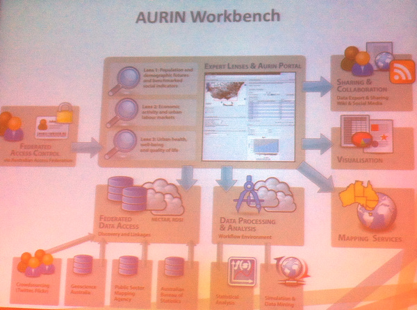
  • Above, the AURIN Workbench is a sophisticated platform for city authorities in Australia to output their data and visualise it through a portal. It’s an academic and commercial partnership. A key focus is data consolidation and normalisation, to allow for straightforward comparisons. This is a challenging aspect with so many data sources, from many authorities and places, and as such there is a large team of people involved with the ever-necessary data processing.
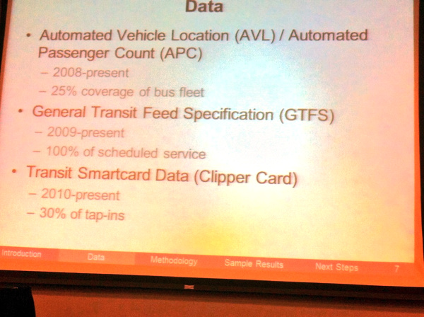
  • CASA scholar Greg Erhardt presented on Ph.D work, below, combining together public transport datasets for San Francisco, to build up a multi-modal database. One particular challenge is the incomplete adoption of smartcard-based travel. Here in London, we are lucky that the Oyster-card usage is so high, that it forms a near-complete picture of public transport usage in many parts of London. This is not the case in San Francisco and many other cities.
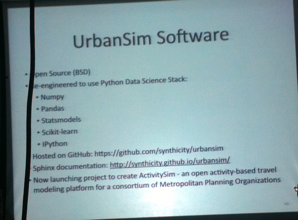
  • An update on UrbanSim (picture at bottom), one of many urban models, a reworked version of which now uses the Python Data Science Data Stack and is hosted on GitHub – both of these potentially opening the model up to discovery, use and adaptation by new groups. ActivitySim is launching as part of the project – this will be an open activity based travel demand model, to complement UrbanSim’s land-use focus.

IMG_0730

IMG_0739

I saw several other interesting talks and presentations, and it is interesting to see just how much activity is going on in the urban informatics spaces, particularly with the ever-increasing volumes of so-called “big data” becoming increasingly easily available for researchers and visualisers.

Categories
Conferences London Mashups

On City Dashboards and Data Stores

Earlier this month, I gave a short presentation at the Big Data and Urban Informatics Workshop, which took place at UIC (University of Illinois in Chicago). My presentation was an abridged version of a paper that I prepared for the workshop. In due course, I plan to publish the full paper, possibly as a CASA working paper or in another open form. The full paper had a number of authors, including Prof Batty and Steven Gray.

Below are the slides that formed the basis of my presentation. I left out contextual information and links in the slidedeck itself, so I’ve added these in after the embedded section:

Notes

Slide 3: MapQuest map showing CASA centrally located in London.
Slides 4-5: More information.
Slide 6: More information about my Bike Share Map, live version.
Slide 7: More information.
Slide 8: More information about CityDashboard, live version.
Slide 10: Live version of CityDashboard’s map view.
Slide 11: More information about the London Periodic Table, live version.
Slide 14: More information about Prism.
Slide 15: London and Paris datastores.
Slide 16: Chicago, Washington DC, Boston data portals.
Slide 17: The London Dashboard created by the Greater London Authority. Many of its panels update very infrequently.
Slide 18: Washington DC’s Open Government Dashboard and Green Dashboard, these are rather basic dashboards, the first being simply a graph and the second having just three categories.
Slide 19: The Amsterdam Dashboard created by WAAG, a non-profit computer society based in the heart of the city.
Slide 20: The Open Data City Census (US version/UK version) created by OKFN – a great idea to measure and compare cities by the breadth and quality of their open data offerings.
Slide 21: More information.
Slide 22: More information.
Slide 23: Pigeon Sim.
Slide 24: Link to iCity, More information on DataShine, live version.
Slide 25: More information on DataShine Travel to Work Flows, live version.

Some slides contain maps, which are generally based on OpenStreetMap (OSM) or Ordnance Survey Open Data datasets.

Categories
Conferences Geodemographics

GISRUK 2014 (Part 3)

A final post where I highlight more of the best papers at GISRUK 2014 in Glasgow – see Part 1 and Part 2.

Geodemographic classification for Ireland

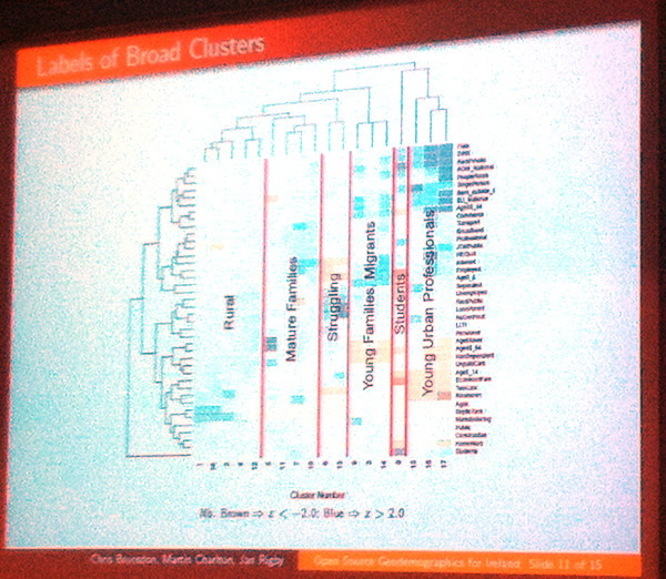
It was an early start on a Bank Holiday Good Friday, particularly as I was commuting from Edinburgh, but I made it in for the second half of Chris Brunsdon (NUI Maynooth)’s talk on creating a geodemographic classification for Ireland. Applying many of the same techniques used to produce the 2001 (and indeed the forthcoming 2011) OAC for the UK, but applying an Irish emphasis – where availability of septic tanks is an important census variable – using using PAM rather than K-means clustering, and ensuring a fully reproducable approach. Six “broad clusters” were identified, as shown on the colourful dendrogram here. Chris also showed maps of the classification, both for Ireland in general and Dublin in particular.

IMG_5783

Mapping neighbourhoods from internet-derived data

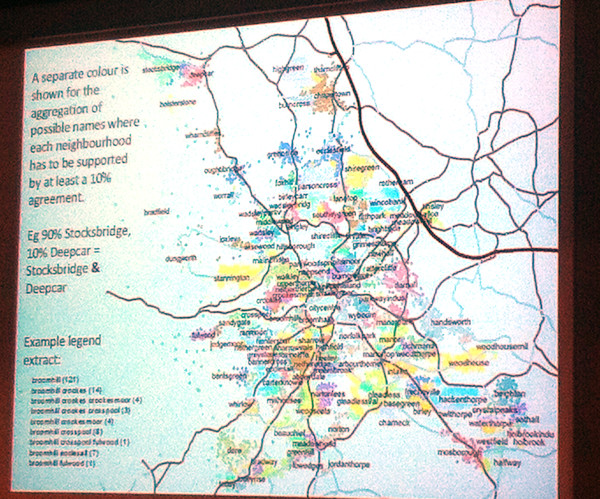
Defining London’s “real” neighbourhoods is something of a preoccupation for me at the moment, with a number of related maps on the Mapping London blog, so this was a talk of great interest to me. Paul Brindley (Nottingham). There are a wide variety of potential sources of data to define neighborhoods – social media, Flickr photograph tags, OpenStreetMap etc. Paul concentrated on postal addresses – specifically the “unnecessary” bit between the street and city, which people habitually still include. By mapping these extra pieces of information to postcodes, and also looking at their population and where their footprints overlapped, an informal geography of neighbourhoods, defined by people themselves, is revealed. The pre-press version of the paper is online.

IMG_5789

Whitebox Geospatial Analysis Toolkit

Finally, a bit of a surprise, and a talk that would have fitted in well at FOSS4G in Nottingham last year, Whitebox GAT is a GIS package focused on complex raster (e.g. LIDAR) manipulation and analysis. The open-source project looks powerful and impressive, but has a low profile, particularly as it’s not part of OSGeo, so the lead author was at the conference, and gave this talk, as part of an effort to increase its profile.

After the conference concluded, I took the opportunity of the unusual weather for Glasgow (i.e. sunny, warm) for a wander around the city, going via the University campus, the new Riverside Museum (and tall ship), the “Squinty Bridge” and Glasgow Green.

IMG_5799

IMG_5794

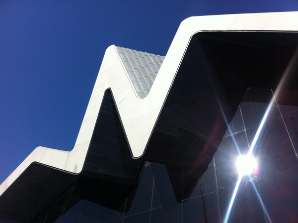
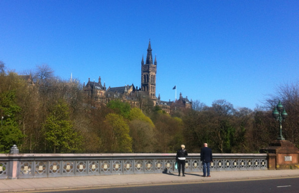
Above: View of the Glasgow University campus from Dumbarton Bridge, and the Riverside Museum building.

GISRUK 2015 will be at Leeds University.

Categories
Conferences Geodemographics

GISRUK 2014 (Part 2)

Following on from part one of my conference review, here are my favourite talks from the middle part of the conference.

Social media and spatial modelling – Tweets and museums

Robin Lovelace (Newcastle) won best paper at the end of the conference, for this talk on examining tweets “geofenced” around many local museums, to see from where these people travelled and what they had to say about the museum.

Agent Based Models and GIS for disaster zones

Sarah Wise (George Mason University & UCL) presented a chapter from her Ph.D on the use of GIS in immediate post-disaster zones, focusing on the Haiti earthquake. OpenStreetMappers quickly mapped Port-au-Prince and other badly damaged areas, using satellite and aerial imagery made available, and Sarah studied the resulting crowdsourced GI information. An agent-based model was then used, with the fractured road network, to model how survivors would move to locations where food and other aid was made available, the visualisation of the model output showing how well different areas, some with considerable damage to the road network, were served in the days after the disaster. Sarah won Best Paper on Spatial Analysis which is awarded by CASA based on submitted abstracts for the conference.

OVsLGyDB

Visualising activity spaces of urban utility cyclists

This talk by Seraphim Alvanides (Northumbria) showed that utility cyclists – those aiming to get from A to B as efficiently as possible – are often poorly served by dedicated cycling infrastructure. Where a road route is shorter than a cycleway, more people than you might expect will take the former, and the talk showed some graphics of flows along roads and paths to demonstrate this.

Exposure to air pollution: the quantified self

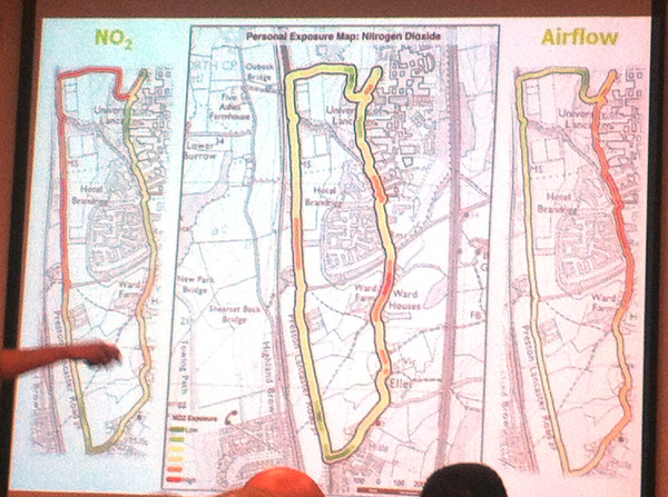
Jonny Huck (Lancaster) gave one of my favourite presentations of the conference, and certainly one of the most visually impressive. It first explored personal sensors (for heart rate, breathing etc) and the internet of things (with small internet-connected devices), then combining the two to detail a device, based on Arduino, e-Health, Waspmote and Android, for monitoring exposure to pollution – combining breathing rate and air pollution levels – for a walk around the campus at Lancaster University, where climbing up steep hills in the campus had as much impact as walking alongside major roads. It’s early stage research and I’m not sure the very intrusive breathing monitor is going to catch on, but certainly points to a quantified future. At CASA, we have started to acquire and evaluate personal and environmental sensors, with FitBits and pollution sensors in the office, so a CASA-centric approach to this kind of research might not be too far off.

IMG_5776

The final session of the day took the form of a series of plenaries about interdisciplinary research. While some of these were interesting in their own right (particularly, an unexpected one on cellular biology!) I didn’t get as much out of them as I did from the paper sessions.

At the end of the second day of the conference most people went to the dinner – I didn’t have a ticket for this though, so headed back to central Glasgow with Addy, who’s written up his thoughts on the conference here on the EDINA Go-Geo blog. My comments on the final day will appear in the final part, tomorrow.

Categories
Conferences Geodemographics

GISRUK 2014 (Part 1)

I was at the Geographic Information Systems Research United Kingdom (GISRUK) 2014 conference last week. GISRUK is the key GIS conference for early-career academic researchers in the UK and Ireland, and is hosted by a different university in the British Isles each year. The audience are mainly UK academics, with young researchers and professors in roughly equal attendance, along with some academics from abroad, including Malaysia, Nigeria and Canada. They are definitely more geo and less tech, the conference being relatively quiet on Twitter, especially compared to conferences such as State of the Map or Wherecamp EU.

This year the conference was hosted up at Glasgow University. Being tucked into the Easter break might have meant a reduced attendance on previous years. However, there were many good talks in the two parallel streams that ran through the three days of the conference – some 50 talks altogether, plus plenaries – and some talks were very popular, with attendees just about squeezing in to the venue.

In this post (and in the second and third parts, to follow) I’ve highlighted the talks that I found the most interesting. Of course, with two streams, there were inevitably interesting sessions which overlapped, and so I may have missed some of the best of all – in a couple of cases I ended up changing room half-way though a session. I’ve paraphrased the talk titles here.

Streets vs landmarks for text-based directions for pedestrians

This talk, given by William Mackaness from Edinburgh, was on an interesting study monitoring how people get from A to B, given one of two kinds of text directions – landmark based “turn left at the Bank of Scotland branch coming up on the left” or street based “continue on George Street, turn left onto Frederick Street in 500m” and monitored, with GPS and movement sensors, how well they moved through the urban realm, with landmark based directions proving better. Of course, these are harder for automated systems as street names a more uniform and consistent storage type than landmarks.

Clustering landmark tags in urban images

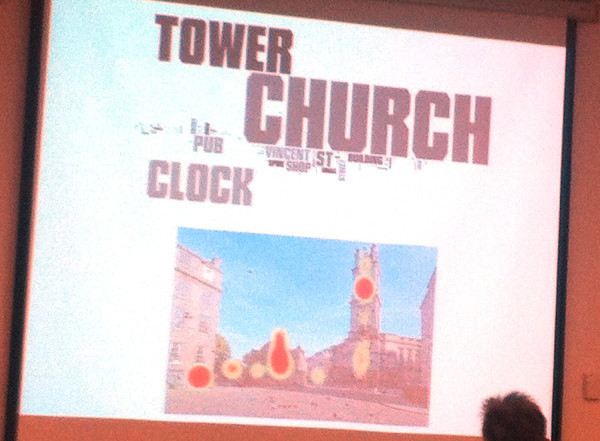
This was probably my favourite talk of the whole conference. By the same team as the above, it was presented by Phil Bartie (St Andrews) and outlined algorithms used to detect buildings and other landmarks from photos, by looking at where people tag interesting features in set photographs, how they tag them, and then linking the tags and locations together to try and separate visually close (but distinct) features, and combine different elements of the same feature that are spatially far apart. The heatmap examples used in the talk were compelling.

IMG_5764

Using social media data to assess crime hotspots

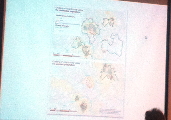
Nick Malleson’s (Leeds) talk looked at tackling the “daytime population” problem – crime statistics tend to exaggerate city centres, as these have a large daytime population but a low residential (i.e. census/official) population, which areas are typically normalised by to produce a crime rate. By looking at georeferenced social media activity as a proxy for daytime population, the city centre hotspots disappear and move into the most deprived suburbs – although these need to be controlled also by a possible lower-than-average use of social media in such areas.

IMG_5765

Exploring links between coal-mining, deprivation and health

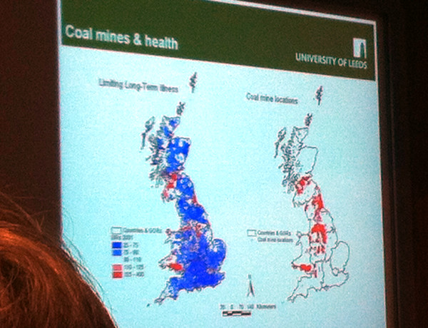
This known link was mapped out well by Paul Norman (Leeds), using some great maps of the relevant census data. The talk included a potted history of coal mines and their phased closures. The study was longitudinal – combining statistics over multiple censuses, with data on opening and closing of mines (mine opening dates often being hard to determine).

IMG_5771

At the end of the first day of the conference, therewas a reception at the opulent City Chambers in the centre of Glasgow, where I had the novelty of being served a glass of Irn Bru (Scotland’s other national drink, and tougher to find in London) by a waiter, in a room surrounded with marble and various paintings of former council leaders!

IMG_5769

Part two to follow tomorrow. Addy Pope at EDINA Go-Geo has also reviewed the conference.

Categories
Conferences

Globe

globe

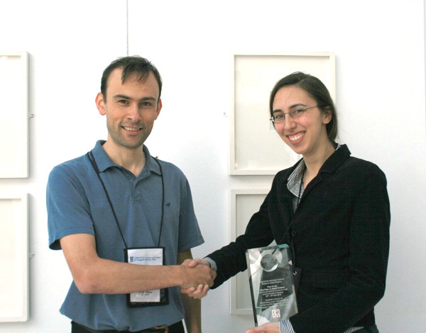
I’m now the proud owner of this lovely green glass globe paperweight – it was my prize from the web map category of the mapping competition at the FOSS4G conference last year, but it’s taken me this long to finally get my hands on it, as I was disappearing on a train before the end of the conference, and accidentally delegated receipt of the prize to a friend who I thought lived in London – actually he lives several hundred miles away. Anyway, thanks to the organisers for coming up with such an inspired prize, one that is useful and beautiful.

Categories
Conferences OpenLayers

FOSS4G 2013 Conference

IMG_4958

Well, that was good.

September this year was Maptember with numerous conferences with a geographical flavour taking place in the East Midlands. The undoubted highlight for me was FOSS4G 2013, the annual conference for OSGeo which travels around the world, this year it was conveniently in Nottingham, so I was able to make it along relatively easily. FOSS4G is Free and Open Source Software for GIS and as such the conference is a good mix of open-source technology and geography.

As I will be spending some time this month writing a book chapter on open source GIS, the conference was an unmissable event for me, even though a clash with another conference (ECCS) abroad meant logistics were tricky – in the end, a 6am wakeup call necessitated and lots of freshly ground coffee (very big thumbs up to the conference for that – a first) helped me out.

Just over 800 people attended the conference and there were up to 9 parallel streams. With many talks sounding very interesting it was often hard to pick a track to follow, not least as there was a 10 minute walk between the two main conference venues. I had brought my bike up from London, which helped.

Highlights of the conference for me were:

  • A keynote by Ben Hennig of Worldmapper fame on the need for the Open Source geospatial software community to remember about the cartography – the gist being just because you have the tools to map, doesn’t always mean you jump straight in without thinking about the better picture.
  • IMG_4959Keynotes by the two top sponsors at the conference – the Ordnance Survey and the Met Office. Both sponsors knew who they were talking to, and pitched the technical level appropriately. At both organisations, the open source ecosystem is pushing in from the sides and slowly becoming a core asset. Both also have large open datasets ready for crunching in your open source GIS of choice.
  • QGIS 2. This was launched at the conference. I’ve always been a fan of this open source GIS in particular (there are others available, including the venerable GRASS, uDIG etc), in no short part because of its excellent integration with PostGIS, that it works well on the Mac and that it is extendable and drivable with Python. Also, excitingly for the project in the longer time, the developer time and effort has ramped up recently – it’s reassuring to be using an open source application with a large and enthusiastic team beside it. Also – it’s not called Quantum anymore, although it’s going to take me a while to stop accidentally still calling it that.
  • OpenLayers 3. The first beta of this was also launched at the conference. I have long been a fan on OpenLayers, having regarded it as a richer and more powerful web mapping API than the Google Maps API, and have used its vector styling capabilities extensively. However, it has somewhat had its lunch stolen from it by Leaflet and by Google Maps continuously innovating, so it was due a rewrite – and OpenLayers 3 looks to be that rewrite!
  • IMG_4956PostGIS/PostgreSQL. There were a number of PostGIS talks, almost all of which were massively oversubscribed – not sure why they were in one of the smallest venues – one even got a representation later! PostGIS is another enormously impressive bit of open source technology, and the rapid-fire demonstration of what was new made me realise I really need to move forward and update my old version! (& do more cool stuff with it.)
  • The final talk before the closing session was by a tech person at ESRI. He had an awful lot to say in 20 minutes, and consequently overran, but had numerous interesting things to say on JavaScript geo libraries, many of which he lamented hadn’t been covered much (or at all) in the conference – I agree, but the conference did have to pare down nearly 400 submissions to under 200 at the event – such as TopoJSON, Node JS, JS Topology Suite, Shapefile.js, or D3. He did bash QGIS a bit which didn’t go down very well, but to be fair some of the QGIS talks had previously bashed ESRI a lot, which wasn’t called for… Good for ESRI for making the effort to come, even if (or indeed because) QGIS is rapidly becoming a serious competitor.
  • The conference food – it was excellent.
  • Catching up with a bunch of people in the community, not just the OSMers – e.g. Rollo (OS), Addy (Edina), Andy, Ben. Andy showed me some new OpenStreetMap renderings which use some advanced cartographic techniques in Mapnik and look great. Mapnik was another topic that I missed from the conference.
  • Evening tour of Nottingham by SK53 (actually just the leg from the curry house to the Ye Olde Trip To Jerusalem, but we went an interesting way.) SK53 has also written up in detail a blog post based in part on a comment I made!
  • IMG_4944The CASA iPad Wall (which was the other reason I was there) was showing, Ken Burns style, the various submissions to the map competition. In the end, the wall pretty much ran itself, thanks to careful stewardship by the Ordnance Survey who had requested it, and some high quality code that had been written for the display. Interestingly, Wired covered the conference, and focused on the iPad Wall, which really was quite a minor, albeit cool, part of the conference.
  • Winning a green glass globe paperweight for my submission to the aforementioned competition, namely the global version of my Bike Share Map – “Best Web Map”. This was completely unexpected, indeed I was already on a train back to London, having left just before the announcement, and found out through Twitter. “Singing” legend Gregory is, I hope, keeping careful stewardship of the globe and I will grab it in due course.

There’s a lot I didn’t get to see – Cartopy/Iris, more CartoDB, plus lots of interesting sounding papers presented on the integrated academic track.

This could have been the best conference I’ve ever been to. Ever. Well done to the organising team – I know they worked incredibly hard to deliver, but it was very definitely worth it.

Categories
Bike Share Conferences

Tracking, Visualising and Cycling

Along with Martin Zaltz Austwick, who blogs as Sociable Physics, I led a workshop session as part of CASA’s annual conference. The topic was “Tracking, Visualising and Cycling” and focused on analysing and mapping bikeshare data. I concentrated on mapping the near-real-time docking station data, while Martin graphed journey data. Both of us used Google Drive as a quick an easy platform to map spatial data and graph it. The techniques that the participants were led through are relatively rudimentary, but hopefully acheived our main purposes of demonstrating the availability of such data and the utility of Google Drive for quick analysis, without leaving anyone on the course behind.

After short presentations by Martin and myself, presenting our recent related output, there were two practical sessions. In the first session, I led participants through downloading the live dock locations/status JSON data files from bikeshare systems in the US, before hacking the JSON into a CSV suitable for upload to Google Drive and showing on a map as a Google Fusion Table. A calculated column was then added to show the empty/full ratio and the docking stations on the maps were coloured appropriately. The result looked a bit like this (if the New York dataset was picked):

trackingworkshop

A couple of gotchas we ran into: (1) If using Notepad, don’t save the JSON text, as that will “burn in” linebreaks that break it. (2) If you don’t see Google Fusion Tables in your Google Drive apps menu, you need to add it as an app using the button at the bottom of the popup.

Martin then followed by showing participants how to download journey data from the Washington DC “Capital Bikeshare” website, extracting just the data for Saturday 30 June 2012, extracting the number of minutes each journey took in Excel, binning the journeys by minute and then plotting it on a Google Speadsheet chart. An additional section was breaking down the plots by user type – showing a pronounced difference between Subscriber and Casual hires – the latter generally taking much longer for their journeys.

You can view the slides here.

Categories
Bike Share Conferences

Bikeshare 100

vcpres_front

This is the presentation I gave at the Velo-City 2013 conference last week – I’m uploading it here as quite a few people have asked for it. The PDF contains my whole talk, except for some graphics from a couple of forthcoming papers which haven’t been published yet, and a conceptual image from a paper that we haven’t even started doing the research for yet!

The paper includes an introduction to EUNOIA, which is my main research project. Bikesharing data will form a small but useful part of this two-year EU transport mobility modelling project.

Here is the PDF of the presentation.

At time of presenting last week I was monitoring 85 cities live, since then I’ve added quite a few more (and dropped a couple) so I am now at 98 cities!

The new cities are:

Castellon and Leon were particular headaches, as they don’t have an official live map with location data – so I had to use a combination of third-party location data and manual georeferencing the newer locations! Oxford is also the first system where there are not a fixed number of docks. Implementing this on my map was a bit of a kludge. I’ve assumed that there are always more docks than bikes there, with a minimum 10 docks at each docking station.

Fixed cities are:

I’ve also switched the Mexico City feed to using the citybik.es service.

Dropped cities include Pavia (too small) and Stockholm East (too small). Nantong and Guadalajara have also been put on hold as their feeds have frozen for the last few days.

Cities I’m hoping to add very shortly are:

  • Portugal: Torres Vedras (launches 22 June)
  • France: Clermont-Ferrand (launches 27 June)
  • USA: Chicago (launches 28 June)

So Chicago’s DivvyBikes could well be the 100th system I’m tracking – and my presentation title will be valid!

You can see all the cities I’m tracking on the global view of my Bike Sharing Map – I also took the opportunity at the conference to launch this new, consolidated view.

Categories
Bike Share Conferences

Velo-City 2013 Review

I was at Velo-City 2013 (a major urban cycling trade conference) in Vienna last Thursday, to present my latest work on the Bike Share Map, EUNOIA’s link to bikesharing, and a CASA research paper update. It was great to be able to attend the conference for free, thanks to winning a ticket in the raffle at last year’s Velo-City in Vancouver.

My paper was presented as the last of four talks, specifically on bikesharing, in the mid-morning session. Despite the session venue being hidden away catacombs deep underneath Vienna City Hall, the room was full with an audience of around 100.

First up was Albert Asséraf of JCDecaux, talking about the history of JCDecaux-built bikesharing systems, staring with Vienna itself 10 years ago:

vc1

The talk focused on Paris which is as large as the other JCDecaux systems put together:

vc2

…although London is closer than the top statistic suggests – London’s, at 8100 bikes, is ~44% of Paris’s 18300 (and London is set to get another ~2000 in the next 6-9 months).

Next up was Hans Dechant, talking about Citybike Wien. The Viennese system is one of Europe’s cheapest – after a 1 EUR one-time verification charge, it’s completely free, as long as journeys are under an hour. It was important to structure charges for longer rentals on a progressively steeper scale, so that bikesharing doesn’t complete directly with daily and longer hires from the established bicycle rental firms:

vc3

The talk also highlighted the intensification (increased density of docking stations) that has taken place in the Viennese system over the last couple of years, moving it to be more in line with other large systems across the world:

vc4

There was also discussion of the automatic maintenance system, where bikes are locked in the system to be picked up for preemptive maintenance, after they have done a certain number of journeys or if they haven’t been used for a long time, even if the users haven’t flagged issues on the bikes.

The third talk, by several people, was on the soon-to-be-launched, but much delayed, Budapest “Bubi Bikes” bikesharing system, now likely to appear in summer 2014 – they are just moving to tender now. The system will be 85% funded by a European Union grant. Trip analysis has been performed to identify the areas of the city most likely to be used for bicycle trips and therefore define the system boundaries – mainly on the east side of the river.

Finally, I was on, and talked about the link between my main project (EUNOIA) and bikesharing:

vc5

I also launched a new global view of my Bike Share Map:

vc6

Finally I touched on some ongoing and potential CASA research into bikesharing, including one possible project we are considering studying the spatial analysis of individual users in London:

vc7

One metric that all three of the previous speakers in the session had mentioned was the average distance between docking stations – it is clearly one which is therefore valued by operators and city/transport authorities, so I included some results of a spatial analysis of bikesharing systems – including docking station density – in the talk.

(I’ll aim to upload most of the slides from my talk in the next few days.)

After the session there were two further main sessions on the day – the first being a round table and the second a “speed date” – in both cases, interested parties gathered around a table in the room and the speaker gave a 10-15 minute talk on their project, then people moved to another table and the talks were repeated. It was a good, lively format – the speed date in particular had 91 tables and 7 “slots” and so I was able to learn about projects as interesting as NextBike‘s technology, the ScratchBikes system (Newcastle) which, via their new Grand Scheme brand, is coming to Headington (Oxford) as OxonBike, a wearable cycle light that changes colour/intensity when turning or braking, and an ambitious project to build a cycleway on the east side of Manhattan – which includes blocking off part of the East River and building a power station underneath a new lake!

As well as the talks there were various opportunities to see trade stands – one thing that struck me was the number of companies now offering bike sharing systems. While my research focus has been on the large, “heavyweight” systems that offer many docks and so present many interesting opportunities for spatial analysis, it is clear that there is a large additional movement towards small-scale, cheap systems which can add this new form of public transport system to an urban area of any size.

One regret from the conference was that there was little presence from cycle companies or operators in the Far East. I would loved to have learnt more about the systems and technologies being used there, but Velo-City 2012 proved to have more coverage from Asia.

I had to leave for my plane as the final event of the day was getting underway – a mass cycle parade using bikeshare bikes and various other borrowed bicycles, around Vienna. Various streets were getting blocked off by the police for the event as I headed towards my bus. The benefit of having a conference organised by the city authorities!