Categories
Data Graphics London

A Census for Open Data in Cities

okfn_census

The Open Knowledge Foundation (OKFN) have produced a census for government open data availability for countries around the world, known as the Open Data Index. Each country is assigned scores for 10 attributes on openness and accessibility for each of 10 types of data (such as election results and pollution information). Currently the United Kingdom is at the top of the table.

More recently, OKFN expanded the concept to look at open data for cities within each country, in other words data that is managed at the City Hall level. For example, there is a project page for individual cities within the UK. This time, 15 types of data are examined, again each gaining up to 10 points for openness. The project is still in its information gathering stage so, at the time of writing, only 6 cities have their data partially, or fully, entered. The census for Italian cities, for example, is looking more complete.

Such a census is of great interest when building an application like CityDashboard, which is currently available for eight cities around the UK. Although CityDashboard doesn’t only use open data sources, those which do have documented APIs, open data licences and machine readable formats greatly aid building and expanding a website such as CityDashboard. CityDashboard takes in social media and sensor data, as well as “official” data of the sort that is being categorised by the OKFN project, but some data, such as live running information for metro services, will quite likely always best come from the official sources.

As such, I will keep a close eye on this project. Cambridge and Sheffield look like two promising cities for which the necessary official data is both available and open, which would make implementing them in CityDashboard relatively straightforward.

The census is user-driven and reviewed, so it’s up to you to get information on the availability (or lack) of data for your local city catalogued in the census.

Categories
Data Graphics London

A Changing City – OS Open Data Reveals a Dynamic London

changingcity_detail

Since launching the data store in early 2010, the Ordnance Survey have been releasing a number of updates to an interesting dataset – VectorMap District – which is a generalisation and simplification of their MasterMap “gold standard” dataset for Great Britain. The updates have been appearing roughly every 6-12 months, and by comparing them in a GIS, you can start to see how places change – at least in the eyes of the Ordnance Survey surveyors tasked to keep the map current. Roads occasionally get built, but building footprints evolve more rapidly – as office blocks and housing developments get taken down and rebuilt with higher capacities or more glass windows.

I’ve taken three of the VectorMap District dataset releases – April 2012, September 2013 and March 2014 – combined the data together and used QGIS’s layer compositing operations to show the geographical differences.

The colours tell of the age of the building – bearing in mind that there is a lag of a few months or years between buildings appearing/disappearing in real life, and on the map. For example, the Olympic Stadium, the turquoise oval above, appears in the 2013 dataset but not the 2012 one, even though of course it was finished in 2011, for the London 2012 Olympic Games.

White Building has existed throughout the three years.
Red Building existed in 2012 only (see note below about extra detail).
Purple Building existed in 2012-2013, but has now gone.
Blue Building was new for 2013, but has now gone.
Turquoise Building was new for 2013, still present (see note below about extra detail).
Green Building is new for 2014, still present.
Yellow Building was around in 2012, disappeared in 2013, but has appeared again now.
Black No building existed in any of the three years.

Above, much of the Olympic Park can be seen – the permanent new buildings (turquoise), temporary buildings for the Games only (blue) and demolished for the games and associated planned development (red). Below, the map covering a wider part of London, zones of activity can be seen. For example, demolition associated with the Nine Elms and Deptford Creek developments (red), and major new blocks such as near the Arsenel stadium (yellow).

Important Note

Between the 2012 and 2013 datasets, the Ordnance Survey changed they way they applied the generalisation on the data, so some of the 2012-2013 changes (shown as red on the maps here for reductions, and turquoise for additions) are as a result of this. For example, narrow gaps between buildings, that always existed, are shown for the first time in 2013 in red (building reductions).

As such, my map slightly overemphasises changes between 2012 and 2013. For example, the pitch at Arsenal and the Great Court at the British Museum appear as changes, but they were always there. As a rough rule of thumb, the smaller red/turquoise patches are due to the generalisation changes, the larger areas of colour show genuine change. With this important caveat, the map remains an interesting insight into London changes, and the larger coloured regions give a good indication of parts of London which are undergoing intensive building redevelopment.

The Bigger Picture

Here is the map for central London – click on it to see a full-size version.

changingcity_overall

Categories
Data Graphics London Mashups

Talking Rabbits and Glowing Lamps – The Internet of London Things

At CASA we’ve always been keen on marrying the online with the tangible – such as the London Data Table (a real table, cut in the shape of London, showing live London data), PigeonSim (fly around a Google Earth view augmented with real-time information) and a couple of 3D printers, one of which was used to print the results of an online mapping field project in Lima, Peru, a couple of weeks ago. One of CASA’s core research projects, Tales of Things, is all about this space.

rabbitOver the last couple of days, Steve, boss Andy and I have been working further on linking online and offline London, by making use of Boris, one of the two Karotz Rabbits that have been knocking around the lab for a while (the other one is of course called Ken), plus a couple of wifi-controllable multi-colour Hue lightbulbs that we acquired more recently.

Steve has set up a couple of servers that receive instructions as simple URL requests, format them and pass them to the external company servers that are an inevitable part of most sensor products these days. (In the case of the Karotz server, this usefully turns text into audio files.) The servers then send instructions back into our network and on to the objects themselves.

A few Python scripts later, and we have the following:

  • Boris announces changes to the statuses of the various London Underground lines, when they occur. He also flashes the colour of the affected line as he speaks the message. Between announcements, Boris will pulsate the colour of lines which are not in “Good Service”. His ears also twitch appropriately – appearing fully alert when there are major problems on the network, and a more lackadaisical look when everything’s OK.
  • The first hue lamp, which sits in a spherical orb, shows the weather forecast, as calculated by CASA’s own weather station that sits on the roof of the building opposite. Steve has configured it to show a yellow glow for sunny and dry weather to follow, while a moody blue indicates rain. Disruptive weather, such as likely snowfalls or strong winds, are shown in red, while rain ceasing is green.
  • The second lamp, also in a spherical orb, polls a special Twitter list of active CASA researchers. Every time one tweets, the lamp which change to a particular colour linked to them. For instance, when I tweet about this blogpost, the lamp will turn a distinctive shade of green.

Data Sources

The rabbit, which is in the video above, sits in front of a TV showing CityDashboard, and speaks its wisdom to the office in general from time to time. The video shows him announcing that problems earlier on the Central and District lines are resolved. After the announcement, he goes back to pulsating green to indicate an ongoing District Line issue. The data comes from the tube line status panel on CityDashboard which is itself using the near-live feed from Transport for London’s Developer Area.

The lamps are in the corridor connecting CASA to the rest of the building. As such, it’s often quite a dark place, but now is bathed in an everchanging glow of light based on both sensor data (weather) and social media output (tweets) from our digital city. The Twitter data for the second lamp comes from the London Periodic Table, which accesses the data from Twitter via a proxy server that Steve built. Once a change is detected, another of Steve’s servers is used to send the message to the Hue servers, which then send it back through a special link, to the lamp. Convoluted, but, with a 10-20 second delay, it does work!

Steve has written up a blog post with more details behind the servers that make the system work.

Panos Mavros, a Ph.D student here at CASA, is also using the Hue lamps, in his research into “digital empathy”. He is bringing a whole new meaning to the phrase “mood lighting” – he only has to think and the colours change!

IMG_5532

Categories
Bike Share Data Graphics London

London Cycle Hire on the Cover of BMJ

7946.cover_89I produced this data map which forms the front cover of this week’s British Medical Journal (BMJ). The graphic shows the volumes of Barclays Cycle Hire bikeshare users in London, based on journeys from February 2012 to January 2013 inclusive. The routes are the most likely routes between each pair of stations, as calculated using Routino and OpenStreetMap data. The area concerned includes the February 2012 eastern extension to Tower Hamlets (including Canary Wharf) but not the December 2013 extension to Putney. The river was added in from Ordnance Survey’s Vector Map District, part of the Open Data release. QGIS was used to put together the calculated results and apply data-specified styling to the map.

The thickness of each segment corresponds to the volume of cyclists taking that link on their journey – assuming they take the idealised calculated route, which is of course a not very accurate assumption. Nevertheless, certain routes stand out as expected – the Cycle Superhighway along Cable Street between the City and Canary Wharf is one, Waterloo Bridge is another, and the segregated cycle route south of Euston Road is also a popular route.

The graphic references an article in the journal issue which is on comparing health benefits and disbenefits of people using the system, with comparison to other forms of transport in central London. Pollution data is combined with accident records and models. The paper was written by experts at the UKCRC and the London School of Hygiene and Tropical Medicine (LSHTM) and I had only a very small part in the paper itself – a map produced by Dr Cheshire and myself was used to illustrate the varying levels of PM2.5 (small particulate matter) pollution in different parts of central London and how these combine with the volume of bikeshare users on the roads and cycle tracks. The journal editors asked for a selection of images relating to cycle hire in London in general and picked this one, as the wiggly nature and predominant red colour looks slightly like a blood capillary network.

A larger version of the graphic, covering the whole extent of the bikeshare system at the time, is here or by clicking on this thumbnail of it:

bmjfinal

Very rare journeys, such as those from London Bridge to Island Gardens, have faded out to such an extent that they are not visible on the map here. An example route, which the map doesn’t show due to this, goes through Deptford and then through the Greenwich Foot Tunnel.

For an interactive version of the graphic (using a slightly older dataset) I recommend looking at Dimi Sztanko’s excellent visualisation.

Categories
Data Graphics London

London North/South

[Buy this print!]

London North/South shows every building block in central and inner city London, coloured blue if it’s north of the River Thames and red if it’s south. And that’s all. No other features are shown, and yet, from this simple premise, a map of the city appears. Almost every street is visible, as a linear white line. Longer lines, with gentler curves, particularly in south London, are often the railways. Stadia are noticeable for generally having a football-field-sized hole surrounded by an often oval block of colour. St Paul’s Cathedral is surprisingly small, but obvious if you know where to look. Big holes in the map are London’s grand parks – Hyde Park and Kensington Gardens being perhaps the most distinctive, as they are surrounded on all sides by densely packed building blocks. A flash of blue appears in the bottom left corner of the map – a mistake? No, the Thames wiggles so much in west London, that this area (Hampton Wick), on the far south of the map, is in fact on the river’s north bank.

The map has 48912 shapes on it – 28200 in blue and 20712 in red. It covers, I think, more than half of London’s eight million plus population, suggesting an average of around 100 people live in each housing block. It does include industrial and commercial buildings, but it’s a fair assumption I think to say that the great majority of buildings in London are residential ones.

The map is centred on a spot just south of Waterloo Railway Station, which is the geographical centroid of Greater London – despite this being south of the river, while the major institutions of the capital – and most of Zone 1 of the tube network – are on the north.

One feature which is on almost all London maps is the River Thames. Famously, when it was removed from the official tube map a few years ago, there was a big outcry and it was hastily restored. This map doesn’t have the Thames on it – but the space through where it runs is obvious. Think of it as being there after all – but coloured white.

I’ve had the graphic professionally litho-printed and it is currently available as a limited edition A2 edge-to-edge print which you can buy from my new online shop, as one of two designs available at the shop’s launch. So far, it’s comfortably outselling the other print which is an update of my Electric Tube design. I think a lot of people like the idea of owning something which has their house on it!

The data comes is Ordnance Survey’s Vector Map District, released under the Open Government Licence. The data is therefore Crown copyright and database right Ordnance Survey 2014. It was prepared in QGIS 2.0, with finishing touches and colouring carried out in Illustrator.

Categories
Data Graphics London

Electric Tube

electric-tube-photo

[Buy this print!]

A couple of years I drew a quirky tube map to commemorate the completing of the circle on London’s Overground, affectionally known as the Ginger Line. The artwork has proven to be quite popular so I’ve produced a print run of an updated version of it. The new version retains the circles, loops and quirks of the original, but I took the opportunity to fix a few lines that weren’t quite right, and throw in a few more wiggles – have a look at that DLR!

Here’s what I wrote previously:

My starting principles for the diagram were concentric circles for the orbital sections of the Circle Line and the Overground network, and straight lines for the Central and Piccadilly Lines, with the latter two converging in the centre of the circles. I then squeezed everything else in. I realised that the Northern Line’s Bank branch passed the Circle Line three times so was going to need something special, so I added a sine wave for this section, and extended this north and south as much as possible.

The River Thames is on there – because any tube diagram doesn’t look correct without the river – and the diagram is topologically accurate – everything connects correctly, and features are in an approximately correct geographical position relative to their neighbours, but not to the diagram overall. Only stations that are designated intersections, or have connections with National Rail stations, are shown. I haven’t labelled anything. It’s art.

I was also thinking about physics when creating the diagram – specifically Feynman diagrams, bubble chamber traces, particle physics collisions, magnetic flow lines and electrical circuit diagrams (as was Beck himself). Hence why I’ve called it the Electric Tube.

The work was also inspired by the likes of Fransicso Dans (more) and Project Mapping, as well as of course the famous Official Tube Map.

The limited edition prints can be bought from my online shop.

electric-tube-detail

Categories
Data Graphics London

Data Windows Update

datawindows

The charity auction for the artwork/map that I created with Dr James Cheshire, Data Windows, took place last night, at the Granary Building in King’s Cross. Our work was part of the silent auction section and received four bids, going eventually for £140. James and I are delighted that our map sold, and contributed to the fundraising effort.

Having looked at the other artworks that were on display, I was a little worried ours wouldn’t sell at all. There were many very impressive works, many that went for well above my budget, including a few for over £1000. The pieces by Dame Zaha Hahid and Lord Richard Rogers went for over £2000. The theme this year was drawing the area around Shoreditch, and the Hawksmoor-designed church of Christchurch Spitalfields appeared numerous times. My personal favourite work was Cycledelious, which was a bright multicolour stylised drawing of a Barclays Cycle Hire docking station. However it approached £200 before I had even got to it to put a bid down. The organisers’ strategy of very regularly topping up our wine glasses meant that I did very nearly end up bidding on several items…

You can find out more about how Data Windows was made in this earlier post.

Photo courtesy of Isla.

Categories
Data Graphics London

Mapping London’s Cycling Census Dataset

londontraffic

The London Cycling Census Map is an interactive map I’ve created, showing traffic flows on key corridors in central London. The counts were collected by Transport for London in around 170 locations, in April. TfL released some sample statistics from the dataset in a report published on their website, but the original dataset was not released – however Andrew Gilligan, the Greater London Authority’s cycling commissioner, obtained the data and forward it on to a number of people, including (indirectly) me. I took the data, consolidated it, and created this map. The most tedious bit was pointing the arrows in the right direction!

There are three time periods for which you can show data: AM Peak (7am to 10am), PM Peak (4pm to 7pm) and All Day (which is, I believe, a 24-hour sample.) which is from 6am to 8pm. The locations chosen are generally ones where high numbers of cyclists travel, so some roads which have high numbers of other vehicles, but not bicycles, e.g. Oxford Street, are not included.

Cycling along key corridors in London is highly time dependent – in the below extract, morning (red) and evening (green) flows for cyclists are compared. Cyclists generally travel away from Clerkenwell, to the east and the west, in the morning, returning to it in the evening. The other travel modes generally don’t show this directionality on this road – cars in particular generally travel in both directions during both peaks. I would hypothesis that the cyclists are accessing this road from Goswell Road, which unfortunately wasn’t included in the census.

london_ampm

So what does the data show?

  • There are several roads where there are more bikes on the streets than any other type of vehicles.
  • Bicycle flow is highly direction, unlike that for most other forms of transport.
  • There are certain routes which are popular with certain kinds of traffic. There are four main east/west corridors in central London. Cars dominate the north-most (Euston Road) and the south-most (Victoria Embankment) ones. Taxis heavily use Holborn, while cyclists mainly use Old Street/Theobald’s Road. You can see all four of these corridors in the map extract at the top of this article.
  • Equivalent north-south links show little separation of vehicle types.
  • Elephant & Castle remains a complicated junction with large numbers of cyclists and buses, depending on the direction, road and time of day.

A note on the arrows

The map uses the vector styling capabilities of OpenLayers, with a custom SVG “arrow” symbol. Symbols in OpenLayers are always positioned with their centre over the location point, so to have them pointing away from the location, I had to add a hidden stalk to each arrow – you can see the stalk when clicking on it. My custom SVG for the arrows is:


OpenLayers.Renderer.symbol.arrow = [1, 0, 0, -3, -1, 0, 0, -0.5, 0, 3, 0, -0.5];

I’m using 0, 0 as the point on the arrow that corresponds to the underlying location – but it doesn’t need to be that, i.e. the location of 0, 0 does not affect where OpenLayer actually pins your symbol on your point location.

And finally…

Red arrows are taxis, blue arrows are buses. Proof, perhaps, of the oft-quoted saying that it’s a battle to find a London taxi driver willing to go south of the river:

londontaxis

The map was created as an output of EUNOIA, a European Union funded project to model travel mobility in major European cities using novel datasets. UCL CASA is the UK university partner for the project.

You can view the map here.
View alternative version of the map – uses OpenCycleMap as a basemap.
Download the data here which I have augmented with bearings.

Categories
Data Graphics Geodemographics London

Data Windows

datawindows
Our 10×10 artwork for 2013.

This is a data visualisation artwork created by Dr Cheshire (@spatialanalysis) and myself. We were invited to submit an entry to 10X10 Drawing the City London, run by the building design charity Article 25. The submissions, including various from “real” artists and architects, will then be auctioned in November to raise funds for the charity’s projects.

Our technological, cartographical and geographical skills are almost certainly better than our artistic ability, so we decided to let technology create our artwork. We took the 2011 census data for the target area (Shoreditch) and combined it with building data from Ordnance Survey Vector Map District, creating a 3×3 panel. Colorbrewer colour ramps, supplied in QGIS 2.0, were used, to colour each panel differently.

The resulting artwork is completely based on open data, licensed under the Open Government Licence.

A single physical copy was printed directly onto white canvas, using specialised equipment operated by Miles Irving at the Drawing Office in UCL Geography. He mounted it onto a wooden frame. The resulting artwork can be seen above and has now been passed to Article 25 for their exhibition and auction next month.

Update: They invited us back for 2014 and 2015, and we produced maps for these latter two editions too.

2014 was taken from an old high-resolution Ordnance Survey map, which we vectorised and stylised:

Our 10×10 artwork for 2014.

Our 2015 map was from GIS digital raster data – using a high-resolution DEM for our square, and styling it in Illustrator:

Our 10×10 artwork for 2015.
Categories
Bike Share Data Graphics Mashups

Analysing “CitiBike” in New York City

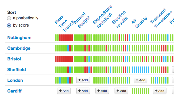
The above interactive map compares the popularity of different CitiBike docking stations in New York City, based on the number of journeys that start/end at each dock. The top 100 busiest ones are shown in red, with the top 20 emphasised with pins. Similarly, the 100/20 least popular ones are shown in blue*.

CitiBike is a major bikesharing system that launched in New York City earlier in the summer and has been pulling in an impressive number of rides in its first few weeks – it regularly beats London’s equivalent, whose technology it shares, in terms of daily trip counts, even though London’s system is almost twice as big (compare NYC).

Different areas have different peak times

Here are three maps showing the differences in the popularity of each docking station at different times of the day: left covers the “rush hour” periods (7-10am and 4-7pm), the middle is interpeak (10am-4pm), the domain of tourists, and on the right is evening/night (7pm-7am) – bar-goers going home? The sequence of maps show how the activity of each docking station varies throughout the day, not how popular each docking station is in comparison to the others.

nyc_rushhour_small

Red pins = very popular, red = significantly more popular than average, green = significantly less popular than average. Binning values are different for each map. Google Maps is being used here. See the larger version.

Some clear patterns above – with the east Brooklyn docks being mainly used in the evenings and overnight, the rush hours highlighting major working areas of Manhattan – Wall Street and Midtown, and interpeak showing a popular “core” running down the middle of Manhattan.

The maps are an output from the stats created by a couple of requests for CitiBike data came through recently – from the New York Times and Business Insider – so it was a good opportunity to get around to something I had been meaning to do for a while – see if I can iterate through the docking station bike count data, spot fluctuations, and infer the number of journeys starting and ending at each docking station.

I was able to relatively quickly put together the Python script to do this fluctuation analysis and so present the results here. I can potentially repeat this analysis for any of the 100+ cities I’m currently visualising collecting data for. Some of these cities (not New York yet) provide journey-level data in batches, which is more accurate as it’s not subject to the issues above, but tends to only appear a few months later, and only around five cities have released such data so far.

Places with persistently empty or full docks differ

Here are two maps highlighting docks that are persistently empty (left) or full (right).

nyc_emptyfulldocks

Left map: green = empty <10% of the time, yellow = 10-15%, red = 15-20%, red pins = empty 20%+ of the time. Right map: green = full <2% of the time, yellow = 2-3%, red = 3-4%, red pins = empty 4%+ of the time. Google Maps is being used here. Live version of full map, live version of empty map.

The area near Central Park seems to often end up with empty docking stations, caused perhaps by tourists starting their journeys here, going around Central Park and then downtown. Conversely, Alphabet City, a residential (and not at all touristy) area fairly often has full docking stations – plenty of the bikes for the residents to use to get to work, although not ideal if you are the last one home on a bike.

How the stats were assembled and mapped

As mentioned above, I assembled the stats by looking at the data collected every two minutes, iterating it, and counting changes detected as docking or undocking “events”, while also counting the number of spaces or bikes remaining for the second set of maps.

There are a couple of big flaws to this technique – firstly, if a bike is returned and hired within a single two minute interval (i.e. between measurements) then neither event will be detected, as the total number of bikes in that docking station will have remained constant. This problem mainly affects the busiest docks, and those that see the most variation in incoming/outgoing flows, i.e. near parks and other popular tourist sites. The other issue is that redistribution activities (typically trucks taking bikes from A to B, ideal from full docks to empty docks) are not distinguishable. In large systems, like New York’s, this activity is however a very small proportion of the total activity – maybe less than 5%, and so generally discountable in a rough analysis like this. I detected 1.6 million “events” which equates to 0.8 million journeys which each have a start and end event. The official website is reporting 1.1 million journeys during the same period, suggesting that this technique is able to detect around 64% of journeys.

I’ve used Google Fusion Tables to show the results. Although its “Map” function is somewhat limited, it is dead easy to use – just upload a CSV of results, select the lat/lon columns, create a map, and then set the field to display and which value bins correspond to which pin types. Just a couple of minutes from CSV to interactive map. There are a few other similar efforts out there – which aim to take point-based data and stick it quickly on a map, but Google’s Fusion Tables does the job and is easy to remember.

The data is one month’s worth of journeys – 17 July to 16 August. One note about the popularity map – the data. I am really just scratching at the surface with what can be done with the data. One obvious next step is to break out weekend and weekday activity. There are a few other analysis projects around – this website is analysing the data as it comes in, to an impressive level of detail.

* Any docks added in the last month will probably show as being unpopular at the moment, as it’s an absolute count over the last month, regardless of whether the dock was there or not.