Categories
Data Graphics

Manchester – Languages and Jobs

Many of my visualisations have focused on London – there is an advantage of being in the city and surrounded by the data, which means that London is often the “default” city that I map. However, I’ve created a couple of Manchester versions of my popular maps Ward Words and Ward Work. Logistics and time reasons mean that I present these as images rather than interactive websites, although I used the existing London-centric website as a platform to work with the Manchester data. A bonus is that, by presenting these as images, I can use LSOAs which are more detailed than wards – there are too many of them for my interactive version to be very useable but they work well within a standalone graphic.

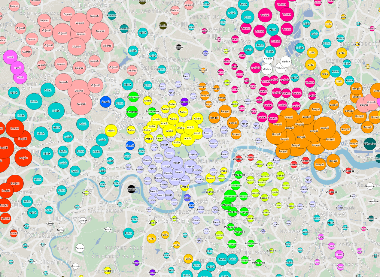
I’m only showing the top* result, and the way the categories are grouped can therefore significantly influence what is shown. For example, if I grouped certain categories together, even ones which don’t appear on the map itself, then the grouped category would likely appear in many places because it would more likely be the top result. It would therefore easy to produce a version of this graphic that showed a very different emphasis. (*Strictly, second-top for the languages.)

The maps were created using open, aggregated data (QS204EW and QS606EW) from the ONS which is under the Open Government Licence, and the background map is from HERE maps. Enjoy!

1. Languages second-most commonly spoken in each LSOA in the Greater Manchester area (click for a larger version):
second_languages_manchester 
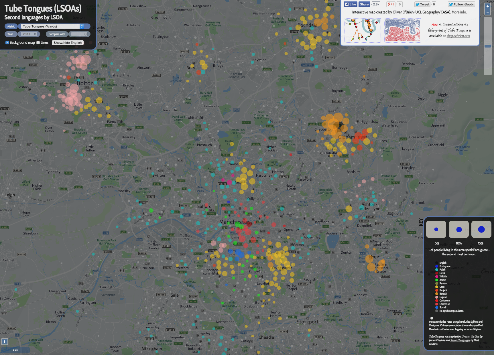
N.B. Where the second language is spoken by less than 2% of the population, I simply show it as a grey circle. LSOAs have a typical population of around 1500 so the smallest non-grey circles represent around 30 speakers of that language.

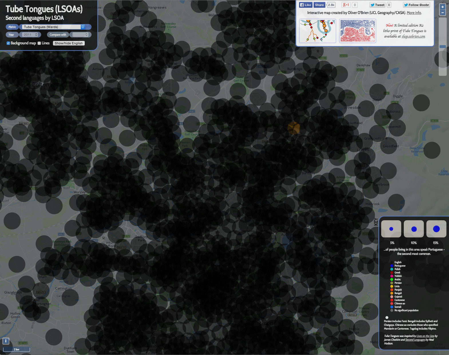
2. It’s important to remember that, except in a single area, English is not represented on the map at all. If you show the primary language (i.e. English) to the same scale, the map looks like this:
second_languages_manchester_english

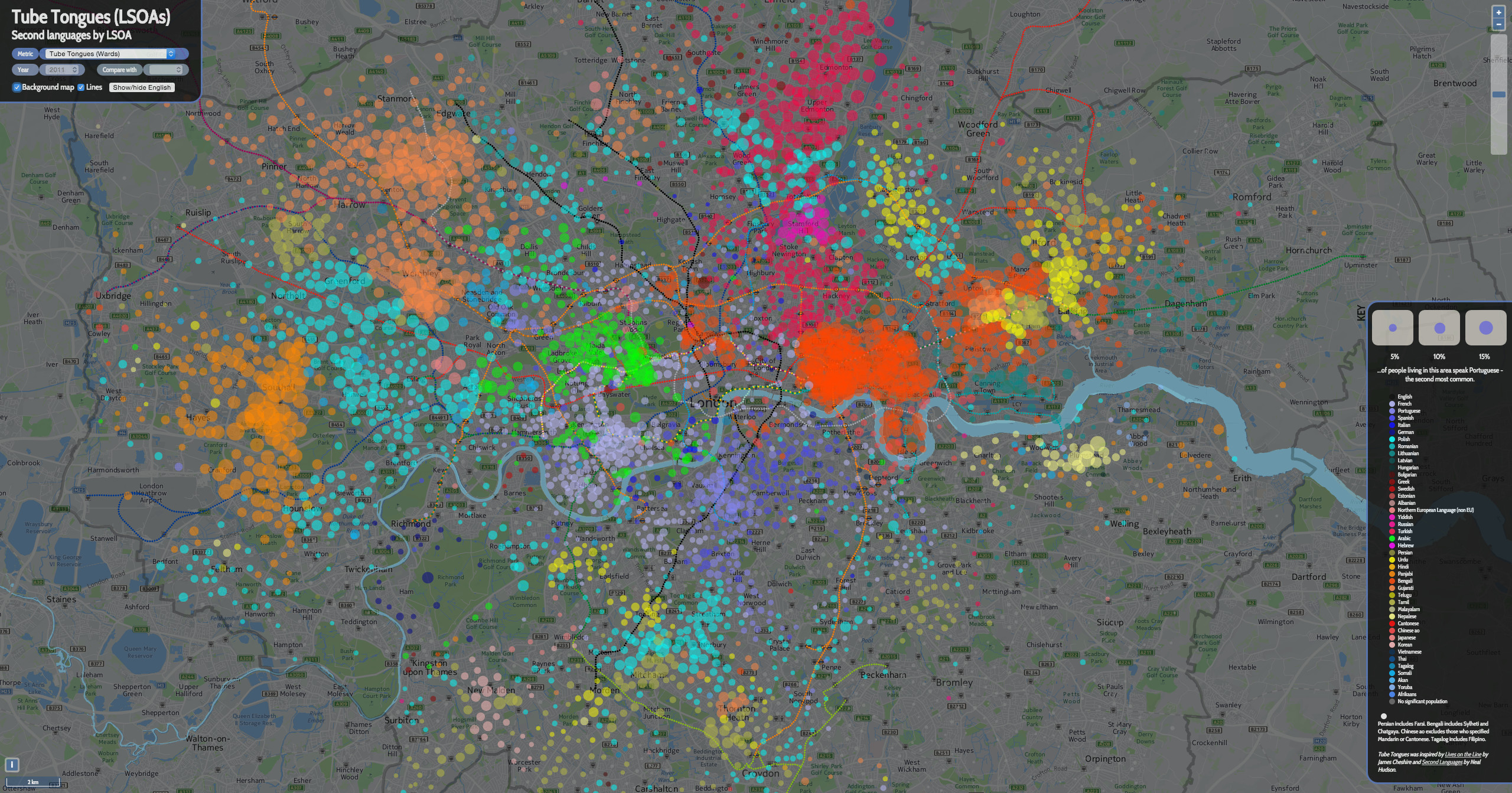
3. Here’s the equivalent of the first map, for (most of) London. Note I’ve changed the key colours here. I appreciate that it is difficult to use the key, as there are so many more languages shown, and the variation between the colours is slight – particularly as they are shown translucently on the map:
london_secondlanguages

4. The most popular occupation by (home) LSOA (again, click for a larger version):
manchester_occupation_adornedI’ve used grey here for the “Sales Assistant” occupational group, as this is the dominant occupation in large urban areas.

5. By way of comparison, and at roughly the same scale, here is (all of) London:
occupation_adorned
My interactive (London only I’m afraid) version is here – change the metric on the top left for other datasets.

Categories
Data Graphics

Bad Maps

<rant> Three maps with glaring errors which I came across yesterday. I’m hesitant to criticise – many of my own maps have, I am sure, issues too (i.e. my Electric Tube map, on the right, is deliberately way off.) But I couldn’t resist calling out this trio which I spotted within a few hours of each other.

1. Global Metropolitan Urban Area Footprints

footprints

This is, in itself, a great concept. I particularly like that the creator has used the urban extent rather that administrative boundaries, which rarely follow the true urban extent of a city. The glaring error is scale. It looks like the creator traced the boundaries of each city’s urban extent in Google Maps (aerial view) or similar. All well and good, but a quirk of representing a 3D globe on a 2D “slippy” map means that the scale in Google Maps (and OpenStreetMap and other maps projected to “WebMercator”) varies with latitude, at a fixed zoom level. This hasn’t been accounted for in the graphic, with the result that all cities near the equator (i.e. most of the Asian and African ones) are shown on the map smaller relative to the others, while cities near the poles (e.g. London, Paris, Edmonton, Toronto) are shown misleadingly big. This is a problem because the whole point of the graphic is to compare footprints (and populations) of the major cities. In fact, many of those Chinese and African cities are quite a bit bigger relative to, for example, London, than the graphic suggests.

2. Where Do All The Jedi Live?

religions

The map is in the Daily Mirror (and their online new media) so it doesn’t need to be a pinnacle of cartographic excellence – just a device to get a story across.However, Oxford and Mid Sussex – 40% of the datapoints – are shown in the wrong place – both are much closer to London than the map suggests. The author suggests they did this to make the text fit – but there better ways to accommodate text while having the centroid dots in the correct location. It might take a little longer but then it wouldn’t be – quite simply – wrong. I’m somewhat disappointed that the Mirror not only stoops to the level of Fox News in the accuracy of their mapping, but appears to have no problem with maintaining such an error, even when readers point it out. It’s sloppy journalism and a snub to the cartographic trade, that just relocating whole cities for artistic purposes is not an issue, particularly as so many people in the UK have relatively poor spatial literacy and so can be potentially easily manipulated.

3. A London map…

breakfasts

I’m not really sure where to begin here. I’m not sure if any of the features are in fact in the right place!

Categories
Data Graphics London

North/South – The Interactive Version.

northsouth_large

As a weekend project, I’ve made an interactive version of my London North/South artwork.

As well as the blue and red house silhouettes, assembled in QGIS, I’ve added in GeoJSON files of the River Thames (from Ordnance Survey Vector Map District, like the buildings) and of tube/DLR/Overground stations – the location/name/network data is from this GitHub file and I’ve applied a custom styling in OpenLayers 2, with station name styling inspired by the NYC Subway signs. The positional information comes from an OpenLayers control – I’m using a utility function to modify the output to use degrees, minutes and seconds. Finally, the naming popup is a set of UTFGrid JSON files (with 2-pixel resolution) based on OpenStreetMap data for polygons. Where the polygon has a building, leisure or waterway tag, I’m extracting a name, if available, and showing it. The coverage here is therefore only as good as building naming is in OpenStreetMap. I could potentially add in street names in the future.

Try it out here.

Categories
Data Graphics London

All the Tweets

Cross-posted from Mapping London, edited slightly.

This is a map of geolocated Tweets for the whole world – I’ve zoomed into London here. The map was created by Eric Fischer of Mapbox, who collected the tweets over several years. The place where each tweet is posted from is shown by a green dot. There are millions and millions of tweets on the global map – in fact, over 6.3 billion. The map is zoomable and the volume of tweets means that popular locations stand out even at a high zoom level. The dots are in fact vectors, so retain their clarity when you zoom right in. The map is interactive – pan around to explore it.

If you think this looks familiar, you’d be right. Mapping London has featured this kind of social media ‘dot-density mapping’ a few times before, including with Foursquare and Flickr (also Eric’s work), as well as colouring by language. The key difference with this latest map is the sheer volume of data. By collecting data on geolocated tweets over the course of several years, globally, Eric has assembled the most comprehensive map yet. He has also taken time to ensure the map looks good at multiple zoom levels, by varying the dot size and dot density. He’s also eliminated multiple tweets that happen at the exact same location, and reduced some of the artefacts and data quality issues (e.g. straight lines of constant latitude or longitude) to produce perhaps the cleanest Twitter dot-density map yet. Zooming out makes the map appear somewhat similar to the classic night-time satellite photos of the world, with the cities glowing brightly – here, London, Paris and Madrid are prominent:

activity_westeurope

However it should still be borne in mind that while maps of tweets bear some relationship to a regular population density map at small scales, at large scales they will show a bias towards places where Twitter users (who may be more likely to be affluent and younger than the general population) live, work and socialise. The popularity of the social network also varies considerably on a country-by-country basis. Some countries will block Twitter usage altogether. And in other countries, the use of geolocated tweets is much less popular, either due to popularity of applications that do not record location by default or a greater cultural awareness of privacy issues relating to revealing your location when you tweet.

activity_edinburgh

Above: Twitter activity in central Edinburgh, proving once and for all that the East End is a cooler place than the West End.

From the Mapbox blog. Found via Twitter, appropriately. Some of the background data is © OpenStreetMap contributors, and the map design and technology is © Mapbox.

Categories
Data Graphics London

Tube Tongues – The Ward Edition

wardwords

If you are a Londoner but felt that Tube Tongues passed you by, maybe because you live in south-east London or another part of the city that doesn’t have a tube station nearby, then here’s a special version of Tube Tongues for you. Like the original, it maps the most popularly spoken language after English (based on 2011 Census aggregate tables released by the ONS, via NOMIS) but instead of examining the population living near each tube station, it looks at the population of each ward in London. There are 630* of these, with a typical population of around 10000. I’ve mapped the language as a circle lying in the geographic centroid of each ward. This is a similar technique to what I used for my local election “Political Colour” maps of London.

A few new languages appear, as the “second language” (after English) in particular wards: Swedish, Albanian and Hebrew. Other languages, which were previously represented by a single tube station, become more prominent – Korean around New Malden, German-speaking people around Richmond, Nepalese speakers in Woolwich, Yiddish in the wards near Stamford Hill and Yoruba in Thamesmead. Looking at the lists of all languages spoken by >1% of people in each ward, Swahili makes it on to a list for the first time – in Loxford ward (and some others) in east London. You can see the lists as a popup, by clicking on a ward circle. As before, the area of the circles corresponds to the percentage of people speaking a language in a particular ward. The very small circles in outer south-east London don’t indicate a lack of people – rather that virtually everyone there speaks English as their primary language.

English remains the most popularly spoken language in every ward, right across London. Indeed, there are only a three wards, all in north-west London, where it doesn’t have an absolute majority (50%). London may seem very multilingual, based on a map like this, but actually it is very much still Europe’s English-speaking capital. See the graphic below, which shows the equivalent sizes the circles are for English speakers, or click the “Show/hide English” button, on the interactive map.

Here’s the interactive map. There’s also a ward version of Working Lines.

* I’ve ignored the tiny City of London ones except for Cripplegate, which contains the Barbican Estate.

Background map uses data which is copyright OpenStreetMap contributors. Language data from the ONS (2011 Census).

wardwords_english

Categories
Data Graphics London

Tube Tongues

tubetongues

I’ve extended my map of tube journeys and busy stations (previous article here) to add in an interesting metric from the 2011 census – that of the second most commonly spoken language (after English) that people who live nearby speak. To do this I’ve analysed all “output areas” which wholly or partly lie within 200m radius of the tube station centroid, and looked at the census aggregate data for the metric – which was a new one, added for the most recent census.

See the new map here.
Also available as an A2 print.

tubetongues_vic
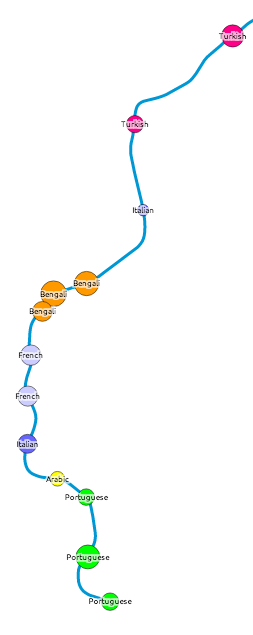
Each tube station has a circle coloured by, after English, the language most spoken by locals. The area of the circle is proportional to the percentage that speak this language – so a circle where 10% of local people primarily speak French will be larger (and a different colour) than a circle where 5% of people primarily speak Spanish.

Language correlates well with some ethnicities (e.g. South Asian) but not others (e.g. African), in London. So some familiar patterns appear – e.g. a popular, and uniform, second language appearing at almost all Tower Hamlets stations. Remember, the map is showing language, not origin – so many of the “Portuguese” speakers, for instance, may be of Brazilian origin.

Click on each station name to see the other languages spoken locally – where at least 1% of local speakers registered them in the census. There is a minimum of 10 people to minimise small number “noise” for tube stations in commercial/industrial areas. In some very mono-linguistic areas of London (typically in Zone 6 and beyond the GLA limits) this means there are no significant second languages, so I’ve included just the second one and no more, even where it is below 1% and/or 10 people.

This measure reveals the most linguistically diverse tube station to be Turnpike Lane on the Piccadilly Line in north-east London, which has 16 languages spoken by more than 1% of the population there, closely followed by Pudding Mill Lane with 15 (though this area has a low population so the confidence is lower). By contrast, almost 98% of people living near Theydon Bois, on the Central Line, speak English as their primary language. English is the most commonly spoken language at every tube station, although at five stations – Southall, Alperton, Wembley Central, Upton Park and East Ham – the proportion is below 50%.

turnpikelane

A revealing map, and I will be looking at some other census aggregate tables to see if others lend themselves well to being visualised in this way.

I’ve also included DLR, Overground, Tramlink, Cable Car and the forthcoming Crossrail stations on the map. Crossrail may not be coming until 2018 but it’s very much making its mark on London, with various large station excavations around the capital.

The idea/methodology is similar to that used by Dr Cheshire for Lives on the Line. The metric was first highlighted by an interesting map, Second Languages, created by Neal Hudson. The map Twitter Tongues also gave me the idea of colour coding dots by language.

One quirk is that speakers of Chinese languages regularly appear on the map at many stations, but show as “Chinese ao” (all other) rather than Cantonese, whereas actually in practice, the Chinese community do mainly speak Cantonese (Yue) in London. This is likely a quirk of the way the question was asked and/or the aggregate data compiled. Chinese ao appears as a small percentage right across London, perhaps due to the traditional desire for Chinese restaurant owners to disperse well to serve the whole capital? [Update – See the comments below for an alternative viewpoint.]

The TfL lines (underground, DLR etc), station locations and names all come from OpenStreetMap data. I’ve put the collated, tidyed and simplified data, that appears on the map, as GeoJSON files on GitHub – see tfl_lines.json and tfl_stations.json. The files are CC-By-NC, licensing information is here.

Categories
Data Graphics Geodemographics

A Result/Turnout Correlation for the Scottish Independence Referendum?

graph_corr2

A final update to my Scottish Independence Referendum Data Map – the circle borders now show the turnout percentage, with the highest (>90%) as a solid green, the lowest showing as red.

There is a weak (R^2 = 0.177) negative correlation between the Yes vote %, and the Turnout %, suggesting that the Yes campaign had more difficulty in getting its supporters to vote on the day. This may be due to the traditional tendency for older voters to turn out more than younger ones, and the polls suggesting that younger people were more likely to vote Yes. (The BBC has more on the demographics of the Scottish voters.)

You can see this weak correlation on the map, with green-borders (high turnout %) on red circles (low Yes %), and some of the bluer areas (high Yes %) having red borders (low turnout %), although East Dumbartonshire is a noticeable exception.

map_corr

Categories
Data Graphics

Scottish Independence Referendum: Data Map

indyref

Scotland’s population is heavily skewed towards the central belt (Glasgow/Edinburgh) which will affect likely reporting times of the independence referendum in the early hours of Friday 19 September, this being dependent both on the overall numbers of votes cast in each of the 32 council areas, and the time taken to get ballot boxes from the far corners of each area to the counting hall in each area. Helicopters will be used, weather permitting, in the Western Isles!

There is also likely a significant variation in the result that each area declares – with regions next to England (so dependent on trade with them) and furthest away from them (so benefiting most from support) likely to strongly vote “No”, the major cities being difficult to call, and the rural areas and smaller, less affluent cities of the central vote much more likely to vote “Yes”. Note that unlike a constituency election which is “first past the vote” for each area, the referendum is a simple sum-total for everyone, so while it will be interesting hearing each individual results, ultimately we won’t know the result until almost every area has declared the result, and the lead for one side becomes unassailable (areas will declare the size of the vote well before the result, which will make this possible).

A screenshot of a table, in a report “Scotland referendum: Looking through the mist” from the Credit Suisse Economics Research unit, was circulating Twitter a couple of days ago:

Expected #indyref declaration times for every council area. Good find by @gerrybraiden. pic.twitter.com/ryzCtDbRCQ

— Scott Reid (@scottreid1980) September 12, 2014

It has estimates on all three of these metrics, so I’ve taken this, combined it with centroids of each of the council areas, and produced a map. Like many of my maps these days, coloured circles are the way I’m showing the data. Redder areas are more likely to vote no, and larger circles have a larger registered population. The numbers show the estimated declaration times. Looks like I’ll be up all night on Thursday. Mouse over a circle for more information.

View the live #indyref map here.

ps. I’ve subsequently got hold of a copy of the report concerned. To quote the methodology for determining the “Yes” rating, it’s

“derived from support for the Scottish National Party in the 2012 local elections. We… show a range from 0 (the lowest local vote [share] for SNP in 2012, excluding Orkney and Shetland where the vote was negligible) to 10 (highest local vote share for SNP).”

This implies the Orkney/Shetland results were not used in the 0-10 scaling, as their very low results for the SNP overly skewed the metric.

Categories
Data Graphics London

London Words

Screen Shot 2014-07-21 at 15.46.02

Above is a Wordle of the messages displayed on the big dot-matrix displays (aka variable message signs) that sit beside major roads in London, over the last couple of months. The larger the word, the more often it is shown on the screens.

The data comes from Transport for London via their Open Data Users platform, through CityDashboard‘s API. We now store some of the data behind CityDashboard, for London and some other cities, for future analysis into key words and numbers for urban informatics.

Below, as another Wordle, are the top words used in tweets from certain London-centric Twitter accounts – those from London-focused newspapers and media organisations, tourism organisations and key London commentators. Common English words (e.g. to, and) are removed. I’ve also removed “London”, “RT” and “amp”.

Screen Shot 2014-07-21 at 15.56.57

Some common words include: police, tickets, City, crash, Boris, Thames, Park, Festival, Bridge, bus, Kids.

Finally, here’s the notes that OpenStreetMap editors use when they commit changes to the open, user-created map of the world, for the London area:

Screen Shot 2014-07-21 at 16.10.50

Transport and buildings remain a major focus of the voluntary work on completing and maintaining London’s map, that contributors are carrying out.

There is no significance to the colours used in the graphics above. Wordle is a quick-and-dirty way to visualise data like this, we are looking at more sophisticated, and “fairer” methods, as part of ongoing research.

This work is preparatory work for the Big Data and Urban Informatics workshop in Chicago later this summer.

Thanks to Steve and the Big Data Toolkit, which was used in the collection of the Twitter data for CityDashboard.

Categories
BODMAS Data Graphics London

London Borough Websites and their Election Data

lewishamdata

Lewisham’s “data”

I’ve been looking at a lot of London Borough council websites recently, for the Election Map. I’d rather I hadn’t – just one website would be better – but in London, each borough council publishes its local election results first and foremost to its own website, rather than it being pushed to a more central location such as London Councils which only holds aggregate data. It is also likely that the London Data Store, run by the Greater London Authority, will publish the combined results in due course.

So I’ve been visiting the 32 council websites in order to obtain the full (i.e. number of votes for every candidate in every ward) election data for 2014, for some forthcoming work. It’s striking how differently the data is presented, from site to site. A number of councils use the same software to show the data, but even there there are slight differences – and the other council websites do entirely their own thing.

Perhaps of most surprise is that – in 2014, only 1 of the 32 councils provide their election results in a machine readable data (e.g. CSV). Step forward the London Borough of Redbridge and their excellent data website – its interactive and database-driven nature meant that it struggled to show the live results on election night itself (judging by some now-deleted Tweets they sent out) but now that the “surge” of interest has passed, it means it is very easily to obtain the full dataset, even including geographical IDs that are critically important when creating a map – matching by name is fraught with errors due to punctuation and abbreviation variations.

hounslowdata
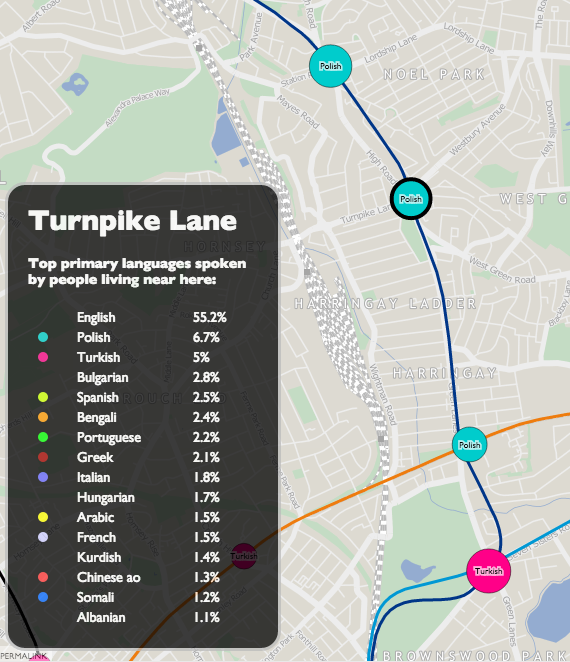
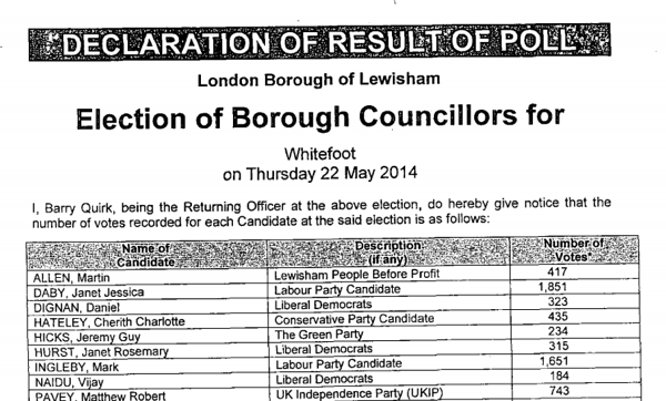
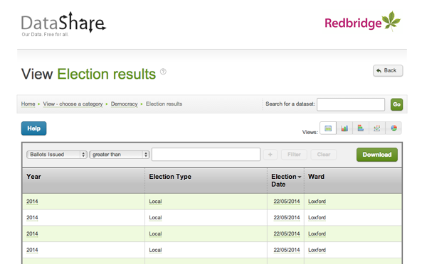
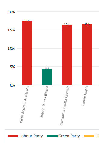
At the other end of the scale, Lewisham and Bromley councils only provide the data as PDFs. The tables contained with these does not indicate the winners – only the prose below it does. In Lewisham’s case the PDFs were scanned in so the text is not even copyable. Hounslow was a narrow second worst – while they did list all the candidates for all the wards on a single page (yay!) this information does not include the party that the candidates were representing (boo!). You have to go to another page for that and read the party name off a bar chart, as shown on the right here…

In the table below, I’ve awarded each council up to 5 stars on the following basis. This was inspired by Tim Berners-Lee’s Open Data deployment star system which uses a similar (but more nuanced) approach.

  • One star if the individual counts for most of the borough’s wards are available on the council’s main website or a dedicated subdomain, four days after the end of the election, in a searchable form (i.e. not as an image). Speedy and official publication is important for maximum transparency of the process. Only Lewisham failed have published their data by Monday evening. Croydon was pretty slow but got there in the end. Tower Hamlets results dribbled in but only one ward missed the deadline, which is not ideal but sufficient here.
  • Two stars if the data in available as structured data which is straightforward to manually extract for further processing. Examples where are good: HTML tables and Excel documents. Bromley’s results were supplied in the form of vector PDFs which made their tables difficult to copy. Hounslow’s results were presented in an attractive way, with maps and graphs, but no table containing both the candidate’s votes and their party.
  • Three stars if the data is free of errors and typos, such as punctuation problems (stray commas/hyphens, parts of candidate names in the party column, inconsistent ways of referencing which candidates were elected (or missing altogether) or party names, suggesting that it was input into the system in a structured/managed way.
  • Four stars if the data is supplied as a downloadable datafile in a standard machine-readable format, e.g. CSV, JSON, XML. Only Redbridge makes the data available in this way.
  • Five stars if the data contains ward and borough geographical identifier ONS GSS codes. Only Redbridge has this facility.
Rating Borough(s)
0 Lewisham
* Bromley, Hounslow
** Ealing, Hammersmith, Islington, Barking & Dagenham, Southwark, Kingston upon Thames^
*** Barnet, Bexley^, Brent^, Camden, Croydon, Enfield, Greenwich, Hackney, Hammersmith & Fulham, Haringey, Harrow^, Havering^, Hillingdon, Kensington & Chelsea, Lambeth^, Merton^, Newham^, Richmond upon Thames^, Sutton, Tower Hamlets^, Waltham Forest^, Wandsworth, Westminster
****
*****       Redbridge

^ = Councils that appear to use a common technology package for displaying their election results.

redbridgedata

Redbridge’s excellent data website.

A number of councils, mainly in the 3* category above and marked with a ^, seem to use the same software for displaying their election results on their webpages. The software outputs the results as tables, and includes graphs. If this one piece of software was improved to allow a data download (e.g. as a CSV with ONS GSS codes) of the tabular data, and was then pushed out to the relevant sites, then a lot of councils could move to give stars with a minimum of effort.