Categories
Data Graphics

Putting Cartography Back on the Map – Google Maps Getting Prettier

googlemaps_july2016

There was a time when Google Maps was an ugly ducking. It started life as a road map, and its grey background was decryed at a memorable keynote at the British Cartographic Society annual conference 8 years, contrasting with the classic Ordnance Survey Landranger maps where the spaces between roads were normally full of “something” – be it contours, trees or antiquities. Google’s features, on the other hand, were pretty messy, and often wrong. However, Google has been steadily beautifying its functional map (and correcting it), focusing on the cartography as well as the data, as it turns from a map of roads and POI pins, to a map of everything. 2013 was a big step forward, when the map became vector-based and superimposed features customised to just you. Now in 2016, it’s the look of the map itself that is the focus. Cartography on digital maps is far from dead.

This week, Google has unveiled a the latest update to Google Maps, showing that it is serious about the cartography and colour. The map has a cleaner, more refined look that continues its trend of taking out the detail you don’t need and focusing on the information that you are looking for. The two most obvious changes are (a) a new, brown/orange shading showing “areas of interest” – think high streets and tourist attractions, and (b) smaller roads have had their borders removed and are now simple white lines overlaid on a grey, green or brown background. I have been keen on this technique, using it for OOMap, DataShine and CDRC Maps. MapBox’s basic-style map of OpenStreetMap data also has taken this “white on grey, + data” approach which I am sure has helped inspire Google’s new look. (OpenStreetMap.org has always taken a different approach, with the many contributors wanting their particular mapping visible, it has always looked very busy and colourful. Unlike MapBox and Google Maps, OpenStreetMap.org’s map is to be seen “as is”, rather than acting as a background map upon which colourful project-specific data is intended to be overlaid.)

An accompanying blog post goes into more details about the changes. It includes a nice graphic demonstrating the new colour palette used and how Google are using colour to group and categorise map features, which I’ve reproduced here:

SS3

There is a clear use of complementary colours to balance out the map – the search results and current user interest shown in red, man-made features in pinks and oranges, and natural features in greens and blues, all criss-crossed with the white (and yellow) transport networks. It makes for a map that is logical to look at – and crucially, one that is immediately pleasing to the eye. It doesn’t “shout” at you any more.

One final note – the “Areas of Interest” is a powerful new bit of cartography – it draws the eye to it, and means Google Maps has a significant influence on what parts of an unfamiliar city you are likely to visit. It’s a subtle but key bit of “suggestive” mapping. Bad news for the businesses though that rely on passing trade, and are not in these areas.

Categories
Data Graphics

Inside HERE

Z

A startup with a billion dollar asset. This is how HERE’s new CEO Edzard Overbeek describes the location services company that is making a striking pitch for being the third major digital mapping and location platform alongside Google and Apple.

HERE has had an interesting recent history. Originally NAVTEQ, one of the major cross-world road network databases, used by various “sat nav” systems, it was bought by Nokia and became Nokia Maps, before being rebranded as Ovi Maps. Nokia then sold its phone business to Microsoft – but as the latter already had Bing Maps, the digital mapping business was spun off into a new unit and sold to a consortium of German car companies. At the time, this perhaps seemed a surprising new set of owners but it has quite quickly become obvious – with self-driving car technology suddenly seemingly closer on the horizon, the need to have a global, highly precise digital map of the world’s streets is suddenly incredibly important – the aforementioned billion dollar asset. Google has been building it up from its initial, low-precision mapping, using its fleet of LIDAR mapping cars, and Apple has been doing the same, arguably starting from an even worse base. HERE has arrived in the space with the highest quality start, having been based on a digital map that is over 20 years old.

The insideHERE Event

HERE was kind enough to invite me to an event, insideHERE, at their European headquarters in the heart of Berlin, for demonstrations of their portfolio, using some of the platforms used recently at MWC, CES and the other major trade exhibitions in the technology and mobile space. They also discussed a few “under the hood” features, and what they are working on right now.

There were three themes, reflecting the three main segments of digital mapping at the moment – business, consumer and auto. A cancelled flight at very short notice (thanks for nothing, Norwegian!) meant that I arrived in Berlin late and so missed the first two. The first can be summarised with the HERE Reality Lens Lens product which provides high quality asset and street furniture mapping for the use and management by local authorities, and the second is encompassed by the HERE mobile app digital app, which occupies the same space as Apple Maps and Google Maps app, aiming to displace these on their respective platforms. This is a challenge of course, as the existing apps are pretty good, so HERE’s unique selling point is that they are designed for offline from the ground up (Google Maps offers this on a slightly more restricted basis, but HERE will be available in offline mode for an area, as soon as you initially load it up online.) Reality Lens and the HERE Offline Maps app are nice pieces of technology that utilise data from HERE’s car data gathering options and make it accessible to public sector and consumer users respectively, but it was clear, both from HERE’s new owners and the comparative length of time used during the day, that HERE Auto is the key sector for the company now.
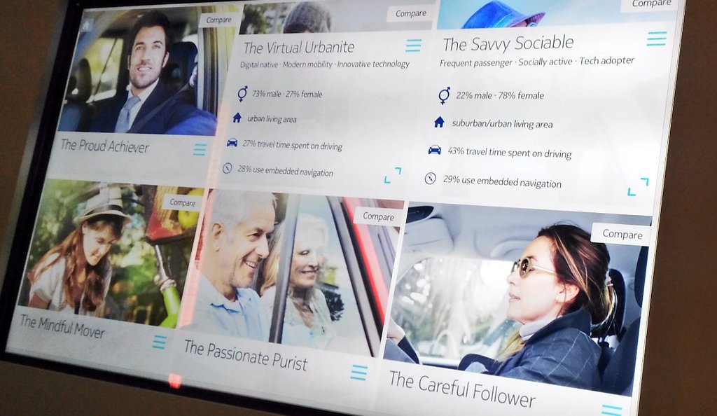
Geodemographics

HERE have developed geodemographic profiles for car users (drivers/passengers), based on surveys in the USA, South Korea and Germany. Using cluster analysis of the results, they have identified six characteristic types of users, based on how they use cars and other transport options, day to day:

Z-2

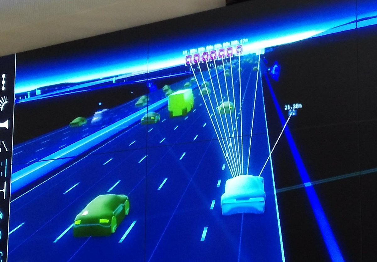
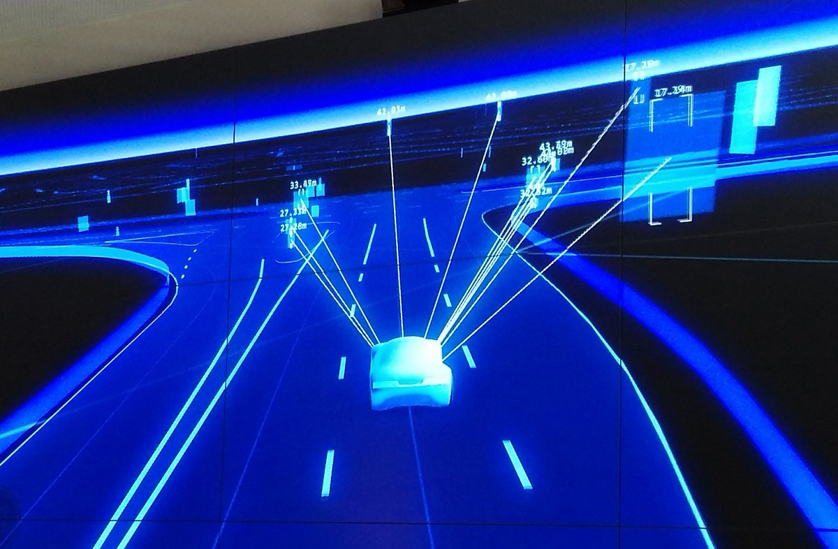
Autonomous Navigation Data

Here’s a visualisation of the datasets that HERE use for self-driving cars. These are datasets designed for machines, not people, and the maps of the datasets, shown here, show the breadth and detail of the information used by self-driving cars to determine road information:

9k=

The data in these maps is highly compressed and delivered to cars, anywhere in the world, in cacheable 2km x 2km squares. (N.B. In one of the three pictures showing the maps of these datasets here, there is a mistake with the data shown. Can you see it? It’s obvious – once you’ve spotted it. No, it’s not that the cars on the wrong side of the road, as it’s showing a German autobhan rather than a British highway. Leave a comment if you find it!)

2Q==

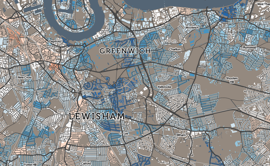
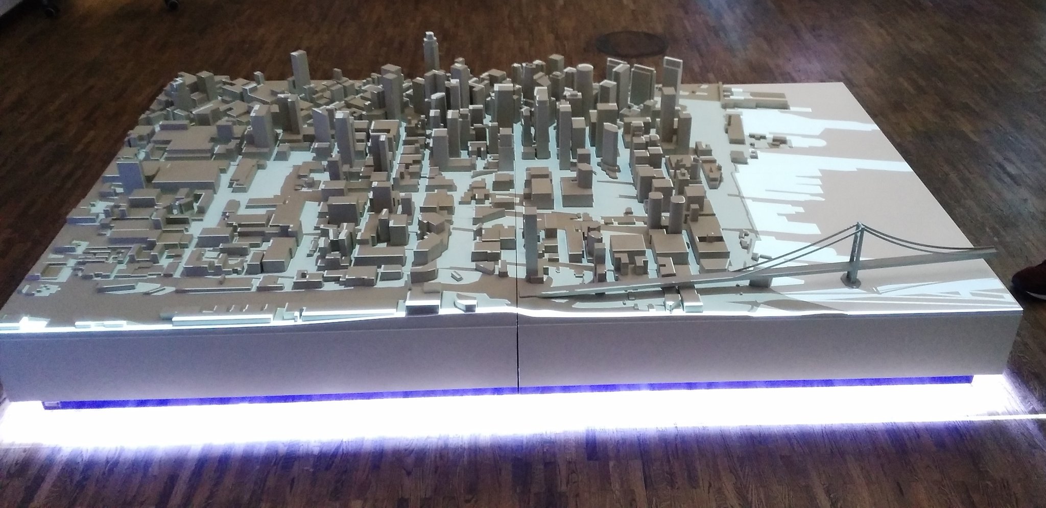
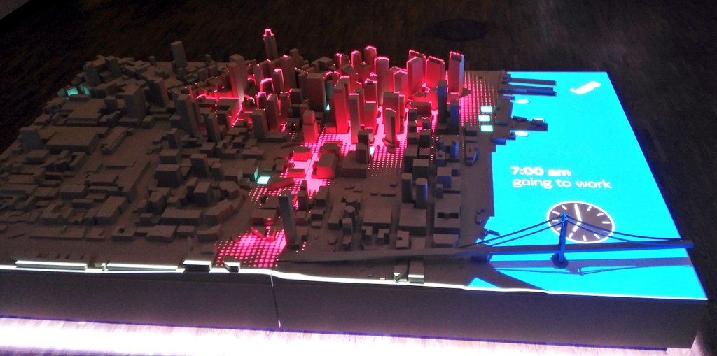
Spatial Data Visualisation

HERE also have some nice demo rigs to show their data in a context that is familiar to people, such as using a top-down projection on a 3D model city section, allowing data to be draped over the buildings and street structure:

2Q==-1

9k=-1

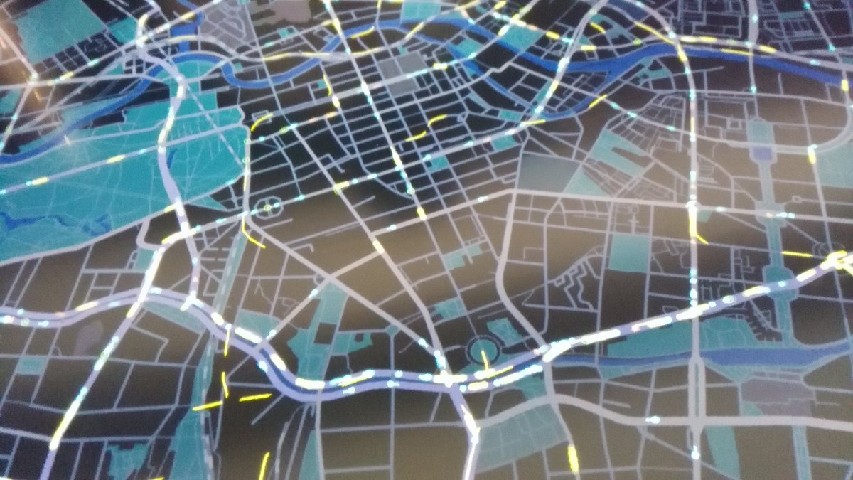
Transit Demand Modelling

We also saw a glimpse of a microsimulation-based travel demand model (TDM) for central Berlin, with what-if scenarios possible by placing various objects on the screen visualising the output of the model, such as a rain shower or closed road. The transport mode share will likely continue to adjust in large cities throughout the world, while the street network will often remain static, so such models (and associated visualisations) try and predict what will happen on the ground:

2Q==-2

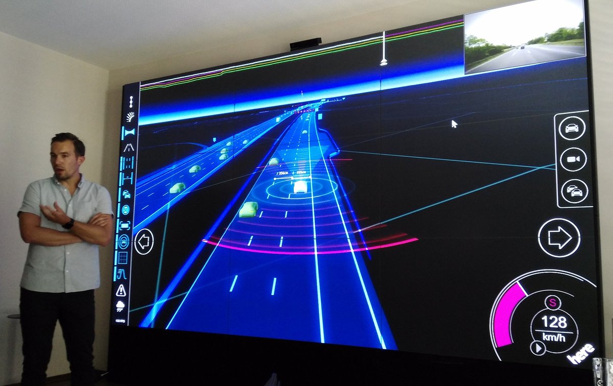
The other maps shown were in the user interface (i.e. dashboard/HUD) of a car test-rig, which is being used for UX/UI testing of autonomous/mixed-mode driving. I wrote about this in this previous blogpost.

HERE and the Future

Perhaps the most “exclusive” part of the day’s event was an hour long “fireside” chat with the new CEO of the company. As a relatively small group (there were around 10 of us)l, this was an excellent opportunity to grill the top-guy of one of the world’s three from-technology digital mapping providers (as opposed to from-GIS like ESRI or from-paper like the OS). Edzard Overbeek answered every question we threw at him efficiently. I quizzed him on whether indoor digital mapping, the “next frontier” identified by Google at least, will also be a priority for HERE given its new driving focus, to which Mr Overbeek was clear that, in order to be a serious player in the space it needs to be mapping everything, so that a single platform is available cross-use, i.e. if a customer journey ends with a walk through a department store, the platform needs to do the “last 100m” mapping too. It’s clear also that the HERE offline maps app will remain a key part of the company’s offering – not just to realise the value of their existing, long-built-up “consumer-grade” mapping, but to build the “HERE” brand to consumers. Ultimately though, their most important clients are the car companies – both the three that own the company but also others needing a “car mapping operating system”.

Categories
Data Graphics OpenLayers

named

named_lennon_mccartney

named is a little website that I have recently co-written as part of an ongoing ESRC-funded project on UK surnames that we are conducting here at UCL Department of Geography. I put together the website and adapted for the UK some code on generating heatmaps showing regions of unusual popularity of a surname, that was created by researchers in the School of Computing, Informatics & Decision Systems Engineering at ASU (Arizona State University) in the USA.

The website is deliberately designed to be simple to use and “stripped down” – all you do is enter your surname and the website maps where in the UK there is an unusually high number of people with that surname living. There is also an option to enter an additional surname (for example, a maiden name for yourself or your partner, or the name of a friend) – and, by combining heatmaps of both names, we try and draw out where we think you might have met each other, or grown up together.

The Research

named_tweedy_coleOf most interest to us is the quality of the technique with pairs of surnames. It is well known already (for example, J A Cheshire, P A Longley (2012) Identifying Spatial Concentrations of Surnames, International Journal of GIS 26(2) pp309-325) that most traditional UK surname distributions remain surprisingly unchanged over many years – internal migration in the UK is a lot less than might be traditionally perceived. One of the research questions in the underlying project is to see whether this extends to marriages and other pairings too. So we encourage you to use this mode and help us understand and evaluate pairing surname distributions and patterns.

The site is also a useful information gathering tool – we are only in the early stages of evaluating the validity or accuracy of this method – we know it works well for certain regional UK names which are not too popular or too rare, at least. We ask for optional quick feedback following a search, so we can evaluate if the result feels right for you. So far, with the website been operational for around a week, nearly 10% of people are giving feedback, and around half of those suggest that it is good result for them. If it doesn’t highlight where you live now, it might be showing your ancestral home or other region that you have a historical link to. Or it may be showing complete rubbish – but let us know either way!

named_whyte_mackay

Try it out for yourself – visit here and see what it says for your surname. The site should be quite quick – it will take up to 10 seconds for names which have not already been searched, but is much faster if getting information that’s previously been searched for.

How it Works

The system is creating a probabilistic kernel density estimate (KDE), based on surname distributions (in a postcode) for an old electoral roll. It finds the relatively frequency/density of the surname compared with the general population in the area. So, in most cases, it will often highlight an area in the countryside – a sparse population, but maybe with a cluster of people with that surname. As such, it will only rarely highlight London and the other major cities of the UK, except for exceptionally urban-centric surnames, typically of foreign-origin. The method is not perfect – the “bandwidth” is fixed which means that neighbouring cities and other population fluctuations can cause false-positive results. However, we have seen enough “good” results that we think the simple has some validity, with the structure of the UK’s names.

named1

Design

On a design perspective, I wanted to build a website that looks different from the normal “full screen slippy maps” that I have designed for a lot of my research projects. Maps are normally rectangular, so I played with some CSS and a nice JQuery visual effects library, to create a circular map instead which appears to be on the back of an information disc.

Data Quality and Privacy

The map is deliberately small and low on detail because having a more detailed map would imply a higher level of precision for the underlying names data than can actually be justified. The underlying dataset has issues but is considered to be sufficient for this purpose, as long as the spatial resolution is low. Additionally, for rare names where a result may appear for only a small number of people with that name (when in rural places) we don’t want to be flagging individual villages or houses. The data’s just not good enough for that, for many names (it may well be good for some) and it may imply we are mapping exact data over someone’s house, possibly raising privacy issues – we are not, the data is not good enough for that but by coincidence it may still happen to line up with a very local feature if it was high res.

It should give an indication into the general area where your name is unusually popular relative to the local population there (N.B. not quite the same as where your name is popular in absolute terms) but I would be wary of the quality of the result if you were identifying a particular small town or exact location.

[A little update as one user worried that it was just showing a population heatmap. This would only happen for names which have a higher relative population in more dense area of the UK. Typically, older common foreign origin names will most likely show this, as foreigners traditionally migrate to cities in the UK first. The only name so far that I’ve seen it for (I haven’t tested it for many) is Zhang which is a very common surname. Compare Zhang (left) with an overall population heatmap (using the same buffer and KDE generation as the rest of the maps):

named_zhang_allpop

Some newer foreign origin names show an even more pronounced urban tendency, such as Begum and Mohammed.]

More…

Try named now, or if you are interested in surnames across the world, see the older WorldNames website, and for comparisons between 1881 and 1998 distributions in the UK, see GB Names.

If named shows “No Data” and you have entered a real surname, this may be because there are only very few of you on the UK – and in this case, I show the “No Data” graphic to protect your privacy. Otherwise I’d be mapping your house – or at least, your local neighbourhood.

Categories
Data Graphics

Changes in Deprivation in England, 2010-15

Click any of the images in this article to go to the interactive map.

imd2015_londonup
Above: A significant reduction in relative deprivation in Blackheath and Maze Hill since 2010.

I’ve just now published a number of maps on the CDRC Maps platform which uses the DataShine mapping style (more about DataShine) to show demographic data relating to consumer and other datasets.

The maps relate to the Indices of Deprivation 2015, small-area measures of deprivation in England, which were compiled and published at the end of September by OCSI on behalf of the UK Government.

imd2015
Above: Deprivation varies between Tottenham, Walthamstow and Woodford Green, in 2015.

The Indices of Deprivation (of which the Index of Multiple Deprivation, or IMD is the overall index) split England into around 32000 areas (“LSOAs”), each containing a typical population of 1500. Each area is scored for several components, which are then combined (with different weights) to produce an overall score of deprivation for the area. Note that areas with little deprivation may be mainly compared of people who are not “wealthy” but just not deprived, and therefore rank the same as areas mainly populated by extremely affluent people. IMD is a measure of deprivation, not affluence.

The look of these maps, with their Red-Yellow-Green colour ramp, is intentionally similar to my New Booth map of the 2010 IMD deciles which was my first “colour the houses” map and the precursor to DataShine and therefore CDRC Maps.

imd2015_miltonkeynes
Above: Milton Keynes has a characteristic strip of high deprivation, running north/south.

These scores cannot be directly compared with those from previous exercises (2010, 2007 and 2004 are the recent ones) due to slight methodological alterations, however we can rank each area based on the overall score – this is the Index of Multiple Deprivation – and then compare ranking changes between the years. It should be noted that a decrease in rank (i.e. an increase in deprivation measure compared with other areas) does not mean that an area has become more deprived in absolute terms – it may be just becoming less deprived at a slower rate. I have mapped the overall rank change from 2010 to 2015, and also the rank change of the component which measures the effects of crime on deprivation, as this shows some particularly interesting spatial characteristics.

Looking at the overall changes, London’s pattern is striking:
imddelta_london
Above: London has an inner-city “ring” of blue showing a large reduction in relative deprivation since 2010.

London’s inner city areas – Zones 2-4 – have becoming significantly less deprived in the last year. Indeed London, in general, has done very well recently relative to the rest of England, with only a few areas (St John’s Wood, Thornton Heath, Mill Hill, East Barnet and Hounslow) showing a significant increase in relative deprivation levels. Again, this may mean that they are still becoming less deprived, just at a slower rate. By comparison, Blackheath, Ealing, Upton, North Wembley and Crouch End have become dramatically less deprived since 2010. There are smaller pockets throughout the city who are are also showing marked moves in both directions – see the interactive map. I use a different (Red-White-Blue) colour ramp for these maps, to emphasise that they are showing changes.

imddelta_readingbury
Above: The contribution of crime to deprivation has significantly dropped in Reading and increased in Bury.

Some of the more notable results for changes in the crime component ranking of the IMD are in Reading (where the impact of crime on deprivation has significantly reduced) and Bury (where it has had a significantly greater impact). In both towns (see above, presented at different scales) however, other components have acted in the opposite direction, such as the deprivation ranking of these two places, with respect to the rest of England, has not significantly changed in five years. Bury, was, and still is, already significantly more deprived than Reading, the difference between the two has increased.

Another example: comparing Gateshead with nearby South Shields. The former coming up, the latter going down:
imd_gateshead
Gateshead is almost universally moving out of deprivation at a faster rate than the rest of England, while South Shields is change much more slowly.

The components are income, employment, education, health, crime, barriers to housing and services, and living environment. Their weights are summarised in this nice infographic from gov.uk.

There is also an official summary which maps the data slightly differently. One of its analyses – Chart 6 – shows the local authorities (LA) where relative deprivation has significantly fallen, by measuring the proportion of areas within the LA that have moved out of the bottom 10% in the IMD, between 2010 and 2015. The top four are: Hackney, Tower Hamlets, Greenwich and Newham. These are four of the five Olympic Boroughs. The fifth, Waltham Forest, is also in the top 10. East London is changing.

See these maps and various geodemographic classifications at CDRC Maps.

imd2015_midlands
Across middle England, cities are more deprived than the countryside, with notable exceptions (such as Shrewsbury, Cambridge, northern Leeds and western Sheffield).

Categories
Data Graphics London

Living Somewhere Nice, Cheap and Close In – Pick Two!

eastsheen

Skip straight to the 3D graph!

When people decide to move to London, one very simple model of desired location might be to work out how important staying somewhere nice, cheap, and well located for the centre of the city is – and the relative importance of these three factors. Unfortunately, like most places, you can’t get all three of these in London. Somewhere nice and central will typically cost more, for those reasons; while a cheaper area will either be not so nice, or poorly connected (or, if you are really unlucky, both). Similarly, there’s some nice and cheap, places, but you’ll spend half your life getting to somewhere interesting so might miss out on the London “experience”. Ultimately, you have to pick your favoured two out of the three!

Is it really true that there is no magic place in London where all three factors score well? To see the possible correlations between these three factors, I’ve calculated the ward* averages for these, and have created a 3D plot, using High Charts. Have a look at the plot here. The “sweet” spot is point 0,0,0 (£0/house, 0 score for deprivation, 0 minutes to central) on the graph – this is at the bottom left as you first load it in.

Use your mouse to spin around the graph – this allows you to spot outliers more easily, and also collapse down one of the variables, so that you can compare the other two directly on a 2D graph. Unfortunately, you can’t spin the graph using touch (i.e. on a phone/tablet) however you can still see the tooltip popups when clicking/hovering on a ward. Click/touch on the borough names, to hide/show the boroughs concerned. Details on data sources and method used are on the graph’s page.

The curve away from the sweet spot shows that there is a reasonably good inverse correlation between house prices and deprivation, and house prices and nearness to the city centre. However, it also shows there is no correlation between deprivation and nearness. Newington is cheap and close in, but deprived. Havering Park is cheap and a nice area, but it takes ages to get in from there. The City of London is nice and close by – but very expensive. Other outliers include Merton Village which is very nice – but expensive and a long way out, while Norwood Green (Ealing) is deprived and far out (but cheap). Finally, Bishop’s in Lambeth is expensive and deprived – but at least it’s a short walk into the centre of London.

Try out the interactive graph and find the area you are destined to live in.

kingspark

p.s. If you are not sure where your ward is, try clicking on the blobs within your borough here.

* Wards are a good way to split up London – there are around 600 of them, which is a nice amount of granularity, and importantly they have real-world names, unlike the “purer” equivalent Middle Super Output Areas (MSOAs). Using postcode “outcodes” would be even better, as these are the most familiar “coded” way of distinguishing areas by non-statisticians, but statistical data isn’t often aggregated in this way.

Categories
BODMAS Data Graphics London

The City of London Commute

Here’s a graphic I’ve made by taking a number of screenshots of DataShine Commute graphics, showing the different methods of travelling to work in the City of London, that is, the Square Mile area at the heart of London where hundreds of thousands and financial and other employees work.

All the maps are to the same scale and the thickness of the commuting blue lines, which represent the volume of commuters travelling between each home area and the City, are directly comparable across the maps (allowing for the fact that the translucent lines are superimposed on each other in many areas). I have superimposed the outline of the Greater London Authority area, of which the City of London is just a small part at the centre.

ttwf_cityoflondon

There’s lots of interesting patterns. Commuter rail dominates, followed by driving. Car passenger commutes are negligible. The biggest single flow in by train is not from another area of London, but from part of Brentwood in Essex. Taxi flows into the City mainly come from the west of Zone 1 (Mayfair, etc). Cyclists come from all directions, but particularly from the north/north-east. Motorbikes and mopeds, however, mainly come from the south-west (Fulham). The tube flow is from North London mainly, but that’s because that’s where the tubes are. Finally, the bus/coach graphic shows both good use throughout inner-city London (Zones 1-3) but also special commuter coaches that serve the Medway towns in Kent, as well as in Harlow and Oxford. “Other” shows a strong flow from the east – likely commuters getting into work by using the Thames Clipper services from Greenwich and the Isle of Dogs.

Try it out for your own area – click on a dot to see the flows. There is also a Scotland version although only for between local authorities, for now.

Click on the graphic above for a larger version. DataShine is part of the ESRC-funded BODMAS project at UCL. I’ll be talking about this map at the UKDS Census Applications conference tomorrow in Manchester.

Categories
Data Graphics London Mashups OpenLayers OpenStreetMap

Tube Line Closure Map

anim

[Updated] The Tube Line Closure Map accesses Transport for London’s REST API for line disruption information (both live and planned) and uses the information there to animate a geographical vector map of the network, showing closed sections as lines flashing dots, with solid lines for unaffected parts. The idea is similar to TfL’s official disruption map, however the official one just colours in the disrupted links while greying out the working lines (or vice versa) which I think is less intuitive. My solution preserves the familiar line colours for both working and closed sections.

My inspiration was the New York City MTA’s Weekender disruptions map, because this also blinks things to alert the viewer to problems – in this case it blinks stations which are specially closed. Conversely the MTA’s Weekender maps is actually a Beck-style (or actually Vignelli) schematic whereas the regular MTA map is pseudo-geographical. I’ve gone the other way, my idea being that using a geographical map rather than an abstract schematic allows people to see walking routes and other alternatives, if their regular line is closed.

Technical details: I extended my OpenStreetMap-based network map, breaking it up so that every link between stations is treated separately, this allows the links to be referenced using the official station codes. Sequences of codes are supplied by the TfL API to indicate closed sections, and by comparing these sequences with the link codes, I can create a map that dynamically changes its look with the supplied data. The distruption data is pulled in via JQuery AJAX, and OpenLayers 3 is used to restyle the lines appropriately.

Unfortunately TfL’s feed doesn’t include station closure information – or rather, it does, but is not granular enough (i.e. it’s not on a line-by-line basis) or incorrect (Tufnell Park is shown only as “Part Closed” in the API, whereas it is properly closed for the next few months) – so I’m only showing line closures, not station closures. (I am now showing these, by doing free-text search in the description field for “is closed” and “be closed”.) One other interesting benefit of the map is it allows me to see that there are quite a lot of mistakes in TfL’s own feed – generally the map shows sections open that they are reporting as closed. There’s also a few quirks, e.g. the Waterloo & City Line is always shown as disrupted on Sundays (it has no Sunday service anyway) whereas the “Rominster” Line in the far eastern part of the network, which also has no Sunday service, is always shown as available. [Update – another quirk is the Goblin Line closure is not included, so I’ve had to add that in manually.]

Try it out

Categories
Data Graphics OpenLayers

General Election Maps for 2015

ge_swingmap

When I first moved to UCL CASA back in 2010, the first online map I created from scratch was one showing swings in the general election that year. So it seemed fitting to update the old code with the data from the 2015 general election, which took place last week. You can see the resulting maps here – use the dropdowns to switch between headline swing, winner, second places, turnout % variations, majorities, political colour and individual party votes and X-to-Y swings.

Screen Shot 2015-05-11 at 15.09.08

My style of Javascript coding back in 2010 was – not great. I didn’t use JQuery or event AJAX, choosing instead to dump the results of the database query straight into the Javascript as the page was loaded in, using PHP. I was also using OpenLayers 2, which required some rather elaborate and unintuitive coding to get the colours/shapes working. My custom background map was also rather ugly looking. You can see what the map looked like in this old blog post. I did a partial tidyup in 2013 (rounded corners, yay!) but kept the grey background and slightly overbearing UI.

Now, in 2015, I’ve taken the chance to use the attractive HERE Maps background map, with some opacity and tinting, and tidied up the UI so it takes up much less of the screen. However, I decided to leave the code as OpenLayers 2 and not AJAX-ify the data load, as it does work pretty well “as is”. The constituency boundaries are now overlaid as a simplified GeoJSON (OL 2 doesn’t handle TopoJSON). For my time map, I was using OL 3 and TopoJSON. Ideally I would combine the two…

Link to the interactive maps.

ge_colourmap

Categories
Data Graphics London OpenStreetMap

Street Trees of Southwark

southwarktrees_rotherhithe


Above is an excerpt of a large, coloured-dot based graphic showing the locations of street trees in Rotherhithe, part of the London Borough of Southwark in London, as released by them to the OpenStreetMap database back in 2010. You can download the full version (12MB PDF). Street trees are trees on public land managed by LB Southwark, and generally include lines of trees on the pavements of residential streets, as well as in council housing estates and public parks. By mapping just the trees, the street network and park locations are revealed, due to their linear pattern or clumping of many types of trees in a small area, respectively. Trees of the same genus have the same colour, on this graphic.

southwarktrees_thin

Why did I choose Southwark for this graphic? Well, it was at the time (and still is) the only London borough that had donated its street tree data in this way. It is also quite a green borough, with a high density of street trees, second only to Islington (which ironically has the smallest proportion of green space of any London borough). There are street tree databases for all the boroughs, but the data generally has some commercial value, and can also be quite sensitive (tree location data can useful for building planning and design, and the exact locations of trees can also be important for neighbourly disputes and other damage claims. It would of course be lovely to have a map of the whole of London – one exists, although it is not freely available. There are street tree maps of other cities, including this very pretty one of New York City by Jill Hubley. There’s also a not-so-nice but still worthy one for Washington DC.

Also well as a PDF version, you can download a zip-file containing a three files: a GeoJSON-format file of the 56000-odd street trees with their species and some other metadata, a QGIS style file for linking the species to the colours, and a QGIS project file if you just want to load it up straight away. You may alternatively prefer to get the data directly from OpenStreetMap itself, using a mechanism like Overpass Turbo.

A version of this map appears in London: The Information Capital, by James Cheshire and Oliver Urberti (who added an attractive colour key using the leaf shapes of each tree genus). You can see most of it below. I previously talked about another contribution I made to the same book, OpenStreetMappers of London, where I also detailed the process and released the data, so think of this post as a continuation of a very small series where I make available the data from my contributions to the book.

The data is Copyright OpenStreetMap contributors, 2015, under the Open Database Licence, and the origin of most of the data is a bulk-import supplied by Southwark Council. This data is dated from 2010. There are also some trees that were added manually before, and have been added manually since, by other OpenStreetMap contributors. These likely include some private trees (i.e. ones which are not “street” trees or otherwise appear on private land.) Many of these, and some of the council-data trees, don’t have information their genus/species, so appear as “Other” on the map – orange in the above extract.

southwarktrees_book
Categories
Data Graphics OpenLayers

Election Time!

electiontime

I’ve created an Election 2015 Time Map which maps the estimated declaration times that the Press Association have published. It follows on from a similar map of the Scottish independence referendum.

Each constituency is represented by a circle which is roughly in its centre (using a longest-interior-vertex centroid determined in QGIS). The area of the circle represents the size of the electorate, with the Isle of Wight being noticeably larger, and the Western Isles and Orkney/Shetland constituencies smaller, than average. The main colours show the expected time (red = around midnight, falling to green for the slow-to-declare constituencies late in the morning) while the edge colour shows the 2010 winning party. Mouseover a constituency circle for more data. Grey lines shows the constituency boundaries, created from ONS data (for Great Britain) and aggregating NISRA small area and lookup data (for Northern Ireland). You can download the resulting TopoJSON file, which is simplified using MapShaper. The data is Crown Copyright ONS/NISRA.

As the election approaches, and after the results come in, I hope to modify and update the map with other constituency-level data, such as the result itself.