Categories
Bike Share London OpenLayers OpenStreetMap Technical

All the Docks: Technical Notes on the Routes and Map

Routes

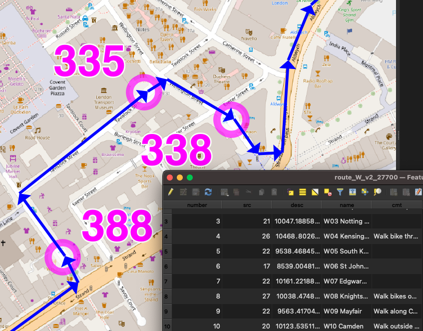
I created GPX route files for the challenge. These were created manually in QGIS, using the OpenStreetMap standard “Mapnik” render as a background, by drawing lines, with Google Street View imagery used to check restrictions.

I split each team’s route into 12 stages (so 36 altogether), which were initially each just over 10km and ended at a docking station. Each stage contained between 10 and 40 sequential legs to docking stations. I’m not sure I would trust proper routing engines (based on Google Maps or OpenStreetMap, normally) to have found better routes on each leg between each docking station, than me and Google Street View, largely because many London boroughs have been experimenting a lot recently with Low Traffic Neighbourhoods (LTNs) and modal filters (e.g. two way for bikes/one way for cars). But I did run a TSP solver (RouteXL) on 3 of the stages and in 2 cases it did find a slightly shorter ordering of the legs, within the stage. So I would probably use a TSP solver more for a future iteration of the challenge.

The three route/team files were saved in British National Grid (EPSG27700) GeoJSONs (technically not allowed by the spec) so I could get proper metre distances ($length) auto-updated into a column, for each stage, during planning. The stages had a number column, and were numbered sequentially. Having a number column results in LineStrings in the GeoJSONs and GPX routes/routepoints rather than single MultiLineStrings and GPX tracks/trackpoints. They were then saved as WGS84 GPX files. I (mis-)used a very limited set of column names (name, number, src, desc, cmt), due to the restrictions with the GPX specification – I didn’t want to use GPX extensions.

It was important to have three separate GPX files so that each team would need to load in just a single file to their navigation device and not see docking stations/routes from other teams). But it did make preparations a bit harder for the online map.

The docking stations were imported in via a TSV file, then saved as GPX waypoints (column names again restricted to src, desc, name, and cmt), and the relevant ones were manually appended to the GPX team files. The GeoJSONs were retained as my master editing files, as QGIS cannot easily edit GPX files due to them containing multiple geometry types.

I would certainly like to try a more automated approach to the routing. It did take a substantial amount of time – probably two evenings for each of the three routes, and a further evening for each route to enumerate the docking stations, fine-tune the routes and reorder any sliced up GeoJSON LineString segments (part-stages) back into the correct sequence. The reordering was needed as QGIS would incorrectly reorder parts of the route that crossed over itself, when it was sliced up.

But an automated approach would require a method that deals with docking stations that are just 10m down a no-entry street (so you’d just walk it), which is hard. Currently they are represented as a point defined by TfL through their API (and separately in OpenStreetMap) which may be the location of the “totem pole” kiosk but not the docking points themselves. In routing or GIS systems, the docking station needs to be represented as an area (within which you would walk the bikes) plus a (multi-)line (representing the line of dock points – some of these are quite long – some have significant gaps, and sometimes they are split on either side of a road). Potentially, the point representing a docking station really needs to be an area, and that area can extend up to the nearby road junction to deal with the one-way issue.

Future Improvements

In terms of the general design, a few things could be changed for a future challenge (some of these I mentioned in my previous blog post):

  • Ensuring that participants are well away from the finish at around the 60-80% stage, so that they are less likely to bail at that difficult time of the day, because the remainder of the challenge is then a kind of “run in” to the finish, rather than routing them away at a late stage.
  • When participants pass by another docking station twice, they should visit it on the first occasion, not the second time. (An exception is when it is on the wrong side of a dual carriageway, particularly one with a median barrier). Otherwise there is a danger of it being missed on the return.
  • Build specific meal stops in.
  • Maximum of 200 docking stations/10 hours per team.

The Web Map
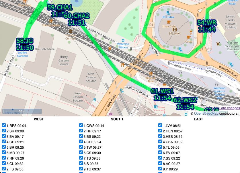
By comparison, building the web map was straightforward, probably just one evening’s work to build the map page itself as a basic OpenLayers map reading in GPX files and with simple browser-based geolocation, and one further evening to build a “team” version of the map that allowed ticking off the stations, the action being stored in a database, and a time string echoed back to the web map (and other viewers, on a Javascript timer) as confirmation. The database had two tables, a summary table with a row per docking station, and an action log which recorded the dock’s TfL ID, timestamp, event type and the submitter’s browser user agent string ($_SERVER[‘HTTP_USER_AGENT’]) in lieu of logins/IDs. It was fairly easy to assign a manually assign each user agent to team, post-event.

Each docking station ended up with 4 identifiers which feels a bit too many, but it kind of made sense:

  • an integer TfL ID (e.g. 761)
  • the TfL Name that appears on the totem pole (e.g. Gower Place, Bloomsbury)
  • a shortcode which was the sequence number and the initials of the first part of the TfL Name (e.g. 37.GP). There were some duplicates across the team. FIN.HS was a special shortcode for the finish for the two teams that didn’t have that as a docking station in their “zone”. One newly added docking station had “A” appended to the sequence number of the previous, rather than having to renumber everything.
  • a unique sequence code which was the team, stage and docking station order within that stage, (e.g. W02.15). This was used as a logical ordering of the file and to help with assigning each docking station to its stage on the online map.

I also listed an “actual sequence” post-event ordering, e.g. W038, in the final results file.

I could have used the sequence code on the map but felt the shortcode was the most useful concise way of identifying each station to the team as they approached it, and hopefully the simple number would result in any missing out being spotted quickly.
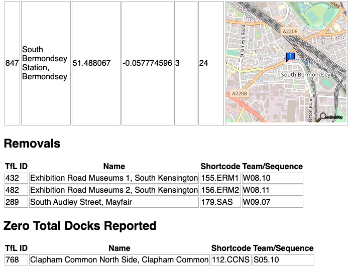
I built a special “diff” webpage that compares our docks file with the live data (via BikeShareMap) every 2 minutes and this alerted us of any new, closed or zero-capacity docking stations, plus a list of full ones. There was one that opened a few days before, but none on the day, thankfully!

Future Improvements

I do think that using fewer intermediate routing points on each leg would be better and would allow for turn-by-turn satnav directions. Having said that, having street names called out is of limited use as they are often hard to spot on the ground, so the breadcrumb trail approach we used worked well.

We had paper maps (just screenshots of the website) as a backup. I never used them, and I think Team South used the website. Team West used them exclusively, with a separate person using the website to tick off.

I would have liked to have had a single source of docking station locations. In the end, they were:

  1. on TfL’s API, which is fed through to a CSV on BikeShareMap every two minutes,
  2. on a CSV file on Github,
  3. as GPX waypoints appended to each team’s GPX routes file, and
  4. in my database for recording times on the ATDMap website.

1 and 2 were automatically compared (see above), 2 could be added to QGIS to compare and generate GPX for 3, and also imported into the database table (4) but this would all be manual steps.

Links

Website map with the timings: https://misc.oomap.co.uk/atdmap/

Route GPX files and timings CSV: https://github.com/oobrien/allthedocks

Strava link (Team East): https://www.strava.com/activities/7908548122
Categories
London OpenLayers

London’s Poverty Profile 2020

Trust for London (TFL), a charity and themselves a major funder of charitable projects in London to address poverty and inequality, has this week launched the London Poverty Profile (LPP) 2020. There is an updated data-driven website with over 100 different indicators of poverty and inequality, compiled by WPI Economics, along with a PDF report snapshotting the indicators as at early 2020.

With the ongoing Covid-19 pandemic and resulting lockdown likely to cause a significant impact on London’s social economics and community wellbeing throughout this year and going forward, the LPP 2020, which was compiled with pre-Covid-19 data, acts as an important baseline, looking at London’s poverty and inequality profile towards the beginning of the year.

As one of the world’s most international and wealthy cities, it is easy to overlook that London also has areas of extreme poverty and deprivation. The luxury apartments of Knightsbridge and Chelsea are often in the headlines but less obvious are the endemic poverty that has persisted in areas such as much of Newham borough in east London, parts of Tower Hamlets close to the glittering lights of Canary Wharf, or even North Kensington in the west. The recent political focus may have been on “rebalancing the North” (of England) away from London as a whole, but treating London as a single unit of the wealthy South is over-simplistic. The London Poverty Profile acts to ensure that all of London is understood and its challenges, when considered at detail, are not overlooked.

The Consumer Data Research Centre (CDRC)’s London hub has been involved with the LPP 2020 and will continue to work with Trust for London going forward. Our role has been two-fold. First of all, I was seconded to Trust for London periodically over the last year to overhaul the mapping system that appears on the LPP webpages. Previously using a heavily simplified representation of London boroughs, it has now been rewritten to use OpenLayers 6 (in Javascript ES6 form) which is integrated with the Content Management System used to publish the data and indicators by WPI and TFL. Secondly, CDRC will be contributing and mapping “experimental” datasets, from time to time. These will utilise CDRC’s own datasets and its ability to cross-tabulate datasets from other source, open and non-open, to provide further innovative insight into spatial aspects of poverty and inequality across the capital’s 9 million population.

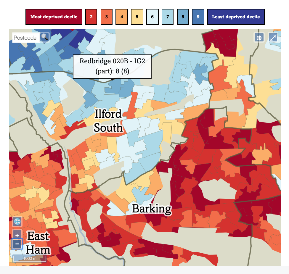
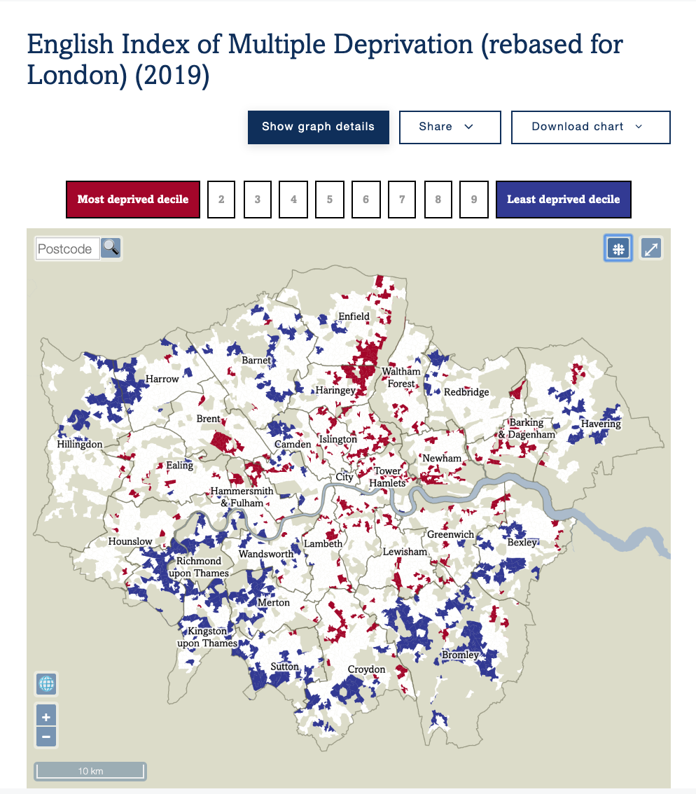
Geographies that can now be used extend beyond the London boroughs, to include LSOAs, MSOAs and (shortly) Wards. This allows more detailed maps. Poverty does not stop at London borough boundaries (although there are a number of cases where there is a big change, for example Redbridge to Waltham Forest), and some boroughs, such as Haringey, are well known for having a considerable east-west split, with a major railway line acting as a physical and socioeconomic split between wealthy Highgate and Muswell Hill to the west, and poorer Wood Green and Tottenham to the east.

Sometimes, other political boundaries do show a step-change in deprivation, as seen here between Ilford South and Barking constituencies (which is also a Redbridge/Barking & Dagenham borough boundary):

In addition, the maps use a selection of ColorBrewer colour ramps to ensure that spatial trends in the datasets are easily seen. ColorBrewer is widely used in the digital cartography field to ensure visually fair and effective use of colour in showing quantitative data.

All maps include a postcode search widget, and ones showing data at a final resolution than London boroughs include a toggle between borough outlines and Westminster political constituencies. Maps are zoomable and pannable, and PDFs and images can be quickly produced.

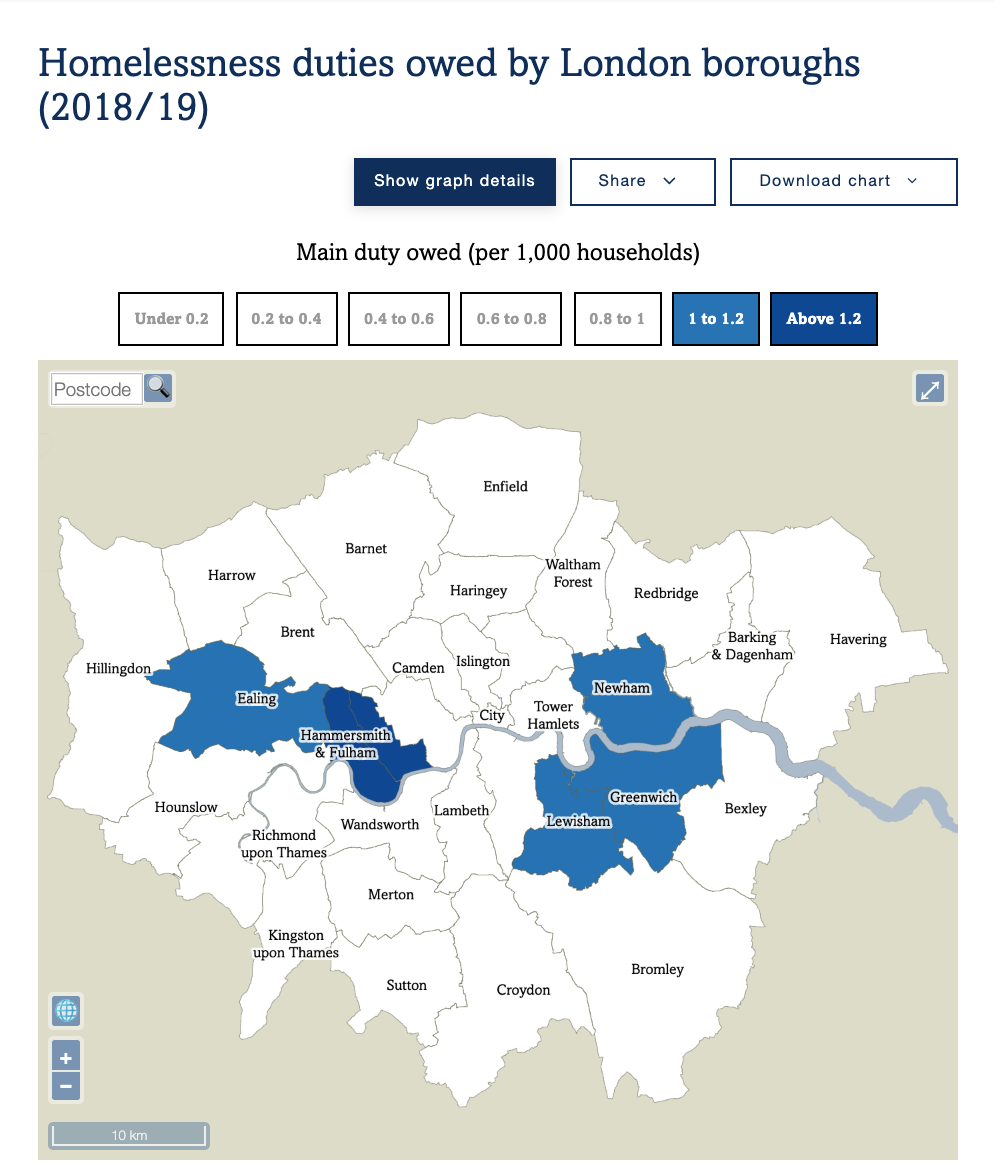
For launch, the new maps on London Poverty Profile include:

In addition, a number of existing maps on the LPP have been brought over to the new system, and other datasets, typically those split by borough and with some slight of spatial autocorrelation, will also gain maps in due course.

We hope to introduce additional experimental datasets, and corresponding maps, to the London Poverty Profile, on an approximately monthly basis this summer. Possible examples, based on current maps on CDRC Maps, include mapping on access to broadband, rate of household composition turnover, and consumer vulnerability to marketing practises.

Understanding the spatial characteristics of London’s poverty, inequality and other social challenges, is vital, and our hope is that these maps will help inform and better navigate the data available.

Categories
Conferences OpenLayers

FOSS4G 2019

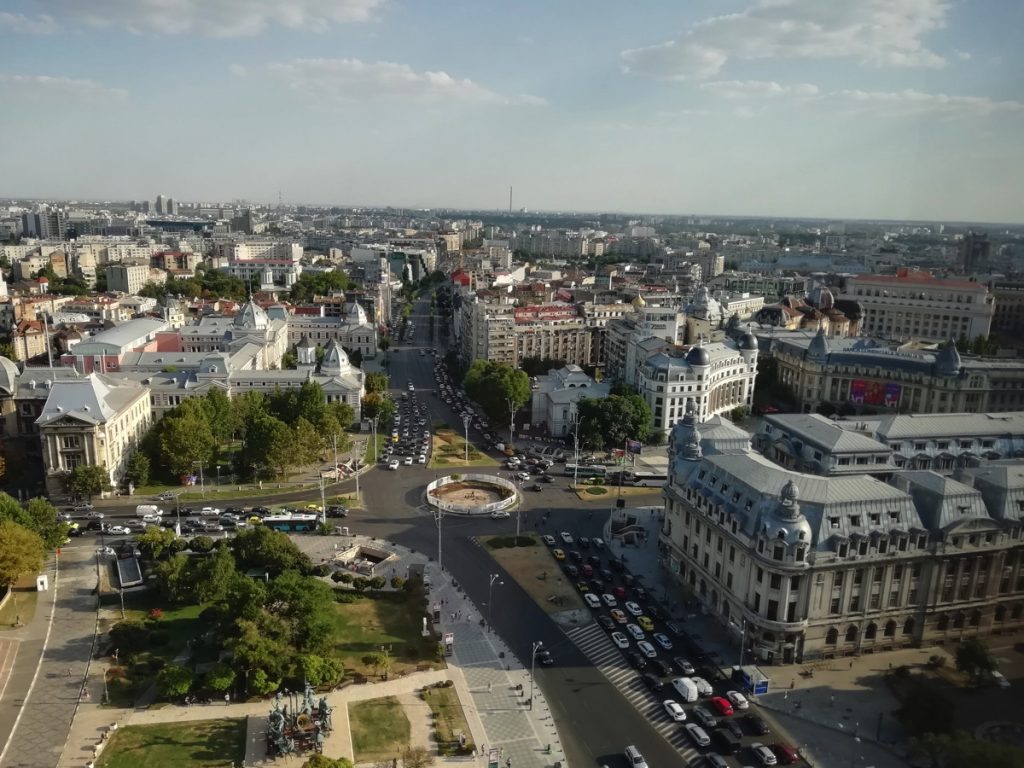
Central Bucharest – “Universitate”.

Last week I was at FOSS4G (Free and Open Source Software for Geo) 2019 conference, in Bucharest, Romania. It was the second time I had attended the global conference, the first being back in 2013 in Nottingham. There are also country and region “mini” versions of the conference, including FOSS4G UK which I have also been to a few times. Relatively cheap airfares and hotel costs in Bucharest, along with the conference fee itself being low for early birds, along with the theme focusing on open source geo software that I use heavily (e.g. QGIS and OpenLayers) meant this was an obvious summer conference to go to. As it is the “canonical” conference for the industry, it means that many of the key technologies have core developers attending – and speaking. Hearing insight from the creators – rather than just vendors – is invaluable.

I attended the main conference days on Wednesday, Thursday and Friday. It was a packed event, with 11 simultaneous streams of talks, starting each day at 9am, and with social events in the evenings too. Two smartphone apps for the conference were a must – Attendify was a good interface work out which sessions to go to when. The app is full of annoying quirks, and ironically lacking on the map front, but does have a bookmarking system which was invaluable. Telegram was the other app, as there was a FOSS4G event group chat which was lively and frequently updated. Around a third of the 1000 attendees were on the group chat. Unfortunately I had to find out about both Attendify and Telegram from other attendees – registration didn’t tell me about these. You would have had much less of a conference experience without these apps.

Openlayers 6.

Day 1 – Wednesday – was the best day for me, as it included core developer talks on GDAL, OpenLayers 6 and QGIS.

The GDAL talk included mentions of ndjson (and so ndgeojson), whichI hadn’t heard of before but is being supported in GDAL 3. It also touched on PROJ 6 and TileDB.

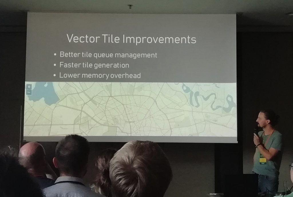
The OpenLayers 6 preview gave a good insight into the main optimisations and improvements being made – faster Vector Tiles, high-volume point-based vector rendering and arbitrary HTML elements as part of the map, to name but three. At the 2013 conference, OpenLayers 3 Beta was released – we’ve come a long way.

The QGIS talk previewed some of the work in progress in 3.10 and the next LTS release. QGIS 2 was launched at the 2013 conference – again, we’ve come a long way.

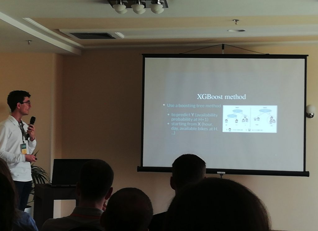
But the biggest surprise for me was one of the first talks – on bikeshare data visualisation, by Oslandia, detailing their python-based web application showing flows. My own Bike Share Map won Best Web Map back at FOSS4G 2013, and since then the industry has evolved a lot, and my map with it. I wasn’t expecting to see much in the way of bikeshare at FOSS4G, it being very much a technology rather than transport conference, so it was a nice surprise.

Bikeshare data clustering using open software.

Day 2 – Thursday – was not quite so unmissable for me, although this may perhaps have been due to the icebreaker event at Bragadiru Palace, following by a long walk back through central Bucharest in the evening heat – stopping off at Caru’ cu Bere, an intricate neo-gothic pub/restaurant that reminded me of the Cittie of Yorke in London.

Anyway I enjoyed the talk on PGRouting although I would have loved to have learnt about the differences between the main routing algos that have recently been added to it.

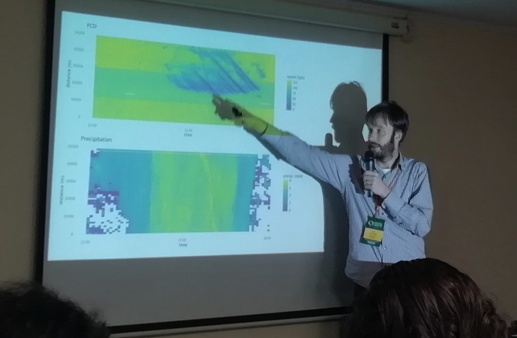
The best talk (for me) of the whole conference was on this day and was one that I hadn’t even been planning on attending. It was “Analyzing floating car data with clickhouse db, postgres and R”. It only had a teeny bit of R in it (I’m a python person) and was a great example of crunching a big dataset (all major road vehicle speeds and weather conditions grid data) using a specialised database, and visualising effectively.

Car speeds in the Netherlands and the effects of weather.

Day 3 – Friday – kicked off with “What’s new in PostGIS” was another unmissable talk – PostGIS’s importance in the FOSS4G community being acknowledged by it being a plenary rather than parallel-session talk, and so hosted in the 1000-seat National Theatre auditorium. Unfortunately this meant it was on at 9am, and so I opted to watch this one on the excellent, high-quality live stream being broadcast by CCC, from my hotel room, before checking out and going to the remainder of the conference. CCC’s production quality and coverage is perhaps one of the best things of the entire conference.

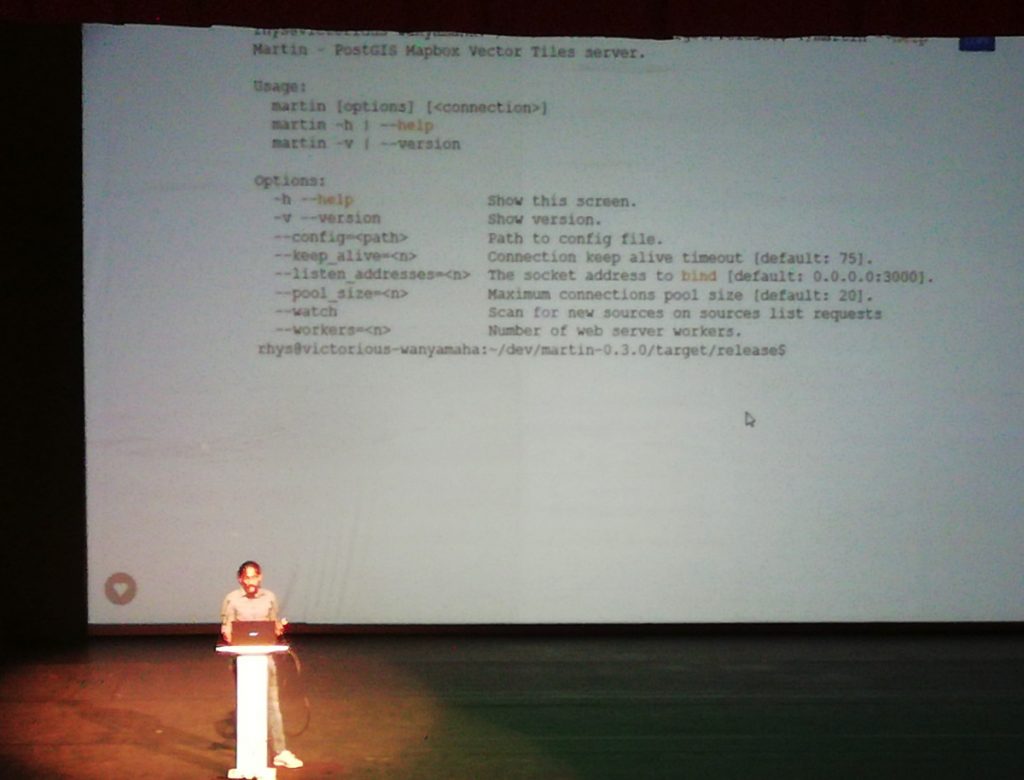
Other good talks on the final day included an integration of OpenLayers with the decidedly non-open-source Power BI platform, and a demonstration of Martin (a PostGIS-based vector tile server written in Rust).

QGIS on the Road sounded promising, but was a little too contrived (using QGIS to plan a bee-keeping hobby) and also too long – it was a triple-length session unexpectedly without breaks and was more of a tutorial. I was hoping there would be a demonstration of QGIS on mobile devices.

Finally a talk on GNOSIS style sheets – I certainly think any consideration of good cartography is a good thing, but feel there are already excellent ways (e.g. SLD, or Mapnik/CartoCSS) of standardising cartographic style sheets on the web.

Martin, a vector tiles server.

As previously, there were some themes that I would have liked to see more of such as on advanced Mapnik usage. There was also little on Leaflet, which was a surprise. Heavy users of the open source geo-toolstack didn’t have a huge presence – e.g. Mapbox. Indeed, Google and ESRI, two non-open vendors, were more visible. Like back in 2003, there is little if anything on D3. I was also surprised to see little mention of MapShaper or Shapely.

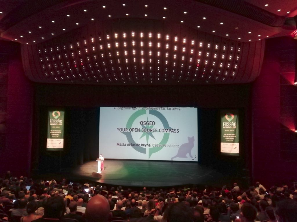
The other thing was that the OSGeo AGM sessions, representatives of the many incubator and other supported projects had around 30 seconds each to introduce their work and progress in the last year. I hadn’t heard of many of these, and ideally, every OSGeo incubator and supported project would have a least one 20 minute talk during the main conference itself, as an audience education. Perhaps something for the future conferences.

Opening Plenary session in the impressive National Theatre.

So overall another excellent, well organised conference with many good talks and also excellent community networking opportunities. The facilities were good (even if the hotel changed the names of some of the rooms after the programme went to press!) and there was something for everyone in the community. I don’t know if I’ll make it to FOSS4G Calgary in 2020 – I probably should start writing some open geo software first – but hopefully I will make it to another FOSS4G before too long.

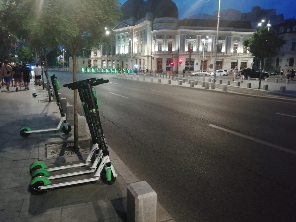
Lime eScooters-for-hire in Bucharest, with the older bikesharing system behind.

Micro-MaaS in Bucharest

A note on Bucharest’s micro-MaaS options – it currently has a third-gen non-electric bikeshare, L’Velo Urban although it covers very little of the city, and requires potential users to go one of two manned booths during working hours to get a pass to operate it. So hardly user-friendly. I saw a grand total of one person using the system during my entire 3 day stay.

The other option is eScooters – Lime and Wolf-E are both present. Lime is surprisingly expensive – the equivalent of 60p to start a journey and then 12p/minute. Nearly as expensive as London, in a city where food, drink, the metro and taxis are far cheaper. Indeed, it’s probably about double the rate of getting an Uber. Despite that, there were loads of people using Lime – I didn’t see anyone using Wolf-E. So, Lime may be on to something – there are plenty of people who are brave enough to scoot on the roads (which are dominated by traffic bombing along a way that London traffic doesn’t) and happy enough to pay for what seems like an expensive option – perhaps because it is the only fast option that doesn’t get held up in the pretty bad traffic the city has (there are not many bus lanes either).

Bucharest itself was a pleasant city to visit. Once I had got used to the traffic, it was quite nice to walk around, particularly in the evening-time when the worst of the heat has passed, and it still felt safe to walk around. It is a city with a recent history, with much graffiti (including on historic buildings), crumbling pavements with mysterious holes, and an oversupply of administrative buildings, a place where the car is king (some pavements are unwalkable due to parking on them) – but also a busy, bustling place full of interesting cafes and bars.

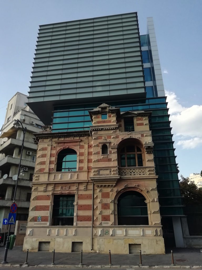
A building within a building in central Bucharest.
Categories
CDRC Conferences Data Graphics London OpenLayers

FOSS4G UK 2018 Meeting and OpenLayers 4

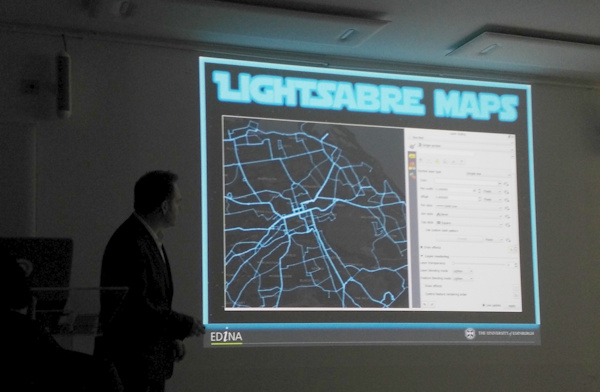
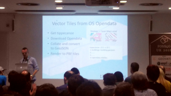
I attended and presented at the FOSS4G UK conference in central London, in early March. I was scheduled to present in the cartography track, near the end of the conference, and it ended up being an excellent session, the other speakers being Charley Glynn, digital cartographer extraordinaire from the Ordnance Survey, who talked on “The Importance of Design in Geo” and outlined the release of the GeoDataViz Toolkit, Tom Armitage on “Lightsaber Maps” who demonstrated lots of colour compositing variants and techniques (and who also took the photo at the top which I’ve stolen for this post):

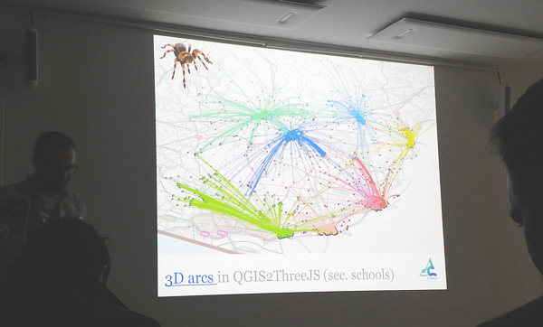
…and finally Ross McDonald took visualising school catchment areas and flows to an impressive extreme, ending with Blender-rendered spider maps:

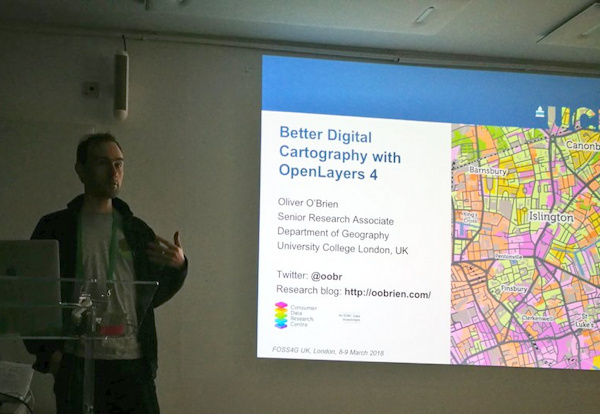
My talk was originally going to be titled “Advanced Digital Cartography with OpenLayers 4” but in the end I realised that my talk, while presenting what would be “advanced” techniques to most audiences, would be at a relatively simple level for the attendees at FOSS4G UK, after all it is a technology conference. So, I tweaked the tittle to “Better…”. The main focus was on a list of techniques that I had used with (mainly) OpenLayers 4, while building CDRC Maps, Bike Share Map, TubeCreature and other map-based websites. I’m not a code contributor to the OpenLayers project, but I have been consistently impressed recently with the level of development going on in the project, and the rate at which new features are being added, and was keen to highlight and demonstrate some of these to the audience. I also squeezed on a bonus section at the end about improving bike share operating area maps in London. Niche, yes, but I think the audience appreciated it.

My slides (converted to Google Slides):

Some notes:

  • My OpenLayers 2/Leaflet/OpenLayers 3+4 graphic near the beginning was to illustrate the direction of development – OpenLayers 2 being full-featured but hard to work with, Leaflet coming in as a more modern and clean replacement, and then OpenLayers 3 (and 4 – just a minor difference between the two) again being an almost complete rewrite of OpenLayers 2. Right now, there’s a huge amount of OpenLayers 4 development, it has momentum behind it, perhaps even exceeding that of Leaflet now.
  • Examples 1, 3, 4 and 5 are from CDRC Maps.
  • Example 2 is from SIMD – and there are other ways to achieve this in OpenLayers 4.
  • Examples 5, 6 and 9 are from TubeCreature, my web map mashup of various London tube (and GB rail) open datasets.
  • Regarding exmaple 6, someone commented shortly after my presentation that there is a better, more efficient way to apply OpenLayers styles to multiple elements, negating my technique of creating dedicated mini-maps to act as key elements.
  • Example 7 is from Bike Share Map, it’s a bit of a cheat as the clever bit is in JSTS (a JS port of the Java Topology Suite) which handily comes with an OpenLayers parser/formatter.
  • Example 8, which is my London’s New Political Colour, a map of the London local elections, is definitely a cheat as the code is not using the OpenLayers API, and in any case the map concerned is still on OpenLayers 2. However it would work fine on OpenLayers 4 too, particularly as colour values can be specified in OpenLayers as simply as rgba(0, 128, 255, 0.5).
  • Finally, I mention cleaning the “geofences” of the various London bikeshare operators. I chose Urbo, who run dockless bikeshare in North-East London, and demonstrated using Shapely (in Python) to tidy the geofence polygons, before showing the result on the (OpenLayers-powered) Bike Share Map. The all-system London map is also available.

FOSS4G UK was a good meeting of the “geostack” community in London and the UK/Europe, it had a nice balance of career technologists, geospatial professionals, a few academics, geo startups and people who just like hacking with spatial data, and it was a shame that it was over so quickly. Thanks to the organising team for putting together a great two days.

Categories
BODMAS OpenLayers

The Great British Bike to Work

Cross-posted from the DataShine blog.

cycle_thumbnail

Here’s a little visualisation created with the DataShine platform. It’s the DataShine Commute map, adapted to show online cycle flows, but all of them at once – so you don’t need to click on a location to see the flow lines. I’ve also added colour to show direction. Flows in both directions will “cancel out” the colour, so you’ll see grey.

London sees a characteristic flow into the centre, while other cities, like Oxford, Cambridge, York and Hull, see flows throughout the city. Other cities are notable for their student flows, typically to campus from the nearby town, such as Lancaster and Norwich. The map doesn’t show intra-zone (i.e. short distance) flows, or ones where there are fewer than 25 cyclists (13 in Scotland as the zone populations are half those in England/Wales) going between each origin/destination zone pair – approximately 0.15% of the combined population.

Visit the Great British Bike to Work Map.

Categories
Data Graphics OpenLayers

named

named_lennon_mccartney

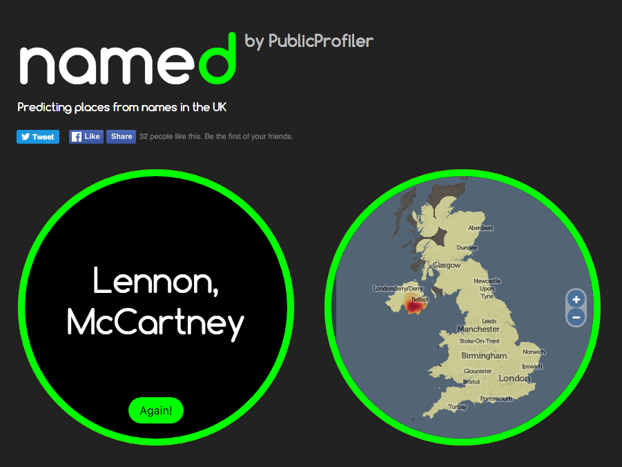
named is a little website that I have recently co-written as part of an ongoing ESRC-funded project on UK surnames that we are conducting here at UCL Department of Geography. I put together the website and adapted for the UK some code on generating heatmaps showing regions of unusual popularity of a surname, that was created by researchers in the School of Computing, Informatics & Decision Systems Engineering at ASU (Arizona State University) in the USA.

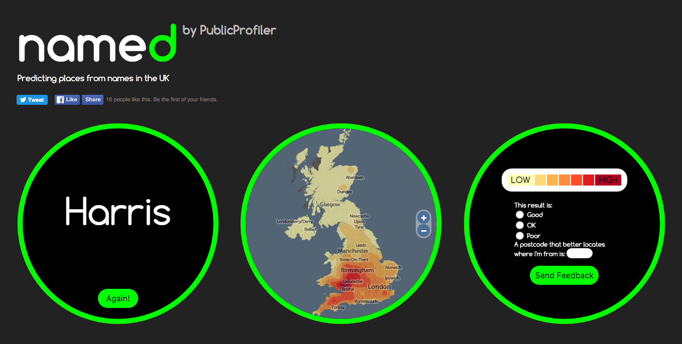
The website is deliberately designed to be simple to use and “stripped down” – all you do is enter your surname and the website maps where in the UK there is an unusually high number of people with that surname living. There is also an option to enter an additional surname (for example, a maiden name for yourself or your partner, or the name of a friend) – and, by combining heatmaps of both names, we try and draw out where we think you might have met each other, or grown up together.

The Research

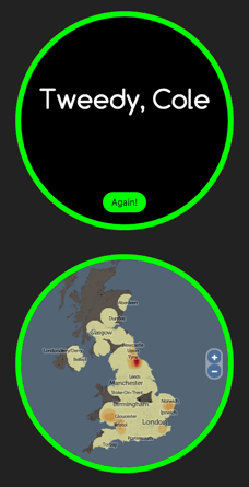
named_tweedy_coleOf most interest to us is the quality of the technique with pairs of surnames. It is well known already (for example, J A Cheshire, P A Longley (2012) Identifying Spatial Concentrations of Surnames, International Journal of GIS 26(2) pp309-325) that most traditional UK surname distributions remain surprisingly unchanged over many years – internal migration in the UK is a lot less than might be traditionally perceived. One of the research questions in the underlying project is to see whether this extends to marriages and other pairings too. So we encourage you to use this mode and help us understand and evaluate pairing surname distributions and patterns.

The site is also a useful information gathering tool – we are only in the early stages of evaluating the validity or accuracy of this method – we know it works well for certain regional UK names which are not too popular or too rare, at least. We ask for optional quick feedback following a search, so we can evaluate if the result feels right for you. So far, with the website been operational for around a week, nearly 10% of people are giving feedback, and around half of those suggest that it is good result for them. If it doesn’t highlight where you live now, it might be showing your ancestral home or other region that you have a historical link to. Or it may be showing complete rubbish – but let us know either way!

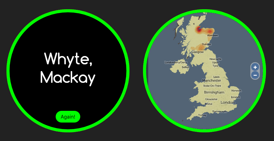
named_whyte_mackay

Try it out for yourself – visit here and see what it says for your surname. The site should be quite quick – it will take up to 10 seconds for names which have not already been searched, but is much faster if getting information that’s previously been searched for.

How it Works

The system is creating a probabilistic kernel density estimate (KDE), based on surname distributions (in a postcode) for an old electoral roll. It finds the relatively frequency/density of the surname compared with the general population in the area. So, in most cases, it will often highlight an area in the countryside – a sparse population, but maybe with a cluster of people with that surname. As such, it will only rarely highlight London and the other major cities of the UK, except for exceptionally urban-centric surnames, typically of foreign-origin. The method is not perfect – the “bandwidth” is fixed which means that neighbouring cities and other population fluctuations can cause false-positive results. However, we have seen enough “good” results that we think the simple has some validity, with the structure of the UK’s names.

named1

Design

On a design perspective, I wanted to build a website that looks different from the normal “full screen slippy maps” that I have designed for a lot of my research projects. Maps are normally rectangular, so I played with some CSS and a nice JQuery visual effects library, to create a circular map instead which appears to be on the back of an information disc.

Data Quality and Privacy

The map is deliberately small and low on detail because having a more detailed map would imply a higher level of precision for the underlying names data than can actually be justified. The underlying dataset has issues but is considered to be sufficient for this purpose, as long as the spatial resolution is low. Additionally, for rare names where a result may appear for only a small number of people with that name (when in rural places) we don’t want to be flagging individual villages or houses. The data’s just not good enough for that, for many names (it may well be good for some) and it may imply we are mapping exact data over someone’s house, possibly raising privacy issues – we are not, the data is not good enough for that but by coincidence it may still happen to line up with a very local feature if it was high res.

It should give an indication into the general area where your name is unusually popular relative to the local population there (N.B. not quite the same as where your name is popular in absolute terms) but I would be wary of the quality of the result if you were identifying a particular small town or exact location.

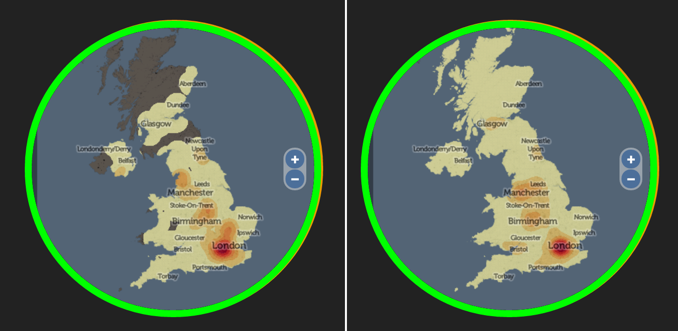
[A little update as one user worried that it was just showing a population heatmap. This would only happen for names which have a higher relative population in more dense area of the UK. Typically, older common foreign origin names will most likely show this, as foreigners traditionally migrate to cities in the UK first. The only name so far that I’ve seen it for (I haven’t tested it for many) is Zhang which is a very common surname. Compare Zhang (left) with an overall population heatmap (using the same buffer and KDE generation as the rest of the maps):

named_zhang_allpop

Some newer foreign origin names show an even more pronounced urban tendency, such as Begum and Mohammed.]

More…

Try named now, or if you are interested in surnames across the world, see the older WorldNames website, and for comparisons between 1881 and 1998 distributions in the UK, see GB Names.

If named shows “No Data” and you have entered a real surname, this may be because there are only very few of you on the UK – and in this case, I show the “No Data” graphic to protect your privacy. Otherwise I’d be mapping your house – or at least, your local neighbourhood.

Categories
Data Graphics London Mashups OpenLayers OpenStreetMap

Tube Line Closure Map

anim

[Updated] The Tube Line Closure Map accesses Transport for London’s REST API for line disruption information (both live and planned) and uses the information there to animate a geographical vector map of the network, showing closed sections as lines flashing dots, with solid lines for unaffected parts. The idea is similar to TfL’s official disruption map, however the official one just colours in the disrupted links while greying out the working lines (or vice versa) which I think is less intuitive. My solution preserves the familiar line colours for both working and closed sections.

My inspiration was the New York City MTA’s Weekender disruptions map, because this also blinks things to alert the viewer to problems – in this case it blinks stations which are specially closed. Conversely the MTA’s Weekender maps is actually a Beck-style (or actually Vignelli) schematic whereas the regular MTA map is pseudo-geographical. I’ve gone the other way, my idea being that using a geographical map rather than an abstract schematic allows people to see walking routes and other alternatives, if their regular line is closed.

Technical details: I extended my OpenStreetMap-based network map, breaking it up so that every link between stations is treated separately, this allows the links to be referenced using the official station codes. Sequences of codes are supplied by the TfL API to indicate closed sections, and by comparing these sequences with the link codes, I can create a map that dynamically changes its look with the supplied data. The distruption data is pulled in via JQuery AJAX, and OpenLayers 3 is used to restyle the lines appropriately.

Unfortunately TfL’s feed doesn’t include station closure information – or rather, it does, but is not granular enough (i.e. it’s not on a line-by-line basis) or incorrect (Tufnell Park is shown only as “Part Closed” in the API, whereas it is properly closed for the next few months) – so I’m only showing line closures, not station closures. (I am now showing these, by doing free-text search in the description field for “is closed” and “be closed”.) One other interesting benefit of the map is it allows me to see that there are quite a lot of mistakes in TfL’s own feed – generally the map shows sections open that they are reporting as closed. There’s also a few quirks, e.g. the Waterloo & City Line is always shown as disrupted on Sundays (it has no Sunday service anyway) whereas the “Rominster” Line in the far eastern part of the network, which also has no Sunday service, is always shown as available. [Update – another quirk is the Goblin Line closure is not included, so I’ve had to add that in manually.]

Try it out

Categories
Data Graphics OpenLayers

General Election Maps for 2015

ge_swingmap

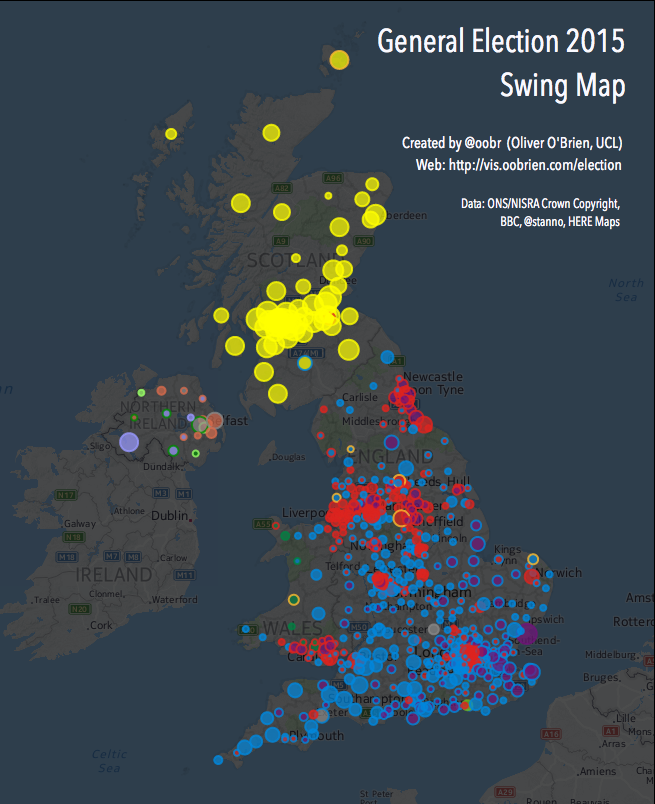
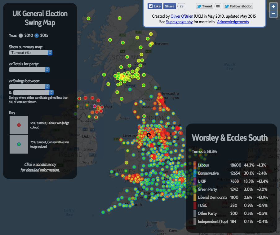
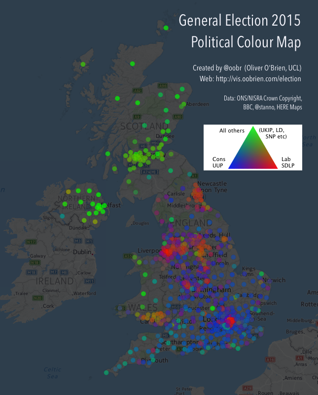
When I first moved to UCL CASA back in 2010, the first online map I created from scratch was one showing swings in the general election that year. So it seemed fitting to update the old code with the data from the 2015 general election, which took place last week. You can see the resulting maps here – use the dropdowns to switch between headline swing, winner, second places, turnout % variations, majorities, political colour and individual party votes and X-to-Y swings.

Screen Shot 2015-05-11 at 15.09.08

My style of Javascript coding back in 2010 was – not great. I didn’t use JQuery or event AJAX, choosing instead to dump the results of the database query straight into the Javascript as the page was loaded in, using PHP. I was also using OpenLayers 2, which required some rather elaborate and unintuitive coding to get the colours/shapes working. My custom background map was also rather ugly looking. You can see what the map looked like in this old blog post. I did a partial tidyup in 2013 (rounded corners, yay!) but kept the grey background and slightly overbearing UI.

Now, in 2015, I’ve taken the chance to use the attractive HERE Maps background map, with some opacity and tinting, and tidied up the UI so it takes up much less of the screen. However, I decided to leave the code as OpenLayers 2 and not AJAX-ify the data load, as it does work pretty well “as is”. The constituency boundaries are now overlaid as a simplified GeoJSON (OL 2 doesn’t handle TopoJSON). For my time map, I was using OL 3 and TopoJSON. Ideally I would combine the two…

Link to the interactive maps.

ge_colourmap

Categories
Data Graphics OpenLayers

Election Time!

electiontime

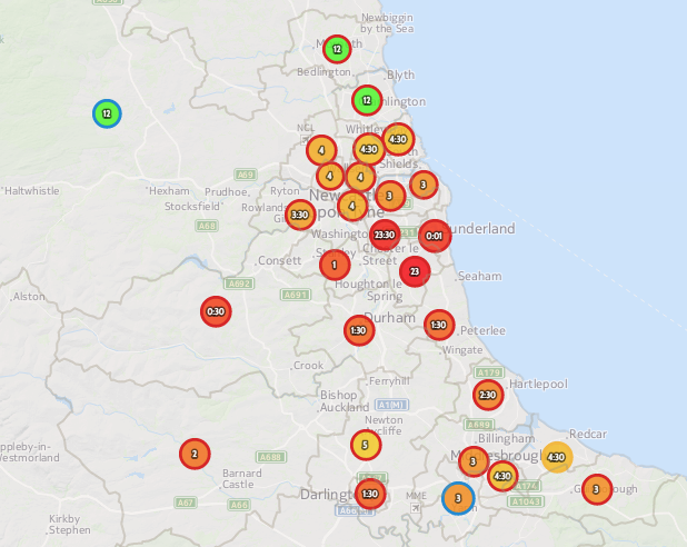
I’ve created an Election 2015 Time Map which maps the estimated declaration times that the Press Association have published. It follows on from a similar map of the Scottish independence referendum.

Each constituency is represented by a circle which is roughly in its centre (using a longest-interior-vertex centroid determined in QGIS). The area of the circle represents the size of the electorate, with the Isle of Wight being noticeably larger, and the Western Isles and Orkney/Shetland constituencies smaller, than average. The main colours show the expected time (red = around midnight, falling to green for the slow-to-declare constituencies late in the morning) while the edge colour shows the 2010 winning party. Mouseover a constituency circle for more data. Grey lines shows the constituency boundaries, created from ONS data (for Great Britain) and aggregating NISRA small area and lookup data (for Northern Ireland). You can download the resulting TopoJSON file, which is simplified using MapShaper. The data is Crown Copyright ONS/NISRA.

As the election approaches, and after the results come in, I hope to modify and update the map with other constituency-level data, such as the result itself.

Categories
OpenLayers Technical

GeoComputation: A Practical Primer

geocomputationGeoComputation: A Practical Primer, edited by Profs Chris Brunsdon and Alex Singleton, has just been published by SAGE.

The book acts both as a reference guide to the field and as a guide to help you get to know aspects of it. Each chapter includes a worked example with step-by-step instructions.

Each chapter has a different author, and includes topics such as spatial data visualisation with R, agent-based modelling, kernel density estimation, spatial interaction models and the Python Spatial Analysis library, PySAL. With 18 chapters, the book runs to over 300 pages and so has the appropriate depth to cover a diverse, active and fast-evolving field.

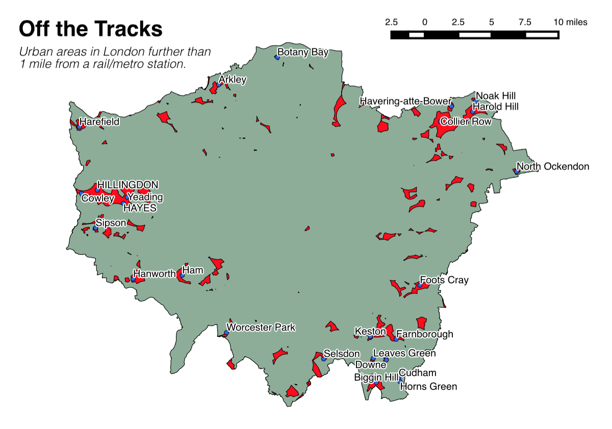
I wrote a chapter in the book, on open source GIS. I focused particularly on QGIS, as well as mentioning PostGIS, Leaflet, OpenLayers (2) and other parts of the modern open source “geostack”. My worked example describes how to build a map, in QGIS, of London’s railway “not-spots” – places which are further than a mile from a railway station, using open data map files, mainly from the Ordnance Survey. With the guide, you can create a map like the one below:

offthetracks

That little spot on its own in central-ish London, by the way, is part of Burgess Park, near Peckham.

The book has only just been published and I was able to slip in brand new screenshots (and slightly updated instructions) just before publication, as QGIS 2.6 came out late last year. So, the book is right up to date, and as such now is a great time to get your copy!

It’s available now in paperback on Amazon: Geocomputation: A Practical Primer.

The first part of my chapter:

geocomp_ch17