Categories
Data Graphics

LinkedIn Network Maps

I’ve just come across the network map generator from LinkedIn Labs, the “cool fun stuff” page where LinkedIn employees put their “20%-time” projects. I don’t use LinkedIn hugely, but have built up enough contacts on the “professional” social network now, from accepting connection requests, for a reasonably interesting map to be produced. You can see mine here. Four clumps are immediately spatially apparent: I identify them as University, Graduate Job, Current Job (CASA) and Orienteering. The software itself identifies and colour-codes six categories – it separates out my graduate job clump into the interns and the people I met once I came back for real – and splits the current job clump into the current and previous role with a closely aligned group (the quantative geographers at UCL.)

The maps are reminiscent of what can be produced in GePhi, an open-source network visualiser that is becoming increasingly popular here in the CASA lab. I produced a similar kind of map a good 15 months ago of my Facebook connections – this latter map has a richer set of connections but people are connected by the simple application of Hooke’s Law (masses on interconnected springs) with straight lines, rather than the sweeping curves of the LinkedIn Lab map, and without the automatic categorisation. You also don’t get yourself placed at the centre, with all the lines leading to you :-). My connections did however also group roughly into the same categories, showing that once you’ve got your connections, it’s difficult to lose them, no matter what network you are on… 😉

Categories
Orienteering

Population Pyramid of Scottish 6 Day Orienteering Entries

Here’s a population pyramid of the entries so far for this summer’s Scottish Six Days (S6D) orienteering event, based on the 2000-odd people on the entry list shortly after the cheap entries’ closing date.

At first glance it looks like the demographic is horribly unbalanced. There is definitely a “hole” in the middle! However, there are some possible mitigating factors:
1. Older people might be more keen on entering early so that their plans for the summer are organised well in advance. Younger people are less organised?
2. Younger people are maybe more likely to be injured due to their faster running speeds, so only want to enter when they are more confident of being injury free?
3. Younger people’s incomes are more vulnerable to change so they are waiting to enter closer to the event (£90+ entry fee for the six days) when they are sure they can afford it?
4. Older people are more affluent and so happy to enter a long time in advance and then maybe not show up?
5. Leave is harder to arrange for younger workers?
6. Younger people are more weather sensitive and want to see what sort of summer it’s going to be in a notoriously wet (or midgy) part of Scotland, before entering?

Here’s what the Office of National Statistics’ population pyramid for the UK population for 2011 looks like – you can see this for yourself at the ONS website:

Bear in mind that this is just the UK population, and 20% of the entries for the S6D so far are from foreigners. The age axis for the ONS pyramid starts at zero.

(N.B. The ages for the S6D pyramid are based on the age at 31 December, rather than at the event date in August. Ages are also averaged through the age bands – 2-year for juniors, 5-year for vets – for which the data is available. I have assumed that all the M/W10s are aged 9 or 10.)

Categories
OpenStreetMap Orienteering

OpenOrienteering Map Back Online

Following a period of downtime, caused by the rapid increase in size of the OpenStreetMap database, OpenOrienteeringMap is now back online.

There are now two editions – a UK edition which receives the live updates from OpenStreetMap, so will normally show roads and paths that are added to OpenStreetMap within a few minutes of the edit – and a world edition, which no longer updates live, but uses a static database. This database hopefully will be rebuilt occasionally to bring it up to date, although this will result in 3-4 days of downtime each time. The lack of updating, and the update downtime, is due to the limited resources I have at my disposal to run OpenOrienteeringMap. Unfortunately I cannot guarantee long-term availability or that the service will be around forever – my employer will want to reclaim the server eventually!

You can access OpenOrienteeringMap here, there is a new interstital which allows you to select the edition you want. Remember there are two versions, Street-O and “Pseud-O”. The image above shows the Pseud-O map for central Paris. Below is the Street-O map of part of Guayaquil in Ecuador.

Categories
Bike Share Data Graphics London OpenStreetMap

Flow Animation of Barclays Cycle Hire Bikes

Dr Martin Austwick and I, here at UCL CASA, have been working on an animation of the Barclays Cycle Hire bikes (aka Boris Bikes) in London, based on the historical flow information that was released by Transport for London (TfL) last month.

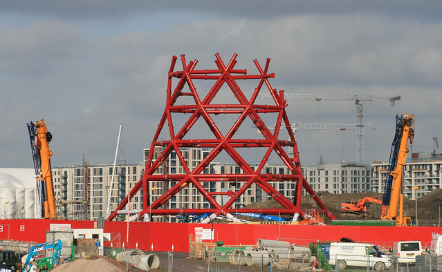
Taking one of the busiest days of the scheme – the 4th of October last year, a Monday which coincided with a London Underground strike – Martin has created an animation showing pulsing blobs, or motes, representing the bikes, moving through the 18 hours of the day that the data is available for. As each hire is made, the docking station dot flashes red, and and blue trail starts to leave it, heading towards the destination dock which flashes yellow as it receives a bike.

At the rush-hour peaks (08:45 and 17:45) the map becomes a sea of a 1000 blue pulses, many congregating on a number of key routes in London. The few bridges across River Thames can be picked out as intense bars of light, as commuters travel between Waterloo/South Bank and the City/West End. Hyde Park (middle left) and Regents Park (top left) are noticeable from having few docks in their area, and only a few bikes crossing them. The east seems busier than the west, as the City workers typically commute to work earlier and so dominate the scheme on strike day.

Martin’s used Processing, a rich Java graphics library, to create the animation, which has been then output to video. This allows the up-to-1000 bikes to be animated smoothly and effectively.

The bikes are in official Barclays Blue, although if you don’t view the video in HD, they look slightly washed out. Watch the video on the Vimeo website in HD, although you’ll need a fast computer and a broadband connection.

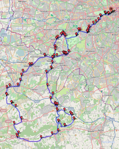
The routing is done based on the OpenStreetMap data for central London. I used Routino to do the routing, producing a routing file for each of the 137,000 possible journeys between docks in London. The routing is directed, meaning the bikes won’t cycle the wrong way down a one-way street. They also generally avoid trunk roads, such as Euston Road, preferring to use the quieter roads and dedicated cycle lanes nearby. Being able to use the new cycling infrastructure in the routing, is one big advantage of using OpenStreetMap.

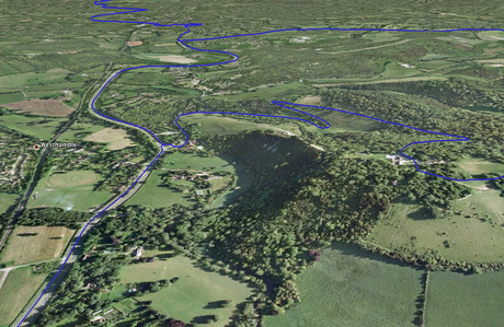
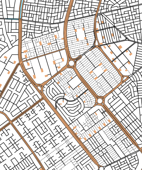
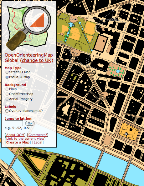
A disadvantage is where the routing is wrong. For example, access from the Embankment is not shown correctly. Another problem was the reluctance to cross Trafalgar Square in the centre of the city. This meant I had to move a couple of the docking stations slightly. An example of the latter is shown in the picture here. These quirks, and a few others, result in some bikes flying around the animation extremely fast, as the router sends them a mile up in one direction, around a roundabout, and back down in the other direction. The speeds of the bikes are based on the duration information for the journey, which is included in the data, so they start and finish at the right time.

The routing is the “best guess” route, based on the assumption that the majority of cycle users will know the “best” route to take. Casual and multi-stop use will be less accurately shown. Bikes which are returned to the same docking station they started from, are shown “orbiting” the dock for four times, before returning to it.

The work follows on from a recent animation showing the TfL buses in London, by Anil Bawa-Cavia, also here at the UCL Centre for Advanced Spatial Analysis in London.

Categories
London

Crime Maps – New and Improved

A new version of the crime maps for England and Wales was launched last night, at police.uk. These are now more granular, offering street-level detail, rather than the sub-ward choropleths that were available before. More significantly, the data behind the maps is now readily downloadable from the website, so if you don’t like the maps, you can create your own. No more will we have maps showing virtually the whole of London has having “average” crime levels, due to the outliers – the pickpockets in the West End – being so much higher than anything else.

My tweet-stream is full of people grumbling about the new system – but I rather like it:

Technical Concerns

  • It’s broken
    Any website launched with a fanfare will break on the first day as the media announce it. There’s not point spending huge amounts on the infrastructure for one day of use, when the rest of the time, the number of visits will be far smaller

Data Concerns

  • It’s using point data for streets
    Yes, it’s not ideal, but it means you don’t have a problem with (a) drawing lots of polygons which would slow things down, or (b) drawing lots of lines and having them not quite line up with the background. It is a bit of a (mis-)use of the Google Maps aggregating icon, having it show at every level, but this means there’s no “pin-point” at anyone’s door.
  • It’s showing anti-social behaviour reports as well as crimes. Conspiracy!
    They are separated out – you can turn these on and off. They do certainly make some areas look a lot higher for crime than they actually are.
  • The data shouldn’t just be given away like this – people will misinterpet it and jump to the wrong inclusions
    Yes, absolutely, and this is a big problem at the moment. My own maps (above and below) certainly have their problems. But isn’t it better to have the data open so people start to become more aware of the statistics around them? My hope is that, with all these public datasets becoming available, people will start to get a greater awareness that maps can lie, and be more investigative about the truth.
  • The data shouldn’t just be given away like this – it’s an invasion of privacy
    Maybe, but the data is only at street-level, rather than house-level. In the U.S., the data is at house-level. The point-based nature of the data does make it appear that particular houses are crime-hotspots rather than the whole street, but that is a technical limitation of the way the data is made available at present.
  • The data will blight my area!
    The truth hurts?
  • My street is showing up as a crime hotspot – it’s not
    Not a fault of the map or the website (although perhaps it should carry a warning) – at the end of the day if the data supplied is wrong, then it’s going to show up wrong. Don’t shoot the messenger! The data may also be referring to shopping arcades the like for which this street is the nearest.

More Technical Concerns

  • It’s not using OpenStreetMap (an open map dataset)
    OSM isn’t complete for England and Wales – particularly in parts of north England. It wouldn’t look good if someone uses the map and finds their street is not there. Like it or not, this wouldn’t happen so often with Google maps. Additionally, very popular sites using OpenStreetMap tiles from the tileserver are frowned upon, the project doesn’t have the server resources of Google.
  • It’s not using custom mapping based on OpenStreetMap
    This is quite hard to do, and, while allowing for theming of the mapping, would present an unfamiliar looking and still incomplete map. Plus hosting the tiles yourself means a lot more bandwidth is needed, so the site is likely to suffer even more under the high load.
  • It’s not using third-party suppliers of tiles, such as Cloudmade
    These address the hosting problem but still suffer from incompleteness.
  • It’s not using Ordnance Survey OpenData (another open map dataset)
    The OpenData image tiles don’t include maps that the general public is familiar with (i.e. Landranger, Explorer). People are more familiar with Google Maps now and understand them more quickly. The vector information could have been used to make some really nice background mapping, but again this requires advanced knowledge and being able to host the tiles and manage the bandwidth that would ensue. Google is happy to give you their own tiles for free and they are highly scalable. Certainly I think this is a missed opportunity for making a completely open site, but I don’t have a major problem with Google Maps here – it’s a sensible tactical decision.
  • It’s not using OpenLayers (an open mapping API)
    Google Maps API works on mobile devices, e.g. the iPhone. OpenLayers (on a website) doesn’t really – no gesture support.
  • Just give us the data, we don’t need a map
    You might not, but the media and public do need something they can look at immediately, rather than waiting for third-party developers to release their own interpretations.

Political Concerns

  • I can’t believe they spent £300,000 on this!
    Actually pretty good value for a site like this – if that includes the infrastructure, bandwidth, database support, testing, maintenance. It’s not just for building a Google Maps API map.
  • It’s still broken
    Wait until tomorrow. Or download the data here – this link has been generally working through the day.

The heatmap above shows robberies in London, below shows anti-social behaviour in north London. I’ve combined the Metropolitan Police and City of London police data-files for December 2010 together. You can play with the heatmap yourself [Updated – the website is now offline] if you have an HTML5-compliant browser. The background mapping is from OpenStreetMap. More about the heatmaps.

Categories
Bike Share

Paris Open Data site Launches

After Washington DC’s pioneering site, and the launch last year of London’s Data Store, a catalogue of free and open public data about the city, Paris has now unveiled a similar own open data site: ParisData. They have a Twitter account too.

There’s not a huge number of datasets listed on the site yet, but it looks very promising. My hope is that the live-running data for the huge “Velib” bike share system in the city gets added to the site, so that I would be allowed to re-enable my live bike share map of Paris.

Incidentally, the London’s bike share (aka Barclays Cycle Hire) live-running data is not in fact available on the London Data Store either – they seem not be aware of this anomaly but the operator in London has at least tacitly allowed third-party use through “scraping”. Paris is the “grand daddy” of all bike share schemes though (at least in Europe) so having Paris in the fold would be great.

For now though, for open data in France, Rennes is still the best.

Categories
Bike Share

Washington DC Storm – Bike Share Shutdown

Washington DC’s Capital Bike Share is shutdown tonight because of another snow storm there.

On my bike share map, red circles have appeared around all the docking stations, indicating they are locked down to prevent new journeys starting.

With the Montreal, Denver and Minneapolis systems closed for the winter, none of the major North American bike shares are operating right now.

Categories
Leisure

London 2012 Training Guides

Now this is interesting – I spotted on Amazon these London 2012 Olympic Games training guides, which are coming out at the beginning of March. There are four – Track, Field, Cycling and Swimming. I’m not sure quite who they are aimed at – not the pros I presume, but are they trying to cater for both complete beginners and club-level athletes (the blurb suggests so.) I’m also not sure about all the other Olympic sports that don’t fit into the four categories, e.g. Rowing and Sailing. I think we are quite good at those!

There’s also an “The Official Countdown to the London 2012 Games” which is launching at the same time. Could be interesting.

The London 2012 “brand” (i.e. jagged lines) is starting to grow on me, it has to be said. No circles in sight!

Categories
Data Graphics London

London Surnames: An Onomap of London

I’ve created a website to showcase a number of bespoke typographic maps that James Cheshire (a Ph.D colleague UCL Geography) has created. The website shows the origin of the most common 15 surnames in each MSOA in London – MSOAs are spatial units roughly encompassing 7000 people.

It’s important to emphasise that these are the origins of the surnames, not of the people themselves, i.e. it is a map of names, not ethnicities. The categories are chosen descriptions of the Onomap groupings that appear when matching surnames and forenames and therefore don’t necessarily line up with associated ethnicities or countries. For example, the high numbers of “Welsh” names appearing is likely not due to lots of Welsh people!

Communities which have more homogenous surnames are more likely to be highlighted on a map like that, at the expense of communities with more mixed surnames – another reason why this map cannot tell you about the proportion of people in a particular area – just their names.

The extract below shows a small Jewish “cluster” of names appearing on the border of Harringay, Hackney and Waltham Forest boroughs – the area known as Stamford Hill, which is an area noted for its large Orthodox Jewish community.

The website itself is nothing particularly special, except that it allows easy panning, zooming and scrolling of James’ eye-catching maps. OpenLayers powers the website, and a custom “pixel-coordinate” projection is used. There is a JQuery slider to scroll through the maps, and the user interface elements adopt the “London street sign” look. The data comes from 2001 so doesn’t account for the likely recent significant population movements around the city in the last few years.

More on James’ blog.

Categories
OpenStreetMap

Wheelmap – The Right Way for the World to Tag OpenStreetMap

I recently came across Wheelmap, a website (and also an associated iPhone app) specifically built to display – and accumulate – wheelchair accessibility information for points of interest (POIs) such as pubs, cafes, shops on OpenStreetMap. As you move around the map, an overlay highlights the POIs and colour-codes their accessibility for wheelchair users. Adding or changing the accessibility for a POI is as easy as clicking on it and clicking one of three options – job done! The data is then fed back to OpenStreetMap (so the whole community gets the benefit of this extra “tagging” information) and Wheelmap itself updates the colour.

The website is not perfect – the location finder is not yet fully localised from its German origin, for example, also the map controls aren’t styled like the rest of the site and the default OpenStreetMap map also shows its own symbols for many POIs, so they really need their own custom render – but this is nonetheless a great implementation targeting very specific data in the OpenStreetMap database and making it absolutely trivial for anyone to enhance the map in this way. I’m a firm believer that the easier it is to do something, the greater number of people will contribute.