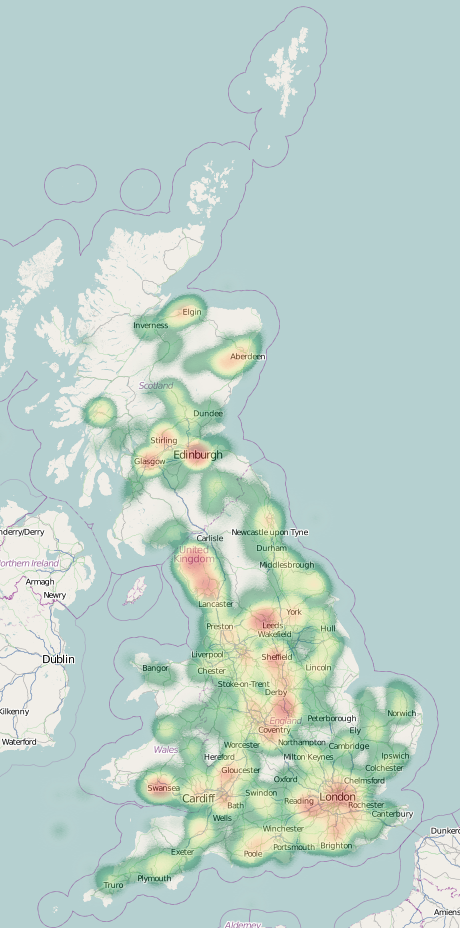
I’ve created a website to showcase a number of bespoke typographic maps that James Cheshire (a Ph.D colleague UCL Geography) has created. The website shows the origin of the most common 15 surnames in each MSOA in London – MSOAs are spatial units roughly encompassing 7000 people.
It’s important to emphasise that these are the origins of the surnames, not of the people themselves, i.e. it is a map of names, not ethnicities. The categories are chosen descriptions of the Onomap groupings that appear when matching surnames and forenames and therefore don’t necessarily line up with associated ethnicities or countries. For example, the high numbers of “Welsh” names appearing is likely not due to lots of Welsh people!
Communities which have more homogenous surnames are more likely to be highlighted on a map like that, at the expense of communities with more mixed surnames – another reason why this map cannot tell you about the proportion of people in a particular area – just their names.
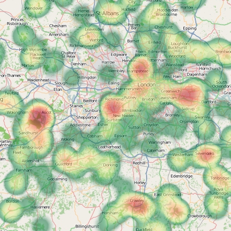
The extract below shows a small Jewish “cluster” of names appearing on the border of Harringay, Hackney and Waltham Forest boroughs – the area known as Stamford Hill, which is an area noted for its large Orthodox Jewish community.

The website itself is nothing particularly special, except that it allows easy panning, zooming and scrolling of James’ eye-catching maps. OpenLayers powers the website, and a custom “pixel-coordinate” projection is used. There is a JQuery slider to scroll through the maps, and the user interface elements adopt the “London street sign” look. The data comes from 2001 so doesn’t account for the likely recent significant population movements around the city in the last few years.


 Cross-posted from