Categories
London

Book Review: London Buildings – An Architectural Tour

londonbuildings

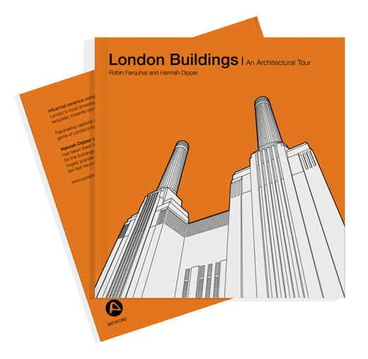
This book, which features great examples of London building architecture, is itself distinctively designed and immaculately presented. It’s been out for a couple of years now, however I was recommended it when purchasing another book recently on Amazon, as an impulse purchase, it’s an excellent find.

The book was authored by Hannah Dipper and Robin Farquhar of People will always need plates and is based on their heavily stylised interpretation of the buildings featured.

Each building featured in the book – there are around 45 – gets a two page spread, always in the same format – the building shown in white with clean strokes of detail in black, and a distinctive, single tone of colour for the sky. A small inset box includes the buliding name, architects, age and 100 words. That’s it.

The book doesn’t just feature the modern Brutalist London landscape (e.g. Trellick Tower), and the latest modern skyscrapers (e.g. the Gherkin) it also includes such older gems as Butler’s Wharf and the Dulwich Picture Gallery. These two are treated to the wonderful, minimalistic sketch style, with just the two colours allowing the design detail of the building itself to take centre stage.

On Amazon: London Buildings: An Architectural Tour, currently for £9.99. Published by Batsford, an imprint of Anova Books.

Image from the London Design Guide website.

Categories
London OpenStreetMap

OpenStreetMappers of London

IMG_1370

I contributed a number of graphics to LONDON: The Information Capital, a book co-written by Dr James Cheshire, also of UCL Geography. Two of my graphics that made it into the book were based on data from OpenStreetMap, a huge dataset of spatial data throughout the world. One of the graphics, featured in this post, forms one of the chapter intro pages, and colours all the roads, streets and paths in the Greater London Authority area (around 160,000 “ways” which are discrete sections of road/path) according to the person who most recently updated them. Over 1500 indivdual users helped create and refine the map, and all are featured here. I was pleased to discover I was the 21st most prolific, with 1695 ways most recently modified by myself at the time that the graphic was produced.

The more active users will typically have areas around home and work which they intensively map, plus other, smaller areas such as contributions made during a mapping party or other social event organised by/for the London OSM community. Here’s an example filtering for just one user:

osm_dan

Putting the users together reveals a patchwork of key authors and more minor contributors, together forming a comprehensive map of the city. Detail levels vary, partly as the fabric of the city varies from area to area, but also as some contributors will be careful to map every path and alleyway, while others will concentrate on the driveable road network.

osm_detail

The data was obtained from a local copy of the OpenStreetMap database, for Great Britain, that I maintain for various pieces of work including OpenOrienteeringMap. You can obtain the data files from GeoFabrik (this link is to their new London-only version). The data was captured in early February 2014. Newham borough in east London (light blue) shows up particularly prominently because it looks like it had had a bulk update of all roads there by a single user, just before the capture, to indicate which were lit by streetlights (lit=yes).

I used QGIS to assemble the data and applied the temp-c colour ramp, classifying across all the contributors – I then changed the ones which were assigned a white colour, to green. The colours used in the book are slightly different as some additional editing took place after I handed the graphic over. The colour ramp is relatively coarse, so multiple users will have the same colour assigned to them. The very long tail of OSM contributions (where only a small number of people make the great majority of edits) mean that this still means that most major contributors have a unique colour assigned to them.

osm_book


View larger version.

Download:

Note that these files actually are for an area that is slightly larger than the Greater London Authority extent – a buffer from Ordnance Survey Open Data Boundary-Line is used to mask out the non-GLA areas.

If you like this thing, it’s worth noting that Eric Fischer independently produced a similar graphic last year, for the whole world. (Interactive version).

Categories
Data Graphics London

Tube Tongues – The Ward Edition

wardwords

If you are a Londoner but felt that Tube Tongues passed you by, maybe because you live in south-east London or another part of the city that doesn’t have a tube station nearby, then here’s a special version of Tube Tongues for you. Like the original, it maps the most popularly spoken language after English (based on 2011 Census aggregate tables released by the ONS, via NOMIS) but instead of examining the population living near each tube station, it looks at the population of each ward in London. There are 630* of these, with a typical population of around 10000. I’ve mapped the language as a circle lying in the geographic centroid of each ward. This is a similar technique to what I used for my local election “Political Colour” maps of London.

A few new languages appear, as the “second language” (after English) in particular wards: Swedish, Albanian and Hebrew. Other languages, which were previously represented by a single tube station, become more prominent – Korean around New Malden, German-speaking people around Richmond, Nepalese speakers in Woolwich, Yiddish in the wards near Stamford Hill and Yoruba in Thamesmead. Looking at the lists of all languages spoken by >1% of people in each ward, Swahili makes it on to a list for the first time – in Loxford ward (and some others) in east London. You can see the lists as a popup, by clicking on a ward circle. As before, the area of the circles corresponds to the percentage of people speaking a language in a particular ward. The very small circles in outer south-east London don’t indicate a lack of people – rather that virtually everyone there speaks English as their primary language.

English remains the most popularly spoken language in every ward, right across London. Indeed, there are only a three wards, all in north-west London, where it doesn’t have an absolute majority (50%). London may seem very multilingual, based on a map like this, but actually it is very much still Europe’s English-speaking capital. See the graphic below, which shows the equivalent sizes the circles are for English speakers, or click the “Show/hide English” button, on the interactive map.

Here’s the interactive map. There’s also a ward version of Working Lines.

* I’ve ignored the tiny City of London ones except for Cripplegate, which contains the Barbican Estate.

Background map uses data which is copyright OpenStreetMap contributors. Language data from the ONS (2011 Census).

wardwords_english

Categories
Orienteering

Where in the World…

oom_world

…is OpenOrienteeringMap being used to create simple maps, for training and small “Street-O” events?

Since the all new (version 2) of OpenOrienteeringMap launched 19 months ago March 2013, almost 7000* maps have been created (4300* in the UK), with around 40000 control features added to them. Above (click for large version) is a map showing where in the world these maps have been created. Below is a zoomed in version for the UK. If your local club hasn’t put on a Street-O yet, then why not ask them to do one – with the map already drawn in OpenOrienteeringMap, putting on a Street-O event has never been easier.

oom_uk

Maps here use background data which is CC-By-SA OpenStreetMap contributors. The background data from the maps, and used in OpenOrienteeringMap, is Copyright OpenStreetMap contributors and licensed under the Open Database Licence (ODbL).

* Planners/organisers will may produce several maps for a single event, as they iterate towards their desired final race map. A new map is created every time they save. If we look at unique map centroids, then the number is 5000 for the world, of which 3000 are in the UK. Additionally, a proportion of maps will have been created without any controls added to them, likely for purposes other than Street-O.

Categories
Orienteering

OOMap 2.2 – Closed Route Crosses

crosses2

OpenOrienteeringMap 2.2 has been released, with a significant new feature addition – closed route crosses. These allow you to manually mark routes as out of bounds, for example along roads or paths which are private and locked at either end. The crosses are red “X”s, they are added singly, using the same dialog box for adding controls.

It is recommended that you places a little distance away from junctions, so that it is clear which road/path is being marked as closed,(and because the crosses will be sized slightly differently in the PDF that is created). You cannot edit or move existing red crosses, as they do not have an edit button in the control descriptions list, but you can delete all the red crosses you have added with the “Delete Xs” button at the top.

crosses1

I’ve also updated the styles slightly:

  • leisure=garden now included, shown as yellow (open ground). Previously it was shown as olive green (out of bounds) on Pseud-O or as white (not mapped) on Street-O.
  • Waterways in tunnels (such as canals or underground rivers) are no longer shown.
  • landuse=greenfield and landuse=brownfield no longer shown, as these are just legal designations.
  • landuse=construction and landuse=landfill now shown with light pink overlay rather than vertical black lines (Pseud-O) or white (Street-O).
  • On Pseud-O, fences (barrier=fence) are now shown with the fence symbol, rather than the wall symbol.
  • On Pseud-O, sports pitches no longer automatically have a fence shown around them.

The styles are open source, in Mapnik XML format, and can be found here on GitHub.

Why not try out the new feature now!

The OpenOrienteeringMap service is giftware. If it’s useful for you, it helps you run a successful event, or saves you time mapping, please buy me something on my gift-list or buy a print. Or buy yourself something through my Amazon store link. Gifts will encourage further development and offset the costs of hosting the site. The styles are open source (see link above) and you are encouraged to adapt them!

Categories
BODMAS

DataShine: Local Area Rescaling & Data Download

Cross-posted from the Datashine Blog.

DataShine Census has two new features – local area rescaling and data download. The features were launched at the UK Data Service‘s Census Research User Conference, last week at the Royal Statistical Society.

Local Area Rescaling

This helps draw out demographic versions in the current view. You may be in a region where a particular demographic has very low (or high) values compared to the national average, but because the colour breakout is based on the national average, local variation may not be shown clearly. Clicking on the “Rescale for current view” button on the key, will recolour for the current view.

For example, the popularity of London’s underground network with its large population, means that, for other cities with metros or trams, their usage is harder to pick out. So, in Birmingham, the Midland Metro can be hard to spot (interactive version):

metro1

Upon rescaling, just the local results are used when calculating the average and standard deviation, allowing usage variations along the line to be more clearly seen:

metro2

As another example, rescaling can help “smooth” the colours for measures which have a nationally very small count, but locally high numbers – it can remove the “speckle” effect caused by single counts, and help focus on genuinely high values within a small area.

Hebrew speakers in Stamford Hill, north-east London (interactive version):

hebrew1

Upon rescaling, a truer indication of the shape of the core Hebrew-speaking community there can be seen:

hebrew2

Occasionally, the local average/standard deviation values will mean that the colour breakout (or “binning”) adopts a different strategy. This may actually make the local view worse, not better – so click “Reset” to restore the normal colour breakout. Planning/zooming the map will retain the current colour breakout. PDFs created of the current view also include the rescaled colours.

Data Download

On clicking the new “Data” button on the bottom toolbar, you can now download a CSV file containing the census data used in the current view. Like the local area rescaling functionality, this data download includes all output areas (or wards, if zoomed out) in your current view. This file includes geography codes, so can be combined with the relevant geographical shapefiles to recreate views in GIS software such as QGIS.

Next on the DataShine project, we are looking to integrate further datasets – either aggregating certain census ones or including non-census ones such as IMD and IDACI deprivation measures, or pollution.