Categories
Data Graphics

Six Degrees of Twitter

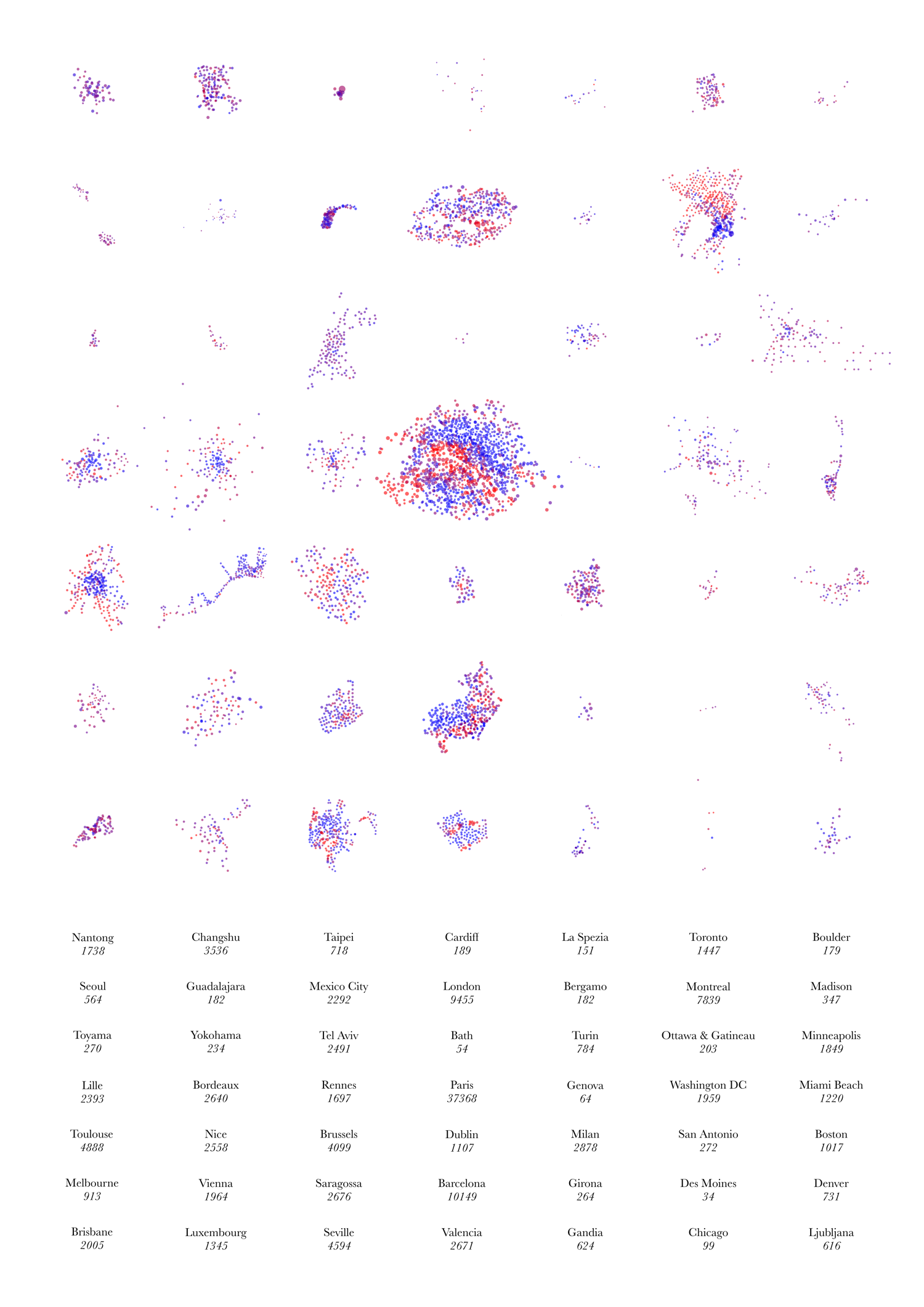
This is my Twitter social graph. Click on the graphic to see a larger version.

Key

The font sizes for the names correspond to the number of followers, while the colour ramp (light grey to yellow to blue) is proportional to the number of listings per follower. That is, someone who has a small number of followers, but has been listed by many of those people (and others) will appear bright blue. This is designed to be a very simple measure of value and influence – you can have a few number of followers, but if many of those have considered you to be an authority in a subject (and are themselves switched on enough to know about Twitter listing) then you can be considered to be a more influential Twitterer. I bet you most of the “celebrity” accounts will therefore score poorly here, while experts will be picked out. Bad luck BTTowerLondon.

How this Compares to other Social Graphs

To make the graph, I have taken the subset of people that both follow me and I follow back. I’ve then looked at connections between these people. Doing this in Twitter is a similar idea to what has been done in Facebook and Linked-In before except that:

  • The groups that appear will be quite different to what appear in Facebook. Facebook is a social network for friends, whereas Twitter is more of a social network for interests.
  • Twitter’s connections are asymmetric (you can follow people who won’t follow you back, and vice versa) which means you have to think about exactly what you are mapping.
  • It’s much more of a fiddle in Twitter because you have to query each person’s connections separately.
  • Twitter’s rate limits (for unauthenticated connections) are aggressive – a maximum of 150 requests an hour from a single IP. Luckily I have access to nine Linux machines which run my Python scripts nicely.
  • The lack of the equivalent of Facebook “apps” that do this kind of visualisation automatically, mean you have to do it yourself. I produced the visualisation in Gephi, which is powerful but tricky to get to grips with.

There is one great thing though:

  • You can build up these kinds of visualisations for anyone, not just yourself, as the raw information is accessible to anyone.

Community Classification

My Twitter network is more homogenous than I thought – a big blog of tech/geo, with the orienteers forming the main breakaway group, and some slender strands of friends on either side. Networks of friends which don’t share any connections with the other groups, will not be connected at all and will float away.

Below is a hand-done, rough community classification. Again, please click for a larger, more readable version. If I pulled in more of the metadata (profile and qualitative/quantitative) from Twitter for each person, then this could probably be done automatically – enough people in the CASA cluster, for instance, will mention CASA on their profiles, for it to be detectable, showing such people as CASA-linked even if they don’t say so themselves.

  • A – The Neogeo (Geography+Technology) community
  • B – OpenStreetMappers in London and elsewhere
  • C – The Open Data movement
  • D – Data visualisation and data journalism
  • E – UCL CASA, UCL Geography and associates
  • F – London general
  • G – East London
  • H – Running
  • I – Orienteering
  • J – Non-techy friends
  • K – Techy friends
  • L – An unlinked group of non-techy friends There are a couple of other such groups.
  • M – People unconnected to themselves and the others
  • N – Bike share operators

The last group is small – I follow a lot more of them, but generally these “official” accounts don’t follow back.

Categories
Conferences Data Graphics London

The London Data Table

The London Data Table was one of my personal favourites from the exhibition accompanying the CASA “Smart Cities” conference which took place at the University of London last Friday. The concept was thought up by Steven Gray and it consists of a wooden table, cut by programmable lathe into the outline of London. A special “short throw” projector with a fish-eye lens was purchased. It was mounted vertically on a converted basketball hoop stand, pointing downwards and outwards, allowing the content to be approached and examined without the projector getting in the way. Steven has blogged about the construction process.

I created a generic dark grey background map (from Ordnance Survey OpenData) with a blue River Thames as the main identifying feature. This was used by several authors, including myself, to create either Processing “sketches” in Java, or pre-recorded videos, which were displayed on the table during the exhibition. A simple Javascript script running on Node.JS was written to automatically cycle through the animations.

By ensuring that the background map and accompanying sketches/videos where “pixel perfect”, we were able to take advantage of having control of every individual pixel, producing the quite pleasing pixellated effect as seen in the below closeup of one of the sketches (a photo taken of a part of the table) – it is showing a bike share station animation that I created, based on the same data that powers the equivalent website.

The photo above shows the table running another Processing sketch, showing point information from CityDashboard and similar to the map view on the website, except that points are randomly and automatically selected to be displayed, as people stand beside and watch the table.

The most interesting sketch presented on the table (and shown on the right – photo by Helen) was built by Steven Gray and connected to a airplane sensor box, that picked up near-real-time broadcasts of location, speed and aircraft ID, of planes flying over London. The sketch stored recently received information, and so was able to project little images of plans, orientated correctly and with trails showing their recent path. Attached to each plane image was a a readout of height and speed, and most innovatively of all, a QR code was programmatically generated and rendered behind each plane, allowing smartphone users to scan it. QR codes are normally encoded URLs, and these ones were set to point to a flight information website, with the aircraft’s details preloaded, showing a photo, and the origin and destination at a glance.

The QR codes were able to be made very small – using a single projector pixel per QR code pixel and little error correction. Various smoothing and blurring digital effects having been switched off, and a digital connection between computer and projector used, to allow the sharpest possible representation. As a result, my iPhone was able to tell me more about the planes I was seeing fly, in near real time, around the table.

Categories
Data Graphics London

On Colour Ramps and City Dashboards

Here are the colour ramps I am using for numeric measures in the recently launched CityDashboard (which by the way now has a new URL – http://citydashboard.org/):

The colours have been designed to be clearly distinguishable from the white text that is on top of them.

Here is the PHP code that I’m using to choose the appropriate colour for each measure, and which I also used to produce the above ramps – the reverse colour and bad value handling is only implemented where I currently needed, ideally these would be implemented for all the ramps:

$na_rgb = 128;

function getGreyRedHex($val, $min, $max, $reverse=false, $processing=false)
{
	$val_0_255 = getNormalisedVal($val, $min, $max);
	$r = 128 + 0.5*intval($val_0_255);
	$g = 128 - 0.5*intval($val_0_255);
	$b = 128 - 0.5*intval($val_0_255); 
	return getHex($r, $g, $b, $processing);
}

function getGreyBlueHex($val, $min, $max, $reverse=false, $processing=false)
{
	$val_0_255 = getNormalisedVal($val, $min, $max);
	$r = 128 - 0.5*intval($val_0_255);
	$g = 128 - 0.5*intval($val_0_255);
	$b = 128 + 0.5*intval($val_0_255); 
	return getHex($r, $g, $b, $processing);
}

function getColdWarmHex($val, $min, $max, $reverse=false, $processing=false)
{
	$val_0_255 = getNormalisedVal($val, $min, $max);
	$r = intval($val_0_255);
	$g = 255 - 2*abs(127.5 - $r); 
	$b = 255 - $r;	
	if ($reverse)
	{
		$r_temp = $r;
		$r = $b;
		$b = $r_temp;
	}	 
	return getHex(0.8*$r, 0.8*$g, 0.8*$b, $processing);
}

function getGreenYellowRedHex($val, $min, $max, $reverse=false, $processing=false)
{
	global $na_rgb;
	if ($val === "n/a") { return getHex($na_rgb, $na_rgb, $na_rgb, $processing); }
	if ($val === "?") { return getHex($na_rgb, $na_rgb, $na_rgb, $processing); }
	$val_0_255 = getNormalisedVal($val, $min, $max);
	$r = intval($val_0_255);
	$g = 255 - intval($val_0_255);
	if ($g > 128) { $g = 128; }	
	$b = 0; 
	return getHex($r, $g, $b, $processing);
}

function getRedGreyGreenHex($val, $min, $max, $reverse=false, $processing=false)
{
	global $na_rgb;
	if ($val === "n/a") { return getHex($na_rgb, $na_rgb, $na_rgb, $processing); }
	$val_0_255 = getNormalisedVal($val, $min, $max);
	$r = 255 - intval($val_0_255);
	$g = intval($val_0_255);
	if ($g > 128) { $g = 128; } 
	$b = 128 - abs(127.5 - $val_0_255);
	return getHex($r, $g, $b, $processing);
}

function getNormalisedVal($val, $min, $max)
{
	if ($val < $min) { $val = $min; }
	if ($val > $max) { $val = $max;	}
	$range = $max - $min;
	return ($val - $min)*(255/$range); 
}

function getHex($r, $g, $b, $processing)
{
	$hex = str_pad(dechex($r), 2, "0", STR_PAD_LEFT) 
		. str_pad(dechex($g), 2, "0", STR_PAD_LEFT) 
		. str_pad(dechex($b), 2, "0", STR_PAD_LEFT);

	if ($processing) { return "FF" . $hex; }
	else { return "#" . $hex; }
}

I’ll be presenting CityDashboard at the forthcoming Wherecamp EU unconference which is taking place in Amsterdam this weekend.

Categories
Data Graphics London

CityDashboard

CityDashboard is the main project that I have been working on for the last few months. It aims to summarise quantitative data (both officially provided and crowd-sourced) for the major UK cities, in a single screen. Point data is also shown in an alternate map view.

It was launched at the CASA Smart Cities conference last Friday, for eight cities – London, Cardiff, Edinburgh, Glasgow, Manchester, Leeds, Birmingham and Newcastle. London has the most dashboard “modules” at present, with a number of London-specific modules from Transport for London, the Port of London Authority, and CASA’s own sensors. Other cities have several more generic modules (such as weather and Twitter trends) and more city-specific modules will be added to these in due course. I am also looking at improving the overall look and feel of the website, possibly by using the BBC Glow API that was suggested to me at the conference (but just now took me half an hour to find on the web!)

CityDashboard features specially curated Twitter lists. For each city, there is a general news list, featuring tweets from local newspapers, local correspondents for the BBC and other TV and radio channels, tourist organisations and the official accounts for the relevant local authorities. There is also a universities list, with the official Twitter accounts for the main universities in each city, as well as their student unions. It is hoped that this latter list with detail the latest university research outputs, coming out of that city. The account that manages the lists is CityDB and the lists take the form of, for example, http://twitter.com/citydb/london and http://twitter.com/citydb/london-uni. Anyone can subscribe to these lists, you don’t have to only view them through CityDashboard.

You can visit CityDashboard live, right now, at http://citydashboard.org/

The project is an output of NeISS, which is funded by JISC.

Categories
Data Graphics OpenLayers

Rank Clocks and Maps: Spatiotemporal Visualisation of Ordered Datasets

Rank Clocks are a type of visualisation invented by Prof Michael Batty here at UCL CASA. They are time-based line charts, wrapped around a clockface – with the start date at the top, wrapping around clockwise to the end date. The lines on the clock show the change in ranking of the items being visualised. By effectively wrapping a line chart around itself, certain patterns, that would be otherwise hard to spot, become clearer.

Starting from Prof Batty’s Rank Clocks application (written in VB), I created a web version that has a subset of the application’s features, but also includes a map, allowing both temporal rank changes, and location, to be shown. A future enhancement would also be to show the change in location with time as well (an example would be how football clubs have moved around in London over the years and how their relative rank in the leagues has also varied) but for now each item in the dataset has just a single point location that remains constant with time.

Live Rank Clock site here.

The “classic” Rank Clock is of New York skyscrapers – looking at the clock allows bursts of skyscraper development to be easily spotted, and as New Yorkers have been building skyscrapers for over a hundred years, and have many of them, it is a rich dataset. I have curated a London equivalent from various sources including Wikipedia. It includes the many residential towerblocks of the 1960s/1970s, many now knocked down, but is not quite the same as New York’s.

The website is written in Javascript, using OpenLayers both for the map (with OpenStreetMap background) and for the rank clock itself. For the rank clock, I am doing some basic trigonmetry to calculate the coordinates needed to show the lines and converting from polar coordinates to “native” screen coordinates. This is a novel but not particularly efficient use of OpenLayers, but I used it as I am quite familiar with using OpenLayers, particularly for showing lines as vectors, rather than using a Javascript vector-based charting API which would be the more obvious choice.

My interpretation of the Rank Clock concept has plenty of flaws – in particular, data can often be easily obscured, and spotting patterns in noisy (frequently changing rank) data is difficult. It’s difficult even to select lines (to see their caption) if other lines are nearby and overlaying them. Nonetheless, it can provide an unusual way of looking at some interesting datasets.

For one of the datasets in the sample website (US baby names) I have repurposed the map to effectively show a 2D graph indicating beginning and ending (in time) positions of the names – so here OpenLayers is being used to show two “maps” – but neither are actually maps.

I’ve also linked into the Google Earth browser plugin (installation maybe be required), replacing each dot on the OpenStreetMap map, with a column of varying height (and colour) based on the initial rank, with an extent appropriate to the data set. Google Earth can be refreshed by supplying new KML information – and it turns out that OpenLayers has a rather nice KML conversion and export feature for any geometry in it, which allows Google Earth to be driven in this way. This is done when clicking on a Rank Clock line, allowing the equivalent feature in Google Earth to be redrawn with a thicker border. Unfortuantely events cannot be captured from Google Earth and back into the OpenLayers map, so clicking on a pillar in the former will not highlight the corresponding Rank Clock line in the latter. Still, it’s a nice way of linking spatialtemporal information and then visualising it in 3D.

I carried this work out quite a while ago, but haven’t mentioned it to now, as it’s not complete. There are only a limited number of datasets available, and plenty more features could be added – and the navigation and interaction improved significantly. Please bear this in mind when viewing the live site.

There are a few “toy” features already though – you can invert the rank clock (normally the top-ranked items are in the middle of the circle and so are hard to see), change the metric the colour is showing, and filter and relayer.

The three rank clocks shown here are showing: TOP – Changes in population of the London Boroughs of Newham and Tower Hamlets, and the City of London, over 150 years. The City of London line spirals outwards, showing its drop in population (and so rank). Tower Hamlets also shows a big drop in rank during WWII, but has started to increase again recently. Westminster’s population rank has steadily increased, until WWII – but again its rank has also more recently increased. MIDDLE – Tall buildings in London, coloured by year they were built. The oldest (red) buildings have been selected and show in Google Earth, showing that such buildings were entirely in the centre and west of London. BOTTOM – US company revenue. The San-Francisco-headquartered companies are selected on the map and correspondingly highlighted on the rank clock, showing that only one was founded before the 1970s – IBM – and a general spiralling inwards as Silicon Valley grows.

Live Rank Clock site here.

Categories
Data Graphics London

Tube Colours

[If you are looking for my London Tube Stats interactive map, it’s now here.]

Transport for London (TfL) take their colours extremely seriously – the London Underground, in particularly, uses colour extensively to brand each line, and the maps and liveries are very well known.

The organisation has a colour guide to ensure that, when referencing the tube lines, the correct colour is used. Somewhat surprisingly, the guide includes hexadecimal (i.e. web) colours for only a “safe” palette – i.e. colours which would definitely work in very old web browsers. They don’t list the “true” hexadecimal for the colours, even though, confusingly, the colour shown is the true one. I couldn’t find anywhere on the web that did this either, all in one place, so here below is a summary. I’ve also included the safe colours so you can see the difference – but don’t use these unless you have to.

Line True Hexadecimal Web Safe Hexadecimal
Bakerloo #B36305 #996633
Central #E32017 #CC3333
Circle #FFD300 #FFCC00
District #00782A #006633
Hammersmith and City #F3A9BB #CC9999
Jubilee #A0A5A9 #868F98
Metropolitan #9B0056 #660066
Northern #000000 #000000
Piccadilly #003688 #000099
Victoria #0098D4 #0099CC
Waterloo and City #95CDBA #66CCCC
DLR #00A4A7 #009999
Overground #EE7C0E #FF6600
Tramlink #84B817 #66CC00
Cable Car #E21836
Crossrail #7156A5

All the colours above can be found on my new Electric Tube print.

Categories
Data Graphics

Mappiness – A Personal Mood Map

The Mappiness project is run by one of CASA’s technology superstars Dr George MacKerron – it was his Ph.D project at LSE. The project, which is still going, aims to quantify happiness based on environmental factors, such as location, views and sound, as well as who people are with and what they are doing. Data is collected by volunteers downloading an iPhone app, which then pings them at random moments twice a day between 8am and 11pm (configurable) to ask them the questions and collect the data. Volunteer incentive is driven by having access to a personal webpage which contains all their collected data, visualised in a wealth of attractive graphs and maps.

I’ve been using the app since late October, it has been steadily pinging me twice a day since then, and most of the time I hear the familiar ‘ding ding’ and get around to recording the information. With around 160 responses, some interesting insights are now appearing, some(!) of which are non-personal enough to share here. The map above shows the locations where I was pinged, for the London area – yellow stars indicate where a photo was taken.

Here’s one, based on the general environment:

Perhaps more interesting is that I spend much less time outdoors than I thought. The app (by default) only asks for a picture if you are outdoors, so by counting the number of pictures that appear on my personal webpage – just 14 out of 161 – this in theory means that I spend only 8-9% of my waking life outside. This percentage will hopefully grow as summer approaches and things start to warm up again.

Because I don’t get to choose when to post the images, the photos are a good snapshot of my “everyday” outdoor view, rather than a nice or interesting place that I would specifically stop to photograph. Here’s a couple of my most recent ones:

One of Dr MacKerron’s current projects involves using Microsoft Kinect sensors for visualisation – this is my very tenuous link to allow me to post the image below, which is a 3D grid “photograph” of me at my desk, constructed from Kinect data.

Mappiness managed to choose to ping me this morning precisely at the moment that my bike chain snapped, on the way to work. Needless to say, a low score for happiness was recorded.

Map background Copyright Google.

Categories
Bike Share Data Graphics

Bike Share Route Fluxes

Capital Bikeshare, the bike sharing system for Washington DC and Arlington, recently released the data on their first 1.3 million journeys. Boston’s Hubway bike sharing system also released journey data for around 5000 journeys across an October weekend, as part of a visualisation competition. Both these data releases sit alongside London’s Barclays Cycle Hire scheme, which also released data on around 3.2 million journeys made during the first part of last year.

Taking together all these data sets, I’ve used Routino and OpenStreetMap data to suggest likely routes taken for each recorded journey. This same set of data was used for Martin Zaltz Austwick’s excellent animation of bikes going around London streets. I’ve then built another set of data, an node/edge list, showing how many bike sharing bikes have probably travelled along each section of road. Finally, I’ve used node/edge visualiser Gephi and its Geo Layout plugin to visualise the sets of edges. The resulting maps here are presented below without embellishment, contextual information, scale or legend (for which I apologise – unfortunately this isn’t my current primary work focus so my time on it is restricted.)

For the two American schemes featured here, I have set the Routino profiler to not use trunk roads. Unlike most UK trunk roads, American trunk roads (“freeways”?) appear to be almost as big as our motorways, and I expect you wouldn’t find bikes on them. Unfortunately there are some gaps in the Washington DC data, which does show some cycle-lane bridges alongside such freeways, but these aren’t always connected to roads at either end or to other parts of the cycle network, so my router doesn’t discover them. This means that only a few crossings between Virginia and Washington DC are shown, whereas actually more direct ones are likely to be also in use. The profile also over-rewards cycleways – yes these are popular but probably not quite as popular as the distinctive one in the centre of Washington DC (15th Street North West) showing up as a very fat red line, suggests. The highlighting of other errors in the comments on this post is welcomed, I may optimise the profiler (or even edit OpenStreetMap a bit, if appropriate) and have another shot.

London:

Washington DC:

Boston:

Categories
Bike Share Data Graphics

A Glimpse of Bike Share Geographies Around the World

[Update – now including a much larger version.] Below is the image I submitted to this year’s UCL Research Images as Art exhibition. You can see it, and around 300 other entries, in the South Cloisters on the UCL campus in central London, for the next few days. A larger version can be viewed here. The image purposely has no explanatory text as it is intended as a piece of “infogeographic art” rather than as a map. It is derived from the dots for the various cities on my bike share map.

It shows the “footprint” of the docking stations making up 49 bike share systems around the world. The colours represent the empty/full state of each docking station at the particular moment in time when the image was made. The numbers show the total number of docking points – each docking station being made up of one or more docking points, each of which may or may not have a bike currently parked in it.

The geographies and topographies of the cities themselves inform the shape of the systems – particularly coastal cities (e.g. Nice, Rio, Barcelona, Miami Beach) and ones with large lakes mountains near their centres (e.g. Montreal).

A subtle but important point on the scaling: The scales of the systems (i.e. each system footprint and the spacing between docking stations) are roughly comparable – they actually vary by the cosine of the latitude – these means that the more tropical systems, e.g. Mexico City’s, appear to be up to ~20% smaller than they actually are, relative to the majority which are generally at temperate latitudes. However, the sizes of the circles themselves are directly comparable across all the systems, i.e each pixel on the graphic represents an equal number of docking points, regardless of which system it is in.

Categories
Bike Share Data Graphics London

Don’t Zone-1 It When You Can Boris Bike It

[Updated with new connections.] Ever thought what the tube network would look like if you took out the expensive Zone 1? Me neither, until this morning, when I was wondering if it was possible to utilise my current “Boris Bike” bikeshare 24-hour membership to save a bit of money on commuting in to work.

Transport for London would really rather you didn’t take the tube into Zone 1. It’s often at capacity during the rush hour. The fares are priced accordingly – for example, to get a tube from Zone 3 to Zone 1, it costs £2.90 during the Peak Fare periods, compared with £1.40 if you only go from Zone 3 to Zone 2. Do that commute twice, and it’s a £3 saving missing out Zone 1, which more than makes up for the £1 Boris Bike 24-hour membership charge. So, I was wondering if it is viable to get off the tube a few stops early and Boris Bike the final mile or so.

Superimposing my London bike share map reveals directions from where such money-saving journeys may be possible. Plenty of opportunities from the north-west or the west, with St John’s Wood, Notting Hill and Earls Court having easy Boris Bike accessibility. Access from the south-west and south is also good, thanks to Vauxhall and Elephant & Castle. Things get a little trickier – as usual – in the south-east, where a 1km walk from Bermondsey, or a much longer walk from South Bermondsey are your only options – the region won’t even stand to benefit from the forthcoming scheme expansion. The east is also an option, with Whitechapel being very well stocked with Boris Bikes, and Wapping not being too far either. The east is set to benefit too from the imminent expansion of the Barclays Cycle Hire scheme, to use its full name, to cover all of Tower Hamlets. The north-east is OK, with Hoxton an option, although it’s a shame the docks don’t extend up to Highbury & Islington station, a major interchange. The north is also good, thanks to the legendary Mornington Crescent station.

Four of the Best Zone 2 & Bike Opportunities

  • Mornington Crescent (Northern Line) – right beside a big docking station. Don’t go to Euston (Zone 1). It’s also easy to get to Mornington Crescent from the Overground, thanks to an unmarked but official Out of Station Interchange.
  • Notting Hill Gate (Central Line) – the tube takes you to the top of the hill, then go east by Boris Bike.
  • Earl’s Court (District/Piccadilly) – it’s a long way to Charing Cross, but if you don’t need to go that far, the bike is a good way to travel.
  • Whitechapel (District/Hammersmith & City) – two big stands very close to the station, and an easy cycle along CS2 into the City.

So, all in all, not too bad. Whether it’s worth the extra time walking to a convenient docking station, and the worry of finding it all out of bikes, to save a pound or two, is another thing…

+ =

See my Mapping London article for more detail about the No Zone 1 map. You can click on the map above for a larger version. An SVG version (i.e. editable) without the bike docking stations, is downloadable here although there is lots of missing detail beyond Zone 2.

The map was based on a Wikimedia/Wikipedia file, which I then augmented (to show the Overground and some selected regular railway lines) with OpenStreetMap data, by producing a map in GEMMA of railway=rail features. I also added some unmarked Out of Station Interchanges, thanks to this FOI request. Photos by Gnatallica, Clotheyes and Wwarby on Flickr.

[Update: An earlier version of the article and map made reference to Shoreditch High Street station which I incorrectly thought was in Zone 2 for “old East London Line” journeys – it appears this is not actually the case – the anomaly that I was misremembering is that for short journeys from the station, the Peak Fare increases do not apply. I’ve also updated the map a few times since posting this article, to add in a few missing stations and also the locations of the big terminus stations in London. I’ve also added some “Out of Station Interchanges” on the Overground – many of these aren’t marked on official TfL maps, but are valid interchanges, i.e. you don’t get charged for two journeys.]