JUMP has a promotion in London today. To tie in with general election day, JUMP are offering two free rides. It is being promoted as an easy free way to (and back from) your polling booth, although I would have thought most polling booths in London would be walking distance. Anyway, you don’t have to use the code to just go to vote, you can in fact use it for any two journeys in London’s operating area, today. The promotion includes two £1 unlock fees, and up to 24 minutes of usage across one or two trips. It’s worth up to £5 in total. (JUMP is 12p/min with no free period after unlocking).
The promotion runs until 11pm tonight only and use code ELECTIONDAY19ED to activate it, on the JUMP section of the Uber app. Out-of-operating-area and banned parking area fines still apply.
Beryl, who operate a small system in the City of London and larger systems in Bournemouth/Poole and Hereford, also have a free-today election themed promotion. No code is needed, and the free period is half an hour for each of two journeys – however you must remember, as always, to finish your journey in a marked hub. The promotion finishes at midnight.
JUMP has increased its charges recently – it used to offer a 5 minute free period after the £1 unlock, but now the 12p/min charge starts from the moment of hire – so most journeys now cost 60p more.
JUMP’s 1300-strong fleet operates in Islington, Camden and Kensington & Chelsea boroughs, along with a small part of south-west Haringey. They are due to move back into Hackney soon. The position of red zones in the app suggests an aspiration to launch in Tower Hamlets soon along with inner south London.
East-London startup Beryl continues to expand their bikesharing footprint – their existing hub-based operations in the City of London, Hereford and Bournemouth/Poole are being joined by a 200-300 bike system in Watford next spring. Of note, this will include 100 electric bikes – a first for Beryl.
Mixed-type systems are fairly rare due to their operational complexity for both users and operators, however both London’s Santander Cycles and Edinburgh’s Just Eat Cycles are also going to part-introduce electric bikes to their fleet. Glasgow already has such a system, but the limited numbers of electrified docks cause confusion and fines for their users.
Beryl are also expanding internationally, launching an up-to-1000-bike system in Staten Island, one of New York City’s five boroughs and not currently served by the 14000 dock-based bikeshare bikes in Manhatten, Brooklyn and Queens. Staten Island has recently withdrawn the permits for Lime and JUMP, who were operating dockless systems in the borough. Beryl’s system here will presumably also be electric, due to Staten Island’s notoriously hilly topography.
Beryl was due to expand in London to Barnet, however they recently withdrew from neighbouring Enfield due to vandalism, so they may have decided that outer-London surburbia’s low density and limited existing cycling infrastructure and opportunity is not for them.
Lime’s “Lime-E” pedelec bikeshare system in London has hit one million rides since launch, 11 months ago – an average of just over 3000 rides per day.
I estimate that Lime currently has around 1500 bikes on the road, up slightly from 1400 in February and 1000 shortly after launch. So, averaging 1300 bikes across 330 days we have a good average utilisation rate of 2.3 trips per bike per day (t/b/d). This compares quite well with around 2.5 for JUMP, the rival dockless pedelec system, and around 3 for Santander Cycles, London’s preeminent public system. (JUMP’s estimate is just for the more popular summer period as they launched this May, while Lime and Santander Cycles both include the tougher winter period – so I would expect JUMP and Lime to end up with around the same year-averaged t/b/d rate after this winter).
Lime also report 2 million km for the 1 million journeys, so an average distance of 2km. This is slightly more than the typical 1.6km journey we see for unpowered systems, although slightly less than the typical 3km journey I would expect for powered systems – perhaps due to constraints in where the bikes are available (although Lime does have the best coverage in London – even after their winter reduction) or the high cost of each journey – Lime is far and away the most expensive of the six central London systems – only Bird’s scooters in the Olympic Park are more, and those are targeted at tourists anyway, so less of an issue.
Both Lime and Mobike have reduced their operating areas in London, for the winter.
Lime have removed their south London “official” area and correspondingly drawn up their unofficial “unserviced” area too. They are out of Croydon, Sutton and Bromley officially, as well as Kingston and Merton. However, south of the river, they are still in Lambeth, Wandsworth and Richmond unofficially, as well as in various North London boroughs.
Lime’s official operating area:
Lime’s implicit operating area – covering the above (white area) plus an area in grey where they don’t guarantee service – i.e. they won’t stock bikes here – but you can end your journey here without penalty:
Mobike have also announced that they are once again reducing their operating footprint, for winter, however they have not yet made the change. Mobike’s current (summer) area:
While this might look like an abandonment of areas, Mobike did do the same in late 2018 and came back in early 2019, so with luck, south London’s provision will again increase next year. However, for commuters or other regular users in south London, the removal of this option must be quite frustrating!
By way of comparison, here’s the operating footprint for the other dockless operator, JUMP:
The other operators in London (Santander Cycles x2, Freebike, Beryl, KU Bikes) are dock or hub-based.
I don’t have any up-to-date information on Bird in the Olympic Park.
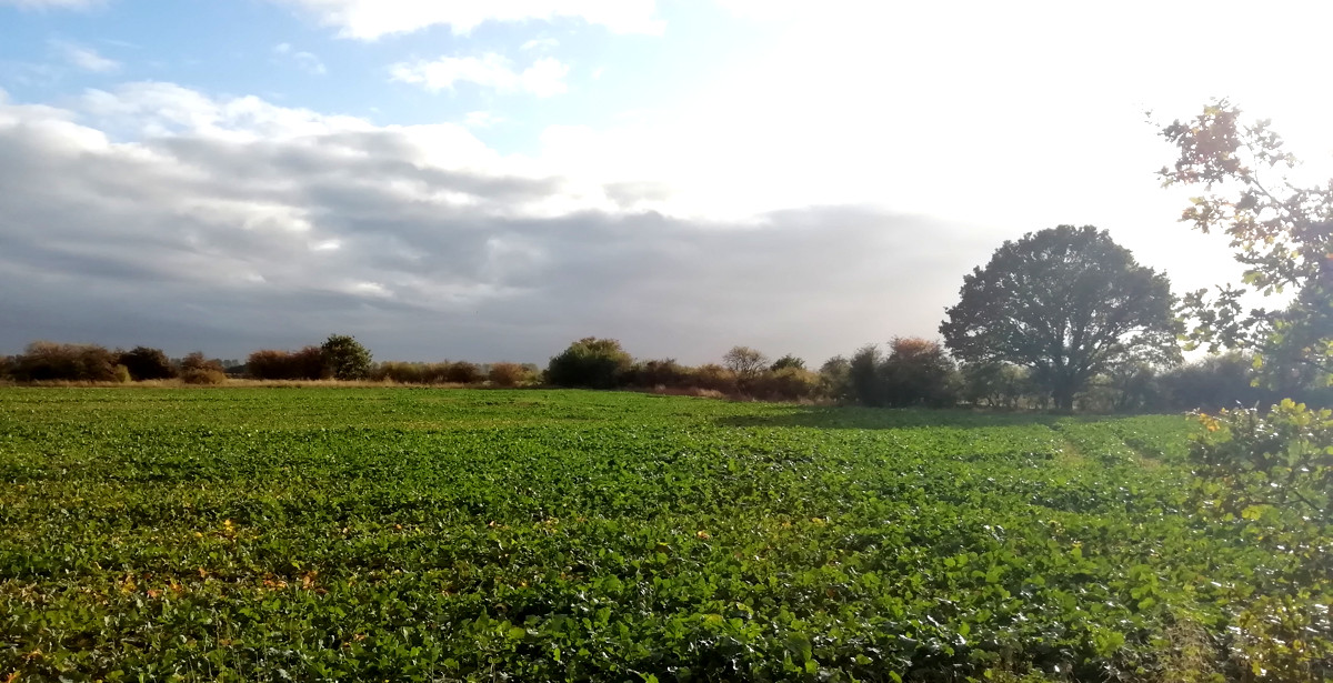
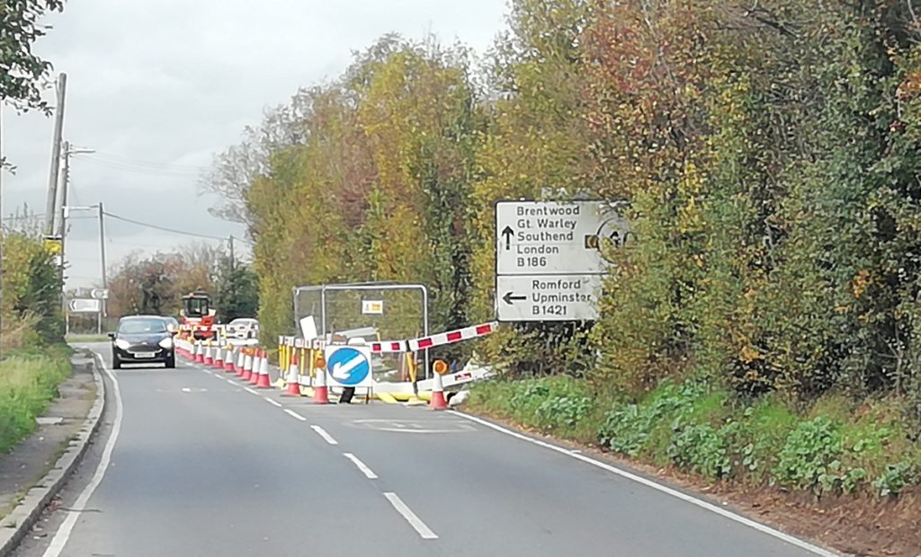
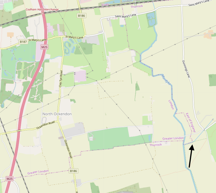
…is, roughly, at the small bush in the middle of this photo, on the corner of a field, around 100m south of Fen Lane. It’s a very rural spot – certainly far, in terms of distance and feeling, from the centre of the capital. It’s also part of the only significant area of London than is beyond the M25 motorway that otherwise encircles the capital. Why it is part of London is a historical quirk.
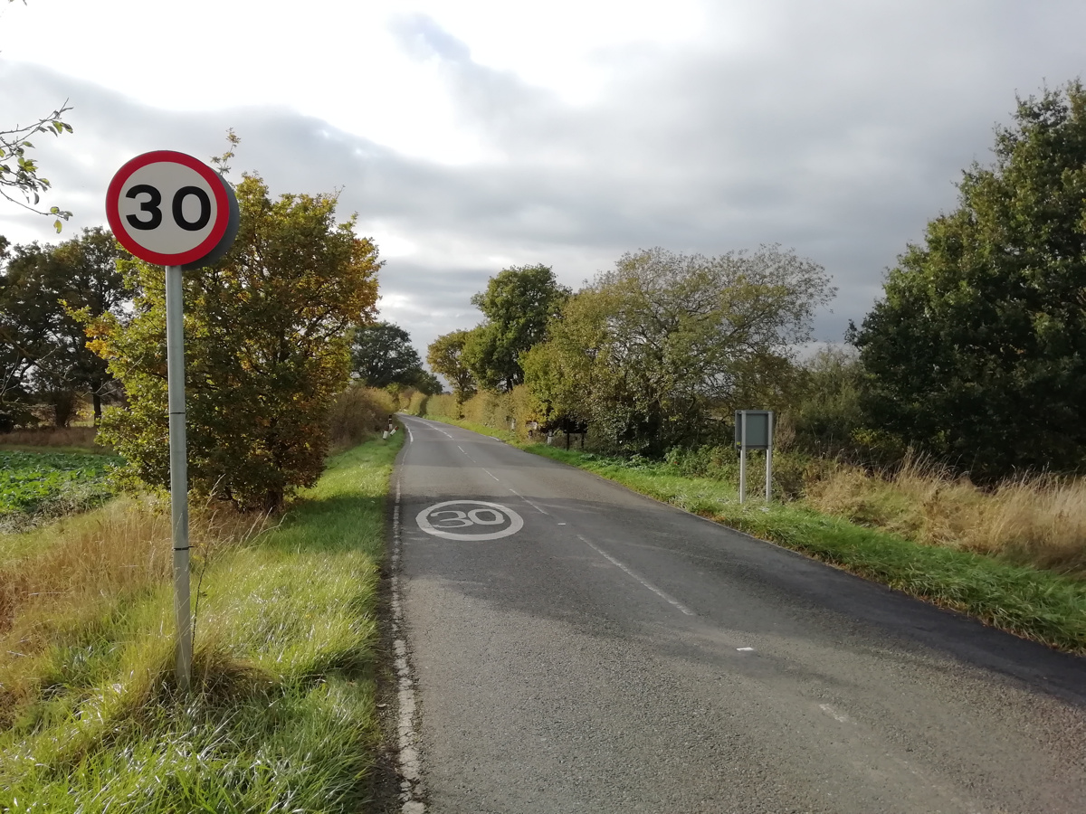
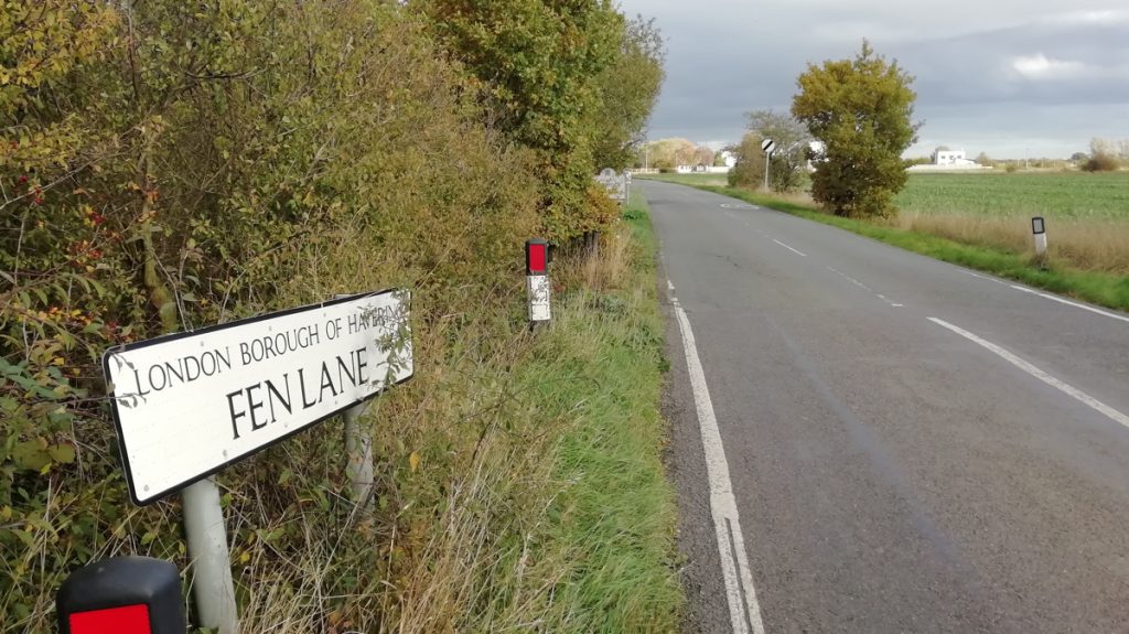
Fen Lane has no sign welcoming travellers along the road to London – the only sign that you are entering the city here is the sudden appearance of 30 mph signs and a very small street sign mentioning the borough that you are now in:
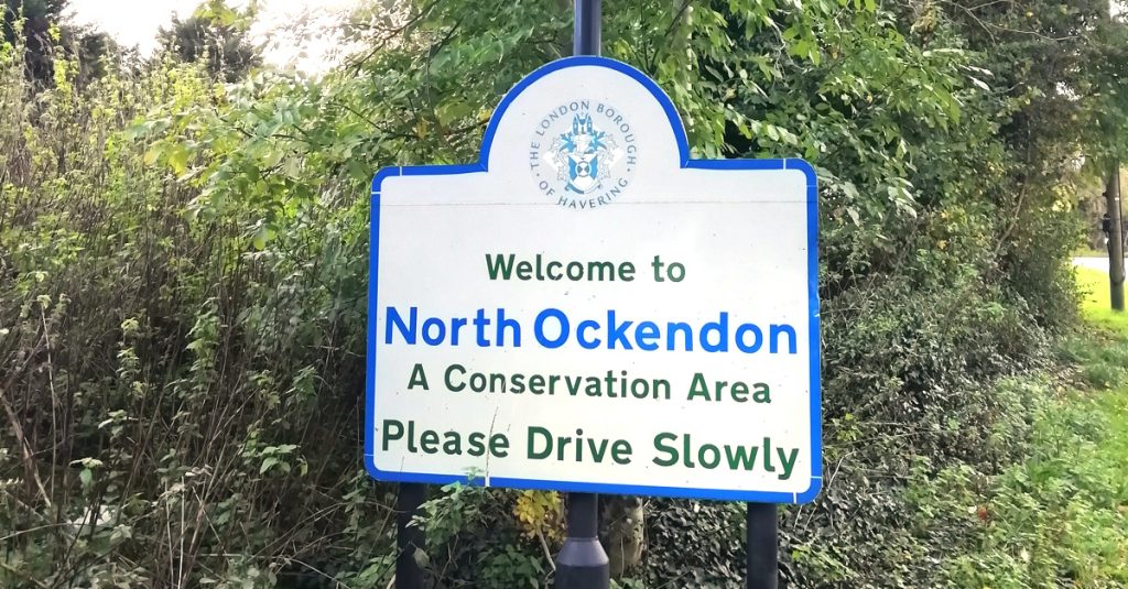
Further on, at the first hamlet, you do get a Welcome – but not to London, just to the London Borough of Havering:
Even once you are in this strange part of London, some of the road signs still point to “London” rather than “Central London”:
It can feel like this little corner doesn’t really want to be part of London at all. But it is:
The East-most point of London is marked with the arrow, in the map extract above. Fen Lane is the narrow road just to the north. North Ockendon is the only London settlement of any significant size, outside of the M25.
I wonder if you are properly welcomed to London at any of the capital’s other boundary entry points?
South London looks like it will be getting an expansion of the Santander Cycles dock-based bikeshare system – eventually. Southwark council has approved an extension to Bermondsey, Rotherhithe and Walworth – 18 new docking stations, but you’ll have to wait up to two years for them to be implemented. It also has plans to extend down Camberwell and Peckham – but these further 21 docking stations may not be appearing until 2023.
The slow rollout is being funded by different parties – TfL along its “red routes”, developers at major housing projects, and the borough itself – the docking stations themselves being the major expense, as they require an electricity supply and internet connection, and have to go through the full planning process with detailed design documents.
The Santander Cycles system currently has 777 docking stations with 20495 docking points, servicing around 8400 bikes, with an average straight-line closest distance between docking stations being just 213m. The Southwark expansion therefore represents around a 5% expansion of the system.
Sooner than this expansion, it is expected that the Santander Cycles system will start to introduce electric-assist bicycles (pedelecs). These were first demonstrated at the London Car Free day in September and will likely debut in “revenue” service soon – hopefully early next year. It is unclear how these will be managed – whether they will be charged at all docking stations, at certain designated docking stations, or whether the batteries will be mechanic-replaced and the bikes will continue to use docking stations like the regular bikes. Already there are two versions of the (non-electric) fleet in simultaneous use – the original PBSC “Bixi” bikes which launched in 2010, and the Pashley-designed bikes (denoted 5xxxx) which launched in 2017.
Meanwhile, central London’s five other bikeshare systems continue to evolve and adapt at pace, with Beryl launching an electric version of their fleet next year, and JUMP, Freebike and Lime already electric.
This is a draft piece of commentary and I will evolve it in response to any feedback and further analysis I am performing.
A bylaw is being drafted between the 32 London borough councils (and the City of London) to introduce a coordinated approach to managing dockless micromobility sharing, such as bikeshare and (should future national legislation permit it) escootershare, across London.
Currently, each council sets its own policy with regards to dockless cycle operators in their area, making running a pan-London system painful for operators, and resulting in a number of inconsistencies. The matter is further complicated by the parking of a bicycle on a pavement not actually being illegal currently, as long as it is not obstructive, and by “red route” roads in London – the larger roads, which are generally managed by Transport for London and not the councils – and which in some cases have good segregated cycle lanes installed by the transport authority which is more focused on getting people travelling efficiently throughout London, rather than entirely within small borough boundaries – some councils tend not to consider than someone would ever want to leave the borough, as evidenced by mandating max/minimum bike numbers on operators who then watch as their users head, like everyone else, in the direction of the City/Westminster/Canary Wharf, in the morning.
At the same time, there are currently 7 operators in central London (3 free-floating, 2 hub-based and 2 dock-based), a mix of bike types (3 electric systems and 4 manual ones) and yet, while some areas have 5 operators, a third of boroughs have none.
The bylaw will ask each council to outline its policy of where parking of dockless bicycles is allowed, the policy then applied consistently to all operators who want to be in that borough. This potentially could result in huge variations – some, like Islington, may be happy to allow parking whereever, as long as basic sensible parking considerations are taken into account. Some may designate only a small number of hubs, perhaps far away from their local commercial centres and bus/rail stations, where they are out of sight and with little impact, but not useful for the great majority of people. And some may take a balanced approach, like the City of London which has designated (and marked) a number of hubs throughout its area.
My personal view is that one size does not fit all, and in fact there are five distinct categories of publically accessible “realm” in London which all need different approaches to how dockless micromobility should be parked on them.
For outer London boroughs (Z5-6), with low population density, the designation of hubs is I think vital for a bikesharing service to ever be viable. But these should be recommended rather than mandated. There should not be any specified exclusion areas, instead, users should follow “common sense” principles.
For inner London boroughs (Z3-4) where cycling to the centre of London is viable – on a pedelec at least – it is important to allow the operators to position their bikes where they feel they can provide a service that is viable for them. Councils should publish geo-files containing exclusion areas, such as the busiest pavements in their urban centres, while still allowing the parking of free-floating bicycles close enough to them. If an inner borough is very keen on having designated hubs, then they should either exist on an optional basis (like for the outer boroughs) or at the density of the city centre (i.e. with no part of the borough more than a ~400m walk from one). Hubs must be outlined in brightly coloured paint and with a generic caption like “dockless parking”, and ideally with a metal sign to increase visibility. As below, hoops/fences are an alternative.
For the city centres (the area covered by Santander Cycles, roughly Z1-2) free-floating will not work – there just isn’t enough pavement space. A high density of hubs should be made available – these should – as a minimum – include the ends of all the existing Santander Cycles docking stations, as these have a good density throughout the city centres and almost always have space at either end for at least 3 or 4 dockless bicycles – parked at right angles to the Santander Cycles. I regularly see them being used in this way already. Other hubs should either be as rectangles taped/painted on the ground, or designated fences, cycle hoops and other structures to which the bicycles can be secured (using cable locks present in the JUMP system – other operators would need to adapt their bikes to have cable locks).
Royal parks (and other urban parks) should adopt the city centres approach of having mandated docking areas within each park (although not at city centre density) – a suitable number around the perimeter of each park, but also one at all their park car parks. If people can drive into a Royal Park car park, why shouldn’t they also be allowed to start or finish a bicycle journey there?
Canal towpaths (and the Thames path) are generally linear and cramped, and the adjacent water is always a tempting target for vandals, so bicycles should continue to be not be parked on these – although allowed to move along them. Generally, the nearest designated hub will only be a short distance away from the tow path. Similarly for railway stations and markets.
Building density
Docking station/hub density
Suburbia, Urban parks
Hubs, ~ max 500m walk.
Inner City
Dockless. Some hubs in retail/office areas.
City centres, Railway stations
Existing docks (where present) plus “infill” hubs, max ~300m walk.
Canal towpaths/ river walks/ highwalks
Not allowed.
Other thoughts:
Operators should pay a fully refundable deposit for each bike, to the body managing the bylaw, which should be refunded when the bike is withdrawn from operation. This would ensure that operators, to the best of their abilities, retrieve broken bikes and remove them from circulation. If an operation folded, then the deposit can be used by the councils to remove the bikes themselves.
Operators should not be charged by the councils (i.e. should not have to pay for permits to operate), except on a cost-incurred basis.
Operators must publish the live locations of their available bicycles (when they are not in active use or transport), regardless of whether they are in a hub or not, on a timely basis (e.g. updating every minute) as open data. A suggested specification would be GBFS.
Councils must publish the spot locations, names, geographical extents and capacities of their hubs (where designated) and their exclusion zones, as open data. A suggested specification would be GeoJSON. These should be published to a central location, e.g. the GLA Data Store, and kept up to date.
A standard way of reporting mis-parked bikes should be adopted, such as FixMyStreet.
Councils should have the right to fine operators for mis-parked bikes but only if they have been demonstrably not made an effort to retrieve a bike after it is reported to them by the council, that it is a legitimate report, and after a reasonable amount of time (at least 12 hours from the report being passed on), and on a per-issue basis. The level of the fine should be two-tier based on whether the bike is in an obstructive position or just in an excluded area.
Boroughs should fund the cost of marking hubs.
Hubs can be on both streets and pavements – if the former, they should be protected from errant car tyres by using “armadillos” or similar equipment.
If operators want to fund hubs, that’s OK, but there should not be operator-branded hubs.
Finally – London’s bikeshare operators are actually, generally, providing a good service now. We aren’t seeing the huge levels of complaints about poor parking which were seen when the larger Mobike, ofo and oBike operations were running. JUMP are reporting great usage rates, and the smaller hub-based operators (Freebike and Beryl) have tightly managed fleets. Even Mobike’s much reduced fleet seems to be operating in a less intrusive way, and although data on Lime is difficult to get, it too appears to be operating effectively, in terms of rides vs complaints.
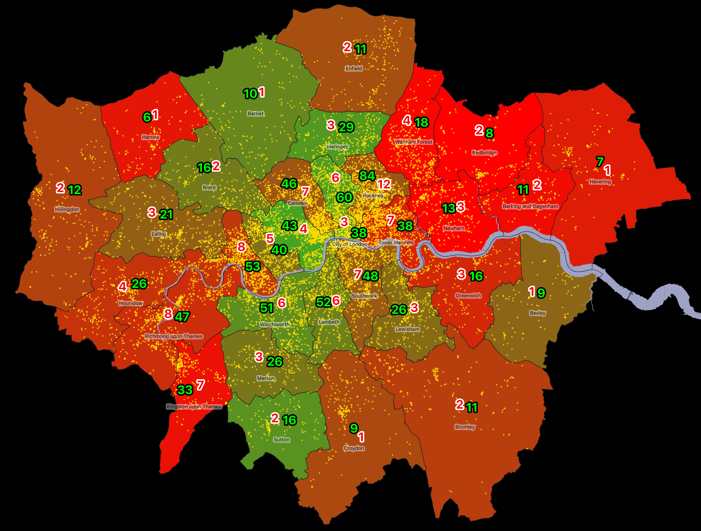
Cycle use rates/1000 pax (green) and theft rates/1000 pax (red) in London boroughs. Yellow dots show individual cycle thefts in 2018-9. The green/red borough colour compares the theft rate with the usage rate. Populations are daytime and nighttime, averaged.
When running a fleet of dockless bikeshare bikes, one of the potentially most costly problems is theft of the bicycles. They aren’t attached to anything if they are dockless, even if they are in a marked “hub”, and, even if the bikes are typically heavier than a personal bike, they can still be easy targets for theft. There are six operators in central London currently and each of these operators has to consider whether it is worthwhile operating in a particular borough – whether the profit to be made from legimitate hires outweights the costs involved in replacing stolen bicycles.
With the news earlier this month that Beryl is suspending operations in Enfield due to vandalism after just three months of operation, and following Urbo’s similarly rapid arrival to and departure from the borough (and indeed all of the UK) last year, I’ve done a simple analysis of the risk/reward of operating in different London boroughs. This analysis is an alternative approach to a previous model that looked specifically at general vandalism rates and usage rates, because it looks at the daytime as well as nighttime populations.
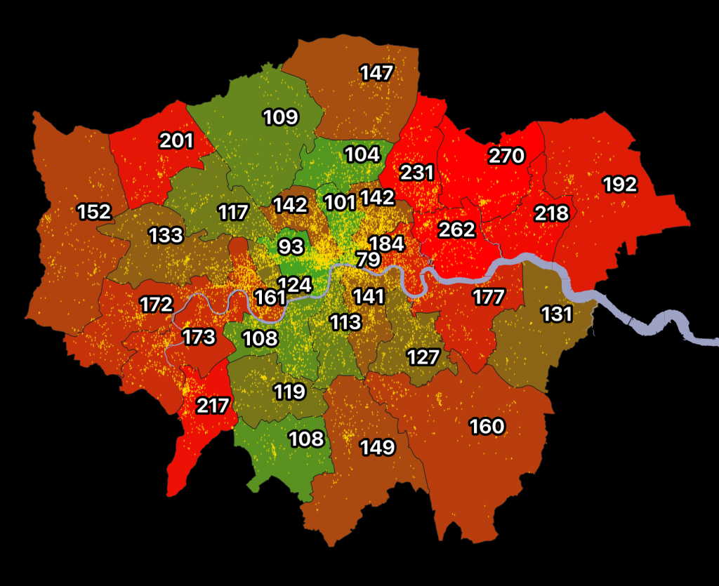
I’ve used the Census 2011 Travel to Work counts, comparing the full 16-74 population with that that travels to work mainly by bicycle, looking at both the Workplace populations (i.e. daytime/evening) and the Residential populations (i.e. nighttime/weekends). A simple approximation of the populations is achieved by equally weighting both figures. This means that Croydon’s average population more than halves its nighttime population during the day, while Westminster’s triples. I also only looked at bikes being used to regularly travel to work, as these are the ones that are most likely on the streets, and therefore much more vulnerable to theft.
I also use the Police data statistics on cycle theft, for 2018-9, looking across the Metropolitan Police, City of London Police and British Transport Police force data. I only considered bicycle theft rather than vandalism, as the latter is not broken down by object type, and I believe that general bicycle theft is a good proxy for vandalism and theft of dockless bicycles – with vandalism often occurring as a result of attempted theft. Dockless bicycles are probably not numerous enough in London yet (there are maybe around 3000 available) compared with the ~200000+ private bicycles that are used to commute to work daily with many left in public parking facilities, albeit almost always chained to an immoveable object.
I was keen to not map areas of high cycle theft or use – but rather map one compared to the other. Some places see very little cycle use – the low green numbers – e.g. Harrow and Havering. But they still see some cycle theft – the red numbers – and so the average number of thefts per bicycle is therefore high. On the other hand, Westminster, the City and Islington also see high theft rates but these are more than balanced out by very high usage rates. Only in Hackney, does the very high cycle usage rate (84 bikes/1000 people) still suffer from the also very high theft rate (12 bikes/1000 people). In Hackney, you’ll therefore probably suffer a stolen bike every 7 years on average. In Redbridge though, it’s 1 every 4 years – there aren’t very many bikes in the borough at all, but the few that there are often victims of cycle theft.
This is a really rough study – it could be improved by using more recent population/cycle usage data (which is available for residential areas but not work areas), by looking at vandalism as well as cycle theft, and by more carefully modelling the 24-hour population. But it’s good indicator of why Islington, Westminster and the City of London are so popular with operators, despite a high “headline” rate of theft when looking at the raw Police numbers, and why Greenwich, Newham and Kingston have no operators at all, despite plenty of regular cyclists. It is also why boroughs that sit in the middle – Enfield, Croydon, Southwark and Hillingdon – are probably only going to succeed with dock-based approaches, and so likely require council capital funding rather than hoping that dockless operators will be able to run a successful commercial service for making bikes easily available to those that don’t own one or have one handy – which is what bikeshare is.
Beryl Bikes has closed the Enfield part of its London operation on 1 October, having launched just this summer, after suffering high vandalism levels. This leaves the borough with a number of paint-marked hubs but no bikeshare service to occupy them. in London, Beryl continues to operate in the City of London and is due to expand to neighbouring Hackney (along with JUMP). Beryl is not the first operator to try and crack Enfield – Urbo also briefly operated there, before pulling out of the UK altogether.
Separately, Beryl has announced they will be launching in Norwich next spring as sole operator. Ofo previously operated in Norwich, before pulling out and then closing altogether in the UK. This will be Beryl’s fourth urban system, after London, Hereford and Bournemouth/Poole.
All systems below can be seen at Bike Share Map – click on a circle to see the details of that system.
Manual
Both
Pedelec
Dock/ hub-based**
London (Sant.)* London (Beryl)* Stirling Edinburgh* Belfast Liverpool Nottingham Cardiff Swansea Hereford Bournemouth Slough M. Keynes (Sant.) Brunel (Uni.) Surrey (Uni.) Warwick (Uni.)
Glasgow Lincoln
Exeter Forth Valley
Both
London (Freebike)
Brighton
Dockless
London (Mobike) Bristol Oxford (Mobike) Oxford (Pony) Cambridge
London (Lime) London (JUMP) M. Keynes (Lime)
* Pedelecs announced but not yet launched.
** Including systems where bikes can be left out of a docking station/hub or the adjacent area, but a punitive fee (at least £5) is charged for such an activity.
Not including systems where the minimum hire time is a day or more or not point-to-point, like Brompton Hire, or very small systems (<20 bikes) like Donkey Republic, private systems, e.g. corporate or student-only schemes like Kingston Uni, or systems which are not at least third-gen (i.e. automatic kiosks) like Southport.
Forthcoming systems that have been announced include Norwich (a manual dock-based system from Beryl).