Categories
Bike Share London

Population Analysis of London Bikeshare Systems

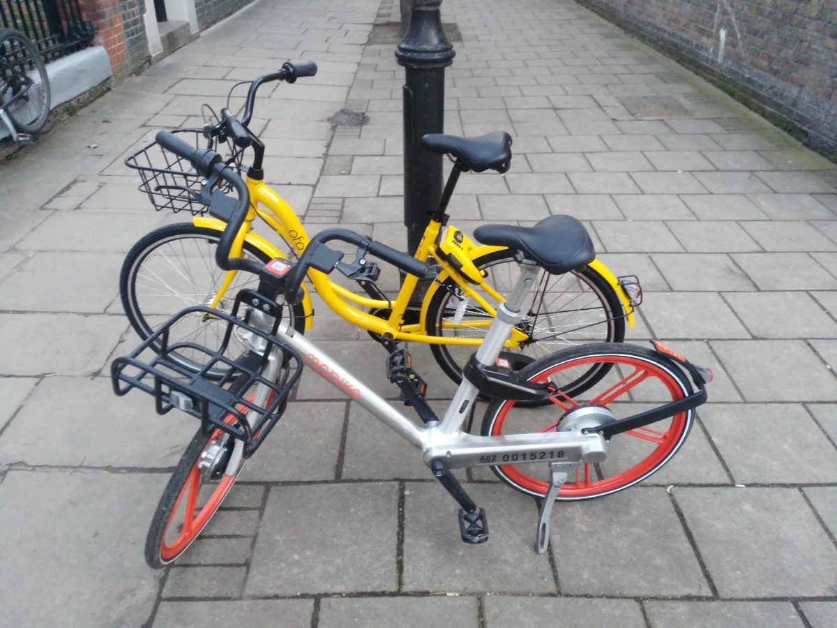
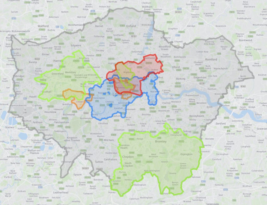
Mobike, one of London’s four bikeshare operators (with Urbo, Ofo and Santander Cycles) as today expanded to Newham. The operators are being driven by different borough approaches and priorities, which is resulting in a patchwork quilt of operating areas, although the London Assembly is today pushing for a more London-wide approach to regulation of the field.

Over and above the map linked above, I’ve done some population analysis to look at how the four different operators compare in London. Demographic figures are from the 2011 Census so total population will have gone up a bit, and cycle-to-work population up a lot. Nonetheless, the figures still allow for a useful comparison. The populations here are working age (16-74) populations. The differences across the operators are dramatic:

Operator
 
# of
Boroughs
Area
/km2
# of
Bikes
Average
Day/Night
Pop
Bikeshare
Bikes per
Person
Pop
Density
pax/km2
Cycle
To Work
Pop %
Santander Cycles  5, + 6 (part) 112 10200 1,520,000 1:150 13500 4.8%
Mobike  6 196 1800 1,425,000 1:800 7300 3.5%
Ofo  5 123 1300 1,040,000 1:1000 8500 4.0%
Urbo  3 177 500 570,000 1:2800 3200 1.2%

I have calculated the populations by averaging the day-time workplace population and the night-time residential population, making a very rough assumption that people spend their waking hours split roughly between work and home. Santander Cycles, the dock-based system, has been around since 2010. The others are all dockless operators and launched in 2017.

The high population density where Santander Cycles works in its favour, as does its high bikes/population ratio, with one bike available for every 150 person who lives and/or works in the area. Urbo, on the other hand, is mainly targetting populations that both have a low population density, and a low cycle-to-work percentage – two factors that would work against it. Mobike and Ofo sit in the middle, with the former quite a bit larger than the latter at the moment, but the latter operating areas with a more established tradition of cycling (using here the Cycle to Work population as a proxy for cycling in general).

Categories
CDRC

Changing Broadband Speeds in the UK

The Broadband Speed map has been one of the most popular maps that the Consumer Data Research Centre has ever published on our CDRC Maps platform. The map is based on data from Ofcom, the UK’s digital connectivity and broadcast media regulator, and I was invited to talk at their Innovation Workshop event, hosted by ODI Leeds, earlier this month. My brief was to demonstrate the Broadband map but also critique Ofcom’s open data offering (which provided the data for the map). The talk slides can be found below:

As part of the preparation for the event, I produced a new version of the the Broadband map, showing 2017 data from the Connected Nation report (the original was based on the 2016 data). This gave the opportunity to therefore prepare a third map, showing the change between 2016 and 2017. Note that this is showing the change in the average broadband download speed experienced across both business and residential premises conneections, averaged by postcode with each postcode averaged then averaged again across the local output area (which typically contains five postcodes for residential areas, but many more than this for business areas.) The metric population numbers displayed when you mouse across each area, therefore, is the number of business and residential connections – typically 50-150 for the latter.

The map shows a general light green gradient across the country, showing broadband connection speeds are gradually increasing, as more and more fibre to the cabinet (FTTC) is installed and people change organically contracts to providers with better service. The places where other colours appear are the interesting results. Large increases are seen in rural Lancashire, near Kendal in the Lake District, as a community-driven ultra-high-speed rural service there continues to roll out. More dramatic improvements are seen just to the east of Cheltenham, again a rural area with specialist high technology and defensive industries.

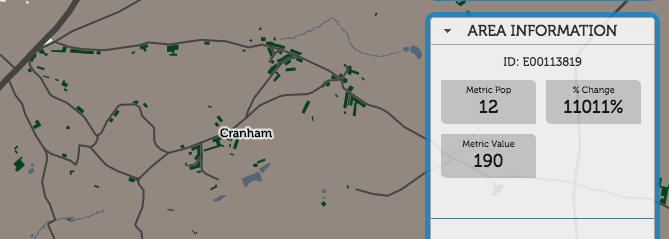
Cranham, for example, has seen a 11000% improvement, from 1.7mbit/s to 190mbit/s, as new business connections have come online:

Appleton, on the other hand, has seen a 99% decrease, from 540mbit/s to 2.3mbit/s:

In London, the drop around King’s Cross, the previous year’s fastest postcode, is almost certainly not due to a general decrease in available speed, but actually because residential connections have come online, and demonstrates the problem with aggregating by the residentially defined “Output Area” geography. The previous, ultrafast result was likely due to dedicated ultra-highspeed links into Google’s new UK office, and other high-technology businesses opening there. Since then, the residential blocks nearby have opened. These still have pretty nice connections, but not the business-level infrastructure needed. So, it shows as an average fall in London.

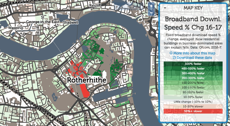
Rotherhithe is always an interesting area:

A traditionally very poorly connected area, both in transport but also digital connectivity, it has seen dramatic improvements in many areas. but also big falls in the newest area – again possibly due to an increased residential component in the mix.

Explore the broadband difference interactive map.

Categories
CDRC Conferences Data Graphics London OpenLayers

FOSS4G UK 2018 Meeting and OpenLayers 4

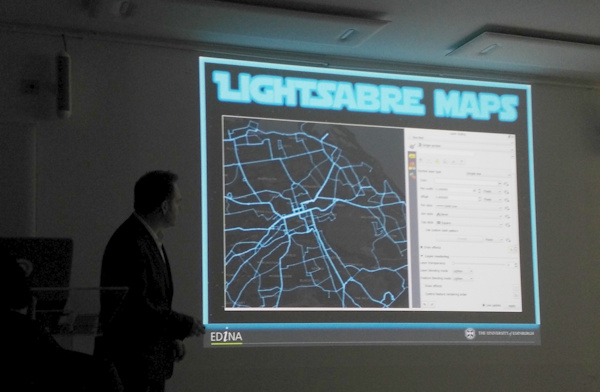
I attended and presented at the FOSS4G UK conference in central London, in early March. I was scheduled to present in the cartography track, near the end of the conference, and it ended up being an excellent session, the other speakers being Charley Glynn, digital cartographer extraordinaire from the Ordnance Survey, who talked on “The Importance of Design in Geo” and outlined the release of the GeoDataViz Toolkit, Tom Armitage on “Lightsaber Maps” who demonstrated lots of colour compositing variants and techniques (and who also took the photo at the top which I’ve stolen for this post):

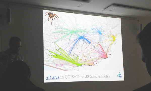
…and finally Ross McDonald took visualising school catchment areas and flows to an impressive extreme, ending with Blender-rendered spider maps:

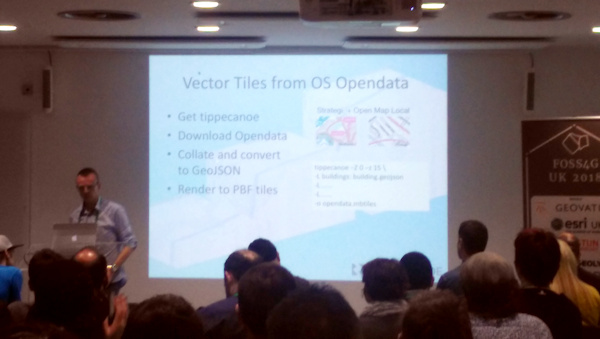
My talk was originally going to be titled “Advanced Digital Cartography with OpenLayers 4” but in the end I realised that my talk, while presenting what would be “advanced” techniques to most audiences, would be at a relatively simple level for the attendees at FOSS4G UK, after all it is a technology conference. So, I tweaked the tittle to “Better…”. The main focus was on a list of techniques that I had used with (mainly) OpenLayers 4, while building CDRC Maps, Bike Share Map, TubeCreature and other map-based websites. I’m not a code contributor to the OpenLayers project, but I have been consistently impressed recently with the level of development going on in the project, and the rate at which new features are being added, and was keen to highlight and demonstrate some of these to the audience. I also squeezed on a bonus section at the end about improving bike share operating area maps in London. Niche, yes, but I think the audience appreciated it.

My slides (converted to Google Slides):

Some notes:

  • My OpenLayers 2/Leaflet/OpenLayers 3+4 graphic near the beginning was to illustrate the direction of development – OpenLayers 2 being full-featured but hard to work with, Leaflet coming in as a more modern and clean replacement, and then OpenLayers 3 (and 4 – just a minor difference between the two) again being an almost complete rewrite of OpenLayers 2. Right now, there’s a huge amount of OpenLayers 4 development, it has momentum behind it, perhaps even exceeding that of Leaflet now.
  • Examples 1, 3, 4 and 5 are from CDRC Maps.
  • Example 2 is from SIMD – and there are other ways to achieve this in OpenLayers 4.
  • Examples 5, 6 and 9 are from TubeCreature, my web map mashup of various London tube (and GB rail) open datasets.
  • Regarding exmaple 6, someone commented shortly after my presentation that there is a better, more efficient way to apply OpenLayers styles to multiple elements, negating my technique of creating dedicated mini-maps to act as key elements.
  • Example 7 is from Bike Share Map, it’s a bit of a cheat as the clever bit is in JSTS (a JS port of the Java Topology Suite) which handily comes with an OpenLayers parser/formatter.
  • Example 8, which is my London’s New Political Colour, a map of the London local elections, is definitely a cheat as the code is not using the OpenLayers API, and in any case the map concerned is still on OpenLayers 2. However it would work fine on OpenLayers 4 too, particularly as colour values can be specified in OpenLayers as simply as rgba(0, 128, 255, 0.5).
  • Finally, I mention cleaning the “geofences” of the various London bikeshare operators. I chose Urbo, who run dockless bikeshare in North-East London, and demonstrated using Shapely (in Python) to tidy the geofence polygons, before showing the result on the (OpenLayers-powered) Bike Share Map. The all-system London map is also available.

FOSS4G UK was a good meeting of the “geostack” community in London and the UK/Europe, it had a nice balance of career technologists, geospatial professionals, a few academics, geo startups and people who just like hacking with spatial data, and it was a shame that it was over so quickly. Thanks to the organising team for putting together a great two days.

Categories
Cycling London

Modal Choices for the London Commute

..and why I’m excited about the rollout of dockless bicycle sharing systems in London.

My commute is around 11km long, it is Zone 3 to Zone 1. Generally I avoid peak times.

Ofo and Urbo are the dockless systems listed here. (Mobike doesn’t yet work for me, in terms of their borough rollout). Their current footprints don’t include either my start or finish location, so a walk is required at each end (and between them, when changing).

ModeTime      CostNotes/section times
Walk130 min£0.0045 mins to jog (or 60 mins via the scenic route) – can’t do that every day though!
Santander Cycles membership + walk100 min£0.2320+80. £90/year, 200 jnys
Dockless membership (future?)35 min£0.27Door to door. Based on £10/month for 11 months (Mobike). However is high risk as requires high bike availability.
Dockless (future?) + walk45 min£0.5030+15
Ofo (current) + day walk60 min£0.5015+30+15
Ofo (current) + night walk75 min£0.5015+30+30
My bicycle30 min£0.75Get through a £300 bike (or parts)/year
Dockless (future?)35 min£1.00Door to door
Ofo + Urbo (current) + walk70 min£1.0015+30+5+15+5
Santander Cycles + walk100 min£1.0020+80
Tube Z3-2 + walk55 min£1.5030+25. 20p more for peak.
Bus65 min£1.502 buses – hopper fare
Tube Z3-2 + Santander Cycles membership40 min£1.7330+10. 20p more for peak.
Tube Z3-2 + a bike for commute40 min£2.2530+10. 20p more for peak.
Tube Z3-2 + Santander Cycles40 min£2.5030+10. 20p more for peak. SC £2/day = £1/jny
Tube Z3-2 + bus season45 min£2.5530+15
Tube Z3-1 + walk25 min£2.8015+10. 50p more for peak.
Tube Z3-2 + bus45 min£3.0030+15. 20p more for peak.

Some notes:

  • Annual membership of Santander Cycles is scandalously cheap. If you are lucky enough to live in the Santander Cycle zone, then you really are getting a very good deal.
  • Sure I could save a lot of money (or time) by jogging twice a day, but my legs would probably give out after a few days of that!
  • Tube travel, avoiding Zone 1, remains a great bargain London. It’s a pity my work is just a bit too far inside the Zone 1 boundary – but then, that’s why the boundary is where it is.
  • I’m not including commute options that cost more than £10 (taxis, Uber etc). This includes driving, as the London Congestion Charge is £12/day and it is hard to park cheaply (or for free) just outside it!
  • It suprised me that it costs nearly £1 to cycle on my own bike each time, until I realised I spend around £300 a year, either on a new bike, or on repairs/components/tools for the existing one.

Categories
Bike Share London

Bikeshare in London – Borough Update

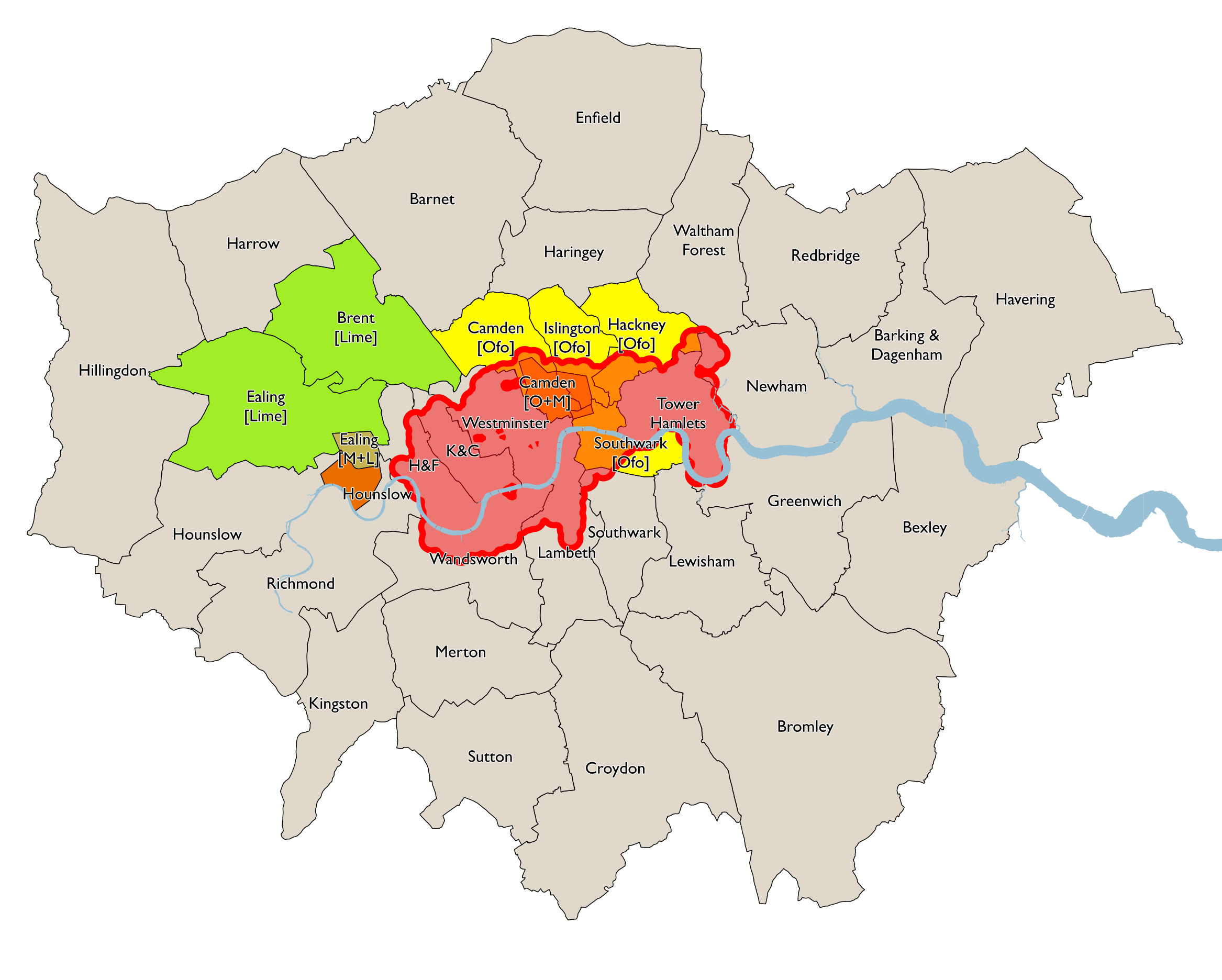
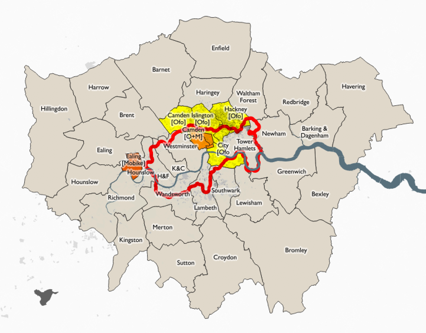
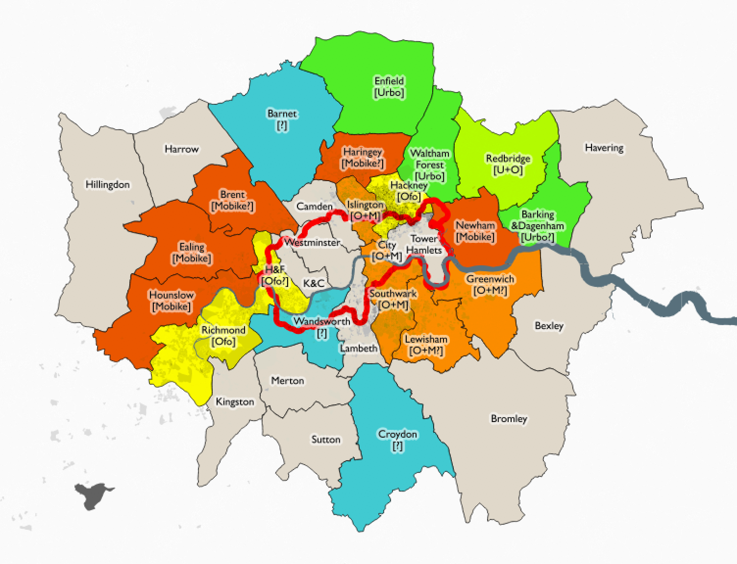
While TfL ponders London-wide regulation and freezes Santander Cycles, borough-by-borough rollout (and sometimes rollback) of dockless in London continues. I’ve rated each borough based on its provision – current, announced and rumoured (so likely some errors) of this all-important last-mile mobility addition to our streets:

Key

  • A – 2+ operators in/confirmed, at least 1 of which covers/allows >75% of borough and the other covers/allows >25% of borough
  • B – At least one operator, in/confirmed, covering significant part (>25%) of borough.
  • C – Operator(s) only covering small area, and/or only rumours of new operator.
  • D – No operators or positive news.
  • + – Improvement expected soon.
  • * – Simple projected % for 2018, based on Census data – 2011% and 2001-2011 rates of change

I intend to keep this table up to date as things change, and make corrections where I discover things are wrong above. In case it doesn’t view correctly for you, you can see the full table on Google Sheets here. You can also see operator open data scores – check the tab at the bottom of the sheet. Nobody gets an A on this measure, though (GBFS+journeys).

Current (May 2019):

Previous (January 2019):

Previous (October 2018):

Previous (June 2018):

Previous (May 2018):

See also my thoughts on the future of bikeshare in London in general.

Categories
Bike Share London

Future Transport Report and Bikeshare in London

The GLA published an interesting report last week: Future transport – How is London responding to technological innovation. It focused mainly on drones, driverless cars and app-based services (as an example, CityMapper’s experimenting on turning its huge desire-line dataset, created from the data of its millions of users and their journeys, into a group-based taxishare service), but also included some details on bikeshare, and in particular the dockless “revolution” that is currently underway in the capital.

Not Looking Good for Santander Cycles

Some tidbits from the report include some depressing news from Transport for London regarding future of the Santander Cycles dock-based bikeshare system – “the scheme is also limited geographically to central London, with TfL having no plans to extend it.” Ouch.

Well, that’s a pity, but not entirely surprising. The reason are both political and financial:

  • It was a system launched and promoted by a previous mayor, of the “other party”, who was more focused on cycling and also less afraid to challenge the status quo. The existence of the system (despite its problems), and the associated disruptive – but brilliant – segregated cycle lanes – have been revolutionary. But they will be ever associated with a previous mayor.
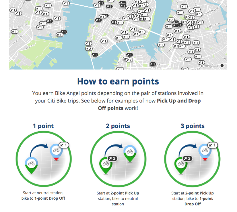
  • Also despite the system being almost eight years old, TfL is still subsidising the system by over £3m a year. Too much unnecessary redistribution going on – using vans – presumably because they always have done it or other schemes have. Vans and drivers are expensive! And they clog up the streets. Incentivise users to do their own distribution – by using the bike itself – for rewards – much cheaper! The New York City system has “Bike Angels” (pic below) which actually has pretty decent rewards for riders who rebalance. There has also been an, I think, frankly misguided focus on keeping docking station density unnecessarily high throughout the area, and a focus on journey numbers over user utility, means the main beneficiaries are city workers getting from Waterloo to the Bank during weekdays and tourists circling Hyde Park at the weekends. Both groups have numerous other options, so the bikeshare here isn’t really solving any “last mile” mobility problems.
A flat rate of say 50p/20 min or £1/30 min, similar to the dockless systems (generally 50p/30 min), and moving the 20% least used docking stations so they were outside every tube/train station and inside every park and larger open spaces in Zone 2 to provide a ready source of obvious rides, would probably end up being more profitable, as there would be a massive surge in usage (right now it’s cheaper to get the bus!), particularly if it was integrated into Oyster card/contactless and was covered by daily/weekly capping. Why does it need to be profitably anyway? The buses (in London) aren’t, and the bikes encourage healthier outcomes, both to the user and surrounding pedestrians, than sitting on a bus emitting pollution.

London-Wide Regulation of Dockless

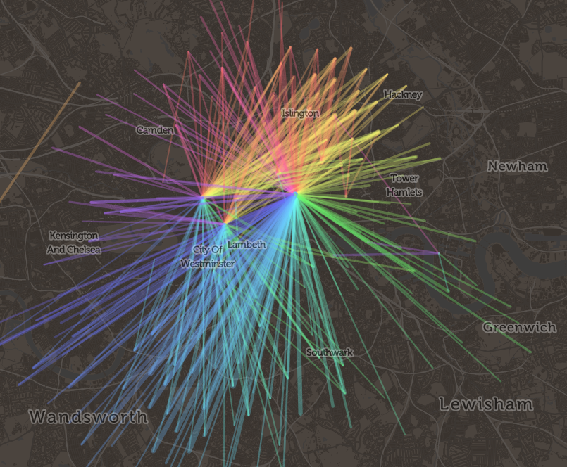
One important point from the report is suggesting that TfL should take the lead in regulating and so controlling the provision of dockless bikeshare systems on London streets, instead of the individual boroughs as present. This is an “obvious” thing to do – it is time consuming and inefficient for each operator to, assuming that they want a pan-London rollout, have 33 sets of negotiations with the 32 separate borough councils and the City of London, when much of London’s other transport operations are specified, operated or regulated by one entity – Transport for London. It also slows the rollout, makes the systems very expensive for operators to maintain if they are fragmented, particularly if each borough has slight differences in their specification (e.g. on maintenance response times). More importantly, it makes it less useful and more confusing for the user – both the start and the end of an intended journey need to be within an operating zone. Borough boundaries are somewhat arbitrary to most people living in London, and not easily noticed when crossing them. “London” is a more familiar area. Most commute journeys in London are radial – going towards or away from the centre (see pic below). The reluctance of many of the operators to even publish their operating zone except on their individual apps, also makes discovering the allowable area of a system – let alone using it – a challenge.
Curiously, a lot of the press leading from this report seemed to suggest that the recommendation of TfL taking on regulation of dockless bikeshare in London was in some way a clampdown on their operations, or a tightening of the environment, and would be therefore bad for the operators and presumably therefore good for those wanting to see these bikes off the streets. Rather an odd, negative spin. I don’t think it’s not that at all. Having TfL specifying and setting operational parameters for dockless systems, rather than 33 geographically limited entities doing so, can only be good for everyone concerned.

Smarter City? It’s All About the Data

My own take is that TfL regulation would be welcomed, but it should be linked with an incorporation of data into TfL’s own open data platform. A smart city is an open city, one where availability data on useable assets in the public realm is accessible to all, not to those tied to a particular platform (even if the transaction part needs operator control) or hidden to hide poor public value for money or failing/missing assets, as is happening for a system in a certain city up north. There is a need to democratise the information, in order to digitise the city. To this mind, dockless operators should be mandated to open up data on the location of bikes available to hire, hubs (preferred parking areas) and operating zones. This kind of information has generally always been made available by dock-based systems, dockless systems have so far not been compelled to release this as open data yet – at least in the UK.

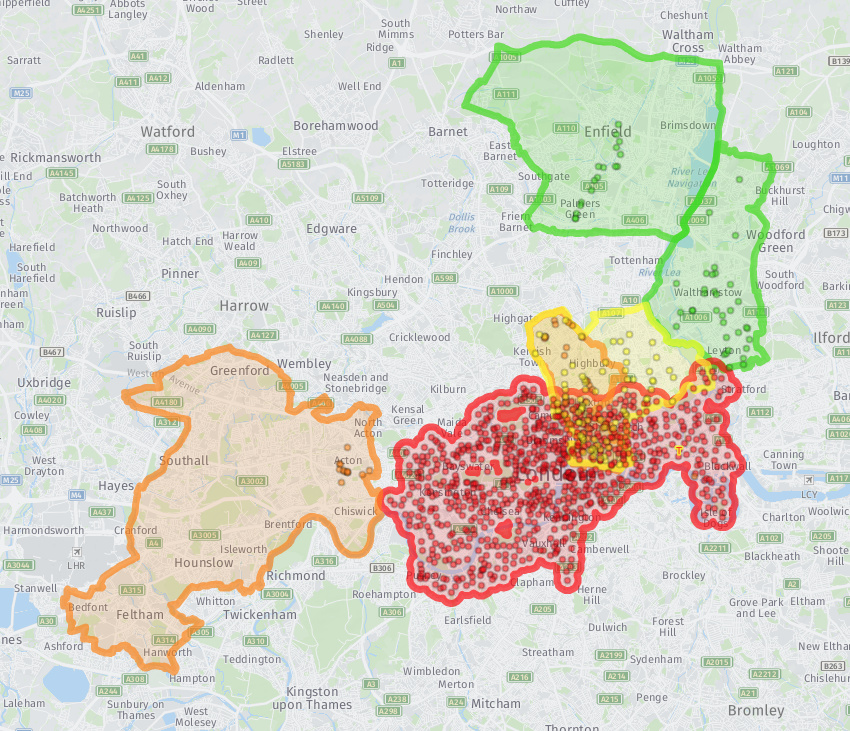
To this mind, I am contemplating launching an operator data openness scoreboard for the UK – similar to one that was unveiled at a recent bikeshare hackathon event in Washington DC. I’ve also put together an interactive map showing the current coverage in London of the four active systems (Urbo, Ofo, Mobike and the dock-based Santander Cycles), plus known “hubs” where you are most likely to find bikes available for hire – N.B. not all the operators are using a hub-based approach across their whole areas. Because of the lack of open API data from most of the operators, much of this map is manually put together and so may be a little out of date – I will do my best to keep it current. The crucial data missing here of course is the current locations of bikes available to hire. For now, you’ll need to use each individual app.

How Dockless Might Work in London

Personally, I think that hub locations are one of the most important features of the new dockless systems. They can act as a point that is regularly stocked with bikes, meaning that regular users might not need to keep doing different journeys on foot to hunt down a bike. They also help the system keep order – they may help to minimise the amount of inconsiderate parking. Currently, the reward for finishing a journey at such a hub is minimal. Operators will have to be more ambitious if the hub-inducement model work. Something like halving the fee to finish a ride in a hub, and doubling it to finish a ride outside of an operating zone altogether. It should also be possible to have hubs outside of operating areas, for example, on specific pieces of private land where access has been granted, but the local authority has not granted permission.

More generally, I think, for large western cities like London, where pedestrian space will always be at a premium, the dockless model, as it stands, will not work. Either there won’t be enough bikes, so that no one uses the system, or the labour costs will be too high for the operators, or there will be too many bikes causing clutter. The system for London that I envisage, will work, is that Zone 1 gets around 1000 “mandatory hubs”, boxes painted on the ground, each around the size of a car parking space but mainly on the pavement, where any cycles from any of the dockless cycles may be left. TfL or boroughs get tough with the operators and users and impound bikes left outside of these zones by users, with operators getting fined for each impound and the operators passing on these fines (should they choose) to the delinquent user. Outside of Zone 1, the system could work as present, with recommended hubs. However boroughs/TfL need to stop operators creating hubs branded with only their own logos and signs, and instead create generic hubs. They can still just be painted lines on the ground – the bikes themselves should be all the branding needed.

See also my borough by borough scores, or the interactive map.
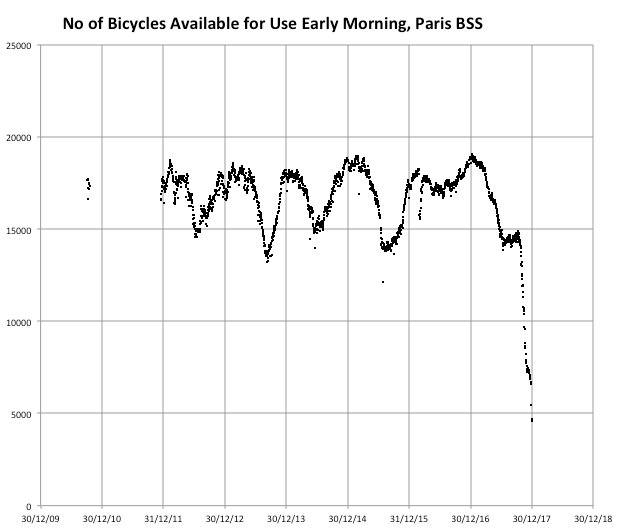
Categories
Bike Share

Dockless Continues to Expand – Here’s the Data

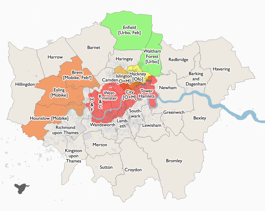
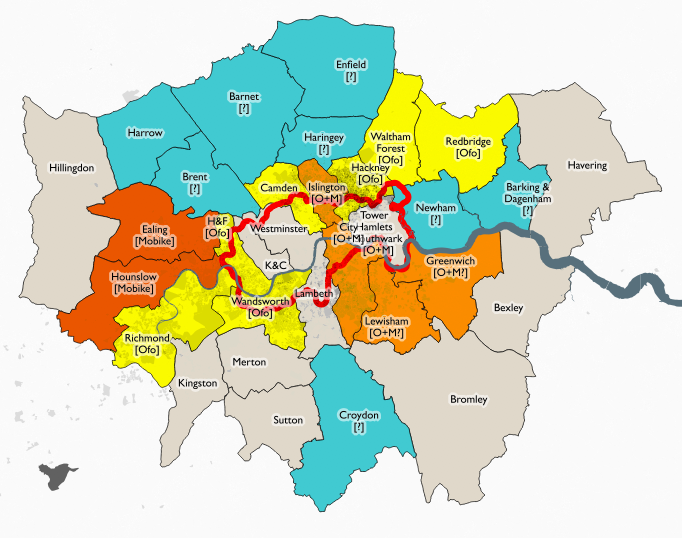
It looks like Brent will be the next London borough to get dockless bikeshare, with Mobike likely to be setting up in the borough within the next few weeks. The operator is not confirmed, although strongly hinted at, including by the council themselves. The choice of Mobike makes sense, as the operator already has a fleet of bikes in the two boroughs to its south, allowing journeys across quite a wide area of west London – although if you want to journey to the centre of the capital on a Mobike, you will still need to finish your journey in Islington or the City, or return the bike back to the three West London boroughs.

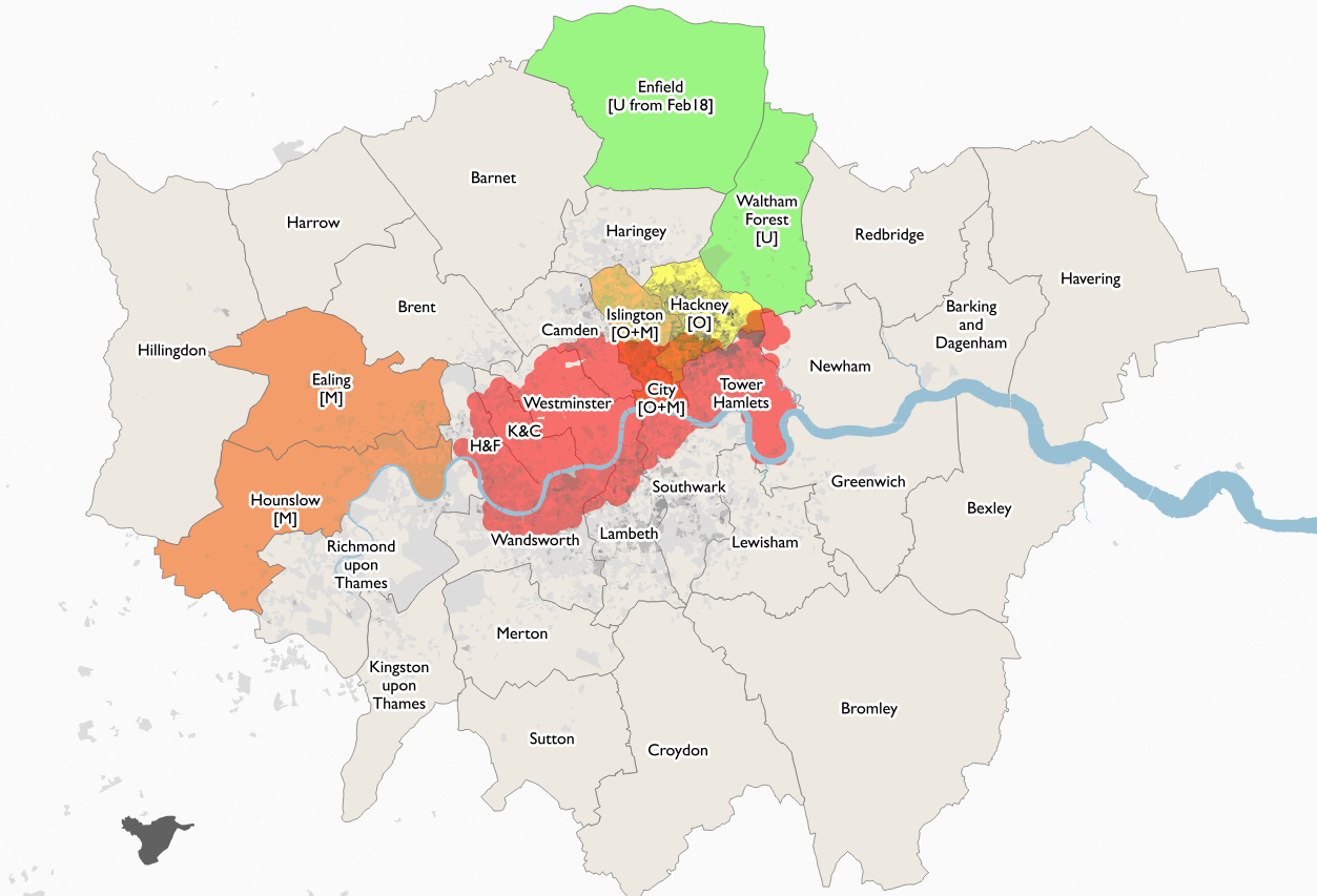
Above is my latest map of London boroughs, showing bikeshare provision. The red circles show Santander Cycles docking stations, while the other colours show the spread of dockless bikeshare – yellow (Ofo), orange (Mobike) and green (Urbo). Darker grey shades show areas of the capital with a high proportion of the resident population cycling to work (2011 census).

As well as these maps, I have now published interactive maps of the Ofo, Mobike and Urbo current operating areas in London (for all three) and other UK cities (for Ofo). Ofo were kind enough to supply me with their boundary files, for the others, which define their areas by borough boundaries in London, I have simply dissolved these boundaries. Simple spatial analysis shows the current area, in square kilometres, of these systems. See the “Numbers” tab for the latest numbers.

Currently, there are:

There are also individual dock maps for other operators in London (Santander Cycles, 110km2) and Oxford (Oxonbike, 8km2).

Operators do not supply consistent numbers of bikes operating in their areas, so I am not currently listing those. Various press quotes suggest 230 Urbos, 1000 Mobikes and 400 Ofos in London, 150 Ofos in Cambridge, 100 Ofos in Oxford and 200 Ofos in Norwich. This numbers likely include significant numbers that are not currently on the streets and available for use.

In parts of Islington, there are noticeably fewer Ofo bikes than a few weeks back, where they were previously very visible on on the main roads, while Mobikes are very visible but lined up in neat, operator-placed rows, rather than in the more organic placement you would expect from bona-fide users. There have been no London usage numbers released by the operators so far, despite having been operating for nearly half a year, which suggests they are perhaps not great. To be fair – it is wintertime and it is still early days.

Categories
Data Graphics

Railway Station Numbers

You can click on all the images in this blogpost to go explore each view further on the interactive map.
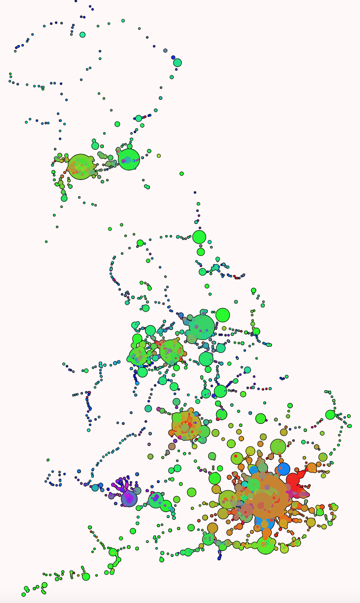
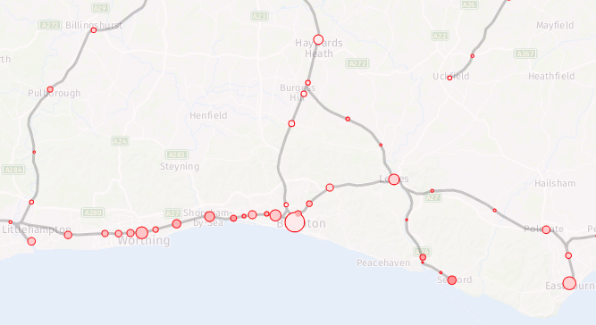
The ORR publishes station entry/exit numbers on an annual basis, on a “best guess” basis, using ticket sales, gate information and modelling. The data is split by ticket type – full fare, reduced fare (off-peak tickets, tickets bought with railcards, advance tickets, child tickets etc) and season tickets. They make this data available as an Excel spreadsheet, so I’ve crunched it and have produced a couple of maps based on this data. I have also consolidated the total counts and ticket type counts data on CDRC Data.

The first shows the total numbers of entries/exits across the last year that the data is available for (2016-7), with a blended colour, with different red/green/blue strengths proportional to the % numbers for season tickets (red), full fare (blue) and reduced fare (green) entering/exiting National Rail services at that station. The area of the circle is proportional to the total numbers, combined across the ticket types. I’m using a minimum circle size, as otherwise some stations would be practically invisible on the map, as they can see days go by without any passengers – or trains.

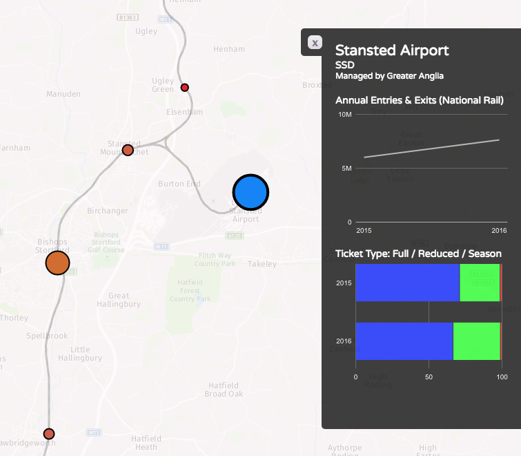
Some interesting patterns – blues for many of the airport stations, where off peak tickets generally aren’t available, and most people don’t think to get advance tickets, such as to/from Stansted:

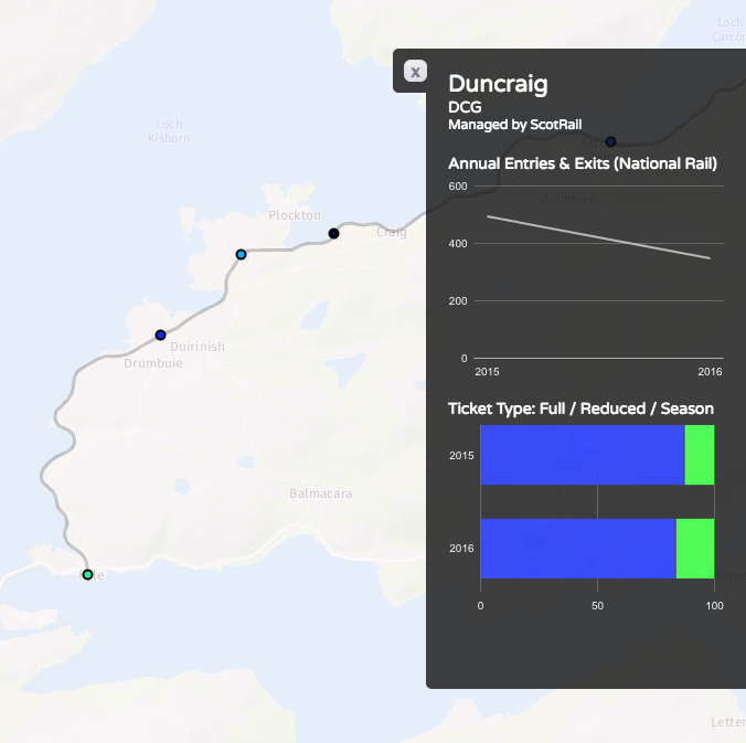
…and almost no-one pays full fare for some of the remotest stations:

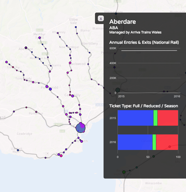
Purples on the Welsh valleys lines, showing mainly commuters and peak time users:

Bright greens for stations serving major destinations where advance tickets are readily available, such Newcastle-upon-Tyne:

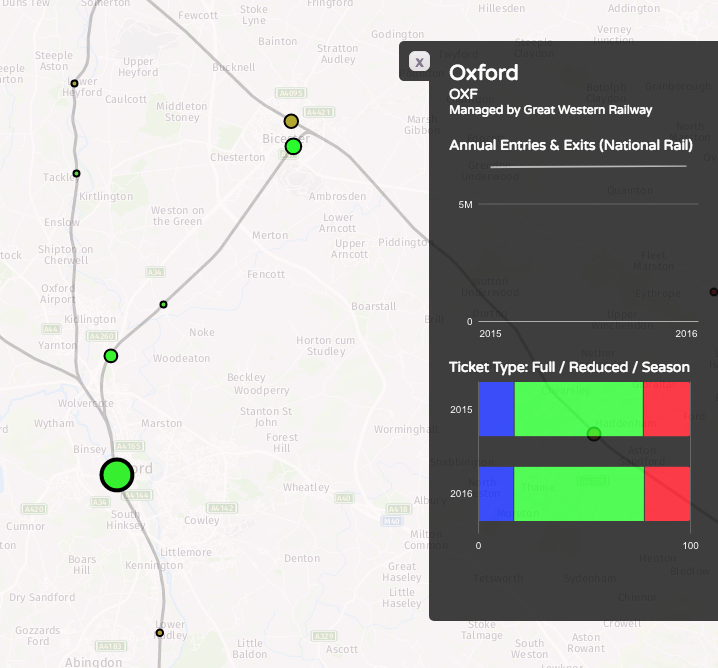
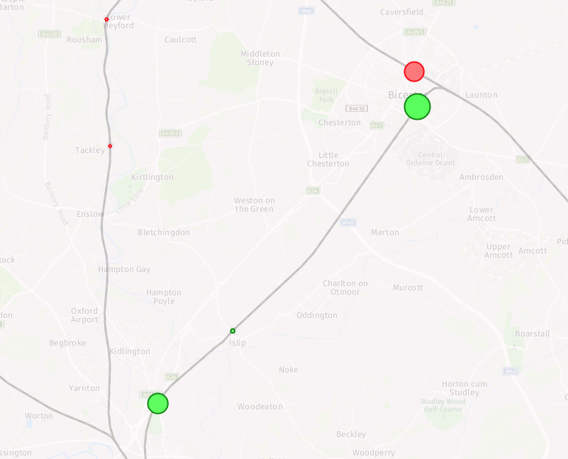
…popular tourist places, where many people will be visiting outside of the rush hours and at weekends, such as Oxford and Bicester Village retail outlet:

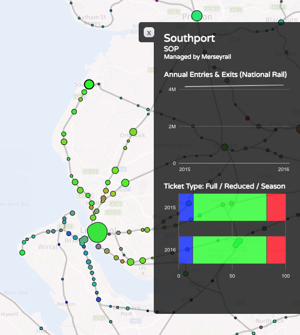
…and areas well covered by discounted travelcards, like Liverpool’s Merseyrail:

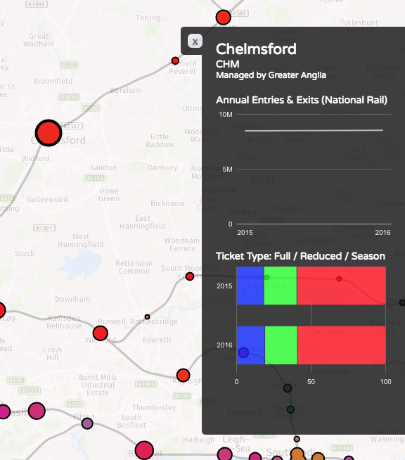
Reds where the season ticket holders dominate, such as Chelmsford and Colchester to the north-east of London:

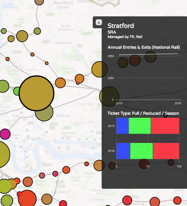
Browns showing an “urban mix” of season ticket commuters and travelcard local journey makers, like in Straford, London:

See this map on TubeCreature.

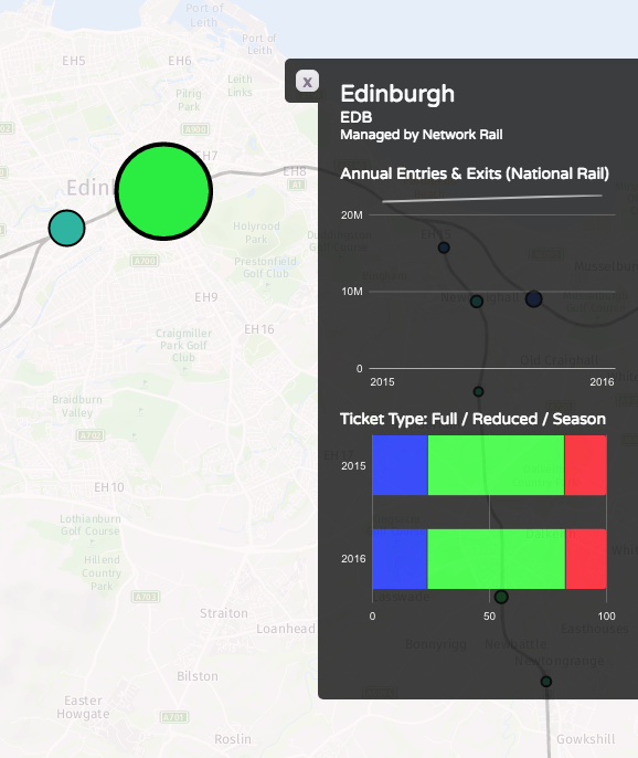
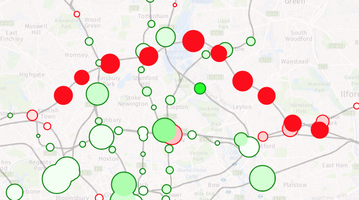
The second map looks at the change in numbers between 2015/6 and 2016/7 (a major methodological change means I cannot use data from earlier years, for a more complete time series). You can view the absolute numbers for both years, but what is of more interest is looking at the changes. The circle fill colour is the % change (with 100% green for a doubling of numbers and 100% for a halving of numbers). The area of the circle represents the absolute change in numbers. The border colour emphasises whether the change is an increase or decrease. Stations with little change will show up as small circles. The biggest trends are the new lines to Oxford via Bicester, and from Edinburgh to Tweedbank. In both cases, the lines were only open for part of the first year, so an increase would be expected even if the day-by-day numbers were flat:

Big drops show in parts of London – the Goblin line having been closed for much of 2016/7 due to a bungled overhead line installation:

There is also a big drop at Kensington Olympia’s however the source reports says this is due to a methodological change – i.e. it may not have actually been a significant drop at all. This is somewhat puzzling, as there are ticket gates at this station, so in/out numbers should be pretty solid, but it may be relating to due to many fewer people, than previously thought, transferring in-barrier to the sparse District line services at this station. When they do this, they are no longer considered to be National Rail passengers and so have “exited” the station here, from a National Rail perspective.

Most parts of the country see a steady increase (light greens):

The big exception being area served by Southern trains – with them being on strike for much of the second year, the fall in numbers in this region is almost universal:

See this map on TubeCreature. You can also download all the total counts and ticket type counts data from CDRC Data.

Categories
Bike Share London

Three Bikeshare Systems now Competing Directly in London

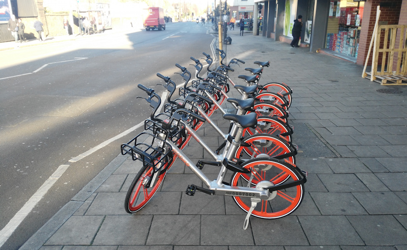
[Updated] Following Ofo’s recent expansion to Islington and the City of London, Mobike has also expanded to Islington and the City – here’s a set of operator-placed bikes outside Cally Road tube station:

This presumably means that you can now cycle from Acton in Ealing, the original London location for Mobike, to Islington, for 50p/half hour. You can’t end your journey in between the two boroughs, though. It would probably take you over an hour, so it would work out the same price as getting the London Overground between the two (£1.50 off-peak via Willesden Junction), in a slower but more healthy way.

The bikes have registration numbers starting “A02”, I think this means they are unfortunately the same design as the cramped and uncomfortable Manchester bikes (which are, I understanding going to be replaced soon with new European-market-designed bikes). Mancunians presumably would have been unimpressed with London getting the new ones first!

The new bicycles are not appear in in the Mobike app yet, although this may just be because the app is a bit flakey – you have to pan and zoom very close to the location to see it on the map, and the app regularly reports “servers busy”. Now if they just released an open bike location API it would make it a lot easier for everyone to find their bikes…

Just down the road, here’s another operator-placed set of Ofo bikeshare bikes, near Mount Pleasant, right on the borough boundary line between Islington and Camden:

The latter location is also served by the dock-based incumbent, Santander Cycles, for example seen here a few hundred metres further on, in Holborn Circus:

Ofo and Mobike bikes are allowed to be parked in the City, along with Santander Cycles (at docking stations). Only Santander Cycles can be parked in Camden borough, but that hasn’t stopped many Ofo bikes appearing available for use in Camden borough anyway – in theory, all of these users would get a penalty:

In practice, Ofo (and the other operators) want to expand, it’s the boroughs that are moving slowly (with good reason, after the oBike debacle) so I would imagine they will be slow to penalise such out-of-zone journeys. It’s all a bit confusing for the average person who just wants to do a quick one-way journey on a shared bike.

The bikeshare wars continue, meanwhile, plenty of London’s 33 boroughs* still don’t have any bikeshare system in them (see map at top, which shows grey shading for areas with an established commute-by-bicycle residential community).

Surely it’s only a matter of time though…

*Including the City of London which isn’t technically a borough.

Categories
Bike Share London

Five Bikeshares in London


Bikeshare system coverage in London, November 2017. Shading: Proportion of people who cycle to work.


Updated map showing bikeshare system coverage in London, June 2018

There are now five bikeshare systems operating in London:

Santander Cycles (Central London)

Photo: Copyright TfL.

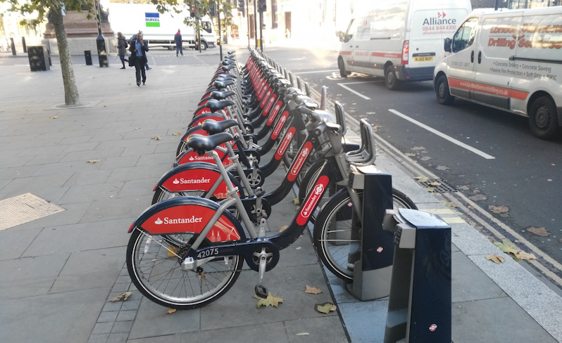
Santander Cycles are red, they launched in July 2010 and currently have 9500 bikes on the street (around 12000 in total), covering an area of 110km across 11 boroughs and the City of London – this sounds impressive, but it is only 7% of London’s area (based on a 500m station buffer), and equates one bike for every 950 people in the capital. You can see the live state of the system (in terms of empty/full docking stations) on Bike Share Map. As a publically funded system, Santander Cycles have an excellent open data policy and release live docking station data which can be readily mapped, location information and historic journeys through TfL’s Open Data Portal.
Santander Cycles last week unveiled their “50000-series” bikes which are part-manufactured in the UK, with smaller wheels, bluetooth asset tags and a number of other enhancements, although in technology terms they still very much third-generation bikeshare bikes (“dumb” bike, smart dock) and the system remains expensive to use with a complicated pricing structure (£90/year or £2/day membership for journeys under half-hour, £2 per extra half-hour), with any expansion hamstrung by the very expensive docking station installation costs – so its footprint has only slightly expanded in the last few years. There have been some other innovations, such as widespread use of Blaze laserlights, and its current sponsor has also invested considerably in promoting the system. The Santander Cycles system looks expensive and rigid, particularly compared with the newer alternatives. It is, however, in terms of bike quality, maintenance and use, and public acceptance, the “gold standard” of bikeshare in London.

Mobike (LB Ealing)

Mobike (orange bikes) were the first dockless fourth generation* (smart bike, dumb dock) compliant (working with local authorities) system in London, which launched in Ealing in July this year – a far from obvious place to launch, as Ealing has a very low tradition of cycling in general (no dark areas in the map above). However, Mobike did have UK experience before, having had a bigger and higher-profile launch in two of Greater Manchester boroughs. Mobike persevered through initial bad publicity due to vandalism and can be seen on many streets of the city. Personally, I found Mobike extremely uncomfortable to cycle – their bikes have been shipped from the far east with little customisation, and their frames are designed for the far eastern rather than the European build (Europeans are typically bigger!) At its maximum extended saddle position, it was uncomfortably tiny to pedal one. This is a pity, presumably the extremely cheap mass manufacturing costs of sticking with their global design were too tempting.

The Ealing launch had a reported 750 bicycles although as ever you have to take the numbers with a pinch of salt. A quick look at the app reveals around 160 bikes in the preferred zones and around 10 parked elsewhere. Mobike is very cheap and has a simple to understand pricing model (£29 joining fee then 50p per half-hour ride). One nice touch is that if you have a membership of the Manchester system, it will work fine in London too. Ealing is not a densely populated inner-city borough and the 750 bicycles serve a huge 56 square kilometres – in practice, as shown on the app map, the bikes (and zones, shown with a “P”) are clustered in the eastern edge of the borough, around Acton. I wish Mobike good luck but they need more comfortable bikes and to get into a borough with an established cycling tradition, and operate around a larger area than the few square miles in the eastern end of this borough. Mobike, as a fully commercial operation, does not release bikeshare open data for Ealing (dockless bikeshare data does have theoretically considerable economic value), although they have plans to release it for Manchester (likely a stipulation from the local authority there) so maybe it will come here too in time.

Ofo (LB Hackney, LB Islington and City)

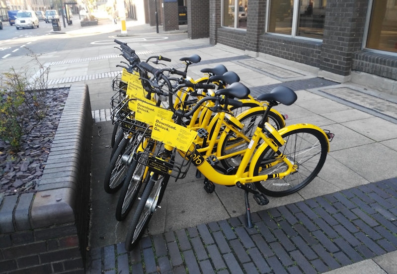
Ofo (yellow bikes) are, like Mobike, a big global player in dockless fourth generation bikeshare. They launched in Hackney – London’s spiritual home of regular cycling – in September, and have just announced (this week) an expansion to the neighbouring borough of Islington and the City of London, meaning serious commute potential of these bikes.

I have ridden an Ofo bike (a one-off in Manchester) and found it extremely comfortable – it felt like riding a “real” bike rather than an approximation of one. Like Mobike, Ofo have a low joining fee, a flat rate for usage and the membership can be used in their other systems (including Cambridge in the UK). Ofo has targetted boroughs with a good cycling tradition and also is, in some parts of the boroughs, in direct competition with the incumbent Santander Cycles – the only one to do so (see map below). Hopefully this competition will lead to innovations on both sides and not damage either.

Urbo (LB Waltham Forest)

Photo: Paul Gasson on Twitter.

Urbo (green bikes) are another dockless fourth generation bikeshare operator. They are an Irish company, although they are buying the bikes and technology (e.g. the smart lock and the apps) from China and customising locally. Their bikes are the most attractive of the new dockless bikeshare bikes I have seen (with a nice curve design on the frame) and appear (I haven’t ridden one yet) to be similar in overall build style, and so hopefully comfort, to Ofo’s bikes. Waltham Forest (39 sqkm in east London with some tradition of cycling, on its western edge) is their first system and it has only just launched this week. They also do not yet release open data (although they have only just launched). Ofo may be most useful for residents of Higham Hill, Poets Corner, the top of Walthamstow Village and certain other parts of the borough to get quickly to the stations on the efficient Victoria Line or Overground to central London.

Like Ofo and Mobike, Urbo have designated zones in their host boroughs and induce users (via cheaper journeys) to end their journeys in these zones (shown with the STOP icon on their app’s map, here). These zones come with a bespoke street sign erected by the local authority, as well as the usual taped/painted markings on the ground. It is a little surprising that Waltham Forest have included the operator logo on the signs (presumably to Urbo’s delight) as there is no good reason why other dockless systems, when they inevitably arrive here too, should use these spaces too. It is kind of like the council painting new car parking spaces on a street and putting up a sign, with the Ford logo, saying they are spaces for Ford cars only. They are just spaces on a road/pavement…

oBike (Withdrawn)

Then there’s oBike (orangey-yellow) which launched in July without coordinating with boroughs (using the Uber-style “forgiveness is easier than permission” modal), had a number of its bikes impounded by Wandsworth borough and withdrew from the capital – almost all of its bikes are lurking behind locked gates in an industrial park in Rainham so they aren’t included on the maps here. There is the odd one that got away from the purge and remains in central London. They will return, I’m sure, once the company has a strategy for compliance with TfL and the boroughs. oBike did at least wake up authorities to the fourth generation revolution, and force some much-needed policy documents to be hastily released. I rode a few oBikes and found them more comfortable than the Mobike but not as good as Ofo, Urbo or Santander Cycles.

November 3rd Snapshot

System  Type            Locations Area
/km2
Launch
Date
Reported
Bikes**
Available
Bikes
(Estimates)
Santander
Cycles
 Dock
 -based
Central London 110 July 2010 12000 Was 10800
now 9600***
oBike  Pure
 dockless
All London,
but withdrawn
1570 July 2017 400 initially
5500 planned
Was 1500
now 6
Mobike  Zoned
 dockless
West: Ealing 56 July 2017 750 160
Ofo  Incentive
 dockless
North: Hackney,
Islington & City
37 Sept 2017 300-400 Around 200
Urbo  Zoned
 dockless
East: Waltham
Forest
39 Nov 2017 250 40
(so far)

Of course, it’s hard to know how well these systems are being used, particularly as dockless systems don’t generally release this information (except if the numbers are particularly good, as occasional press releases). Santander Cycles reliably gets around 20000-40000 usages a day (i.e. 2-4 usages/bike/day), and certainly, on the more central parts of the Cycle Superhighways during rush hour, there is a sea of red Santander Cycles amongst the other cyclists. Anecdotally, I’ve a couple of Ofo bikes in use, but this is a bit unfair on Ofo and Urbo – I regularly cycle through Hackney on my own bike, but don’t generally pass Waltham Forest and Ealing. My sneaking suspicion is that Ofo will do quite well, by targeting the boroughs where there are going to be a lot of cyclists, and that Mobike and Urbo will either have to expand or will stay irrelevant in London’s overall cycling picture. This sounds harsh, but, as DataShine Region Commute and TubeHeartbeat show, Londoners move beyond their borough boundaries a lot. We shall see, we live in interesting times for bikeshare.

This map (an inset of the map above) shows the reach of the four systems (excluding oBike) in London. The shading behind shows the proportion of residents there who cycle to work (2011 Census data, Copyright ONS) and therefore likely enjoy good cycle infrastructure and community (e.g. cycle cafes, cycle repair workshops) that would help integrate bikeshare. Parts of Southwark and Lambeth look woefully underserved.

* The first generation of bikeshare systems were free bikes, left on streets for people to use. Inevitably they were stolen or broken. Second generation bikeshare systems used “dumb docking stations” where cash was used to release them. Users were therefore only out by the cash amount if they didn’t release them, and operators didn’t know where they were without visiting the docks, so again they got stolen and/or broken. Third generation bikeshare systems require the user to use credit cards (and so charge a large amount for non-return) and use smart docking stations which can report the status of themselves and their bikes. They have been very popular for the last few years, but require a large up-front investment and are very expensive to operate and maintain, so most are publically subsidised. Minor advances to these (such as GPS on some bikes, or integration with transit smart cards) are sometimes termed as fourth generation but are actually really just usability tweaks to fundamentally the same third generation concept. I am terming the new dockless systems, where the bikes know where they are (through an app, or their own communications) as fourth generation. Physical docking stations can still exist on the ground, to manage the bikes or provide a known starting location, but the bikes don’t have to be left there, if inconvenient – the “hybrid” model, as used in Brighton. Zoned dockless systems (Urbo, Mobike) have tapes on the ground as “preferred” docking zones, replacing the physical docks. Incentive dockless systems (Ofo) don’t even have the tapes – just virtual locations that appear in the app). The Pure dockless systems (oBike) don’t even have anything – inevitably resulting in bikes being scattered through an area.

** These numbers, reported in media and press releases, will invariably be higher that the “available bikes” currently on the streets (or visible in the app, in the case of the dockless systems). The difference can typically be explained by bikes will be in repair or reported broken, some will be in active use (although generally I try to measure at night to avoid this) or in redistribution, some will be in the warehouse, ready to come out in the near future. Ultimately though, if the bikes aren’t available for use, then they aren’t really any good to anyone, so bikes on streets is the number the operators should be reporting!

*** For larger, commuter heavy systems (like Santander Cycles) that are dock-based, there are good operational reasons to slightly reduce the numbers of bikes available during the winter months (where the commuter mode share will be higher) as the flows are more undirectional and therefore full-dock pressures are otherwise worse. In the summer, tourist use acts as a natural rebalancer.