Categories
London

Crossrail Site Tour: Tottenham Court Road

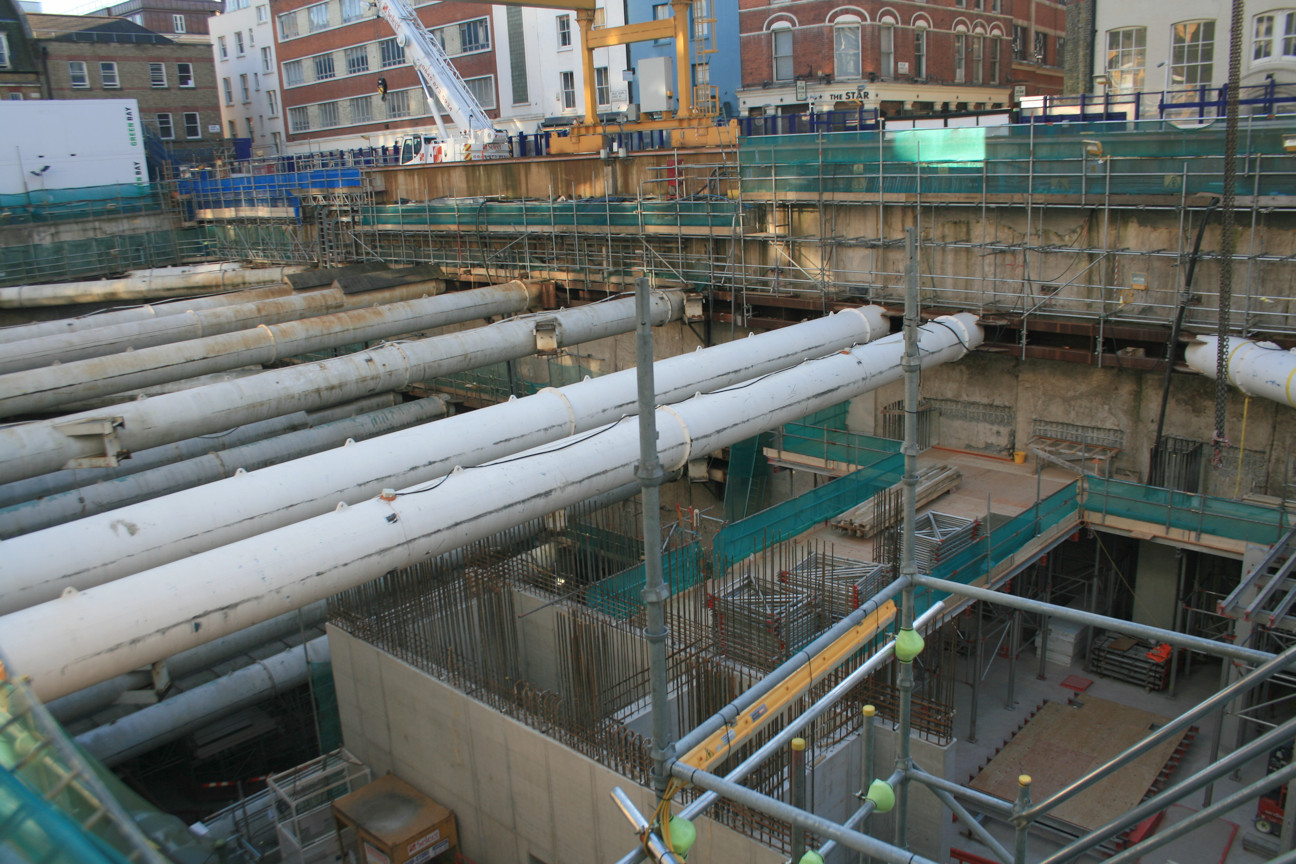
Crossrail organised a number of tours of their major worksites, as apart of Open Doors, this weekend, for civil engineering students and other interested parties. One of the sites was the Dean Street box, which will form the western ticket hall at the Tottenham Court Road Crossrail station. While the eastern ticket hall will connect directly with the existing Underground station (for the Central and Northern lines), the western ticket hall is quite some distance away, and in fact is nearly half way towards Oxford Circus – it will also connect to the other lines, via new pedestrian tunnels, but it will be a long walk! The Dean Street box is a huge site itself, with six distinct levels, and yet only a small part of what Tottenham Court Road station will become in 2018:
IMG_3034

The challenges of the site itself are illustrated just by getting to it – access is via the pavement on Oxford Street. As soon as the pavement barrier is drawn across and the doors open, the narrow pavement quickly crowds up with pedestrians, while numerous buses and angry, revving taxis, continue to squeeze along the street.

The Crossrail platforms will stretch between the two ticket halls, and space has been made for a future extension. Crossrail 2, should it be built, will have platforms here, in further tunnels crossing below these new platform tunnels, perpendicularly and approximately half-way between the ticket halls. Some of the pedestrian passageway tunnels, which also run between the two ticket halls, have sections which will connect with the equivalent for Crossrail 2, the extent of which appears in outline on the main site diagram. Planning ahead.

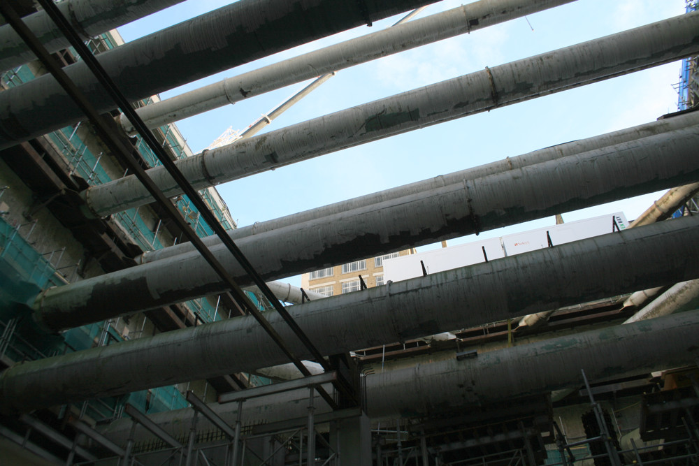
The first thing that strikes you when in the “box” is the huge number of old boiler pipes that are being used to brace the outer wall and stop the pressure of the London clay behind (which has been compressed from buildings over hundreds of years) from collapsing it. The boiler pipes near the top are smaller as they have less pressure to withstand. Some of the larger ones are starting to be removed now as the lower levels of the station ticket hall start to be structurally complete. The pressures are so huge that the engineering team is wary of suddenly removing one and causing any unwanted movement – so they are cutting notches in them to allow the pipes to continue to hold a weaker load, before removing them once the force has been almost entirely redistributed elsewhere.
IMG_3019

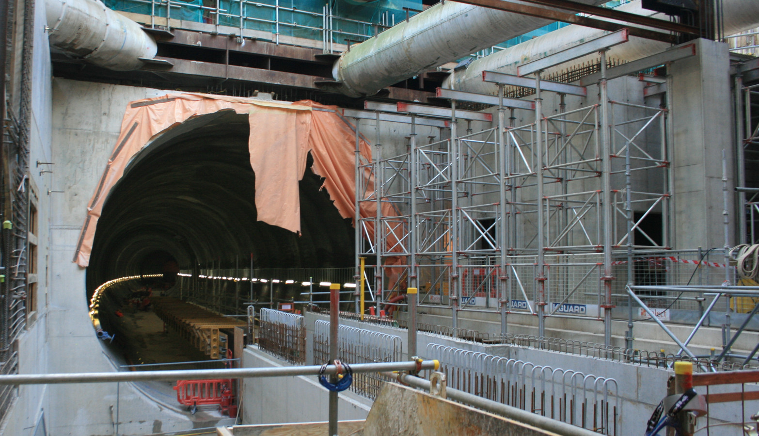
Here, reached by a very large number of steps down a couple of gantries, you can see the western end of the eastbound Crossrail platform tunnel. I initially thought that the line of yellow struts was showing the platform itself starting to be built, but actually I think it is marking the “floor” upon which the rails will be laid, as it lies right in the middle of the tunnel, and so the platform level would be marked approximately by the line of lights to the right:
IMG_3031
I was surprised to see the quite noticeable curve of the platform tunnel, to the right – I assumed they’d all be straight, which would enable easy boarding for those on wheelchairs and future platform-edge doors. Perhaps, should the latter happen, there will be some kind of mechanical gap infilling?

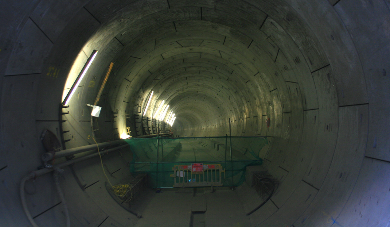
Looking in the other direction is the running tunnel, large by tube standards but much smaller than the platform tunnel, where trains will pass along from Bond Street station to here. Because the Dean Street box was excavated before the tunnel boring machine passed through, a tube of foam concrete was added back in, to give the tunnel boring machine something to push against as it passed through. The machine continued to line its tunnel in the box and the platform area, with concrete slabs like you can see below here, but with lower quality, weaker “sacrificial” slabs as they were then bulldozed shortly again after the machine had passed through:
IMG_3025
It was somewhat eerie peering into the silent tunnel, with not a workman in sight, deep below the bustling streets of central London. Largely empty at the moment, with a couple of grooves in the base slab showing where the construction mini-railway had its tracks. Come December 2018, there will be up to one train every two minutes passing along here, so it will not be nearly as silent. Looking into this tunnel there is a noticeable gradient downwards. As trains travel upwards towards here, into the station, the slope will help slow them down, saving energy on braking.

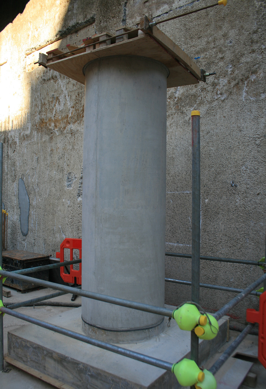
Various parts of the worksite are being built to different specifications – much of the concrete structure will be clad and so not visible to the public, but there are some parts where concrete pillars will be visible features. So, some experimentation is currently taking place to test the quality of finish they can produce with the processes on site. Here is a test pillar that they are quite happy with already, but they think they can do an even better job when they put them in the appropriate place:
IMG_3018
The edge of the western ticket hall box is immediately behind the pillar – notice the much coarser surface, as this will be covered with additional walls and claddings, so it will never be seen by the public. There is also quite a distinct colour/texture change line, running horiztonally along and reflecting different soil/clay conditions behind it.

Thanks to Crossrail and the contractors (Laing O’Rourke) for organising the tours and to the staff on site for showing us their site and enthusing on their work. At TCR, they assembled a PPE-free route through the site, allowing us (mainly civil engineerings students, only a few of the “general public”) to get right into the construction area and get an excellent feel of what is going on and the challenges of such a place. It is extremely tidy for such a complex construction site – with multiple levels having simultaneous construction, they have no choice but to keep everything super-organised. Various walkways have yellow lines and blue “walkway” silhouettes on the ground – somewhat reminiscent of the lines you have to walk along between the bottom of steps from an aircraft and the terminal building. Everything about Crossrail is on a grander scale than London’s existing transport infrastructure, and it will be most impressive seeing the completed stations, which are set to become major London destinations.

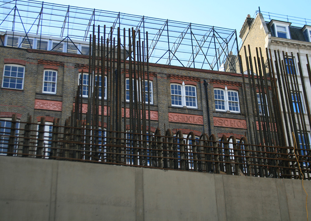
The old and the new:
IMG_3013

Categories
Technical

Ordnance Survey Open Data – The Next Level of Detail

An encouraging announcement from BIS (the Department for Business, Innovation and Skills) a few days ago regarding future Open Data products from the Ordnance Survey (press release here) – two pieces of good news:

  • The OS will be launching a new, detailed set of vector data as Open Data at the end of this month. They are branding it as OS OpenMap, but it looks a lot like a vector version of OS StreetView, which is already available as a raster. The key additions will be “functional polygons” which show the boundaries of school and hospital sites, and more detailed building outlines. OS Vector Map District, which is part of the existing Open Data release, is already pretty good for building outlines – it forms the core part of DataShine and this print, to name just two pieces of my work that have used the footprints extensively. With OpenMap, potentially both of these could benefit, and we might even get attribute information about building types, which means I could filter out non-residential buildings in DataShine. What we do definitely get is the inclusion of unique building identifiers – potentially this could allow an crowd-sourced building classification exercise if the attribution information isn’t there. OpenMap also includes a detailed and topological (i.e. joined up under the bridges) water network, and an enhanced gazetteer, i.e. placename database.
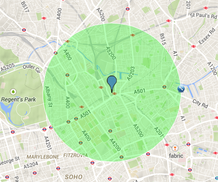
  • The other announcement relates to the establishment of an innovation hub in London – an incubator for geo-related startups. The OS are being cagey about exactly where it will be, saying just that it will be on the outskirts of the Knowledge Quarter, which is defined as being within a mile of King’s Cross. UCL’s about a mile away. So maybe it will be very close to here? In any case, it will be somewhere near the edge of the green circle on the (Google) map below…

p.s. The Ordnance Survey have also recently rebranded themselves as just “OS”. Like University College London rebranding itself as “UCL” a few years ago, and ESRI calling itself Esri (and pronouncing it like a word), it will be interesting to see if it sticks. OS for me stands for “open source” and is also very close to OSM (OpenStreetMap), so possible confusion may follow. It does however mean a shorter attribution line for when I use OS data in my web maps.

Screen Shot 2015-03-04 at 17.47.52

London’s Knowledge Quarter
Categories
Data Graphics

Manchester – Languages and Jobs

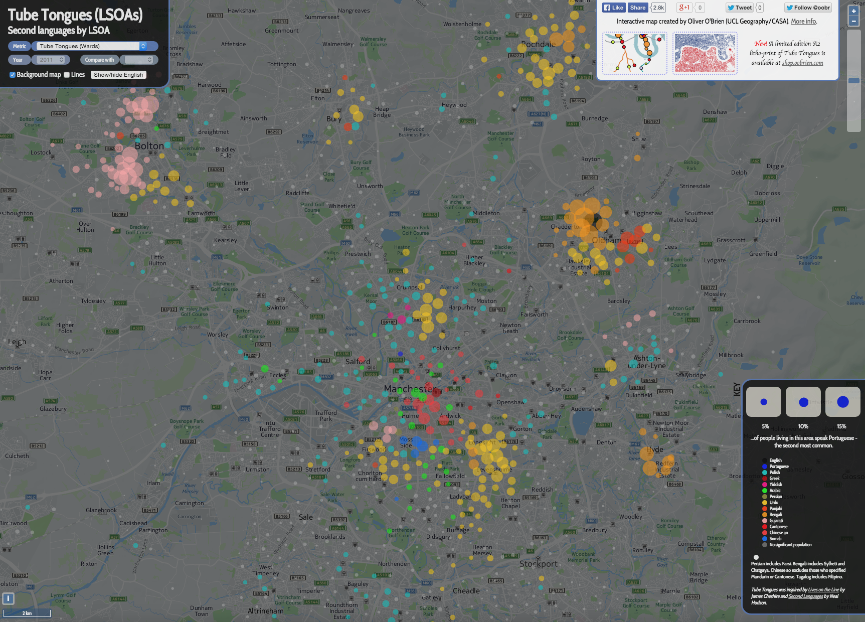
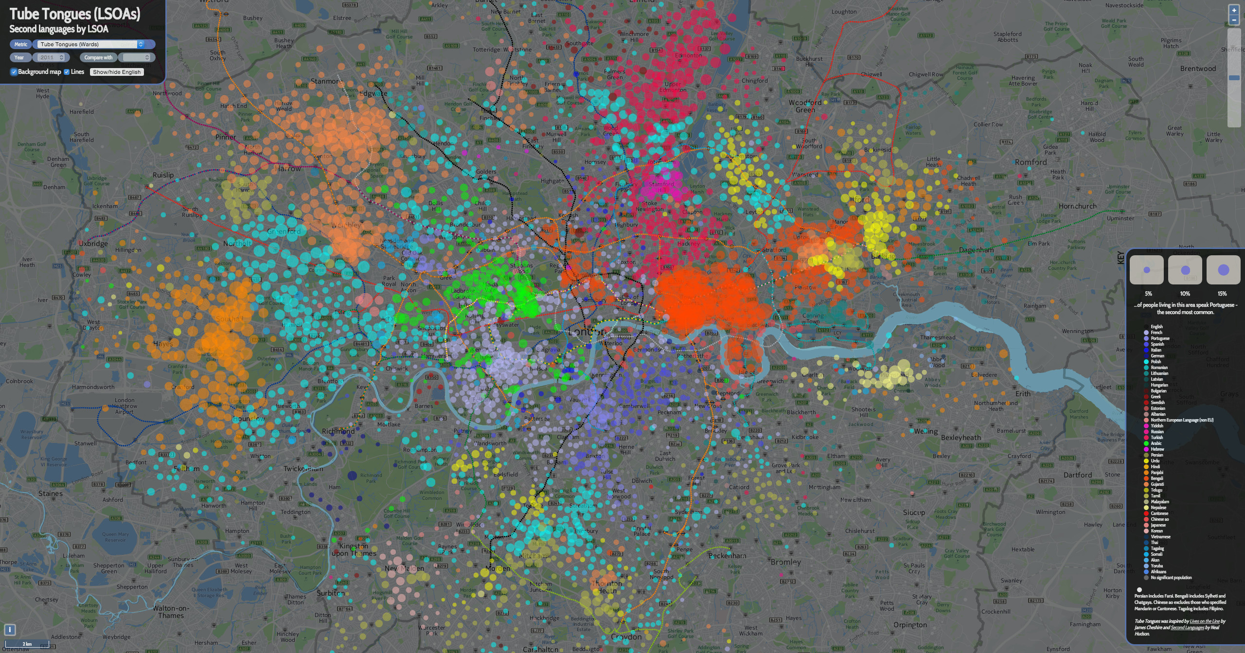
Many of my visualisations have focused on London – there is an advantage of being in the city and surrounded by the data, which means that London is often the “default” city that I map. However, I’ve created a couple of Manchester versions of my popular maps Ward Words and Ward Work. Logistics and time reasons mean that I present these as images rather than interactive websites, although I used the existing London-centric website as a platform to work with the Manchester data. A bonus is that, by presenting these as images, I can use LSOAs which are more detailed than wards – there are too many of them for my interactive version to be very useable but they work well within a standalone graphic.

I’m only showing the top* result, and the way the categories are grouped can therefore significantly influence what is shown. For example, if I grouped certain categories together, even ones which don’t appear on the map itself, then the grouped category would likely appear in many places because it would more likely be the top result. It would therefore easy to produce a version of this graphic that showed a very different emphasis. (*Strictly, second-top for the languages.)

The maps were created using open, aggregated data (QS204EW and QS606EW) from the ONS which is under the Open Government Licence, and the background map is from HERE maps. Enjoy!

1. Languages second-most commonly spoken in each LSOA in the Greater Manchester area (click for a larger version):
second_languages_manchester N.B. Where the second language is spoken by less than 2% of the population, I simply show it as a grey circle. LSOAs have a typical population of around 1500 so the smallest non-grey circles represent around 30 speakers of that language.

2. It’s important to remember that, except in a single area, English is not represented on the map at all. If you show the primary language (i.e. English) to the same scale, the map looks like this:
second_languages_manchester_english

3. Here’s the equivalent of the first map, for (most of) London. Note I’ve changed the key colours here. I appreciate that it is difficult to use the key, as there are so many more languages shown, and the variation between the colours is slight – particularly as they are shown translucently on the map:
london_secondlanguages

4. The most popular occupation by (home) LSOA (again, click for a larger version):
manchester_occupation_adornedI’ve used grey here for the “Sales Assistant” occupational group, as this is the dominant occupation in large urban areas.

5. By way of comparison, and at roughly the same scale, here is (all of) London:
occupation_adorned
My interactive (London only I’m afraid) version is here – change the metric on the top left for other datasets.

Categories
Bike Share London

Seeing Red: 15 Ways the Boris Bikes of London Could be Better

santabikes

A big announcement for the “Boris Bikes” today, aka Barclays Cycle Hire. London’s bikeshare system, the second largest in the western world after Paris’s Velib and nearly five years old, will be rebranded as Santander Cycles, and the bikes with have a new, bright red branding – Santander’s corporate colour, and conveniently also London’s most famous colour. As well as the Santander logo, it looks like the “Santa Bikes” will have outlines of London’s icons – the above publicity photo showing the Tower of London and the Orbit, while another includes the Shard and Tower Bridge. A nice touch to remind people these are London’s bikes.

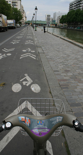
velibIt’s great that London’s system can attract “big” sponsors – £7m a year with the new deal – but another document that I spotted today reveals (on the last page) that, despite the sponsorship, London’s system runs at a large operating loss – this is all the more puzzling because other big bikeshare systems can (almost) cover their operating costs – including Washington DC’s which is both similar to London’s in some ways (a good core density, same bike/dock equipment) and different (coverage into the suburbs, rider incentives); and Paris’s (right), which has a very different funding model, and its own set of advantages (coverage throughout the city) and disadvantages (little incentive to expand/intensify). What are they doing right that London is not?

In financial year 2013/4, London’s bikeshare had operating costs of £24.3m. Over this time period, the maximum number of bikes that were available to hire, according to TfL’s Open Data Portal was 9471, on 26 March 2014. This represents a cost of just over £2500 per bike, for that year alone. If you look at it another way, each bike is typically used three times a day or ~1000 times a year, so that’s about £2.50 a journey, of which, very roughly, the sponsor pays about £0.50, the taxpayer £1 and the user about £1. In those terms it does sound better value but it’s still a surprisingly expensive system.

As operating costs, these don’t include the costs of buying the bikes or building the docking stations. Much of the cost therefore is likely ocurring in two places:

  1. Repairing the bikes – London’s system is wildly* successful, so each bike sees a lot of use every day, and the wear and tear is likely to be considerable. This is not helped by the manufacturers of the bikes going bust a couple of years ago – so there are no “new” ones out there to replace the older ones – New York City, which uses the same bikes, is suffering similar problems. (* Update: To clarify, based on a comment from BorisWatch, this assertion is a qualitative one, based on seeing huge numbers of the bikes in use, in certain places at certain times of the day. Doubtless, some do remain dormant for days.)
  2. Rebalancing/redistribution activity, operating a fleet of vehicles that move bikes around.

I have no great issues with the costs of the bikes – they are a public service and the costs are likely a fraction of the costs of maintaining the other public assets of roads, buses, railway lines – but it is frustrating to see, in the document I referred to earlier, that the main beneficiaries are in fact tourists (the Hyde Park docking stations consistently being the most popular), commuters (the docking stations around Waterloo are always popular on weekdays), and those Londoners lucky enough to live in Zone 1 and certain targeted parts of Zone 2 (south-west and east). Wouldn’t be great if all Londoners benefited from the system?

Here’s 15 ways that London’s bikeshare could be made better for Londoners (and indeed for all) – and maybe cheaper to operate too:

  1. Scrap almost all rebalancing activity. It’s very expensive (trucks, drivers, petrol), and I’m not convinced it is actually helping the system – in fact it might be making it worse. Most cycling flows in London are uni-directional – in to the centre in the morning, back out in the evening – or random (tourist activity). Both of these kinds of flows will, across a day, balance out on their own. Rebalancing disrupts these flows, removing the bikes from where they are needed later in the day (or the following morning) to address a short-term perceived imbalance that might not be real on-the-ground. An empty docking station is not a problem if no one wants to start a journey there. Plus, when the bikes are in sitting in vans, inevitably clogged in traffic, they are of no use to anyone. Revealingly, the distribution drivers went on strike in London a few months ago and basically everything carried on as normal. Some “lightweight” rebalancing, using cycle couriers and trailer, could help with some specific small-scale “pinch points”, or responding to special events such as heavy rainfall or a sporting/music event. New York uses cyclists/trailers to help with the rebalancing.
  2. Have a “guaranteed valet” service instead, like in New York. This operates for a certain number of key docking stations at certain times of the day, and guarantees that someone can start or finish their journey there. London already has this, to a certain extent, at some stations near Waterloo, but it would be good to highlight this more and have it at other key destinations. This “static” supply/demand management would be a much better use of the time of redistribution drivers.
  3. rrrHave “rider rewards“, like in Washington DC. Incentivise users to redistribute the bikes themselves, by allowing a free subsequent day’s credit (or free 60-minute journey extension) for journeys that start at a full docking station and end at an empty one. This would need to be designed with care to ensure “over-rebalancing”, or malicious marking of bikes as broken, was minimised. Everyone values the system in different ways, so some people benefit from a more naturally balanced system and others benefit from lower costs using it.
  4. Have more flexible user rules. Paris’s Velib has an enhanced membership “Passion” that allows free single journeys of up to 45 minutes rather than every 30 minutes. London, like Paris, is a large city, and the current 30 minute cutoff seems short and arbitrary, when considering most bikes are used around three times a day. Increasing the window would therefore have little impact on the overall distribution of the system and might in fact benefit it – because the journeys from the terminal stations to the City or the West End, which are the most distinctive flows seen, are acheived comfortably in under half an hour. In London, you have to wait 5 minutes between hires, but most systems (Paris, Boston, New York) don’t have this “timeout” period. To stop people “guarding” recently returned bikes for additional use, an alternative could be make it a 10 minute timeout but tie it to the specific docking station (or indeed a specific bike) rather than system-wide. Then, if people are prepared to switch bikes or docking stations, they can continue on longer journeys for free.
  5. Adjust performance metrics. TfL (and the sponsors) measure performance of the system in certain ways, such as the time a docking station remains empty at certain times of the day. I’m not sure that these are helpful – surely the principle metric of value (along with customer service resolution) is the number of journeys per time period and/or number of distinct users per time period. If these numbers go down, over a long period, something’s wrong. The performance metrics, as they stand, are perhaps encouraging the unnecessary and possibly harmful rebalancing activity, increasing costs with no actual benefit to the system.
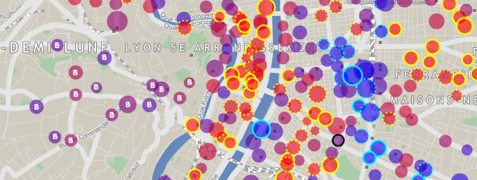
  6. lyonRemove the density rule (one docking station every ~300 metres) except in Zone 1. Having high density in the centre and low density in the suburbs works well for many systems – e.g. Bordeaux, Lyon (above) and Washington DC, because it allows the system to be accessible to a much larger population, without flooding huge areas with expensive stations/bikes. An extreme example, this docking station is several miles from its nearest neighbour, in a US city.
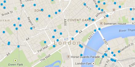
  7. Build a docking station outside EVERY tube station, train station and bus station inside the North/South Circular (roughly, Zones 1-3). Yes, no matter how hilly* the area is, or how little existing cycling culture it has – stop assuming how people use bikes or who uses them! Bikeshare is a “last mile” transport option and it should be thought of as part of someone’s journey across London, and as a life benefit, not as a tourist attraction. The system should also look expand into these areas iteratively rather than having a “big bang” expansion by phases. It’s crazy that most of Hackney and Islington doesn’t have the bikeshare, despite having a very high cycling population. Wouldn’t be great if people without their own bikes could be part of the “cycling cafe culture” strong in these places? For other places that have never had a cycling culture, the addition of a docking station in a prominent space might encourage some there to try cycling for the first time. (*This version of the bikes could be useful.)
  8. Annual membership (currently £90) should be split into peak and off-peak (no journey starts from 6am-10am) memberships, the former increased to £120 and the latter decreased back to £45. Unlike the buses and trains, which are always full peak and pretty busy off-peak too, there is a big peak/offpeak split in demand for the bikes. Commuters get a really good deal, as it stands. Sure, it costs more than buying a very cheap bike, but actually you aren’t buying the use of a bike – you are buying the free servicing of the bike for a year, and free distribution of “your” bike to another part of central London, if you are going out in the evening. Commuters that use the bikes day-in-day-out should pay more. Utility users who use the bike to get to the shops, are the sorts that should be targetted more, with off-peak membership.
  9. officialmapA better online map *cough* of availability. The official map still doesn’t have at-a-glance availability. “Rainbow-board” type indications of availability in certain key areas of London would also be very useful. Weekday use, in particular, follows distinct and regular patterns in places.
  10. Better indication of where the nearest bikes/docks are, if you are at a full/empty docking station, i.e. a map with route indication to several docking stations nearby with availability.
  11. Better static signage of your nearest docking station. I see very few street signs pointing to the local docking station, even though they are hard-built into the ground and so generally are pretty permanent features.
  12. Move more services online, have a smaller help centre. A better view of journeys done (a personal map of journeys would be nice) and the ability to question overpayments/charges online.
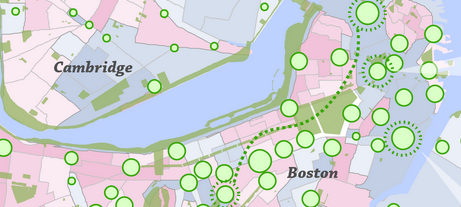
  13. hubwayEncourage innovative use of the bikeshare data, via online competitions – e.g. Boston’s Hubway data visualisation competitions have had lots of great entries. These get further groups interested in the system and ways to improve it, and can produce great visuals to allow the operator/owner to demonstrate the reach and power of the system.
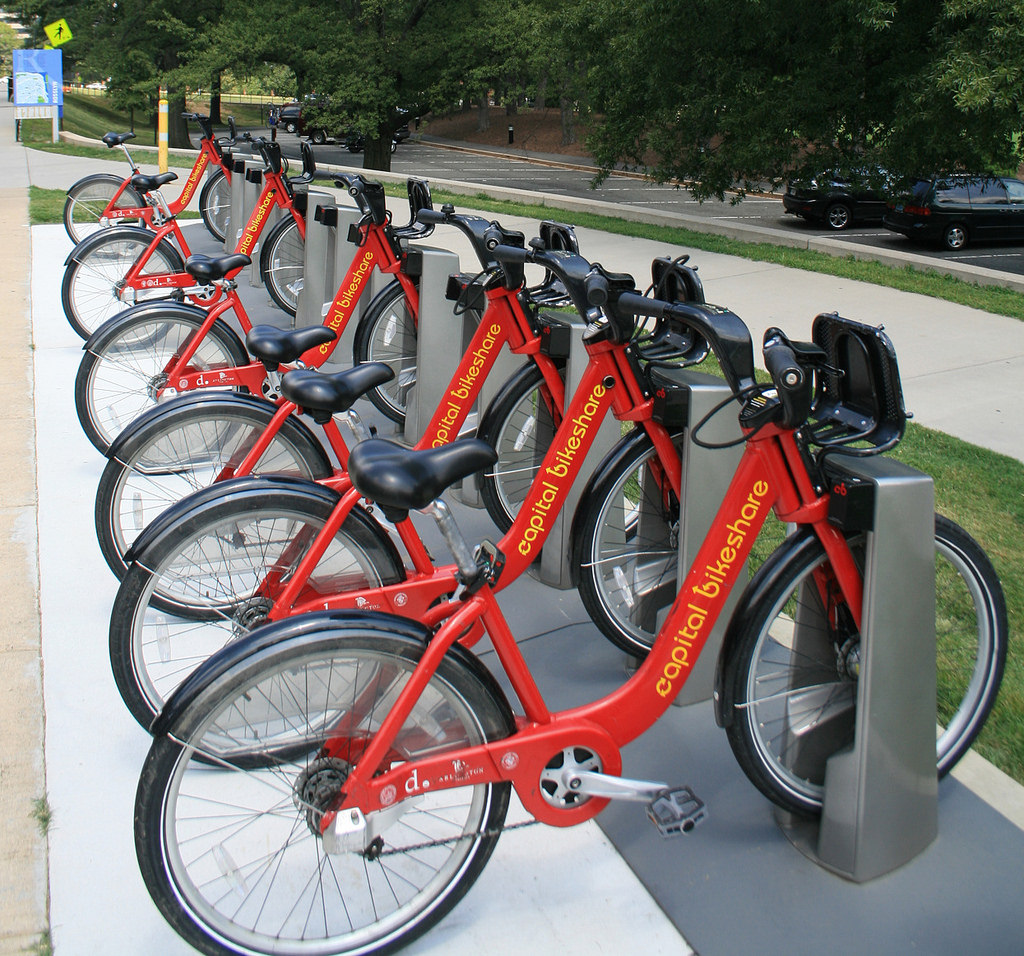
  14. Allow use of the system with contactless payment cards, and so integration with travelcards, daily TfL transport price caps etc. The system can’t use Oyster cards because of the need to have an ability to take a “block payment” charge for non-return of the bikes. But with contactless payment, this could be achieved. The cost of upgrading the docking points to take cards would be high, but such docking points are available and in use in many of the newer US systems that use the same technology.
  15. Requirement that all new housing developments above a certain size, in say Zone 1-3 London, including a docking station with at least one docking point per 20 residents and one new bike per 40 residents, either on their site or within 300m of their development boundary. (Update: Euan Mills mentions this is already is the case, within the current area. To clarify, I would like to see this beyond the current area, allowing an organic growth outwards and linking with the sparser tube station sites of point 7.)

London has got much right – it “went big” which is expensive but the only way to have a genuinely successful system that sees tens of thousands of journeys on most days. It also used a high-quality, rugged system that can (now) cope with the usage – again, an expensive option but absolutely necessary for it to work in the long term. It has also made much data available on the system, allowing for interesting research and increasing transparency. But it could be so much better still.

15094632681_a184a8a065_b
Washington DC’s systems – same technology as London’s, not that much smaller, but profitable.

Categories
Technical

Downtime

Various websites I’ve built, and mentioned here on oobrien.com from time to time, are down from Friday at 5pm until Monday noon (all times GMT), due to a major power upgrade for the building that the server is in.

This affects the following websites:

  • DataShine
  • CDRC
  • Bike Share Map
  • Tube Tongues
  • OpenOrienteeringMap (extremely degraded)
  • Some other smaller visualisations

However the following are hosted on different servers and so will remain up:

Categories
OpenLayers Technical

GeoComputation: A Practical Primer

geocomputationGeoComputation: A Practical Primer, edited by Profs Chris Brunsdon and Alex Singleton, has just been published by SAGE.

The book acts both as a reference guide to the field and as a guide to help you get to know aspects of it. Each chapter includes a worked example with step-by-step instructions.

Each chapter has a different author, and includes topics such as spatial data visualisation with R, agent-based modelling, kernel density estimation, spatial interaction models and the Python Spatial Analysis library, PySAL. With 18 chapters, the book runs to over 300 pages and so has the appropriate depth to cover a diverse, active and fast-evolving field.

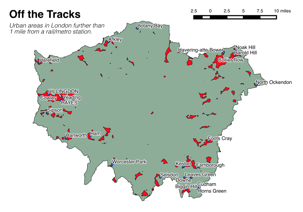
I wrote a chapter in the book, on open source GIS. I focused particularly on QGIS, as well as mentioning PostGIS, Leaflet, OpenLayers (2) and other parts of the modern open source “geostack”. My worked example describes how to build a map, in QGIS, of London’s railway “not-spots” – places which are further than a mile from a railway station, using open data map files, mainly from the Ordnance Survey. With the guide, you can create a map like the one below:

offthetracks

That little spot on its own in central-ish London, by the way, is part of Burgess Park, near Peckham.

The book has only just been published and I was able to slip in brand new screenshots (and slightly updated instructions) just before publication, as QGIS 2.6 came out late last year. So, the book is right up to date, and as such now is a great time to get your copy!

It’s available now in paperback on Amazon: Geocomputation: A Practical Primer.

The first part of my chapter:

geocomp_ch17

Categories
Leisure London

Book Review: The Capital Ring

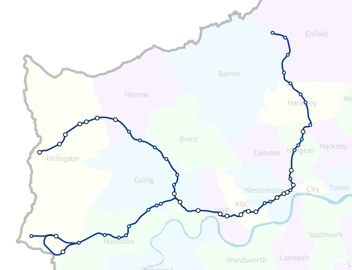
capitalringThe Capital Ring, by Colin Saunders, is an guide to walking the eponymous route, a 78 mile circular walk around inner London (generally Zones 3-4), one of London’s official long-distance walking trails.

The book, a new (2014) edition, is presented in an attractive, compact format with rounded corners, so ideal for chucking in a bag when walking the trail. The new edition means that the book will have taken into account minor changes to the route that happen from time to time due to housing developments and other aspects of London’s continuing evolution. The route is split up into 15 sections, all between 3 and 8 miles long and generally starting/finishing at or near stations (with short link sections where necessary).

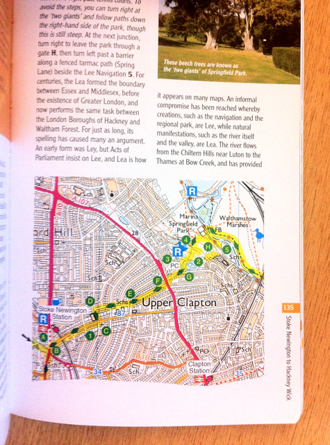
The book makes excellent use of Ordnance Survey Explorer (1:25000) mapping, with different map excerpts for each mile or so of the trail, appearing inline with the route description. The route itself is overlaid in yellow on these maps. Generally, this makes the map useful for navigating, except in some small sections where the route is complicated and the yellow line is a little broad and the scale a bit small (the Ordnance Survey’s own “official” green diamond marks for the route also appear on the maps, which can further confuse). There, you’ll need to follow the route description carefully. The route itself is waymarked on the ground with posts and signs but sometimes these are missing, which is where the book comes in particularly useful.

The clear and concise route descriptions, and annotated mapping, are augmented by short descriptions of features and trivia of local interest. The walk generally passes through interesting parts of London all the way long, so the book has many such pieces. Some of these are illustrated by photographs:

capitalring_page

Your reviewer test-walked a section near Stoke Newington and found the guide’s navigation effective, and learnt some new things about an area he thought he knew well! If you are looking for a good walk and a great guide to it, that illuminates just how green and varied London’s “inner city” is, you could do a lot worse than with this book.

Get it here on Amazon: Capital Ring. (Make sure you get the newest edition, reviewed here, which has an orange cover.)

Thanks to publisher Aurum Press for sending me a review copy. ISBN 9781781313374. List price is £12.99.

Categories
London

London Boroughs and Tube Lines

piccadilly

How many of London’s 32 boroughs (& the City of London) would you pass through on a single end-to-end journey on the tube?

It turns out that if you travel the length of the Piccadilly Line (Uxbridge branch), then, in a single journey, you’ll pass through 14 boroughs (and stop at least once in all of them but Barnet). That’s more of London than if you travel on any single Crossrail journey, once it opens in 2018.

Line Branch # Boroughs
with Stops
# Boroughs
(Total)
Piccadilly to Uxbridge 13 14
Crossrail to Shenfield 10 13
Central to West Ruislip 11 12
Piccadilly to Heathrow 11 12
Central to Ealing Broadway 10 11
Northern High Barnet to Morden 10 10
District Upminster to Richmond/Ealing Broadway 10 10
Overground Richmond to Stratford 8 10
District Wimbledon to Barking 9 9
Hammersmith & City 9 9
Jubilee 9 9
Northern Edgware to Morden via Bank 9 9
Overground Clapham Junction to Stratford 8 9
Northern Edgware to Morden via Charing Cross 8 8
Bakerloo 5 8
Overground West Croydon to Highbury & Islington 7 7
Metropolitan 7 7
Circle 7 7
Victoria 6 7
Overground Clapham Junction to Highbury & Islington 6 7
Overground Gospel Oak to Barking 6 6
Overground Watford Junction to Euston 3 6
District Wimbledon to Edgware Road 5 5
DLR Bank to Lewisham/Woolwich Arsenal 4 4
Tramlink Wimbledon to New Addington 3 3
Waterloo & City 2 3
Cable Car 2 2

See for yourself at http://vis.oobrien.com/tube/#map.

Of course, if you are aiming to see a cross-section of London’s boroughs, in a rush, then the tube probably isn’t the best way, as you’ll be underground for quite a lot of the journey…

Categories
Technical

Quick-and-Dirty WordPress Site Cloning

mysqlcloning

Here is a guide to clone a WordPress(.org) blog, on the same server, 10 steps, on Linux, You’ll definitely need admin access to the blog itself, and probably to the database and server too, depending on your setup. I did this recently as I needed a copy of an existing production site, to hack on. If you don’t fancy doing it the quick-and-dirty way, there are, I’m sure, even quicker (and cleaner) ways, by installing plugins.

In the following instructions, substitute X and Y for your existing and new blog, respectively.

0. Do a backup of your current website, like you do normally for an upgrade or archiving, in case anything goes wrong. e.g. under Tools > Export in the WordPress admin interface.

1. Copy all the files:
cp -r /home/~username/www/blog_X /home/~username/www/blog_Y

2. Edit wp-config.php in your new blog directory:

Change:
$table_prefix = 'wp_X_';
to:
$table_prefix = 'wp_Y_';

3. Copy all the database tables (prefixed with wp_X_). The new ones should have a prefix wp_Y_ instead. I used the Copy functionality under the Operations tab in phpMyAdmin (see screenshot below).

4. Edit wp_Y_options:
update wp_Y_options set option_name = 'wp_Y_user_role' where option_name = ' wp_X_user_role';

5. Edit wp_Y_options:
Edit the option_value for rows with option_name values of siteurl and home, pointing them to the new location – mine are the same but one might be different, e.g. if you have your WordPress core files in a subdirectory relative to the directory for the site entry-point on the web.

update wp_Y_options set option_value = 'http://your_server.com/~username/wp_Y' where option_name = 'siteurl';
update wp_Y_options set option_value = 'http://your_server.com/~username/wp_Y' where option_name = 'home';

There may be other rows referencing your old blog name, but these are probably from plugins and therefore probably don’t need to be changed.

6. Edit wp_Y_usermeta:
update wp_Y_usermeta set meta_key = replace(meta_key, 'wp_X', 'wp_Y');

(You can edit the affected rows manually, but I had a lot to do – there’s around 5 for each user.)

7. Drop force-upgrade.php in the same directory as wp-config.php and run it from your browser. This rebuilds caches/hashes stored in some of the tables. You can run it repeatedly if necessary, (e.g. if you missed a step above), it shouldn’t do any harm.

You can find force-upgrade.php here.

8. Delete force-upgrade.php. Leaving it is a security risk.

9. Log in to your blog in the new location, as normal. Usernames and passwords should be preserved.

mysqlcopy

Categories
Data Graphics

Bad Maps

<rant> Three maps with glaring errors which I came across yesterday. I’m hesitant to criticise – many of my own maps have, I am sure, issues too (i.e. my Electric Tube map, on the right, is deliberately way off.) But I couldn’t resist calling out this trio which I spotted within a few hours of each other.

1. Global Metropolitan Urban Area Footprints

footprints

This is, in itself, a great concept. I particularly like that the creator has used the urban extent rather that administrative boundaries, which rarely follow the true urban extent of a city. The glaring error is scale. It looks like the creator traced the boundaries of each city’s urban extent in Google Maps (aerial view) or similar. All well and good, but a quirk of representing a 3D globe on a 2D “slippy” map means that the scale in Google Maps (and OpenStreetMap and other maps projected to “WebMercator”) varies with latitude, at a fixed zoom level. This hasn’t been accounted for in the graphic, with the result that all cities near the equator (i.e. most of the Asian and African ones) are shown on the map smaller relative to the others, while cities near the poles (e.g. London, Paris, Edmonton, Toronto) are shown misleadingly big. This is a problem because the whole point of the graphic is to compare footprints (and populations) of the major cities. In fact, many of those Chinese and African cities are quite a bit bigger relative to, for example, London, than the graphic suggests.

2. Where Do All The Jedi Live?

religions

The map is in the Daily Mirror (and their online new media) so it doesn’t need to be a pinnacle of cartographic excellence – just a device to get a story across.However, Oxford and Mid Sussex – 40% of the datapoints – are shown in the wrong place – both are much closer to London than the map suggests. The author suggests they did this to make the text fit – but there better ways to accommodate text while having the centroid dots in the correct location. It might take a little longer but then it wouldn’t be – quite simply – wrong. I’m somewhat disappointed that the Mirror not only stoops to the level of Fox News in the accuracy of their mapping, but appears to have no problem with maintaining such an error, even when readers point it out. It’s sloppy journalism and a snub to the cartographic trade, that just relocating whole cities for artistic purposes is not an issue, particularly as so many people in the UK have relatively poor spatial literacy and so can be potentially easily manipulated.

3. A London map…

breakfasts

I’m not really sure where to begin here. I’m not sure if any of the features are in fact in the right place!