Categories
Data Graphics London

Tube Tongues – The Ward Edition

wardwords

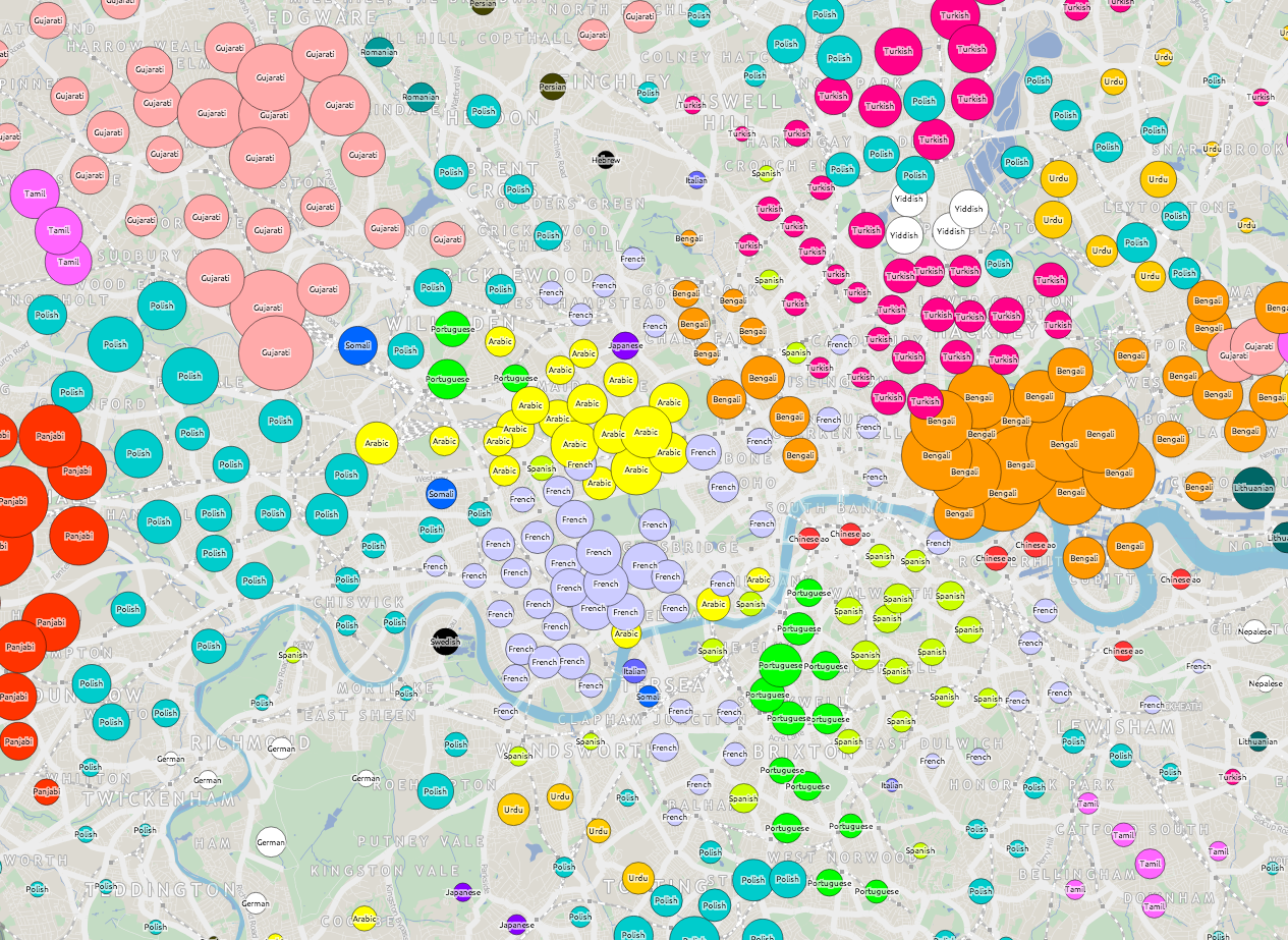
If you are a Londoner but felt that Tube Tongues passed you by, maybe because you live in south-east London or another part of the city that doesn’t have a tube station nearby, then here’s a special version of Tube Tongues for you. Like the original, it maps the most popularly spoken language after English (based on 2011 Census aggregate tables released by the ONS, via NOMIS) but instead of examining the population living near each tube station, it looks at the population of each ward in London. There are 630* of these, with a typical population of around 10000. I’ve mapped the language as a circle lying in the geographic centroid of each ward. This is a similar technique to what I used for my local election “Political Colour” maps of London.

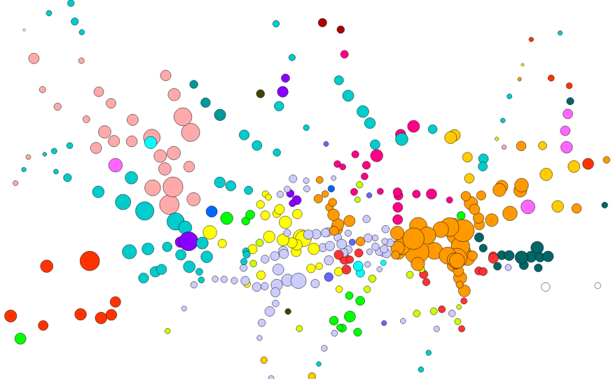
A few new languages appear, as the “second language” (after English) in particular wards: Swedish, Albanian and Hebrew. Other languages, which were previously represented by a single tube station, become more prominent – Korean around New Malden, German-speaking people around Richmond, Nepalese speakers in Woolwich, Yiddish in the wards near Stamford Hill and Yoruba in Thamesmead. Looking at the lists of all languages spoken by >1% of people in each ward, Swahili makes it on to a list for the first time – in Loxford ward (and some others) in east London. You can see the lists as a popup, by clicking on a ward circle. As before, the area of the circles corresponds to the percentage of people speaking a language in a particular ward. The very small circles in outer south-east London don’t indicate a lack of people – rather that virtually everyone there speaks English as their primary language.

English remains the most popularly spoken language in every ward, right across London. Indeed, there are only a three wards, all in north-west London, where it doesn’t have an absolute majority (50%). London may seem very multilingual, based on a map like this, but actually it is very much still Europe’s English-speaking capital. See the graphic below, which shows the equivalent sizes the circles are for English speakers, or click the “Show/hide English” button, on the interactive map.

Here’s the interactive map. There’s also a ward version of Working Lines.

* I’ve ignored the tiny City of London ones except for Cripplegate, which contains the Barbican Estate.

Background map uses data which is copyright OpenStreetMap contributors. Language data from the ONS (2011 Census).

wardwords_english

Categories
Orienteering

Where in the World…

oom_world

…is OpenOrienteeringMap being used to create simple maps, for training and small “Street-O” events?

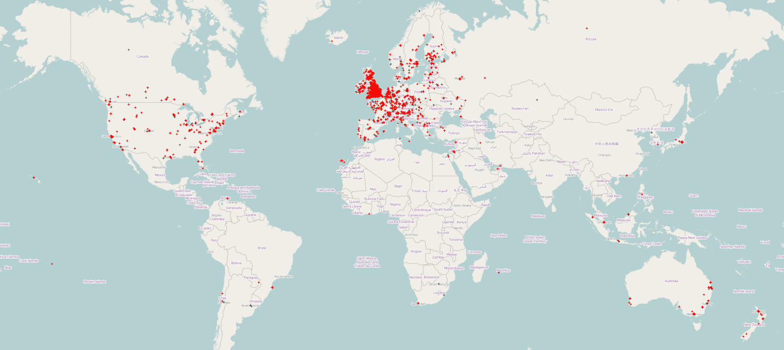
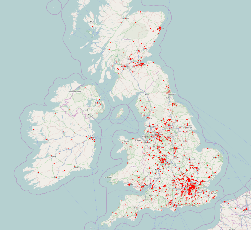
Since the all new (version 2) of OpenOrienteeringMap launched 19 months ago March 2013, almost 7000* maps have been created (4300* in the UK), with around 40000 control features added to them. Above (click for large version) is a map showing where in the world these maps have been created. Below is a zoomed in version for the UK. If your local club hasn’t put on a Street-O yet, then why not ask them to do one – with the map already drawn in OpenOrienteeringMap, putting on a Street-O event has never been easier.

oom_uk

Maps here use background data which is CC-By-SA OpenStreetMap contributors. The background data from the maps, and used in OpenOrienteeringMap, is Copyright OpenStreetMap contributors and licensed under the Open Database Licence (ODbL).

* Planners/organisers will may produce several maps for a single event, as they iterate towards their desired final race map. A new map is created every time they save. If we look at unique map centroids, then the number is 5000 for the world, of which 3000 are in the UK. Additionally, a proportion of maps will have been created without any controls added to them, likely for purposes other than Street-O.

Categories
Orienteering

OOMap 2.2 – Closed Route Crosses

crosses2

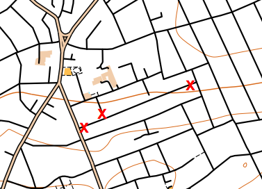
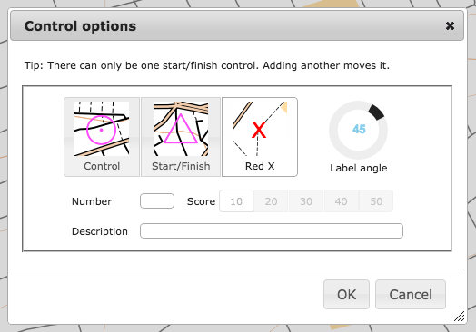
OpenOrienteeringMap 2.2 has been released, with a significant new feature addition – closed route crosses. These allow you to manually mark routes as out of bounds, for example along roads or paths which are private and locked at either end. The crosses are red “X”s, they are added singly, using the same dialog box for adding controls.

It is recommended that you places a little distance away from junctions, so that it is clear which road/path is being marked as closed,(and because the crosses will be sized slightly differently in the PDF that is created). You cannot edit or move existing red crosses, as they do not have an edit button in the control descriptions list, but you can delete all the red crosses you have added with the “Delete Xs” button at the top.

crosses1

I’ve also updated the styles slightly:

  • leisure=garden now included, shown as yellow (open ground). Previously it was shown as olive green (out of bounds) on Pseud-O or as white (not mapped) on Street-O.
  • Waterways in tunnels (such as canals or underground rivers) are no longer shown.
  • landuse=greenfield and landuse=brownfield no longer shown, as these are just legal designations.
  • landuse=construction and landuse=landfill now shown with light pink overlay rather than vertical black lines (Pseud-O) or white (Street-O).
  • On Pseud-O, fences (barrier=fence) are now shown with the fence symbol, rather than the wall symbol.
  • On Pseud-O, sports pitches no longer automatically have a fence shown around them.

The styles are open source, in Mapnik XML format, and can be found here on GitHub.

Why not try out the new feature now!

The OpenOrienteeringMap service is giftware. If it’s useful for you, it helps you run a successful event, or saves you time mapping, please buy me something on my gift-list or buy a print. Or buy yourself something through my Amazon store link. Gifts will encourage further development and offset the costs of hosting the site. The styles are open source (see link above) and you are encouraged to adapt them!

Categories
BODMAS

DataShine: Local Area Rescaling & Data Download

Cross-posted from the Datashine Blog.

DataShine Census has two new features – local area rescaling and data download. The features were launched at the UK Data Service‘s Census Research User Conference, last week at the Royal Statistical Society.

Local Area Rescaling

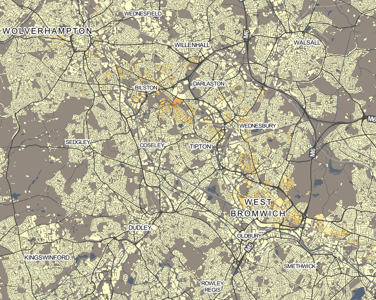
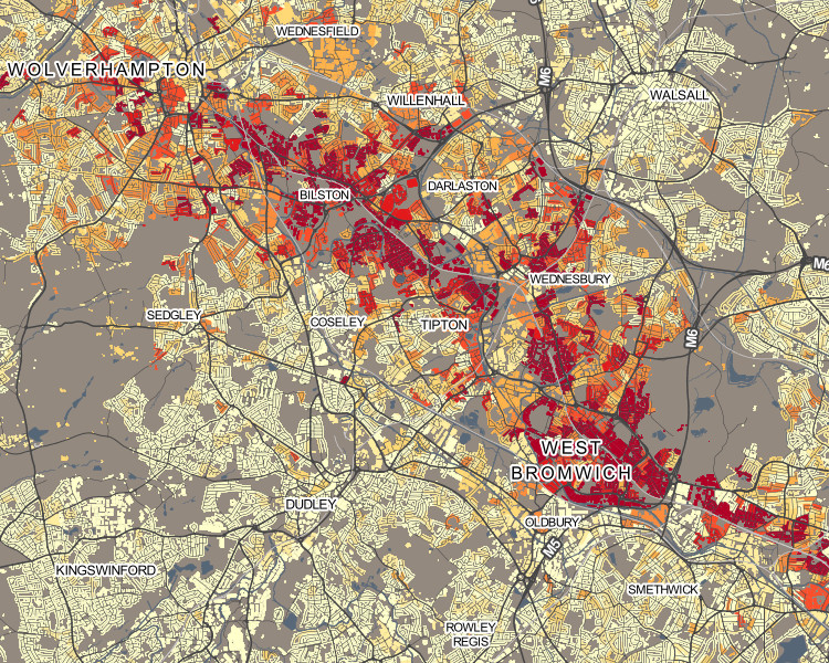
This helps draw out demographic versions in the current view. You may be in a region where a particular demographic has very low (or high) values compared to the national average, but because the colour breakout is based on the national average, local variation may not be shown clearly. Clicking on the “Rescale for current view” button on the key, will recolour for the current view.

For example, the popularity of London’s underground network with its large population, means that, for other cities with metros or trams, their usage is harder to pick out. So, in Birmingham, the Midland Metro can be hard to spot (interactive version):

metro1

Upon rescaling, just the local results are used when calculating the average and standard deviation, allowing usage variations along the line to be more clearly seen:

metro2

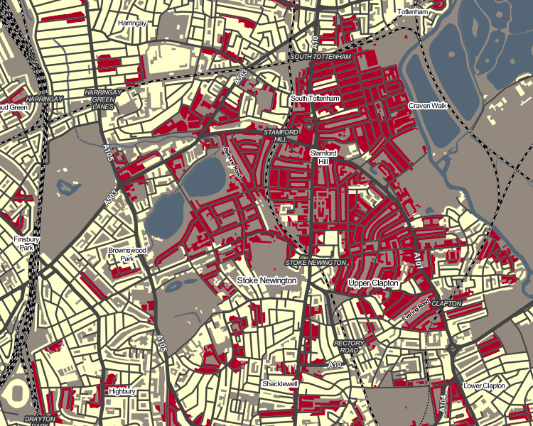
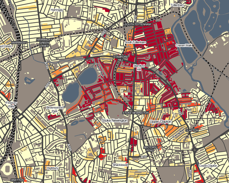
As another example, rescaling can help “smooth” the colours for measures which have a nationally very small count, but locally high numbers – it can remove the “speckle” effect caused by single counts, and help focus on genuinely high values within a small area.

Hebrew speakers in Stamford Hill, north-east London (interactive version):

hebrew1

Upon rescaling, a truer indication of the shape of the core Hebrew-speaking community there can be seen:

hebrew2

Occasionally, the local average/standard deviation values will mean that the colour breakout (or “binning”) adopts a different strategy. This may actually make the local view worse, not better – so click “Reset” to restore the normal colour breakout. Planning/zooming the map will retain the current colour breakout. PDFs created of the current view also include the rescaled colours.

Data Download

On clicking the new “Data” button on the bottom toolbar, you can now download a CSV file containing the census data used in the current view. Like the local area rescaling functionality, this data download includes all output areas (or wards, if zoomed out) in your current view. This file includes geography codes, so can be combined with the relevant geographical shapefiles to recreate views in GIS software such as QGIS.

Next on the DataShine project, we are looking to integrate further datasets – either aggregating certain census ones or including non-census ones such as IMD and IDACI deprivation measures, or pollution.

Categories
London

Working Lines

workinglines_northern

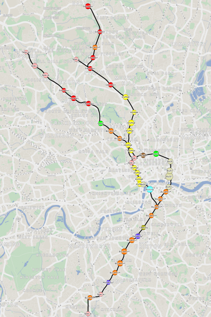
As a followup to Tube Tongues I’ve published Working Lines which is exactly the same concept, except it looks at the occupation statistics from the 2011 census, and shows the most popular occupation by tube station. Again, lots of spatial clustering of results, and some interesting trends come out – for example, the prevalence of teachers in Zones 3-4, that there is a stop on the central line in north-east London which serves a lot of taxi drivers, and that bodyguards really are a big business for serving the rich and famous around Knightsbridge.

The northern line (above) stands out as one that serves a community of artists (to the north) and less excitingly a community of business administrators (to the south). Tottenham/Seven Sisters has a predominance of cleaners, and unsurprisingly perhaps plenty of travel agents live near Heathrow. I never knew that the western branch of the central line, towards West Ruislip, was so popular with construction workers. Etc etc.

Only the actively working population is included, rather than the full population of each area. This makes the numbers included in each buffer smaller, so I’ve upped the lower limit to the greater of 3% and 30 people, to cut down on small-number noise and minimise the effect of any statistical record swapping.

Categories
Data Graphics London

Tube Tongues

tubetongues

I’ve extended my map of tube journeys and busy stations (previous article here) to add in an interesting metric from the 2011 census – that of the second most commonly spoken language (after English) that people who live nearby speak. To do this I’ve analysed all “output areas” which wholly or partly lie within 200m radius of the tube station centroid, and looked at the census aggregate data for the metric – which was a new one, added for the most recent census.

See the new map here.
Also available as an A2 print.

tubetongues_vicEach tube station has a circle coloured by, after English, the language most spoken by locals. The area of the circle is proportional to the percentage that speak this language – so a circle where 10% of local people primarily speak French will be larger (and a different colour) than a circle where 5% of people primarily speak Spanish.
Language correlates well with some ethnicities (e.g. South Asian) but not others (e.g. African), in London. So some familiar patterns appear – e.g. a popular, and uniform, second language appearing at almost all Tower Hamlets stations. Remember, the map is showing language, not origin – so many of the “Portuguese” speakers, for instance, may be of Brazilian origin.

Click on each station name to see the other languages spoken locally – where at least 1% of local speakers registered them in the census. There is a minimum of 10 people to minimise small number “noise” for tube stations in commercial/industrial areas. In some very mono-linguistic areas of London (typically in Zone 6 and beyond the GLA limits) this means there are no significant second languages, so I’ve included just the second one and no more, even where it is below 1% and/or 10 people.

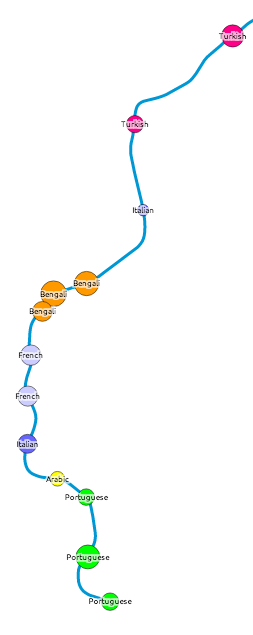
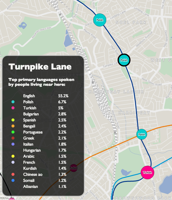
This measure reveals the most linguistically diverse tube station to be Turnpike Lane on the Piccadilly Line in north-east London, which has 16 languages spoken by more than 1% of the population there, closely followed by Pudding Mill Lane with 15 (though this area has a low population so the confidence is lower). By contrast, almost 98% of people living near Theydon Bois, on the Central Line, speak English as their primary language. English is the most commonly spoken language at every tube station, although at five stations – Southall, Alperton, Wembley Central, Upton Park and East Ham – the proportion is below 50%.

turnpikelane

A revealing map, and I will be looking at some other census aggregate tables to see if others lend themselves well to being visualised in this way.

I’ve also included DLR, Overground, Tramlink, Cable Car and the forthcoming Crossrail stations on the map. Crossrail may not be coming until 2018 but it’s very much making its mark on London, with various large station excavations around the capital.

The idea/methodology is similar to that used by Dr Cheshire for Lives on the Line. The metric was first highlighted by an interesting map, Second Languages, created by Neal Hudson. The map Twitter Tongues also gave me the idea of colour coding dots by language.

One quirk is that speakers of Chinese languages regularly appear on the map at many stations, but show as “Chinese ao” (all other) rather than Cantonese, whereas actually in practice, the Chinese community do mainly speak Cantonese (Yue) in London. This is likely a quirk of the way the question was asked and/or the aggregate data compiled. Chinese ao appears as a small percentage right across London, perhaps due to the traditional desire for Chinese restaurant owners to disperse well to serve the whole capital? [Update – See the comments below for an alternative viewpoint.]

The TfL lines (underground, DLR etc), station locations and names all come from OpenStreetMap data. I’ve put the collated, tidyed and simplified data, that appears on the map, as GeoJSON files on GitHub – see tfl_lines.json and tfl_stations.json. The files are CC-By-NC, licensing information is here.

Categories
Munros

A Trio of Munros in the Ben Alder Forest

IMG_1211

I climbed three Munros in the Ben Alder Forest area yesterday. This is the eastmost part of large tract of wilderness in the Scottish Highlands, stretching from Loch Ericht (between Dalwhinnie and Rannoch) all the way over to Glen Nevis (near Fort William). No public roads cross the area, and just one railway line, the West Highland Line. Ben Alder itself is a Munro of considerable bulk and height (1148m), it is hard to get to, requiring a long walk eastwards from Corrour station, northwards from Loch Rannoch or southwards from Dalwhinnie. I took the last option, taking advantage of a newly upgraded estate road to cycle the first 14km of the route to Loch Pattack (450m elevation), which took around 50 minutes – the well packed track generally passable on my road bike, apart from a sandy section near the end.

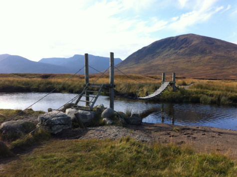
Shortly after crossing a wobbly suspension footbridge (pic above) across the loch inflow, I left the bike and climbed onto and up the easy-sloping ridge of Carn Dearg (1034m) from where there were fine views, both to Ben Alder and more immediately the Lancet Edge, a sharply pyramidal ridge leading up to another Munro I had climbed a few years before. I dropped down below the Lancet Edge, traversing a corrie and a valley at 600m before climbing up 100m to the Long Leachas. This is one of a number of ridges leading onto Ben Alder and it is in a spectacular location. The ridge offers easy scrambling, always with a bypass path. It is scenic and so makes the climb up to 1050m almost effortless. Near the top, it narrows, and keeping to the crest of the ridge offers numerous short and easy scambles over various boulders. From the top of the ridge, it is a 1.5km walk across the plateau to the summit of Ben Alder itself. Just below the summit lies the ruins of a small house – built by the team of the original Ordnance Survey surveying expeditions. Shortly after is a small lochan – at 1100m altitude, presumably one of the highest bodies of water in the UK.

IMG_1235

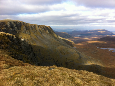
The best views are from the ridge following on from the summit (see pic above), particularly looking north down the cliffs to a large loch and over to the Monadhliath Mountains. Looking the other way, Loch Ossian, with its wonderfully remote youth hostel, is also visible.

It is best not to follow the ridge eastwards too far from Ben Alder’s summit, as it curves around to the north and then ends in cliffs on three sides. So I came off the ridge early, aiming for the high bealach (840m) and then it was a quick ascent up Beinn Bheoil (1019m), the last of the three. There is a small top just to the right, on the way up, that has a fine view over Loch Ericht – the loch is a reservoir, dammed at both ends as it crosses over Scotland’s east/west watershed.

After Beinn Bheoil, I continue northwards along the largely flat and easy ridge, then coming off it to the left and hitting a well made stalkers’ path, that leads down to the river, to a bridge across it near Culra Bothy (now closed) and finally back to Loch Pattack and my bike, exactly six hours after I left. I’d walked 22km and climbed 1450m. The return along the estate road, to catch the evening train home, was done with care, as it was by now twilight.

Route.

Categories
Conferences

Conference Review: GIScience 2014

IMG_0953c

I was in Vienna for most of last week, presenting at a satellite workshop of the GIScience conference, before joining the main event for the latter part of the week.

GIScience is a biennial international academic conference, alternating between America and Europe. At the intersection between geography, GIS and information visualisation. It is very much academically focused, which contrasts strongly with FOSS4G (GIS technology), WhereCamp (GIS community) and the AGI (GIS business).

My highlights for this year’s conference:

  • Jason Dykes (City) gave a keynote on balancing geovisualisation and information visualisation. As ever with presentations from City’s GICentre unit, the graphics were presented by way of various live demos and compellingly explained.
  • UCL Geography/CEGE had a strong presence of the conference and various of my colleagues gave presentations, a number focusing on using geolocated social media, both as a tool for research (e.g. population synthesis) and for research itself. There was also an unveiling of LOAC (UCL/Liverpool), a classification specially built for London, further details on this to follow soon as LOAC is signed off and rolled out.
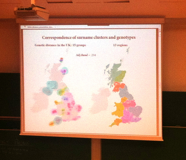
  • Another UCL Geography presentation on comparing surname clustering and genotype clustering in the UK
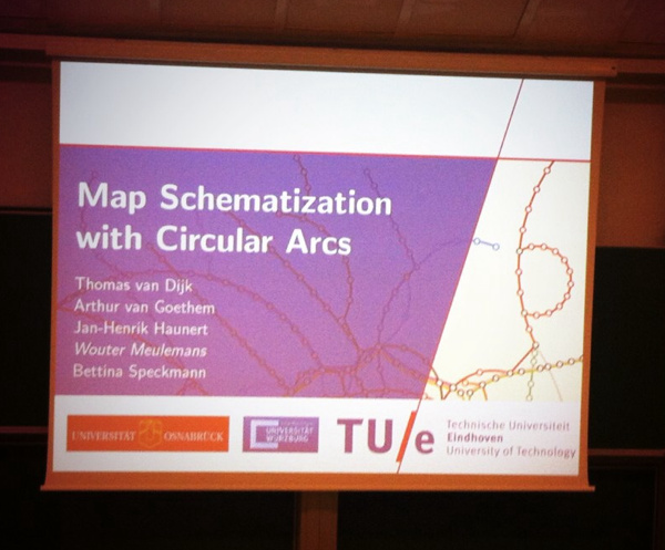
  • A interesting presentation from TU Eindhoven on automatically creating and simplifying network diagrams using circular arcs.
  • Automatic Itinerary Reconstruction from Texts (LIUPPA/Pau) – showed how a fairly accurate map can be made simply by scanning prose, and otherwise unknown locations of places can be roughly determined by their textual relations to other, known places.

Many of the talks appear in an LNCS proceedings book.

Outside of the conference, much Wiener Schnitzel and Gelato was consumed, and historic old Vienna was explored. A highlight was conference drinks in the huge barrelled halls underneath the very grand city hall.

IMG_0963ec

Categories
Conferences Geodemographics

Mapping Geodemographic Classification Uncertainty

oxford_sed

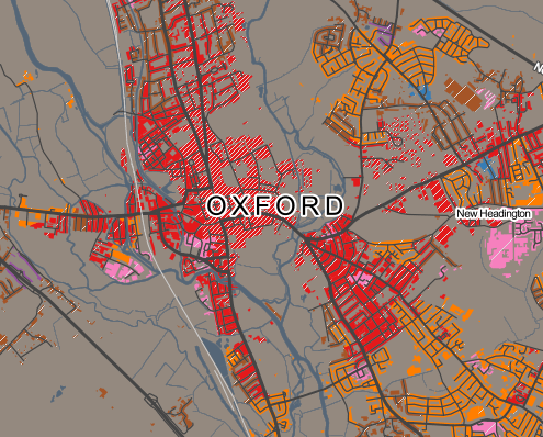
I’m presenting a short paper today at the Uncertainty Workshop at GIScience 2014 in Vienna, looking at cartographic methods of showing uncertainty in the new OAC 2011 geodemographic maps of the UK using textures and hatching to the quality of fit of areas to their defined “supergroup” geodemographic cluster.

Mapnik was used – its compositing operations allow the easy combination of textures and hues from the demographic data and uncertainty measure onto the same tile, suitable for displaying on a standard online map.

These are my presentation slides (if you get a bandwidth message, try refreshing this webpage, or download here):

You can download a PDF of the short paper from here.

A special version of the OAC map, which includes the special uncertainty layers that you can see in the paper/presentation, can temporarily be found here. Use the extra row of buttons at the top to toggle on/off uncertainty effects, and see the SED scores at the bottom left, as you mouse over areas. Note that this URL is a development one and so likely to change/break at some point soon.

Background mapping is Crown Copyright and Database Right Ordnance Survey 2014, and the OAC data is derived from census data that is Crown Copyright the Office of National Statistics. Both are used under the terms of the Open Government Licence.

Categories
Data Graphics Geodemographics

A Result/Turnout Correlation for the Scottish Independence Referendum?

graph_corr2

A final update to my Scottish Independence Referendum Data Map – the circle borders now show the turnout percentage, with the highest (>90%) as a solid green, the lowest showing as red.

There is a weak (R^2 = 0.177) negative correlation between the Yes vote %, and the Turnout %, suggesting that the Yes campaign had more difficulty in getting its supporters to vote on the day. This may be due to the traditional tendency for older voters to turn out more than younger ones, and the polls suggesting that younger people were more likely to vote Yes. (The BBC has more on the demographics of the Scottish voters.)

You can see this weak correlation on the map, with green-borders (high turnout %) on red circles (low Yes %), and some of the bluer areas (high Yes %) having red borders (low turnout %), although East Dumbartonshire is a noticeable exception.

map_corr