Categories
Conferences Geodemographics

GISRUK 2014 (Part 2)

Following on from part one of my conference review, here are my favourite talks from the middle part of the conference.

Social media and spatial modelling – Tweets and museums

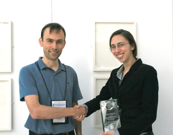
Robin Lovelace (Newcastle) won best paper at the end of the conference, for this talk on examining tweets “geofenced” around many local museums, to see from where these people travelled and what they had to say about the museum.

Agent Based Models and GIS for disaster zones

Sarah Wise (George Mason University & UCL) presented a chapter from her Ph.D on the use of GIS in immediate post-disaster zones, focusing on the Haiti earthquake. OpenStreetMappers quickly mapped Port-au-Prince and other badly damaged areas, using satellite and aerial imagery made available, and Sarah studied the resulting crowdsourced GI information. An agent-based model was then used, with the fractured road network, to model how survivors would move to locations where food and other aid was made available, the visualisation of the model output showing how well different areas, some with considerable damage to the road network, were served in the days after the disaster. Sarah won Best Paper on Spatial Analysis which is awarded by CASA based on submitted abstracts for the conference.

OVsLGyDB

Visualising activity spaces of urban utility cyclists

This talk by Seraphim Alvanides (Northumbria) showed that utility cyclists – those aiming to get from A to B as efficiently as possible – are often poorly served by dedicated cycling infrastructure. Where a road route is shorter than a cycleway, more people than you might expect will take the former, and the talk showed some graphics of flows along roads and paths to demonstrate this.

Exposure to air pollution: the quantified self

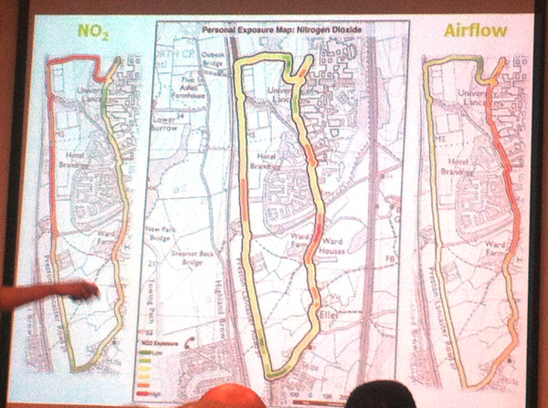
Jonny Huck (Lancaster) gave one of my favourite presentations of the conference, and certainly one of the most visually impressive. It first explored personal sensors (for heart rate, breathing etc) and the internet of things (with small internet-connected devices), then combining the two to detail a device, based on Arduino, e-Health, Waspmote and Android, for monitoring exposure to pollution – combining breathing rate and air pollution levels – for a walk around the campus at Lancaster University, where climbing up steep hills in the campus had as much impact as walking alongside major roads. It’s early stage research and I’m not sure the very intrusive breathing monitor is going to catch on, but certainly points to a quantified future. At CASA, we have started to acquire and evaluate personal and environmental sensors, with FitBits and pollution sensors in the office, so a CASA-centric approach to this kind of research might not be too far off.

IMG_5776

The final session of the day took the form of a series of plenaries about interdisciplinary research. While some of these were interesting in their own right (particularly, an unexpected one on cellular biology!) I didn’t get as much out of them as I did from the paper sessions.

At the end of the second day of the conference most people went to the dinner – I didn’t have a ticket for this though, so headed back to central Glasgow with Addy, who’s written up his thoughts on the conference here on the EDINA Go-Geo blog. My comments on the final day will appear in the final part, tomorrow.

Categories
Conferences Geodemographics

GISRUK 2014 (Part 1)

I was at the Geographic Information Systems Research United Kingdom (GISRUK) 2014 conference last week. GISRUK is the key GIS conference for early-career academic researchers in the UK and Ireland, and is hosted by a different university in the British Isles each year. The audience are mainly UK academics, with young researchers and professors in roughly equal attendance, along with some academics from abroad, including Malaysia, Nigeria and Canada. They are definitely more geo and less tech, the conference being relatively quiet on Twitter, especially compared to conferences such as State of the Map or Wherecamp EU.

This year the conference was hosted up at Glasgow University. Being tucked into the Easter break might have meant a reduced attendance on previous years. However, there were many good talks in the two parallel streams that ran through the three days of the conference – some 50 talks altogether, plus plenaries – and some talks were very popular, with attendees just about squeezing in to the venue.

In this post (and in the second and third parts, to follow) I’ve highlighted the talks that I found the most interesting. Of course, with two streams, there were inevitably interesting sessions which overlapped, and so I may have missed some of the best of all – in a couple of cases I ended up changing room half-way though a session. I’ve paraphrased the talk titles here.

Streets vs landmarks for text-based directions for pedestrians

This talk, given by William Mackaness from Edinburgh, was on an interesting study monitoring how people get from A to B, given one of two kinds of text directions – landmark based “turn left at the Bank of Scotland branch coming up on the left” or street based “continue on George Street, turn left onto Frederick Street in 500m” and monitored, with GPS and movement sensors, how well they moved through the urban realm, with landmark based directions proving better. Of course, these are harder for automated systems as street names a more uniform and consistent storage type than landmarks.

Clustering landmark tags in urban images

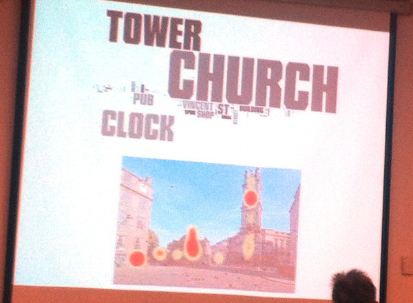
This was probably my favourite talk of the whole conference. By the same team as the above, it was presented by Phil Bartie (St Andrews) and outlined algorithms used to detect buildings and other landmarks from photos, by looking at where people tag interesting features in set photographs, how they tag them, and then linking the tags and locations together to try and separate visually close (but distinct) features, and combine different elements of the same feature that are spatially far apart. The heatmap examples used in the talk were compelling.

IMG_5764

Using social media data to assess crime hotspots

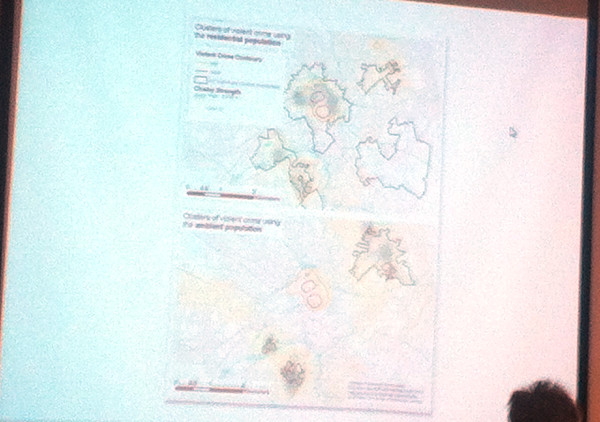
Nick Malleson’s (Leeds) talk looked at tackling the “daytime population” problem – crime statistics tend to exaggerate city centres, as these have a large daytime population but a low residential (i.e. census/official) population, which areas are typically normalised by to produce a crime rate. By looking at georeferenced social media activity as a proxy for daytime population, the city centre hotspots disappear and move into the most deprived suburbs – although these need to be controlled also by a possible lower-than-average use of social media in such areas.

IMG_5765

Exploring links between coal-mining, deprivation and health

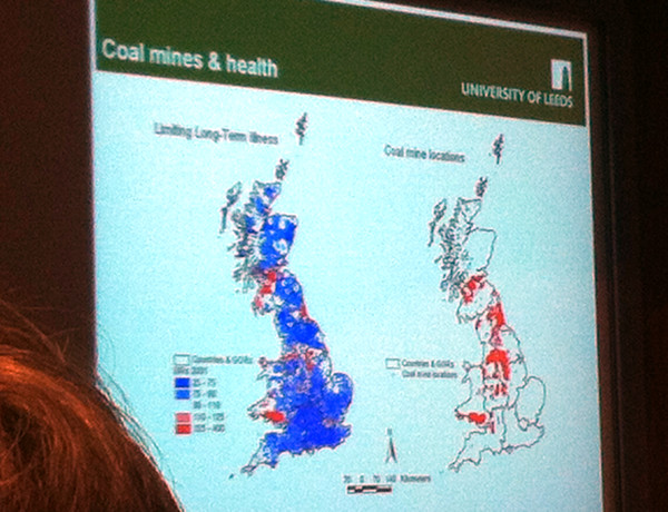
This known link was mapped out well by Paul Norman (Leeds), using some great maps of the relevant census data. The talk included a potted history of coal mines and their phased closures. The study was longitudinal – combining statistics over multiple censuses, with data on opening and closing of mines (mine opening dates often being hard to determine).

IMG_5771

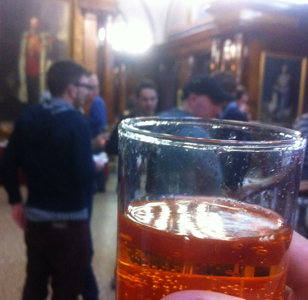
At the end of the first day of the conference, therewas a reception at the opulent City Chambers in the centre of Glasgow, where I had the novelty of being served a glass of Irn Bru (Scotland’s other national drink, and tougher to find in London) by a waiter, in a room surrounded with marble and various paintings of former council leaders!

IMG_5769

Part two to follow tomorrow. Addy Pope at EDINA Go-Geo has also reviewed the conference.

Categories
Leisure

Kelpies and the Wheel: Falkirk on the Tourist Map

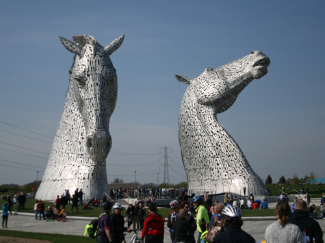
Falkirk, sitting between Glasgow and Edinburgh, but not with the fame of either, isn’t on the normal tourist trail for Scotland, however it does now have two excellent attractions at each end of town – the Falkirk Wheel canal lift, which opened in 2002 at the junction of the Union and Forth & Clyde Canals and is unique in the world; and the Kelpies, two huge sculptures of horses in The Helix, a modern park in the scrubland between Falkirk and Grangemouth which opened today.

The Kelpies are a pair of huge steel horse heads, positioned near the point where the Forth & Clyde canal meets the Firth of Forth. With a motorway on one side and two canal sections on the other, it’s an isolated spot, but great for an iconic sculpture, with a brand new lock being positioned right between the sculptures themselves.

IMG_1987

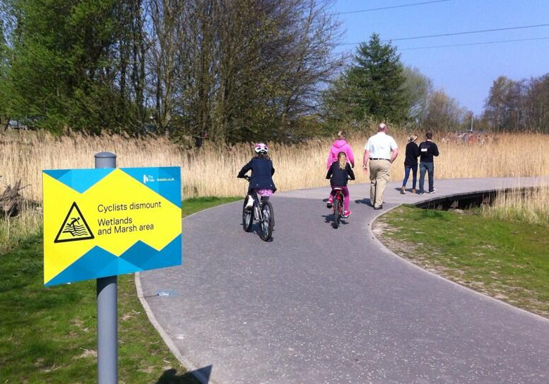
The Kelpies are part of a new park, The Helix, which sits in a no-mans land between Grangemouth (of oil refinery fame) and Falkirk, with a number of other communities – Polmont and Larbert – not far away either. It consists of a number of new cycle paths, connecting these various communities, through a modern park (various bridges, small water features and curved paths) which reminds me a little of the new Olympic Park back in London. It was great to see so many cyclists using the park already, although the appearance of a no-cycling sign on one section was a bit silly:

BlwF4PWIMAAO1DN

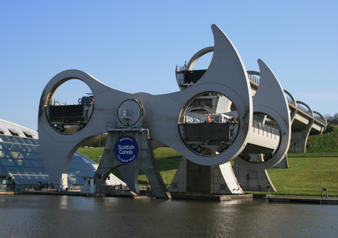
The Falkirk Wheel, a few miles away from the Kelpies to the south-west, acts as a ship lift, moving canal boats between two canals which have a considerable vertical difference. Because both boat “pens” have the same mass (of water and/or boats displacing the water) the rotation of the wheel is done with a minimum of electricity and noise.

IMG_1997

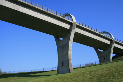
The approach for the higher canal, to the wheel, is also a pretty impressive piece of engineering.

IMG_2004

Categories
Olympic Park

The Orbit

13550401863_be7800f8c9_z

Part 2 of a writeup of a press preview tour of the Queen Elizabeth Olympic Park – thanks to Diamond Geezer for passing his invite to me – see Part 1, about the South Park itself, here.

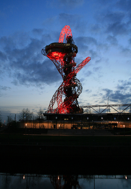
The visit to the South Park was finished up with a trip to the Orbit – the huge red sculpture that is “Marmite” to east Londoners. I hadn’t made it up during 2012 when it was last open, what with needing a combination of a timed Olympic Park ticket and a timed Orbit ticket, both tricky to obtain, with a lot of people presumably wanting to go up it to see what was going on in the Olympic Stadium. I wasn’t convinced that, with a now empty stadium being reconstructed in a park that still has a number of other “brownfield” sites, the view would be that interesting, but was very happy to be proved wrong.

The main viewing platform at the Orbit is 80 metres high – the sculpture itself being 114m tall. That’s not nearly as high as the Shard or even the London Eye, but because east London is still relatively low-rise, and because the surrounding Queen Elizabeth Olympic Park is spacious and not crowded with the buildings of an inner city, the platform gives the illusion that you are actually quite a lot higher.
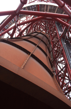
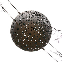
13550326755_6acb06c8d6_bWhile you wait for the lift up you can admire the giant rust-coloured metal bell which fills the lower space. The sculptor insisted on total darkness within the space, so tiny pieces of light shining through rivets and welds had to be fixed, the result is a surreal experience of being below a giant bell-shaped dome, receding into darkness and apparently suspended in mid-air.

Once up in the Orbit itself, there’s a couple of outdoor platforms, facing north-west and south-east – and also an indoor space, from where you can look south-west and also to an inner void looking down the structure of the Orbit itself. The glass was a little bit dusty (maybe from the Saharan weather we have at the moment) and also somewhat reflective, so the experience is much better on the outside platforms. Semi-pro photographers might be perturbed that the outside platforms have quite small mesh fencing, so it’s difficult to poke a DSLR camera lens through for a clear shot. Plenty of space for cameraphones though. Once you’ve drunk in the view, there are a number of helpful and enthusiastic staff in the indoor space, ready to answer your questions on what you were looking at – I tested them out on their knowledge of the Crossrail portal location and the appearance of some allotment huts and they seemed to know their stuff.
13550420653_035e4acb8a_z

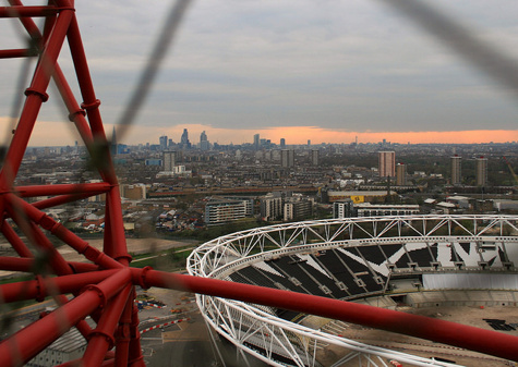
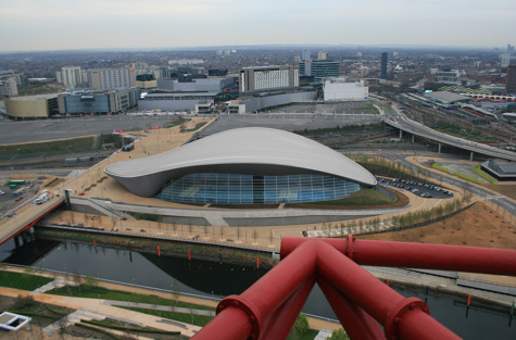
The view over into the Olympic Stadium was more complete than I was expecting – this is simply because the roof and lighting gantries are temporarily gone for the footballisation of the venue. The general city views were also excellent – the City and Canary Wharf clusters of skyscrapers being roughly the same distance away, mean they balanced rather well. Stratford itself is having a go at being a third (smaller, closer) skyscraper cluster and to some extent is managing to pull off the look. Finally, to the east the Aquatic Centre (“Come swim in the World’s Best Swimming Pool”) looks especially impressive when viewed from the Orbit – the famous, and expensive, flowing roof and huge glass side looking particularly stunning from above. Westfield is – to be honest – a bit of an eyesore from high up. Ironically, the older Stratford Shopping Centre looks more attractive, with its colourful “fish scale” wall glinting in the distance. In time, Westfield will get masked by the International Quarter development which will squeeze behind the Aquatic Centre.
13550313875_210b59a364_b

The other thing to note is it’s not all about the view. The primary purpose of the Orbit is not as a building (like the Shard) or a tourist attraction (like the London Eye) but it is first and foremost a piece of public art. A very red, rather large and not at all subtle piece, but an artwork nonetheless – and unmistakably an Anish Kapoor creation. A lot of people will look at its asymmetric, organic skyline, from a distance and think it ugly. I did and still do – from a distance. It delights in being the opposite of Paris’s Eiffel Tower, with a geometry as imperfect as possible. Up close though, it reveals itself as a very complex beast and does have a subtle beauty from certain angles.

One disappointment is that the Orbit will not be open to the public in the evenings – so no great views of sunsets over central London, at least in the summer months. I suspect this is due to a nervousness that it will not attract the level of visitors needed to justify staying open in the evenings – I wonder if the struggling Cable Car has proved that not everything built in London is instantly popular. It’s a shame though as the evening is probably the best time to experience the view. Certainly, being up in the tower, when the pulsating red lights are shining on and from it in the evening, is a bit of a spectacle.

13550626594_44a448cfd2_b

Finally, getting back down is an experience in itself. First you need to pass two large distorting mirrors – a bit of a disturbing sensation if you are already on edge from the height. Then you have 445 steps down in a spiralling cage, initially anticlockwise, then doubling back. The route is not a perfect spiral, so there are some sections with a lot of empty air below the floor! You do still get a view through the cage though, and also up to the Orbit itself.

So, I’m a bit of a convert to London’s new and unsubtle sculpture, with the proviso of course that my trip to see it was free. You want to pick a day of good weather to visit, but the shape of the Orbit itself means it’s more than just another tall building to soak up a view from – the interest is as much inward to the object itself, as outward to the park and London.

All my photos from the South Park preview.
Categories
Bike Share

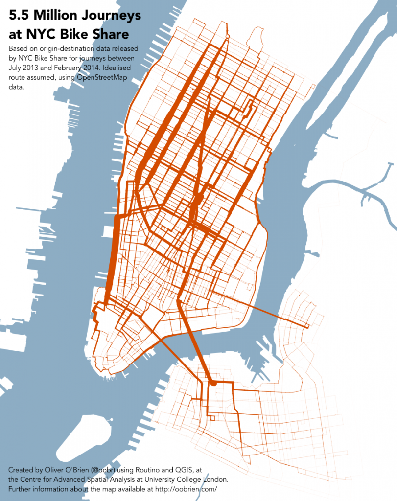
5.5 Million Journeys at NYC Bike Share

nycbikeshare_journeys

[Updated – timeperiod-split maps added] Following on from my London bikeshare journeys graphic, here is the same technique applied with the data released by NYC Bike Share (aka Citi Bike) earlier this week.

If you look carefully at the full size map you can see a thin line heading north-eastwards, initially well out of the bikeshare “zone”, representing journeys between Williamsburg and Central Park, via the Queensboro Bridge cycle path. We see a similar phenomenon for journeys between Tower Bridge and Island Gardens in London. Whether any of the riders actually take this route, of course, is open to question – they might take a longer – but more familiar – route, that stays more within the area of the bikeshare.

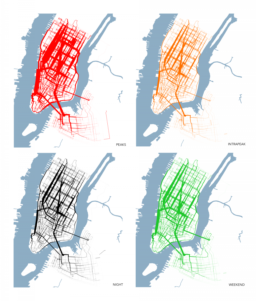
Below is a version of the graphic with the data split into four timeperiods – weekday rush-hour peaks (7-10am and 4-7pm starts), weekday interpeak (10am-4pm), weekday nights (7pm-7am) and finally weekends. The data is scaled so that the same thicknesses of lines across the four maps represent the same number of journeys along each street segment – but bear in mind that there are fewer weekends than weekdays. While, as would be expected, the rush-hour peaks see the most number of journeys, there is less spatial variation across the city, between the four timeperiods, than I expected. Click on the graphic for a larger version.

timesplits

The graphics were produced by creating idealised routes (near-shortest path, but weighted towards dedicated cycle routes and quieter roads) between every pair of the ~330 docking stations in the system, using Routino and OpenStreetMap data (extracted using the Overpass API). Edge weights were then built up using a Python script, a WKT file was created and then mapped in QGIS, with data-based stroke widths applied from the weights.

The routes are only as good as the OpenStreetMap data – I think the underlying data is pretty good for NYC, thanks to great community work on the ground, but there is still a possibility that it has missed obvious routes, or proposed wacky ones. It also doesn’t account for journeys starting or ending at the same place, or journeys where the prime purpose is an exploration by bike – with the user unlikely therefore to take an “obvious” A-B route.

Even with that caveat, it’s still a revealing glimpse into the major route “vectors” of bikeshare in New York City.

Categories
Olympic Park

South Park Opening

13549856023_749a55d723_z

It’s been nearly two years since the Games. The Olympic Park has gradually opened back up in legacy mode, but the central section, near the stadium itself, has remained closed thus far. However the section, known as the South Park, is finally reopening this weekend along with the Orbit sculpture. It’s changed quite a bit, and it’s been worth the wait. I got a preview tour of the new park on Monday – legendary local blogger Diamond Geezer was kind enough to pass his invitation on and I was only too happy to take it up.

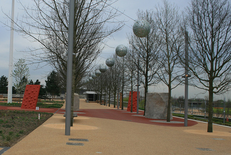
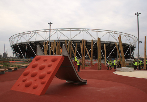
13549758935_0274da160b_mThe tour itself was relatively short – after a visit to the breathtaking (and warm) Aquatic Centre, it was a wander up and down the narrow strip of parkland that sits between two water channels, with the stadium across one waterway and the Aquatic Centre beside the other. Two years ago, this was the main thoroughfare between venues in the park, built to move up to 200,000 people. Now, with the future crowd routes likely to be directly between the stadia and park entrances, the space will not see a huge level of “through” traffic and so the opportunity was taken to turn it into a rather unique park – part designer children’s playground, part traditional promenade.
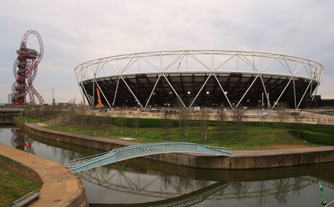
13549746495_50b5df162d_z

Some of the highlights:

  • One of the five bridges that connects the park to the “Stadium” island has disappeared, and its abutment on the park has turned into a bright orange climbing wall.
  • The playground area is quite organic in feel, with strange bumps in the ground, a set of bubbles to climb to get up to the slide, and some carefully hewn rocks beside a sandpit. A fountain trickles water down one of the rocks into the sandpit – it somewhat bizarrely reminded me of a miniature version of the Princess Diana fountain in Hyde Park.
  • The playground spills over into the promenade in places, rather than being in a single place, so removing the traditional fenced off “zonal” feel of regular parks.
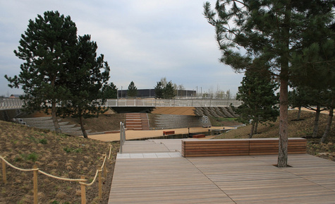
  • There is a small wooden outdoor stage and auditorium near the playground.
  • The area that was known as the Spotty Bridge has opened up – the bridge having metamorphosed into three narrow metallic bridges arranged in an “N” shape. In the resulting void, sets of steps lead down to the lower towpath level and, surprisingly, pine trees have been planted around the area. The strong and pleasant pine smell was not one that I have experienced in London before!
  • There is another fountain feature nearer to the Orbit and Aquatic Centre. It wasn’t working on the day of our visit, but it promises to rival the Russell Square or More London “flat ground” fountains, in terms of interactivity, on a hot day.

13549744855_077859b8a1_z

The Carpenter’s Road lock, which connects the canal and river channels together, has not been restored, which is a shame, but the Canal & River Trust who own the waterway still have plans to do so, and the passage of boats through the channel, surrounded by the three metallic bridges and the wooden seating panels, will be quite a spectacle when it all comes together.

So, although a smaller park than I was envisaging, it’s quite different to a traditional Victorian space such as the nearby Victoria Park, and certainly more interesting than a big slab of grass (you can visit Hackney Marshes for that) or a giant paved space for outdoor concerts that I had feared. It’s clear that the park designers have been enthusiastic about the project and have worked to make it distinctly modern and quite different. Best of all, it will be open 24 hours a day. The area will be gently lit at night – not too brightly as the Lea is London’s “bat motorway” apparently, but enough for it to be a welcoming space at all hours.

I was pleased, when I got home, to discover I had unwittingly taken three photos that were more-or-less the view that I had taken two years ago, shortly before the opening ceremony for London 2012:

  • View from Carpenter’s Road Lock – 2012 vs 2014.
  • The turquoise bridge – 2012 vs 2014.
  • View of the stadium from the South Park – 2012 vs 2014.

Full set of my photographs of the South Park preview here.

Part two, about the legacy-mode Orbit, to follow on Thursday.

13550059194_0da25a4cd1_z

Categories
Data Graphics London

A Census for Open Data in Cities

okfn_census

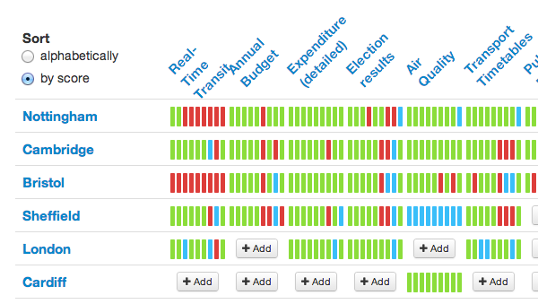
The Open Knowledge Foundation (OKFN) have produced a census for government open data availability for countries around the world, known as the Open Data Index. Each country is assigned scores for 10 attributes on openness and accessibility for each of 10 types of data (such as election results and pollution information). Currently the United Kingdom is at the top of the table.

More recently, OKFN expanded the concept to look at open data for cities within each country, in other words data that is managed at the City Hall level. For example, there is a project page for individual cities within the UK. This time, 15 types of data are examined, again each gaining up to 10 points for openness. The project is still in its information gathering stage so, at the time of writing, only 6 cities have their data partially, or fully, entered. The census for Italian cities, for example, is looking more complete.

Such a census is of great interest when building an application like CityDashboard, which is currently available for eight cities around the UK. Although CityDashboard doesn’t only use open data sources, those which do have documented APIs, open data licences and machine readable formats greatly aid building and expanding a website such as CityDashboard. CityDashboard takes in social media and sensor data, as well as “official” data of the sort that is being categorised by the OKFN project, but some data, such as live running information for metro services, will quite likely always best come from the official sources.

As such, I will keep a close eye on this project. Cambridge and Sheffield look like two promising cities for which the necessary official data is both available and open, which would make implementing them in CityDashboard relatively straightforward.

The census is user-driven and reviewed, so it’s up to you to get information on the availability (or lack) of data for your local city catalogued in the census.

Categories
Olympic Park OpenStreetMap

Mapping the Queen Elizabeth Olympic Park

[Updated – Event webpage here]

The southern section of the Queen Elizabeth Olympic Park opens on 5 April. Much of the northern section is already open.

I’m considering organising an OpenStreetMap mapping party (likely using Walking Papers as a basemap for people) to map the park in its new, legacy mode. Currently, much of the area is shown on OpenStreetMap as it was during London 2012, or as out-of-bounds.

The date is the evening of Wednesday 9 April from 6pm until dark (7:30pm?) followed by beers in The Crate pub. People can then add their discovered detail into the map in their own time or (if they are really keen and bring a laptop/dongle) at the pub.

Post-event pub will be The Crate pub in Hackney Wick, which is right beside an exit to the park, and is a nice pub and brewery that does great pizzas and serves some great beers brewed on site and also Dalston Cola, made just down the street by my bro. It’s a more relaxing experience than the pubs at Westfield.

Stratford is easiest to get to by tube so meeting at Westfield (ground level – that’s UP from the station exit level) at the Westfield end of the big iron bridge that goes over the station, would be the best location. I am planning on setting out from there shortly after 6pm, and then meeting people at The Crate pub (which is at the other side of the park) at 7:30-8pm. The Crate pub is near Hackney Wick station for those who don’t want to walk back across the park afterwards.

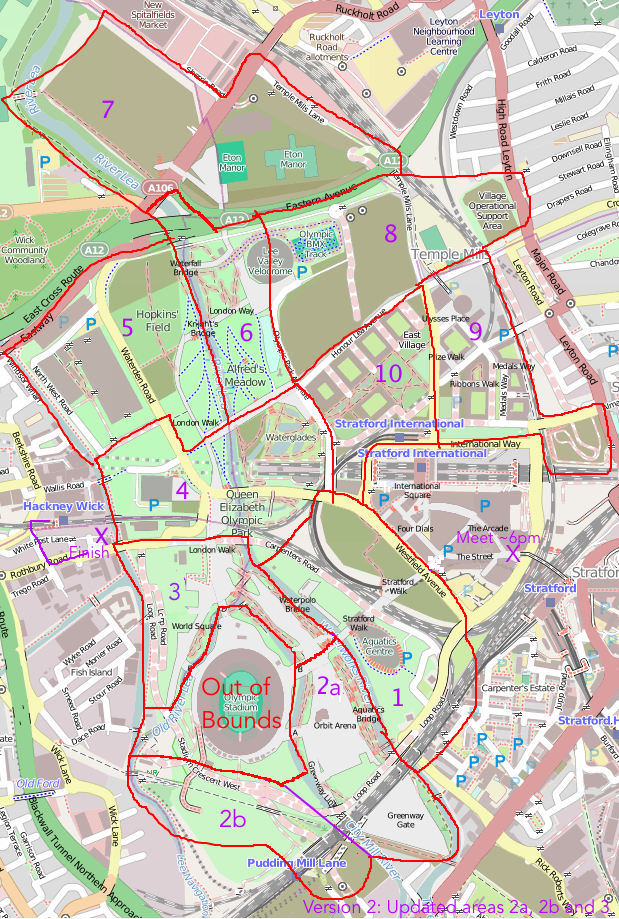
The idea is that everyone picks a slice of this cake – if we get more than 10 people, then we can double-up in the complex central sections, and if we get fewer, then we can concentrate mainly on the central area.

map_qeop

Some notes on the slices:

  • 1. Eastern part will still be a building site but plenty of detail to be both added and removed elsewhere.
  • 2. The southern half of the new South that will be newly opened, includes the Orbit and associated buildings. If time then it’s worth progressing to section 2b – unclear how much of this is open but there are a couple of new links here. The Greenway Gate area may still be inaccessible.
  • 3. Northern half of the new South Park, including the Great British Garden on the other side of the stadium. Lots of natural detail to be added.
  • 4. Not sure if the Waterglades will be open – but if not, some other new detail to add here.
  • 5. May still be under construction in places but definitely some changes from what’s on the map – even simply things like bus stops.
  • 6. The north park is already open but could do with a lot more detail, e.g. the Olympic Rings sculpture, vegetation, and link path to the north.
  • 7. Quite far away and mostly will still be a construction site. Good for someone on a bike.
  • 8. May not be too much to see here as under construction and/or fenced off for the cycling.
  • 9. This part of East Village is partially open and lots of residential detail can be added in.
  • 10. This part of the East Village is mainly closed but some bits, e.g. the park bit, are open.

I will aim to print Walking Papers maps for each of the slices and bring them to the pub.

I’ve added this to the London wiki and Lanyrd. If it’s raining cats-and-dogs on the day we can just go to the pub.

We held a similar mapping party back in late 2011, to map Westfield Stratford City. We based the party at the Cow pub on the edge of the shopping centre. Here’s a neat video that Derick created, showing the map evolving as people added to it, following the party.

Things to add to the map

  • Bus stops (& number of bus service)
  • Car parks (no. of spaces, disabled-bay information)
  • Roads and paths – particularly at park edges/entrances: official or unofficial, walking or cycling, steps
  • Vegetation – woodland, grass, garden, marsh, water
  • Individual trees, if distinctive or ‘street’ trees, ie planted in hard standing or grass
  • Facilities – toilets, concession stands, playgrounds
  • Fences, walls and gates
  • Electricity substations
  • Artworks, sculptures (with name)
  • Traffic lights, zebra crossings
  • Names of areas, places, things – many of these are new – look at what signs say
  • However do not copy names or details from official maps – these may be copyright and not open data
Categories
Data Graphics London

A Changing City – OS Open Data Reveals a Dynamic London

changingcity_detail

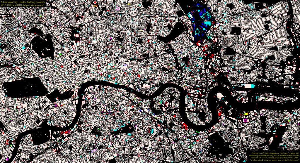
Since launching the data store in early 2010, the Ordnance Survey have been releasing a number of updates to an interesting dataset – VectorMap District – which is a generalisation and simplification of their MasterMap “gold standard” dataset for Great Britain. The updates have been appearing roughly every 6-12 months, and by comparing them in a GIS, you can start to see how places change – at least in the eyes of the Ordnance Survey surveyors tasked to keep the map current. Roads occasionally get built, but building footprints evolve more rapidly – as office blocks and housing developments get taken down and rebuilt with higher capacities or more glass windows.

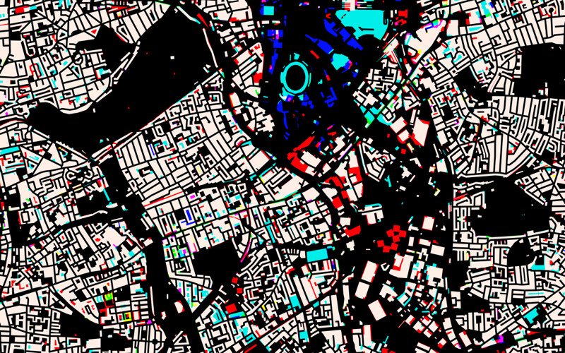
I’ve taken three of the VectorMap District dataset releases – April 2012, September 2013 and March 2014 – combined the data together and used QGIS’s layer compositing operations to show the geographical differences.

The colours tell of the age of the building – bearing in mind that there is a lag of a few months or years between buildings appearing/disappearing in real life, and on the map. For example, the Olympic Stadium, the turquoise oval above, appears in the 2013 dataset but not the 2012 one, even though of course it was finished in 2011, for the London 2012 Olympic Games.

White Building has existed throughout the three years.
Red Building existed in 2012 only (see note below about extra detail).
Purple Building existed in 2012-2013, but has now gone.
Blue Building was new for 2013, but has now gone.
Turquoise Building was new for 2013, still present (see note below about extra detail).
Green Building is new for 2014, still present.
Yellow Building was around in 2012, disappeared in 2013, but has appeared again now.
Black No building existed in any of the three years.

Above, much of the Olympic Park can be seen – the permanent new buildings (turquoise), temporary buildings for the Games only (blue) and demolished for the games and associated planned development (red). Below, the map covering a wider part of London, zones of activity can be seen. For example, demolition associated with the Nine Elms and Deptford Creek developments (red), and major new blocks such as near the Arsenel stadium (yellow).

Important Note

Between the 2012 and 2013 datasets, the Ordnance Survey changed they way they applied the generalisation on the data, so some of the 2012-2013 changes (shown as red on the maps here for reductions, and turquoise for additions) are as a result of this. For example, narrow gaps between buildings, that always existed, are shown for the first time in 2013 in red (building reductions).

As such, my map slightly overemphasises changes between 2012 and 2013. For example, the pitch at Arsenal and the Great Court at the British Museum appear as changes, but they were always there. As a rough rule of thumb, the smaller red/turquoise patches are due to the generalisation changes, the larger areas of colour show genuine change. With this important caveat, the map remains an interesting insight into London changes, and the larger coloured regions give a good indication of parts of London which are undergoing intensive building redevelopment.

The Bigger Picture

Here is the map for central London – click on it to see a full-size version.

changingcity_overall

Categories
Munros

The Munros: 1 – Ben Vorlich

This is the first in an occasional series of chronological posts about Munros that I have climbed. I have so far climbed 206 of the 284-odd Munros – these are mountains in Scotland that are at least 3000 feet (914m) high, with a distinct (but, curiously, not defined) drop between each one and the next. I’m planning to go through the 69 (so far) expeditions where I successfully made it up the the summit of at least one Munro. I’m been keeping track of the Munros I climbed on a Google Map (v2 API – old!) here. The page is old, but has somehow survived my current infatuation with all things OpenStreetMap and OpenLayers. Red pins are climbed Munros and blue ones are those still to do – generally these are well away from the south of Scotland or convenient railway stations.

Expedition 1 – Ben Vorlich

(location)

Ben Vorlich was my first Munro, climbed on 3 May 1992. It was one of the nine trips, carried out once a term in a three-year cycle, by the Junior section of my school’s active and popular Mountaineering Club. Most of these trips didn’t involve Munros, but a couple did, and this one, being right on the edge of the Highlands, was judged OK for kids aged as young as 10 to ascend (I myself had just turned 12). I had been up a few hills before – the 454m Ben A’an in the Trossachs, aged 10, being a highlight, but Ben Vorlich was obviously quite a bit bigger.

I don’t remember too much from the trip, except that, despite an intermittent view at the top, it was a cold, wet and windy day, and I didn’t have a proper outer shell, just a single-layer nylon thing. I developed mild hypothermia (going beyond the shivering stage and into a slightly zen-like state), on the long walk back down the glen to the north of the mountain. This has not happened to me since, but it was scary experience and thankfully one of the adults spotted me in a bad way and gave me a proper cagoule to shelter in for the remainder of the descent. The traditional stop in Callander for fish and chips soon cheered me up again (50 school kids piling off a coach and into the local chippies – so “locking out” the locals for a good half an hour).

One other thing I remember is that one of the kids had this high-tech device, called a GPS receiver. It was a Magellan (Garmin hadn’t really got going with consumer GPSes back then, I think) At the time, the GPS signal was still degraded by the US military – it was just after the Gulf War – so it was only accurate to around 100m. It also had a short battery life, so my friend switched it on every hour or so, waited to get a fix, recorded a waypoint and then switched it off again. Such a device seemed amazing – suddenly, we could “cheat” and find our location on the OS map without having to mapread. But the whole switching on-and-off thing was cumbersome and at the time I thought it was not a practical tool to have.

I don’t have any pics from the expedition unfortunately.