Categories
OpenStreetMap

Milton Keynes Mapping Party

[Updated] I organised a major mapping party in Milton Keynes, a couple of weeks ago. Mapping parties are where a group of like-minded OpenStreetMap mappers get together to tackle a defined area, in the course of a weekend (or weekday evening.) These days in the UK, many of the mapping parties are “second pass” (adding names to roads and features traced from aerial photography) or even “third pass” (adding in points of interest and missing detail, or even building outlines and house-numbers). However, Milton Keynes is unusual in that it was almost entirely unmapped on OpenStreetMap – a “blank canvas”, despite being relatively close to London, the origin of the project. The mapping party was an opportunity to get the active London-based mapping community (currently doing the London Mapping Marathon) together, along with local mappers from Milton Keynes, including those at the Open University campus, and other interested people from further afield. Milton Keynes is a large town, with a low-density structure – its 180,000 residents are spread over an area of nearly 100 square kilometres. As such, a large turnout was going to be key to get the place completed in a single weekend.

[osm_map lat=”52.034″ long=”-0.746″ zoom=”12″ width=”500″ height=”450″ marker=”52.051,-0.795″ marker_name=”wpttemp-red.png”]

The town is rather unusual in its design – a new town, split into numerous self-contained communities connected by a grid-pattern of major roads and roundabouts. This meant the “area cake” – splitting up the target area into segments for people to do individually – was easy to make, although many “slices” of the cake contained a large number of roads.

We did have a great turnout, with over 25 people over the course of the weekend, despite the brooding clouds on Saturday and intermittent rain on the Sunday. Both new and experienced mappers turned up, and we even had a family along, who mapped the central park. Those who hadn’t been before were generally impressed by the dramatic infrastructure of the town, with large, straight and almost empty roads. Milton Keynes is expanding rapidly – it’s set to double in size in the next 20 years – and it certainly has the infrastructure to do so, unlike almost every other town in the UK. This means many of the mapping providers (Google, the Ordnance Survey and Collins) have some of the newest areas completely missing from their maps. In theory, OpenStreetMap would have the most complete map of the town therefore, after we had visited all the areas. However, I underestimated just how far the town is expanding, and, having despatched myself to map one of the newest areas (Oxley Park and Westcroft in the far west of the town) I noticed several brand new suburbs which were not on any map. Unfortunately I ran out of time to completely map them all, having only given myself the Sunday afternoon to map, with Saturday spent organising things at the HQ. Having a dedicated meeting room in a hotel was a definite bonus (thanks to Twain for organising) but it was still a busy day with so many people converging at once.

The other aspect of the town that many found equally impressive and difficult to map, are that the town has three separate networks – the roads network, consisting of the grid roads and very wiggly interior roads, a comprehensive path network joining many of the cul-de-sacs together, and a large and complete cycle network – the “Redway” network, which is designed as an “alternative” set of highways for bikes. Unfortunately cycling in Milton Keynes has never really caught on – the distances are just too far – so this huge, dedicated network is almost completely unused. However the mappers on bikes found it a good, fast way to get to their allocated slice, and we tried to map as much of all three of the networks as we good.

In the end we just about finished the whole town – a few slices were left for local mappers to complete, and one of the London mappers even went back the following weekend to “third pass” the central business district, adding in the hotels and bars. I’m also back in the town in two weeks, I’m not planning on doing any active mapping but will check out our efforts on the newly rendered map.

Being a GIS enthusiast, the best bit of the weekend was getting together all the GPX traces and creating the party render. You can see the animated version here.
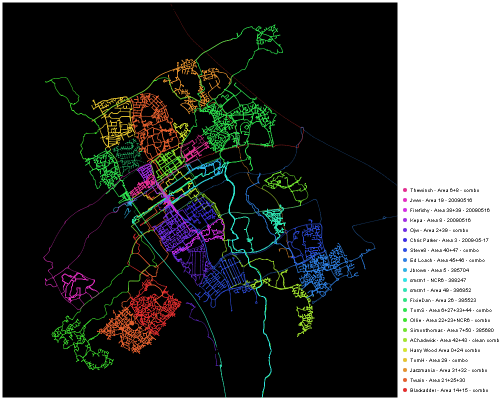
mkpartyrender

The second best bit of the weekend was making a special trip to visit the famous Concrete Cows:
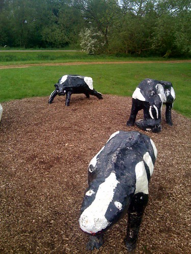
Why Are You Taking a Photo of Me?
They are marked with the pin on the map above.

[Update – animation link fixed.]
Categories
Leisure

London to Oxford

[Updated] I cycled from London to Oxford yesterday, initially taking quite a southerly route out of London, before heading north-west. This was to ensure that the Thames was followed for as long as possible, minimising climb, and because the more direct routes, via High Wycombe or Amersham, are in deep valleys with only major roads (e.g. the A40) – or very steep roads – going up them. As well as being beside the Thames at both the start and the finish, I crossed it three times – at Teddington, Chertsey and Henley.

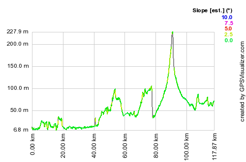
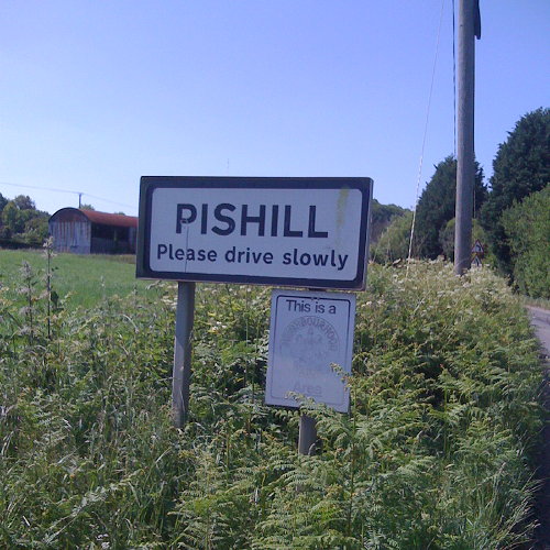
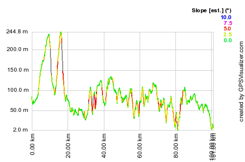
The route was 118km from London Bridge to the centre of Oxford, and had only one big hill – the 200m concave climb out of Henley up onto Christmas Common at the top of the Chilterns. Following the Thames here would mean taking a very long detour down to Reading and back up through Didcot. The Henley to Oxford road is a B-road but is actually very quiet, and was very pleasant to follow. It goes through the legendary hamlet of “Pishill”.

There were two large drops – one on the immediate approach to Henley which is a 10% gradient down around 80m – I hit around 50km/h here. This was however beaten by the 60km/h descent on another 10% gradient drop, at the top of the climb up into the Chilterns.

I was aiming to get to Oxford for around 4pm, to gatecrash the end of the Pembroke College Garden Party and then hopefully watch the end of the summer VIIIs regatta on the river. As I was on my own, I pushed the pace all the way, and only took brief stops. I completed the 118km route in 4h50, plus around 50 minutes of stops and breaks, an average of around 25km/h including hills, which is far above my planned pace for my Thurso to London trip later this summer.

I’m pleased to have completed this ride, in good time and without much effort, as my previous attempt, cycling from Oxford to London around five years ago, ended at Reading. I was on a very old hybrid bike and had optimistically started at 3pm in the afternoon, following National Cycle Route 5, which takes a very meandering route with lots of climb through the Chilterns, rather than following the river as I had hoped.

The route: This is the “idealised” route, routed using OpenStreetMap and Google Maps routing data, rather than my actual route, which included a couple of wrong turns and unplanned detours, largely due to quirks in the routing. I took no map, trusting completely in my Garmin Forerunner 305 turn-based directions, created using Bike Route Toaster, which also creates and loads onto the GPS a profile map – useful for counting down to the top of the climbs.

[osm_map lat=”51.58″ long=”-0.69″ zoom=”9″ width=”500″ height=”300″ gpx_file=”/files/2009/07/londontooxford.gpx”]
lonoxfordprofile

[Update – GPX file here]

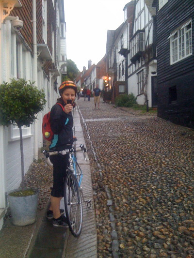
img_0361

Categories
Mashups

ScenicOrNot

Those clever and inventive people at MySociety have created another slick website – now you can rate each square kilometre of the UK to help build up a map of the country’s prettiness.

See here to start voting! You’ll see a near-randomly selected photograph of a place in the UK – click 1-10 above the photo and you are on to the next one.

I hope that the Scottish Highlands come out very well – they certainly should do, many parts are very pretty when it’s not raining there…

I must declare a personal interest, as some of the photographs out there are mine. The scores for mine are pretty middle-of-the-road, as when I joined the Geograph project (which is where the photos are coming from) all the scenic areas near me had already had been well photographed.

Categories
OpenStreetMap

Testing the OpenStreetMap WordPress Plugin

[osm_map lat=”51.525″ long=”-0.134″ zoom=”17″ type=”Mapnik” width=”500″ height=”300″ marker=”51.525,-0.134″]The Pearson Building, UCL Geography.

Very nice. Hopefully there will soon be an easy way to put a pin on the map using this plugin. [Update: It’s been added – thanks!]

Categories
Data Graphics

A Collection of Poor Data Graphics

This BBC article on the budget contains no less than six data graphics – and there’s something wrong with every single one.

By “something wrong”, I mean either:

  • I have to concentrate on the graphic, rather than just glance at it, to understand what it is trying to show, or
  • The numbers are distorted by the graphic – the worse kind of “wrong” as a glance at it could mislead.

The issues are:

  1. UK Budget Deficits: Apart from the unwieldy x-axis labels, showing every second fiscal year, my main gripe is the projected section of this stacked bar chart. It only works because the three projections don’t “swap over” their values at any point. But I still had to look at it for longer than necessary, to realise that the “upper value” stacked bars run “behind” the lower ones.
  2. Long-Term UK Government Debt: The use of a line chart, with smoothly flowing lines, rather than bars suggests that there are values available on a more frequent basis than every year – or that the joins between each yearly point are just artistic and so misleading. If the former, then having the unwieldy “fiscal year” x-axis, with ticks every five years, is unnecessary – why not just shift the tick marks back by 4 months and have normal years? This would be considerably easier to read. If the latter, then that’s just plain misleading!
  3. Treasury Growth Forecasts: The worst one of all. The addition of direction arrows above the positive bars (or below the negative bars) – with the value between them and the bar, and the arrows coloured the same, made me assume the bar ran up to the top of the arrow – massively increasing the value of the 2010 independent forecast, for instance. Not sure why the colours needed to change from the first chart, either, seeing as at least two of the categories have the same source in both charts.
  4. UK Claimant Count: This is a simple sequence of choropleths and as such really shouldn’t be a Flash-based chart – this is trivial to do in HTML/CSS alone, never mind Javascript. The colour sequence is odd too – a series of blues suggesting a value-based ordering, which then arbitrarily switches to purple for the final one/two bins. (The legend changing slightly for the last two!) The choropleth is also too small, so show the needed detail.
  5. Government Spending/Taxes: 3D pie-charts, tut tut! The tilt exaggerates the values at the front, making them seem bigger than they are.
  6. UK Rescue Plans: The circles are correctly scaled in 2D rather than 1D – a common mistake averted. However, they unnecessarily overlap with each other, so partly obscuring the genuine ratios

The Beeb designers need to take a read of Tufte and not go down the Microsoft Excel route!

Categories
Orienteering

At-a-Glance Courses

Course Indicators
I’ve added a new feature to the map of orienteering events – you can now see the range of available courses for each event, via the set of coloured boxes on the right hand side. Mouse-over or click a box for more details.

I’ve also refined the links to the road-maps and the Geograph photos, and added in the region that each event is in, you can also filter by the region. Due to a quirk with the data source at British Orienteering, this information is only available ten weeks into the future, hence why the Scottish 6 Days don’t yet show as being an event in Scotland.

Finally, there is now a way to pre-filter the results (and pins on the map) to be for a certain region or club – this is an “undocumented” feature, to access it you append an “&c=club” or “&c=region” to the end of the URL, using the acronym for the club or region concerned. Use NIOA, SOA and WOA for Northern Ireland, Scotland and Wales respectively, and the two-letter codes for the English regions.

For example, to show all the events in the south-east of England (SEOA region) use http://www.oobrien.com/map/?p=E1&c=SE.

Categories
Conferences

MSc Dissertation

Last year (2007-8) I studied for an MSc in Geographic Information Systems, at City University London. The course was taught by an excellent team of academics and I can thoroughly recommend it as a good, technology-focused introduction to GIS. The highlight was the field-trip, a week away in the Lake District, carrying out three two-day projects, each involving planning, data gathering, preparing and presenting the findings.

The summer last year was spent researching and writing the dissertation. It is entitled “Use of a GIS for Production and Maintenance of Street Orienteering Maps: Can a GIS and Spatially Aware Data add Value to Orienteering?” and can be downloaded from here (24MB, 102 pages).

You almost certainly don’t want to read 102 pages, so there is an extended abstract here (1MB, 5 pages), entitled “Creating and Maintaining Street Orienteering Maps using OpenStreetMap”, which appears in the “Proceedings of the GIS Research UK 17th Annual Conference”, aka GISRUK 2009. I presented a poster summarising the work at the conference, which is reproduced below – linked to a larger version.

Poster for GISRUK 2009
Categories
Uncategorized

Dopplr

I’ve had a Dopplr account for a while now. It’s a rather cool service for basically saying where in the world you will be. It’s a shame that not many people I know are on it, as like all social networking sites, it gets better and better as your network moves onto it.

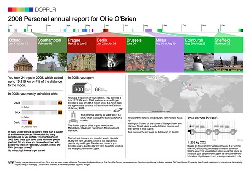
One unexpected freebie that Dopplr did at the end of last year is take everyone’s historical data and create a personalised report of what they did in 2008. In the usual Dopplr style, it’s attractively presented and a little quirky – with the famous city colours (each city has a colour associated with it, based on a conversion of its name into hexadecimal).

Here’s mine for 2008 – it links to a larger version on Flickr:
My 2008 Dopplr Report

I only made two foreign trips last summer, and so far only have one planned this year, although it will be a lot further away than in 2008.

Categories
Leisure

London to Brighton – Again

I’ve already cycled from London to Brighton, but my new housemate suggested it on Saturday morning as it was such a nice day, so off we went.

The route and profile were pretty much the same time, so I won’t repeat them again here. The only variations were starting a couple of miles further back (as I’ve moved house), taking a pleasant detour through Tooting Park as Clapham High Street was closed, and not doing the kilometre-lengthening bit along Madeira Drive in Brighton itself. We also started earlier (just before midday) so the sun set this time when I was on the top of Ditchling Beacon, not at the bottom of it.

The traffic was noticeably busier, both in London and along the country lanes, which was a shame really – but using smaller roads would probably result in an even longer and hillier route. The cars going up and down the narrow road that climbs up Ditchling Beacon were particularly unpleasant.

Moving time was 5h 10 – slightly disappointingly taking 7 minutes longer than last year. However I was in considerably less pain this time and felt a lot fresher at the end – and didn’t get lost on the way from the sea-front to the station. Was too tired to get up early the following day though, so yet another weekend without orienteering.

ditchlingme

Categories
Training

A New Method for Creating Street Orienteering Maps

This is a poster that I will be presenting at next week’s GISRUK conference in Durham. It is a summary of my Masters dissertation that I wrote last summer. The dissertation itself focused on areas and data in London, however thanks to LivingWithDragons‘ (and others’) excellent data-gathering for OpenStreetMap, Durham is similarly well mapped, so I customised the example map to be Durham itself.

The background, by the way, is a faded greyscale version of the map for much of London, which came from a “Slippy” street orienteering map of the metropolis that I’ve created but never got around to releasing, however it does show the extent of OSM’s London coverage now – pretty impressive.

durhama3

Click the graphic to see a larger version, but you’ll have to come to Durham yourself to see the original in its A1 glory.