Categories
Bike Share Conferences

Social Benefits from Public Bike Share Data

I presented at the BikePlus Future of Bike Share Conference in Manchester in late September, as part of a panel session on social benefits of public Bike Share Data. I framed my presentation in the context of open data, whereby operators or technology providers of bikeshare systems, and/or municipalities containing them, release data on the systems on an open data basis, allowing unrestricted analysis and reuse of the data. This is distinct from controlled access to the data, where typically an operator provides data to a local council in exchange for the authority’s blessing/cooperation/support.

The main part of the talk was in five sections, each outlining a social benefit of public data for bikeshare:

  1. Academic research, including themes such as urban mobility, multi-modal journeys, health outcomes
  2. Creating “app” ecosystems around a bikeshare – making greater and better use of often publicly financed systems, by the public.
  3. Effective targeting of cycling infrastructure – understanding where the users go so that infrastructure investments are beneficial.
  4. Improved public visibility – Press coverage and helping with public acceptance of a private business using publically owned assets (i.e. pavement space).
  5. Better management – novel visualisations of fleet and activity, and enabling easy experimentation of new redistribution strategies devised by specialists.

The final part of the presentation was a research and data summary from my perspective, and a wishlist. In particular, I mentioned and enthused on GBFS, an emerging, operator-led standard format for bikeshare data, which will likely be useful for integrating bikeshare with independent multi-city journey planners (e.g. Google Maps, CityMapper) – and useful for me too in managing data feeds from over 250 cities currently, in Bike Share Map.

My presentation can be viewed here:

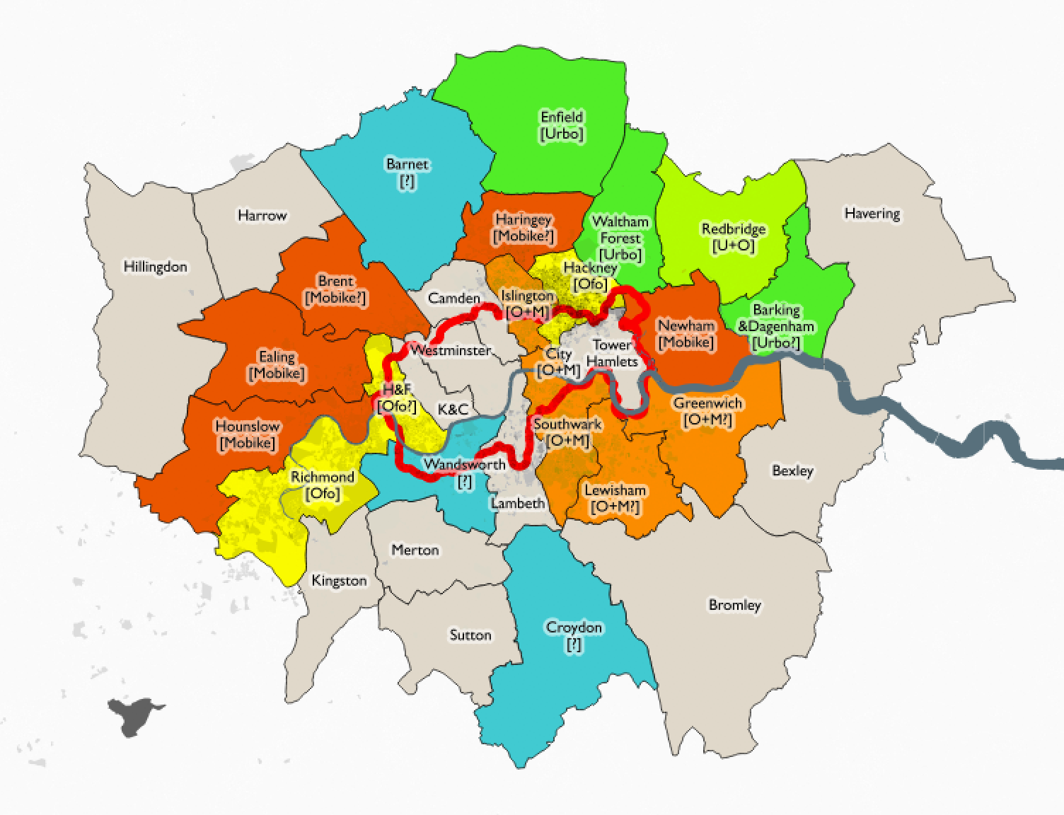
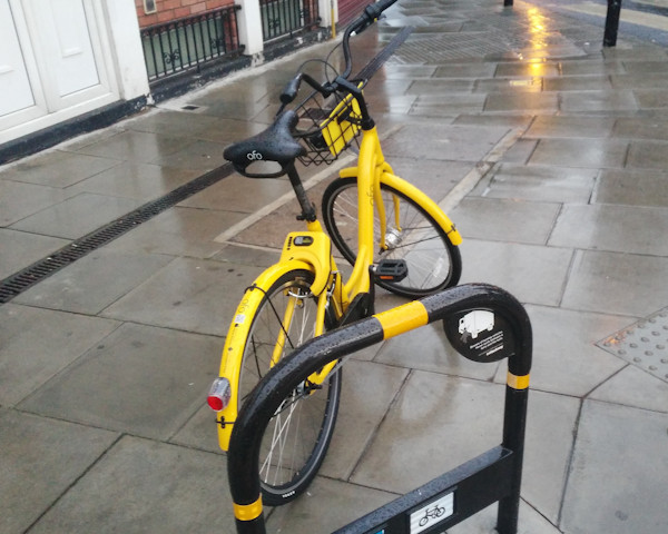
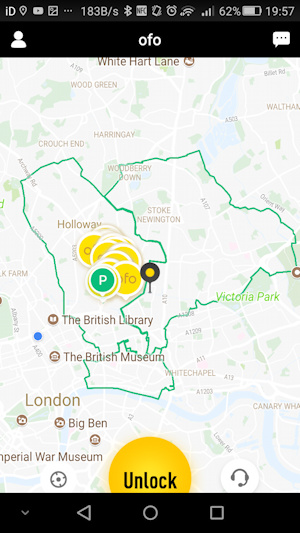
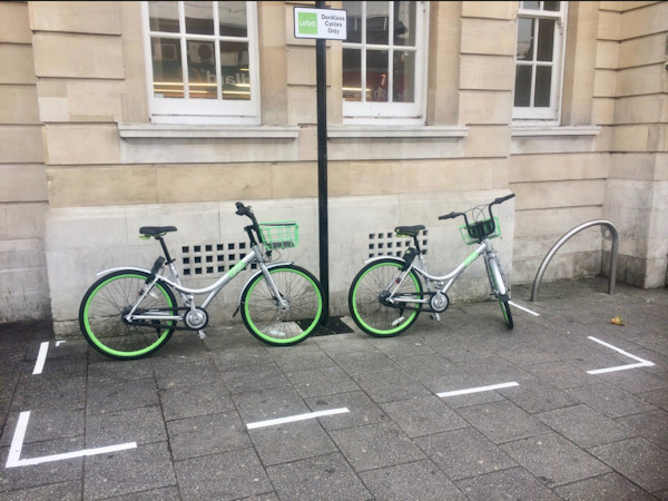
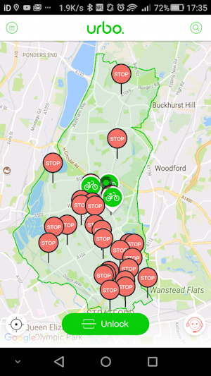
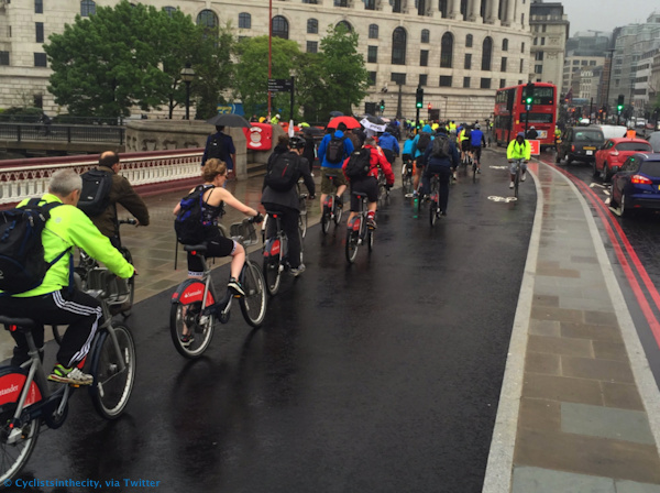
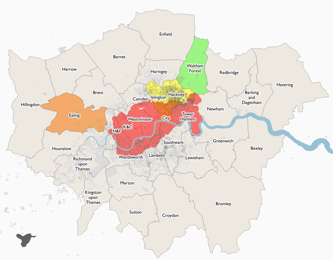
The conference also included a led ride around some of Manchester’s key cycle infrastructure, including the Oxford Road segregated lanes. The bikeshare bikes provided for the ride were dockless bikes supplied by Ofo (who run UK systems in Cambridge and Hackney, London, as well as various other locations around the world) and Urbo (a new Irish start-up who are adopting the Chinese dockless model and bringing their bikes to Waltham Forest, also in London, launching at the end of October).

Photo: © Cyclistsinthecity, via Twitter.
Categories
OpenStreetMap Orienteering

OpenOrienteeringMap Version 3

OpenOrienteeringMap, the easy online tool for creating street orienteering maps from OpenStreetMap data, has been updated to version 3. Development for this version was kindly funded with a grant from the Orienteering Foundation.

New features for version 3 include:

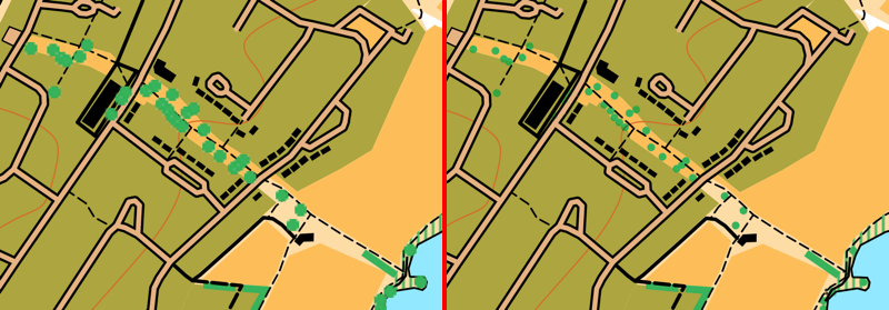
  • Better trees! We now use SVG graphics for lone trees (and monuments). This means they are scaled correctly when appearing on the map, both on the screen and on the high quality ready-to-print PDFs. The use of SVGs and better scaling means that the trees now don’t dominate the map at smaller scales. In addition, trees are drawn underneath line features, so that they don’t obscure, for example, path detail. The same treatment is applied to monuments, too. This fixes one of the most requested bugs on the OpenOrienteeringMap Github. See above for the difference – note the better scaling, lack of pixalation, and less obscured paths, on the right!
  • Similiar vectorisation improvements have taken place for fences, walls, power lines, cliffs and embankments. These linear features have regularly spaced markings to indicate their type. Previously, these markings used PNG images, which did not work well for the high quality vector PDFs. These have been replaced with SVGs, which scale correctly and print at high quality, through the use of a different kind of Mapnik symbolizer – a MarkerSymbolizer rather than a LinePatternSymbolizer. The only remaining raster graphics that appear on an OpenOrienteeringMap are the fill textures for polygon areas, such as vegetation undergrowth. These use PolygonPatternSymbolizer, which does not support SVGs and has no equivalent symbolizer which does.
  • We now include benches, picnic tables and litterbins on the maps. These are shown as small black crosses.
  • JPEGs can now be produced for OpenOrienteeringMap. This is very useful for adding OpenOrienteeringMap maps to platforms like Routegadget or OCAD (as background map) where JPEGs are required. PDFs should still be continued to use for printing, as they will result in a much higher quality map, but you no longer need to manually convert to JPEG using an image editor or other additional software.
  • In conjunction with the above, geolocation “Worldfiles” can now be produced for OpenOrienteeringMap. These are small config files that allow a JPEG (or PDF) OOM map to appear in the correct place on a location-aware service, such as Google Earth, Mapper from the OpenOrienteering project (not tested) or similar.
  • Some of the details from the “Pseud-O” map style on OOM have been ported across to the standard “Street-O” maps. This includes trees, monuments, powerlines, sports pitches and hedges.
  • Some layer reordering – contour lines now go across roads and above buildings. The shape of the land is important, and so this change makes it easier to see hills and slopes.
  • Buildings on the Pseud-O map style are now shown as grey with black borders, rather than all black as before, this stops them from overwhelming the Pseud-O map in city centres.
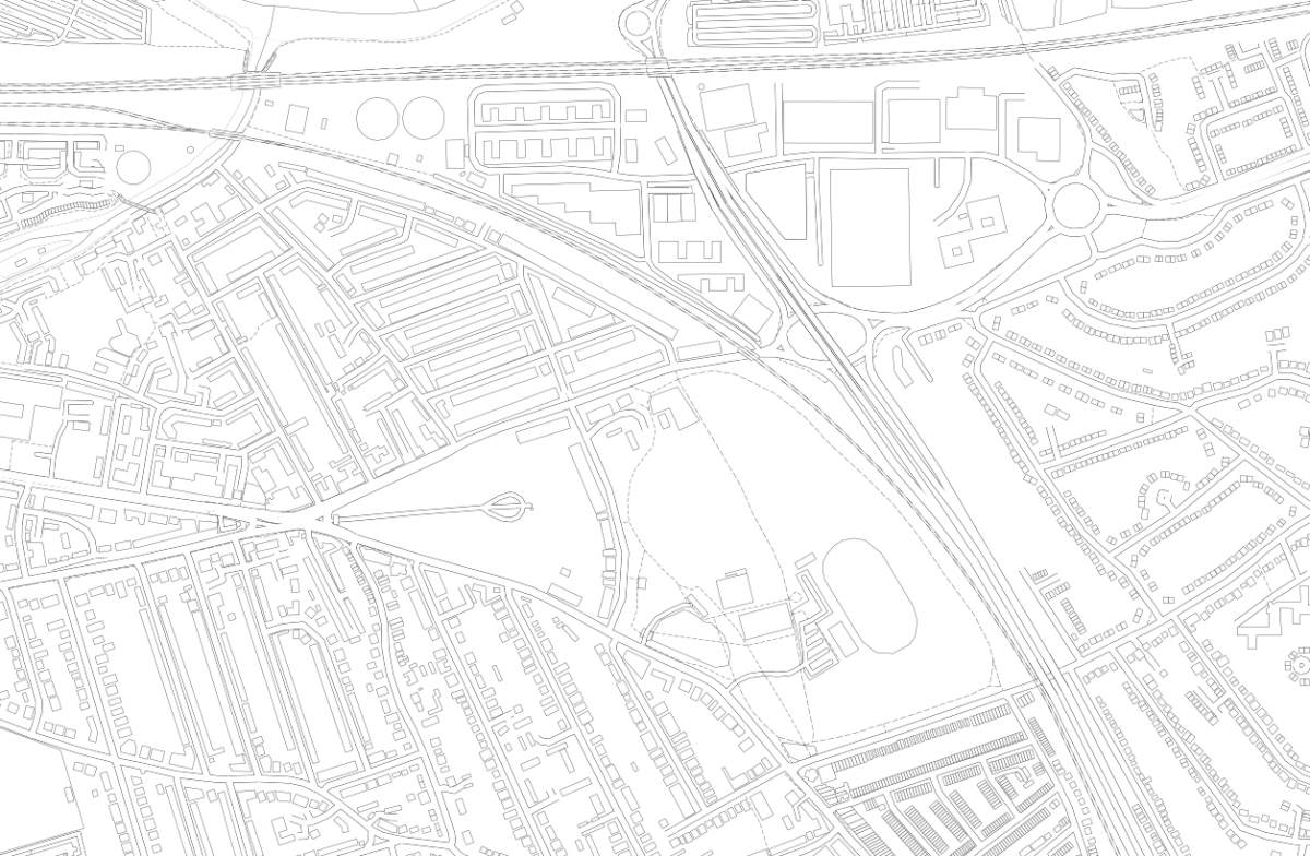
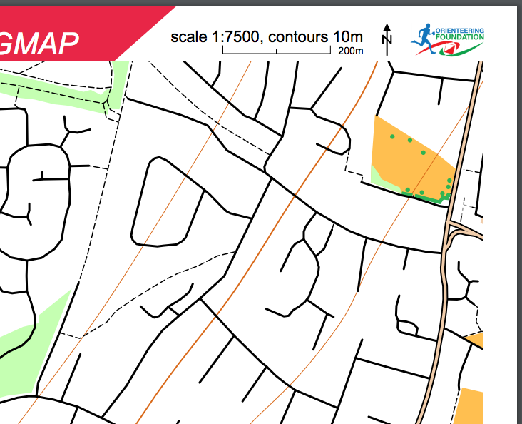
  • A new style, Blueprint, has been officially launched. This style (see example at top) which was in beta for a while, is different to orienteering maps, as it is designed for people who want to create a map of their local area to colour in! A simple set of very think black lines, with lots of white spaces, is produced, allowing a simple high-quality map of local areas to be produced, ideal for colouring in! Blueprint doesn’t include contour lines and doesn’t allow controls to be added. You can try it out here.
  • The global map database has received a bulk update, so now covers changes/additions made to OpenStreetMap up to around early August 2017. The UK database continues to enjoy daily updates (changes appear approximately 48 hours after the corresponding edits in OpenStreetMap).
  • Branding of the website and the PDF maps has been updated to recognise the support received from the Orienteering Foundation.
  • The grant also partially supports the hosting/bandwidth costs associated with OpenOrienteeringMap for the next twelve months.
Categories
London

You Take The High Road…

Just a quick update on High Lines and other lines:

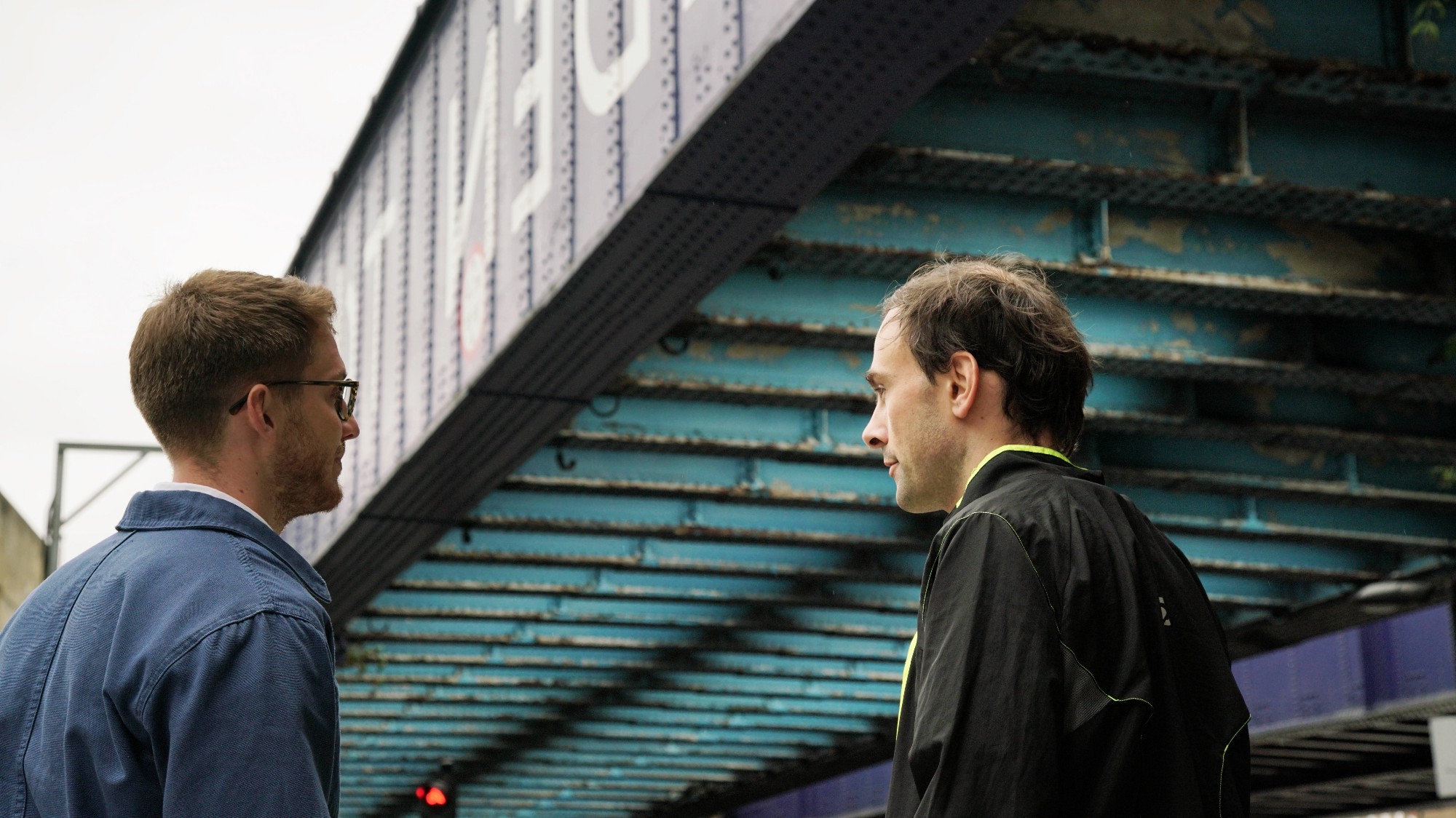
The Camden Highline has smashed its crowdfunding round, which aimed to fund a formal feasibility study and architectural plans for the project, along with creating a community organisation to govern the project. The target was substantially beating due to a late, large donation from Camden Market, along with one from the Major of London, and Camden Unlimited (the organisers of the project so far). The Telegraph published an article noting the successful funding, which references this blog. Camden Unlimited themselves also ran a short interview with yours truly. Here’s a photo from the interview, of me looking contemplative.

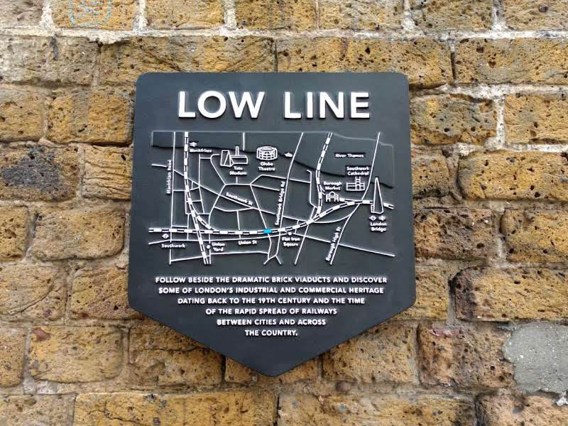
Dropping down a level and crossing the Thames, the London Low Line launched last week. Created by Better Bankside as part of the Bankside Urban Forest project, it is a series of markers, map plaques and paper guides, to the many publicly accessible arches below the railway lines in the Bankside area, out of London Bridge, Cannon Street and Blackfriars stations.

Photos from Better Bankside and Camden High Line.

Categories
Data Graphics

Eight Ways to Better Flow Maps

As part of a presentation I gave yesterday at the RSAI-BIS (Regional Science Association International – British & Irish Section) annual conference, on DataShine Travel to Work maps, I outlined the following eight techniques to avoid swamping origin/destination (aka flow) maps with masses of data, typically shown as straight lines between each pair of locations.

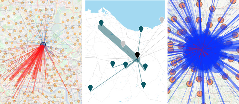
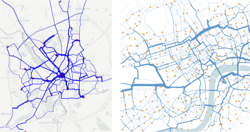
Lines tend to obscure other lines, making the flows of interest and significance harder to spot, and creating an ugly visual impact. See above for an extreme example which shows (all) cycle-to-work flows in inner-city London. Large numbers of flow lines, if delivered as vectors to a web browser, can also cause the web browser to run slowly or run out of memory, affecting the user experience.

To avoid this, I generally try to use one or several of the following techniques.

1. Restrict to a single origin or a single destination. This does require the user to first click on a location of interest before any flow can be seen:

From L to R, DataShine Commute, Understanding Scotland’s Places (USP) and DataShine Region Commute, the last one showing that, in some cases, this can still produce an overload of lines.

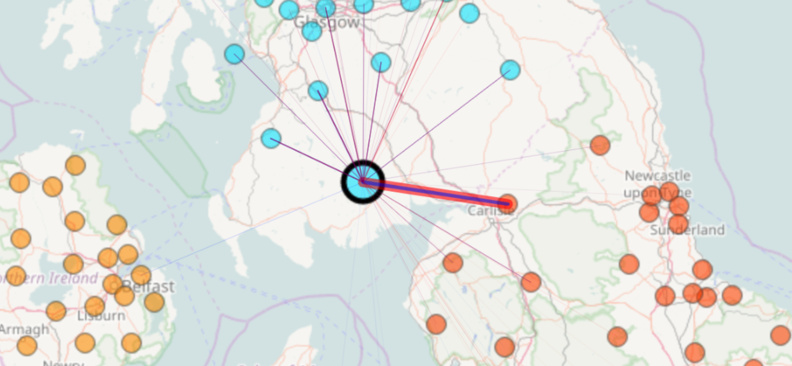
2. Only show flows above a threshold. This could be a simple minimum value threshold (e.g. 10 people), a set number of lines (e.g. 1000 largest flows) or dynamic value-based limit (e.g. only where flow is 1% of the origin population), the latter generally only working if a single origin is shown at a time:

From L to R, The Great British Bike To Work (with a simple flow-size threshold) and Understanding Scotland’s Places, which uses a dynamic origin-based theshold, shown here with the constrasting number of bidirectional flows visualised from a large city (centre) with those from a small town (right), each being selected in turn.

3. Minimise the overall number of possible origins/destinations. What you lose in detail you might gain in clarity and simplicity. DataShine Region Commute only shows flows between LAs, rather than the spatial detail of flows within them.

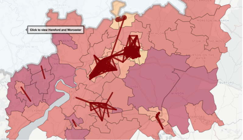
4. Restrict the geography. The Propensity to Cycle Tool (Lovelace R et al, 2017) shows the main flows (based on a threshold) on a county-by-county basis, with easy and clear prompts to allow the user to move to a neighbouring county if they wish.

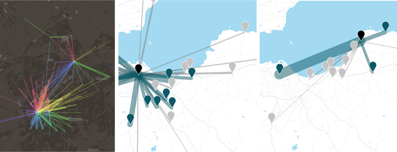
5. Bend the lines. Tools, such as the Stanford Flow Map Layout tool or Gephi with the “Geo Layout” and curved lines, allow flow lines to be clustered or curved in a way that reduces clutter, while retaining geography. The first approach clumps pairs of flow lines together in a logical way, as soon as they approach each other. The second approach simply curves all the lines, on a clockwise basis, generally removing them from the central area unless that is their destination. See also this paper by Bernhard Jenny (Jenny B. et al, 2017) which details the benefits of curving lines and further cartographic modifications, and this paper by Stefan Hennemann (Hennemann S. et al, 2015) which outlines a sophisticated approach to grouping together flow lines, on a world-wide basis.

From L to R: Commutes into London from districts outside London, from the 2001 census, by Alastair Rae (Rae A., 2010) using the Stanford Flow Map Layout tool, and top destination for each origin tube station, based on Oyster card data, by Ed Manley (Manley E., 2014) using a particular Gephi flow layout.

6. Route the flow. Snap the lines to roads or other appropriate linear infrastructure, using shortest-path or sensible-path routing, and combining the segments of lines that meet together, either by increasing the width or adjusting the hue or translucency.

From L to R: The Propensity to Cycle Tool (Lovelace R et al, 2017) routed for shortest path, and journeys on the “Boris Bikes” bikeshare system in central London, routed with OSM data to the shortest cycle-friendly route. In both cases, journeys meeting along a segment cause the segment to widen proportionally.

7. Don’t use a simple geographical map. This map, created by Robert Radburn at City University (Radburn R, 2015) in Tableau, is a “small multiple” style map of car commutes between London boroughs, with a map of London being made up itself of miniature maps of London. Each inner map shows journeys originating from the highlighted borough to the other boroughs. These maps are then arranged in a map themselves. It takes a little getting used to but is an effective way to show all the flows at once, without any potentially overlapping lines.

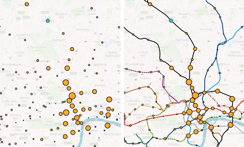
8. Miss out the flow lines altogether. Here, a selected origin (in green) causes the destination circles to change in size and colour, depending on the flow to them. In this case, the flow is modelled commutes on the London Underground network – made clearer by the addition of the tube lines themselves on the second map – but just as a background augmentation rather than flow lines.

Categories
Bike Share London

Dockless Bikeshare in London – oBike is Here

London has a new bikeshare system – and it’s appeared by surprise, overnight. oBike is a dockless bikeshare. The company is based in Singapore, where it runs a number of large dockless systems there and in various Chinese cities, Melbourne, Amsterdam and Zurich, it is also likely coming to Washington DC in the USA and to Berlin in Germany, based on some recent job postings.

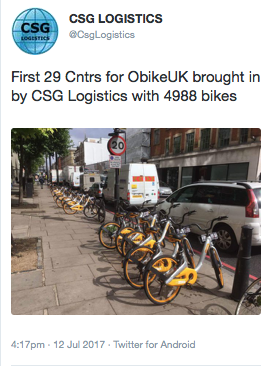
And now they’ve shipped 29 lorry-loads of nearly 5000 bicycles to London, the number being revealed in a now-deleted tweet by a logistics company:

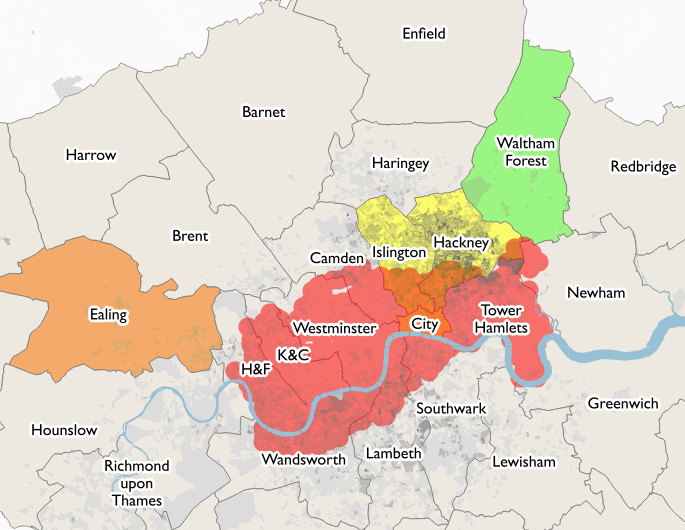
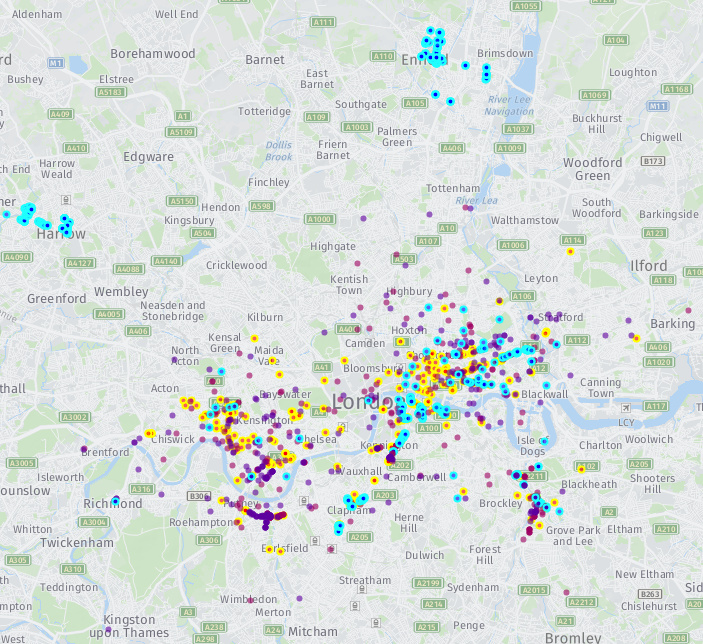
Just under 1500 have been released so far, initially being “seeded” in groups along the major roads in Tower Hamlets and Hammersmith & Fulham boroughs (400 in each), and more recently in Wandworth, Clapham, Kennington, Lewisham, Waterloo, Harrow* and Enfield*, with “organic” use moving the bikes out as far south as Kingston, and as far east as East Ham (plus possibly in the river near Erith…) There have been several hundred journeys already, with the great majority of bikes having been moved at least once from their initial deployment.

Other players in the space are MoBike (in Manchester), OfoBike (in Cambridge – N.B. website currently down) and YoBike (in Bristol). Another company, GetBike, claimed to have launched in London a few months ago but the bikes, to date, have not appeared. Possibly, they got mired in council discussions. MoBike is also launching a system in Ealing, west London, at the end of the month. All five companies are based in Asia, where mass cycle manufacture is cheap, which had led some cities there ending up with huge heaps of dockless bikeshare bikes, being piled up by desperate city councils trying to keep their pavements clear.

As the bike is the only physical presence on the street, there are no permanent structures for the system and so authorities are not always involved in the process, but have to pick up the pieces and clear the streets – leading some in the dock-based bikeshare establishment to term the systems as rogue bikeshares. The European Cyclists Federation have this week published this timely position paper, where they term the systems slightly more politely as “unlicenced bikeshare” and suggest a potential framework to make the concept work in a European urban context. Whether the operators take notice of course is another matter…

Meanwhile, oBike’s rollout continues. In the map below, red dots with yellow borders show the most recently organically moved bikes (i.e. areas of red/yellow = popular use) while the blue dots with turquoise borders show ones which have not moved since their initial deployment. The other bikes (which someone has moved, but not recently) are shown with purple dots. The map is just a snapshot, and is manually created by myself, so I may have missed some bikes (but I think I’ve got almost all of them):

So far, most of the rollout has been to areas already served by bikeshare – the Boris Bikes (aka Santander Cycles). The real value add for London will be when Zones 3-6 (i.e. non-tourist, non-hipster “real London”) get the bikeshare. After 7 years of the Boris Bikes and no sign of them extending outwards, it’s about time the rest of us got the value of bikeshare too, particularly as our alternative options are more limited.

What is it?

Dockless bikeshare is different from the so-called “third generation” dock-based systems like London’s existing Santander Bicycles or “Boris Bikes”. It does away with docking stations and credit card terminals for charging and storing the bikes and administering the access, instead the bikes themselves have locks which contain a solar panel GPS receiver and SIM card for broadcasting their location, and are controlled by an app on your smartphone. It massively cuts down on the costs of the system because no docking stations are needed. London’s docking stations are very expensive as they have to go through the planning process, and also need to be wired up for power. There are also fewer staff needed – oBike do not employ drivers to redistribute the bikes, and also don’t have an established call-centre. Payments are handled entirely through the app. Maintenance teams are also, I suspect, likely to be minimal on the ground.

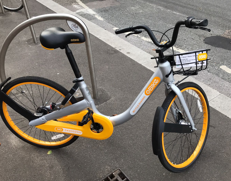
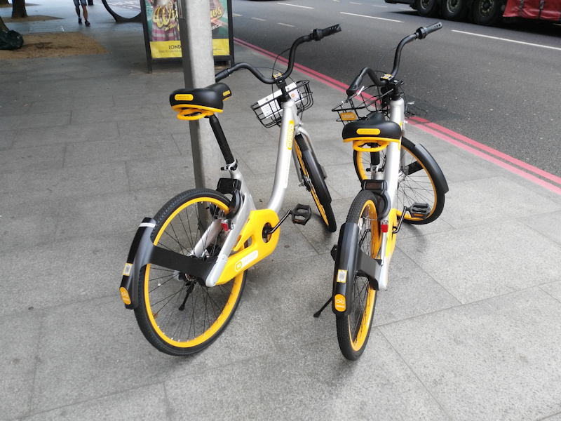
The bikes themselves are similar in size to the Boris Bikes, but come with solid rubber tyres (so no punctures). They feel around the same weight. The bikes only have only one gear, set quite low, so you can’t get up much speed. The bikes don’t feel heavier than a Boris Bike. They have the same, chunky “tank” feel to them and feel sturdy – the livery being bright yellow helps with visibility on the streets, which is a bonus.

Trying it Out

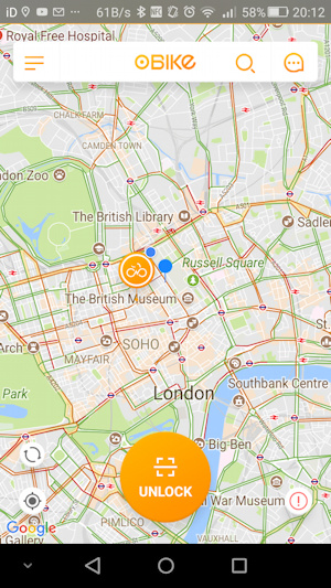
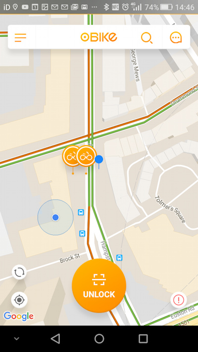
I took an oBike out for a spin yesterday afternoon. I noticed a pair parked (orange pins) close to the Facebook office at Euston Square – maybe some Facebookers trying out the latest thing?

On arrival, I was a little surprised to see the bikes were parked on the other side of the road (small blue pin). Still, my own phone’s GPS was saying I was on the other side of a large building (blue dot)…

The process of getting the bike was straightforward – I had already paid the £29 refundable deposit (£49 from August) by entering my card details into the app on my phone, so it was just a case of clicking “Unlock” and the scanning the QR code on the bike’s stem. Around 10 seconds later (with communication through your phone’s Bluetooth or through the SIM card on the lock – I’m not sure) the lock on the bike clicked open and the app’s timer started. Neat! The whole signup process was far more streamlined than with the Boris Bikes, where you have to go to a docking station, use the terminal there, page through tens of screens of information and put in your credit card at least twice. Here, you can be on board in less than a minute, with subsequent hires even quicker.

My bike already had its seat raised to the highest position (or higher still, as there was some brown scuffing there) so no adjustments needed. I headed across Euston Circus and down to the British Museum. Unfortunately, my bike had a distinct squeak every time the back wheel rotated, although squeezing the brake stopped it for a few seconds. The brakes themselves are excellent (perhaps I noticed this particularly as my own bike brakes are poor) and everything seemed OK. The bike appeared in good condition, no rubbish had collected in the basket. The handlebars are very wide, so I couldn’t squeeze through the usual gaps between cars and buses. I didn’t find the handlebars very grippy – they are plastic rather than rubber, and my left hand slipped off at one point (I was juggling a mobile phone at the time). In all, not the fastest cycle but perfect fine for utility riding and definitely still faster than walking or getting the bus.

There were various Boris Bikers around, I must have passed at least 10 in my 15 minute ride, but no other oBikes – yet! At the end of my journey I dropped the bike beside a bike rack beside Euston Square station. It wasn’t immediately obvious how to end the journey – you don’t press anything in the app, instead you pull the lock switch manually back across the back wheel, until you hear a reassuring click. A few seconds later, as long as you have Bluetooth switch on, on your phone, then the app beeps and confirms the journey as complete.

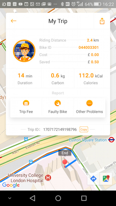
On finishing, the app presents an attractive display showing your start and finish, time, and a “route”, however the route is simple the Google Maps route for bicycles rather than the actual journey taken. The distance also bears no correlation to either the Google Maps “shortest path” route on the map, or the actual distance taken, which is very odd. For the finish location itself, the GPS had once again not given a particularly accurate result, and it looked like I’d cycled the bike straight into the A&E department at University College Hospital. Only 100m or so off again, but not ideal for discovery:

I tried another bike out a bit later. This didn’t have a squeak, however the basket was tilted slightly to one side – not a biggie but still a bit worrying that quirks like this are appearing so soon into the deployment. The bike coped just fine with the rough surface on the River Lea towpath, including over several speedbumps. However, on a return journey, the unlocking process proved to be rather fraught. The QR code was read fine by my phone, but the communication to the lock was not working well, and it kept timing out. Only after around 6 attempts, including moving the bike around. The area we were in had quite poor mobile reception so this may be part of the problem. Still, the few minutes delay to the journey was frustrating. However, once we were moving, the bike itself performed well.

Opportunities

I really like the app, and the payment structure is excellent – 50p flat rate per 30 minutes represents much better value than the £2/day for 30-minute-max journeys on the Boris Bikes. I really didn’t like that, before oBike, it was cheaper to get a bus than a bicycle in London. The reward system is a great idea, it always made sense to incentivise riders to do the tasks of the operator, and the lack of redistribution is another good thing – I always thought it was a huge waste of time redistributing bicycles to one place, only to redistribute them back later.

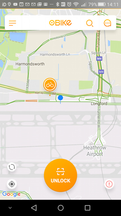
The fact that, rather being constrained to docks, the allowed operating area is the whole of London, is great. Already, one bike has ended up at Heathrow in the far west of London:

The lack of docks mean that the users set the area of coverage. Finally, Hackney and Haringey, Lewisham and Rotherhithe, have the bikeshare that I am sure would always have been popular there.

I do also like the name – oBike (five letters, two syllables) rolls off the tongue a lot more easily than Barclays Cycle Hire or Santander Cycles.

Challenges

I’m not totally convinced that oBike will survive long-term – despite assertions to the contrary by some operators of these dockless bikeshares, the bikes will need maintenance due to the rough weather, roads and people in London. Whether they get any will be interesting to see. The bikes I tried out have only been on the streets for four days, and for the first one I tried have picked up a loud squeak so quickly, and the second one to have a wonky basket, is not great. The bikes are also a little too small for the British frame – having said that I am 6′ and I got around OK on one, but with the seat-post extended to its absolute maximum. There have been some cases of the seat-posts easily coming right off when extended further.

Also – some people will inevitably be hard on the bikes. They are not that indestructible, and some people will see them as a cheap way of getting a bike. Some will end up in the Thames. Councils will end up confiscating some, as Hammersmith & Fulham has already threatened to do. Not getting the council involved is brave – they may have looked at the Cambridge example where the council insisted that another operator reduce its launch from 500 bikes to 20 – there are obvious advantages with not having to deal with 33 separate councils in London (+ the City + TfL and the GLA) and just sticking the bikes out there – but oBike could have made life easier for themselves by distributing them more discretely, to avoid the ire of grumpy councils and pedestrians – placing one or two bikes together, at the most, ad on side roads rather than main roads, beside existing cycle parking racks, rather than obstructing pavements, and focusing on Zones 3-6 first (even if that results in a slower initial takeup). And a commitment to maintenance or organised disposal would also be good – at the moment no one knows what will happen to the bikes after they start to wear out. The scenes of “bicycle graveyards” and huge heaps of brightly coloured bicycles, in the cities of the far east that are full of dockless bikeshares, are worrying.

I hope that oBike is a success, and the bicycles survive grumpy councils, the kids who just want a free bike, and the weather. If it provides an incentive to give the Boris Bikes a kick up the backside (50p per 30 minutes flat rate and all-London low density coverage please!) then that on its own would be a result. Providing a bikeshare out into London’s Zone 3 and further is a real winner for shared mobility options outside London’s already well connected central core.

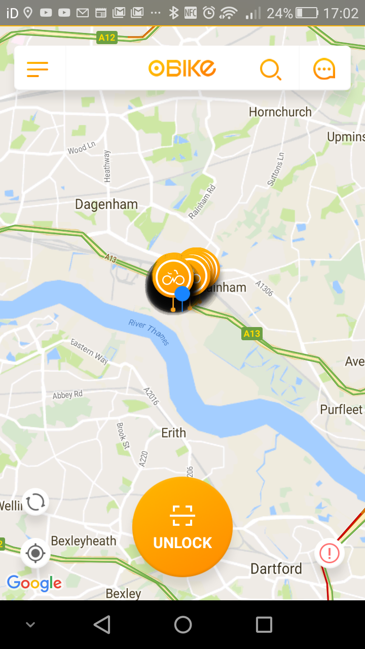
* These have since been removed, I understand, following discussions with the councils there. The company however did not switch off the GPS trackers on the removed bikes, and so have revealed the location of their depot, at Rainham on the very edge of east London:

Map background Copyright HERE Maps. Top photo Copyright JC, bottom photo Copyright SR.

Categories
CDRC

Broadband Speed in the UK

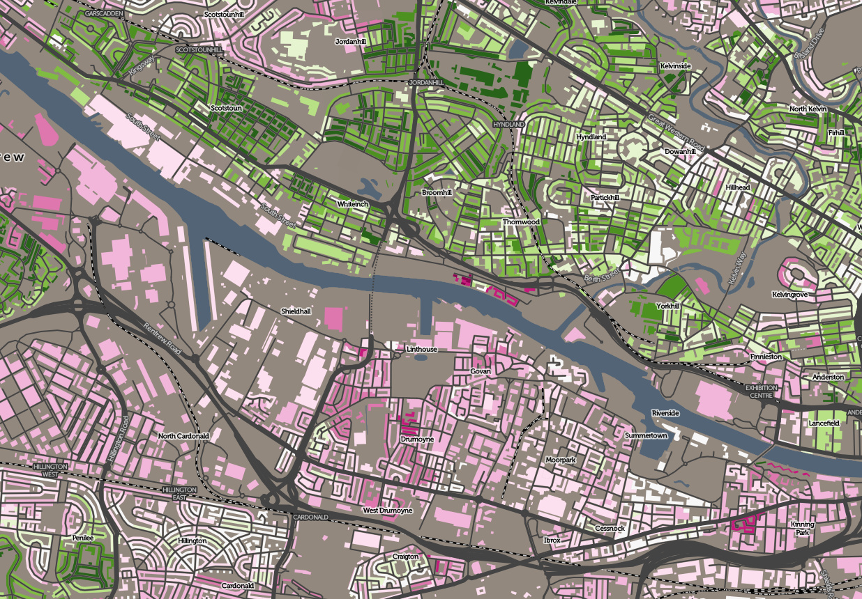
Recently published on CDRC Maps is a new a map of Broadband Speed in the UK. This is the average download speed for premises, right across the UK. It’s based on data annually released by the national regulator, OFCOM (I’m using the most recent dataset, from 2016). I’m using a Purple-White-Green colour ramp, where purples indicate areas with very slow speeds, white tends towards the national median and dark greens show areas of very fast connection – potentially homes using the new “ultrafast” connections available in some areas.

It should be noted that this is based on the actual average download speed based on the deal people have signed up for, not the maximum attainable download speed (either theoretical or actual) in an area. I hypothesise below that, in cities, this may be due to consumer inertia as much as infrastructure gaps – while in rural areas it is more likely the latter. I’m not mapping broadband through high-speed mobile networks, only “fixed line”.

Urban/rural divide

As would be expected with infrastructure costs, the economics of putting in fibre connections, and increased distances to the nearest telephone exchanges, broadband speeds still suffer in the countryside, with the Llandrindod Wells (LD) postal area in rural central Wales, having the slowest average broadband connection of 14.9Mbit/s. Looking at specific postal outcodes, PA70, on the also extremely rural island of Mull in western Scotland, has an average speed of just 1.1Mbit/s.

Why do city centres show up as slow?

Of note, as well as this urban/rural divide, the very centre of cities often show slower speeds than the suburbs. This is possibly because of the difficulty of installing the needed infrastructure under narrow, busy streets and through old, often historic buildings. By contrast, newer housing developments, normally on the edge of cities may come with broadband infra designed in to the plans. The fastest postal region is OX, the Oxford postal area, perhaps reflecting the large technologically literate population (thanks to the universities and various science parks in the area). The fastest postal outcode in the country, however, is N1C, the new area behind King’s Cross. This is a central city area, but one which has essentially been built from scratch in the last few years, rather than needing broadband retrofitted into it. Another new area however, E20 (the Olympic Park) appears in the London bottom 10.

An alternative argument is that it may be that city centres got the “first wave” of broadband capabilities, many years ago, and people switched then – and consumer inertia means that they are less likely to switch to faster broadband offerings that are now available to them. In central London, the Rotherhithe area shows up as having particularly slow broadband speeds being used. This area is quite distinct to just about every other central London area, having become a residential area in the 1980s and 1990s. It is also rather isolated geographically. However, the lowest speeds of all in London are found, rather surprisingly, in and around the City of London. For example, the Barbican Estate has few keen users of ultra-fast broadband. It may be available to them, but the elderly population here may just not want it.

A short note on methodology: This is an area average (by output area – 150 properties) of postcode averages of individual connections. I’ve excluded postcodes with no broadband connections, as these are still recorded in the source data but with a speed of 0. By using OAs rather than individual postcodes, the data is slightly smoothed, i.e. less noisy, so trends can be seen easily across areas, even though individual properties (or indeed whole postcodes) may be connecting at a faster speed than what appears in the map in that place. In short – the map is of the overall picture, not individual addresses.

You can download the data, and see the Top/bottom 10 postal area stats, on the CDRC Data page for the dataset, or explore the data on the interactive map.

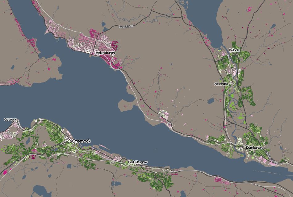
Top: A river divides them – broadband average download speed in west Glasgow. Above: Towns north and south of the Firth of Clyde. Below: Variations in south London. All maps based on data which is Crown Copyright OS and OFCOM.

Categories
Leisure

Promenade Plantée

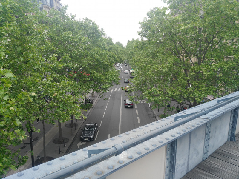
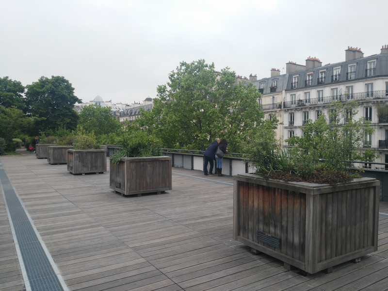
As part of a brief trip to Paris, I recently walked the western part of the Promenade Plantée raised linear park or “rail trail”, in the southern part of the city. The Promenade Plantée, also known as the Coulée Verte, predates the well known “High Line” in New York City (and a potential London version) by many years. Its western part is around 1.6km long – about half as long as the NYC High Line and twice as long as the proposed one in Camden. It is raised a few metres above the streets, on a long viaduct, allowing for the characteristic “street scene from above” views:

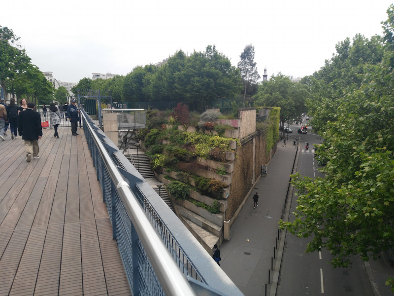
Around half way along, the route crosses a long, wooden bridge (not an original from the time when it was a railway line) which dips down into a park in a surprisingly gritty and unattractive part of Paris, before continuing eastwards under the street level, in a series of tunnels and cuttings. This is also a key access point to both sections, with a set of steps and a lift:

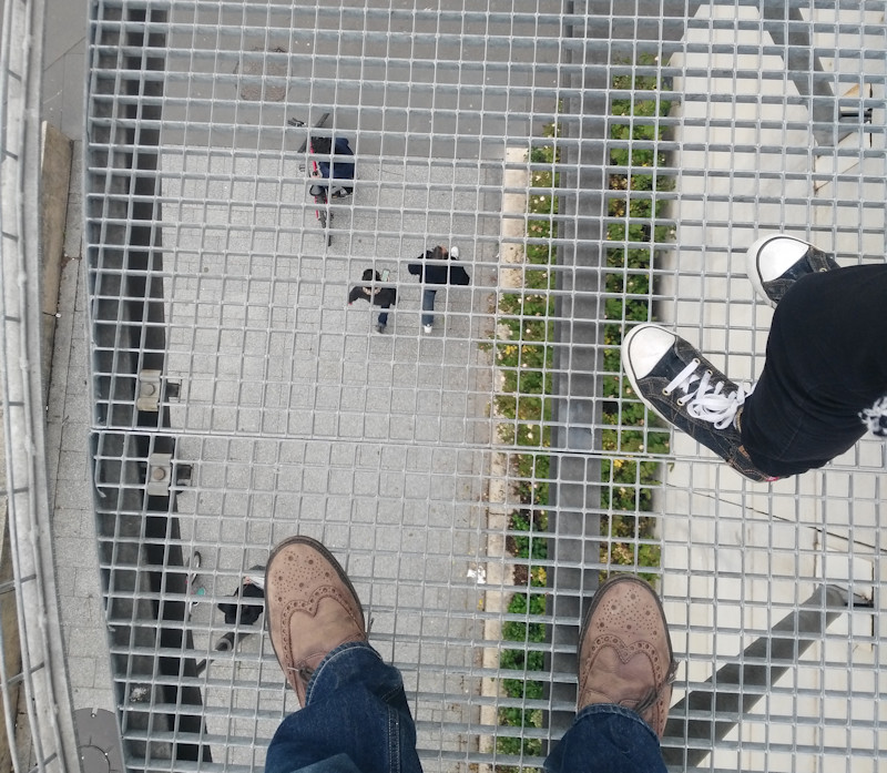
There is also a short section here where you can look down beneath your feet:

I didn’t walk along the section section, which is always open and accessible to bicycles as well as pedestrians. The western section is pedestrians only and is locked at night.

The park, being a former railway line, is generally narrow, but does broaden in a couple of sections:


It also has some interesting detail, for example, near the western end, the walker passes under a number of wooden trellises, full of plants. Further on, the path splits into two, passing either side of a narrow but long pond, bordered by hedges but with a couple of small bridges connecting the two paths:

A section with tall bamboo on either side, creating a natural tunnel, was also of interest.

There was a little bit of antisocial behavior in a couple of sections, but this didn’t spoil the general atmosphere. It was surprisingly busy, with a mixture of local walkers, families (it was a Sunday afternoon) and quite a lot of joggers.

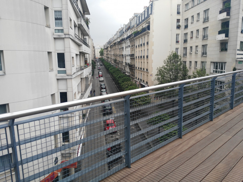
Some of the bridges are the original railway bridges. These have solid iron sidewalls, but the wooden decking has been slightly raised here, with a safety bar added to the top of the sidewall, so that users of the walkway can easy (but safely) see over and along the streets below:

Like the New York City version, there is the interest of passing through (and over) a building, which intrudes on to the route in a dramatic way. Unlike New York City’s version though, there is no trace of the original railway track, with the ballast and rails completely replaced by a mixture of wooden decking and concrete paths, along with plenty of flowerbeds on either side.

It was good to walk the Promenande Plantée, and great to see it so well used, considering its age and that it is not in perfectly maintained condition. Even though it is only 1.6km along, I took a good hour to do the walk, allowing plenty of time to study some of the murals and other small artworks along the route, both official and unofficial (including a piece by Invader), as well enjoying what is essentially a long, thin public roof garden in the heart of a metropolis.

Categories
Technical

Panama’s Population Geographies

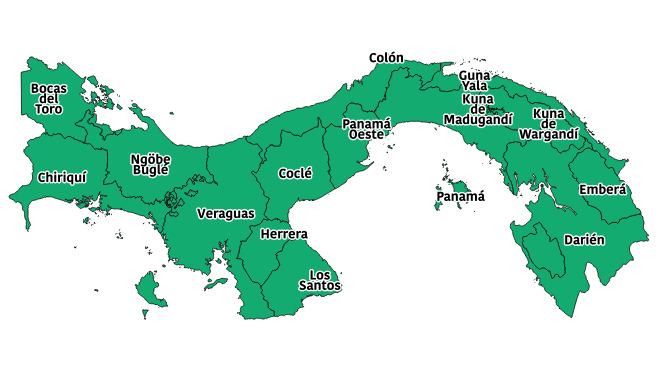
Panama is a Central American country with around 4 million population. The country is split into 10 provinces (including one that was split from another in 2014). The population is obliged to register for and obtain an ID card, or “cedula” which contains an interesting attribute. The prefix of their ID number indicates their province of birth. This not only allows the mapping and analysis of surname (and other) demographic information across the country, but also, if combined with information on current location, even allows for a rudimentary analysis of internal migration in the country.

This official document contains lots of useful information. Subsequent to this, the “Panama” province within the country has split into two, with the westernmost section becoming Panama West and gaining a new province number 13. In practice, the great majority of people living here retain the prefix 8 as the population with “13-” prefixes will be too young to have appeared on school attendance lists, jury service lists, exam candidate lists or government worker salary transparency lists. Here is the very No. 13: Ashly Ríos, getting the number 13-1-001. (People are required to obtain their number by the age of 18 but you can be registered at birth.)

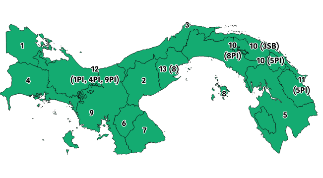
For most people, born in Panama, their cedula number prefix indicates the following provinces of birth:

Province Cedula prefix
Bocas del Toro 1
Coclé 2
Colón 3
Chiriquí 4
Darién 5
Herrera 6
Los Santos 7
Panamá 8
Panamá Ouest 13
8 (pre-2014)
Veraguas 9
Guna Yala (indigenous province) 10
3SB (pre-1953)
Madungandí (indigenous sub-province) 10*
8PI (pre-2014)
Wargandi (indigenous sub-province) 10*
5PI (pre-2014)
Emberá Wounnan (indigenous province) 11
5PI (pre-1983)
Ngäbe-Buglé (indigenous province) 12
1PI, 4PI or 9PI (pre-1997)

* These were briefly assigned No. 13, before being changed to 10.

The format of the cedula number is generally X-YYY-ZZZZ where X is the province number, YYY is the registry book number and ZZZZ is the number within the book. However, for certain groups, the prefix is different. If SB appears after the province prefix, this is an indication that the person was born in Guna Yala (formerly called San Blas), but before it became a standalone indigenous province. Other indigenous areas, some of which have not formally become provinces, were indicated by PI appearing after the prefix of the former or enclosing province, or AV if very old (born pre-1914). However, the numerical codes are now used.

Panamanians born outside the country get “PE” as their prefix instead. Foreigners are assigned “EE” while they retain their immigrant status. If they gain permanent residence rights, they are assigned “E”, and if they become full Panamanian citizens, they are assigned “N”. PE, N, E and EE do not officially have an associated province prefix, although one is occasionally added in third-party lists, or “00”. So, these people can also be assigned a separate ID, starting with “NT” and with an associated province prefix, this is a temporary ID issued for tax purposes, rather than a full cedula number.

Categories
London

Camden Highline

A couple of years ago, I wrote about a number of possible London “High Lines”, London’s own raised “rail trail” to New York City’s High Line and Paris’s Promenade Plantée.

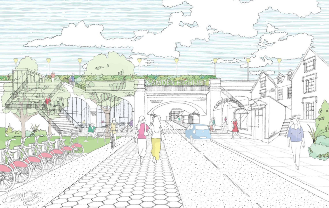
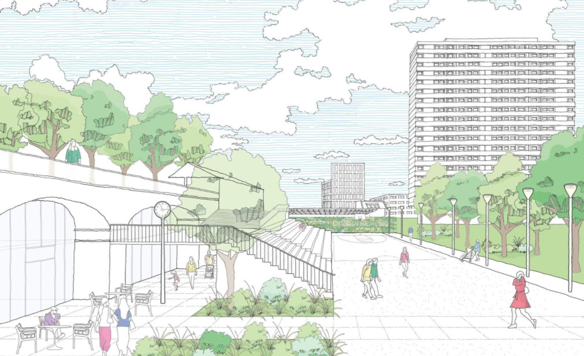
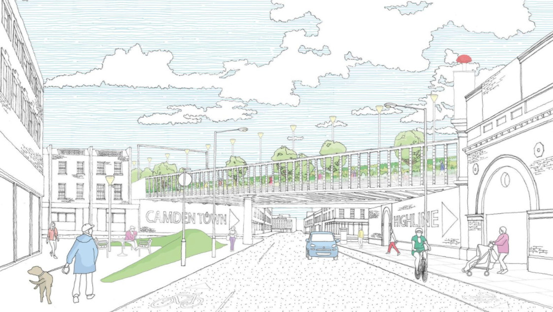
Now it looks like the best one could be happening. Camden Town Unlimited, the business improvement consortium for the area, are proposing a Camden Highline, which would run for around 0.8km, between Camden Town and Camley Street, which is itself 0.8km from the back of King’s Cross Central.

Below is the start of the route, there is a little park here which could provide space for an access point. From the photo, it looks like the operational railway is close, but the route quickly moves away, around the back of Camden Road station.

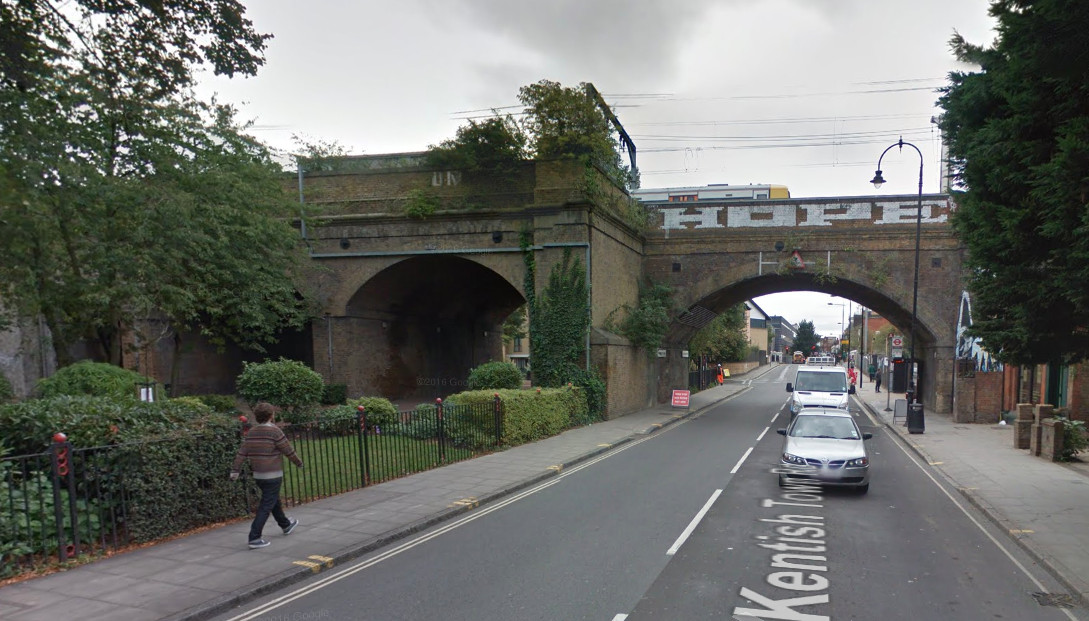
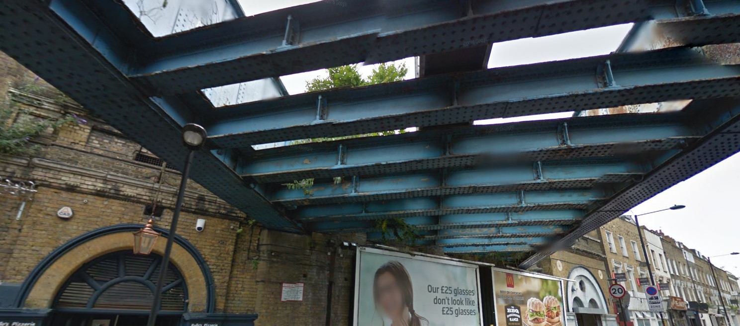
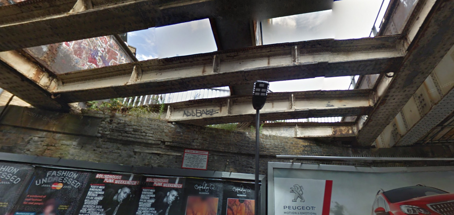
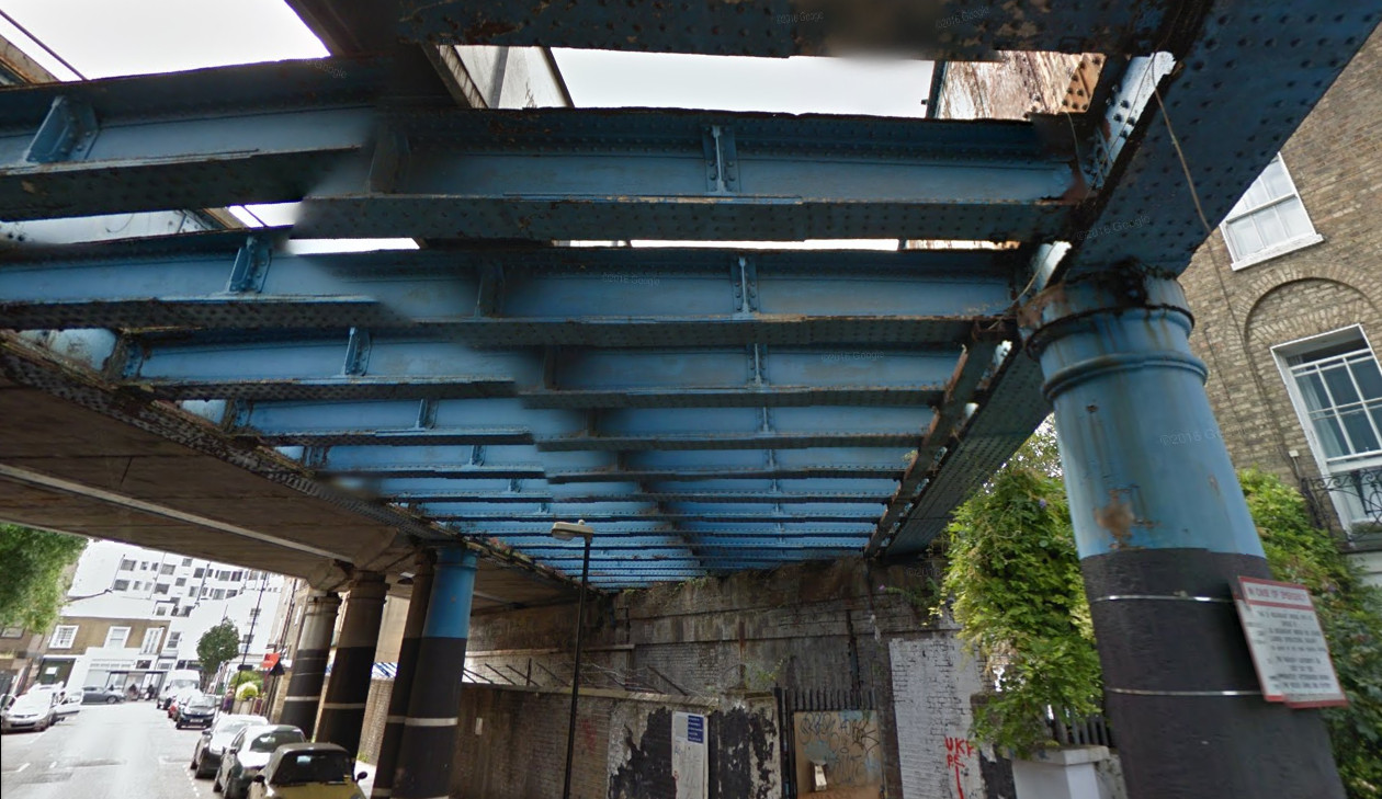
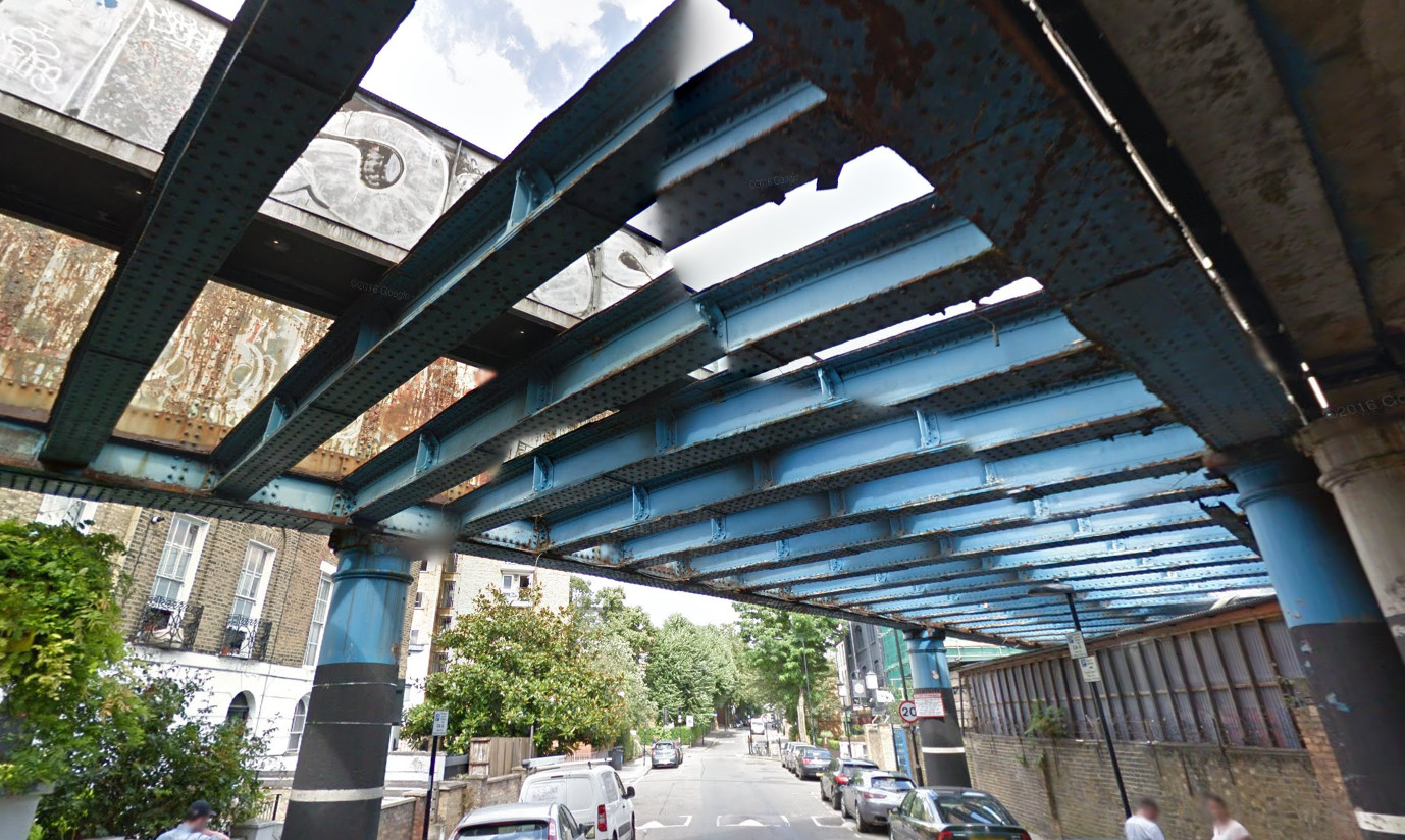
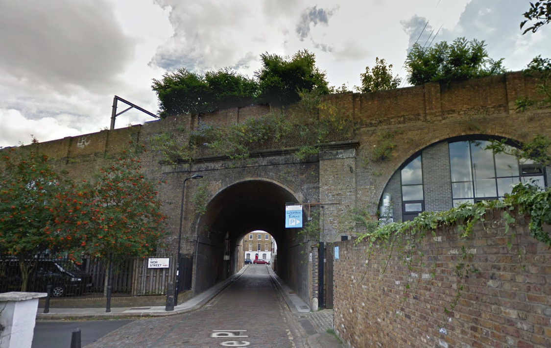
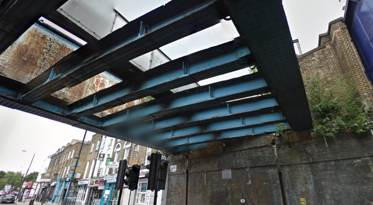
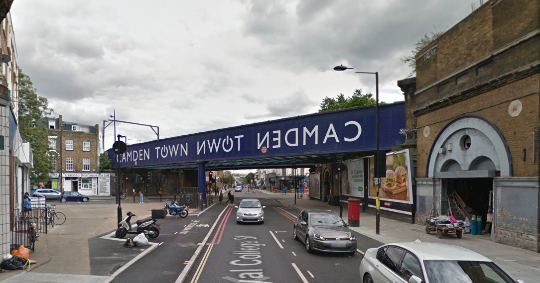
Although there is no public access to the route itself currently, you can get a good idea of the space and route, from Google Streetview, looking up from the streets below. I have included views from below the various bridges, in this post.

The route uses a surprisingly wide corridor of unused railway, mainly alongside the existing North London Line but including a substantial hidden space behind Camden Road station, and seven bridges across eight roads. The route is as wide as 18m in some sections, with narrower sections at either end.

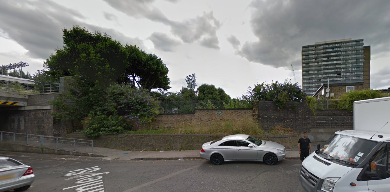
The route ends here (photo below), at Camley Street. To the left is a new bridge for the railway. There is actually still space on the new bridge here for a narrow walkway, and a ramp on the other side means no need for a new access point. However, the land in front is also currently empty, and so could quite easily accommodate a new route down, potentially as part of a wider development of the plot.

See the official Camden Highline website. All photos (c) Google. Illustrations from Camden Town Unlimited.

Categories
London

Crossrail Opening Sequence

Crossrail’s Elizabeth Line will launch in the following stages:

    • Phase 0 – May 2015 – TfL takes control of the Liverpool St (high level) to Shenfield line, a single section with no forks.
    • Phase 1 – May 2017 (above) – The new Crossrail trains start to appear on the Liverpool St (high level) to Shenfield line, a single section with no forks.
    • Phase 2 – May 2018 – TfL takes control of the Heathrow to Paddington (high level) line and introduces Crossrail trains to it. TfL Rail is now two disconnected sections with no forks.

    • Phase 3 – December 2018 (above) – Services start running from Paddington (low level) to Abbey Wood, via Liverpool Street (low level). Services formally switch from being branded as TfL Rail to being the Elizabeth line. First trains through the centre. Crossrail has three disconnected sections, and no forks.
    • Phase 4 – May 2019 – Trains from Paddington (low level) to Shenfield, joining the existing service to Abbey Wood. Crossrail has two disconnected sections, with the eastern section forking twice. (The second eastern fork is a reverse one – a small number of trains will continue to start from Liverpool Street (high level) to Shenfield, missing Whitechapel and joining at Stratford.)

  • Phase 5 – December 2019 (above) – Full services running, all via Paddington (low level) and Liverpool Street (low level), from Reading too Shenfield and from Heathrow to Abbey Wood. Crossrail is a single, connected railway, with a fork to the west and two forks to the east.

[UPDATE] Following the announcement of Crossrail’s delay, it looks like Phase 3 will actually be the services running from Reading into Paddington – which will become part of TfL, in December this year. With luck, some time in early 2020, then services will start running between Paddington and Abbey Wood – a revised Phase 4. This is the separated section from existing National Rail services, so it doesn’t need to wait for the May or December timetable changes. I would imagine that the new Phase 5 – the Whitechapel link, could start in May 2020, with a new Phase 6 – services running from the west into the new tunnels, maybe in December 2020.