Categories
Bike Share Data Graphics

There are .9 Million Shared Bicycles in Beijing

Recently I become part of the editorial team at the Bike-Sharing World Map (this is a new version, not yet launched) which is the world’s only comprehensive map of bikeshare systems, listing the approximately 2000 active systems along with another 1000 that are either in planning or already closed.

The Bike-Sharing World Map was compiled by the late Russell Meddin over the last 12 years and has recorded the gradual evolution of the capabilities of bikesharing systems, with Europe and Asian systems dominating, followed by a huge rise in American systems – but the massive change over the last four years has been the rise of dockless bikeshare systems, powered by smartphone apps, replacing the expensive fixed-docking-station systems, often publically financed and typically one-per-city. Instead, dockless is often entirely privately financed and the major operators run systems across hundreds of cities, often in direct competition with each other.

China invented the dockless concept and made it a “boom” industry by being able to manufacture the bikes very quickly – the timing was also perfect, with Chinese citizens, having previously cycled everywhere and quickly seen their cityscapes convert to the motorcar – perhaps were looking for a return to a simpler, cheaper and perhaps now quicker form of transport. There certainly was an investor boom-and-bust, with many cities being totally overwhelmed in 2017 with dockless bikes. Photos of huge, brightly coloured dockless bicycle graveyards became popular. Almost none of the systems were making money though, and the industry rapidly consolidated – a number went bust or were bought in 2018, the trigger being a snowballing of users requesting deposit refunds.

More recently still, city authorities started to address the problem and many of the larger ones have now introduced operator assessment and the awarding of quotas of bike numbers based on this. This means that, on the assumption that operators obey the quota directives and also maintain the largest fleets they are allowed to, it is possible to calculate the approximate number of dockless bikes in each city and by extension across the world. The operators themselves don’t typically announce their fleet sizes, for commercial reasons, and generally don’t provide public APIs either, so this is typically the most effective way to understand the numbers. The authorities don’t always publish these quotas either, but China’s local press often conducts investigations into and their local journalists are occasionally allowed access into city operations centres where sharing bicycle fleets – amongst other transport assets, are monitored.

This graphic, from a QQ article, shows a screen in such a centre in Chengdu, on which are live statistics for dockless bikeshare – one of my Chinese-speaking colleagues at UCL translated it and this is the source that Bike-Sharing World Map is using for Chengdu:

Chengdu’s transport operations centre, showing their real-time view of the competing dockless bikeshare systems in the city and surrounding area. Photo © Red Star News.

It is possible to mine Mobike’s undocumented API for bike locations, although at the centre of the densest cities, even this exhaustive approach will miss many of the bikes. Here is a map showing a snapshot of 152,300 Mobike bikes available for rent – around 1/3rd of the estimated ~500,000 strong fleet in Shanghai, earlier this month (N.B. quirks with the China datum mean the locations don’t match perfectly with the underlying OpenStreetMap map):
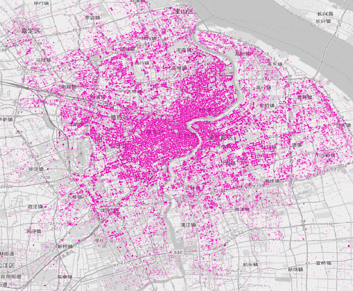
Some of the Mobikes in Shanghai, superimposed on a misaligned OpenStreetMap map. In the central section, the regular grid pattern is an artifact of the technique, revealing that there are many more Mobikes in this region than are shown here.

Beijing’s totals peaked in September 2017 with 2.35 million dockless bikes. In 2018 a quota of 1.91 million bikes was introduced, more recently authorities have reduced this to 900,000. The Chinese “big 3” as of 2020 are all in the capital city – Mobike (morphing into Meituan Bikes having been bought by them), Hellobike (bought by Youon, the biggest operator of docked public systems in China) and Didi’s Qingju brand (Didi is China’s Uber, it bought the assets from Bluegogo when they went bust). There is also a residual ofo presence – the app remains live and there are bikes rentable though it – although they have been largely unmanaged for a while now, the company having been embroiled in a deposit refunds scandal.

Beijing is behind just Chengdu, and possibly Shanghai, in terms of total numbers of bikes.

The industry itself continues to innovate and organise itself, with the increasing pressure from city authorities combining with the need to properly start making money. Hellobike has been one of the most nimble. It has largely avoided the investor bloat and scandals of the others by concentrating on only its home market, China, and also initially concentrating on second-tier Chinese cities, where there is less likely to be competition from Mobike/ofo/Qingju. As it has grown, it is now moving into the biggest cities and taking on all comers.

Recently, Hellobike has started to roll-out dockless hubs, which are enforced by beacons which sweep the designated areas and interact with RFID chips on the bikes. The bikes’s wheel locks will nosily unlock if a user tries to lock and end their journey outside of them. Generally, this beacon approach is much more accurate and immediate than the traditional use of GPS (or the Chinese equivalent) to enforce geofences or understand where the free bikes are for the benefit of app units and redistributors. Other organisations in China are looking at combining the extensive public CCTV camera network in many cities with China’s AI advances and machine object-detection routines, to help authorities detect which bikes are parked where and when, to help with operator scoring for future quotas.

Bike-Sharing World Map currently estimates there are 9.1 million bikeshare bikes in the world, of which at least 8.6 million (over 94%) are in China – and most of these are dockless. We are still compiling and updating the China part of the map – and the actual number could be quite a lot higher (although not as high as in mid-2017 when it was believed there were 16 million dockless bikeshare bicycles in China (10 million ofos, 5 million Mobikes & 1 million Bluegogos). The fleets may have probably halved since then, but the story of bikeshare in the world is far from complete without up-to-date numbers from China.

Terminology note: China generally refers to dockless bikeshare bicycles as “shared bicycles” or “internet bicycles” while the older dock-based systems are generally called “public bicycles” reflecting their publically owned and specified status.
Categories
Bike Share Data Graphics London

Use vs Theft: Risks and Rewards for Dockless Bike Operations in London

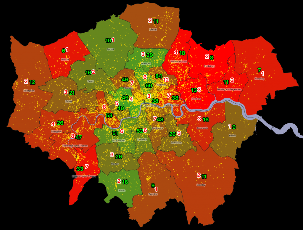
Cycle use rates/1000 pax (green) and theft rates/1000 pax (red) in London boroughs. Yellow dots show individual cycle thefts in 2018-9. The green/red borough colour compares the theft rate with the usage rate. Populations are daytime and nighttime, averaged.
When running a fleet of dockless bikeshare bikes, one of the potentially most costly problems is theft of the bicycles. They aren’t attached to anything if they are dockless, even if they are in a marked “hub”, and, even if the bikes are typically heavier than a personal bike, they can still be easy targets for theft. There are six operators in central London currently and each of these operators has to consider whether it is worthwhile operating in a particular borough – whether the profit to be made from legimitate hires outweights the costs involved in replacing stolen bicycles.

With the news earlier this month that Beryl is suspending operations in Enfield due to vandalism after just three months of operation, and following Urbo’s similarly rapid arrival to and departure from the borough (and indeed all of the UK) last year, I’ve done a simple analysis of the risk/reward of operating in different London boroughs. This analysis is an alternative approach to a previous model that looked specifically at general vandalism rates and usage rates, because it looks at the daytime as well as nighttime populations.

I’ve used the Census 2011 Travel to Work counts, comparing the full 16-74 population with that that travels to work mainly by bicycle, looking at both the Workplace populations (i.e. daytime/evening) and the Residential populations (i.e. nighttime/weekends). A simple approximation of the populations is achieved by equally weighting both figures. This means that Croydon’s average population more than halves its nighttime population during the day, while Westminster’s triples. I also only looked at bikes being used to regularly travel to work, as these are the ones that are most likely on the streets, and therefore much more vulnerable to theft.

I also use the Police data statistics on cycle theft, for 2018-9, looking across the Metropolitan Police, City of London Police and British Transport Police force data. I only considered bicycle theft rather than vandalism, as the latter is not broken down by object type, and I believe that general bicycle theft is a good proxy for vandalism and theft of dockless bicycles – with vandalism often occurring as a result of attempted theft. Dockless bicycles are probably not numerous enough in London yet (there are maybe around 3000 available) compared with the ~200000+ private bicycles that are used to commute to work daily with many left in public parking facilities, albeit almost always chained to an immoveable object.

I was keen to not map areas of high cycle theft or use – but rather map one compared to the other. Some places see very little cycle use – the low green numbers – e.g. Harrow and Havering. But they still see some cycle theft – the red numbers – and so the average number of thefts per bicycle is therefore high. On the other hand, Westminster, the City and Islington also see high theft rates but these are more than balanced out by very high usage rates. Only in Hackney, does the very high cycle usage rate (84 bikes/1000 people) still suffer from the also very high theft rate (12 bikes/1000 people). In Hackney, you’ll therefore probably suffer a stolen bike every 7 years on average. In Redbridge though, it’s 1 every 4 years – there aren’t very many bikes in the borough at all, but the few that there are often victims of cycle theft.

This is a really rough study – it could be improved by using more recent population/cycle usage data (which is available for residential areas but not work areas), by looking at vandalism as well as cycle theft, and by more carefully modelling the 24-hour population. But it’s good indicator of why Islington, Westminster and the City of London are so popular with operators, despite a high “headline” rate of theft when looking at the raw Police numbers, and why Greenwich, Newham and Kingston have no operators at all, despite plenty of regular cyclists. It is also why boroughs that sit in the middle – Enfield, Croydon, Southwark and Hillingdon – are probably only going to succeed with dock-based approaches, and so likely require council capital funding rather than hoping that dockless operators will be able to run a successful commercial service for making bikes easily available to those that don’t own one or have one handy – which is what bikeshare is.

Data used in this study:

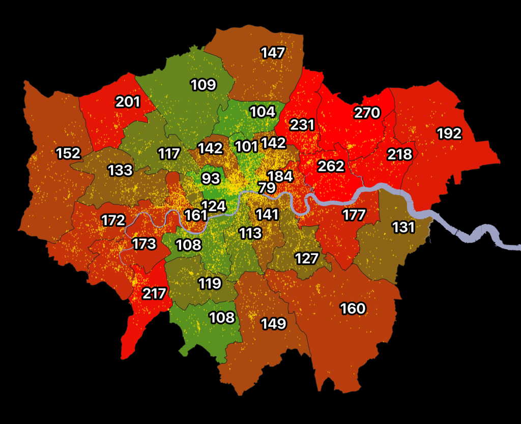
Another view of the same data – here, the numbers are showing the annual theft rate per 1000 bicycles.
Categories
CDRC Conferences Data Graphics London OpenLayers

FOSS4G UK 2018 Meeting and OpenLayers 4

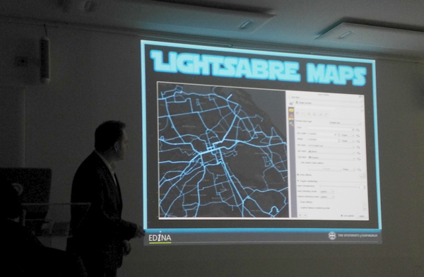
I attended and presented at the FOSS4G UK conference in central London, in early March. I was scheduled to present in the cartography track, near the end of the conference, and it ended up being an excellent session, the other speakers being Charley Glynn, digital cartographer extraordinaire from the Ordnance Survey, who talked on “The Importance of Design in Geo” and outlined the release of the GeoDataViz Toolkit, Tom Armitage on “Lightsaber Maps” who demonstrated lots of colour compositing variants and techniques (and who also took the photo at the top which I’ve stolen for this post):

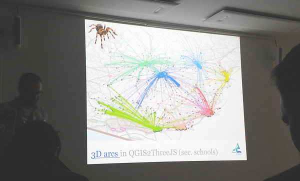
…and finally Ross McDonald took visualising school catchment areas and flows to an impressive extreme, ending with Blender-rendered spider maps:

My talk was originally going to be titled “Advanced Digital Cartography with OpenLayers 4” but in the end I realised that my talk, while presenting what would be “advanced” techniques to most audiences, would be at a relatively simple level for the attendees at FOSS4G UK, after all it is a technology conference. So, I tweaked the tittle to “Better…”. The main focus was on a list of techniques that I had used with (mainly) OpenLayers 4, while building CDRC Maps, Bike Share Map, TubeCreature and other map-based websites. I’m not a code contributor to the OpenLayers project, but I have been consistently impressed recently with the level of development going on in the project, and the rate at which new features are being added, and was keen to highlight and demonstrate some of these to the audience. I also squeezed on a bonus section at the end about improving bike share operating area maps in London. Niche, yes, but I think the audience appreciated it.

My slides (converted to Google Slides):

Some notes:

  • My OpenLayers 2/Leaflet/OpenLayers 3+4 graphic near the beginning was to illustrate the direction of development – OpenLayers 2 being full-featured but hard to work with, Leaflet coming in as a more modern and clean replacement, and then OpenLayers 3 (and 4 – just a minor difference between the two) again being an almost complete rewrite of OpenLayers 2. Right now, there’s a huge amount of OpenLayers 4 development, it has momentum behind it, perhaps even exceeding that of Leaflet now.
  • Examples 1, 3, 4 and 5 are from CDRC Maps.
  • Example 2 is from SIMD – and there are other ways to achieve this in OpenLayers 4.
  • Examples 5, 6 and 9 are from TubeCreature, my web map mashup of various London tube (and GB rail) open datasets.
  • Regarding exmaple 6, someone commented shortly after my presentation that there is a better, more efficient way to apply OpenLayers styles to multiple elements, negating my technique of creating dedicated mini-maps to act as key elements.
  • Example 7 is from Bike Share Map, it’s a bit of a cheat as the clever bit is in JSTS (a JS port of the Java Topology Suite) which handily comes with an OpenLayers parser/formatter.
  • Example 8, which is my London’s New Political Colour, a map of the London local elections, is definitely a cheat as the code is not using the OpenLayers API, and in any case the map concerned is still on OpenLayers 2. However it would work fine on OpenLayers 4 too, particularly as colour values can be specified in OpenLayers as simply as rgba(0, 128, 255, 0.5).
  • Finally, I mention cleaning the “geofences” of the various London bikeshare operators. I chose Urbo, who run dockless bikeshare in North-East London, and demonstrated using Shapely (in Python) to tidy the geofence polygons, before showing the result on the (OpenLayers-powered) Bike Share Map. The all-system London map is also available.

FOSS4G UK was a good meeting of the “geostack” community in London and the UK/Europe, it had a nice balance of career technologists, geospatial professionals, a few academics, geo startups and people who just like hacking with spatial data, and it was a shame that it was over so quickly. Thanks to the organising team for putting together a great two days.

Categories
Data Graphics

Railway Station Numbers

You can click on all the images in this blogpost to go explore each view further on the interactive map.

The ORR publishes station entry/exit numbers on an annual basis, on a “best guess” basis, using ticket sales, gate information and modelling. The data is split by ticket type – full fare, reduced fare (off-peak tickets, tickets bought with railcards, advance tickets, child tickets etc) and season tickets. They make this data available as an Excel spreadsheet, so I’ve crunched it and have produced a couple of maps based on this data. I have also consolidated the total counts and ticket type counts data on CDRC Data.

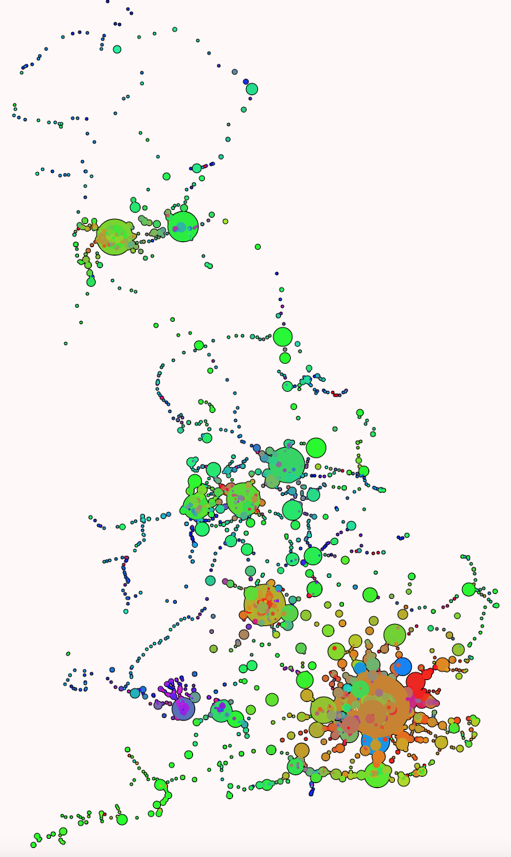
The first shows the total numbers of entries/exits across the last year that the data is available for (2016-7), with a blended colour, with different red/green/blue strengths proportional to the % numbers for season tickets (red), full fare (blue) and reduced fare (green) entering/exiting National Rail services at that station. The area of the circle is proportional to the total numbers, combined across the ticket types. I’m using a minimum circle size, as otherwise some stations would be practically invisible on the map, as they can see days go by without any passengers – or trains.

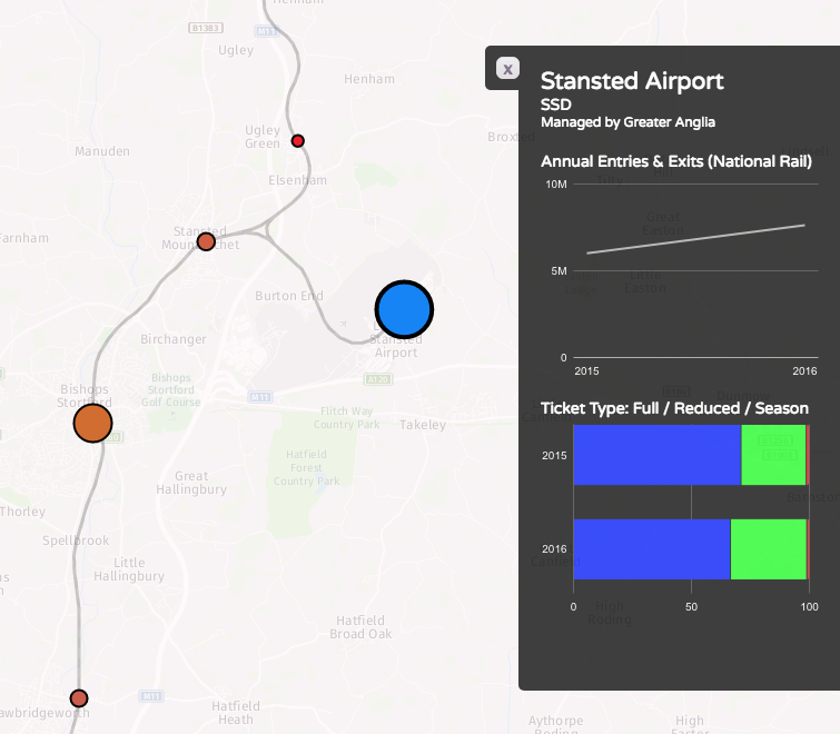
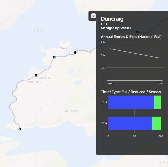
Some interesting patterns – blues for many of the airport stations, where off peak tickets generally aren’t available, and most people don’t think to get advance tickets, such as to/from Stansted:

…and almost no-one pays full fare for some of the remotest stations:

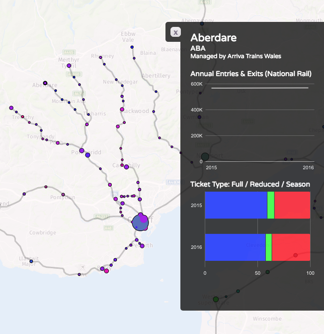
Purples on the Welsh valleys lines, showing mainly commuters and peak time users:

Bright greens for stations serving major destinations where advance tickets are readily available, such Newcastle-upon-Tyne:

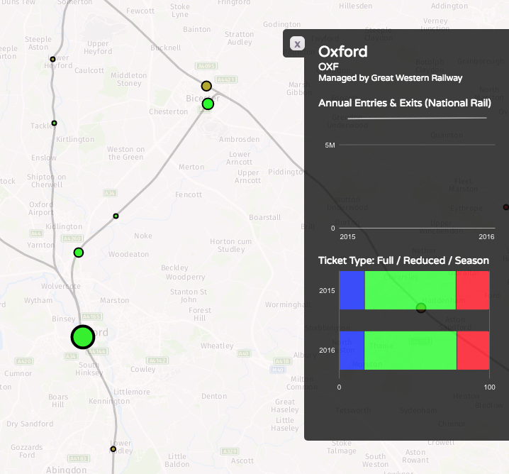
…popular tourist places, where many people will be visiting outside of the rush hours and at weekends, such as Oxford and Bicester Village retail outlet:

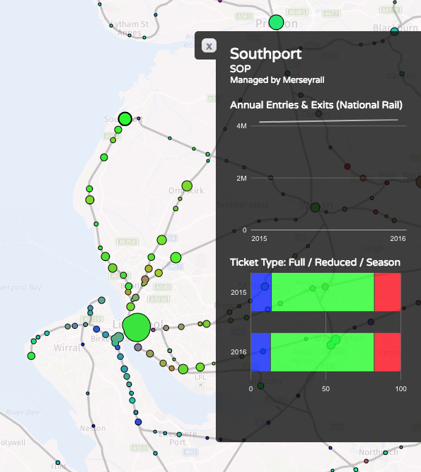
…and areas well covered by discounted travelcards, like Liverpool’s Merseyrail:

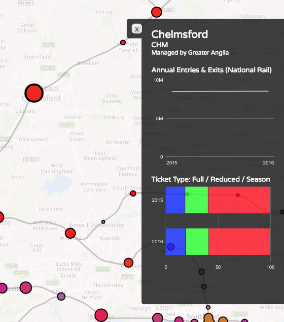
Reds where the season ticket holders dominate, such as Chelmsford and Colchester to the north-east of London:

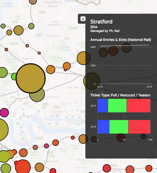
Browns showing an “urban mix” of season ticket commuters and travelcard local journey makers, like in Straford, London:

See this map on TubeCreature.

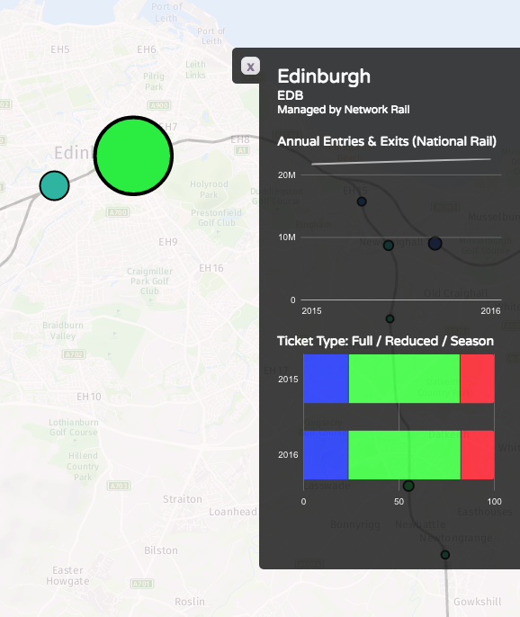
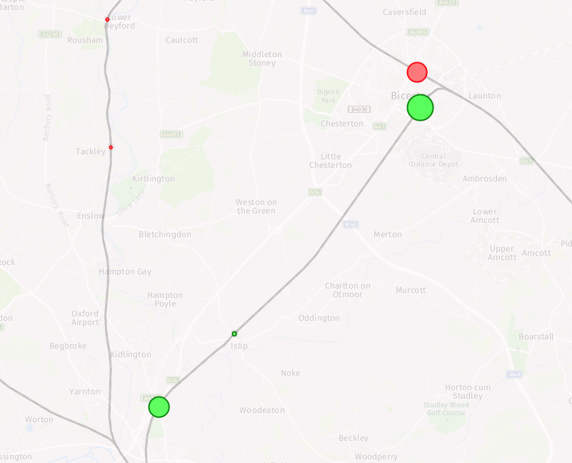
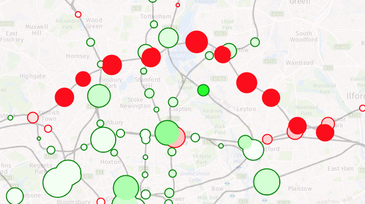
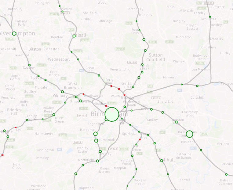
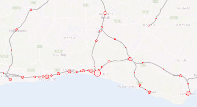
The second map looks at the change in numbers between 2015/6 and 2016/7 (a major methodological change means I cannot use data from earlier years, for a more complete time series). You can view the absolute numbers for both years, but what is of more interest is looking at the changes. The circle fill colour is the % change (with 100% green for a doubling of numbers and 100% for a halving of numbers). The area of the circle represents the absolute change in numbers. The border colour emphasises whether the change is an increase or decrease. Stations with little change will show up as small circles. The biggest trends are the new lines to Oxford via Bicester, and from Edinburgh to Tweedbank. In both cases, the lines were only open for part of the first year, so an increase would be expected even if the day-by-day numbers were flat:

Big drops show in parts of London – the Goblin line having been closed for much of 2016/7 due to a bungled overhead line installation:

There is also a big drop at Kensington Olympia’s however the source reports says this is due to a methodological change – i.e. it may not have actually been a significant drop at all. This is somewhat puzzling, as there are ticket gates at this station, so in/out numbers should be pretty solid, but it may be relating to due to many fewer people, than previously thought, transferring in-barrier to the sparse District line services at this station. When they do this, they are no longer considered to be National Rail passengers and so have “exited” the station here, from a National Rail perspective.

Most parts of the country see a steady increase (light greens):

The big exception being area served by Southern trains – with them being on strike for much of the second year, the fall in numbers in this region is almost universal:

See this map on TubeCreature. You can also download all the total counts and ticket type counts data from CDRC Data.

Categories
Data Graphics

Eight Ways to Better Flow Maps

As part of a presentation I gave yesterday at the RSAI-BIS (Regional Science Association International – British & Irish Section) annual conference, on DataShine Travel to Work maps, I outlined the following eight techniques to avoid swamping origin/destination (aka flow) maps with masses of data, typically shown as straight lines between each pair of locations.

Lines tend to obscure other lines, making the flows of interest and significance harder to spot, and creating an ugly visual impact. See above for an extreme example which shows (all) cycle-to-work flows in inner-city London. Large numbers of flow lines, if delivered as vectors to a web browser, can also cause the web browser to run slowly or run out of memory, affecting the user experience.

To avoid this, I generally try to use one or several of the following techniques.

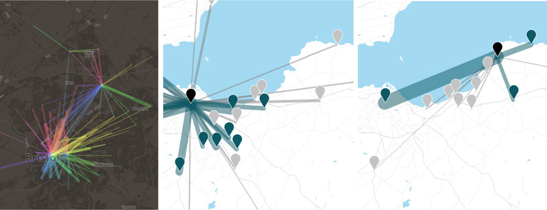
1. Restrict to a single origin or a single destination. This does require the user to first click on a location of interest before any flow can be seen:

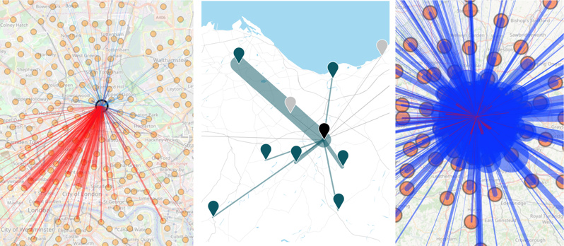
From L to R, DataShine Commute, Understanding Scotland’s Places (USP) and DataShine Region Commute, the last one showing that, in some cases, this can still produce an overload of lines.

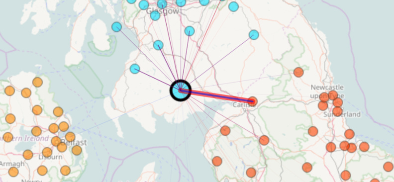
2. Only show flows above a threshold. This could be a simple minimum value threshold (e.g. 10 people), a set number of lines (e.g. 1000 largest flows) or dynamic value-based limit (e.g. only where flow is 1% of the origin population), the latter generally only working if a single origin is shown at a time:

From L to R, The Great British Bike To Work (with a simple flow-size threshold) and Understanding Scotland’s Places, which uses a dynamic origin-based theshold, shown here with the constrasting number of bidirectional flows visualised from a large city (centre) with those from a small town (right), each being selected in turn.

3. Minimise the overall number of possible origins/destinations. What you lose in detail you might gain in clarity and simplicity. DataShine Region Commute only shows flows between LAs, rather than the spatial detail of flows within them.

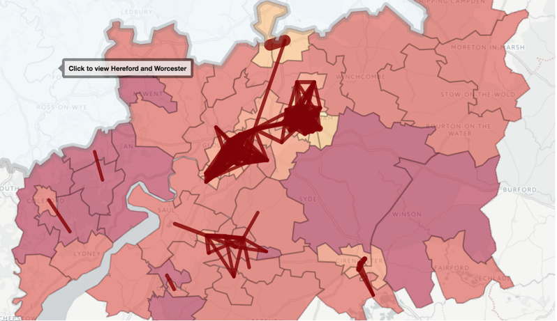
4. Restrict the geography. The Propensity to Cycle Tool (Lovelace R et al, 2017) shows the main flows (based on a threshold) on a county-by-county basis, with easy and clear prompts to allow the user to move to a neighbouring county if they wish.

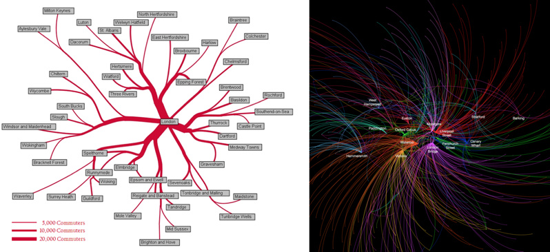
5. Bend the lines. Tools, such as the Stanford Flow Map Layout tool or Gephi with the “Geo Layout” and curved lines, allow flow lines to be clustered or curved in a way that reduces clutter, while retaining geography. The first approach clumps pairs of flow lines together in a logical way, as soon as they approach each other. The second approach simply curves all the lines, on a clockwise basis, generally removing them from the central area unless that is their destination. See also this paper by Bernhard Jenny (Jenny B. et al, 2017) which details the benefits of curving lines and further cartographic modifications, and this paper by Stefan Hennemann (Hennemann S. et al, 2015) which outlines a sophisticated approach to grouping together flow lines, on a world-wide basis.

From L to R: Commutes into London from districts outside London, from the 2001 census, by Alastair Rae (Rae A., 2010) using the Stanford Flow Map Layout tool, and top destination for each origin tube station, based on Oyster card data, by Ed Manley (Manley E., 2014) using a particular Gephi flow layout.

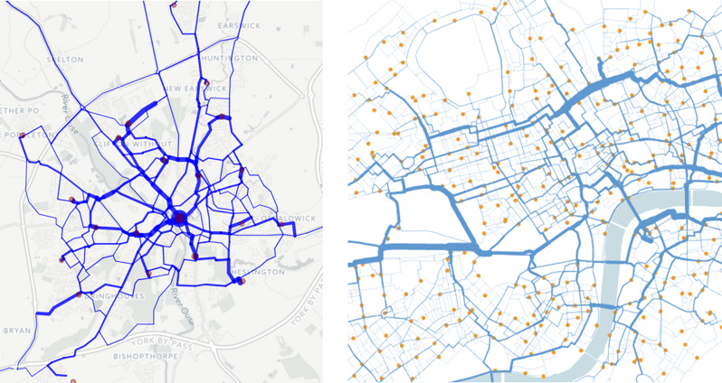
6. Route the flow. Snap the lines to roads or other appropriate linear infrastructure, using shortest-path or sensible-path routing, and combining the segments of lines that meet together, either by increasing the width or adjusting the hue or translucency.

From L to R: The Propensity to Cycle Tool (Lovelace R et al, 2017) routed for shortest path, and journeys on the “Boris Bikes” bikeshare system in central London, routed with OSM data to the shortest cycle-friendly route. In both cases, journeys meeting along a segment cause the segment to widen proportionally.

7. Don’t use a simple geographical map. This map, created by Robert Radburn at City University (Radburn R, 2015) in Tableau, is a “small multiple” style map of car commutes between London boroughs, with a map of London being made up itself of miniature maps of London. Each inner map shows journeys originating from the highlighted borough to the other boroughs. These maps are then arranged in a map themselves. It takes a little getting used to but is an effective way to show all the flows at once, without any potentially overlapping lines.

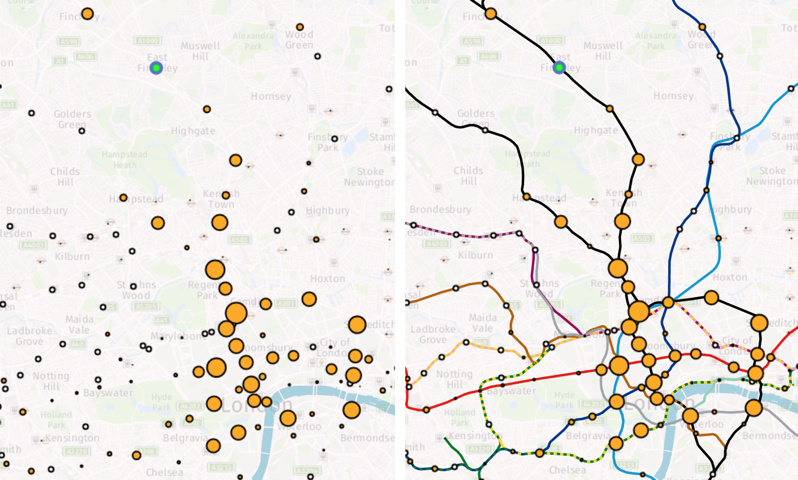
8. Miss out the flow lines altogether. Here, a selected origin (in green) causes the destination circles to change in size and colour, depending on the flow to them. In this case, the flow is modelled commutes on the London Underground network – made clearer by the addition of the tube lines themselves on the second map – but just as a background augmentation rather than flow lines.

Categories
Data Graphics London

Evolution of London’s Rush Hour Traffic Mix

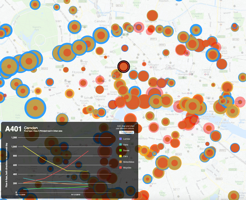
My latest London data visualisation crunches an interesting dataset from the Department of Transport (there’s also a London Borough of Southwark version using their local observation data). The data is available across England, although I’ve chosen London in particular because of its more interesting (i.e. not just car dominated) traffic mix. I’ve also focused on just the data for 8am to 9am, to examine the height of the morning rush hour, when the roads are most heavily used. 15 years worth of data is included – although many recording stations don’t have data for each of those years. You can choose up to three modes of transport at once, with the three showing as three circles of different colours (red, yellow and blue) superimposed on each other. The size of each circle is proportional to the flow.

It’s not strictly a new visualisation, rather, it’s an updated version of an older one which had data from just one year, using “smoothed” counts. But it turns out that the raw counts, while by their nature more “noisy”, cover a great many more years and are split by hours of the day. I’ve also filtered out counting stations which haven’t had measurements made in the last few years.

Note also the graph colours and map colours don’t line up – unfortunately the Google Material API, that I am using for the charting, does not yet allow changing of colours.

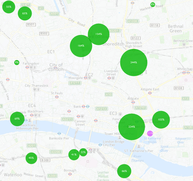
An alternate mode for the map, using the second line of options, allows you to quantify the change between two years, for a single selected type of transport. Green circles show an increase between the first and second year, with purple indicating decreases.

Categories
Data Graphics London

Lives on the Line v2: Estimated Life Expectancy by Small Areas

livesontheline_district

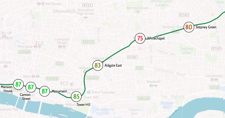
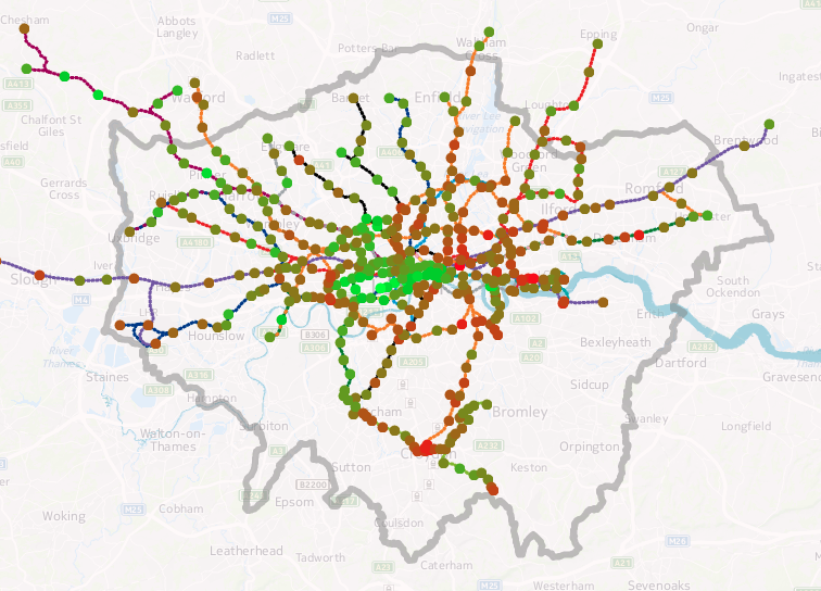
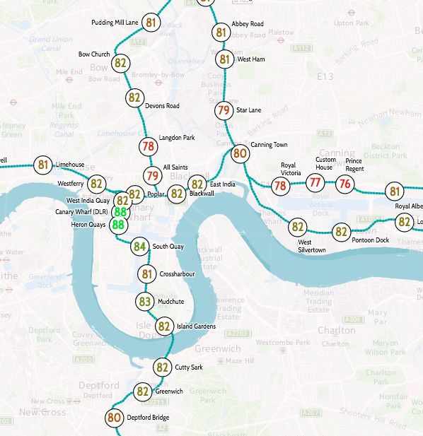
I’ve produced an updated version of a graphic that my colleague Dr James Cheshire created a few years ago, showing how the estimated life expectancy at birth varies throughout the capital, using a geographical tube map to illustrate sometimes dramatic change in a short distance.

You can see an interactive version on my tube data visualisation platform. Click a line colour in the key on the bottom right, to show just that line. For example, here’s the Central line in west London.

The data source is this ONS report from 2015 which reports averages by MSOA (typical population 8000) for 2009-2013. I’ve averaged the male and female estimates, and included all MSOAs which touch or are within a 200m radius buffer surrounding the centroid of each tube, DLR and London Overground station and London Tram stops. I’ve also included Crossrail which opens fully in 2019. The technique is similar to James’s, he wrote up how he did it in this blogpost. I used QGIS to perform the spatial analysis. The file with my calculated numbers by station is here and I’m planning on placing the updated code on GitHub soon.

livesontheline_alllondon

My version uses different aggregation units (MSOAs) to James’s original (which used wards). As such, due to differing wards and MSOAs being included within each station’s buffer area, you cannot directly compare the numbers between the two graphics. An addition is that I can include stations beyond the London boundary, as James’s original dataset was a special dataset covering the GLA area only, while my dataset covers the whole of England. The advantage of utilising my data-driven platform means that I can easily update the numbers, as and when new estimates are published by the ONS.

Estimating life expectancies at birth for small areas, such as MSOAs, is a tricky business and highly susceptible to change, particularly due London’s high rates of internal migration and environmental change. Nevertheless it provides a good snapshot of a divided city.

View the interactive version.

livesontheline_dlr

Data: ONS. Code: Oliver O’Brien. Background mapping: HERE Maps.

Categories
Data Graphics London

Big Data Here

9k-1

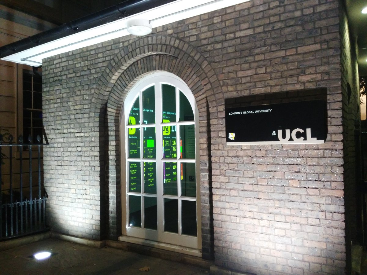
The Consumer Data Research Centre (CDRC) at UCL is organising a short pop-up exhibition on hyperlocal data: Big Data Here. The exhibition is taking place in North Lodge, the small building right beside UCL’s main entrance. The exhibition materials are supplied by the Centre for Advanced Spatial Analysis (CASA).

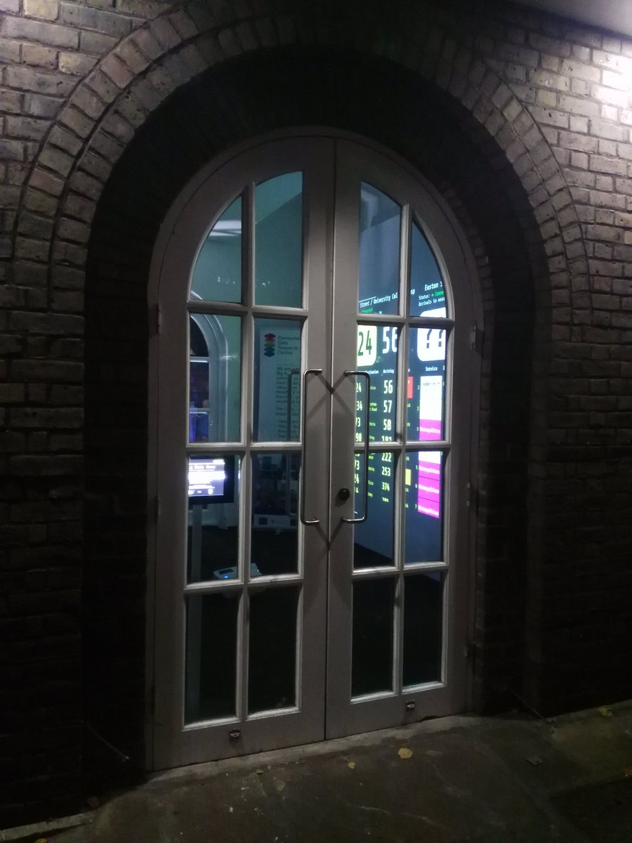
Inside, a big projection shows local digital information. What the screen shows will change daily between now and Friday, when the exhibition closes. Today it is showing a live to-the-second feed of bus arrivals at the bus stop outside the North Lodge, and tube train arrivals at Euston Square station just up the road. Watch the buses zip by as they flash up “Due” in big letters on the feed. Both of these are powered by Transport for London’s Unified Push API, and we are planning on publishing the visualisation online next week. Tomorrow will be showing a different local data feed, and then a final one on Friday.

cvimcbqwgaa4bkw

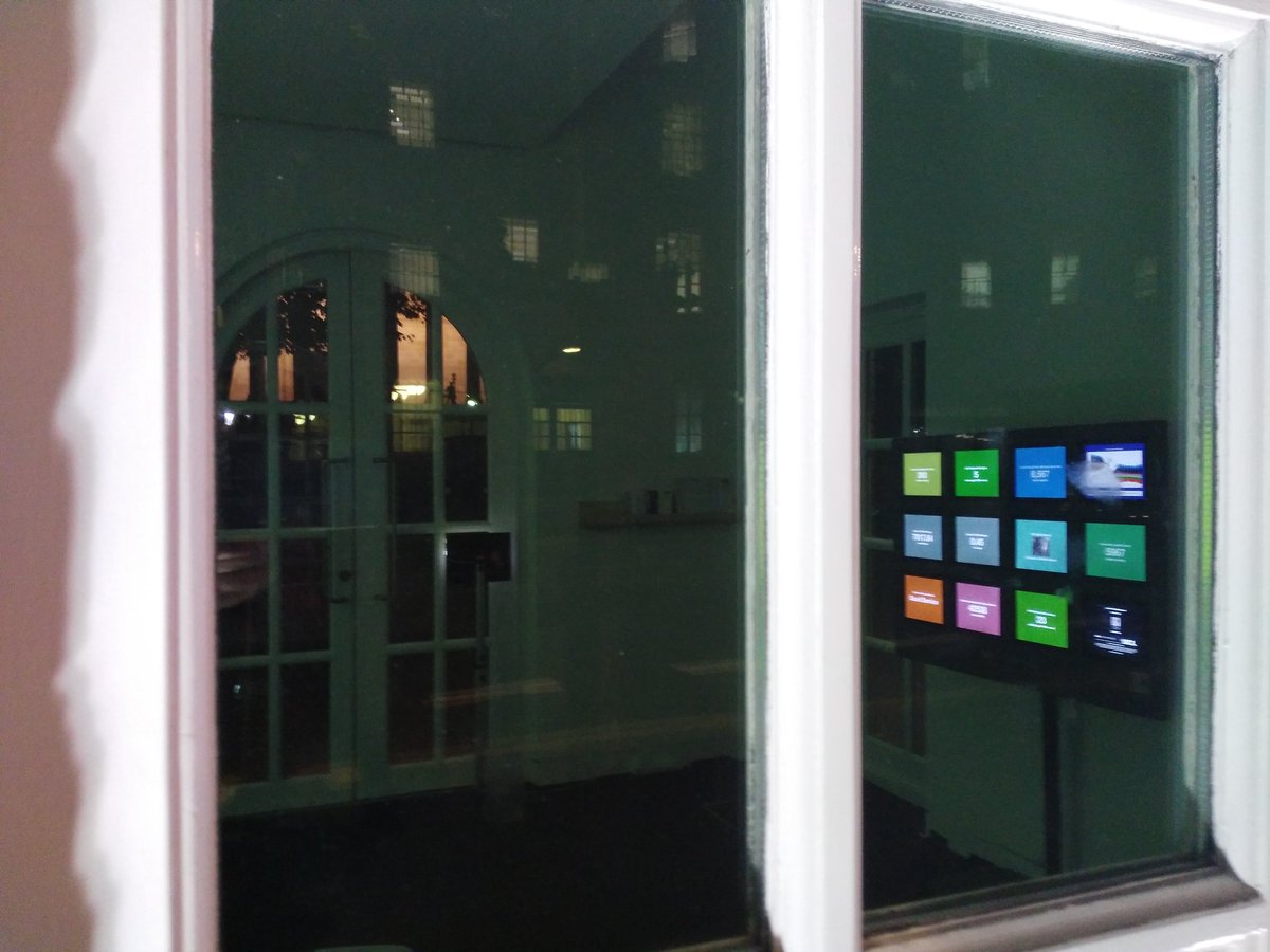
Opposite the projection is the iPad Wall. This was created by CASA a few years back by mounting a bank of iPads to a solid panel (above photo shows them in test mode) and allowing remote configuration and display. The wall has been adapted to show a number of metrics across its 12 panels. Four of these showcase footfall data collected by one of our data partners, and being used currently in CDRC Ph.D. research. The other panels show a mixture of air quality/pollutant measures, tube train numbers and trends, and traffic camera videos.

We hope that passersby will enjoy the exhibition visuals and use them to connect the real world with the digital space, a transposition of a digital data view onto the physical street space outside.

The exhibition runs 24 hours a day until Friday evening, with the doors open from noon until 3:30pm each day. The rest of the time, the visualisations will be visible through the North Lodge’s four windows. The exhibition is best viewed at night, where the data shines out of the window, spilling out onto the pavement and public space beyond:

2q

Big Data Here is taking place during Big Data Week 2016. Visit the exhibition website or just pop by UCL before Friday evening.

9k

cvmvee-xyaaxmep

Categories
Data Graphics

SIMD 2016: The Scottish Index of Multiple Deprivation

simd_2016_pic1

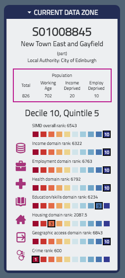
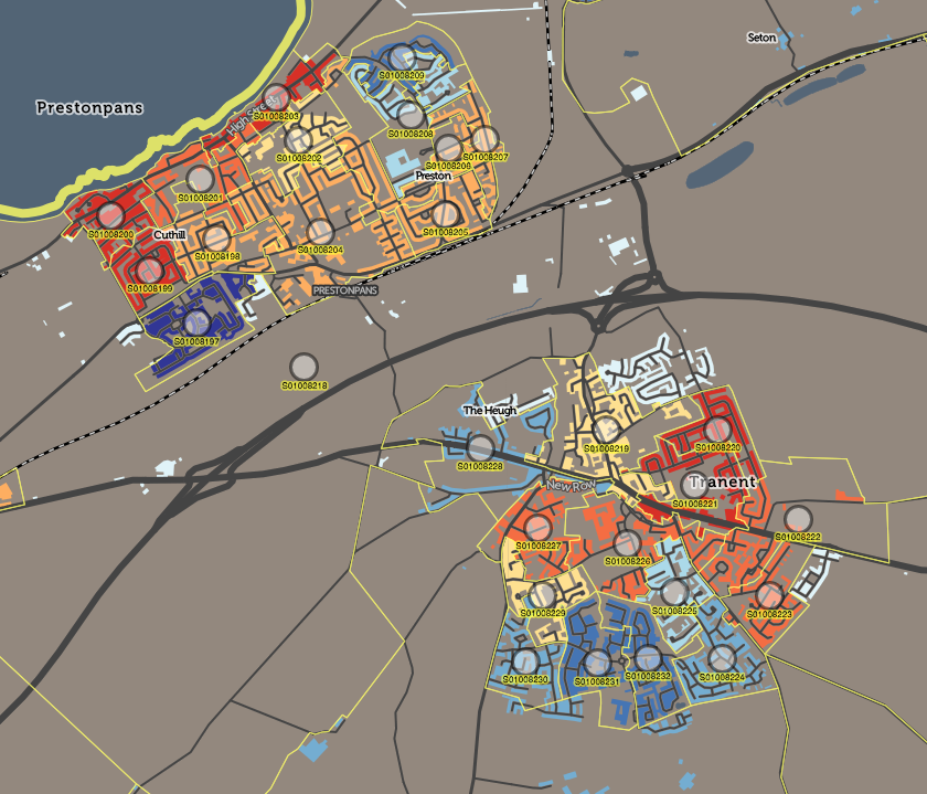
Like its English counterpart IMD, SIMD is released every few years by the Scottish government, as a dataset which scores and ranks every small statistical area in Scotland according to a number of measures. These are then combined to form an overall rank and measure of deprivation for the area. This can then be mapped to show the geographical variation and spread of deprived (and non-deprived) communities across the country. I mapped SIMD 2012 for The New Booth Map and also it appears as a layer in CDRC Maps.

simd_2016_pic3Dr Cheshire and I recently were commissioned to produce a new website to showcase the older SIMD 2012, and for the release of SIMD 2016, that contained tools useful for researchers and other specialist users, such as specific area data selection and retrieval and map downloads. The base of the website was the “DataShine” mapping style used in both the above examples, where only buildings are coloured, so that urban areas can be easily seen and related. With the great majority of the Scottish population in urban areas, and vast areas of unpopulated land in the country, this style of mapping is very useful both to draw the eye to where the population is, and also present a map that is a more familiar representation of the country. As such, even though this is intended to be a “pro users” site, it is accessible and useful to the general viewer too.

The new website SIMD.scot, was launched by the Scottish Government along with the SIMD 2016 statistical release, at the end of August. It was featured on the BBC News Scotland website, as well as on the Daily Record and Scotsman newspaper websites, drawing 60,000+ visits in the first few days.

Some technical notes about SIMD.scot:

  • UTFGrids, at 4×4 pixel resolution are used for the mouseover popup data on component indices.
  • I use HTML5 Download to create a PNG image of the current map view – this works only in Chrome and Firefox.
  • A “mobile” version of the website starts with an area chooser dialog, when viewed on screens smaller than 800px wide.
  • The website uses static content (except for the postcode search) in order to load quickly, even when many people are viewing the site at once.

The work was carried out through UCL Consultants. Explore the SIMD 2016 map itself at SIMD.scot or see the 2012 version.

simd_2016_pic2

Categories
Data Graphics London

Tube Heartbeat

tubeheartbeat

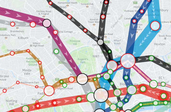
Tube Heartbeat is a interactive map that I recently built as part of a commission by HERE, using the HERE JavaScript API. It visualises a fascinating dataset that TfL makes available sporadically – the RODS (Rolling Origin Destination Survey) – which reveals the movements of people on the London Underground network in amazing detail.

The data includes, in fifteen-minute intervals throughout a weekday, the volume of tube passengers moving between every adjacent pair of stations on the entire tube network – 762 links across the 11 lines. It also includes numbers entering, exiting and transferring within each of the 268* tube stations, again at a 15 minute interval from 5am in the morning, right through to 2am. It has an origin/destination matrix too, again at fine-grained time intervals. The data is modelled, based on samples of how and where passengers are travelling, during a specimen week in the autumn – a period not affected either by summer holidays or Christmas shopping. The size of the sample, and the careful processing applied, means that we can be confident that the data is an accurate representation of how the system is used. The data is published every few years – as well as the most recent dataset, I have included an older one from 2012, to allow for an easy comparison.

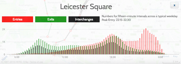
As well as the animation of the data, showing the heartbeat of London as the the lines pulse with passengers squeezing along them, I’ve including graphs for each station and each link. These show all sorts of interesting stats. For example, Leicester Square has a huge evening peak, when the theatre-goers head for home:

leicestersquare

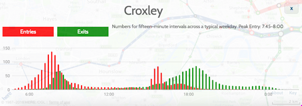
Or Croxley, in suburban north-west London, with a very curious set of peaks, possibly relating to the condensed school day:

croxley

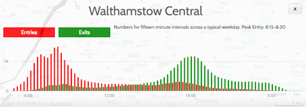
Walthamstow (along with some other east London stations) has two morning rush-hours with a slight lull between them:

walthamstow

Check the later panels in the Story Map, the intro which appears when first viewing Tube Heartbeat, for more examples of local quirks.

This is my first interactive web map produced using the HERE JavaScript API – in the past, I have extensively used the OpenLayers, as well as, a long while back, Google Maps API. The API was quick to pick up, thanks to good examples and documentation, and while it isn’t quite as full-featured as OpenLayers in terms of the cartography, it does include a number of extra features, such as being quickly able to implement direction arrows along lines, and access to a wide variety of HERE map image tiles. I’m using two of these – a subdued gray/green background map for the daytime, and an equivalent darker one for the evening data. You’ll see the map transition between the two in the early evening, when you “play” the animation or scrub the slider forwards.

Additionally, I’ve overlayed a translucent light grey rectangle across the map, which acts to further diffuse the background map and highlight the tube data on top. The “killer” feature of HERE JavaScript API, for me, is that it’s super fast – much faster than OpenLayers for displaying complex vector-based data on a map, on both computer and smartphone. Being part of the HERE infrastructure makes access to the wide range of HERE map tiles, with their distinctive design, easy, and gives the maps a distinctive look. I have previously used HERE mapping for some cities in the Bike Share Map (& another example), initially where the OpenStreetMap base data was low in detail for certain cities, but now for all new cities I “onboard” to the map. The attractive cartography works well at providing context for the bikeshare station data there, and the tube flow data here.

There is some further information about the project on the HERE 360 blog, and I am looking to publish a more deatiled blogpost soon about some of the technical aspects of putting together Tube Heartbeat.

Stats

Number of stations Number of lines Number of line links between stations
268* 11 762

Highest flows of people in 15 minutes, for the four peaks:

Between stations (all are on Central line)
Morning 8208 0830-0845 Bethnal Green to Liverpool Street
Lunchtime 2570 1230-1245 Chancery Lane to Holborn
Afternoon 7166 1745-1800 Bank/Monument to Liverpool Street
Evening 2365 2230-2245 St Paul’s to Bank/Monument
Station entries
Morning 7715 0830-0845 Waterloo
Lunchtime 1798 1130-1145 Victoria
Afternoon 5825 1730-1745 Bank/Monument
Evening 2095 1015-1030 Leicester Square
Station interchanges
Morning 5881 0830-0845 Oxford Circus
Lunchtime 2060 1330-1345 Oxford Circus
Afternoon 5043 1745-1800 Oxford Circus
Evening 1109** 2215-2230 Green Park
Station exits
Morning 6923 0845-0900 Bank/Monument
Lunchtime 2357 1145-1200 Oxford Circus
Afternoon 7013 1745-1800 Waterloo
Evening 1203 1015-1030 Waterloo

* Bank/Monument treated as one station, as are the two Paddington stations.
** Other stations have higher flows at this time but as a decline from previous peak.

I’m hoping to also, as time permits, extend Tube Heartbeat to other cities which make similar datasets available. At the time of writing, I have found no other city urban transport authority that publishes data quite as detailed as London does, but San Francisco’s BART system is publishes origin/destination data on an hourly basis, there is turnstyle entry/exit data from New York’s MET subway, although only at a four-hour granularity, and Washington DC’s metro also publishes a range of usage data. I’ve not found an equivalent dataset elsewhere in Europe, or in Asia, if you know of one please do let me know below.

tubeheartbeat2

The data represented in Tube Heartbeat is Crown copyright & database right, Transport for London 2016. Background mapping imagery is copyright HERE.