Categories
OpenLayers Technical

OpenLayers 3

ol-logo

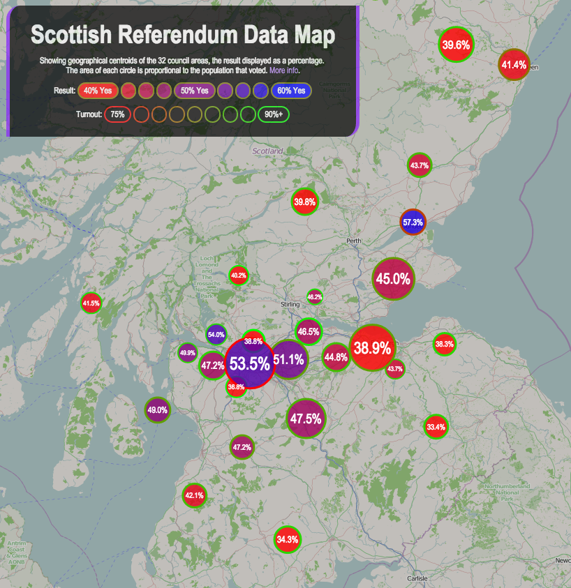
As a learning exercise, I been trying to “migrate” my recent #indyref map from OpenLayers 2.13.1 to the very new version 3.0.0 of the popular mapping API. It seemed a good time to learn this, because the OpenLayers website now shows v3 as the default version for people to download and use. Much of my output in the last few years has been maps based on OpenLayers, so I have considerable interest in the new version. There are some production sites using OpenLayers 3 already – for example, the official Swiss map.

I use the term “migrate” in inverted commas, because, really, OpenLayers 3 is pretty much a rewrite, with an altered object model, and accordingly requires coding from scratch a new map rather than just changing a few lines. It has so far taken me four times as long to do the conversion, as it did to create the original map, although that is an inevitable consequence of learning as I go along.

I’ll update this blogpost as I discover workarounds.

Shortcomings in v3 that I have come across so far:

  • No Permalink control. This is unfortunate, particularly as “anchor” style permalinks, which update as you move around the map, are very useful for visualisations like DataShine where people share specific views and places, and I can inject extra parameters in. The site linked above suggests this is a feature that should not be in the core mapping library, but instead an additional library can query/construct necessary parameters. Perhaps, but I think layer/zoom/lat/lon parameters are such a key part of a map (as opposed to other interactive content) that they still deserve to be treated specially.
  • The online documentation, particularly the apidoc, is very sparse in places. As mentioned above, there is also some mismatching in functionality suggested in the online tutorials, to what is actually available. Another example, the use of “font” instead of “fontSize” and “fontStyle” for styles. This will improve I am sure, and there is at least one book available on OpenLayers 3, but it’s still a little frustrating at this stage.
  • Label centering on the circle vectors is not as good as with OL 2. This is possibly due to antialiasing of the circle itself. You can see the labels “jump” slightly when comparing the two versions – see links below.
  • Much, much slower on my iPhone 4 (and also on a friend’s Android phone). This is not what I was expecting! This is the “killer” problem for me which means I’ve kept my map on OL 2 for now. Wrapping my vector layer in an Image layer is supposed to speed things up, but causes the layer not to display on my iPhone. Disabling the potentially expensive mousemove listener did not make a difference. Adding a viewport meta tag with width=device-width speeded things up a lot so that it was almost as fast as OL 2 (without the meta tag) but then I would need to rewrite my own UI for mobile – something I don’t need to do with the OL 2 version!
  • No support (yet) for UTFGrids. These are a form of vector tiles, for metadata rather than geographic features, which I use on the DataShine project.

Things which I like about the new version:

  • Smooth vector resizing/repositioning when zooming in/out on a computer. (N.B. This is only when using a Vector layer and a Vector source, rather than Image layer with an ImageVector source that itself uses a Vector source.)
  • Attribution is handled better, it looks nicer.
  • No need to have a 100% width/height on the map div any more.
  • Resolution-specific styling. I’ve used this to hide the labels when zoomed out beyond a certain amount.
  • Can finally specify (in a straightforward fashion) a minimum zoom level.
  • Point coordinates and extents/bounds are specified in a much simpler way.
  • On a more general note, the new syntax is more complete and feels less “hacky”. The developers have taken the opportunity to do it “right” and remove inconsistencies, misplaced functionality and other quirks from the old version. For example, separating out visual UI controls and interaction management controls into two separate classes.
  • Drag-and-drop addition of KML/GeoJSON vector features. Example (use this file as a test).

Some gotchas, which got me for a bit, but I was able to solve:

  • You need to link in a new ol.css stylesheet, not just the Javascript library, in order to get the default controls to display and position correctly.
  • Attribution information is attached to a source object now, not directly to the layer. A layer contains a source.
  • Attribute-based vector styling is a lot more complicated to specify. You need to create a function which you feed in to an attribute. The function has to return a style wrapped in an array – this may be the closure syntax in Javascript that I have not come across before.
  • Hover/mouseover events are not handled directly by OpenLayers any more – but click events are, so the two event types require quite different setups.
  • Minor differences between the debug and regular versions of the library. The example I noticed is that the debug version allows ol.control.ScaleLineUnits.METRIC to be specified as an attribute for the ScaleLine control, but the non-debug version needs to use an explicit string “metric”.
  • No opacity control on individual styles – only on layers. This means I can’t have the circles with the fill at 80% opacity but the text at 100% opacity. Opacity can be set on styles, but has to be specified as part of the colour, in RGBA format (where A is the alpha, i.e. opacity, you want) rather than as a separate attribute. This is contrary to the tutorials on the website. Layer opacity can continue to be specified as seperate attributes.

My OpenLayers 3 version of the #indyref map is here – compare with the OpenLayers 2 one. Note that, since first writing this blogpost, I’ve subsequently updated the OpenLayers 2 one to change the cartography there further.

Categories
Data Graphics

Scottish Independence Referendum: Data Map

indyref

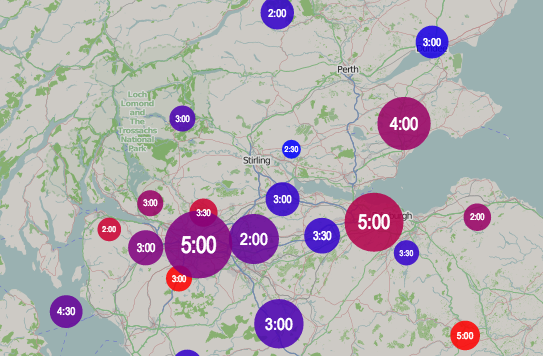
Scotland’s population is heavily skewed towards the central belt (Glasgow/Edinburgh) which will affect likely reporting times of the independence referendum in the early hours of Friday 19 September, this being dependent both on the overall numbers of votes cast in each of the 32 council areas, and the time taken to get ballot boxes from the far corners of each area to the counting hall in each area. Helicopters will be used, weather permitting, in the Western Isles!

There is also likely a significant variation in the result that each area declares – with regions next to England (so dependent on trade with them) and furthest away from them (so benefiting most from support) likely to strongly vote “No”, the major cities being difficult to call, and the rural areas and smaller, less affluent cities of the central vote much more likely to vote “Yes”. Note that unlike a constituency election which is “first past the vote” for each area, the referendum is a simple sum-total for everyone, so while it will be interesting hearing each individual results, ultimately we won’t know the result until almost every area has declared the result, and the lead for one side becomes unassailable (areas will declare the size of the vote well before the result, which will make this possible).

A screenshot of a table, in a report “Scotland referendum: Looking through the mist” from the Credit Suisse Economics Research unit, was circulating Twitter a couple of days ago:

Expected #indyref declaration times for every council area. Good find by @gerrybraiden. pic.twitter.com/ryzCtDbRCQ

— Scott Reid (@scottreid1980) September 12, 2014

It has estimates on all three of these metrics, so I’ve taken this, combined it with centroids of each of the council areas, and produced a map. Like many of my maps these days, coloured circles are the way I’m showing the data. Redder areas are more likely to vote no, and larger circles have a larger registered population. The numbers show the estimated declaration times. Looks like I’ll be up all night on Thursday. Mouse over a circle for more information.

View the live #indyref map here.

ps. I’ve subsequently got hold of a copy of the report concerned. To quote the methodology for determining the “Yes” rating, it’s

“derived from support for the Scottish National Party in the 2012 local elections. We… show a range from 0 (the lowest local vote [share] for SNP in 2012, excluding Orkney and Shetland where the vote was negligible) to 10 (highest local vote share for SNP).”

This implies the Orkney/Shetland results were not used in the 0-10 scaling, as their very low results for the SNP overly skewed the metric.

Categories
Cycling London

An East-West and North-South Cycle Superhighway for London?

eastwest

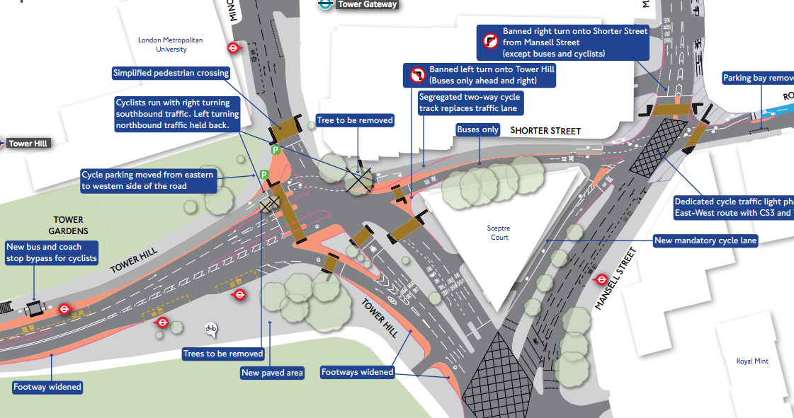
TfL is currently consulting on a couple of proposed “Cycle Superhighways” – an East-West route from Paddington to Tower Hill and a North-South route from St Pancras to Elephant & Castle. The consultations close on 12 October.

The Cycle Superhighways punch right through the centre of London, they are generally wide and properly segregated from traffic. The space is often being made available by reclaiming a traffic lane. The Mayor has referred to them as a “Crossrail for Bikes”, which is a fair description. The two routes meet at the Blackfriars junction.

The east-west route has some curious quirks – it takes a circuitous route around Hyde Park, whereas a new lane going right through the park, or the existing cycle track in the north-east, would surely work better. I expect this is thanks to a lack of cooperation from the Royal Parks authorities – they really should travel to Central Park in New York City to see how world city parks are done properly. It also has a strange section where it takes another tunnel alongside the Blackfriars Tunnel, even though the latter is having one lane closed anyway to keep the traffic lane count consistent. But overall it is a well planned route. Cyclists retain right-of-way over most of the side streets, they don’t have annoying chicanes around the “floating” bus stops, and the “early start” lights (which actually simply act to ensure a cyclist will never get a green light right through) are few and far between.

The north-south route is less completely planned – the core section from Farringdon to Elephant & Castle however is ready for the detailed consultation. A strange dogleg on the approach to Elephant & Castle is unfortunate – “Superhighway” cyclists are always going to be looking for the fastest route, which the route does not take here – but apart from that it is a good, and straight, route.

I very much hope these two routes get built in their planned form and the proposals don’t get watered down. But also I would like Transport for London to focus on improving the busiest existing infrastructure too. Today on my research blog I publish a map showing estimated routes for 12 million bikeshare trips earlier this year. It shows the “Route 0” cyclepath, south of and parallel to Euston Road, as being the busiest of all. There is a good section of segregated two-way cycleway, but it’s horribly cramped, with queues of cyclists at rush-hour often so long that they back onto the next junction. The roadway alongside is normally less busy and therefore often makes for a quicker cycle route. I would also like many more one-way streets to be made two-way for cycles only – the “Sauf Vélo” popular in France, but for London. This can be done on a “lightweight” basis with minimal signage change, so there should be many, many more streets allowing such flows. After all, we don’t make pedestrians walk in a single direction!

Categories
Bike Share London

From Putney to Poplar: 12 Million Journeys on the London Bikeshare

london_barclayscyclehire

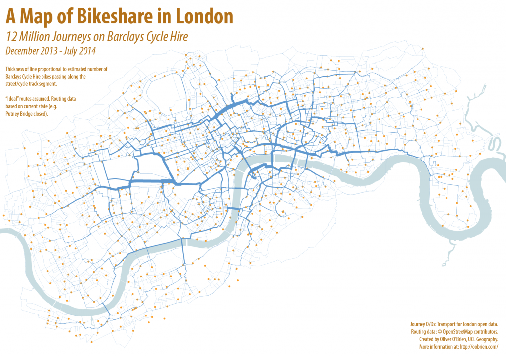
The above graphic (click for full version) shows 12.4 million bicycle journeys taken on the Barclays Cycle Hire system in London over seven months, from 13 December 2013, when the south-west expansion to Putney and Hammersmith went live, until 19 July 2014 – the latest journey data available from Transport for London’s Open Data portal. It’s an update of a graphic I’ve made for journeys on previous phases of the system in London (& for NYC, Washington DC and Boston) – but this is the first time that data has been made available covering the current full extent of the system – from the most westerly docking station (Ravenscourt Park) to the the most easterly (East India), the shortest route is over 18km.

As before, I’ve used Routino to calculate the “ideal” routes – avoiding the busiest highways and taking cycle paths where they are nearby and add little distance to the journey. Thickness of each segment corresponds to the estimated number of bikeshare bikes passing along that segment. The busiest segment of all this time is on Tavistock Place, a very popular cycle track just south of the Euston Road in Bloomsbury. My calculations estimate that 275,842 of the 12,432,810 journeys, for which there is “good” data, travelled eastwards along this segment.

The road and path network data is from OpenStreetMap and it is a snapshot from this week. These means that Putney Bridge, which is currently closed, shows no cycles crossing it, whereas in fact it was open during the data collection period. There are a few other quirks – the closure of Upper Ground causing a big kink to appear just south of Blackfriars Bridge. The avoidance of busier routes probably doesn’t actually reflect reality – the map shows very little “Boris Bike” traffic along Euston Road or the Highway, whereas I bet there are a few brave souls who do take those routes.

My live map of the docking stations, which like the London Bikeshare itself has been going for over four years, is here.

[Update – A version of the map appears in Telegraph article. N.B. The article got a little garbled between writing it and its publication, particularly about the distinction between stats for the bikeshare and for commuter cyclists in London.]

Categories
BODMAS Geodemographics

DataShine: 2011 OAC

oac2

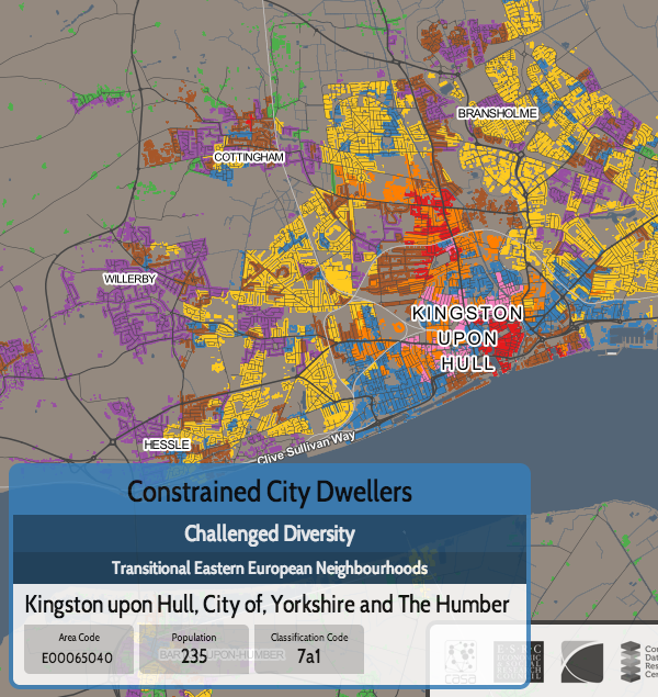
The 2011 Area Classification for Output Areas, or 2011 OAC, is a geodemographic classification that was developed by Dr Chris Gale during his Ph.D at UCL Geography over the last few years, in close conjunction with the Office for National Statistics, who have endorsed it and adopted it as their official classification and who collected and provided the data behind the classification – namely the 2011 Census.

A geodemographic classification such as this takes the datasets and looks for clusters, where particular places have similar characteristics across many of the variables. It does this on a non-geographic basis, but spatial autocorrelation means that geographic groupings do typically appear – e.g. a particular part of an inner city will typically have more in common with another part of the inner city, than of the suburbs. However, these areas will often also share much in common with other “inner city” parts of cities elsewhere. Names are then assigned, to attempt to succinctly describe the clusters.

As part of the DataShine project, we have taken the classifications, and mapped them, using the DataShine style of restricting the classification colouring to built up areas and (when zoomed in) individual rows of houses. The map is the third DataShine output, following maps of individual census tables and also the new Travel to Work Flows table.

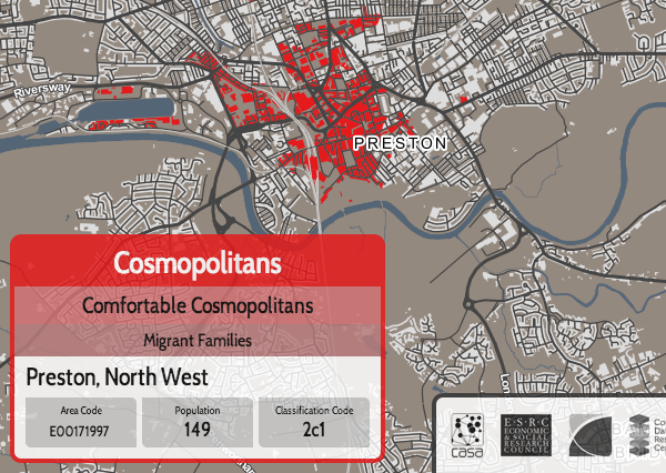
We’re just mapping the eight “Supergroups”, the top-level clusters. A pop-up shows the more detailed groups and subgroups, and you can find pen-portraits for all these classifications on the ONS website.

Click on the box for an individual supergroup, in the key at the top, to see a map showing just that supergroup on its own. For example, here are the “Cosmopolitan” dwellers of London:

oac3

Like 2011 OAC itself, the map covers all of the UK, including Scotland and Northern Ireland. For the latter, there is no Ordnance Survey Open Data which is how we created the building/urban outlines, so we have improvised with data from OpenStreetMap and NISRA (Northern Ireland Statistics).

The map is part of DataShine, an output of the BODMAS project, but also is in conjunction with the the new Consumer Research Data Centre, an ESRC Data Investment which is being set up here at UCL and other institutions. As such, there is a CDRC version of the map.

As part of the BODMAS project we have also been studying the quality of fit of 2011 OAC for different parts of the UK, and techniques to visualise the uncertainty and quality of the classifications. We will be presenting these findings at the Uncertainty workshop at the GIScience conference in Vienna, later this month.

Direct link to the map.
See also the DataShine blog.

Categories
Conferences

Workshop on Big Data and Urban Informatics

IMG_0716

I attended the Big Data and Urban Informatics workshop in UIC Chicago in early August. My previous blog post outlined my presentation at the workshop. Here’s my notes and thoughts on some of the other talks that I attended.

IMG_0724

  • Above, the AURIN Workbench is a sophisticated platform for city authorities in Australia to output their data and visualise it through a portal. It’s an academic and commercial partnership. A key focus is data consolidation and normalisation, to allow for straightforward comparisons. This is a challenging aspect with so many data sources, from many authorities and places, and as such there is a large team of people involved with the ever-necessary data processing.
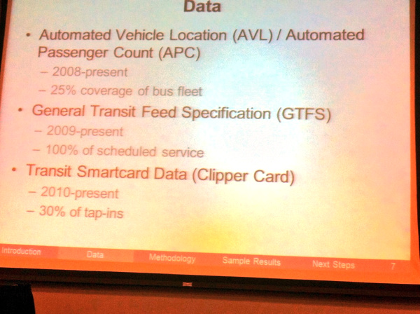
  • CASA scholar Greg Erhardt presented on Ph.D work, below, combining together public transport datasets for San Francisco, to build up a multi-modal database. One particular challenge is the incomplete adoption of smartcard-based travel. Here in London, we are lucky that the Oyster-card usage is so high, that it forms a near-complete picture of public transport usage in many parts of London. This is not the case in San Francisco and many other cities.
  • An update on UrbanSim (picture at bottom), one of many urban models, a reworked version of which now uses the Python Data Science Data Stack and is hosted on GitHub – both of these potentially opening the model up to discovery, use and adaptation by new groups. ActivitySim is launching as part of the project – this will be an open activity based travel demand model, to complement UrbanSim’s land-use focus.

IMG_0730

IMG_0739

I saw several other interesting talks and presentations, and it is interesting to see just how much activity is going on in the urban informatics spaces, particularly with the ever-increasing volumes of so-called “big data” becoming increasingly easily available for researchers and visualisers.

Categories
Conferences London Mashups

On City Dashboards and Data Stores

Earlier this month, I gave a short presentation at the Big Data and Urban Informatics Workshop, which took place at UIC (University of Illinois in Chicago). My presentation was an abridged version of a paper that I prepared for the workshop. In due course, I plan to publish the full paper, possibly as a CASA working paper or in another open form. The full paper had a number of authors, including Prof Batty and Steven Gray.

Below are the slides that formed the basis of my presentation. I left out contextual information and links in the slidedeck itself, so I’ve added these in after the embedded section:

Notes

Slide 3: MapQuest map showing CASA centrally located in London.
Slides 4-5: More information.
Slide 6: More information about my Bike Share Map, live version.
Slide 7: More information.
Slide 8: More information about CityDashboard, live version.
Slide 10: Live version of CityDashboard’s map view.
Slide 11: More information about the London Periodic Table, live version.
Slide 14: More information about Prism.
Slide 15: London and Paris datastores.
Slide 16: Chicago, Washington DC, Boston data portals.
Slide 17: The London Dashboard created by the Greater London Authority. Many of its panels update very infrequently.
Slide 18: Washington DC’s Open Government Dashboard and Green Dashboard, these are rather basic dashboards, the first being simply a graph and the second having just three categories.
Slide 19: The Amsterdam Dashboard created by WAAG, a non-profit computer society based in the heart of the city.
Slide 20: The Open Data City Census (US version/UK version) created by OKFN – a great idea to measure and compare cities by the breadth and quality of their open data offerings.
Slide 21: More information.
Slide 22: More information.
Slide 23: Pigeon Sim.
Slide 24: Link to iCity, More information on DataShine, live version.
Slide 25: More information on DataShine Travel to Work Flows, live version.

Some slides contain maps, which are generally based on OpenStreetMap (OSM) or Ordnance Survey Open Data datasets.

Categories
Cycling Training

Strava – Gamifying the Commute

Screen Shot 2014-08-07 at 14.01.32

I first tried Strava last year, comparing it to Endomondo, RunKeeper and some others, as a way of quickly pushing maps of long bike rides onto Facebook, rather than just keeping them to myself on Ascent (a standalone Mac application which has ceased development) or Garmin Connect (which wasn’t particularly sociable).

I didn’t use Strava in the end, but I’m a big convert now, because I’ve realised that Strava is not just a running/cycling route recording site, but it’s a fully fledged social network – crucially, one which is large enough to actually function as a proper social network – and best of all, they’ve basically turned London’s street network into a giant game, with “segments”. I first heard of this when a friend, who’s an active Strava user, lamenting that the Tour de France riders had wiped out various segment leaders, en masse, as they zoomed through the streets of London during the third stage of this year’s race, as some were GPS’ing their route as they went.

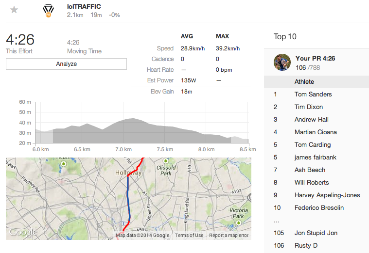
Segments are sections of a street – typically a long, straight section, or between two sets of slow traffic lights, or from the bottom to the top of a hill – which someone has named and designated as a segment. You then have a public leaderboard of who’s cycled/run the segment, plus your own personal statistics for the segments as well.

Despite recording my recent commutes, and back-loading various GPS’d runs and cycles into Strava, I don’t have many “CRs” (course records) for segments. But I’m pleased to hold on to two – both runs. One is along a windy road near Seven Sisters. The route/segment matching algorithm doesn’t seem to have minded that I cut a big corner near the end, even though it is obvious on the GPS trace, so has given me a comfortable 40 second cushion. The other was a short uphill section of the North Downs Way, part of a leg I ran during the NDW Relay race that my club takes part in every July. Oddly, it was a section where I made a mistake (due to OpenStreetMap inaccuracies), and veered off the route, only to have the others in the relay go past. I corrected quickly and ran hard to regain the lead, and as a useful bonus it’s given me a CR here too.

Anyway, for cycling, I may struggle to get any CRs soon, as most of these on the commute require cycling over 40km/hour, or more for sprints and descents. I’ll need to get lucky with traffic light timings, and late night empty roads. It might also encourage me to run more (which is good) and cycle faster (probably not so good). in any case, it’s made the commute a lot more fun. Thanks Strava!

Screen Shot 2014-08-07 at 14.00.01

Categories
London Technical

Borough Tops

Screen Shot 2014-08-05 at 14.49.16

The Diamond Geezer is, this month, climbing the highest tops in each one of London’s 33 boroughs.

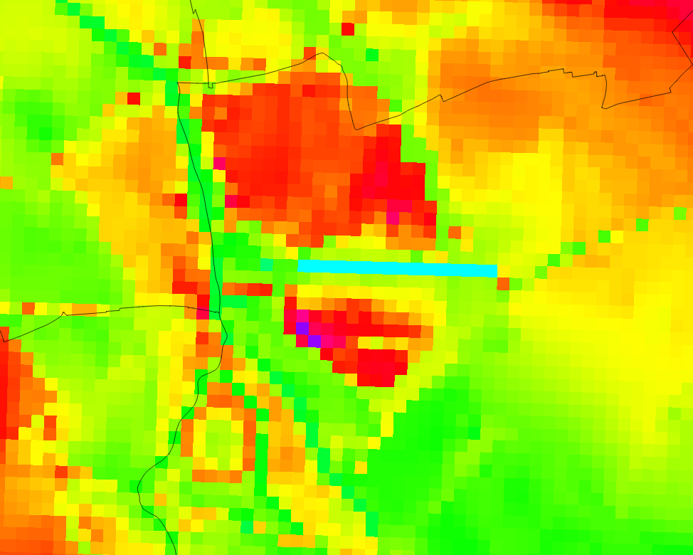
To find the highest points, he’s used a number of websites which list the places. These derive the data from contour lines, perhaps supplemented with GPS or other measurements. However, another interesting – and new – datasource for calculating this kind of metric, is OS Terrain 50. Released as part of the Ordnance Survey Open Data packages, it is a gridded DEM (Digital Elevation Model). It’s right up to date, at 50m x 50m horizontal resolution, and 10cm vertical resolution, and it should correct for buildings, so showing the true ground height.

Looking at the DEM for Newham, I think it reveals a new highest point – not Wanstead Flats at 15m above sea level, as Diamond Geezer’s lists suggest, but Westfield Avenue, the new road that runs through the Olympic Park. Beside John Lewis, the road rises, to a highest point of 21.6m. It shows as purple in the graphic above. Nearby, the new “bowl” of the lower part of the Olympic Stadium can be seen, as well as the trench through which High Speed 1 runs, at Stratford International Station.

I can’t argue with the Chancery Lane/Holborn junction as being the highest ground-point in the City of London, at 21.9m. In Tower Hamlets, it’s more tricky. The old railyards between Shoreditch High Street and the lines into Liverpool Street look like they are at 21.7m, however the ground here is not publically accessible, and the DEM is quite noisy here, with only part of the railyard showing this height.

I’m looking for a way to do this programatically – calculating the highest DEM value for each borough. I’ve tried using QGIS’s Zonal Statistics plugin, with polygon shapefiles of London’s boroughs, but this only shows the mean value of the DEM for that borough.

Here’s the list I’ve created by measuring – the main issue with my dataset is that the measurements are only at the centre of each 50m x 50m cell.

Borough Hgt (m) 50m cn 10-digit grid ref Description of
approximate location
By edge?
Barking and Dagenham 45.3 TQ_48590_89948 Industrial area just E of northern part of Whalebone Lane North.
Barnet 146.1 TQ 21955 95622 Just south of the water tower to the east of Rowley Lane, near Rowley Green.
Bexley 81 TQ 45737 71256 Langdon Shaw, southwest side. Yes
Brent 91.2 TQ 20732 88877 Junction of Wakemans Hill Avenue and The Grove.
Bromley 246.5 TQ 43637 56487 A233 – where Main Road changes name to Westerham Hill Yes
Camden 135.6 TQ 26277 86225 Lower Terrace, just off Heath Street in Hampstead. Yes
City of London 21.9 TQ 30970 81612 NW edge – junction of Holborn and Chancery Lane.
Croydon 175.7 TQ 34330 61827 Sanderstead Plantation, SW path crossroads.
Ealing 81.5 TQ 16177 84398 Horsenden Hill
Enfield 118.7 TQ 25632 97674 Just north of Camlet Way, Hadley Wood, opposite Calderwood Place. Yes
Greenwich 131.1 TQ 43831 76583 Southern end of Eaglesfield Recreation Ground on Shooters Hill.
Hackney 39.8 TQ 32025 87574 In Finsbury Park, beside Green Lanes, opposite No. 330. Yes
Hammersmith and Fulham 45.9 TQ 22960 82756 Harrow Road at north end of bridge over the railway line near Kensal Green station. Yes
Haringey 129 TQ 28326 87479 Ground by Highgate School Chapel, just north of Highgate High Street.
Harrow 153.4 TQ 15288 93808 Magpie Hall Road, between The Common and Alpine Walk. Yes
Havering 106 TQ 51192 93055 Churchyard of St John the Evangelist church (also Broxhill Road by the cricket pitch)
Hillingdon 130.5 TQ 10585 91678 Junction of South View Road and Potter Street Hill Yes
Hounslow 33.6 TQ 11320 78815 Western Road – bridge over the Grand Union Canal.
Islington 99.9 TQ 28874 87217 Highgate Hill and Hornsey Lane junction. Yes
Kensington and Chelsea 45.7 TQ 23014 82728 Kensal Green Cemetery, northern edge, beside the Harrow Road, above the railway line. Yes
Kingston upon Thames 91.3 TQ 16644 60376 Telegraph Hill
Lambeth 110.9 TQ 33620 70729 Westow HIll and Japser Road junction. Yes
Lewisham 111.2 TQ 33918 71779 Sydenham Hill and Rock Hill junction. Yes
Merton 56 TQ 23627 70823 Lauriston Road and Wilberforce Way NW junction.
Newham 21.6 TQ 37967 84530 Westfield Avenue, outside John Lewis in Westfield Stratford City.
Redbridge 91.5 TQ 47945 93784 Cabin Hill
Richmond upon Thames 56 TQ 18779 73065 Bridleway/path junction just east of Queens Road, opposite the Pembroke Lodge car-park and to the NE of it.
Southwark 111.5 TQ 33926 71686 Sydenham Hill, between Chestnut Place and Bluebell Close. Yes
Sutton 146.4 TQ 28383 59986 Middle of rectangle of land south-east of Corrigan Avenue and south-west of Richland Avenue.
Tower Hamlets 21.7 TQ 33720 82184 Railway yards between Shoreditch High Street station and the railways lines leading to Liverpool St Station.
Waltham Forest 92.2 TQ 38415 95010 Pole Hill (north top)
Wandsworth 60.7 TQ 22881 72780 Big Alp, Wimbledon Common
Westminster 53 TQ 26627 18386 Finchley Road and Boundary Road junction. Yes
Categories
BODMAS OpenLayers

DataShine Travel to Work Flows

datashinecommute

Today, the Office for National Statistics (ONS) have released the Travel to Work Flows based on the 2011 census. These are a giant origin-destination matrix of where people commute to work. There are various tables that have been released. I’ve chosen the Method of Travel to Work and visualised the flows, for England and Wales, on this interactive map. The map uses OpenLayers, with an OpenStreetMap background for context. Because we are showing the flows and places (MSOA population-weighted centroids) as vectors, a reasonably powerful computer with a large screen and a modern web browser is needed to view the map. The latest versions of Firefox, Safari or Chrome should be OK. Your mobile phone will likely not be so happy.

Blue lines represent flows coming in to a selected place, that people work in. Red lines show flows out from the selected location, to work elsewhere.

The map is part of the DataShine platform, an output of the BODMAS project led by Dr Cheshire, where we take big, open datasets and analyse them. The data – both the travel to work flows and the population-weighted MSOA centroids – come from from the ONS, table WU03EW.

View the interactive map here.

lichfieldcommute