Categories
Leisure London

High Lines 6. Bishopsgate Goods Yard

06af1170-a125-491c-8775-a8d4ccc348fb

This is one in a series of posts about possible High Lines for London. Look out for the next one tomorrow.

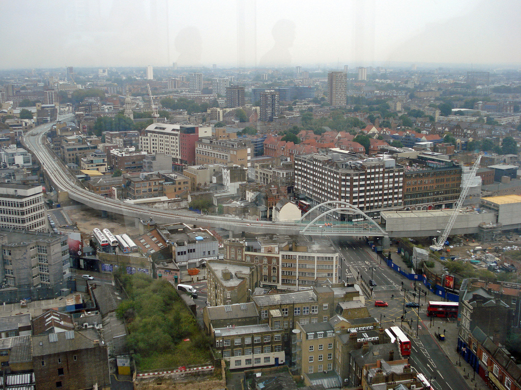
This is a potential High Line that might well happen, but in a radically different form to the current situation. Largely demolished, the raised Bishopsgate Goods Yard space is about to see a big change.

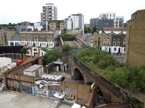
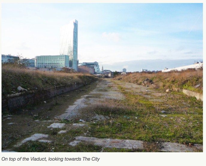
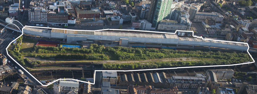
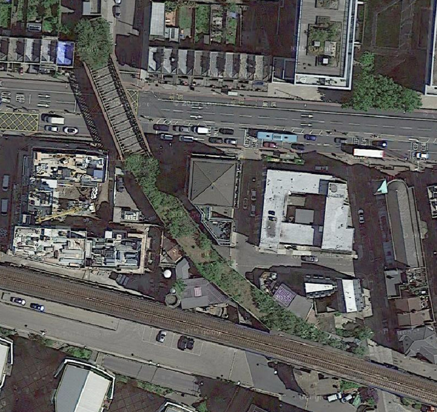
Sitting just south of the new Shoreditch High Street station (the other side from BoxPark), it was once Bishopsgate Station, then it was converted to a goods yard in 1875. After a huge fire in 1964 it was abandoned. The remains of the building were demolished in 2003 but a raised area remains, part of which is the Braithwaite Viaduct, a relatively linear section which is largely unseen – the adjoining Shoreditch High Street station is also elevated and so would have good views of the area, but is enclosed in concrete in anticipation of major building construction over and alongside it.

Aerial view of Shoreditch, London

It would make a nice, if short, High Walk, running between Brick Lane and the Great Eastern Street/Bishopsgate junction with great views over to the City, Spitalfields and Hoxton/Shoreditch. The section is just 260m long, not much longer than the station alongside it, but it would surely be popular, just looking at the crowds that throng the City to the west during the weekdays, and Brick Lane to the east at the weekends.

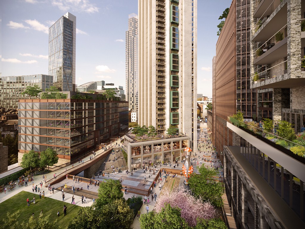
A small part of the site, specifically the arches forming the remainder of the Braithwaite Viaduct, is likely to be preserved and remodelled, rather than being demolished, as part of a huge new mixed use development “The Goodsyard” that is due to start at the end of next year and finish a few years later. Photos of the potential design suggest a high level walking above the arches, connecting the various new buildings as well as Brick Lane with Bishopsgate, along with lower level paths including one in the arches themselves. A campaign against it (more), concerned mainly with overshadowing of the existing Shoreditch area, has already led to some design changes. Existing railway tunnels (Central and Great Eastern) underneath the site mean that piling locations are limited however, and so elevated walkways (which generally wouldn’t require piling) are likely to remain part of the final design. It won’t be a quiet path sneaking through an old industrial area, rather a route connecting various new blocks, so it won’t feel like a hidden secret, but it will be raised, it’s in an appropriately gritty area for a “High Line” (check out this atmospheric passage very close by!) The space has been off limits to the public for 50 years. Looking forward to the transformation.

See also: BBC News article about the “High Line” potential of the Bishopsgate Goods Yard.

260fbf2e-37d9-4de0-93fb-ea317dc568a0

Photos from The Goodsyard (the developer’s website). Aerial image/map from More Light More Power.

Categories
Leisure London

High Lines 5. Parkland Walk

This is one in a series of posts about possible High Lines for London. Look out for the next one tomorrow.

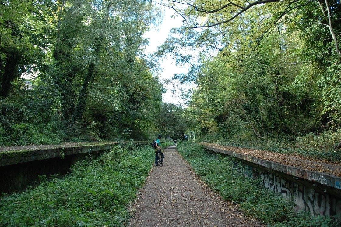
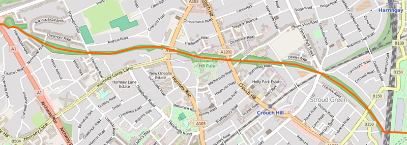
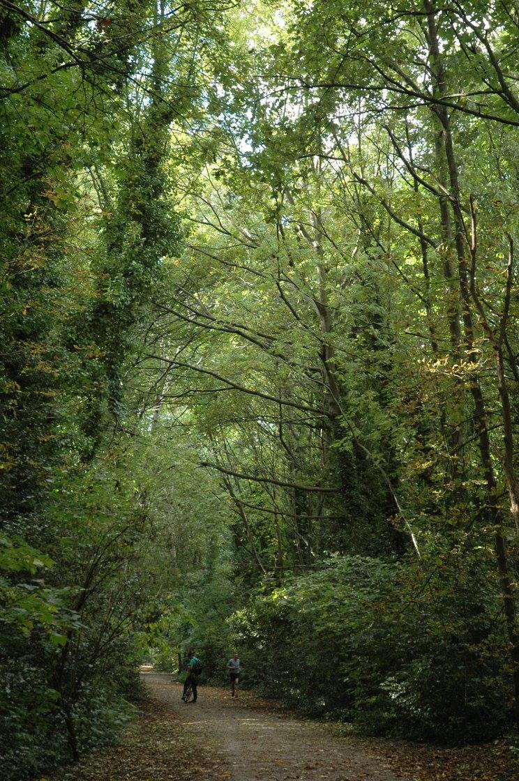
The Parkland Walk is possibly the closest thing that London has to a High Line, right now. It’s on a disused railway line (including platforms at one point), it has some short elevated sections, and it already exists as a walking and cycling route. However, the character of the area is very different. The line runs through a solidly residential, leafy (and hilly) part of north London, connecting Finsbury Park to Highgate. The feel is more of a woodland walk, with some tall mature trees which lessen the sense of threading through the city and observing it, and make the route feel rather enclosed and claustrophobic in places. It’s a lovely route for dog walkers or people cycling west from Finsbury Park – although the route is generally not surfaced and so is difficult to ride on or keep your feet dry after rain, when the path turns to mud.

parklandwalkosm

It’s a shame – more could be made of it certainly, however I rather suspect the local patronage rather like it as it is, and would never allow the trees to be cut down to improve the view*. It’s a lost link, a slightly neglected but useful enough rail trail through some deliberately overgrown flora, rather than a place to view the city from. The route is not secure or lit and is open at night, so suffers from some anti-social problems. Having said that, I would love to have it as a jogging route on my doorstep.

12291138_10100759914621877_7538362270627928830_o

* In my description above I omitted mentioning a branch section of the route, that runs from Queen’s Wood (near Highgate) to Alexandra Palace and does in fact include some spectacular views southward to central London.

Above: The platforms at the old Crouch End station. Below: Tall trees enclosing the Parkland Walk route. Photos by Alyson Fletcher. Map is Copyright OpenStreetMap contributors, ODbL, with cartography CC-By OpenStreetMap.

Categories
Leisure London

High Lines 4. Peckham Coal Line

CAvQOFaWoAAWHCG

This is one in a series of posts about possible High Lines for London. Look out for the next one tomorrow.

The Peckham Coal Line is a potential “High Line” for south London, which has a higher profile than most of the others I’m featuring inn this series, following a recent crowd-funding campaign to fund a full feasibility study, and expressions of interest from thw council, the Mayor and other key parties necessary making such a such a thing happen.

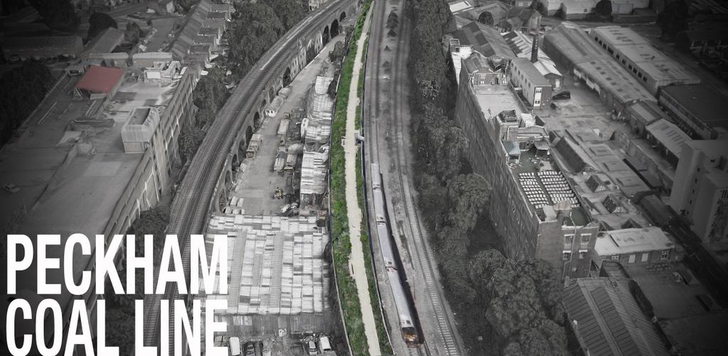
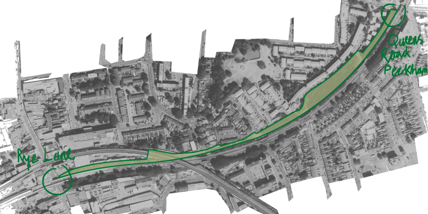
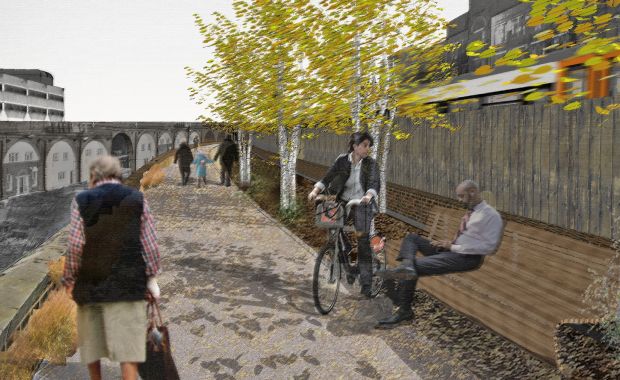
The route proposes taking over an unused set of sidings, beside the London Overground between Rye Lane (near Peckham Rye station) and Queen’s Road Peckham station, and turning it into a linear park, separated from the railway by a fence, and incorporating a gradual descent down to road level at its eastern end, through an existing small park beside the railway. The total length would be a kilometre. Peckham Rye station itself is due to undergo a major redevelopment, opening out the historic Victorian station building and courtyard, and a nearby High Walk type link would likely greatly add to the rejuvenation of the area.

peckhamcoalline

Peckham is reasonably far out from central London, but has the right “inner city” urban-renewal feel that could mean such a venture is successful. The people behind the event held a recent open day where part of the route was test-walked. Looking at the map suggests that much of the route will be a tight squeeze between the viaduct edge and operational railway. The proponents’ sketches on the website though suggest that they think they can make it work. The website for the project is impressive and has some nice videos and visuals of what it looks like now and what it might look like in the future. The Mayor of London has backed the feasibility study. Fingers crossed that the study delivers the right result and the project gets built!

14.autumns

Top photo from the PeckhamCoalLine Twitter feed. Map and bottom photo from the Peckham Coal Line website.

Categories
Leisure London

High Lines 3. Millwall Viaduct

This is one in a series of posts about possible High Lines for London. Look out for the next one tomorrow.

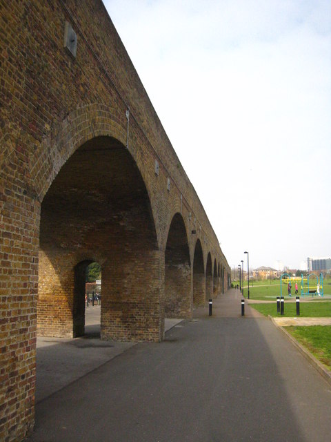
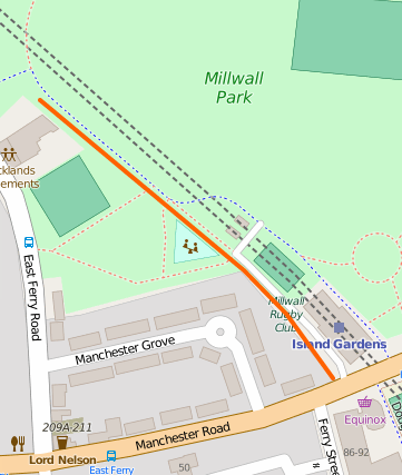
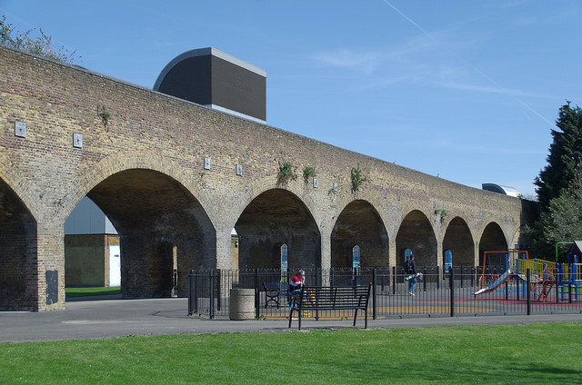
millwallviaductBefore the DLR came along in the 1980s, there was an abandoned railway route (the Millwall Extension of the London & Blackwall Railway) running through the Isle of Dogs and ending on a viaduct just south of the current Island Gardens station, at a terminus station called North Greenwich – several miles from the station currently with that name. Almost whole route, including the viaduct, was then reused when the DLR was built, the new terminus “Island Gardens” being just north of the old one. When the DLR was extended under the River Thames to Greenwich, the route needed to drop down more quickly so that it could tunnel under the Thames, so this short section, at the southern tip of the Isle of Dogs, was abandoned for a second time, but the structure remains to this day, running across Millwall Park, starting shortly after Mudchute Station and ending shortly before the old Island Gardens station.

It would make a lovely High Line if it wasn’t for (a) being a little too short, (b) not going anywhere unique, as there’s a public footpath beneath/beside it all the way, (c) being in a park rather than crossing over roads and around/through buildings, and (d) being quite a long way from the crowds and buzz of inner city London. Still, it would be lovely to be able to walk about up there again – not possible since the original Island Gardens terminus station (nee North Greenwich) re-closed in the 1990s. Aerial imagery suggests it’s just a nice strip of grass and shrubbery these days.

17669485616_c337c9eea1_z

Top photo: Copyright (CC-By) Rod Allday. Bottom photo: Copyright (CC-By) Matt Buck. Map is Copyright OpenStreetMap contributors, ODbL, with cartography CC-By OpenStreetMap.

Categories
Leisure London

High Lines 2. The Greenway

6859370351_1dafec2b0c_b

This is one in a series of posts about possible High Lines for London. Look out for the next one tomorrow.

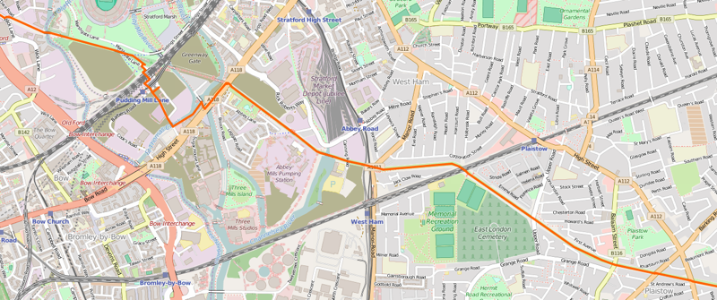
The Greenway is an existing “High Line” in east London, however it does not follow the route of an abandoned railway line, rather it runs along the top of the Northern Outflow Sewer, one of London’s huge Victorian sewer pipes (the odd vent in the path’s tarmac provides you with a reminder of what is below!) The route heads east from Hackney Wick, which certainly ticks the “High Line” boxes of a post-industrial, loft-living neighbourhood, before slicing through the still-evolving Queen Elizabeth Olympic Park. However, the remainder of the route is through big industry sites and a low-density residential area – Plaistow – which doesn’t give quite the same feeling of slicing through an inner city fabric that the NYC High Line, or yesterday’s featured route, the East London Line Extension, does. Abbey Mill is a highlight if you do keep going further east though.

greenwayosm

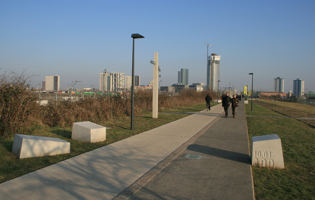
The first part of the Greenway received a substantial upgrade just before the Olympics, as it provided two potential entry points into the Olympic Park during the Olympics themselves. (They were little-used in the end.) However a section was also blocked during the games, as the athletes’ route between the warm-up track and the main Olympic Stadium passing across it. However, the improvement works were designed with the legacy in mind too and the resulting path is of a good quality, lit and with good views to the Olympic Park structures and the various residential skyscrapers going up along Stratford High Street. Cyclists use it as a commuting link, however the path is wide and visibility good.

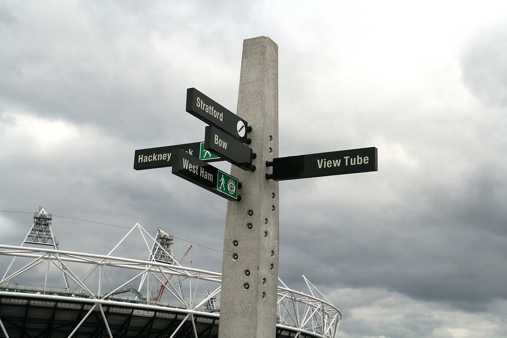
The route will be further improved when the Crossrail works finish in 2018 and a section near Stratford, which has been closed since 2007, finally reopens. If walking along this first part, a stop off at the “View Tube“, a coffee shop made out of lime-green shipping containers, perched at the point where the Greenway route descends to cross under a railway line, it has an excellent view from the top deck. There may be further buildings appearing in the future – such as the UCL East campus and other similar projects, which mean that this section might eventually form more of a “High Line” feel, but it will never be an oasis in a dense inner-city, simply because it is too far out from central London.

4610361656_b519dd14b2_b

Top: The Greenway in the Olympic Park, following improvements made in 2009-10. Bottom: One of the signposts installed before the Olympics. Map is Copyright OpenStreetMap contributors, ODbL, with cartography CC-By OpenStreetMap.

Categories
Leisure London

High Lines 1. The East London Line Extension

This is one in a series of posts about possible High Lines for London. Look out for the next one tomorrow.

One problem with a High Line for London is that we never had very many abandoned, elevated railways in London. The capital largely escaped the so-called Beeching cuts of the 1960s, when many rural and other little-used lines were closed. After these cuts, laws were changed to make the closing of railway lines much harder to do, so even when railway usage reached its nadir in the 1980s, few additional lines were closed. Since then, number of peoples of trains have soared, particularly in London, and there is virtually no prospect of any existing lines being closed in the foreseeable future.

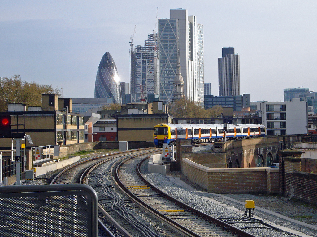
highlineosmPerhaps the most promising candidate for a High Line was one of the few lines that were closed – the elevated railway between Broad Street (beside Liverpool Street Station) and Dalston in north inner-city London. In fact, the line survived Beeching, but succumbed to closure in 1986. The route lay abandoned for many years, with some of its bridges removed but otherwise being largely intact. However, instead of turning into a High Line type walking route it has in fact recently (2006-11) been turned back into a railway, the East London Line Extension (ELLX), arguably more useful and certainly acting as a catalyst for the regeneration of the Dalston/Haggerston/Hoxton area that it runs through.

The new line has a different characteristic to many of London’s lines that act just to get people in and out of the central core. Instead of its central London terminus beside Liverpool Street Station, the line takes a sharp left across a set of new bridges in Shoreditch (see below), linking up to the old East London Line. This is part of a new orbital London railway, the London Overground, and is already very heavily used. So, while London’s best candidate for a High Line was lost, the benefits of turning back into a real, working passenger railway have been quickly realised.

A short abandoned elevated link remains between the Broadgate Tower/Estate – now built across where the old central terminus station was – and where the turn across Shoreditch is – now blocked by Village Underground, a popular music and arts venue which notably has some old Jubilee Line tube carriages on its roof (see below on left) as workspaces. The link however it very short, barely 100m long, so not really viable for the creation of a High Line. You can the remaining link as the patch of green in the foreground on the left below.

You can still experience the “High Line” feel, passing by the second floors and roofs of old industrial buildings and loft apartments, with excellent and unexpected views across to central London, by travelling along the East London Line Extension between Dalston Juction and Shoreditch High Street – just that it’s in a train rather than on foot. The new stations, particularly Hoxton – have developed a “High Line” style coffees-amongst-brickwork feel to them. The trains are modern and airy, and run every few minutes. It’s not quite the same but it’s probably, in terms of area and feel, the closest that we have right now.

See also: This note from Paul Mison.
ellx2

Top photo: The view from Hoxton station, one of the new stations on the East London Line Extensions. Below: Looking at the southern end of the Dalston-Shoreditch part of the East London Line extension, from Broadgate Tower. Photos by Diamond Geezer. Map is Copyright OpenStreetMap contributors, ODbL, with cartography CC-By OpenStreetMap.

Categories
Leisure London

High Lines in London

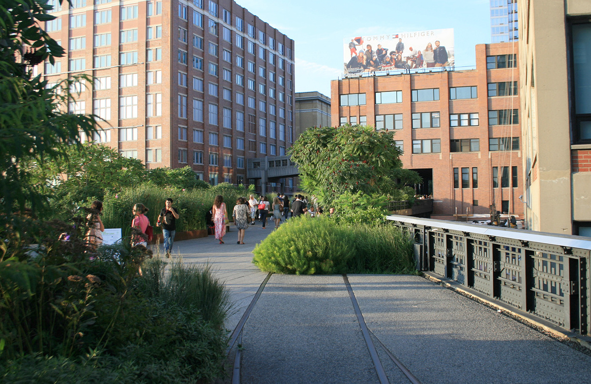
London has been looking for its High Line, the elevated abandoned railway line in inner-city New York City (above) that has become a pleasant linear park, huge tourist attraction (I made a specific point of visiting on my recent trip) and regeneration stimulus in a brick-warehouses-and-cyclists part of Manhattan. Gliding peacefully above the busy traffic, moving through buildings and alongside wild flowers, the experience is rather surreal, and, on experiencing it, it’s easy to see why it’s been such a big hit.

What are the options?

Over the next twelve days, starting today, I’m going to outline twelve ideas for London “High Lines” – some of which already exist, some of which had a chance of being a genuine High Line but recent events took them in a different direction, and some which have potential. On the last day I’ll unveil the one which I think has the most potential, for a number of reasons, but which, curiously, little has been written about so far.

  1. The East London Line Extension
  2. The Greenway
  3. Millwall Viaduct
  4. Peckham Coal Line
  5. Parkland Walk
  6. Bishopsgate Goods Yard
  7. Limehouse Curve
  8. Barbican Highwalks
  9. Pedways of the City
  10. Borough Market Bridge
  11. Garden Bridge
  12. The Camden High Line

What is a High Line?

A “High Line” needs to be a route which is traffic free, not broken up by road or railway crossings. It is a route which is not designed to be a commuter link or an otherwise “fast” route, so with no opportunities for cycling at speed along it. And it is a route which allows to see a densely populated part of a city in a new way, the novelty and theatre of the route created by maximising the contrast between the mean, traffic-choked city streets below and soaring buildings above, and the green oasis of the route itself.
But with the winning entry in a recent competition being an underground walk, we probably need to go back to the drawing board.

Here’s my first idea.

highline2

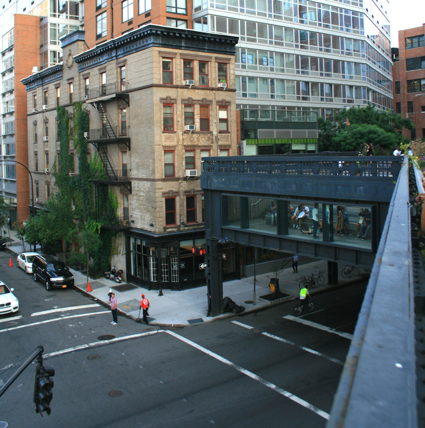
Top photo: The High Line in New York. Old rails embeddded in wooden planks and surrounded by wildflower gardens, all two storeys above the Manhattan streets. Lovely. Bottom photo: The street “theatre” view, created by the line kinking across a street by a junction.

Categories
Cycling London

Traffic Calming Bank Junction

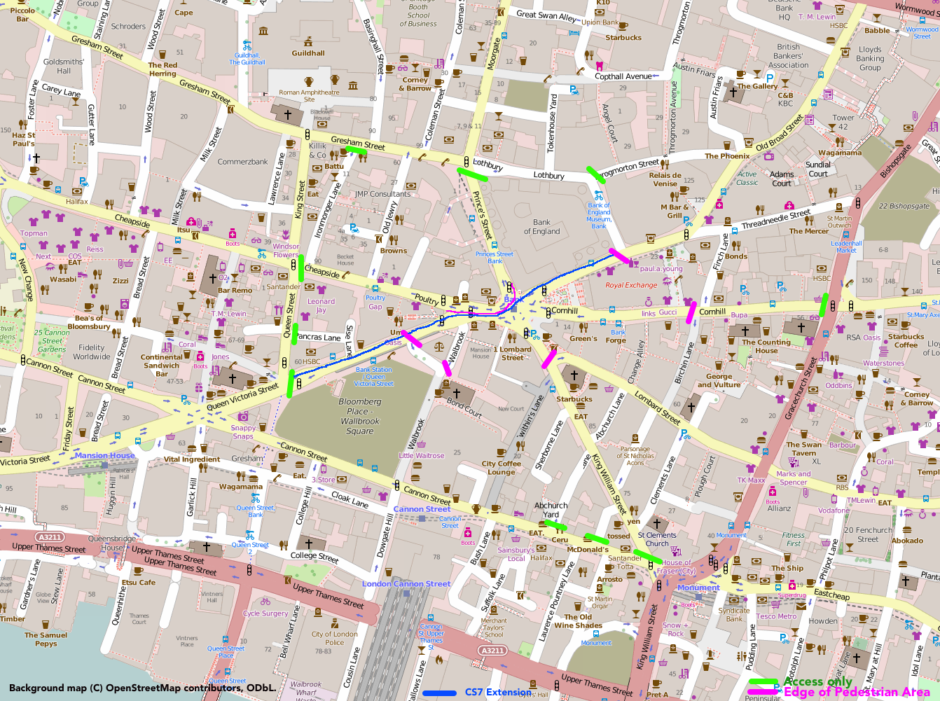
An idea from the City of London – to ban through traffic (except buses) from the seven-way junction at the very heart of the City, modelled on the part-pedestrianisation of Times Square in New York It’s a no-brainer, surely.

Here’s how I would do it – opening up the attractive space around the Royal Exchange for pedestrians only, adding a SW-NE cycleway through the junction as an extension/diversion of CS7 (which currently ends up at the less-well-located Guildhall), and allowing traffic (taxis) very near to the junction from four of the seven radial streets, while cutting out all through-journeys. Lothbury/Gresham Street is a quiet street and certainly able to take the east-west traffic, along with Cannon Street.

bankjunction

Categories
OpenStreetMap Orienteering

MapOnShirt

COyiL04UAAQkgk3

Here’s a great idea well executed – MapOnShirt uses OpenStreetMap data and some nice custom styling – and an easy-to-use website, to allow you to design your own T-shirt of anywhere in the world. It works best in large built-up places, particularly across new-world cities with their grid structures and other large-scale planned road topologies, but familiar shapes in older cities work too – such as the River Thames.

MapOnShirt was kind enough to create a mock-up of a shirt for the recent Street-O race in London that I organised. I reckon these kinds of shirts would make for great prizes for such events.

Categories
Data Graphics

Changes in Deprivation in England, 2010-15

Click any of the images in this article to go to the interactive map.

imd2015_londonup
Above: A significant reduction in relative deprivation in Blackheath and Maze Hill since 2010.

I’ve just now published a number of maps on the CDRC Maps platform which uses the DataShine mapping style (more about DataShine) to show demographic data relating to consumer and other datasets.

The maps relate to the Indices of Deprivation 2015, small-area measures of deprivation in England, which were compiled and published at the end of September by OCSI on behalf of the UK Government.

imd2015
Above: Deprivation varies between Tottenham, Walthamstow and Woodford Green, in 2015.

The Indices of Deprivation (of which the Index of Multiple Deprivation, or IMD is the overall index) split England into around 32000 areas (“LSOAs”), each containing a typical population of 1500. Each area is scored for several components, which are then combined (with different weights) to produce an overall score of deprivation for the area. Note that areas with little deprivation may be mainly compared of people who are not “wealthy” but just not deprived, and therefore rank the same as areas mainly populated by extremely affluent people. IMD is a measure of deprivation, not affluence.

The look of these maps, with their Red-Yellow-Green colour ramp, is intentionally similar to my New Booth map of the 2010 IMD deciles which was my first “colour the houses” map and the precursor to DataShine and therefore CDRC Maps.

imd2015_miltonkeynes
Above: Milton Keynes has a characteristic strip of high deprivation, running north/south.

These scores cannot be directly compared with those from previous exercises (2010, 2007 and 2004 are the recent ones) due to slight methodological alterations, however we can rank each area based on the overall score – this is the Index of Multiple Deprivation – and then compare ranking changes between the years. It should be noted that a decrease in rank (i.e. an increase in deprivation measure compared with other areas) does not mean that an area has become more deprived in absolute terms – it may be just becoming less deprived at a slower rate. I have mapped the overall rank change from 2010 to 2015, and also the rank change of the component which measures the effects of crime on deprivation, as this shows some particularly interesting spatial characteristics.

Looking at the overall changes, London’s pattern is striking:
imddelta_london
Above: London has an inner-city “ring” of blue showing a large reduction in relative deprivation since 2010.

London’s inner city areas – Zones 2-4 – have becoming significantly less deprived in the last year. Indeed London, in general, has done very well recently relative to the rest of England, with only a few areas (St John’s Wood, Thornton Heath, Mill Hill, East Barnet and Hounslow) showing a significant increase in relative deprivation levels. Again, this may mean that they are still becoming less deprived, just at a slower rate. By comparison, Blackheath, Ealing, Upton, North Wembley and Crouch End have become dramatically less deprived since 2010. There are smaller pockets throughout the city who are are also showing marked moves in both directions – see the interactive map. I use a different (Red-White-Blue) colour ramp for these maps, to emphasise that they are showing changes.

imddelta_readingbury
Above: The contribution of crime to deprivation has significantly dropped in Reading and increased in Bury.

Some of the more notable results for changes in the crime component ranking of the IMD are in Reading (where the impact of crime on deprivation has significantly reduced) and Bury (where it has had a significantly greater impact). In both towns (see above, presented at different scales) however, other components have acted in the opposite direction, such as the deprivation ranking of these two places, with respect to the rest of England, has not significantly changed in five years. Bury, was, and still is, already significantly more deprived than Reading, the difference between the two has increased.

Another example: comparing Gateshead with nearby South Shields. The former coming up, the latter going down:
imd_gateshead
Gateshead is almost universally moving out of deprivation at a faster rate than the rest of England, while South Shields is change much more slowly.

The components are income, employment, education, health, crime, barriers to housing and services, and living environment. Their weights are summarised in this nice infographic from gov.uk.

There is also an official summary which maps the data slightly differently. One of its analyses – Chart 6 – shows the local authorities (LA) where relative deprivation has significantly fallen, by measuring the proportion of areas within the LA that have moved out of the bottom 10% in the IMD, between 2010 and 2015. The top four are: Hackney, Tower Hamlets, Greenwich and Newham. These are four of the five Olympic Boroughs. The fifth, Waltham Forest, is also in the top 10. East London is changing.

See these maps and various geodemographic classifications at CDRC Maps.

imd2015_midlands
Across middle England, cities are more deprived than the countryside, with notable exceptions (such as Shrewsbury, Cambridge, northern Leeds and western Sheffield).