Categories
BODMAS Geodemographics

What if There Were No Cars?

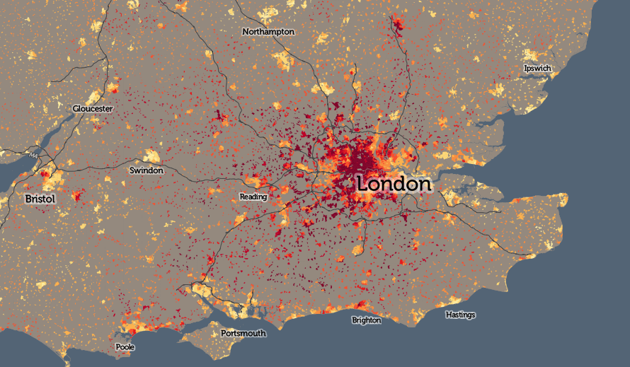
Here’s a map of the top method of travel to work, for each “small area” (~250 people) in the UK, for people aged 16-74 and in employment, at the time of the 2011 Census (or try the interactive, zoomable version):

traveltowork_car

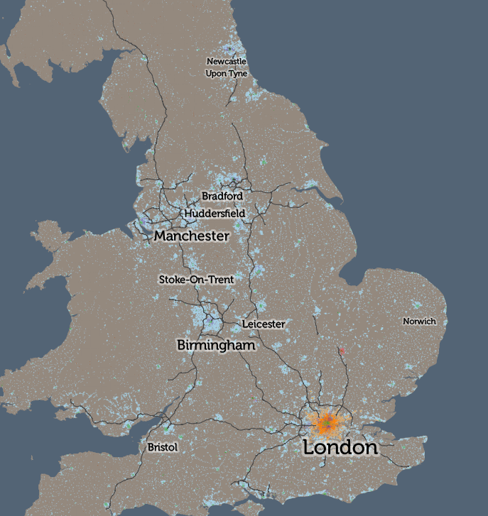
The pattern is, fairly evenly, that car use (light blue) dominates except for people living in the very centre of cities, where walking to work (green) is the most popular method. The two big exceptions are London, where rail/metro travel (orange) dominates for the inner city zone, separating the walking core and car-driving outer London ring; and Cambridge, where the cyclists (red) really are king. There are some other interesting results in small areas (e.g. walking is popular in central Leicester but not in the centre of Peterborough), but overall, the map doesn’t tell you much more.

So, I’ve considered what the map would look like if we removed cars from the calculations – what form of transport is used by the people that need to work but don’t own or otherwise have access to cars, either as a driver or passenger? How does the UK commute, without cars, right now – and what might a UK landscape look like without the great rush-hour traffic jam, if the alternatives, pro-rata, were adopted? A whimsical hypothesis – cars are always going to be essential for certain kinds of commutes in certain parts of the UK – but let’s see what happens anyway, as it will still tell us something about public transport provision, city walkability and maybe attitudes to working life in general.

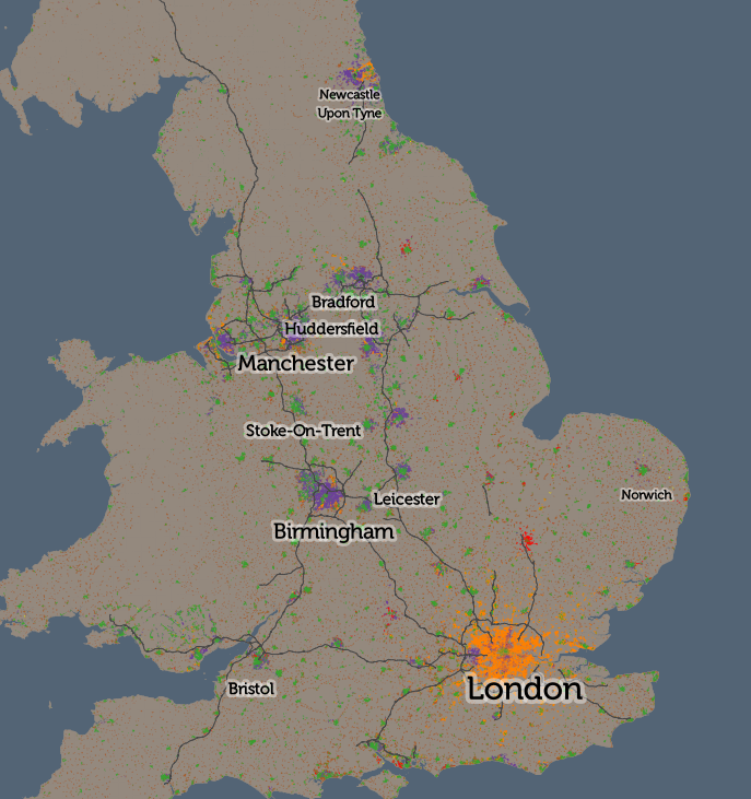
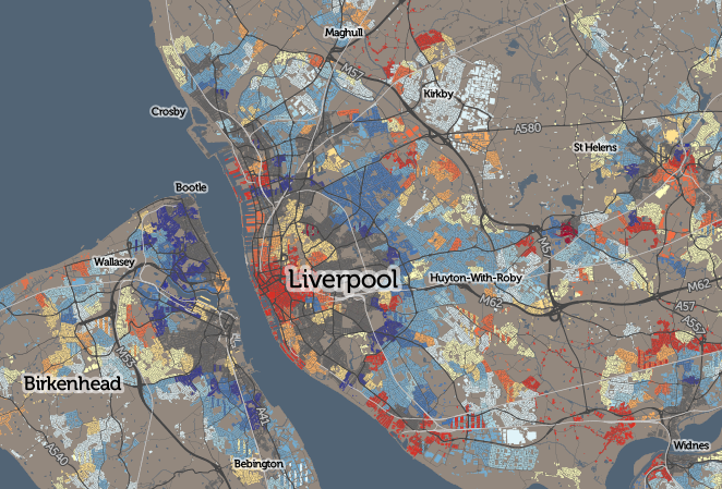
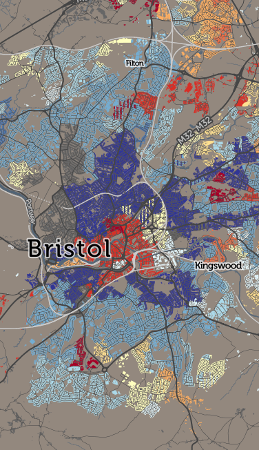
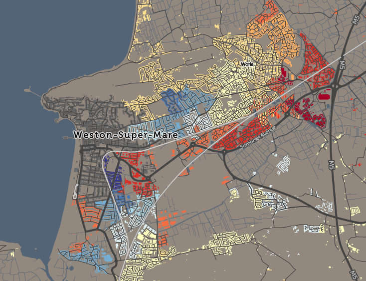
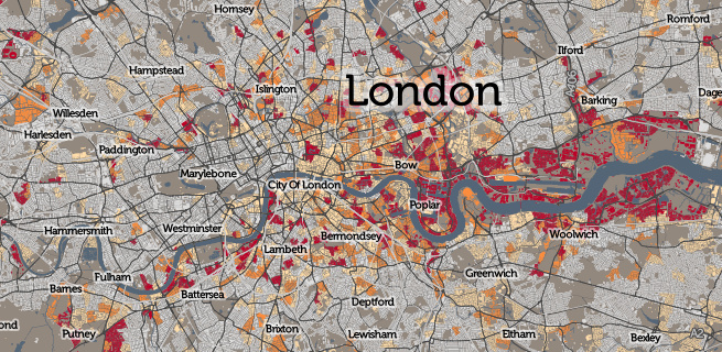
Here is a map of the top carless commute method for small areas, right across Britain:

traveltowork_nocar

(Here is the interactive, zoomable version).

Suddenly, all sorts of interesting trends emerge. In rural areas, working from home dominates – with no public transport, and motorbikes being an uncommon form of transport in the UK, this is the only option. In towns and villages, and in city centres, walking to work dominations. Both are obvious – the interesting results appear if you zoom in:

  • In London, the central walking-to-work area (green) coincides almost perfectly with the congestion charge zone. Other walking areas include the large outer London town centres of Hillingdon, Croydon and Kingston that have been absorbed into the metropolis, and the traditional community of Stamford Hill.
  • Rail/metro (orange) dominates throughout Zones 2-6 London and beyond.
  • London has four major areas of bus dominance (purple) – Burgess Park in the south, Hackney in the north-east, the western Lea Valley in the north and a huge zone surrounding Heathrow Airport in the west. Three of these not surprisingly coincide with areas of poor rail/metro provision, but the western Lea Valley result is interesting – there are two rail lines down through this area with stopping services. However, notably, this area’s most popular employment type is cleaning – cleaners typically have to work nights, where the bus is the only public transport option.
  • York versus Leeds – both have a similarly sized walking core, but then the rest of Leeds has bus users, while York’s outskirts are dominated by cyclists (red). The flatter nature of York is likely the major reason.
  • Buses are pretty crucial in the Birmingham conurbation.
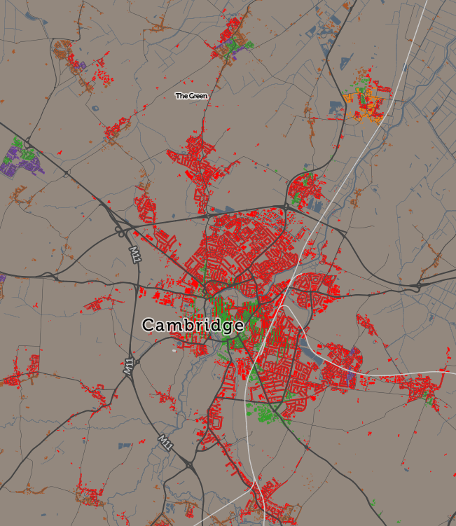
  • Cycling dominates in almost every part of Cambridge but less so in the other famous cycling city, Oxford. In London, Hackney’s famed cycle community actually has roughly equal prominence with both bus and train/metro use.
  • Stoke-on-Trent has a very large walking core, larger than for the larger cities, covering the whole area almost, rather than being surrounded by bus/cycling/train commuters as normally happens. Stoke-on-Trent is actually a conurbation of six towns, with employment scattered throughout rather than concentrated in the normal core. Alternatively this could be due to poor bus provision or a dominance of driving.
  • Ilkley and Bingley like their trains – nearby Keighley and Skipton, nearby and on the same network, don’t. The former two towns perhaps act more as commuter towns for Leeds while the latter two have a tradition of more local employment.
  • The very richest areas have a high proportion of people working at home (brown) – live in help, aka domestic servants? See Knightsbridge and Hampstead Garden Suburb in London, or Sutton Park near Birmingham, are two examples.
  • The new towns in central Scotland seems to have a greater proportion of working-at-home than equivalent new-town areas in England.
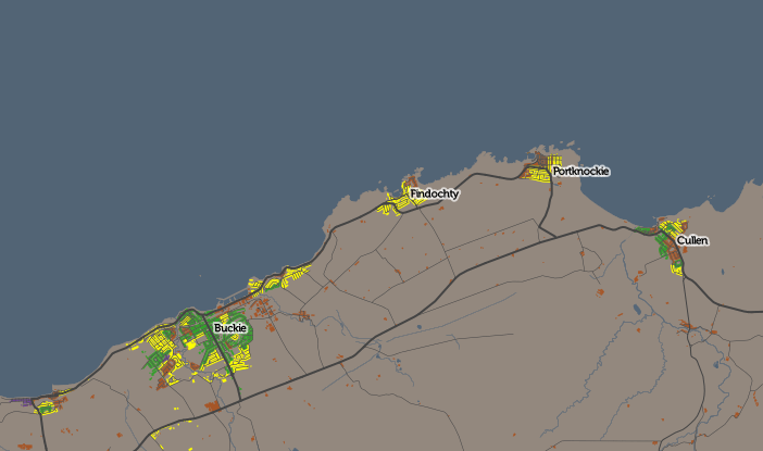
  • Fishing communities (yellow – other) are obvious in north-east Scotland:

traveltowork_nocar_fish

These are just a few of the spatial patterns I’ve spotted – there are I’m sure many more interesting ones. Sometimes, removing the dominant factor reveals the interesting map.

The technique of mapping only the most dominant mode of transport has a serious flaw, in that, depending on how you merge or split other transport modes, you can significantly influence which appears “top”. I have merged some modes together (driver+car passenger, train+metro+tram, and taxi+motorbike+other, e.g. boat), hopefully in a meaningful way that shows interesting results without hiding the bigger picture. Another mitigating factor is that, where a second mode of transport has nearly as much use as the first, I include its colour too, in narrow vertical banding, and highlight this in the interactive “area information” panel.

All the maps in this article use the CDRC Maps platform, created by the Consumer Data Research Centre, to map small-area consumer and other demographic data for the UK. Because I am using Census data, I am able to map for the whole of the UK (including Scotland and Northern Ireland), as, for the Census at least, the activity is coordinated across the nations, and while the outputs are arranged differently, they are sufficiently similar to combine and use together with care. The data comes from the National Statistics agencies – the ONS, NRS and NISRA, and is Crown Copyright, licensed under the Open Government Licence.

Have a look at some other CDRC datasets mapped, download the data yourself or find out more about the CDRC.

traveltowork_nocar_cambridge

Categories
CDRC Geodemographics

The Age of Buildings

liverpool_houseages

We don’t have individual building age open data in the UK, unlike in some other countries (the data has been used to great effect in New York City and Amsterdam) but the Valuation Office Agency, which amongst other things decides council tax bandings for residential properties, has published some interesting data on how old houses are in England and Wales – it’s their “dwelling ages” dataset. A separate governmental organisation, the ONS, publishes house prices summaries, at a relatively small-area* scale, on a quarterly basis for the previous year. I have combined both these datasets into a record on CDRC Data. and have mapped them both on CDRC Maps.

bristol_houseages

The dwelling age data is supplied grouped in approximately ten-year age bands (+ a Pre-1900 catch-all) with a count of the number of houses in each band, for each small area (LSOA) in England/Wales. I’ve mapped just the modal band, that is, the band with the most number of houses in it**. In some cases, houses were steadily built in an area throughout the 20th century, so that the band assigned to that area is not actually very representative of the houses there – this can be spotted by looking at the “Classif. %” number which appears on the right.

Many UK cities show a pattern of Pre-1900 inner-city (dark grey on the map), with early 20th century houses out towards the edge (lightening blues). The “Green Belts” of the 1940s stopped this radial outward development, so, some old housing was instead overhauled to build 1960s-70s housing estates (shown in yellow) and more recently, the urban core has seen much of the recent housebuilding activity. This shows up on the map as an area of red in the centre of many cities. There are some exceptions – Milton Keynes is a large, and new, town, its map showing mainly yellows and reds.

Not all areas are constrained by Green Belts but some have other, physical constraints, such as the sea. Weston-super-Mare, for example, has steadily expanded westwards over the last 150 years:

westonsupermare_ages

A second map concentrates just on post-WW2 (1945+) building, showing the proportion of such houses in each area. Hello, riverside east London:

london_riverside

The house price pattern in England/Wales is quite familiar to many people – basically London is eye-wateringly expensive, particularly in the central and west, along with some satellite towns and cities (e.g. Oxford and Cambridge) but not others (e.g. Luton and Harlow). I’ve mapped the median house prices for each small-area as I think this better provides an indicator of a typical price paid. 50% of properties sold in the previous 12 months, in each area, sold for less than this amount, and 50% for more. As only a few houses in an area typically get sold in a year (I have included this number in the metric data) it is worth noting that the values can jump around a lot.

Explore the interactive maps:

houseprices

* There is separately individual house transactions (with prices) released regularly by a third organisation, the Land Registry, however I have not mapped this at this time.

** Where an area is fairly equally split between two bands, I’ve included the “runner up” band as well, shown thinner vertical stripes. This only appears where the runner up housing count is 90% of the modal band, and the two bands account for more than half of the total housing. I’m using Mapnik compositing operations to get the vertical stripes, rather than a very long and repetitive stylesheet. I calculated the modal band in Excel from the original VOA dataset by using MAX (to find the value) and nested IFs (to display the category). Calculating runner up (i.e. second from mode) was a little more tricky, but I was able to do this but using COUNTIF and LARGE (to find the value – which could the same as the mode, ie. multimodal) and then nested IFs/ANDs to display the category.

Categories
London

Locations of the 12 London “High Lines”

To aid virtual exploration of the twelve possible “High Line” elevated walking routes in inner-city London, that I’ve highlighted in my series over the last couple of weeks, I’ve created this map on Google Maps, showing the extent of each of the twelve routes.

See a larger version of the map here, which you can explore using aerial imagery and “Street View”.

To recap, the 12 are:

  1. The East London Line Extension
  2. The Greenway
  3. Millwall Viaduct
  4. Peckham Coal Line
  5. Parkland Walk
  6. Bishopsgate Goods Yard
  7. Limehouse Curve
  8. Barbican Highwalks
  9. Pedways of the City
  10. Borough Market Bridge
  11. Garden Bridge
  12. The Camden High Line
Categories
Bike Share London

London’s Bikeshare Needs A Redistribution of Stations

bikes_journey_day

Here’s an interesting graph, which combines data on total journeys per day on London’s bicycle sharing system (currently called “Santander Cycles”) from the London Data Store, with counts of available bicycles per day to hire, from my own research database. The system launched in summer 2010 and I started tracking the numbers almost from the start.

You can see the two big expansions of the system as jumps in the numbers of available bikes – to all of Tower Hamlets in early 2012, and to Putney and Fulham in late 2013. Since then, the system has somewhat stagnated in terms of its area of availability, although encouragingly at least the numbers of available bikes has remained constant at around 9500, suggesting that at least the operator is on top of being able to maintain and repair the bikes (or regularly source new ones). Some of the individual bikes have had 4000 trips on them. There is a small expansion due in the Olympic Park in spring 2016, but the 8 new docking stations represents only a 1% increase in the number of docking stations across the system, so I doubt it will have a significant impact on the numbers of available bikes for use.

There is a general downward trend in the numbers of uses of each bike per day, since the halycon Olympic days of Summer 2012, over and above the normal seasonal variation, which concerns me. The one-year moving average recently dipped below 3 uses of each bike per day, this summer, and I am not confident it will pick up any time soon. (The occasional spikes in uses/bike, by the way, generally correspond to sunny summer bank holidays, tube strikes and Christmas Day).

To rejuvenate the system and draw in more users, rather than relying on the established commuter and tourist flows which likely dominate the current usage, I am convinced that the system needs to expand – not necessarily in terms of the number of bikes or docking stations, but in its footprint. I think the system would be much improved by dropping the constraining rule on density (which approximates to always having one docking station every 300m) and instead redistributing some of the poorly performing docking stations themselves further out. It’s crazy that, five years on, there are no docking stations in central Hackney, Highbury, or Brixton, three areas with an established cycling culture and easily cycle-able into the centre of London. Conversely, Putney and Tower Hamlets simply don’t need the high density of docking stations that they currently have, except in specific areas (such as around the train/tube stations in Putney, and Canary Wharf).

Ideally we would have a good density of docking stations throughout cycleable London but, as docking stations (and bikes) are very expensive, I would suggest that TfL instead adopts the model used in Bordeaux (below). Here, the city retains a high-dense core serving tourists, commuters and other centrally-based workers, but adopts a much lower density in the suburbs, so that, while tourists can still “run into” docking stations they don’t know about in the centre thanks to the high density, local users can benefit from the facility in their neighbourhood too, even if it requires a little longer walk to get to it.

bikes_bordeaux

Technical note: Before November 2011, the London numbers included bicycles that were in a docking station but not available to hire (i.e. marked as broken). This exaggerates the number of available bikes (and correspondingly reduces the number of hires/bike/day from the true value) in this period by a small amount – typically around 3-5%, an effect I am not considering significant for this analysis.

Categories
BODMAS Conferences

In/Visibility and Difference – Visual Methods Workshop in Berlin

vmw1

I presented a talk on geodemographic mapping, at a visual methods workshop “In/Visibility and Difference” which took place in Berlin at Bard College (formerly the European College of Liberal Arts). The workshop was organised by the TransformIG project at Humboldt University in Berlin, which was also the venue for the keynote part of the meeting. Thank you to the organisers for organising an interesting and intensive workshop which presented a wide variety of visual and geographical techniques which are becoming key ways to structure and analyse sociological studies.

I structured my talk into four sections:

  1. An primer on improving choropleth mapping of socioeconomic data, moving beyond the basic “heat map” by adding regular geographical feaures (see photo below), labels and clipping coverage to populated areas, to explain the demographic patterns and highlight external influences. This is the technique used by DataShine to display Census 2011 aggregate statistics, and CDRC Maps to show geodemographics. I also outlined alternative approaches used by other research groups, such as cartograms and dot density maps.
  2. A tour of the geodemographic maps in CDRC Maps, including the Output Area Classification and a map of the latest Index of Multiple Deprivation. I also touched briefly on the problems of geodemodemographic classifications, where good/poor fits to the classification are typically mapped identically, and the “second choice” classification doesn’t get shown, showing some techniques to try and map these subtleties.
  3. An introduction to more novel methods of mapping demographic data, such as Lives on the Line and Tube Tongues, but highlighting the shortcomings of such maps too.
  4. Finally, a brief mention of mapping more novel datasets, showcasing the Twitter language maps for London and New York – again discussing the flaws as well as strengths of such maps.

vmw_me

I found many of the other talks very interesting – particularly the work by plan b – two performance artists who have essentially tracked their entire outdoor life over the last 8+ years, both creating GPS traces which they have turned into artworks at various scales and on mediums (including a 3D mould), but also temporal activity indicators which they have grouped together into small multiples. They term these the “birch trees” due to their characteristic stripy white/black columns (see top photo). I also liked the striking pictograms created by Migrantas who have created simple and powerful graphics, from stories from the migrant community in Berlin and elsewhere. Their work can be seen on billboards and walls in various places across the city. There was a good talk by Stefan Lindemann on “SuperLUX”, focusing on linear development along commuter lines to Luxembourg City and corresponding population changes – essentially an international take (due to the country’s size) of the more recent “Northern Powerhouse” project to connect the cities of the north of England.

There was one more map “treat” for me at the workshop – the closing keynote given by Caroline Knowles included her investigative journalistic project where she tracked the complete journey of a pair of flip flops – from oil in Kuwait, to factories in South Korea, then to and through the markets in east Africa, to the consumer, and then finally to the rubbish dumps of the region. A map illustrating the life cycle of the flip flops is below.

Thanks to Agata Lisiak and the TransformIG team for inviting me to speak at the workshop and the opportunity to learn as well as disseminate. (Photo credit for the top photo: Agata).

vmw2

Categories
Leisure London

The Camden High Line

[Update: Being actively considered/promoted by Camden Town Unlimited]

Over the last two weeks I have featured eleven potential London High Lines (see all the previous ones here) – all of them could be interesting place but none of them quite have the potential to be a London “High Line”.

Today, my final London High Line, is the one that I think ticks all the boxes. It runs through post-industrial gritty inner-city London, it’s elevated, it’s an old railway route, and the land is just lying there, undeveloped. It is the Camden High Line – a potential High Line that runs between Camden Gardens Park (just off Kentish Town Road), around the back of Camden Road station, across a number of intact, unused bridges and finishing at an existing footbridge across the Midland Mainline, just past Camley Street. In all, a distance of around 800m (half a mile), with a possible Phase 2 future extension across to the huge and evolving development area behind King’s Cross station, although this additional section would require the building of at least one footbridge.

camdenroute

The route:

1. Western end

camden0

This would likely need the most expensive new structure – a lift with a surrounding staircase, to allow step-free access onto the route from the western end. It would also need to use a small section of the public park here – Camden Gardens Park – for the lift/staircase to “land”.

camden1map

The route would then move quite quickly away from the current line, using the disused (and now heavily overgrown) section behind Camden Road station – another possible access point and one that could provide an alternative step-free entrance using the existing lift there, from the eastbound platform (ticket barrier location notwithstanding).

The route moves back towards the current line, crossing Camden Road on a disused but intact bridge as it does so. This is the bridge which currently has “Camden Road” painted on its side, prominently, by Network Rail, visible when travelling down the hill from Camden Road. (The other nearby railway bridge also has “Camden Road” painted on it, when facing the other way.) As you can see from the Google Streetview imagery, the bridge is sitting waiting for a walkway to be added onto it:

camden1

2. Middle section

The route continues along the former double-track, alongside the existing double-track between Camden Road and Caledonian Road & Barnsbury, walled off safely but with plenty of space available for the High Walk itself.

camden2map

Shortly, a couple of other bridges are crossed. One crosses over at a road junction. There is plenty of pavement below the bridge here and so this is a potential landing location for a staircase (possibly spiral) for an intermediate entry/exit to the walk.

camden2

3. Eastern end

The route continues eastwards, narrowing quite a bit near the end at the final bridge across Camley Street although still with plenty of space beside the operational railway for a path and appropriate screening from the operational railway.

camden3map

There is a choice of endings at the eastern end. There is already a (pretty unpleasant and unsafe feeling) set of steps down from the western side of the Midland Mainline existing footbridge. This could be remodelled and made safer. At the bottom is the northern end of Camley Street, a light industrial estate, with an existing pedestrian link north to Agar Grove, and a quiet road south that leads to the Regent’s Canal – from there, King’s Cross Central is nearby. Alternatively, continuing along the road eventually leads to St Pancras International station.

camden3

The second ending is a level access from the footbridge crossing the Midland Mainline – at its eastern end, paths head north and then northeast, connecting to Agar Grove and eventually Caledonian Road. This has the benefit of providing a step-free end to the walk, so that, unlike at the western end, a lift would not be necessary.

4. Phase 2 extension

This would connect the eastern end of the Camden High Line, southwards to the huge mixed-use King’s Cross Central redevelopment and Central St Martin’s College, behind King’s Cross station. Such a route would require crossing over (or under) the existing North London Line, and various other lines emerging from St Pancras, with at least one footbridge needed – as such it would be an expensive exercise. I’m just mentioning it here as having a complete “High Line” link running all the way between, Camden Town and King’s Cross, to parallel with the Regent’s Canal route to the south of it, seems like an obvious route between two major north London walking destinations.

So could it happen? Well, the viability of the project would depend on Network Rail reliquishing its land, on support from Camden Council, a fundraising effort to fund a feasibility report and build the actual trail, and on the creation of a local trust dedicated to maintaining such a route once it opened on a largely voluntary basis, like happens on the New York High Line. In short, it wouldn’t be easy, but it is certainly very possible.

See all 12 of my London “High Lines”.

Photos from Google Street View and Google Aerial Imagery. Map from OpenStreetMap (Data ODbL, cartography CC-By OSM contributors). Subsequent to first publication, I’ve renamed this blogpost from “The Camden Line” to avoid confusion with the MARC Camden Line rail commuter line in Maryland, USA.

Categories
Leisure London

High Lines 11. Garden Bridge

gardenbridge_photofull

This is one in a series of posts about possible High Lines for London. Look out for the final one – my big idea for a High Line that I think has real potential – tomorrow.

[Update: cancelled]

Well, this is a controversial one. It’s not a structure that exists in any form (let alone being abandoned), it has nothing to do with railway lines – although the landing on the north side is on the roof of Temple station – and it is a high-profile project with influential (& wealthy) backers but also significant opposition. It’s the Garden Bridge, a pedestrian, daytime only bridge to meander along, linking Temple/Strand to South Bank.

It fulfils many of the High Line concepts – it is a private initative to add something “nice” to London. It is substantially privately funded and would be run by a trust. Being a bridge, it certainly affords great views of London. It would be intensively cultivated with trees and flowers to encourage meandering and dawdling rather than it becoming a commuter link (the nearby Waterloo and Blackfriars bridges cater well for that). And finally, it would have tightly controlled access – no cycling, large groups/gatherings, or access after dark.

It is this last point – that it would be a privately owned/managed and controlled space, muscling into a highly visible location in central London, but partially funded, and guaranteed, by public funds – that has proved controversial. However, as long as the governance is appropriately inclusive, i.e. representing the concerned bodies as well as the sponsoring ones, and appropriate covenants were added, e.g., dedicating free public access during daylight hours, every day of the year (no daytime closures for private parties), and income private evening/night time events on the bridge went partially back to public funds, then much of the opposition would maybe be quelled. It certainly doesn’t blend in to the surroundings and its location/height may spoil views of the City from Waterloo Bridge, but if it ends up looking like the impression above, it would be fantastic – another London green space which is (mostly) dedicated to the public, and a wonderful, free London facility for contemplation and enjoyment of the outside. I hope it gets built.

gardenbridge_map

Postscript: There is another “Garden Bridge” already in London – the Green Bridge that crosses the A11 road by Mile End station (it’s actually bright yellow, underneath), linking the two halves of Mile End Park. Originally it had trees growing on top of the bridge itself, however the soil was not deep enough to allow the roots to build and the trees to flourish, so sadly they have been replaced with just grass. Hopefully the designers of the Garden Bridge will have learnt from the mistakes of the Green Bridge and, earlier, the Barbican Estate’s waterfall.

Photo/map from the Garden Bridge website.

Categories
Leisure London

High Lines 10. Borough Market Bridge

This is one in a series of posts about possible High Lines for London. Look out for the next one tomorrow.

[Update (2016) – the main (southern) bridge featured here is already in use by trains now.]

This new railway bridge got lifted into place a couple of years ago. Eventually, in 2018 or so once London Bridge Station has been rebuilt, it will form the dedicated tracks between this station and Charing Cross, with the old bridge going to just Blackfriars, rather than to both at the moment. But that’s a few years away. At the moment the bridge is empty, and just used for storage. How cool would it be if you could walk straight from the concourse in front of London Bridge Station, to Borough Market, without having to cross Borough High Street? A couple of scaffolded staircases would allow for such a possibility, even if it was only for a couple of years.

There is also potential for using the track that curves westwards from Cannon Street to Charing Cross, as no scheduled train needs to use this curve. However there is still a single track here, which is used as a siding after the morning rush-hour, so, although there is enough room for a path alongside, it’s (even) less likely that this would ever become a High Walk for the public.

londonbridge

Top photo: Steven Craven on Geograph. Aerial image from Google Maps.

Categories
Leisure London

High Lines 9. Pedways of the City

This is one in a series of posts about possible High Lines for London. Look out for the next one tomorrow.

Complementary to the Highwalks of the Barbican, the concept (originally called Pedways by the 1950s planners) was intended in fact to spread throughout the “Square Mile” of the City, of which the Barbican formed the northern edge. For several years, new offices were required to have an entrance and lobby on the first floor, as well as on the ground floor as normal. In time, a network of Pedway bridges would connect the offices to each other and provide a complete alternative network of pedestrian routes around the City. Such 1950s utopian ideals never came to pass. There is a great video here about the rise and fall of Pedways and the 1950s buildings that accompanied them. Outside of the Barbican, the few Pedways that did get built are gradually being removed as the 1950s buildings alongside come to the end of their lives, however a couple of significant fragments in the City remain, both of which I feature here. It’s unclear how long they will remain for, but for now they remain a fascinating and hidden way to move around and explore London’s financial district without having to cross roads.

pedway_tower42
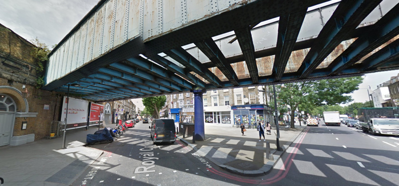
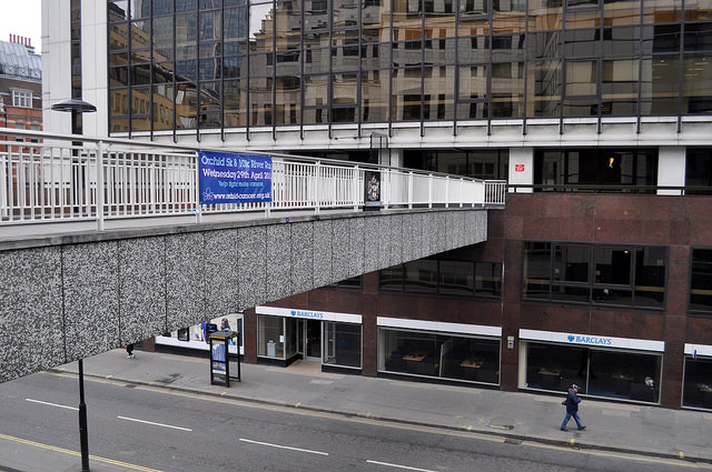
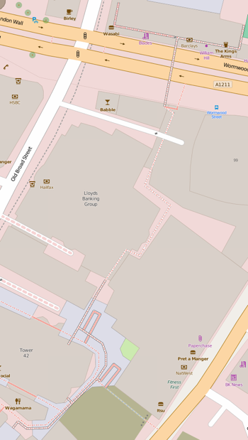
The first is the link that runs behind Tower 42 (the former Natwest Tower). It used to head east to what is now the Gherkin, however the bridge here (across Bishopsgate) was severed when the Pinnacle construction started. The Pinnacle project was then cancelled and the concrete stump is now disappearing again, to be replaced by another skyscraper – but with no bridge link restored. The other link heads north, right through the Lloyds Banking Group building, before coming to another bridge across a busy road. This is still there – for now – but leads to a dead-end, as its steps down were recently removed. So, the urban explorer here has to take the steps down just before the road.

The other is an even less well known link that leads directly from The Monument (to the Great Fire of London) to one of the best views in London – an elevated, river-bank view of Tower Bridge from the elevated plaza at St Magnus House. It passes through a couple of buildings, one on each side of Lower Thames Street, before opening out to a podium for the view, and a convenient staircase (ignored by the great majority that pass below it) that then drops directly down onto the Thames Path.

Iain Targett walked both of these routes, as well as one of the Barbican routes, and documented what they looked like in this photo set.

16784511618_080232c833_z

Top and bottom photos of the Tower 42 Highwalk, both by Steve Keirestu. Map Copyright OpenStreetMap contributors, ODbL (data) & CC-By (cartography).

Categories
Leisure London

High Lines 8. Barbican Highwalks

This is one in a series of posts about possible High Lines for London. Look out for the next one tomorrow.

The Barbican is a huge 1950s/60s housing development in the “raw concrete” Brutalist style which divides opinion (personally, I love it). The concept of the Barbican is having the pedestrian level on two “podiums” 4-6 metres above the car/street level, entirely separated from traffic. Connections between the podiums and the street level, and between different parts of the estate, are via “Highwalks”. These walkways in the sky are in fact legally considered public streets, and if you are familiar with the geography of the Barbican, are a pleasant way to pass through part of the City without encountering traffic.

The Highwalks are shown as orange lines on the estate map below. Some have actual orange lines painted on the ground, these are to help visitors, who are unfamiliar with the complex 3D nature of the walking routes in the area, to make it to the Barbican Art Centre – by following an orange line from an entrance to the estate, you should find your way there. One of these orange lines can be just made out on the far left in the photo above.

466328637_73ef8e8720_b

One section of the Highwalks near the Barbican that has recently disappeared, is a triangle of land near London Wall, that used to connect the predominately residential Barbican to the Guildhall. This has recently been demolished for a new complex of office towers, London Wall Place. Thankfully, the raised sections will be coming back, as a nice looking long bridge, passing through the new buildings and restoring the connection between London Wall, the Barbican’s own network of Highwalks and podiums, and the Guildhall and rest of the City. The temptation these days, surely, must be to improve the pedestrian realm at street level, as ultimately that’s where people want to be, but it’s good to see that, in this case, the “first floor” pedestrian level will live on, as a route from which to observe the buzz of the city below.

londonwallplace_highwalk

Map: Phil Gyford. Bottom photo: London Wall Place.